Life during this pandemic is unlike anything we’ve ever seen before. Such unprecedented circumstances has given us time to reimagine the way we see our homes under the influence of a crisis. Though our habits and values will change within the home, some of us will find the gift of solace and repose within our interiors and for some, a challenge to find any sense of relief from being stuck indoors.
Today, the role of the home extends well-beyond a place of rest. Overnight, the home has transformed into a place of work, a retreat, and a place of safety. The multi-faceted space has opened itself up to a place of freedom, where its revitalised identity is influenced by the way we design and decorate our homes. Australian paint company, Wattyl sees an opportunity for colour to play a pivotal role in this new way of living.
For many, we crave a sanctuary of calm, peace, reassurance and wellness – traits that can be heavily defined by certain tones. Wattyl has long been a proponent of the psychological role that colour has in improving our health and wellbeing in difficult situations and enriching our innate sense of place. Across the Wattyl range, a rainbow of inspiring colours are meticulously designed to bring tranquillity and a breath of fresh air into your home.
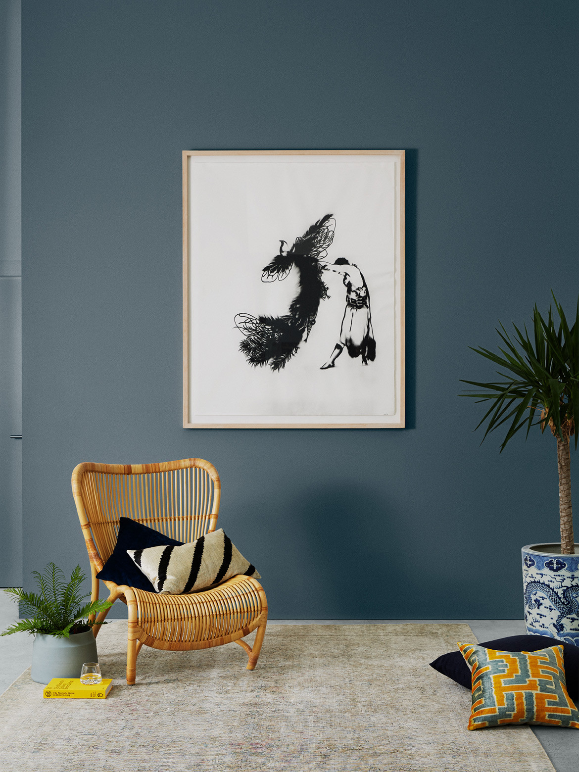
Throughout Australia, we’re spoilt with picturesque coastal views and the jewelled tones of the water. Our yearning to be by the seaside is evident now more than ever. Ideal for communal living areas and the bedroom, Wattyl’s palette of blue hues range from deep sea tones of Wattyl’s Denim; the soft sky blue of Kedron Blue; to the calming aqua of Breezy Day can alleviate the longing for the still sounds of the shore. “Blues, universally recognised as peaceful, calm and gentle, have tremendous power in managing stress,” shares Wattyl colour expert, Sarah Stephenson. “Blue hues are soothing and help calm our minds, they reduce our heart rates, lower our blood pressure and reduce anxiety.”
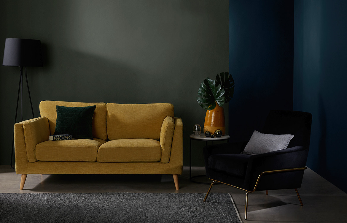
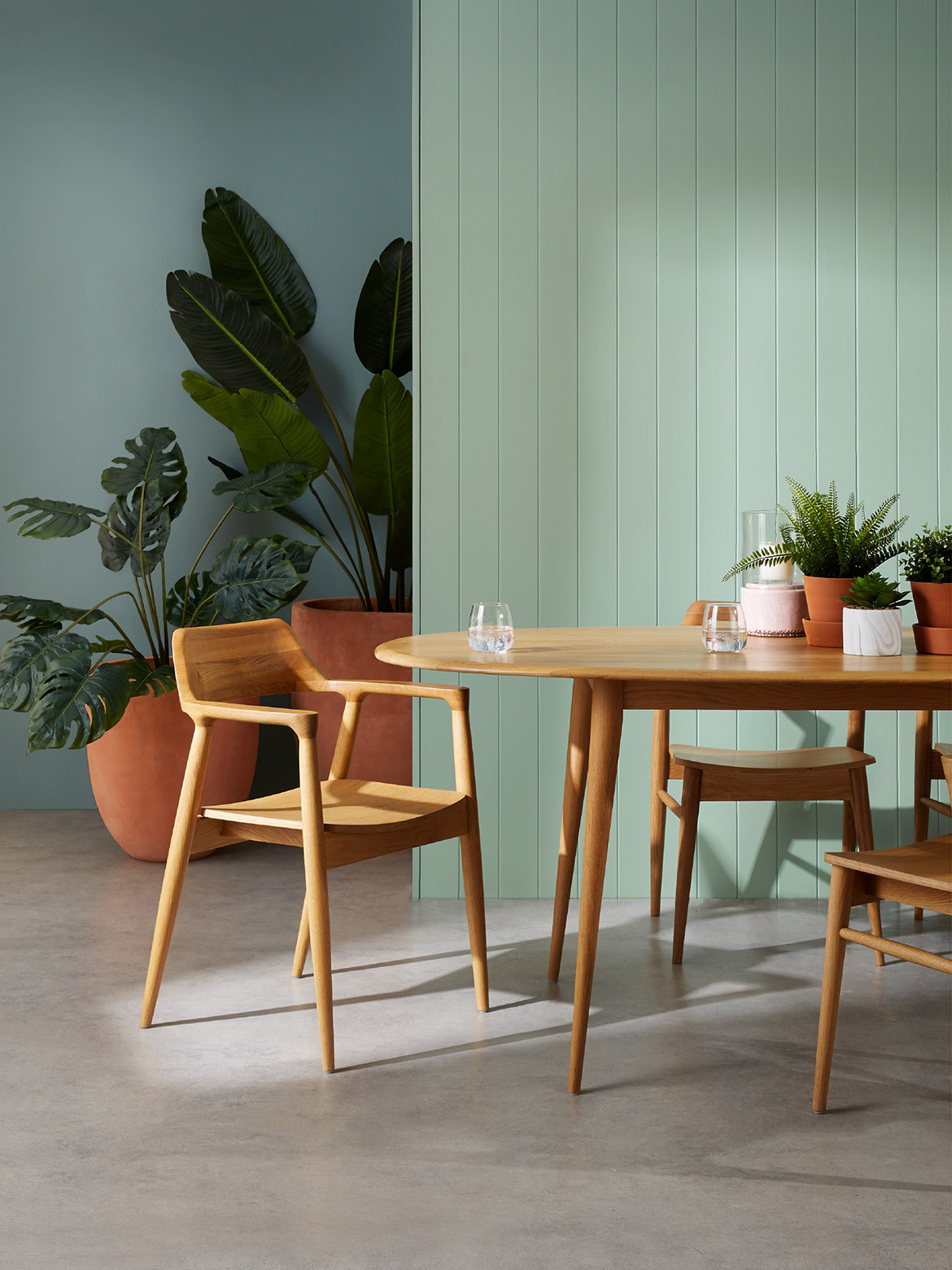
In addition to the coast, our country boasts an abundance of greenery and with our extensive time inside, this period has greatly emphasised our innate need for the outdoors. Wattyl lets us bring the outside in with a selection of green tones to restore our deep connection with nature. “A restful and quiet colour, green symbolises renewal and hope. It can diffuse anxiety, helping us to stay calm and feel refreshed,” Sarah notes. The grey and green shades of the eucalypt are injected into Wattyl’s Sooty Owl, Cloud and Rhino – the perfect accompaniment to let that haul of indoor plants shine even more.
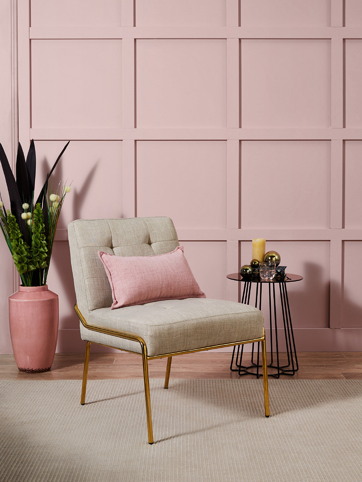
Transporting you to a place of rejuvenation are the soft blush tones and muted pinks, designed to find the perfect balance between your workplace and a home to unwind. Wattyl’s choice of the Tombola, Bath Bubbles and Pink Caress to soothe your mind, body and soul. “Layered tone-on-tone, these pink hues bring a harmonious and soothing ambience to a space and create a sense of optimism,” says Sarah.
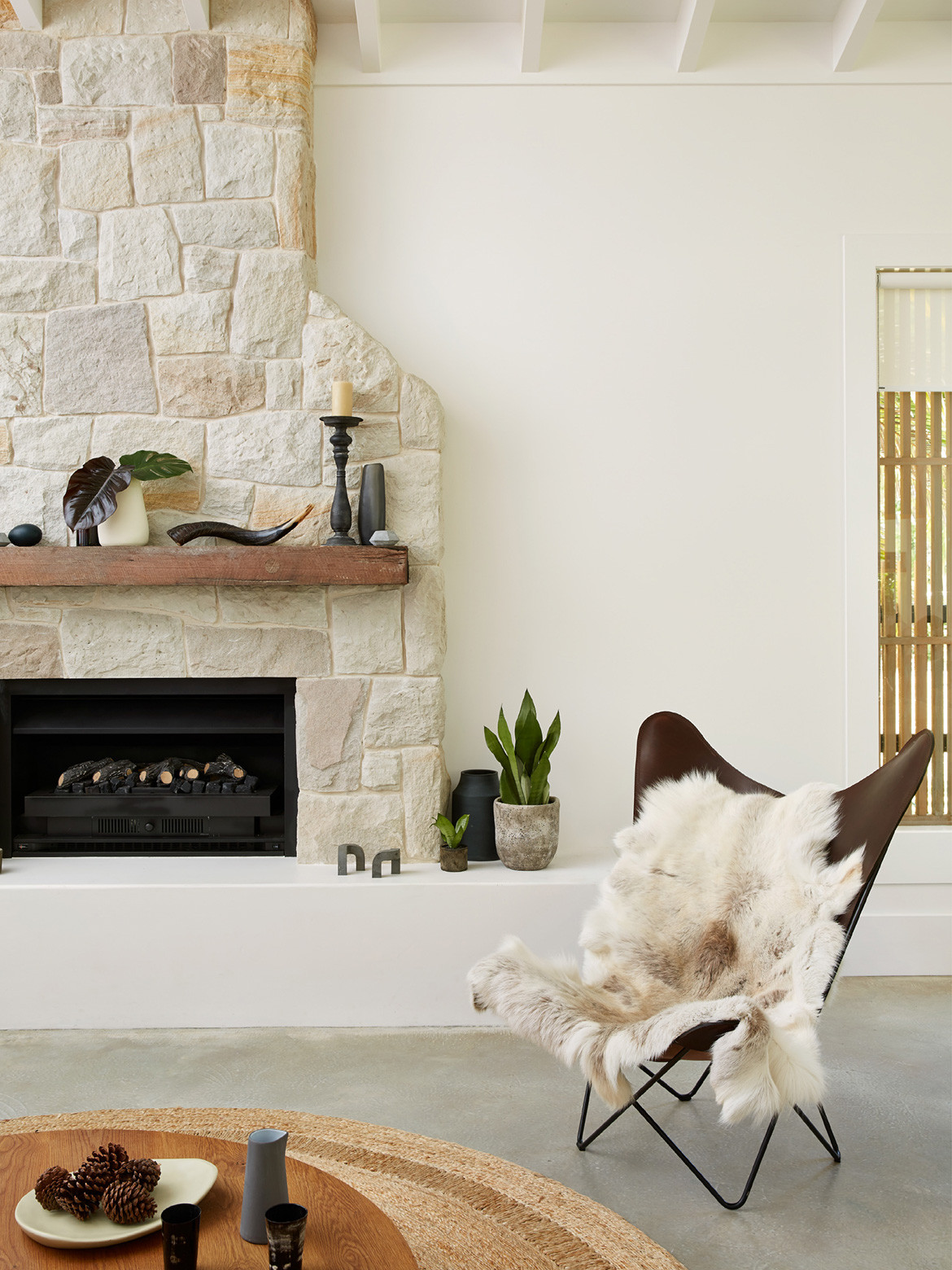
To achieve a sense of clarity and freshness to a space, one can never go wrong with warm neutrals and the cleanliness of white. Safe and reassuring, these tones have a welcoming personality – one that is essential in times of stress. Wattyl’s palette of neutrals are elegantly balanced with Confetti Shower, Creamy Coffee and Talc to bring comfort and a sophisticated charm to your home. Paired with walls of white, it gives the individual room to breathe during the day. The Wattyl Calcium, Cotton Grey and Magnesium act as a blank canvas to clear the mind, reset and refresh.
A bold, dark and rich palette can go a long way in improving one’s sleeping habits. Sleep is essential to a sense of wellbeing and deep, opulent colours can help achieve the individual relax in a space that is distinctly different to the others. Wattyl Sashimi and Midnight Seas is the perfect pairing to define the boundaries between work and relaxation, providing you a sumptuous space to switch off.
Wattyl is dedicated to creating products that are safe, healthy and nurturing. Wattyl’s VOCs (volatile organic compounds) remain at an absolute minimum, ensuring that any harmful toxins have been mitigated. The company’s I.D Advanced ultra-low VOC formula with less than 1g of VOCs per litre exceeds green-building requirements by an exceptionally high margin.
A company that is driven by safe and clean products, this distinct paint palette enriches the soul with safe and clean products, while breathing a new life into your everyday spaces. Wattyl encourages you to look past the functionalities of the home – from solely a practical space and into a welcoming haven, inviting you to sit back and relax at the end of a long day.
Wattyl Paint
wattyl.com.au
We think you might also like Pelci Brisbane by Collectivus
