Originally built in the late nineteenth century, the Victorian Italianate double-fronted home was given a Grecian makeover in the 1960s. The home’s original timber-framed windows were replaced with steel to increase the light and a brown brick fence added, replacing what would have once been decorative wrought iron.
Looking at these changes today, many might have been disappointed. However, Gaby, the owner of this property, was charmed by the previous renovations, seeing them as another layer in the home’s history. “I loved all the layers, from the grape vine trellis to brown Aztec carpets on the floor. Even the café-style curtains suggested newly arrived migrants enjoying coffee,” says Gaby.
While the 1960s quirks bought a smile, “There were things that didn’t work,” says Gaby, referring to the previous kitchen and lean-to, as well as a couple of poky bedrooms. But the ‘bones’ of the original home were good: high ceilings, solid walls, well-proportioned rooms and “Potential, with a large north-orientated back garden,” she remembers. She also warmed to the ‘dog-legged’ passage, with its distinctive linen cupboard.
Gaby commissioned Multiplicity to re-work the house after reading a newspaper article on the directors, architect Tim O’Sullivan and his life and business partner, interior designer Sioux Clark. Visiting the Multiplicity office in Brunswick, a simple shed-like space filled with loved objects and artifacts, assured her of her choice.
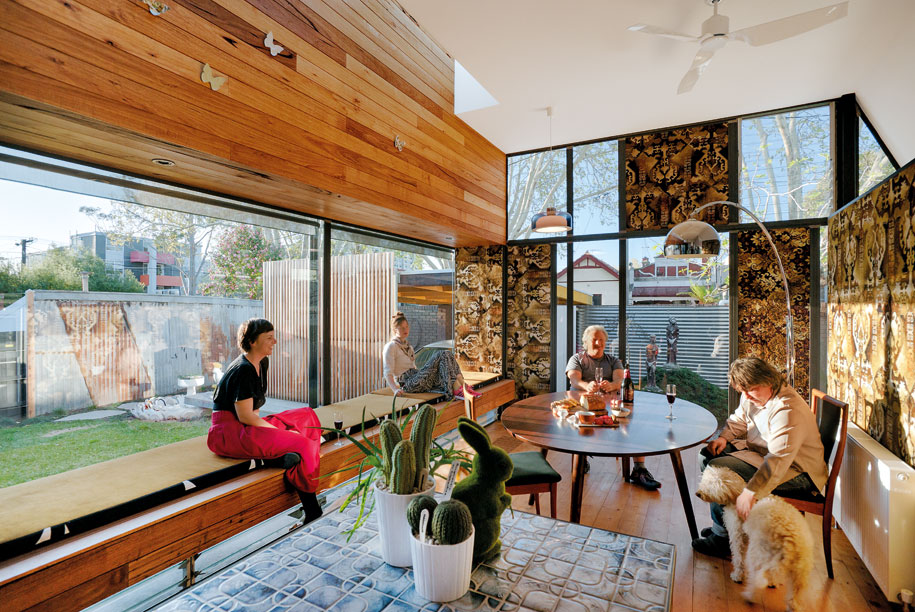
Gaby’s brief to Multiplicity included two bedrooms, sufficient wall space for art, light-filled rooms, an outdoor laundry and generous storage areas. High on her list was to embrace the 1960s influences rather than fight against them. This architectural approach is inherent in Multiplicity’s work, whether it’s a domestic or commercial project, with the directors, as well as staff, regularly fossicking in secondhand yards or visiting building sites and ‘rescuing’ materials so they can have a second life.
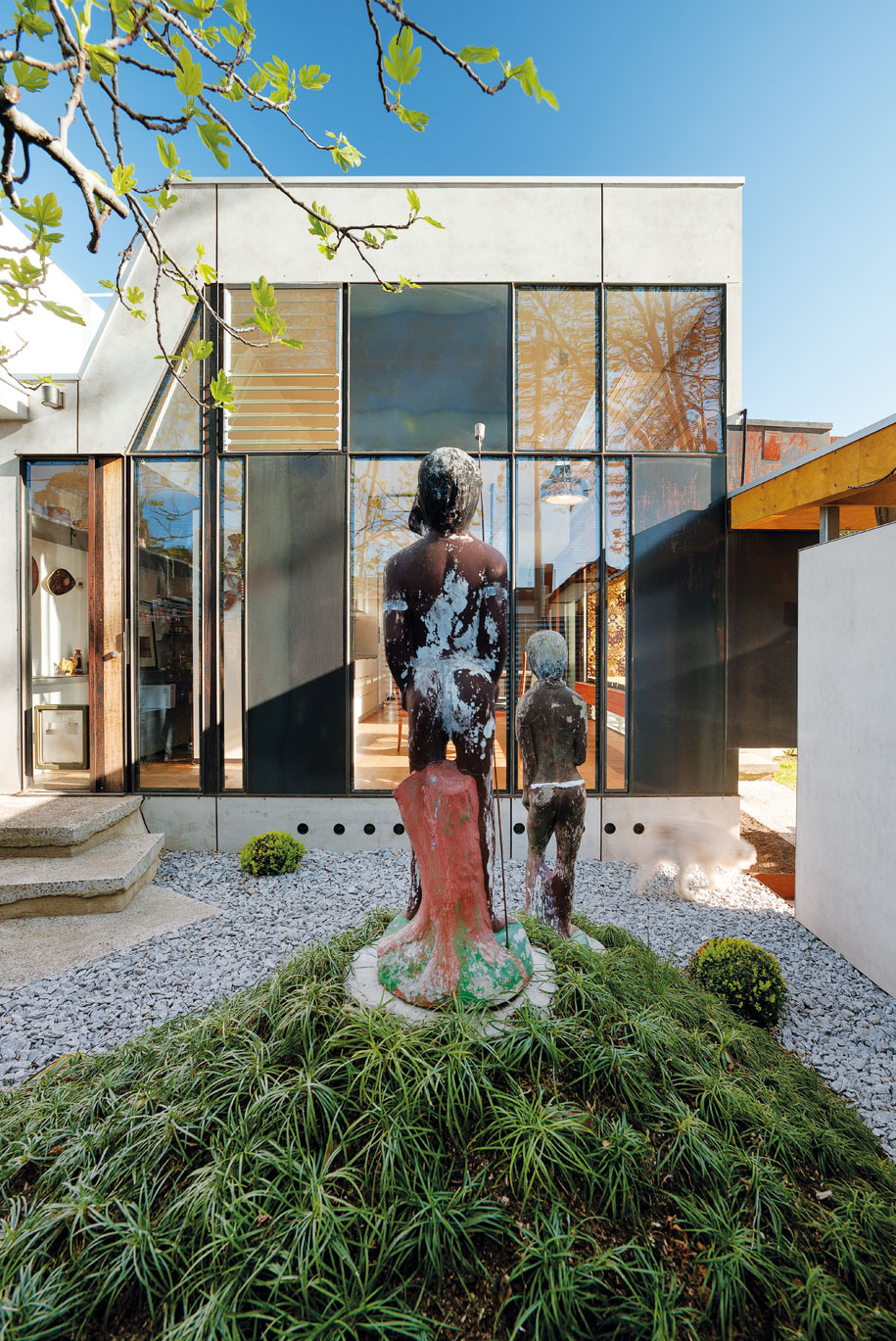
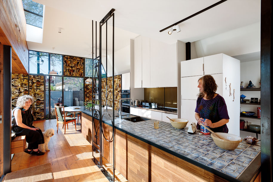
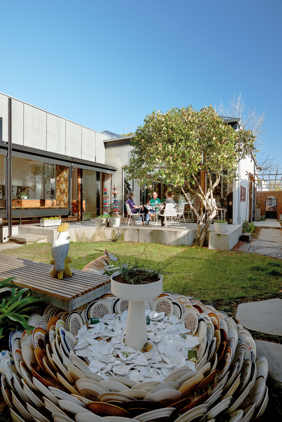
And rather than just add a contemporary glass box on the back, as is often the case when renovating period homes, the preferred scheme was a subtle fusion between past and present. Although the new wing is clearly new, constructed in glass, steel, timber and fibro-cement, it borrows on the scale and proportions of the original house. “We barely increased the size of the home’s original footprint, after the lean-tos were removed,” says O’Sullivan. Within the wing, a new kitchen and casual dining area form an L-shape to the back garden.
Linking the new to the old are textural elements from the home’s Grecian phase, such as the 1960s brown carpets cleverly reworked into wall panels. “We were originally going to use the carpet for rugs. But with the new timber floors, these wall panels soften the acoustics, and they add a sense of warmth to the interior,” says Clark. In addition, the kitchen features original 1970 tiles on the bench, which is also supported by a mix of 1950s and new wrought iron, bringing together past and present.
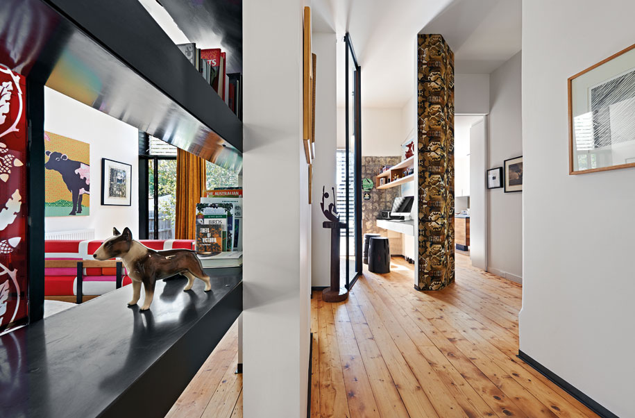
To allow Gaby to enjoy her garden, designed by Andrew Plymin and filled with whimsical garden sculptures, Multiplicity included a generous built-in window seat in the new wing. Lined in timber and clearly articulated in steel, this seat is a favourite spot for Gaby. “People often find it strange occupying a new space. This seat provides a strong visual connection to the garden, but importantly, felt like a home, even before the furniture was arranged,” says Clark, who believes there should always be places to sit or ‘perch’ irrespective of loose furnishings. The office nook, located at the end of the passage, also subscribes to this approach, with built-in desk and stool enjoying vistas both indoors and out.
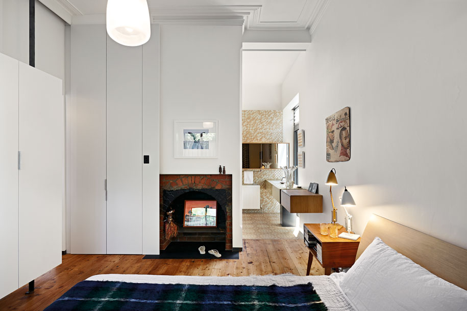
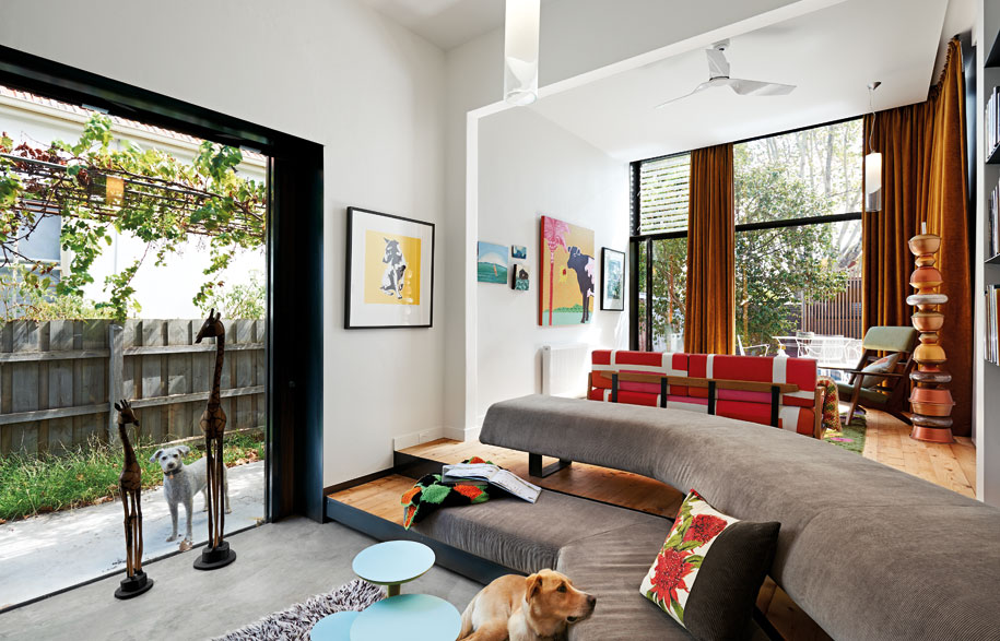
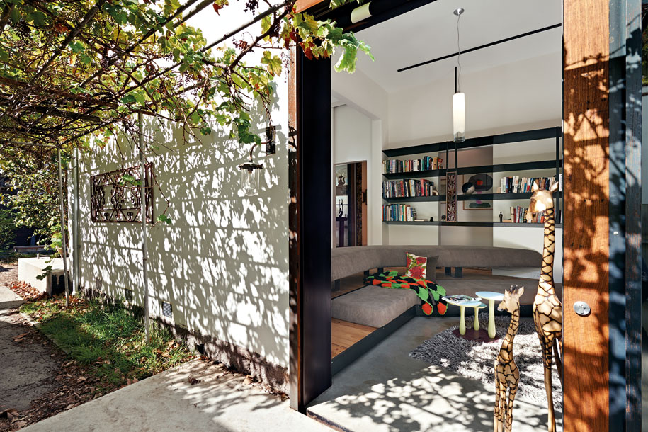
The living room, with its sunken lounge, also offers another experience of the house. Orientated to the cream brick fireplace, it’s an ideal nook through the winter months. “I tend to move around the house depending on where the sun is. But I’m just as content lying on the bed reading,” says Gaby, who is as relaxed and informal as the house. “It’s important for Tim and I that each project captures the personality of its owner,” says Clark. “To have a series of formal spaces just wouldn’t have been appropriate for this place”.
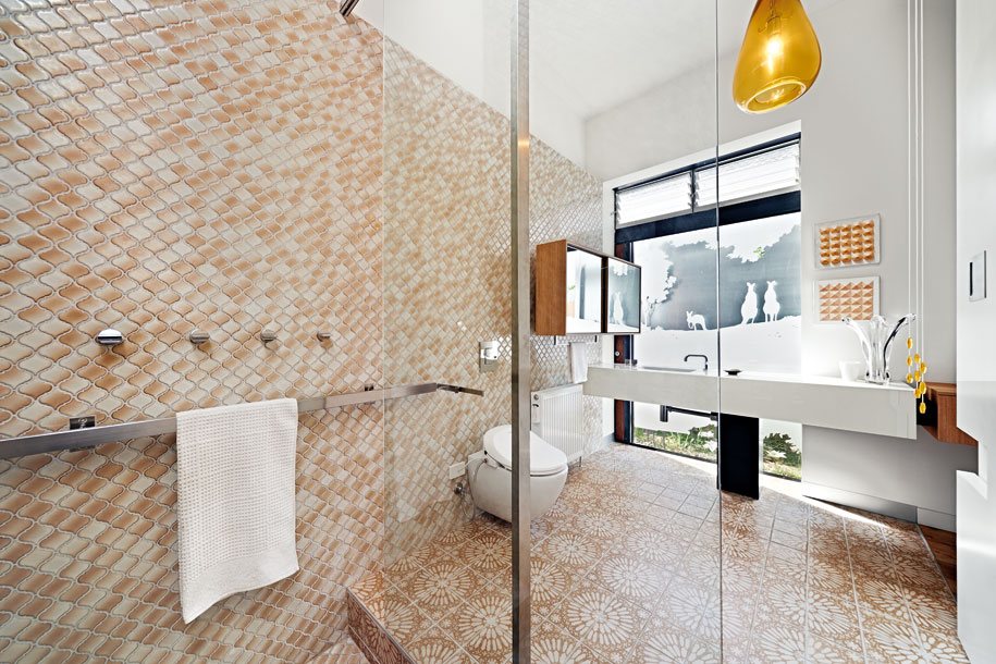
One of the most coveted areas in the house is the sunken shower/bath in the ensuite to the main bedroom. Lined with Moorish patterned tiles from the 1970s, the sunken bath is beautifully illuminated by an overhead skylight. And to make the experience of bathing even more pleasurable, there’s a bespoke steel screen in the adjacent courtyard, depicting kangaroos. “I’ve always responded to kangaroos and Australian wildlife,” says Gaby, whose collection of outdoor ceramics includes kookaburras and cockatoos.

This renovation breaks away from the usual contemporary extension that denies a connection to the past. While Multiplicity should be commended for taking a different path, Gaby’s involvement also needs to be acknowledged. Lets face it, how many clients would select heavy bronze golden velvet for living room curtains? Or reveal a wall where tiles may once have appeared, as in the case of her office nook? It takes a certain client who can envisage 1960s carpet ‘woven’ into a contemporary design, but it’s with clients like these that Multiplicity have achieved something out of the ordinary.
Photography by Emma Cross
This article first appeared in Habitus #26. To subscribe, click here.
