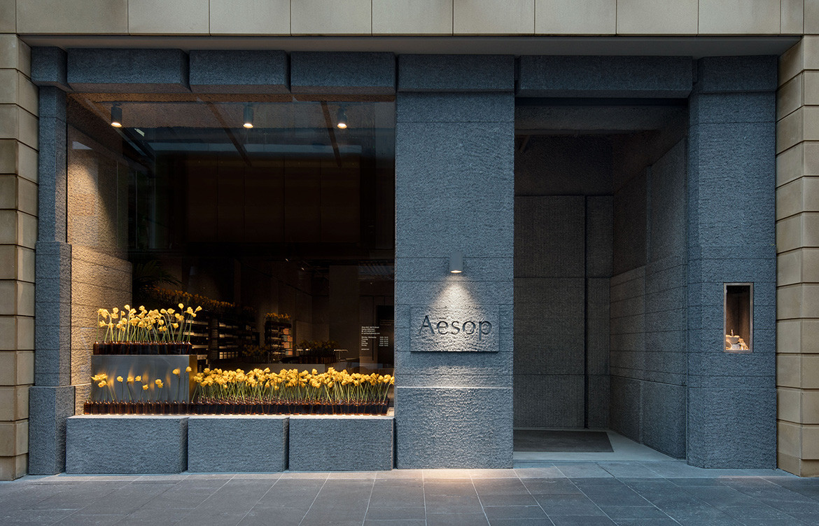
The cautionary tale jack-of-all-trades master of none need not apply here. For Aēsop’s newly unveiled store street facing on Sydney’s bustling Pitt Street shopping strip, the team has collaborated once again with Norwegian design practice Snøhetta. The resulting space caters to time conscious city workers on their lunch break, fans of the cult skincare brand with time to learn more, and to weekend browsers that delight to discover alike.
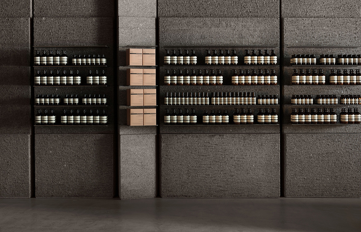
At 250 square metres, this is Aēsop’s largest store globally. Long and narrow, the journey from the front of the store to the back is a carefully constructed narrative that Aēsop and Snøhetta conjointly developed. The bulk of the product display, including the standalone testing basins, is at the front of the store. As you progress there is an open space that during business hours offers breathing space and reprieve, while out of hours it offers a breakout space for in store events. Along the sidewall in the third quarter of the store there are three stand-alone vanities for special treatments and finally along the back wall – to mirror the front – there is seating in the form of an amphitheatre that protrudes from the wall in one continuous motion.

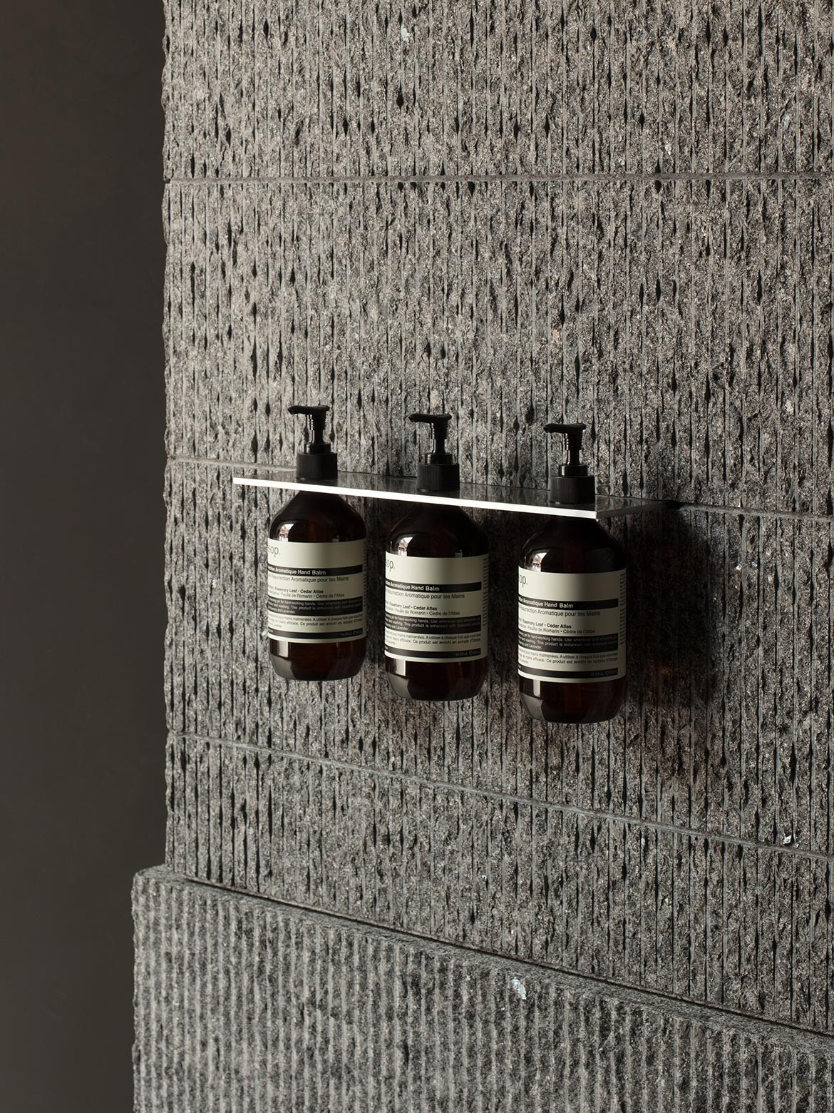
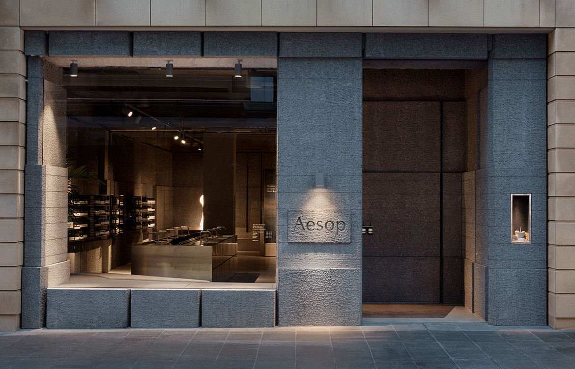
Although this store marks a new direction for Aēsop now entering its fourth decade, it does continue Aēsop’s known preference of working with materials, practices and people local or unique to each location. A monumental granite structure characterises the interior walls of the store, referencing the City of Sydney’s heavy use of the strong and durable material. A local stonemason has scored the walls with a bridge-saw, developing consistent horizontal ridges throughout the store. The ridged granite continues outwards to the shop façade, in contrast with the building’s sandstone make up.
Polished concrete floors and stainless steel – by way of the testing basin, point of sale, and vanities – enhance the atmosphere of the store.
In the face of a constantly evolving retail environment and consumer profiles, Aēsop remains consistent in its dedication and appreciation of meticulously considered design and cross disciplinary collaboration.
Aēsop
aesop.com
Snøhetta
snohetta.com
Photography courtesy Aēsop



We think you might also like Not Just A Shop by Yatofu Creatives
