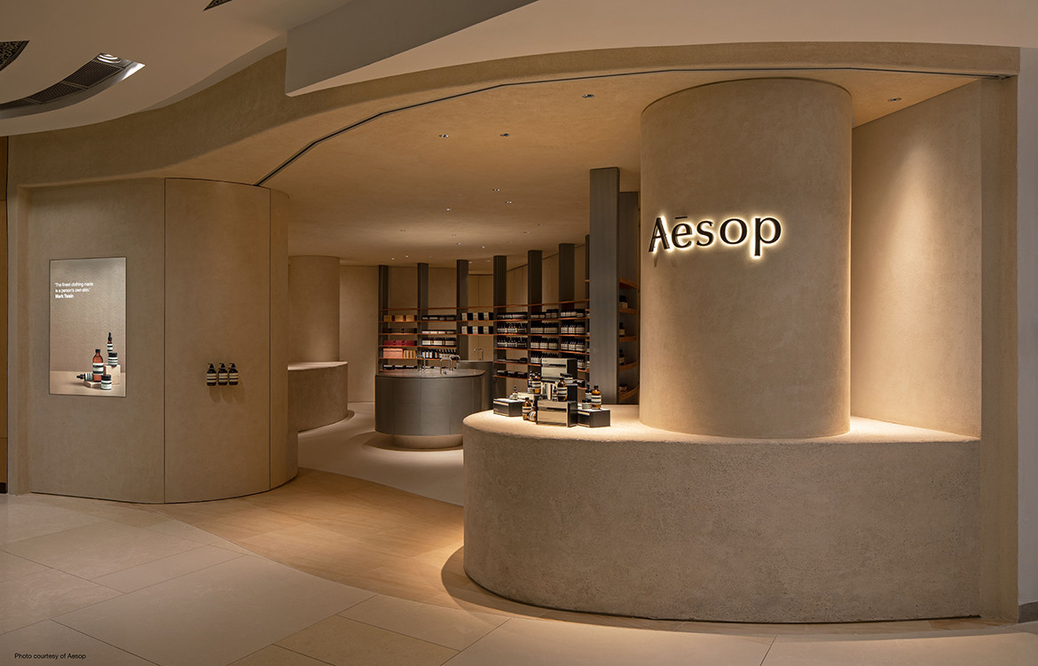
It doesn’t matter if one steps into an Aesop store without intending to buy anything from the skin care brand. An Aesop retail space is a destination unto itself, designed to persuade with artless charm. Gentle spaces, beguiling scents and invitations, both spoken and unspoken, to reimagine daily ablutions are all part of the package.
Beyond all this is also a rather noble intent: “Every Aesop store is designed with sensitivity to its context, each telling a story unique to its location,” says Selwyn Low, Director at FARM. The Singapore design studio was appointed to design Aesop’s latest store at ION Orchard. For their second project for Aesop, FARM took inspiration from the sleepy nutmeg orchards that once grew where Singapore’s main shopping belt, Orchard Road, now stretches.
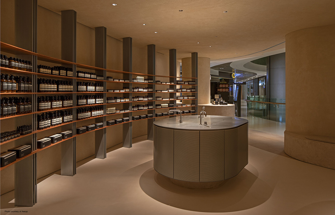
Sweeping curves at the entrance of the store embrace customers into the belly of the interior where a seamless flow of spaces continues throughout the curved plan. An understated wash of earthen tones provides a suitably calming backdrop.
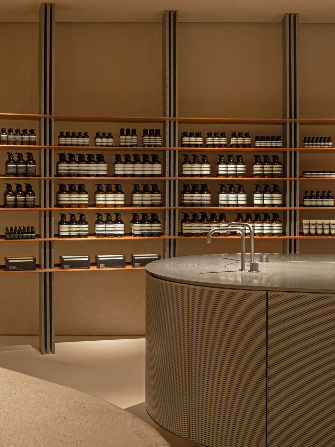
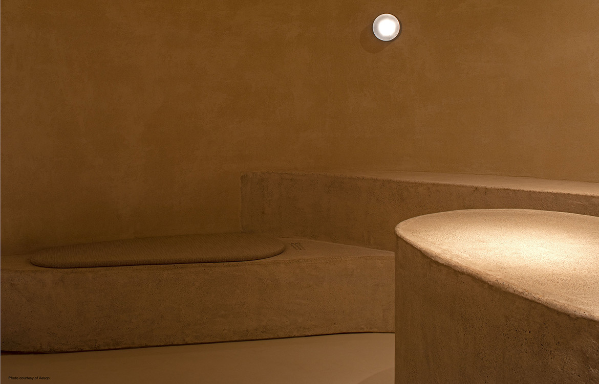
“We developed a family of textures and tones by applying a sand-based coating across various materials such as cast concrete, stucco paint and epoxy to unify them, creating a seamless and controlled palette in the space,” says Low.
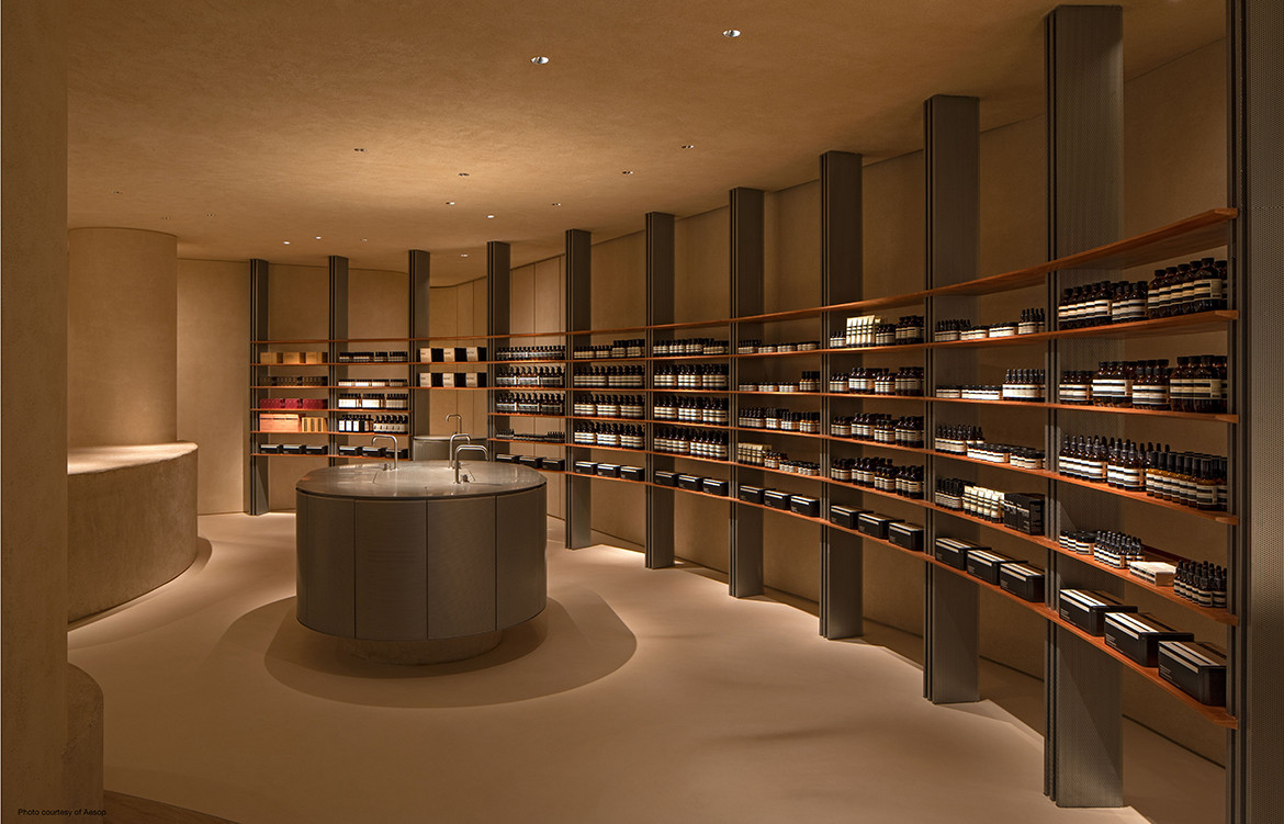
Shelving in the store references the patient process of drying nutmeg and mace where spices originally rested in shallow porous metal trays set on timber racks. Here, galvanised steel and solid unvarnished timber provide the elemental frame on which products are displayed. The intention was to invert the relationship of the vertical and horizontal structural members of the nutmeg drying racks. “Rather than slotting lightweight metal trays into chunky timber plinths, teak planks are supported by perforated folded metal sheets,” Low describes.
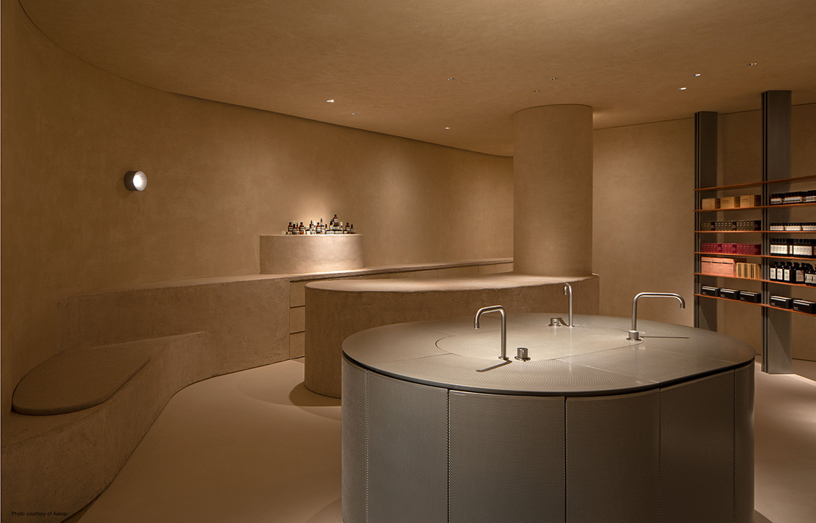
Holding court at the centre of the store is a basin for customers to sample different products—an integral part of the Aesop experience. FARM set out to elevate the process of washing and cleansing. Instead of a concave receptacle, the basin is expressed as a counter of sorts. A flat top of perforated steel allows water to flow through the permeable surface and disappear almost magically.
Aesop ION provides a reprieve from the bustling mall it sits within, a welcome alternative to the hyped-up, fast-paced ways of shopping in Singapore. As for that customer who didn’t intend to buy anything? It’s likely he changed his mind.
Photography by Studio Periphery
