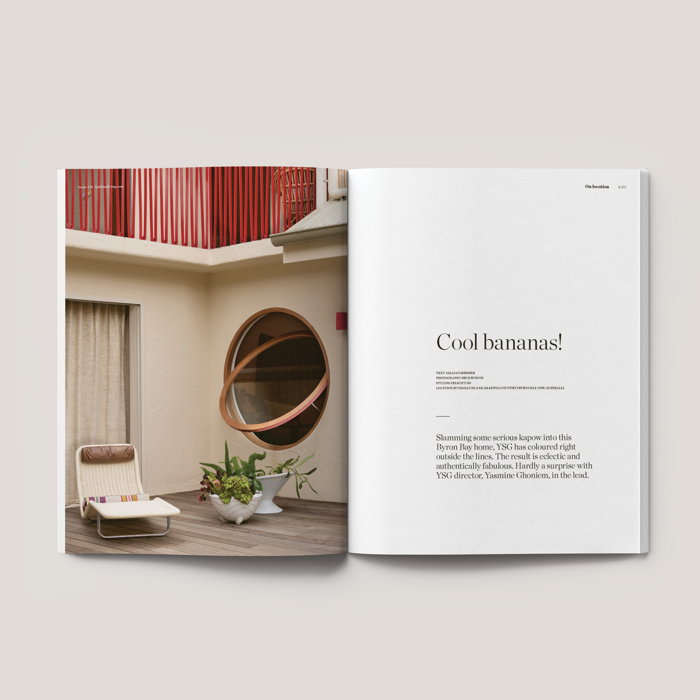
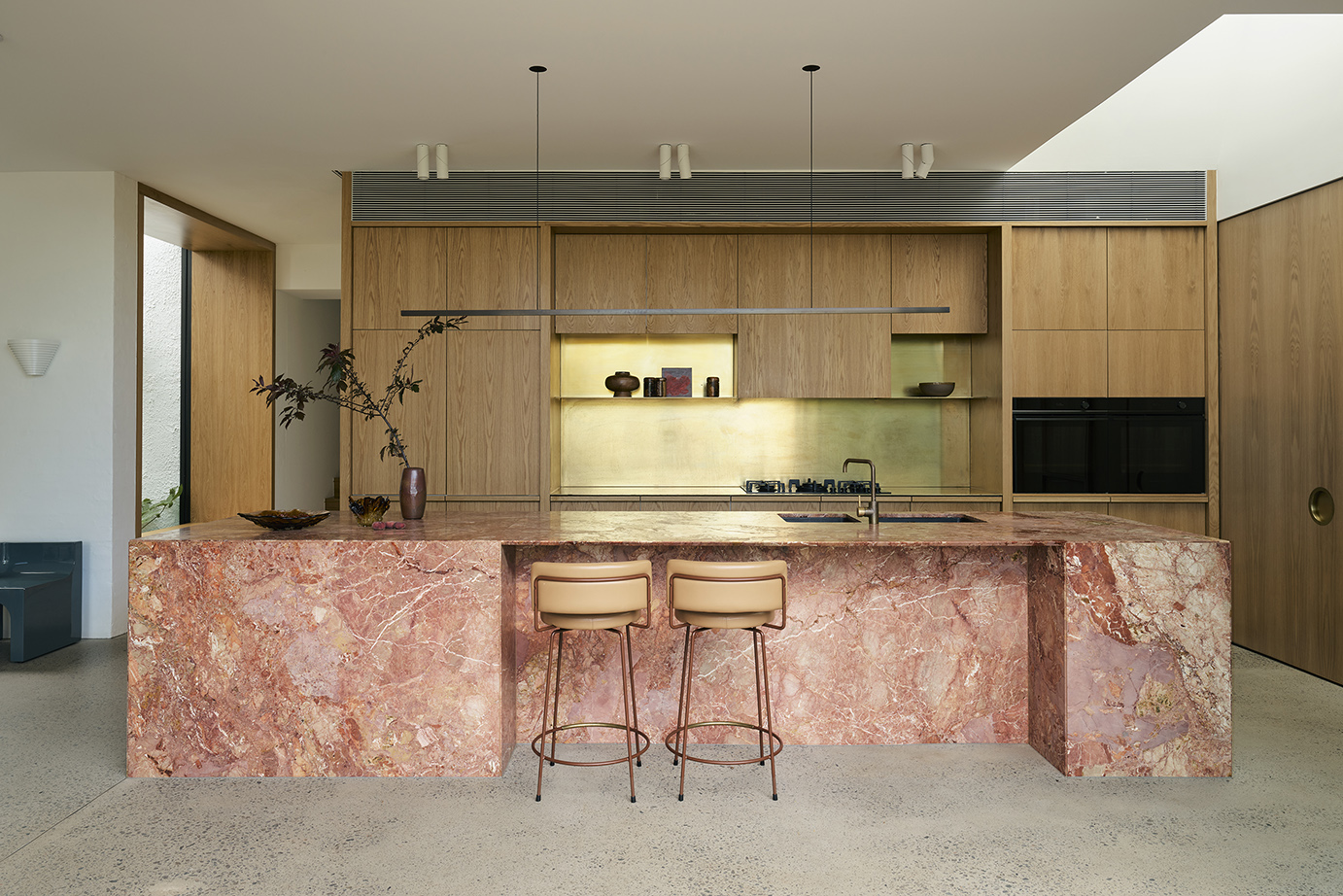
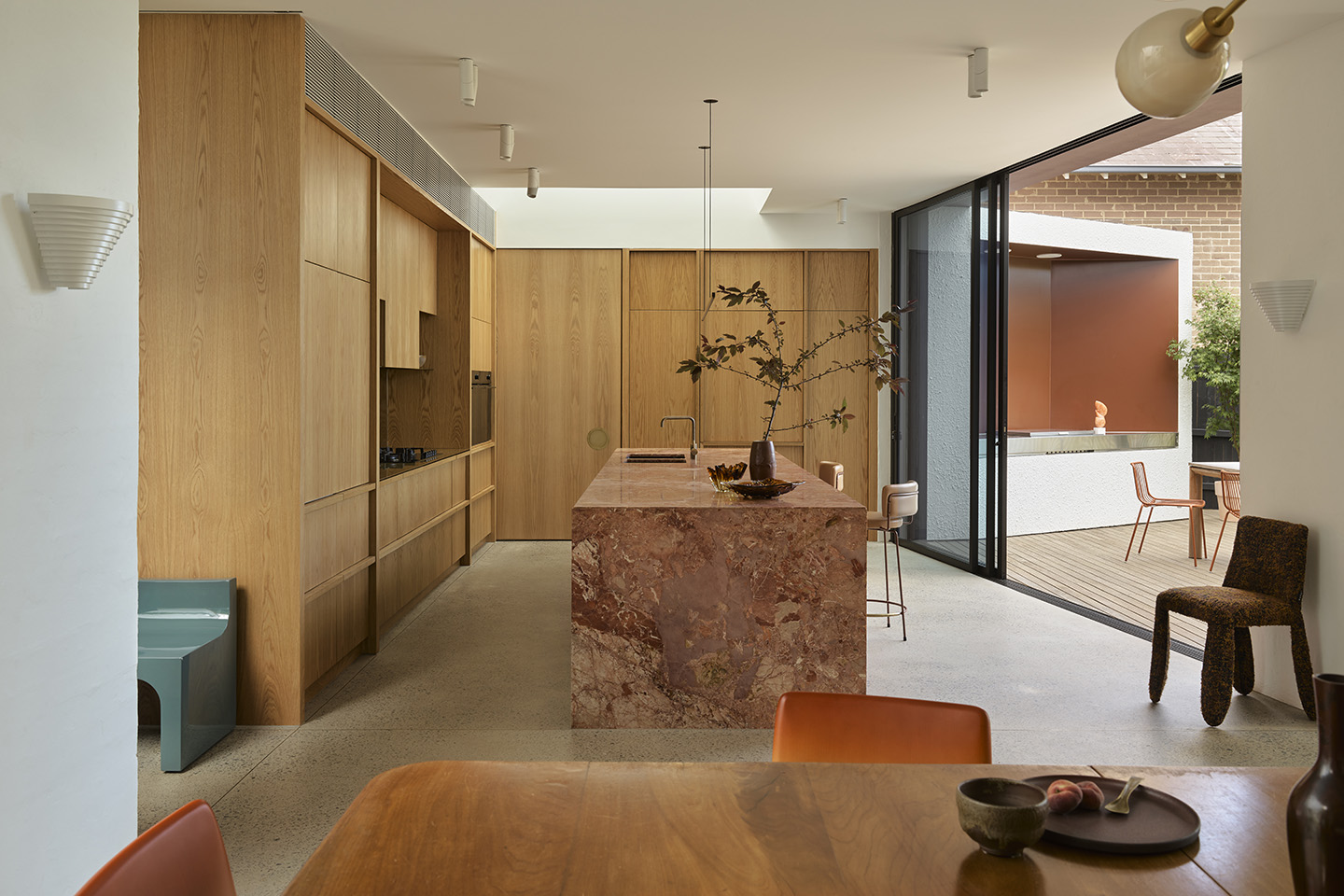
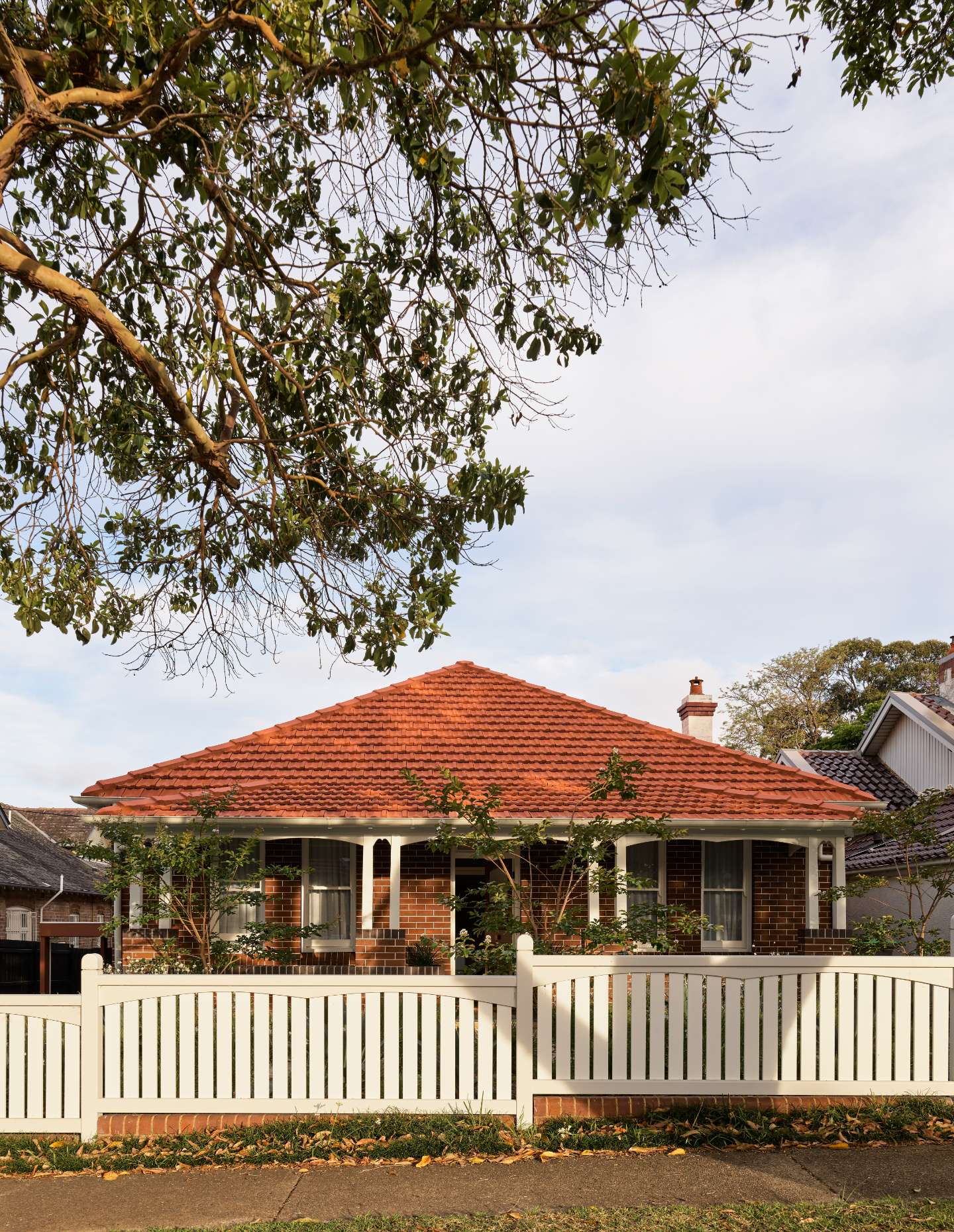
Alpha House is a multilayered story of redesign, renovation, replacement reinvigoration. The transformation of a Federation cottage has a number of different spatial focal points, but it’s hard to look past the show-stopping kitchen island. Indeed, it recently featured as a front cover image for Habitus magazine, standing out for its colour and material qualities.
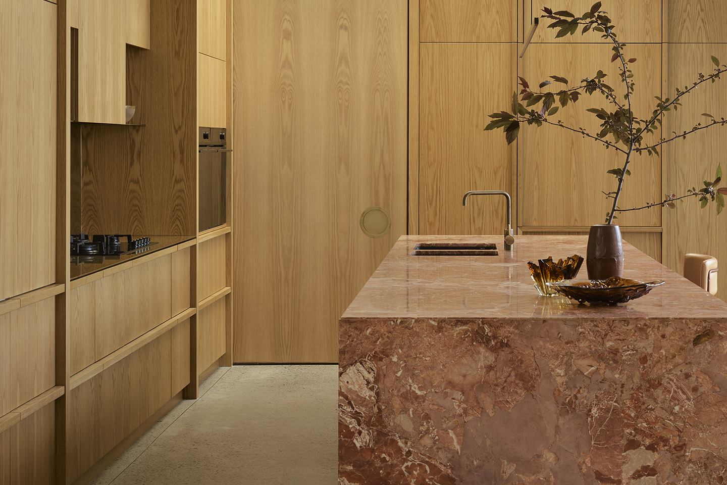
The striking blush and burgundy veined marble of the kitchen island holds the room magnificently. Jewel-like and framed by American Oak veneer cabinetry, the natural shifts within the stone are given full flight with areas of intense tights figuration balanced by large swathes of colour. The large paired splash of pink and white in the left-hand expanse is particularly beautiful, but then so too is the sudden ripple of white through the centre.
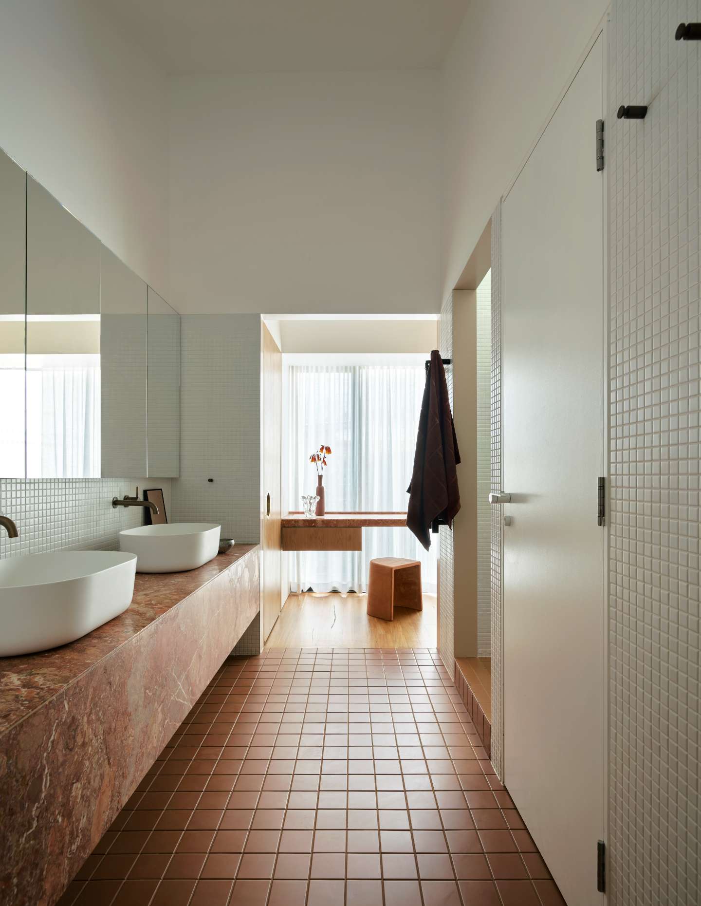
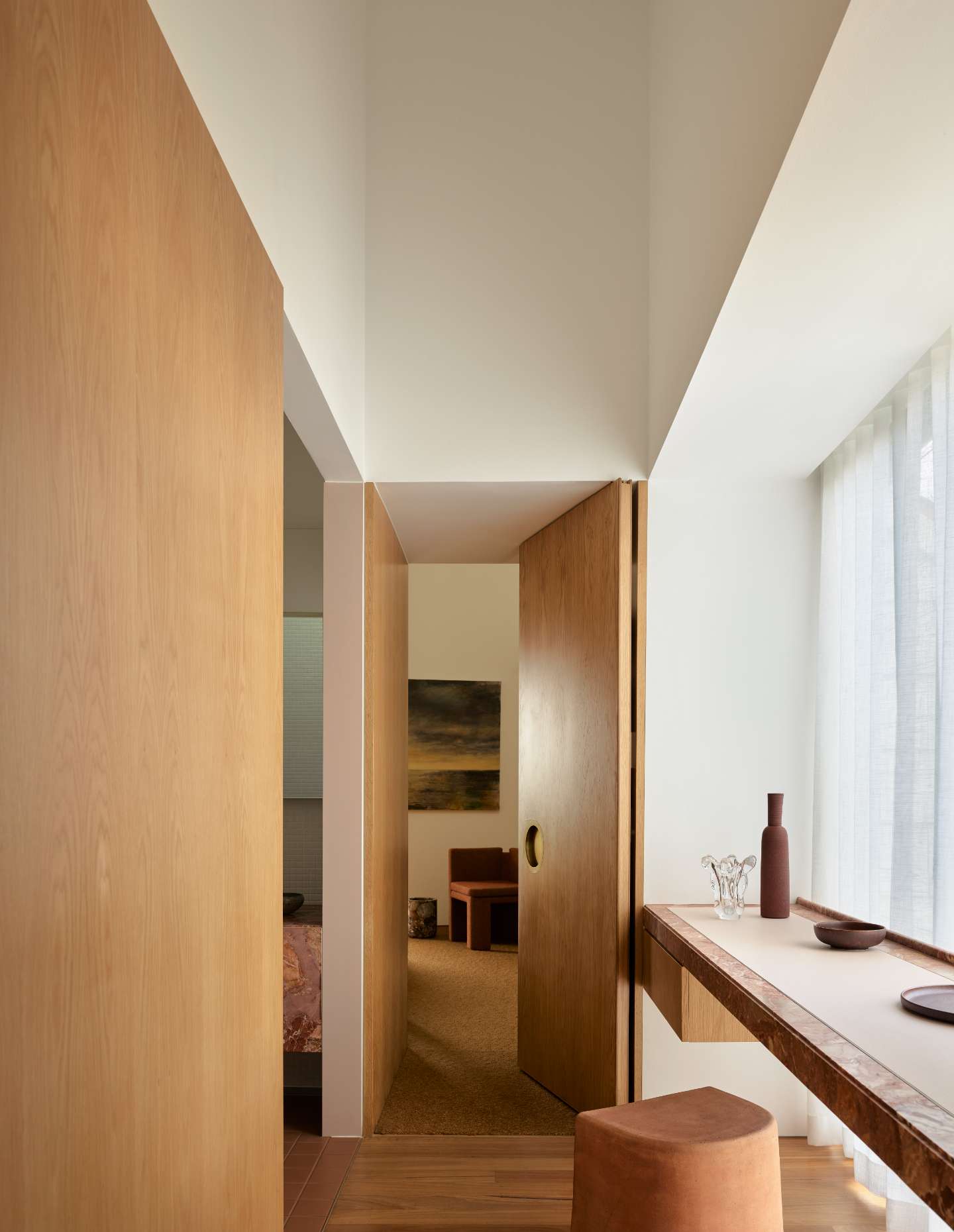
The large block form of the island is countered by a glowing brass splashback that extends upwards behind the floating brass shelves. The cabinetry here is exceptional, with the American Oak figuration fully realised as a layer within the pattern of the whole. Rather than opt for a seamless wall of cabinetry, each cupboard is visually articulated with detailed joinery and trim. It is excellently done and a breath of fresh air in kitchen design. The cabinetry also conceals a mud room, wine store and pantry. While tucked behind the back bench is a service area comprising a laundry, linen store, cellar and powder room, with pocket sliding doors that allow the whole to be closed off as required. Meanwhile, honed concrete floors provide a neutral foundation to the eclectic collection of loose furnishings the family has gathered over the years.
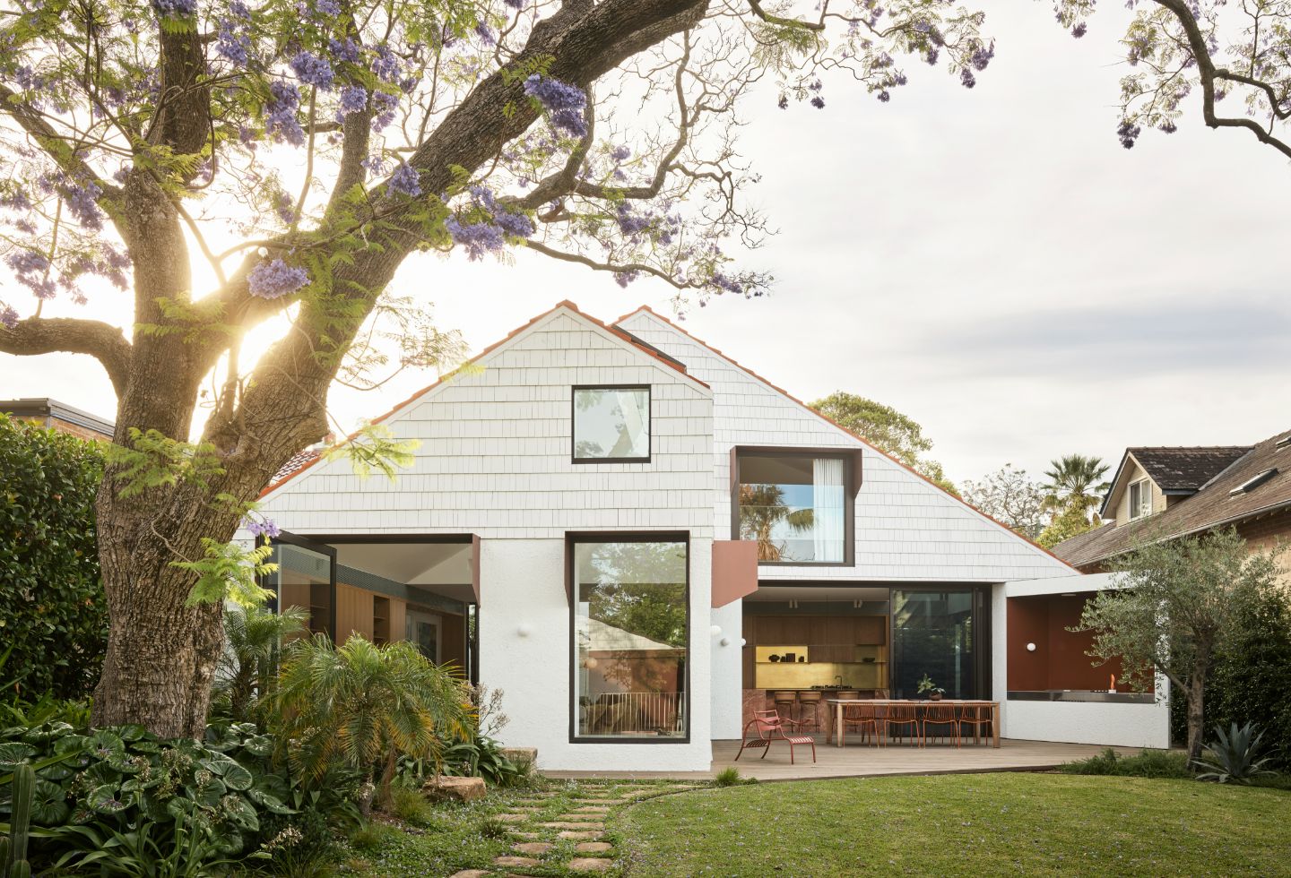
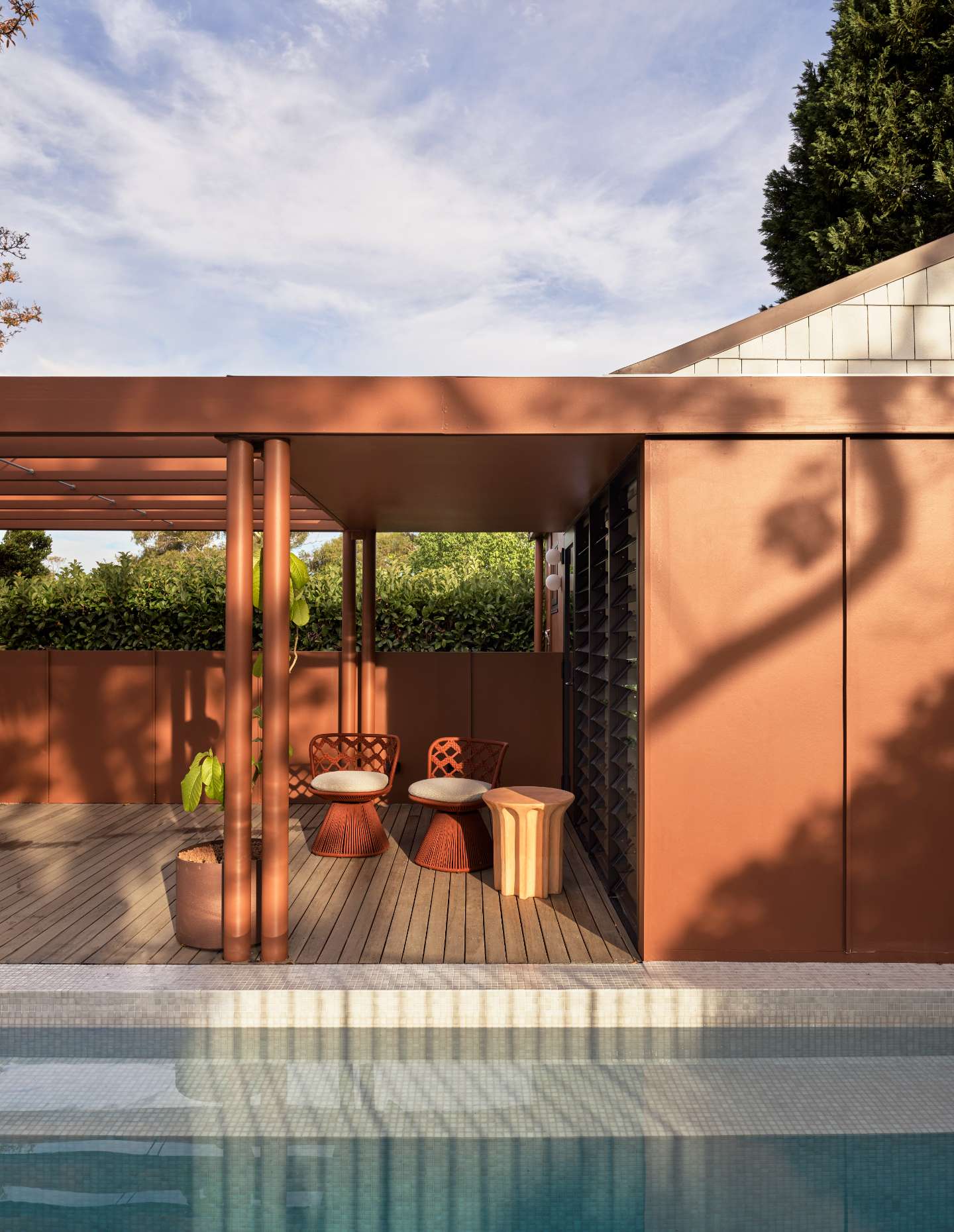
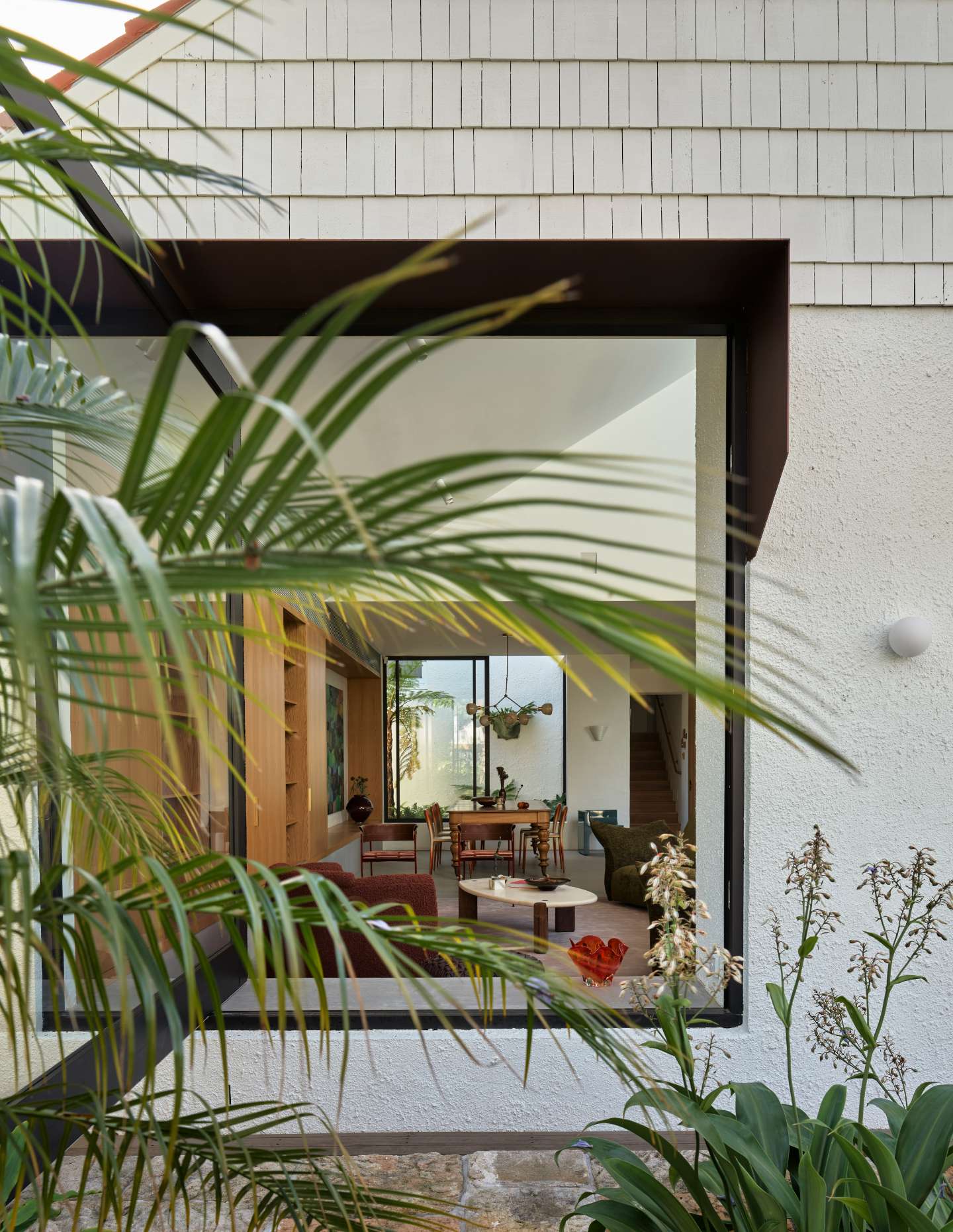
The project as a whole is spatially arranged to optimise the established gardens and Jacaranda tree, transforming it into a warm and generous family residence that encourages a sense of togetherness. Testament to Studio Prineas’ volumetric understanding of space, the home’s previous incongruous additions are replaced with an expansive, L-shaped volume and realignment so that “the internal level change now affords a greater connection between the principal living zones and landscape,” as Eva-Marie Prineas, principal of Studio Prineas explains.
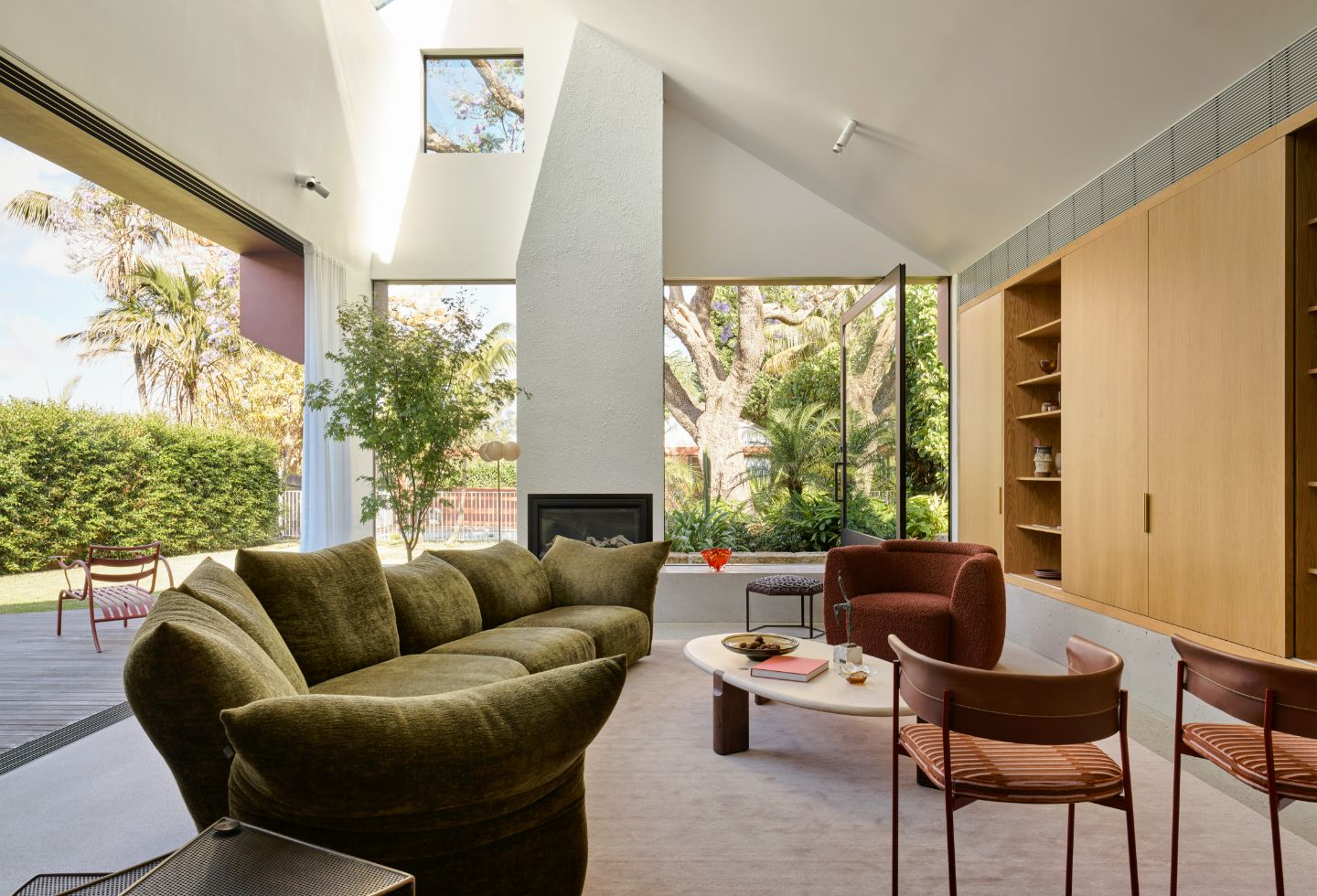
Copious natural light now reaches a new space with generous, dynamic verticality. The light comes in from the side, as well as through a high, angled sylight point above to create a room that truly merges with the outdoors.

More on this project here for Winnings x Habitus House of the Year 2024
