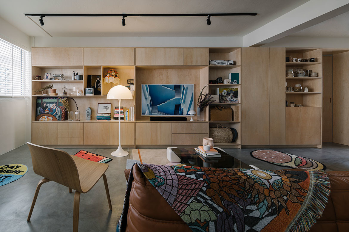
Entering Alvin Richard Chan and Danli Lok’s Housing Development Board (HDB) apartment, there is an unusual sense of spaciousness not typically encountered in three-bedroom public housing units in Singapore.
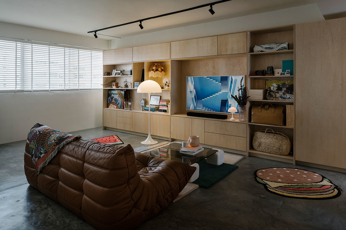
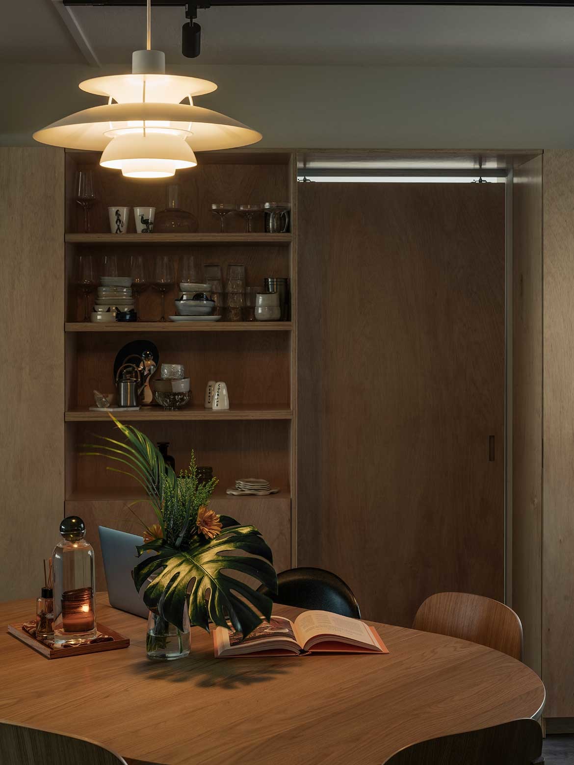
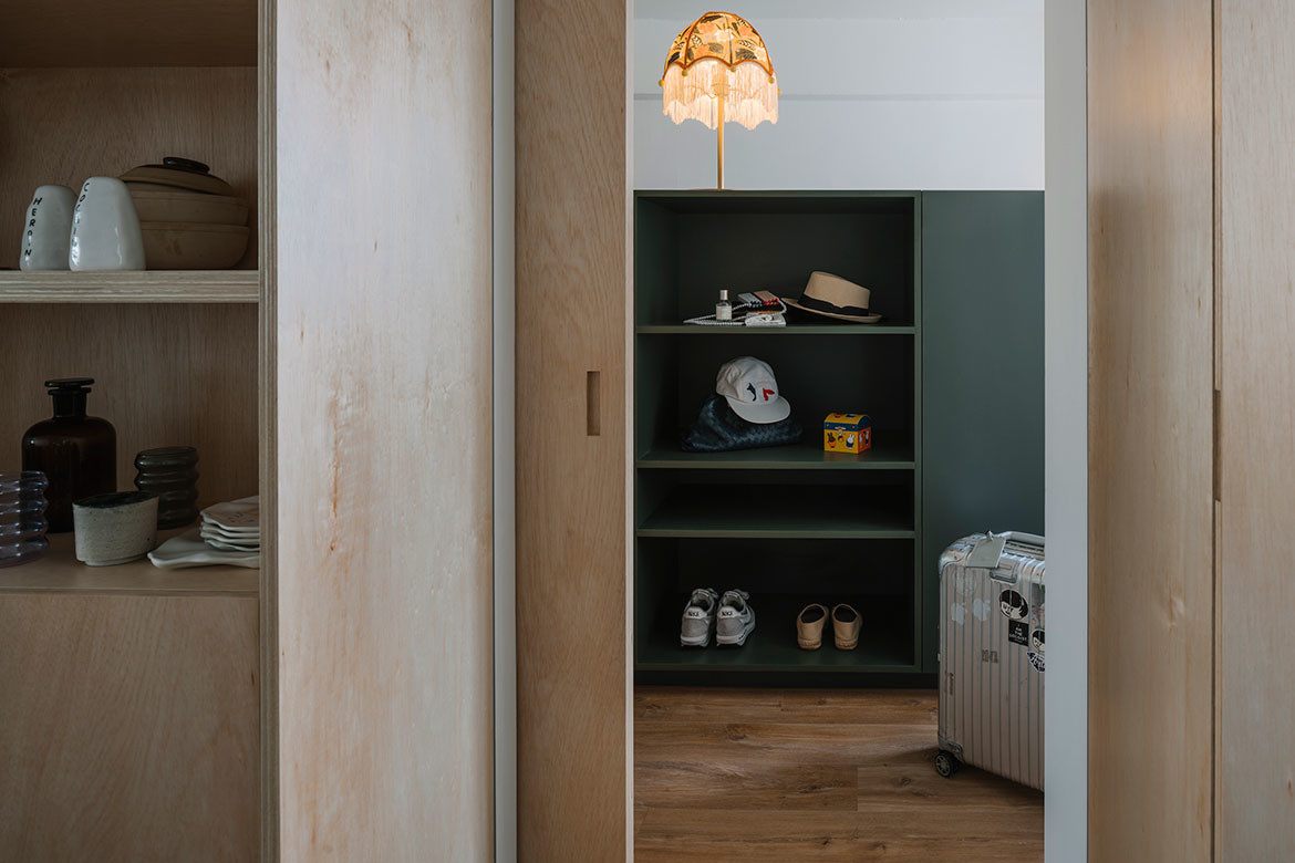
A plywood timber cabinet spanning the eight-metre-long living and dining area accentuates this effect. On this wall the couple stores and displays everything from sentimental objects to everyday tools and crockery.
“This shelf helps to shape the character of the apartment while defining the living area,” says Joy Loo, co-founder of WAFF, the interior design studio engaged to improve the apartment’s original space. Programmatically the clients requested for a communal zone shared between living, work and dining, and an open kitchen and one bedroom.
“Being homebodies and enjoying the bulk of their time working from home and hosting guests, they preferred to have a less rigid built-up space. Instead, they wanted a plan that’s versatile with sufficient storage and display spaces,” says Loo. Chan is a hobbyist who also wanted a room for crafting miniature figurines.
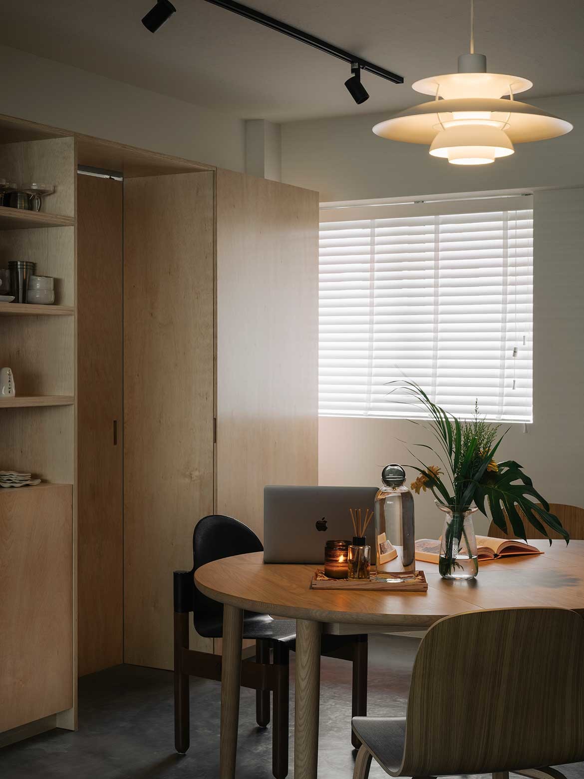
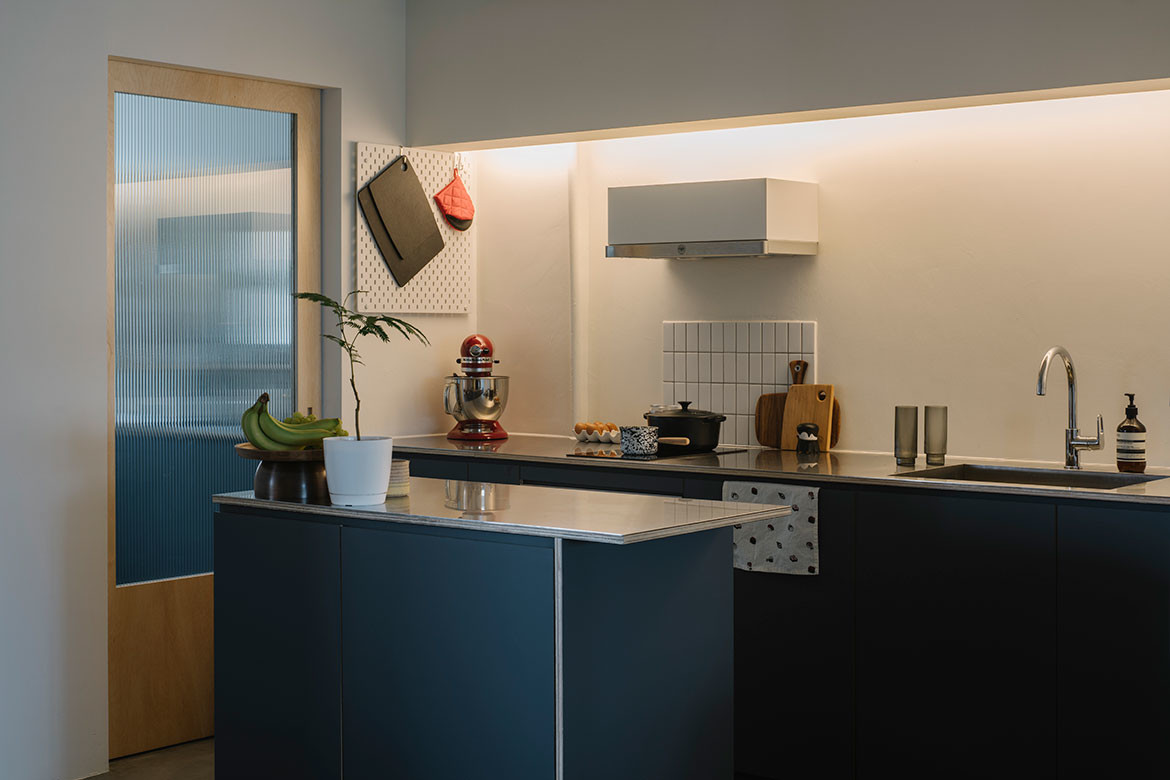
Loo altered the original layout by removing a bedroom between the living room and kitchen. It is now the dining space, connected freely to the living and an open kitchen. A utility room at the back of the original kitchen became Chan’s hobby room while the original kitchen is now the yard. Loo also demolished the wall between another two bedrooms in the rear to create one large bedroom.
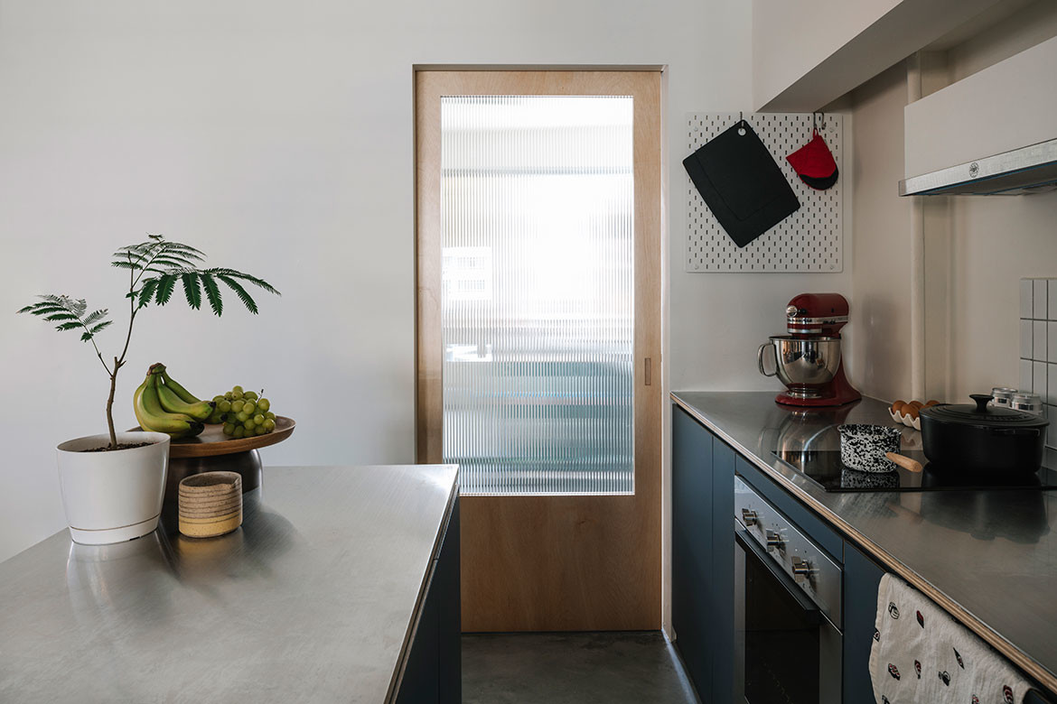
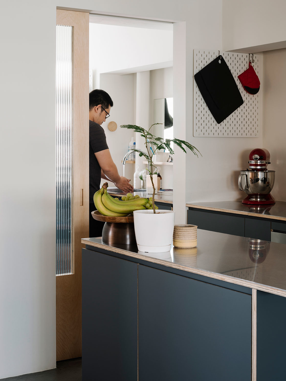
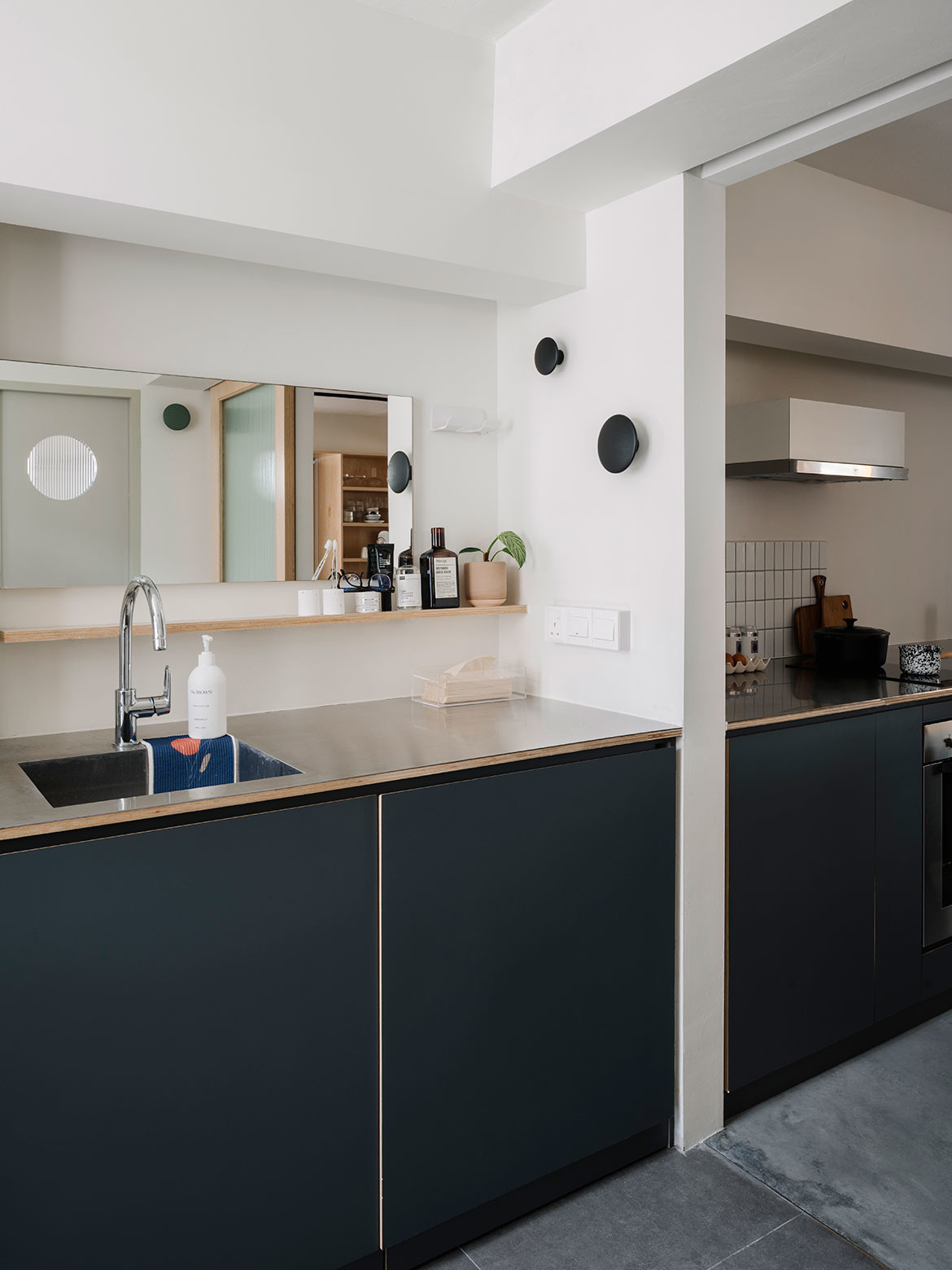
Simple materials such as laminate for cabinetry door panels and stainless steel in the kitchen matche the raw materiality of the plywood shelf in the living and dining, as well as the cement flooring. The latter is a neutral backdrop to flaunt the trowel detailing and wood grain of the plywood, while laminate and stainless steel are easy to maintain, Loo highlights.
A moveable island counter in the kitchen adds storage and counter space for meal preparation, and lets the couple be flexible with its placement within the communal area.
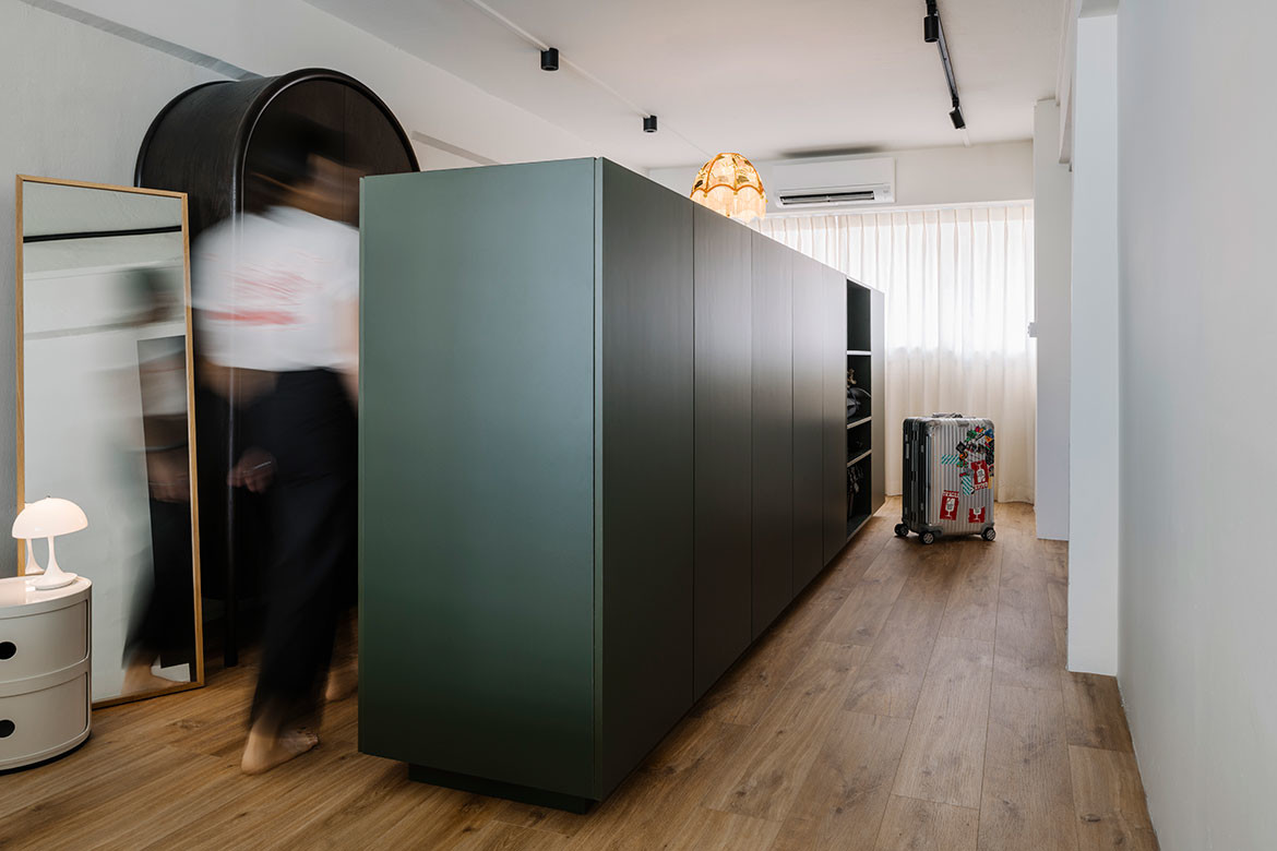
This employment of nifty space-saving and storage tricks continues into the bedroom where a mid-height wardrobe stands in the centre of one side of the room. “I liked the idea of how the island wardrobe splits up the room [and the space around it] giving the room a more spacious look. The 1.4 metre height also creates a sense of privacy when one looks in through the bedroom door,” says Lok.
They are very happy with how versatile the space is and how easily they can style it with their own personal touch. For Loo, the project reflects the importance of embracing the space constraints and bringing out the best of individual projects. This allows for existing elements and new ideas to combine, bringing about new values, purpose and functionality.
Project details
Interior design – WAFF
Photography – Johnston Lim
We think you might like to read about This Humid House, a Singapore-based botanical studio
