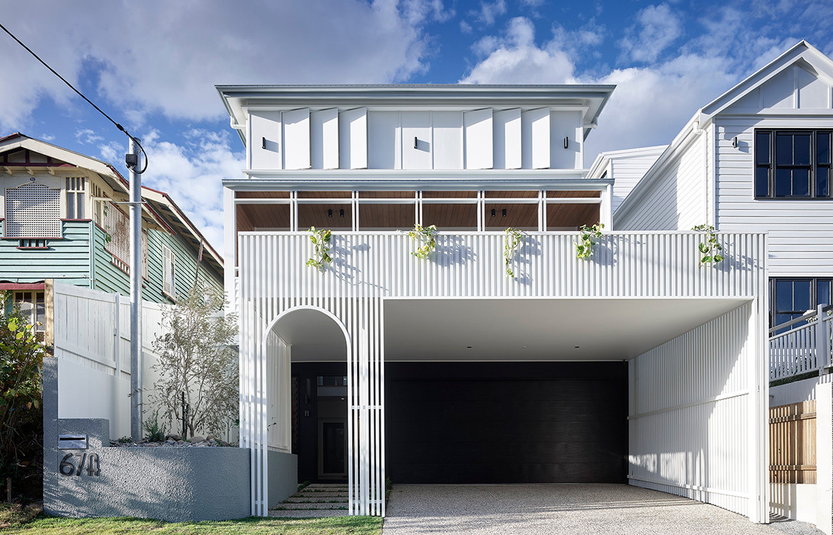
Designing within an acute site and planning restrictions is an unenviable task. In designing this house in the Auchenflower suburb of Brisbane, David Hansford of DAHA has overcome the complexities associated with designing on a steep, small and narrow site with tight setbacks.
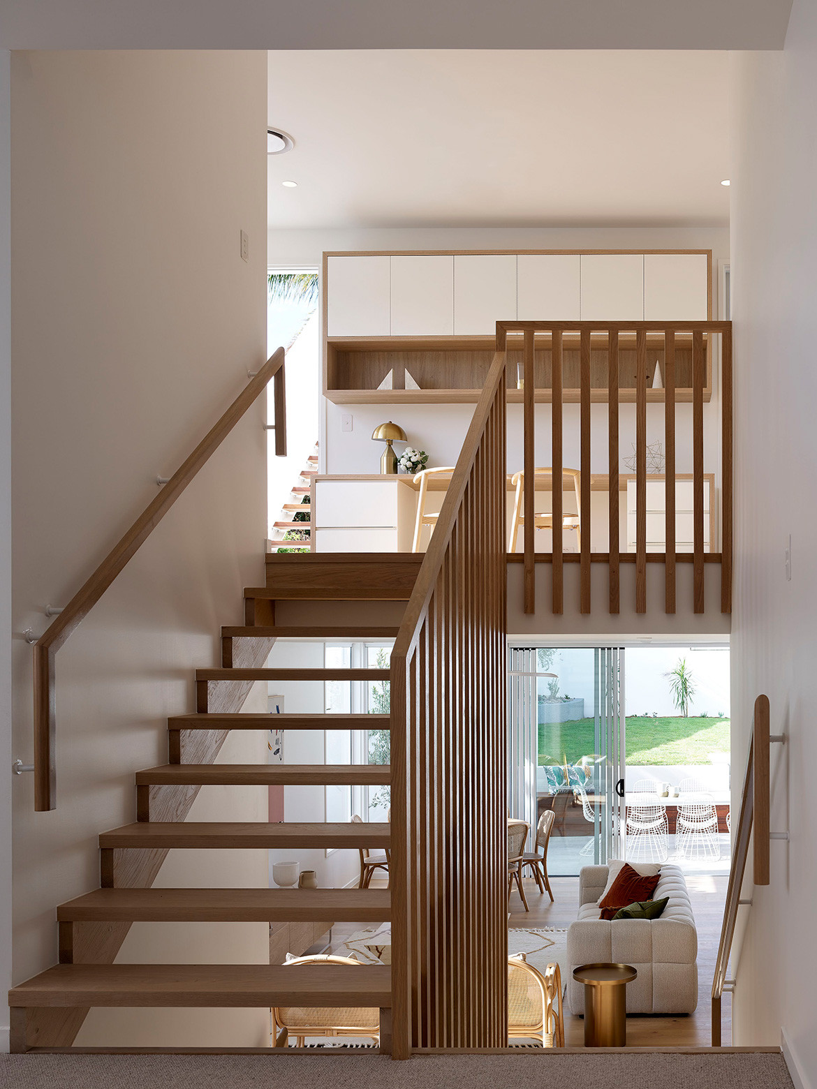
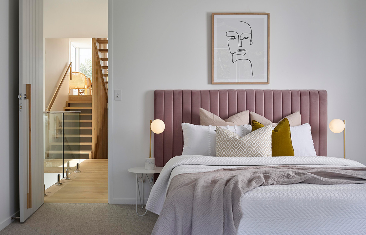
“The house attempts to tame a difficult steep terrain to provide a liveable and expansive [family-centric] lifestyle,” says David. “The plan is a perfect split level configuration that minimises journeys and separation while ascending through the steep site. Connectivity to the guest suite, kids bedrooms and master suite all sit within 1.5 storeys from the main living area.” In addition, the split-level configuration also meant that the architects were able to avoid the regulatory complications of a three-storey house.
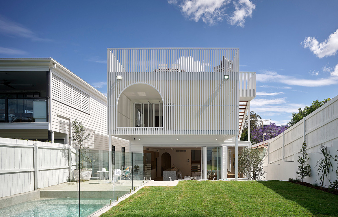
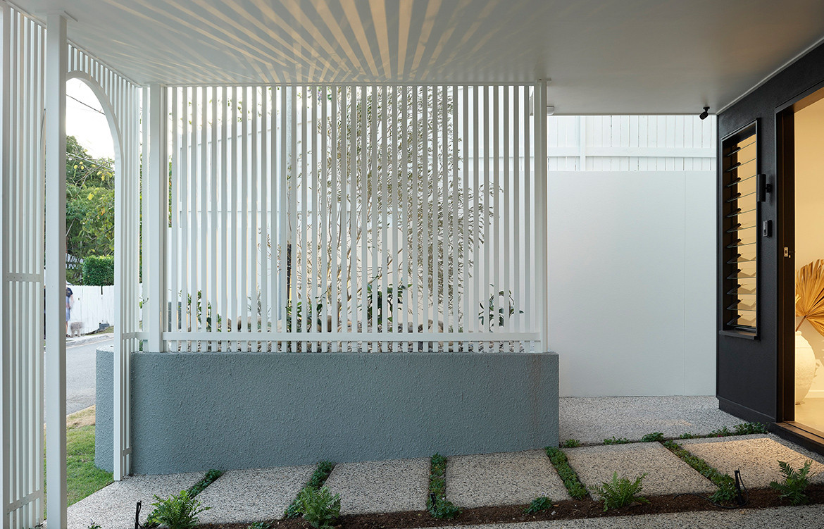
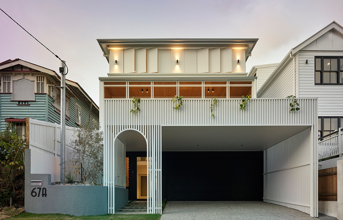
Then, there are those front and rear elevations – delicate, filigree-esque screening elements that address the street and create a playful setting to the rear garden. “Working with the small lot building envelope and common Paddington/Auchenflower tight side setbacks, you’re mainly presented with the rear and front elevations for an identity,” David explains. “The surrounding houses are built out to the front boundary so we decided on our property to incorporate some transparency in screening while speaking to the form of the surrounding buildings.”
“The surrounding houses are built out to the front boundary so we decided on our property to incorporate some transparency in screening while speaking to the form of the surrounding buildings.”
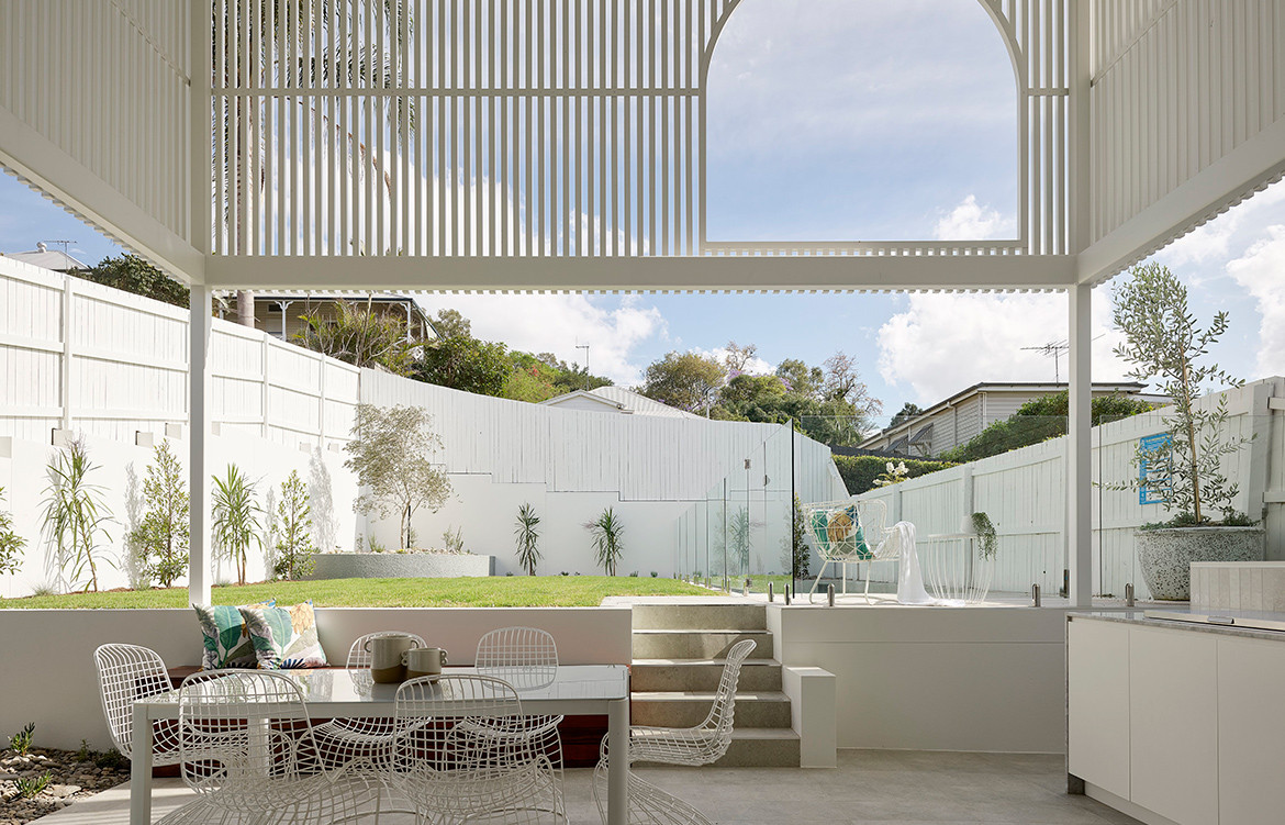
The screens, which provide privacy and protection from the elements, were also conceived with a playful spirit. “We used the architecture in this case as a bit of fun to tie the building together,” adds David. “The rear screening element was used to blend the storeys together to appear as a double-storey residence when it really was addressing a 3-storey element (the courtyard/void/roof terrace). The cutout arch to the northeast corner just gives some play with light and breeze and some interest to a flat elevation.”
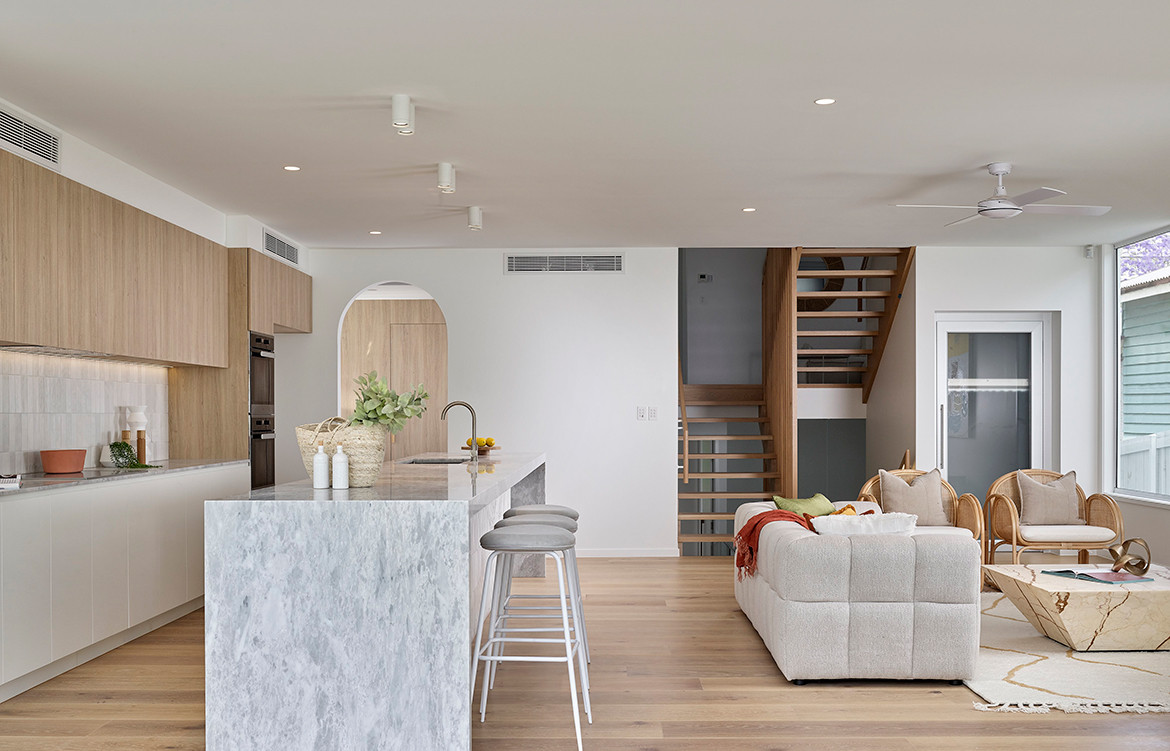
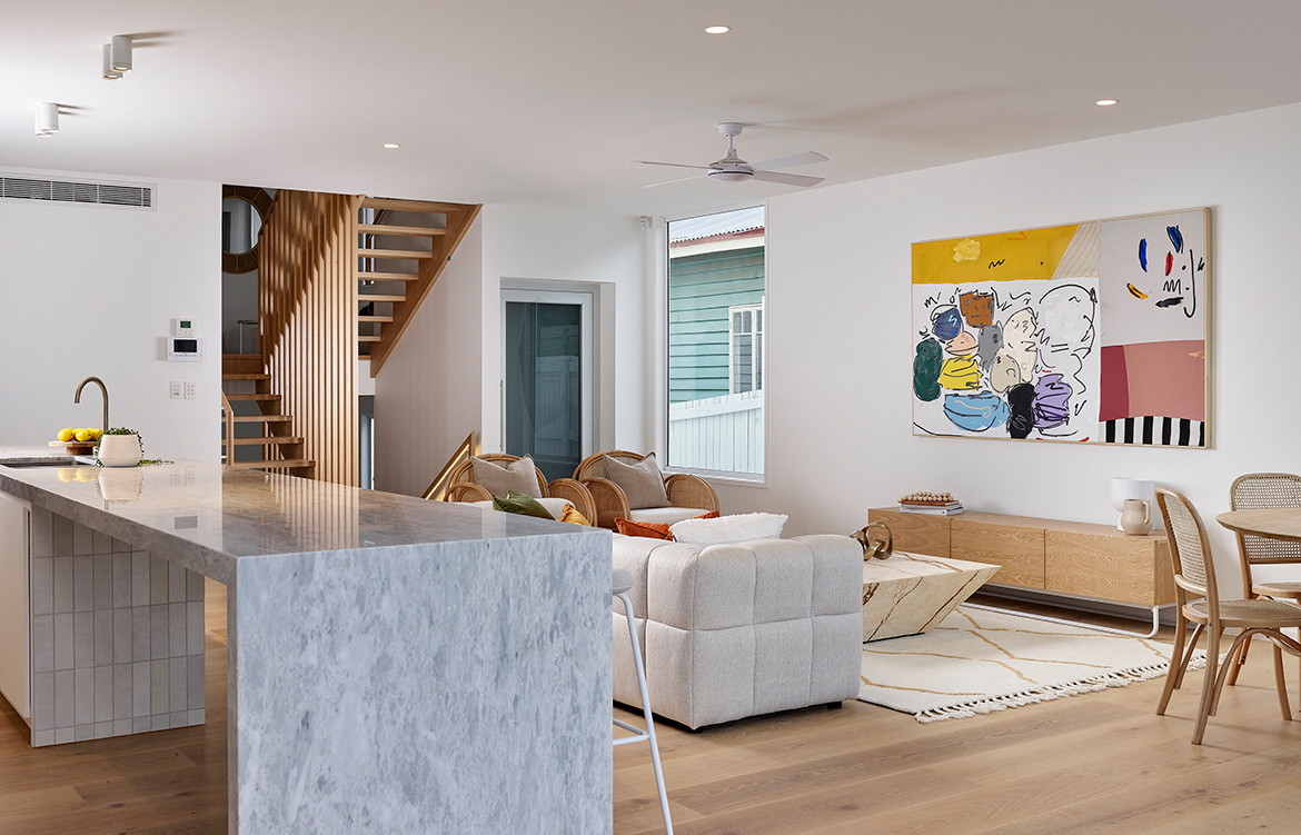
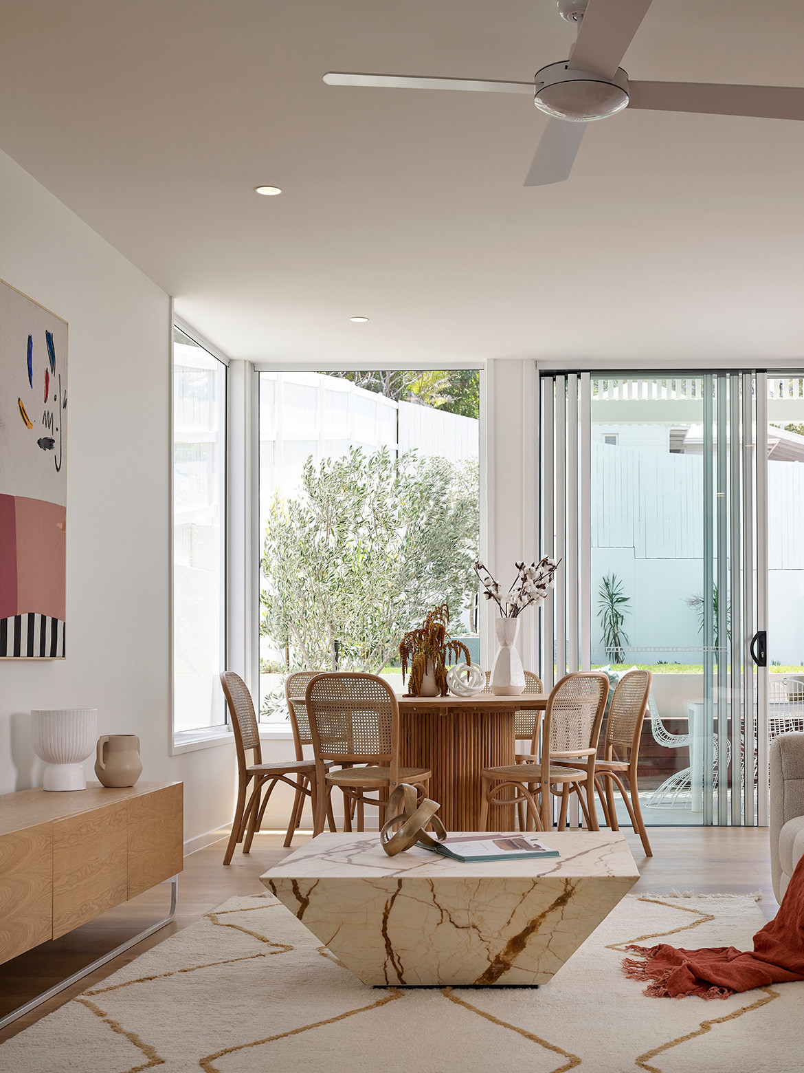
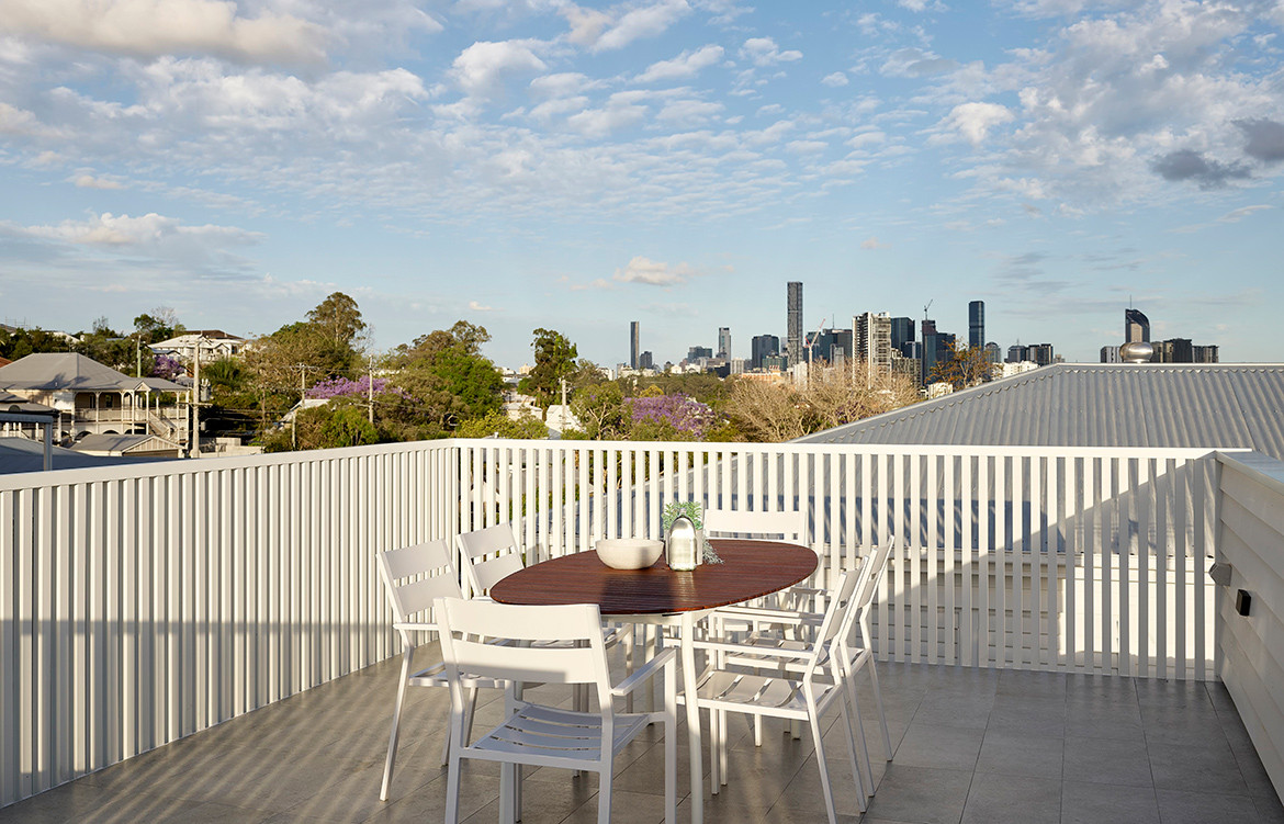
From a planning perspective, the house provides “ground floor living”, a private parents’ retreat on the upper level, and city views. “The use of levels also meant with some excavation to the rear we could extend the main living area into the back yard disguising level changes with bench seating and landscaping to create a 200-metre-squared north-facing internal/external area with screening, voids and landscaping,” adds David.
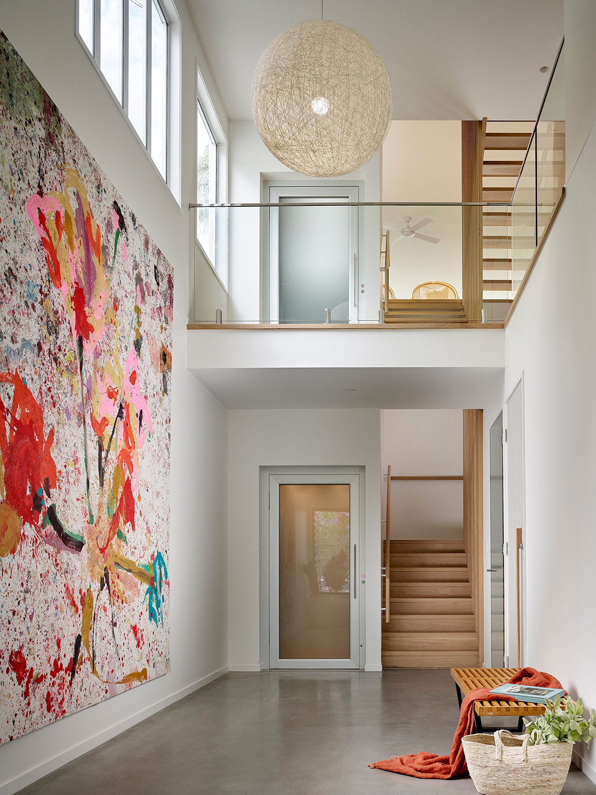
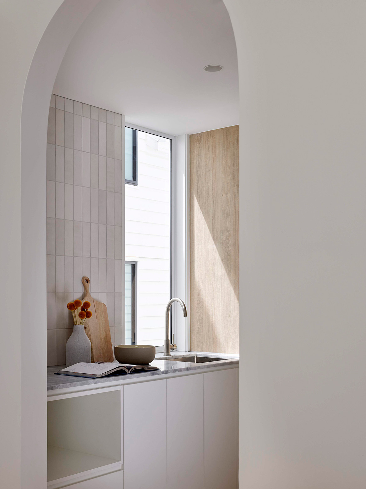
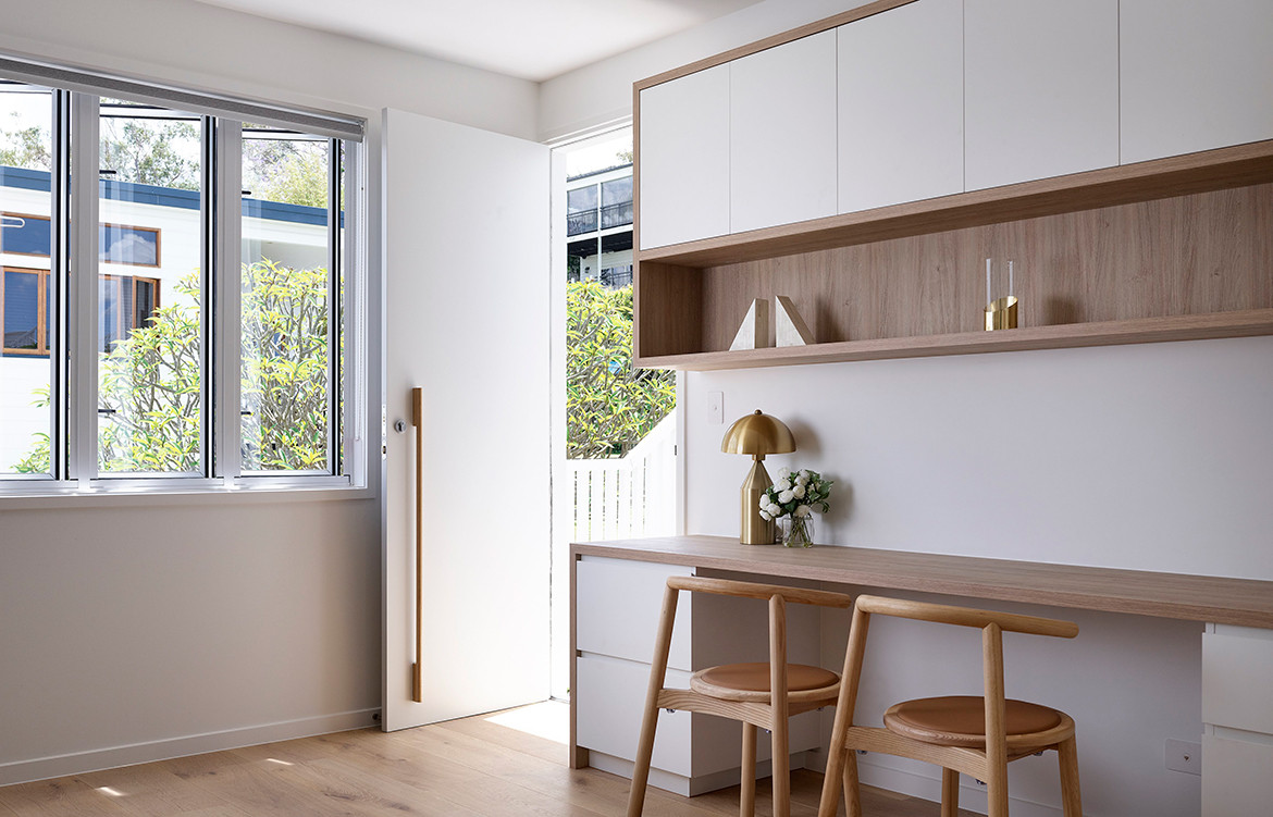
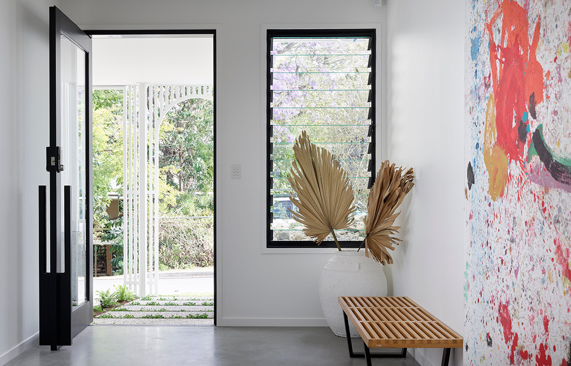
The palette is appropriately understated, referencing the vernacular Queenslander, yet in a contemporary context. “Given the main living spaces are quite long and open, an understated palette was implemented with subtle textures and undulating surfaces providing the impact without overpowering the space,” explains David. For example, the Paloma tile in the kitchen, provides interest and texture in an otherwise muted and edited interior.
DAH Architecture
daharchitecture.com.au
Photography by Scott Burrows
Dissection Information
Provence French Oak floorboards by Queensland Timber Flooring
Avante 20mm honed marble slabs from SNB stone
Paloma kitchen tiles from National Tiles
Evenex Desert Gum kitchen cabinetry from ETON Group
Appliances by Designer Appliances
We think you might also like Glamorgan House by DAHA
