This 680-square-metre, semi-detached house replaces an earlier house on a curving triangulated site. It is for a small family of just three. “[I] had the luxury of building a small house with an ample amount of shade with deep overhangs,” says the architect, Robin Tan of Wallflower.
Part of the clients’ brief was for a house that allowed them to host gatherings of a quite large extended family, previously not possible. Otherwise, they were looking for a house that provided connection to the outside and some form of passive climate control, but without any loss of privacy.
The solution was found through another request from the clients. They had recently visited Kengo Kuma’s exquisite Nezu Museum in Tokyo and had been taken by the beauty of the bamboo-screened entry processional. Could they have something similar?

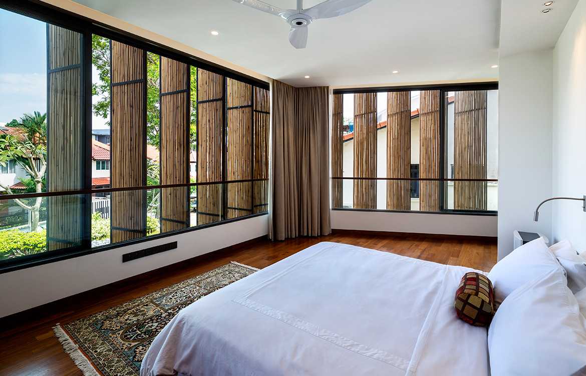
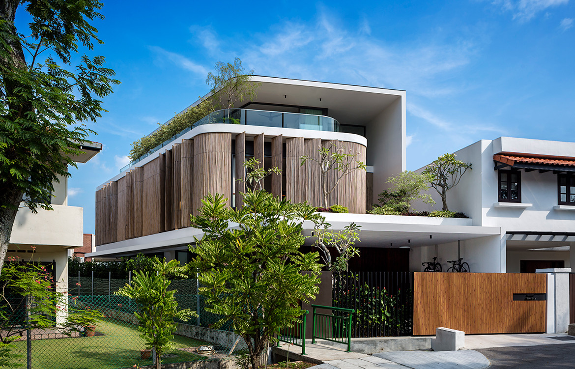
The result is an elegant curving skin of operable screens made of vertical bamboo columns that forms a second skin to the first floor of the house. The new, smaller house is set back further than the original and this has enabled the architects to have the bamboo screens extend out to the original setback line, leaving a 1-1.5 metre gap to the façade. The effect of this is to create an air bubble which helps cool the interior.
The individual screens are pivoting (resulting in less wear and tear) and the gaps between the bamboo columns allow natural ventilation as well as modulating light entering the first floor bedrooms and so creating a gentle play of light and shadow.
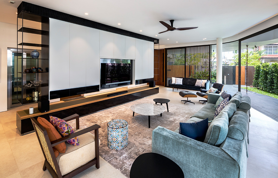
The public spaces in the house are on the ground floor, which is free flowing with ample entertaining space both inside and outside on the terrace. The private spaces are on the first floor with an attic above providing a study and a future yoga room.

Apart from the bamboo screens, climate mitigation is helped by a large overhang that wraps over the attic aided by ample greenery.“We like to introduce pockets of greenery,” says Robin, “because in Singapore owners want to build up to the max. So we like as much as possible to bring the greenery up to the second storey and to the attic level.” In this case, there is a little garden above the garage. This not only helps cool the master bedroom, but it also provides a privacy screen from the neighbours opposite. Planting on the attic floor screens the western afternoon sunlight while also providing some green relief.
In these ways, the house becomes an urban oasis with an easy co-existence of private and public life. The private spaces on the first and second floors form a world of their own, but with the option of connecting with the street life outside. Meanwhile, the public living/dining/kitchen area on the ground floor flows easily between inside and outside, making for an ideal gathering place.

