Creating a relaxed, community vibe in dense, inner-city Melbourne is a tough act by any stretch. But Steve and Keryn, who grew up in Adelaide and rural South Australia respectively, wished to do just that for their growing family.
With busy careers and three children, they were rapidly running out of space in their Kensington residence, which they’d bought in 2011 on a tightly packed street just four kilometres from the CBD. Built in 1914, the house sat somewhere between Edwardian and art deco in era and features.
The challenge was how to do more with less, by creating something new at the rear in contrast to the existing house and take it from a three-and-a-half to a flexible four-and-a-half bedroom home with a kids’ rumpus doubling as a fifth bedroom for guests.
On the plus side, the block was bigger than the single-fronted cottages across the street. This afforded a beautiful north-facing backyard that the family wanted to preserve as much as possible by minimising an extension. The downside was the five-metre brick boundary wall to the east, which prevented solar access to the backyard.
“We also wanted a private space, and not to look into everyone’s backyards,” Keryn says. Enter Nick Harding, principal architect at Ha Architecture. An old school friend of Steve’s, Nick was not only someone they felt would properly listen to their brief, but also would respond to Steve’s own ideas on function and practicality as an expression of his career as a workplace architect.
As feasibility ensued, the three worked meticulously to make every available inch work. The design was then pared back so that the house could simply adapt – without any fancy tricks – to how the family wished to use it throughout the years.
“It’s everything from small, tiny scale design: a spot to sit with your kid right through to how rooms relate,” Steve says. “All good architecture and design is really more about being a setting to life rather than an object that you create.”
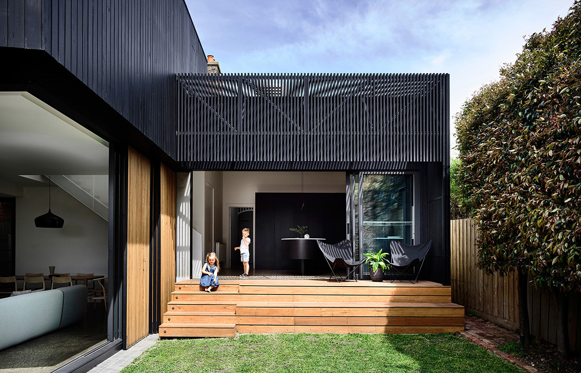
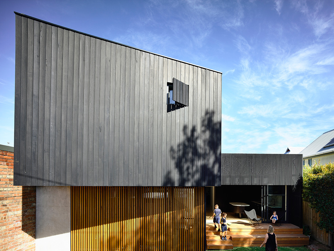
The two-storey black box is on the right, anchored by a spacious lounge/dining area at ground level which also flows out to the backyard.
With a heritage overlay to the façade, the three kids’ bedrooms and family bathroom in the front haven’t changed, but the old lounge has been converted into the kids’ rumpus-slash-fifth bedroom.
The remainder comprises the renovation beyond the central walkway, with the L-shaped element oriented to the west, abutting the boundary wall. The new kitchen and concealed laundry are to the left, with a timber deck and steps down to the backyard, while the two-storey black box is on the right, anchored by a spacious lounge/dining area at ground level which also flows out to the backyard. The main bedroom, study and ensuite are upstairs.
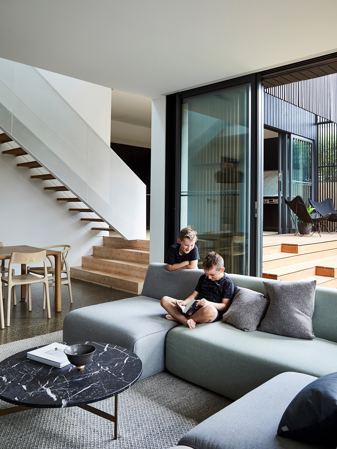
The box is a fairly simple design form, but its layering of rich detail adds unexpected surprises with clever functionality.
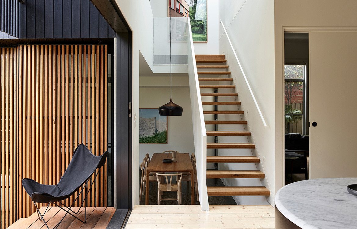
The angular cantilever and raking roof line tracks the precise movements of the sun for maximum solar access to the backyard and kitchen façade. Meanwhile the double-height stair with its ephemeral white balustrade connects the kitchen, living, bedroom and study above.
“The void makes these spaces that could otherwise feel tight, feel airy and plentiful; and the small footprint feels connected and generous,” Nick says. Steve and Keryn can turn and shape the house themselves too, using operable full-height glass windows and vertical timber screens that slide to control the sun, light levels and garden views.
“Exploring light in this way means the house can adapt seasonally, creating a temporal experience of the home,” says Nick.
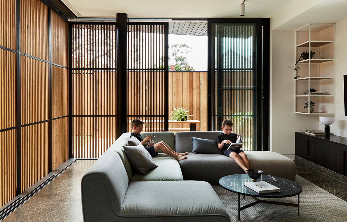
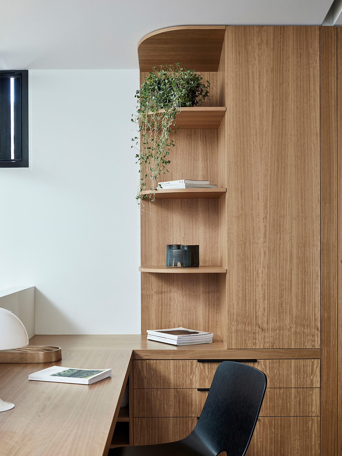
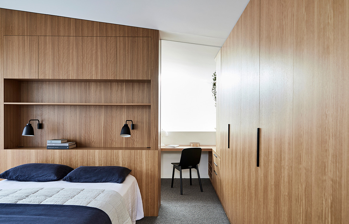
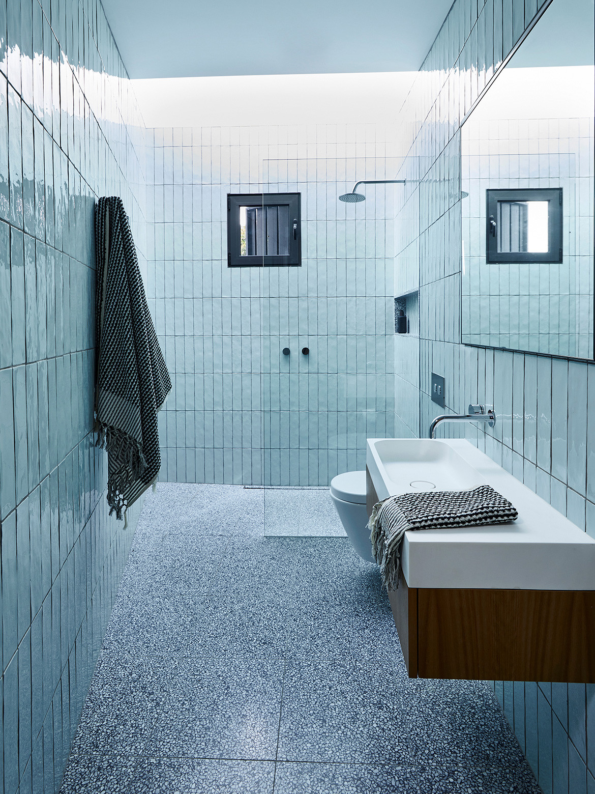
Upstairs, the bedroom and study have been tailored to suit how the couple lives. Dimmable lights at a low level on the bedhead wall joinery enable Steve to rise for travel without waking Keryn, with a little light strip allowing him to see his clothes. Beyond, the ensuite slots neatly into the cantilever over the end of the house – a decision that went against Nick’s intuition but works procedurally well in the space.
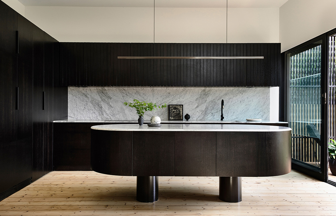
Downstairs, there’s a wow factor moment reserved for the kitchen island bench. Acknowledging people moving through and flowing around the space, its curved, round shape contrasts against the rectilinear design language, and was one of the most hotly debated elements in the house.
“The void makes these spaces that could otherwise feel tight, feel airy and plentiful.”
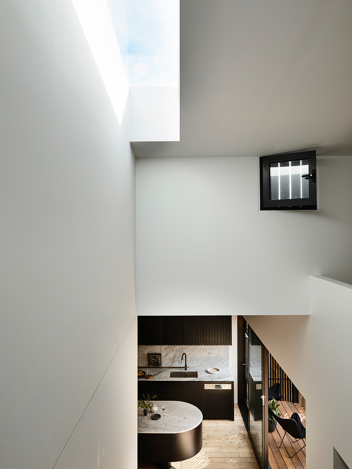
“It’s this futuristic thing floating in the middle of the room,” Steve laughs. “It implies that you want the whole house to revolve around it.”
Finally, an unexpected moment is the soft glow of light in the kitchen that peeps through the lower slats of the cabinets, mirroring the design language of the vertical timber screens.
Whether enjoying a sandwich in the sun on the steps, entertaining, or listening to the screech of the kids’ BMX tyres along the rear laneway, it’s a house that breathes, smiles and and now feels like home.
“It just feels like us,” says Steve. “Hopefully not too pretentious, low-key but clever.” And that is clever design indeed – the modern-day family model reimagined for inner-city living.
Ha Architecture
h-a.com.au
Photography by Derek Swalwell
Dissection Information
Decking and battens in Silvertop Ash, and charred Woca Black vertical cladding boards from Britton Timbers
Blackbutt Veneer Joinery from Timberwood Panels
Bianco Carrera marble from Peraway Marble
Feltex Carpet in Stonesfields 94 from Mr Carpets
Cobblestones in Raven from Eco Outdoor
Terrazzo tiles from Signorino
Milo lounge from Jardan
Molloy Dining Table and Chairs designed by Adam Goodrum for NAU from Cult
CH24 Wishbone Chair designed by Hans J. Wegner for Carl Hansen & Søn from Cult
Coco pendant light from Cocoflip
Highlight pendant designed by Archier from Rakumba
Caravaggio wall light designed by Cecilie Manz for Lightyears from Cult
Architectural lighting by Light Projects
Stove, rangehood, oven and integrated refrigerator from Fisher & Paykel
Milli Pure tapware from Reece
Stovax Riva fireplace from Wignells
We think you might also like Kew East House by Jost Architects
