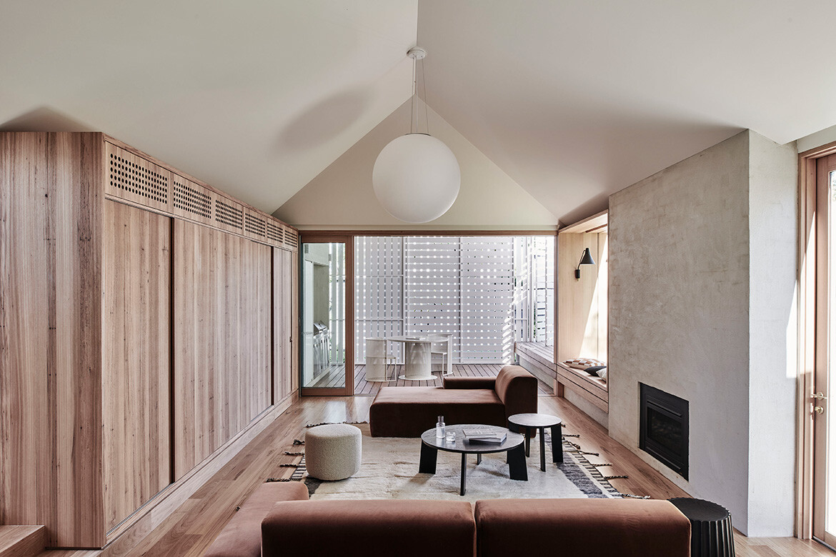
“This project began as a small update,” says Adi Atic, director of Figr Architecture, “but grew to become yet another rebuild iteration based on an emerging set of life circumstances centred around a retired lifestyle, periodic family gatherings, and entertaining grandchildren.”
Brighton House, located in its namesake Melbourne neighbourhood, is an Edwardian home that had been owned by Figr’s clients since the 1970s. As their family grew, the family eventually commissioned an extension in the 1990s, which was designed by architect John Cuthbert.
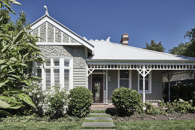
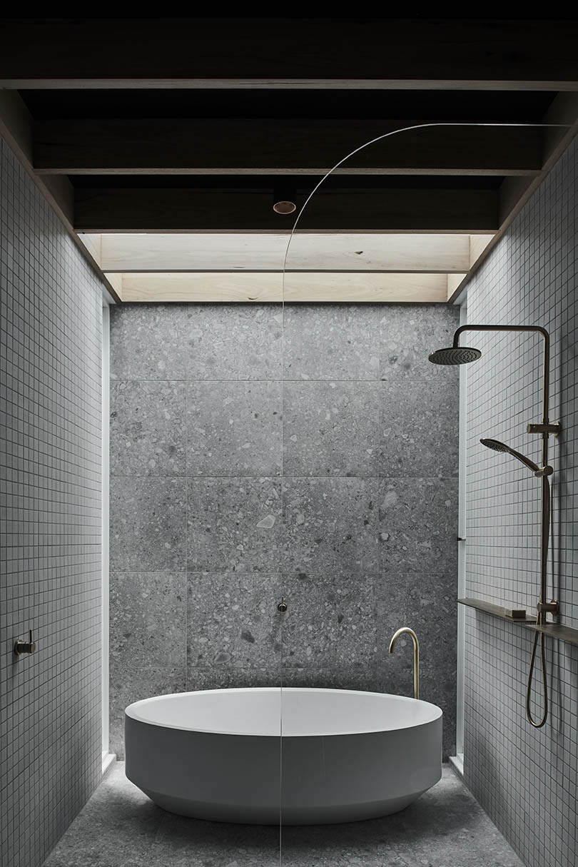
With yet another update sorely needed for their evolving needs, the clients requested an updated three-bedroom home with two living areas, two bathrooms, a laundry and pantry, an open plan kitchen and generous dining, living and outdoor entertaining spaces.
“The project brief at one point appeared to challenge the physical limitations of the existing home, and while the structure was not a registered heritage place, all efforts were made to consider how an alterations and additions project can maintain and preserve as much of the character of the existing house and landscape as possible,” continues Adi.
“However, in the end the clients – being avid architecture enthusiasts – were onboard and an all-new design was abandoned in favour of a sympathetic set of architectural interventions, rigorously stitched in and around the existing building.” This decision was also informed by a desire to reduce as much construction waste as possible.
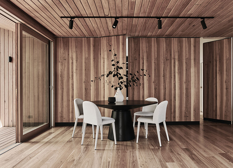
With this approach firmly supported by all parties, Figr proposed amendments to the existing home that are restrained in their massing, materiality and form. “The bones were good, and we felt that by opening up the plan and freeing it from dead ends, we would greatly improve the living conditions,” explains Adi.
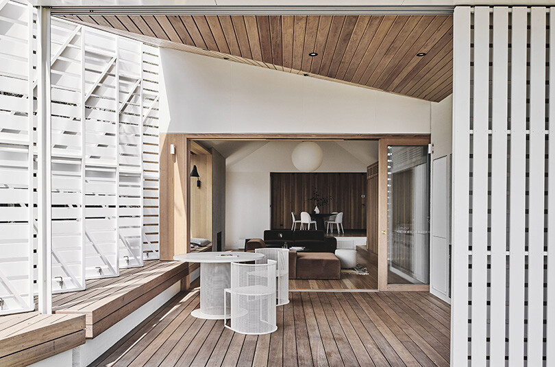
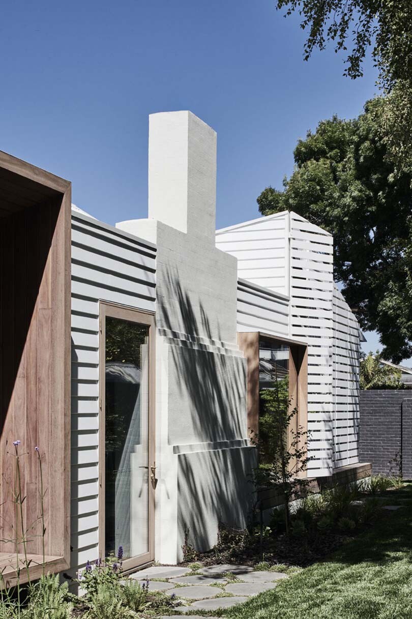
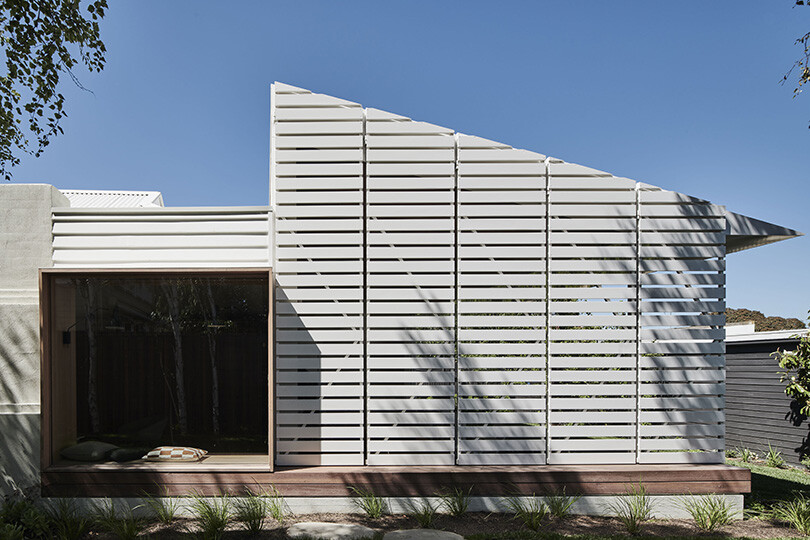
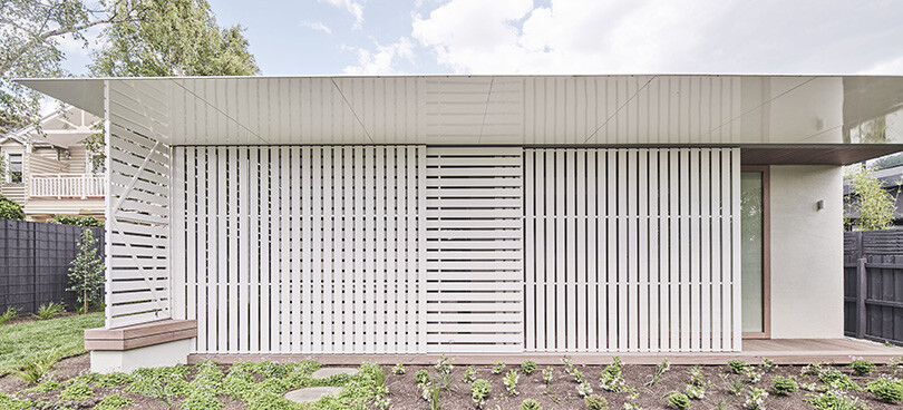
As a result the extension looked to replace the cellular rooms of the existing home with a more open-plan zonal arrangement, capable of expanding and contracting in response to the changing needs of the clients, with a stronger connection to the outdoors. With that, one singular extension was proposed – a new west-facing covered verandah surrounded by operable, slatted screens which shade the house from the harsh western sun.
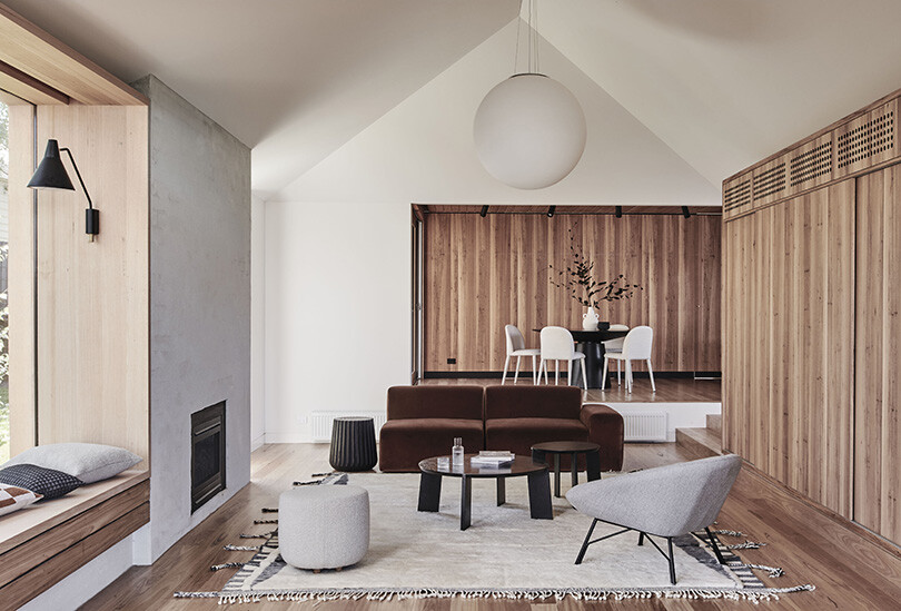
The home’s new undulating roof forms – a direct response by the architects to the local fine-grain residential context of the site – have created generous ceiling heights above the main living areas thereby creating a significantly more voluminous interior.
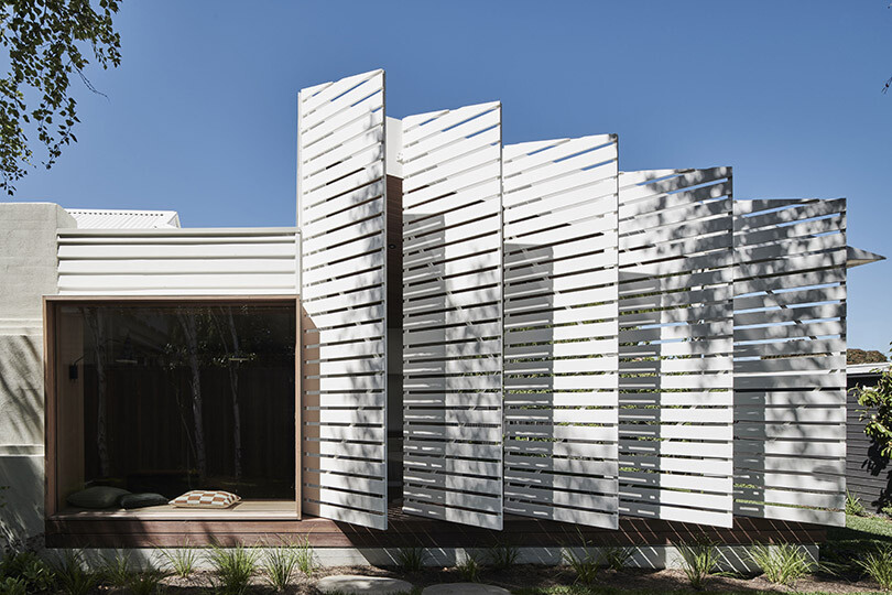
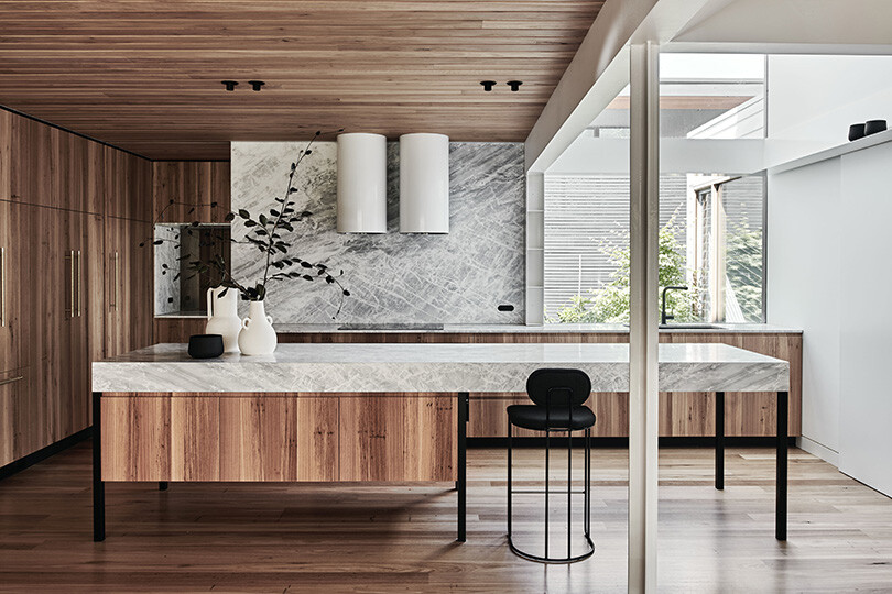
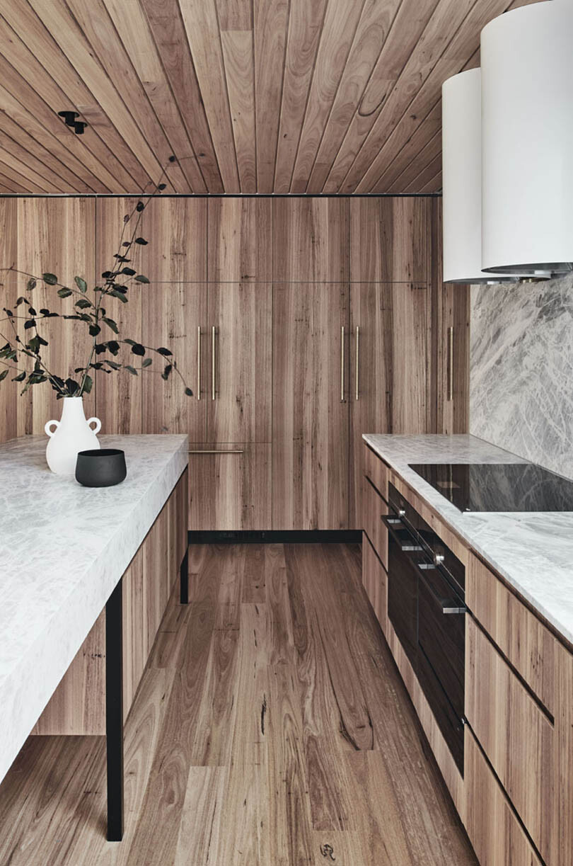
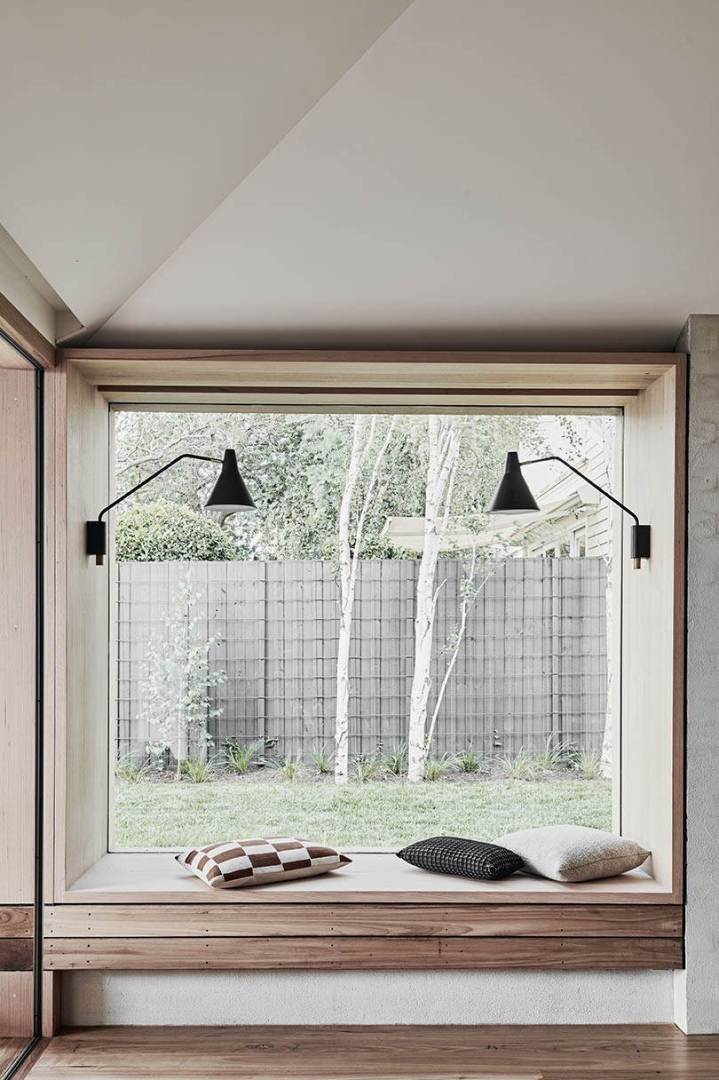
“Another key element to realising this project was this notion of unification between the existing structure and the proposed design,” continues Adi. This has been achieved by both restoring the traditional detailing and creating a seamless interior scheme between new and old with Australian sourced hardwood cladding around the punctured façade openings and lining the ceilings, soffits and decking.
“Existing fireplaces were refurbished, retained and formed as an integral part of the design approach, and architraves, skirtings and picture rails were all not only painstakingly restored, but also informed contemporary reinterpretations in the new portions of the home,” adds Adi. “The undeniable character of old buildings like this provide an indelible foundation on which architecture can avoid whimsy and needless extravagance.”
Project details
Architecture & interiors – Figr Architecture
Photography – Tom Blachford
We think you might also like this playful home by Figr Architecture, Pop-Up House
