“It was an exciting opportunity to see through the lens, we don’t usually get to look through the perspective of being a client,” says Sammy, Director of Interiors at C.Kairouz Architects. “How we objectively visualise a space being used is one thing, but how I personally aspire to experience a space is a completely different thought process.”
C.Kairouz Architects is a family-operated company and the creative endeavour of siblings. Unique by extension, this project had the “added privilege of working alongside an affiliated building arm that goes by the name of Samssons Projects,” says Sammy. Samssons Projects is a commercial and residential construction company founded by three of the Kairouz brothers in honour of their late father.
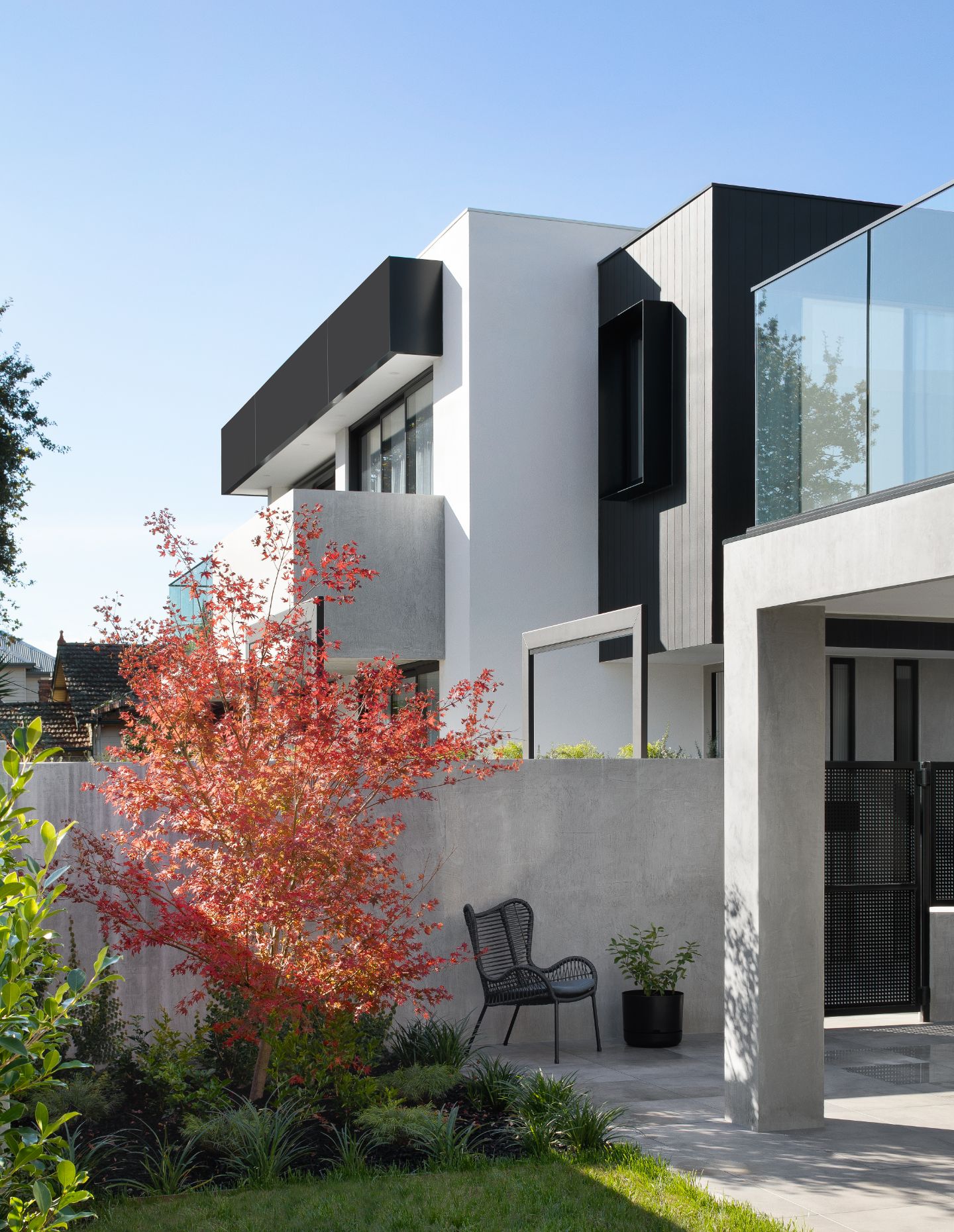
This design collective undertook the restoration of a 1960s building comprising ten one-bedroom apartments and the neighbouring dilapidated residence. The outcome was a modern development of 17 residences aimed at providing some much-needed housing diversity to the area. “The project was an opportunity to revitalise the existing block and take advantage of the natural topography,” adds Sammy. Seeking a home in the locality, the Director of Interiors seized the opportunity to carve out one of the residences for himself, to call home. It provided a rare chance for C.Kairouz Architects to be able to look at the totality of the project from both the perspective of client and designer.
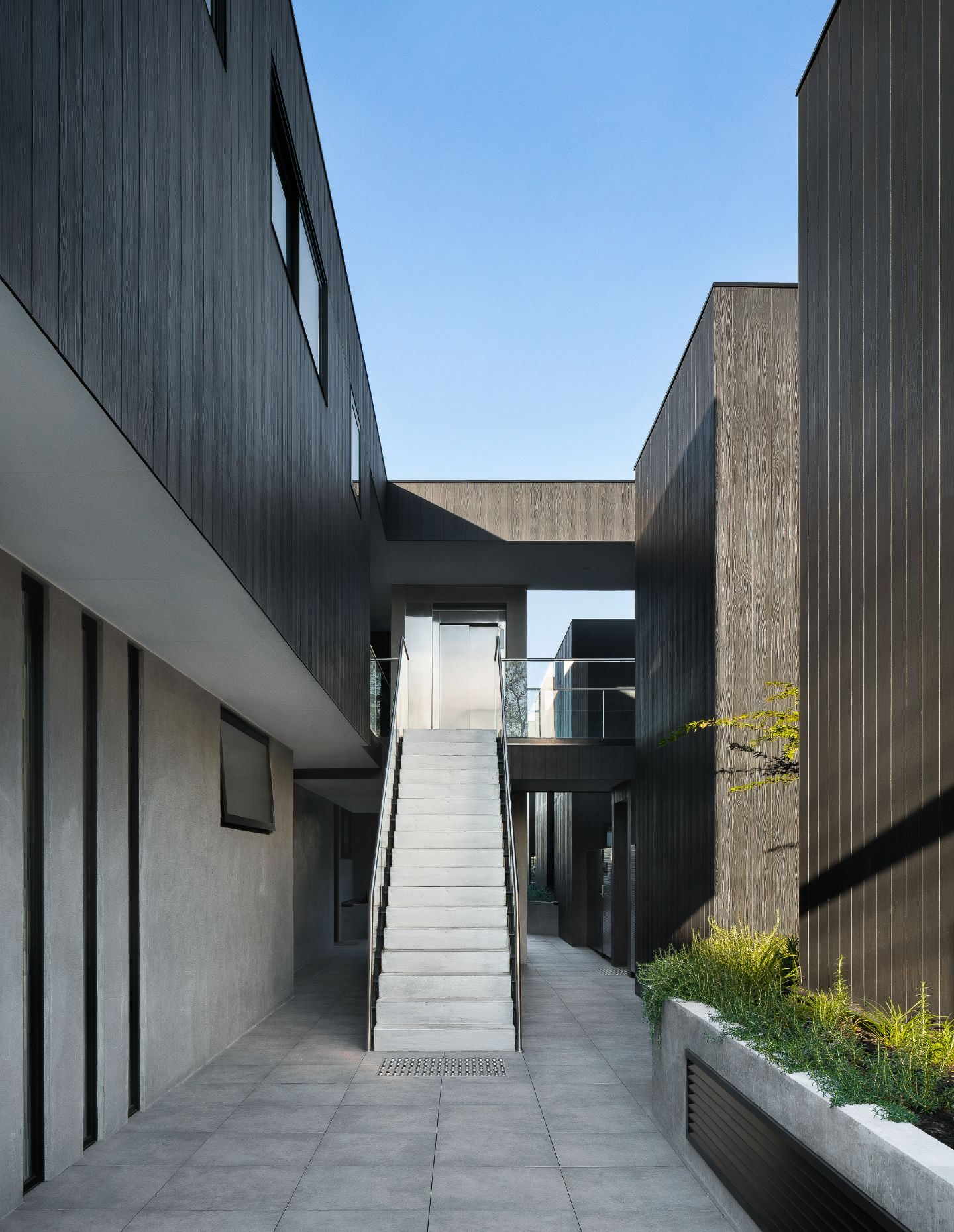
With a tree-lined site on Waterloo Road, these bespoke residences are removed from the crowds of High Street yet reflect the context of the Northcote lifestyle. One of the key advantages of the site was the access to the streetscape: “There was a conscious choice to designing a slight division for this residence from the main development and a clean entry tunnel that is fluid with a curving wall into the living spaces.” As a result, the design provides an autonomous environment with direct access from the street and basement.
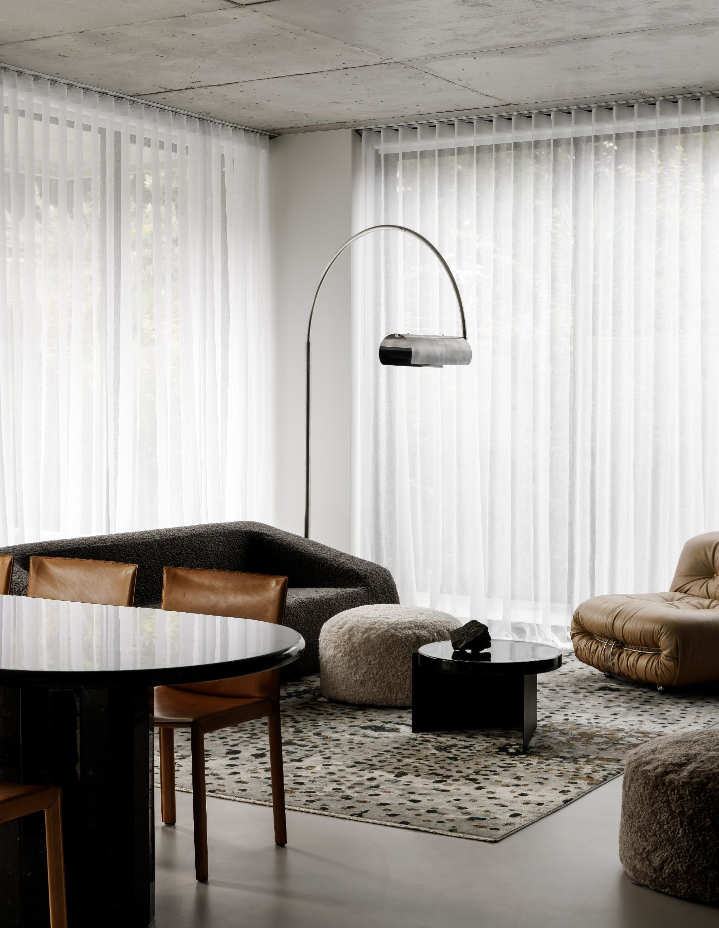
The spatial arrangement has bedrooms off to the right and living areas to the left, with an immediate link to the northern and western aspect. “The layout from the onset was planned for function, carving itself into two immediate zones,” explains Sammy. “I am a big believer in restraint and doing less, allowing a space to be more and do more for its end user.” The dwelling is enveloped in floor-to-ceiling glass windows, with a beautiful orientation to light from the north and west that served as the foundation for the design phase.
Related: The sentimental value of Heirloom House
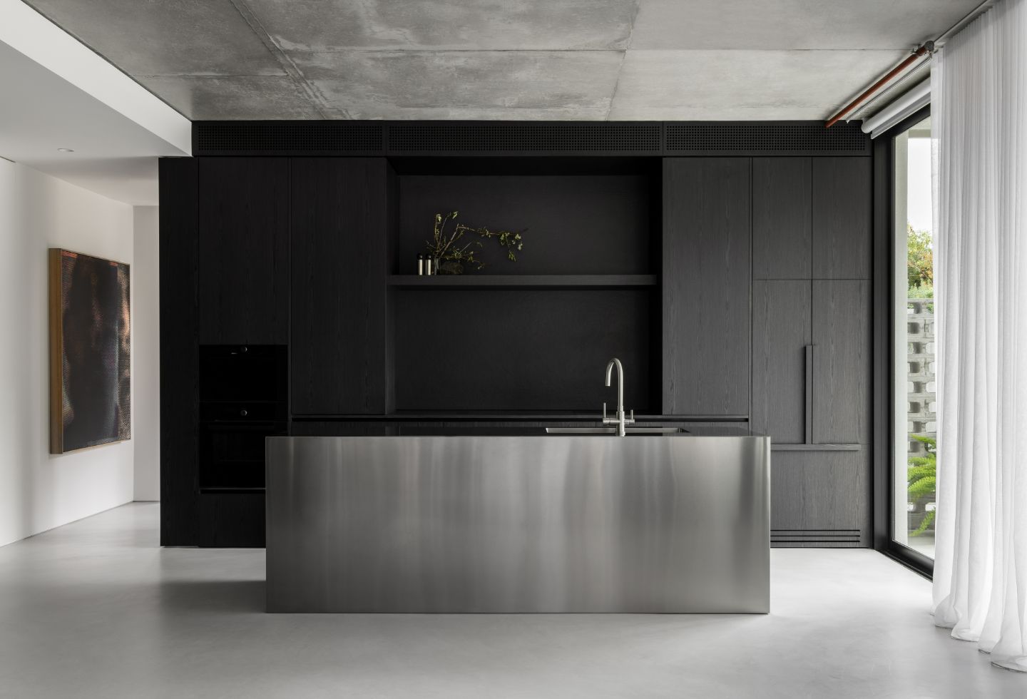
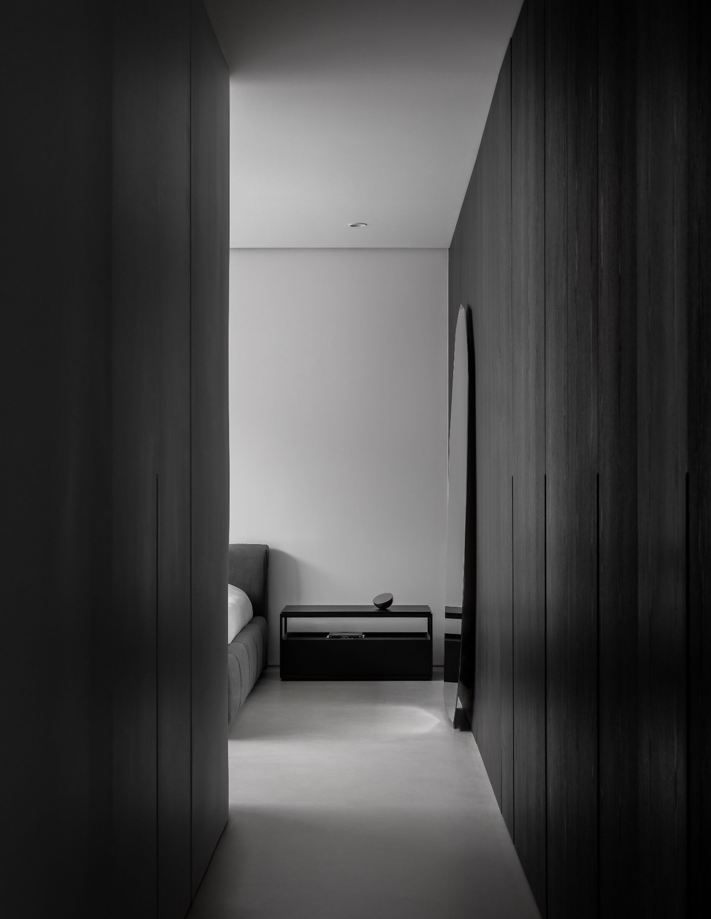
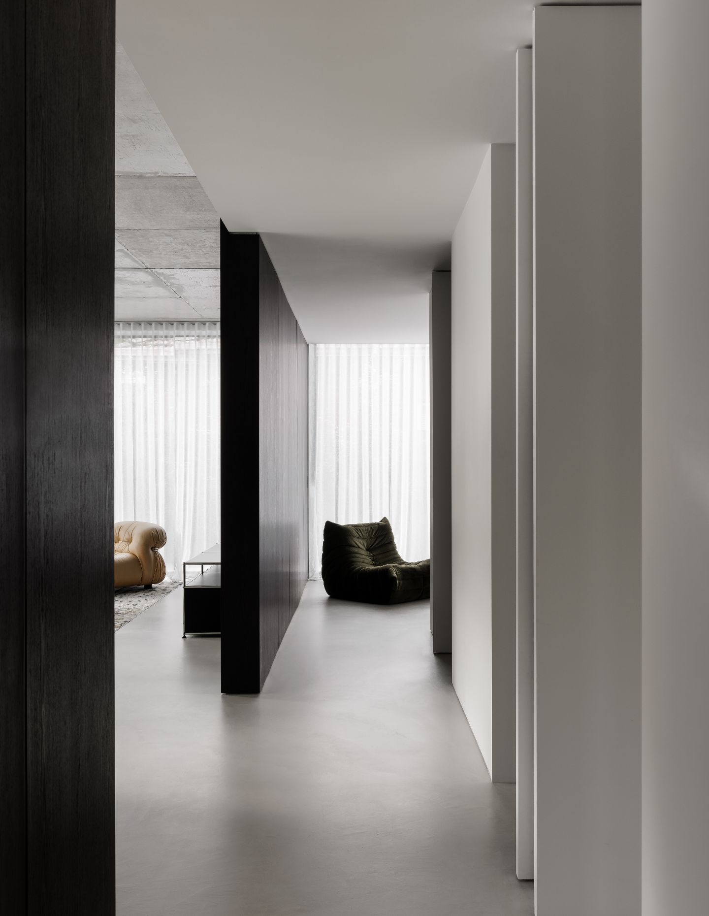
At Waterloo Residence, the material palette is minimal, with few but confident finish selections. The design was also extremely intentional, stripping away any skirting or details around doorways and windows, allowing for a refinement in the project detailing. During the design phase, Sammy posed the question to himself: what do I need for a home to feel calm, tactile and fluid?
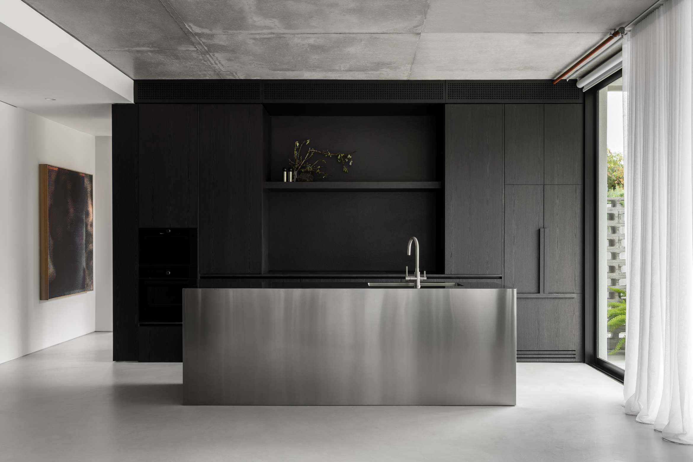
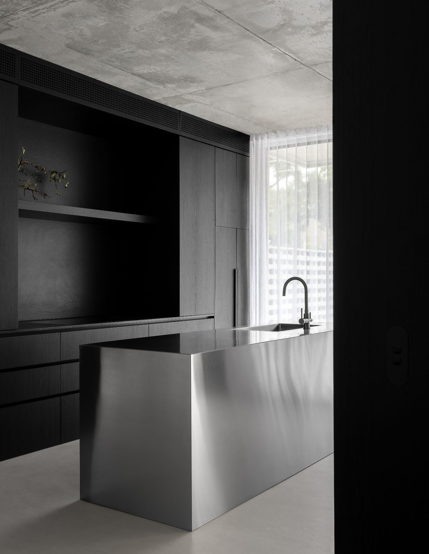
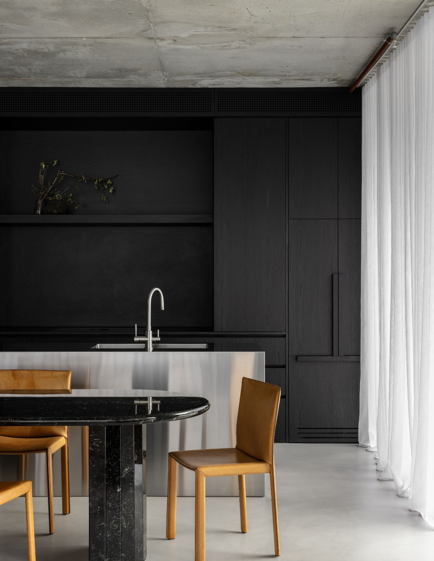
A stainless-steel moulded island bench anchors the kitchen and is a noteworthy design feature for Sammy. “I aspired to challenge a traditional way of thinking; people typically associating industrial spaces with stainless steel, but there was a real desire to convey this steel block as a captivating element in the living space, especially with its tactility and reflection.” Its inherent usability and function was also a real benefit that helped balance this working space.
This further harmonised with materials like Dekton porcelain stone, charred timber veneer, micro-cement flooring, and sleek “V-ZUG appliances were really specific selections… not only from a design point of view but aided in clearing the typical clutter that would otherwise exist, and helped create transitional spaces and surfacing where the details are flush and continuous.”
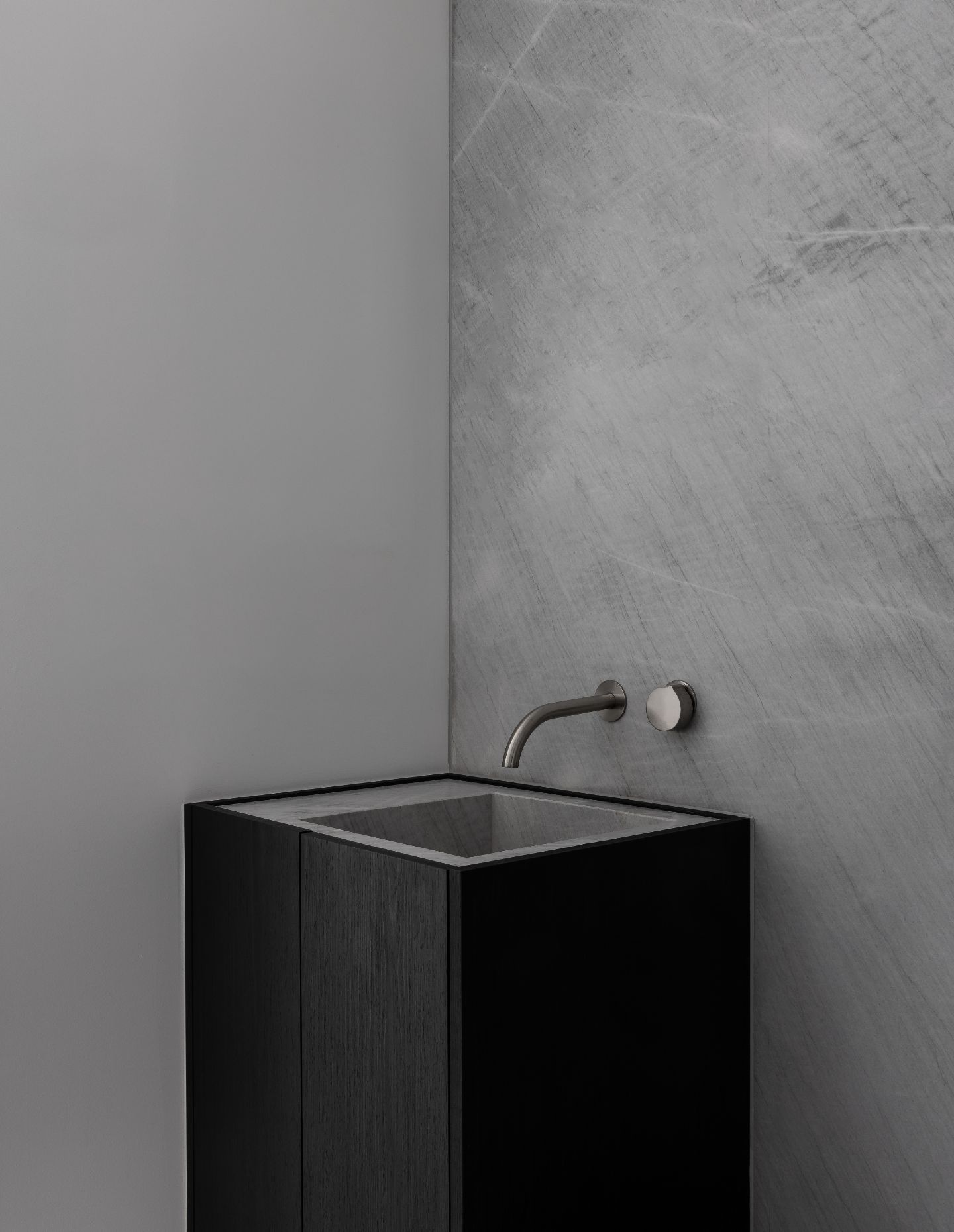
For the bathrooms, in contrast to the brash and brazen marble veining often found, Sammy wanted to continue this journey of ‘strength in subtly and simplified details’, creating dynamic floating forms and confidently heralding the Elba natural stone from Artedomus, lacquering the vanities and walls with its imperfect qualities and almost acid-like veining.
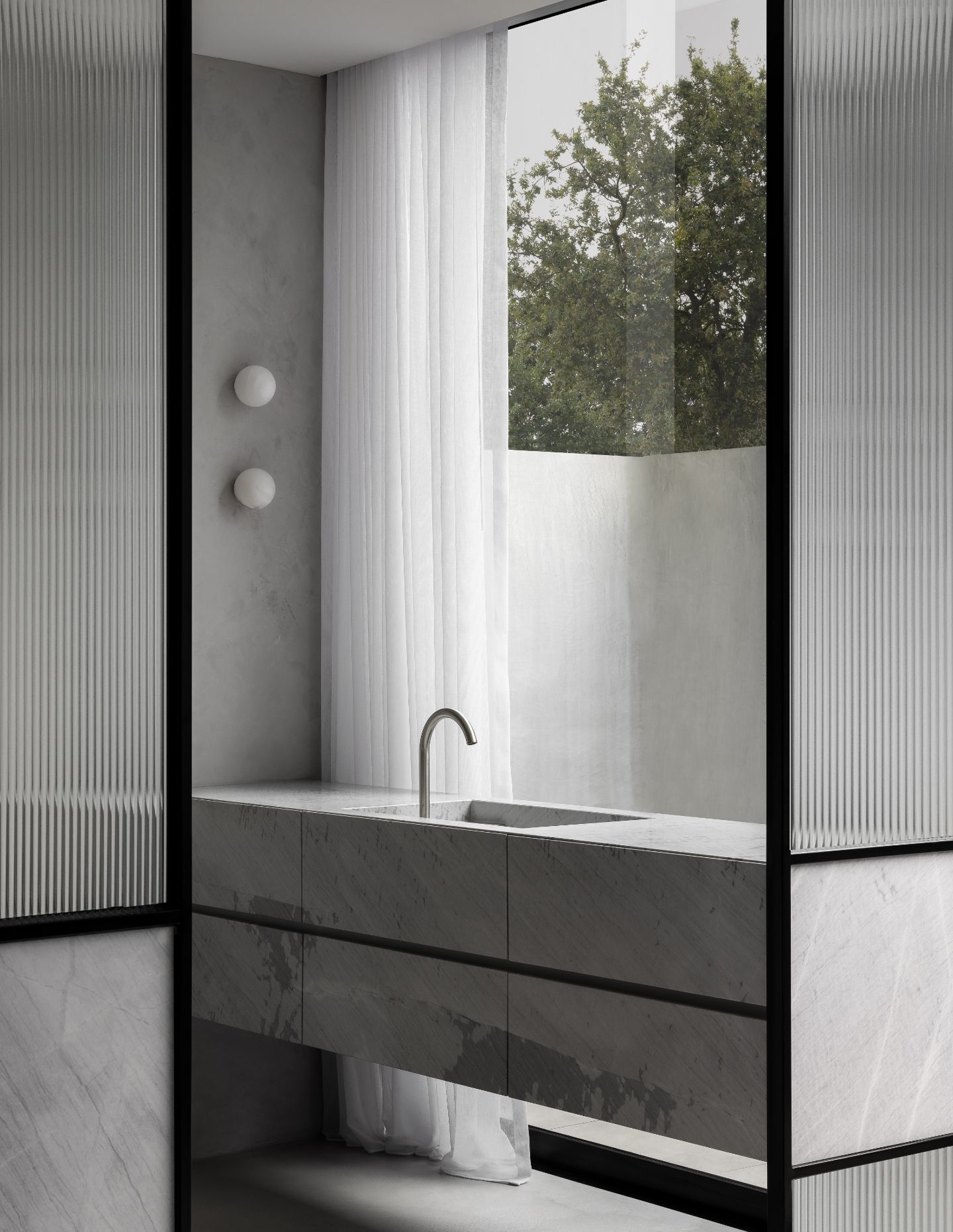
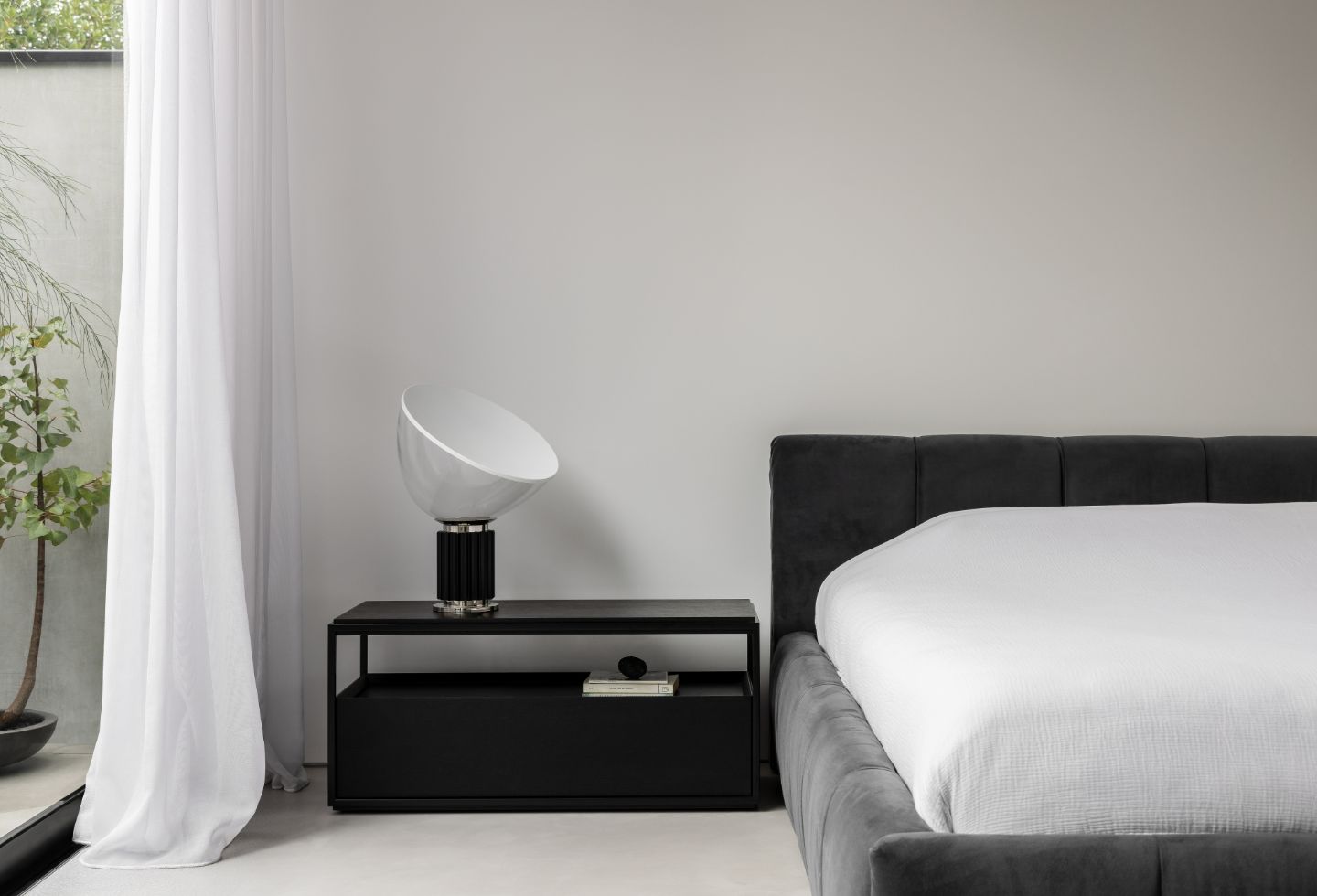
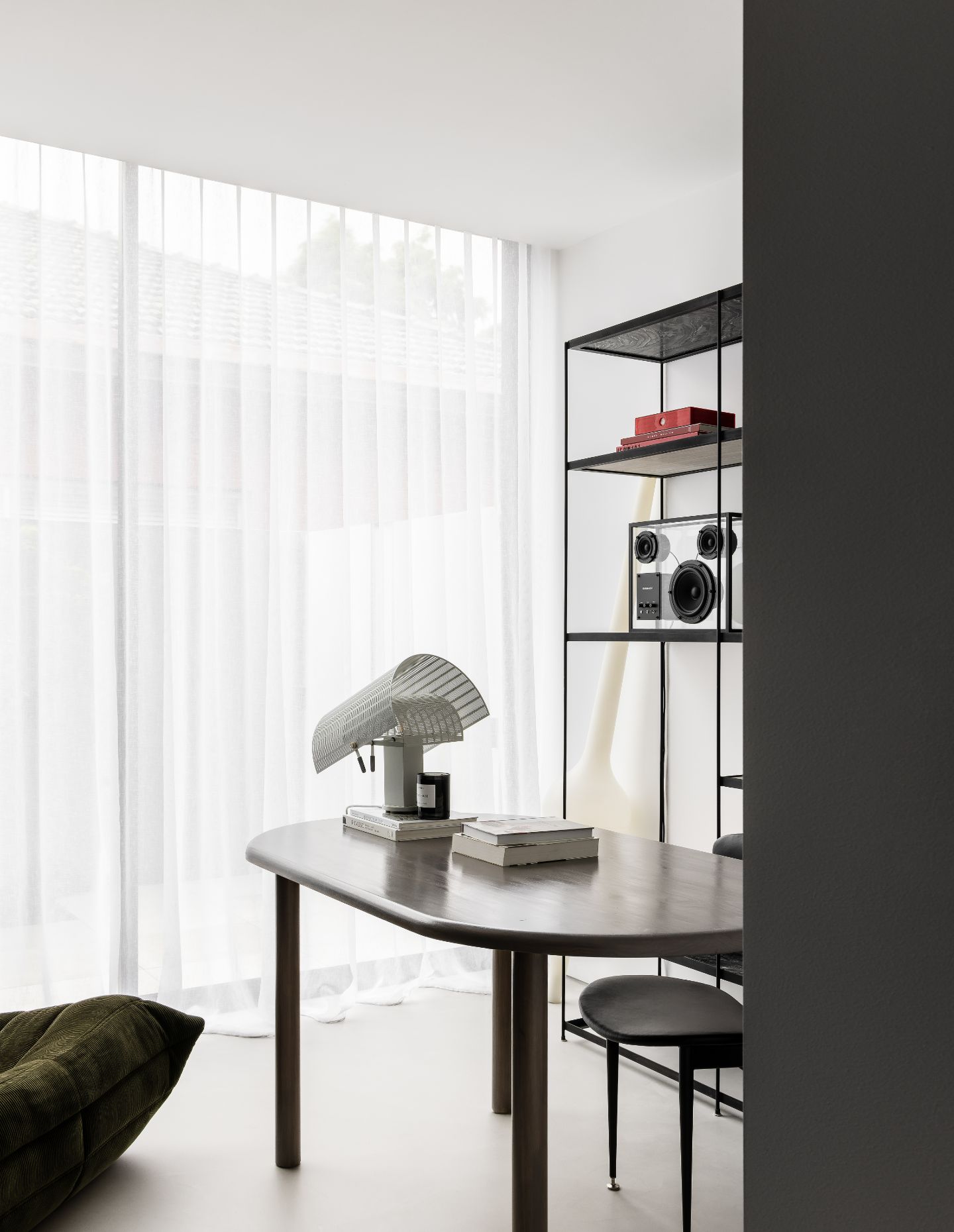
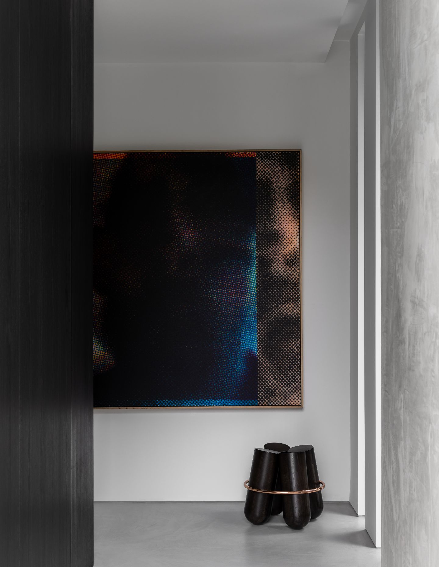
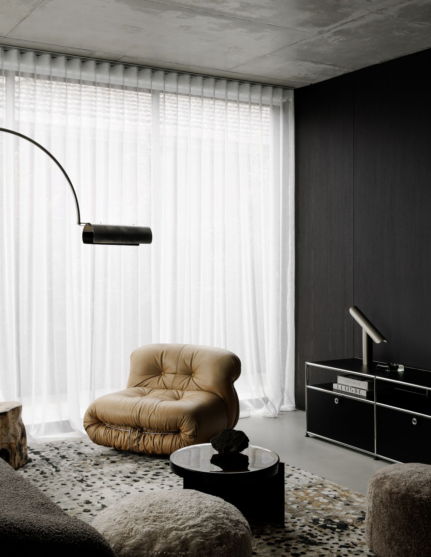
C.Kairouz Architects translated the otherwise cooler finishes by immediately linking them to the surrounding context, aspect and nature. Sammy was extremely particular about the vegetation and how they oscillate seasonally. “A lot of the warmth inherently came through the way the light interplayed with the finishing. Another point of evolution with material choices came down to the furniture. As an aficionado of pre-loved mid-century furniture, Sammy believes objects with history and a patina; a story of their own, help to offset tailored, clean finishes and minimal environments, so this was incorporated into the design from the onset. “The monochromatic palette appearing in the concrete, steel and dark veneer was intended purposefully to create a backdrop, to character rich pieces full of personality.”
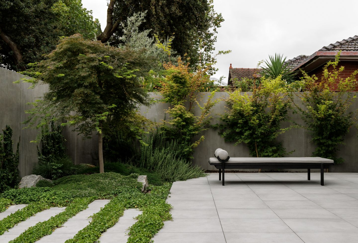
Meanwhile, the courtyard is Sammy’s inaugural attempt at landscape design – and, we might add, he has quite the knack for it. “One consideration that drove the plant selections was how they would perform in all seasons but also keeping the overall scheme tonal and pared-back. With its Japanese undertones, juxtaposing elements and staggering mounds and heights, the garden is balanced. For example, dichondra and rosemary breaking the hard and somewhat stone-like floor to soften the edges and overall aesthetic.
“With every job, there will always be nuances to factor, but seeking success lies in how we evolve, and respectively adapt to the environment,” concludes Sammy.
Next up: Bangalow Road House by Son Studio “breaks away from the conventional”
