.
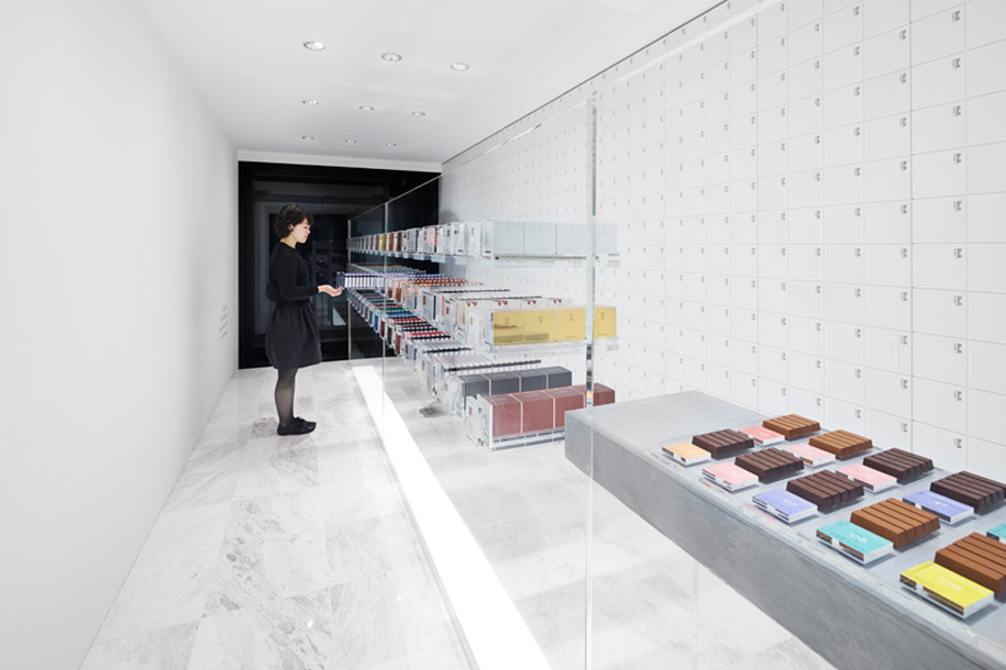
The first overseas shop for BbyB – a chocolate shop by Antwerp-based, two-Michelin star chef Bart Desmidt – may look the same from the outside, but the richness of the product against the stark, minimalists (quintessentially nendo) aesthetic really sets this retail space apart.
Available in 30 richly distinctive flavours; from strawberry, pepper and lemon to passionfruit and basil; the chocolates are all the same shape featuring modular packaging: five bars of chocolate slot neatly into each sliding box, and five boxes slot together into a cube.
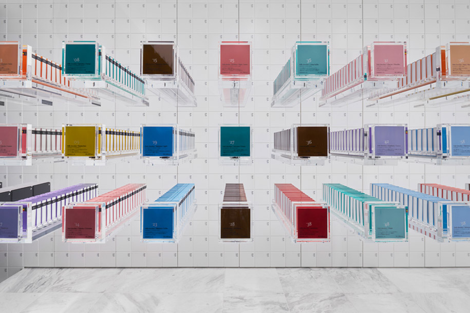

“The contents become apparent only gradually, as the boxes are opened and closed, offering surprises until the very last bite and turning the cube into a ‘magic chest of drawers’,” says nendo founder and designer, Oki Sato.
Following this logic, Sato explains that he and the nendo team “turned the shop space into a three-dimensional version of the chocolate packaging. The chocolates seem to float in a transparent ‘chest of drawers’, placed at the center of the shop. When they purchase chocolates, customers slide the chest and remove them by themselves just like the chocolate packaging.”
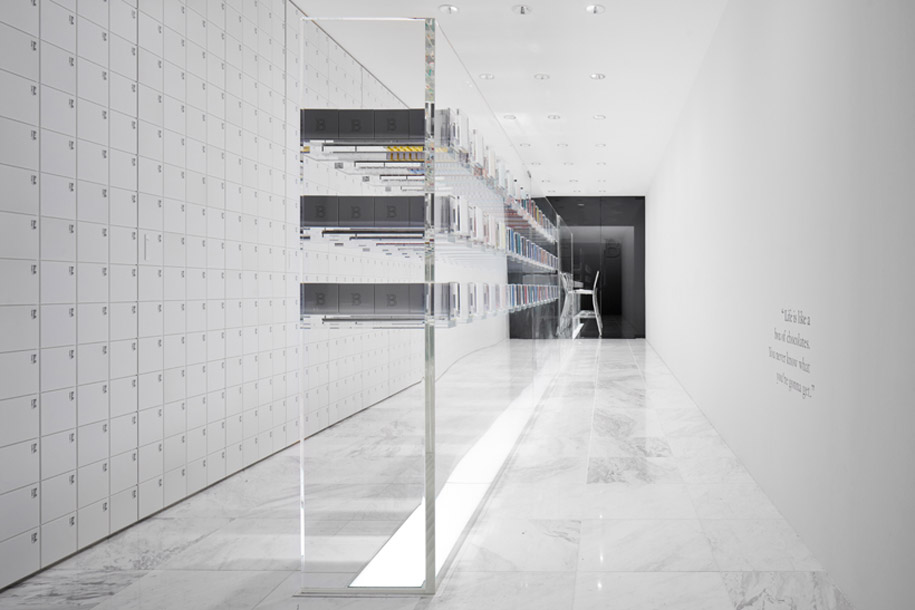
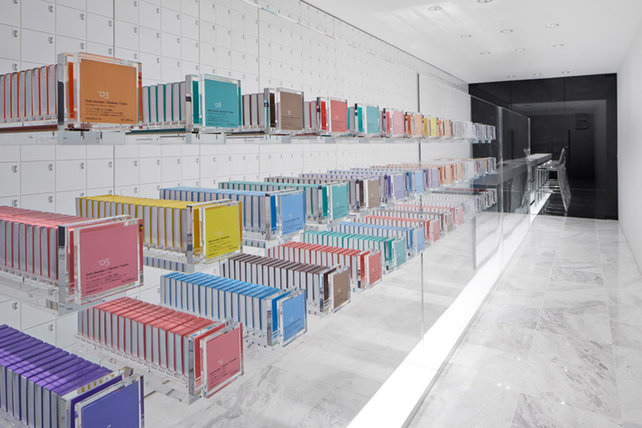
Towards the rear of the shop, the transparent chest becomes a showcase that displays chocolates individually, then turning into a counter for customers at the shop’s cafe.
The shop is a long, narrow space, well suited to accommodate a 12.5m long piece of furniture. “We made the front of the shop entirely white and the cafe space at the rear entirely black – following the colour scheme of the packaging cube, and ‘tiled’ the white wall with chocolate packages so that the entire wall turns into another ‘drawer’,” says Sato.
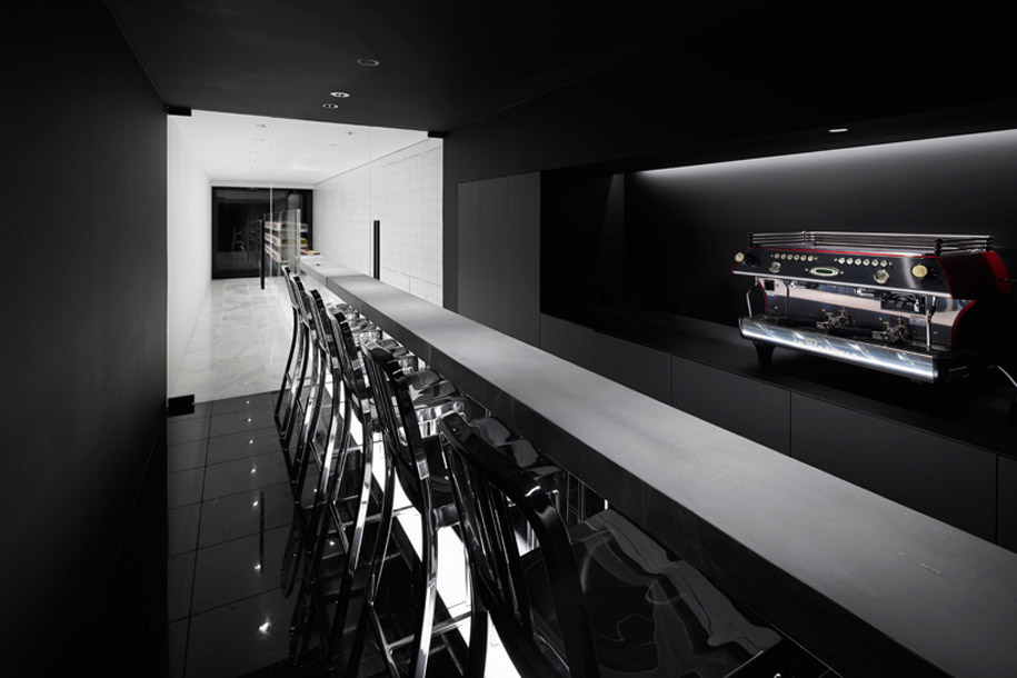
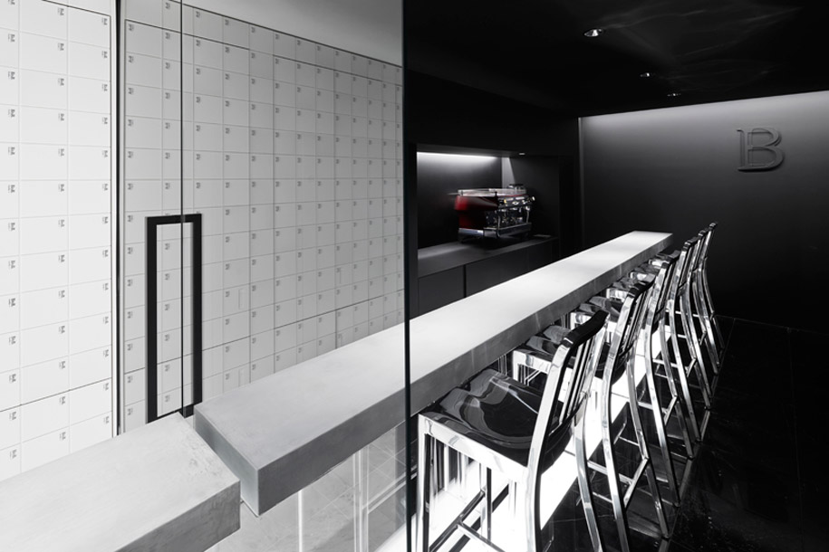
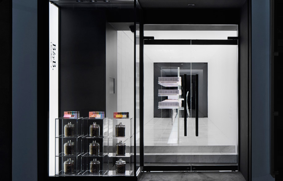
The design creates a seamless transition between the shop space, the packaging and the act of eating the chocolates, offering an organic, compelling experience. And here, nendo again succeeds in one of the design industry’s most poignant challenges – creating more than a branded environment, but a branded experience for users, rewarding loyalty and encouraging repeat visits. This is the edict of the post-GFC consumer, and designers should look to nendo as a solid example.
Words by Sophia Watson //
Designed by Oki Sato for nendo //
Project Assistant: Masumi Hotta (Nomura Kogei) //
Photography by Daici Ano //
