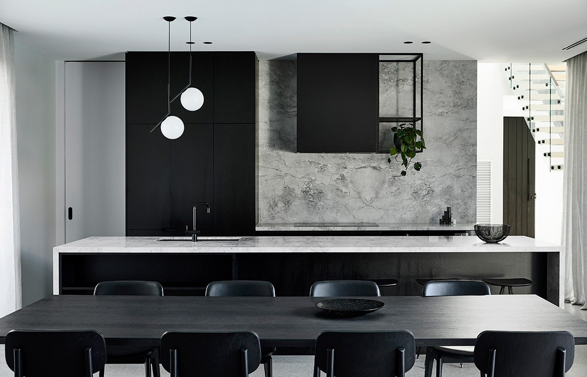
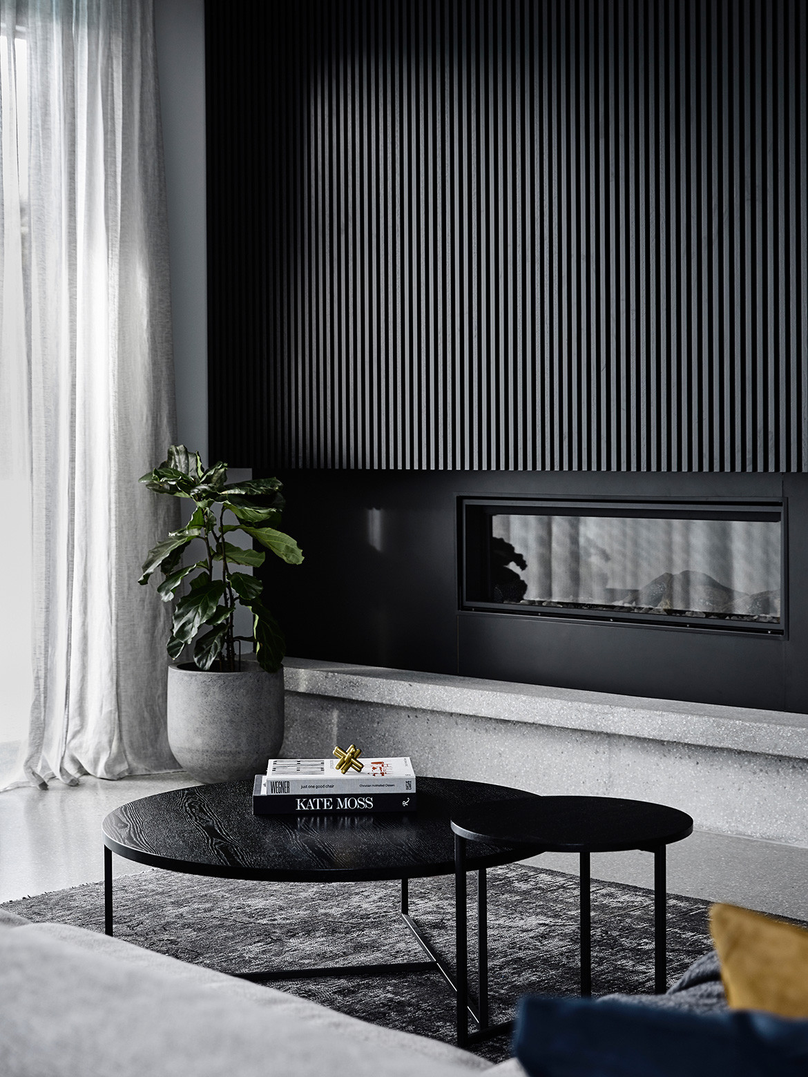
The Italian word chiaroscuro translates to mean “light-dark”; the artistic technique of juxtaposing light and shade to produce dramatic and emotional impact. It is from this notion that Casa Chiaroscuro gets its name and design language.
Melbourne-based multi-desciplinary design studio, Biasol, was engaged by the owners of Casa Chiaroscuro to design a comfortable new home that would accommodate the needs of their young family now and into the future. Their brief was clear, yet open. Spatially, they wanted places for being together, for independence, and for hosting large gatherings. Aesthetically, they wanted something modern, minimalist, and beautiful. For Biasol, this granted a level of carte blanche in the use of colours and materials that it hadn’t encountered before. Taking inspiration from the notion of chiaroscuro, Biasol played with scale, tone and texture to create a timeless and tranquil home.
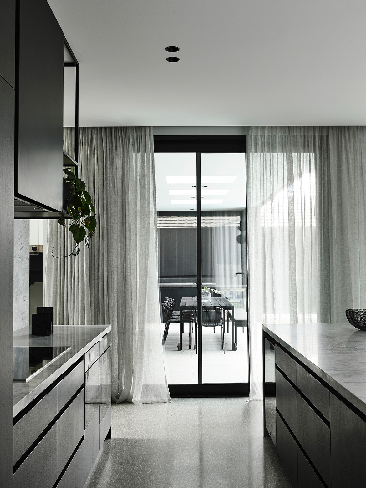
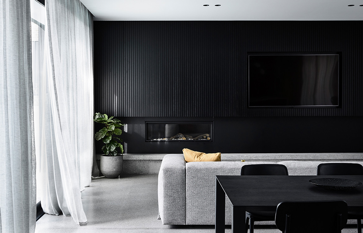
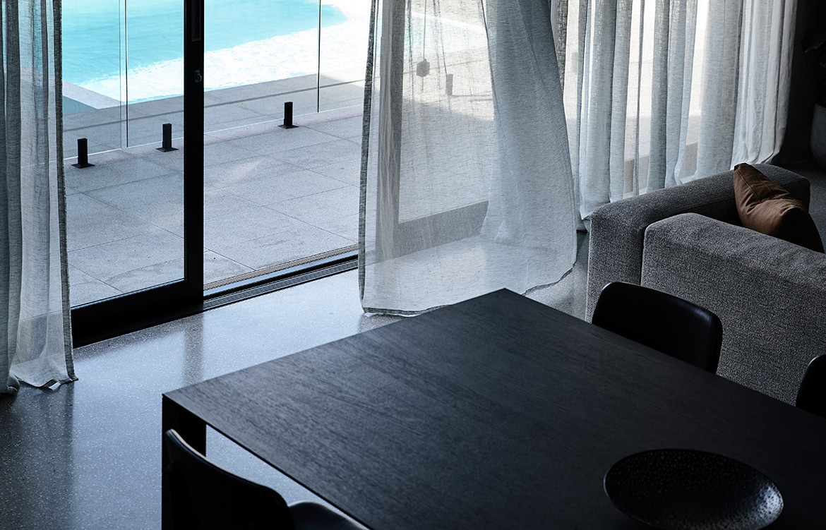
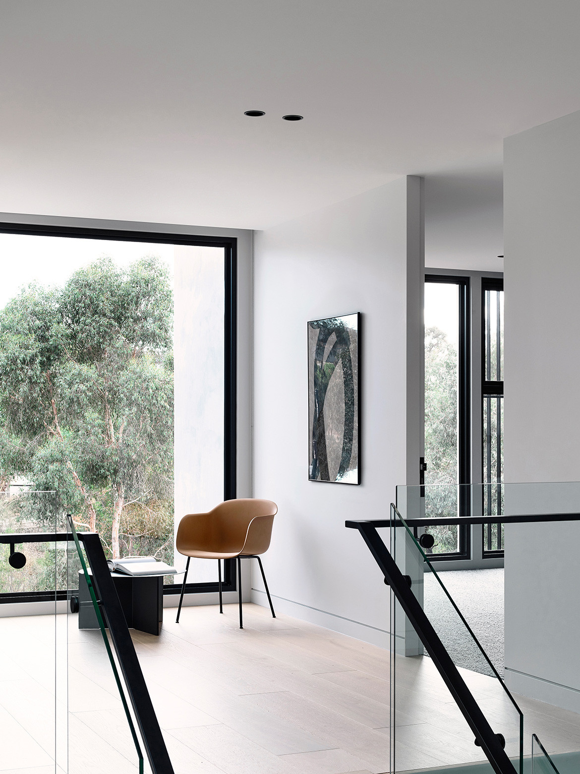
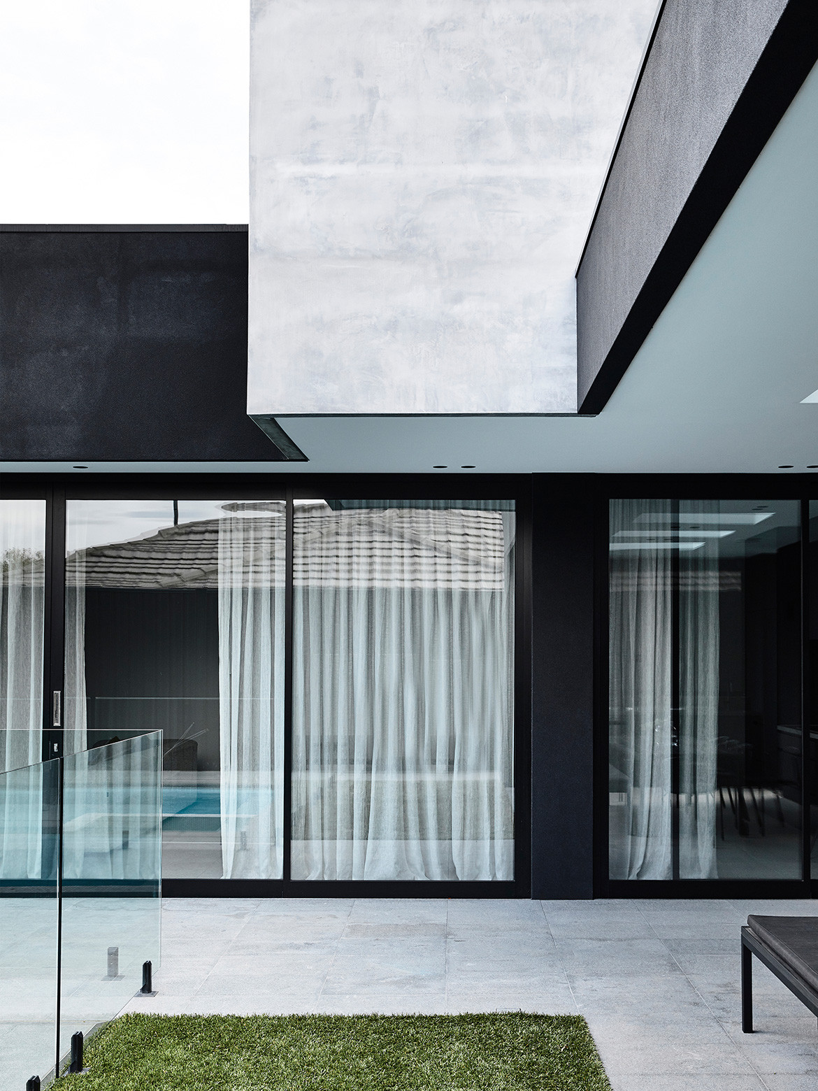
Upon entering Casa Chiaroscuro, one is met by a vast, sunlit entrance space. This voluminous entrance supports the transition from the outside-in and flows on to the rest of the house. The shared living spaces of the ground floor – comprising of a study, entertainment room, and open-plan kitchen, dining, and living area – spill outdoors to include an alfresco dining space and swimming pool. Expansive glass windows and doors demarcate outdoors from in, while seamless connecting the two and embracing parkland views.
Spatially, the clients wanted places for being together, for independence, and for hosting large gatherings.
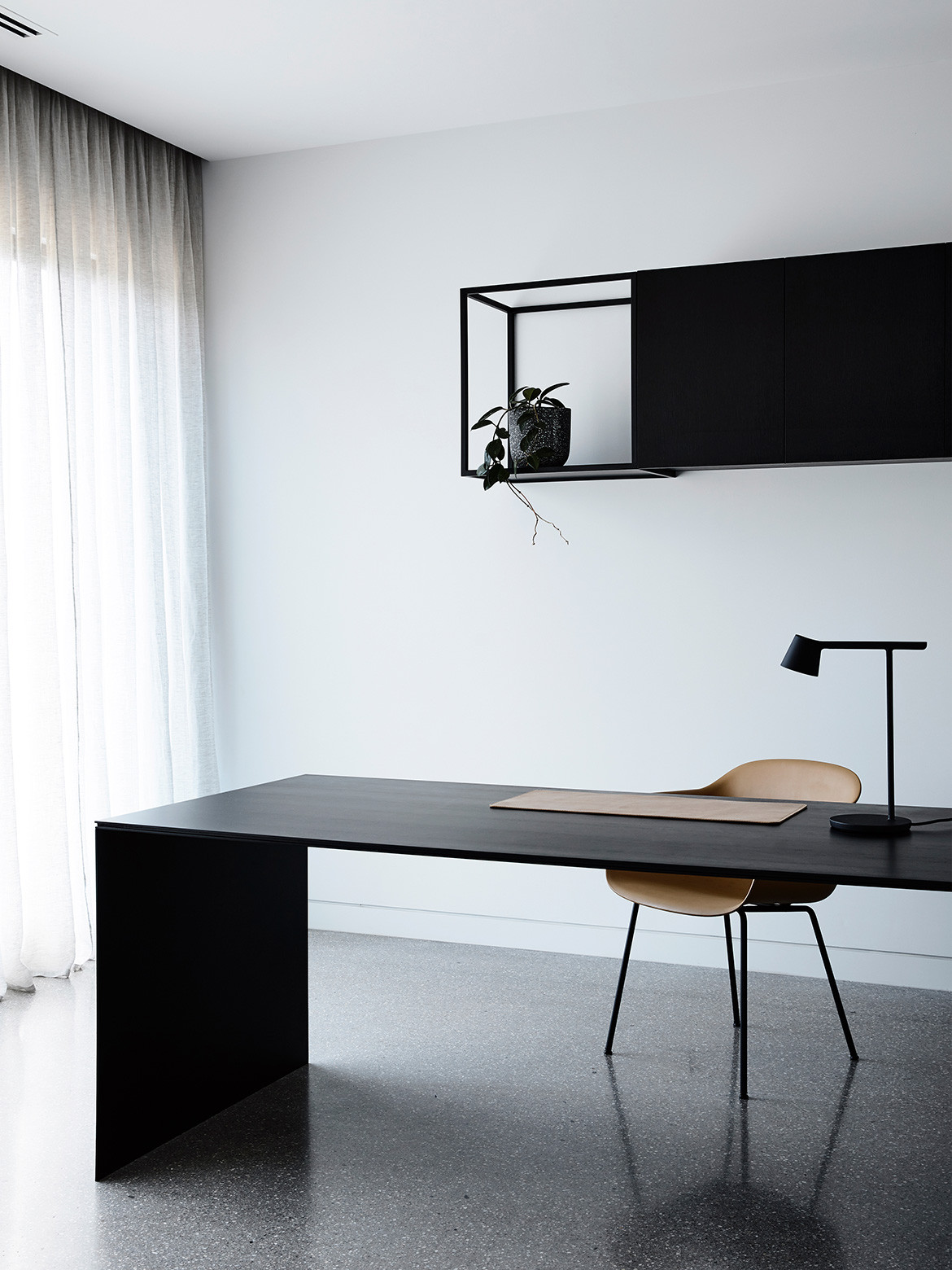
Bold compositions of black oak joinery provide depth in these light-filled spaces, denoting the places in which the family can come together. Characteristic of a contemporary family residence, the dining table acts as the central gathering point; the darkness of its oak is offset by the white veined marble of the kitchen benchtop and walls behind it and the light-grey upholstery of the sofa in front. Custom black joinery continues in the study, while a black outdoor kitchen recedes in the alfresco entertaining area.
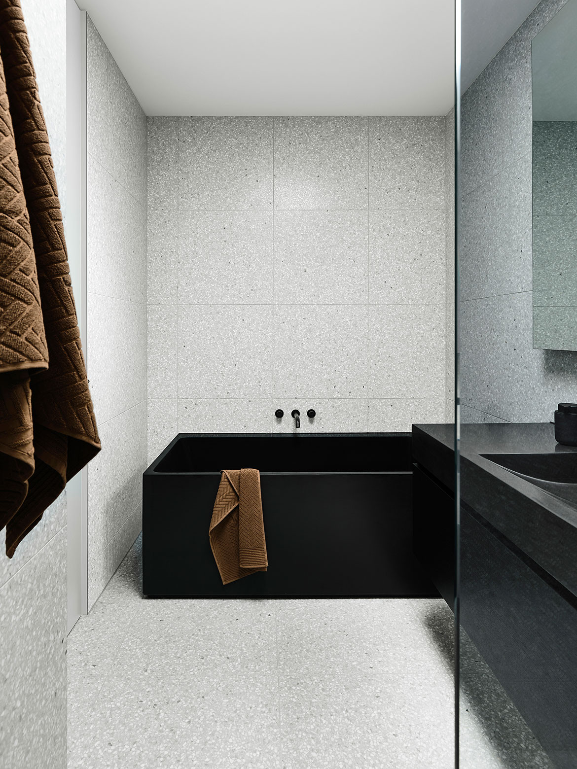
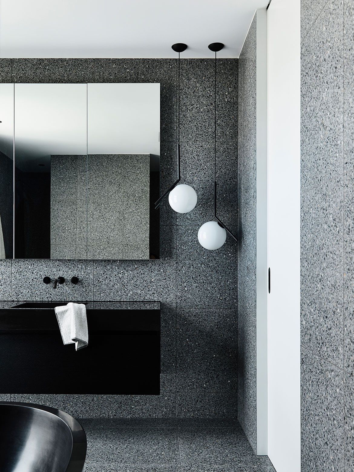
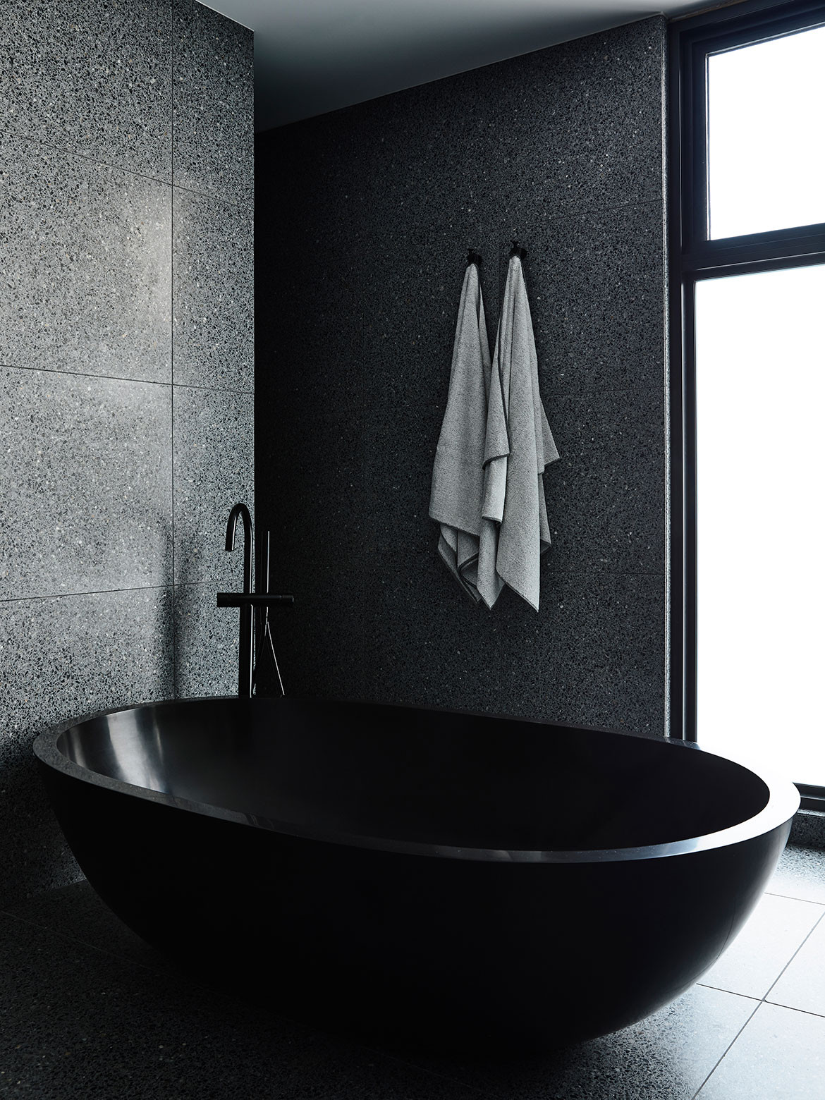
Upstairs, the dark materiality is continued – even amplified – to form immersive and comforting private spaces. In the master ensuite, a black bathtub sits in cave of black terrazzo, complemented by a black vanity and fittings to create a luxurious retreat for the adults of Casa Chiaroscuro. Meanwhile, the children’s bathroom is finished in grey terrazzo to create a lighter, brighter space.
The contrasting tones and textures of Casa Chiaroscuro’s interior are extended to the external materiality of the residence. The concrete rendered upper storey floats atop the black timber-clad lower storey that grounds the house to its site.
Biasol
biasol.com.au
Photography by Derek Swalwell
Characteristic of a contemporary family residence, the dining table acts as the central gathering point.
We think you might also like Vodka Palace by Marcus Brown Architect
