This c.1889 heritage-listed building in North Melbourne, originally occupied by the Metropolitan Gas Company, still stands proud with its arched windows and tessellated brickwork. Re-worked by Multiplicity, what was formerly a shell carved into two levels is now an extraordinary new home. “We presented at least eight different schemes to our clients, with this one being one of the most adventurous,” says architect, Cimone McIntosh, an associate of Multiplicity, who worked closely with the practice’s directors, architect Tim O’Sullivan and interior designer Sioux Clark.
Although the team faced the usual heritage constraints, they didn’t need to be coerced into retaining the building’s many fine features: rosettes, wide cornices and chunky beams. The 150-metre-squared footprint with the opportunity to create over seven-metre-high volumes is a rarity so close to the city. Designed for a couple who were originally looking for a considerably smaller project, the strength of the building, combined with its location directly opposite parkland, secured the deal. “Rosie and I gave Multiplicity a fairly unusual brief. We said forget about how this space has been dissected and look at it more as a theatre, a place that would continually excite us,” says owner John Carruthers, who was keen to be taken on a journey.

This fit-out breaks numerous rules and provides the ability to navigate this place in various ways. Past the enclosed courtyard-style garden, designed by Mel Ogden, one can walk down a corridor framed by translucent polycarbonate and descend into the kitchen and informal living area. Alternatively, it’s tempting to pass by the over-scaled arched windows along the passage and admire the established gum trees in the park, reflected back into the space with the use of reflective gold acrylic panels. This choice leads to an ensuite bathroom and dressing area to the main bedroom. This path also allows you to pop your head into the void, with the main living area directly below. “Following our brief, we felt it was important to create a certain looseness to the way the spaces are navigated, unfolding and revealing themselves depending on the choices made,” says Tim.
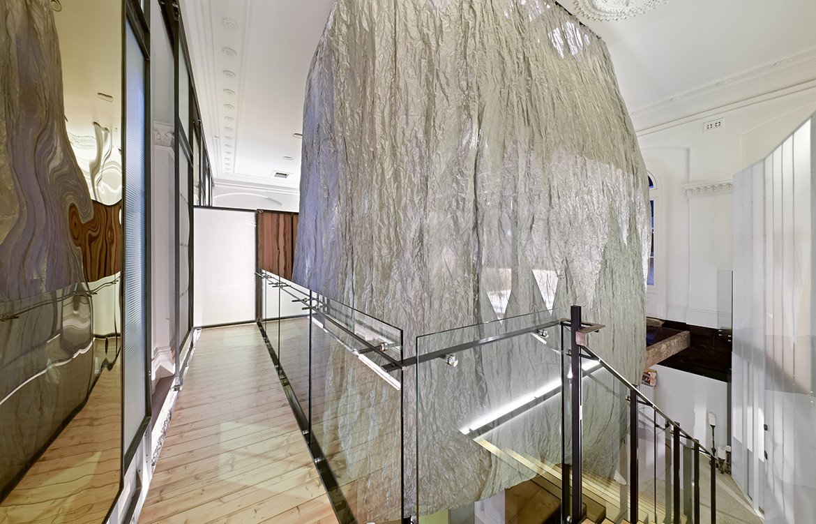
The ‘pod’ which acts as the spine of Multiplicity’s design comprising a steel woven basket-like frame, is fully enclosed with a steel mesh fabric that allows diffused light while still maintaining privacy for the main bedroom. A second staircase, winding past the main bedroom to a guest powder room below, is almost discovered by chance. “You could bring in the word ‘Escher’ to describe this effect. But we see it more as simply defining spaces within spaces and creating a different experience,” says Sioux.

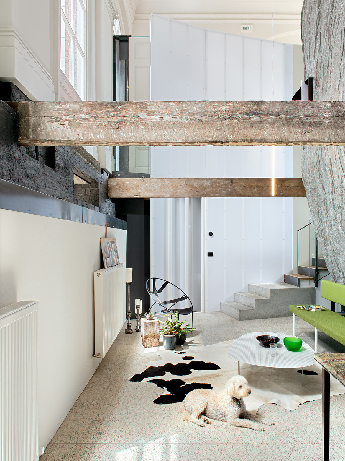
At ground, level there’s the kitchen, separated from the main living area by an operable shelving system, together with John’s study and a second living area that can be used either for guests or watching television. “We love how the spaces continually change. During the day, you receive the sunlight and in the evening, you experience the washed moonlight,” says John.
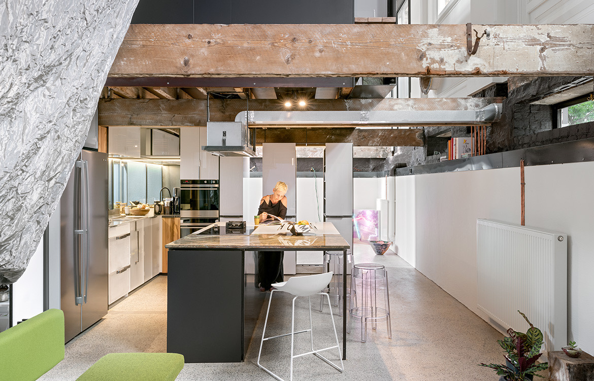
The materials used by Multiplicity, juxtaposing raw with highly polished, enhance the magic of this space. The kitchen, for example, features the carcass of a rangehood over the large island bench, together with translucent polycarbonate sheets for the kitchen joinery that allows the screws of the dishwasher drawer to be on view. In other areas, the gold and silver acrylic panels almost distort some of the period features. Victorian cornices and architraves are blurred in the process. “We don’t like to be too reverential when we’re looking at period buildings. It’s important to add something new in the design, something that keeps you looking at spaces in a different way,” adds Sioux.

