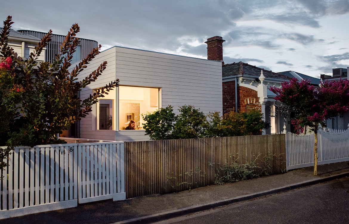
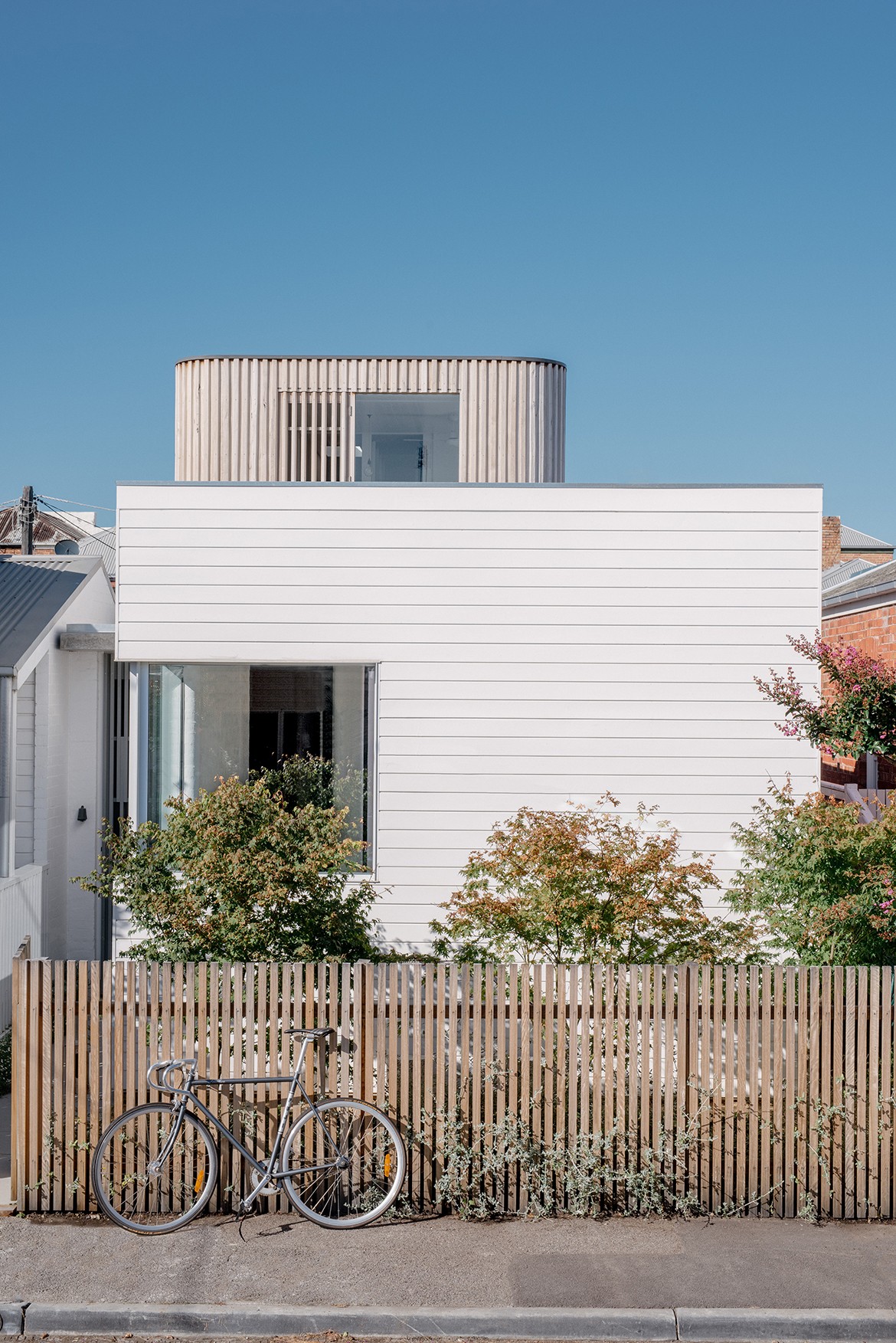
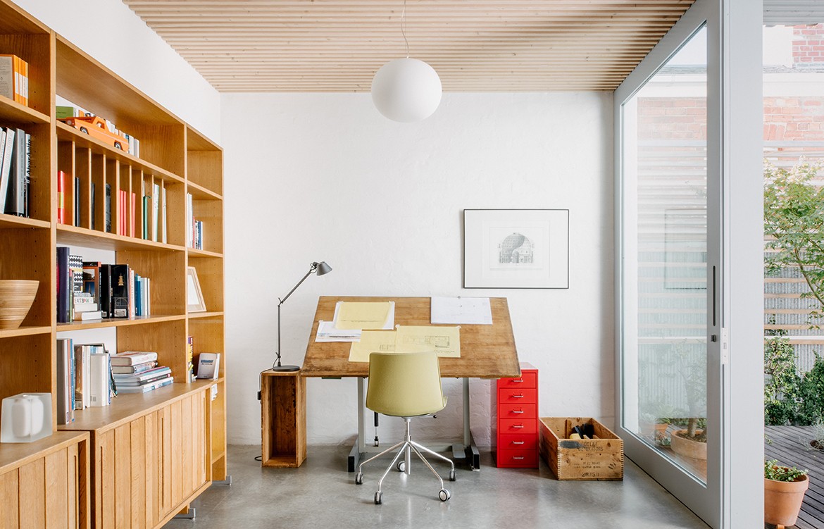
As both the client and the inhabitants of this home, Topology Studio was able to experiment with the build for this coastal home in South Melbourne. “We were in a unique position to really test our design ideas in both the unconventional spatial arrangement as well as details,” explains Amy Hallett of Topology Studio. “We are a family of four with two small children, and we have created a family home and studio within a very compact footprint of 150m2 total floor area.”
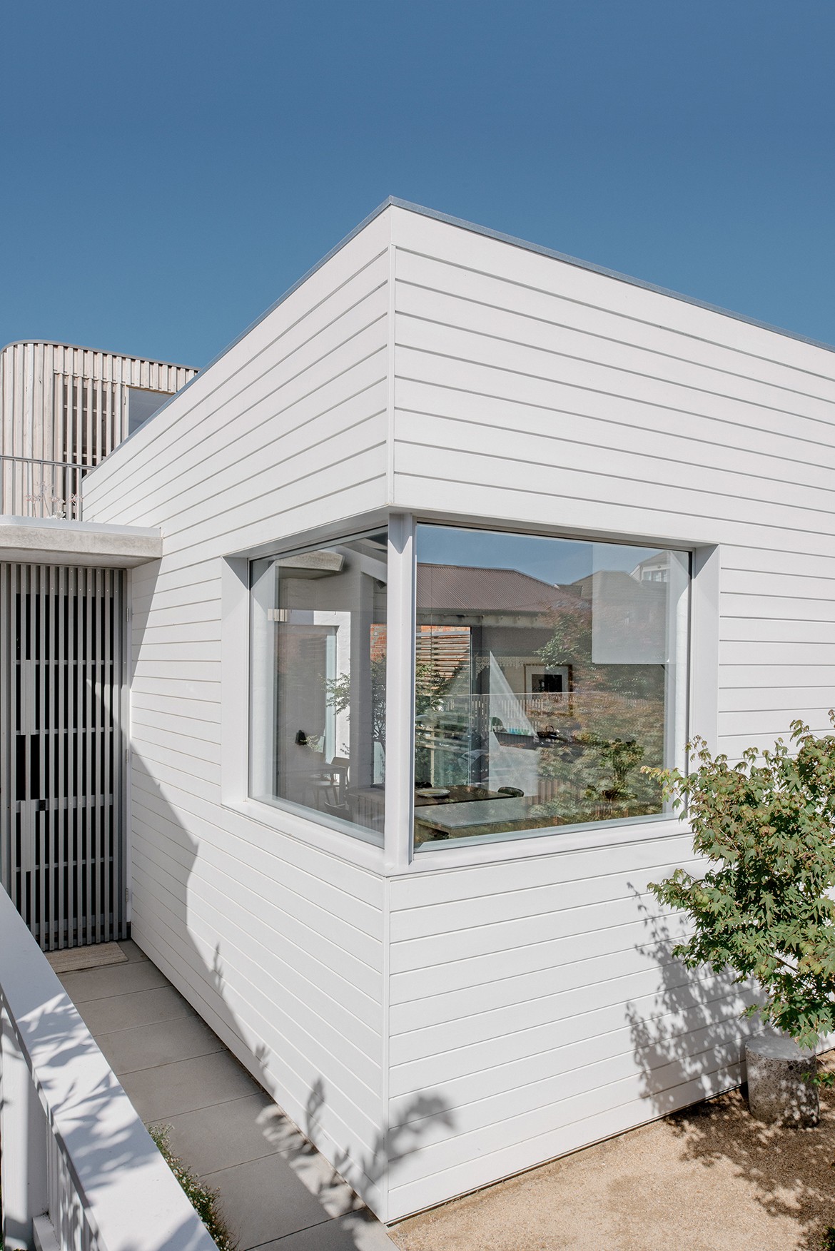
The house sits on a street lined with others built in the Victorian era. The new design is both sensitive to this era’s scale and materials, while also taking cues from the 1950s renovated version. “The original house was Heritage Listed and yet in very poor condition due to the very harsh coastal conditions,” explains Amy. “The alterations undertaken in the 1950s left the original Victorian unrecognisable and although we loved aspects of the 1950s version, it was beyond repair. The Council accepted that our design for a new home was of high architectural merit and so the listing was lifted, enabling us to build a new home.”
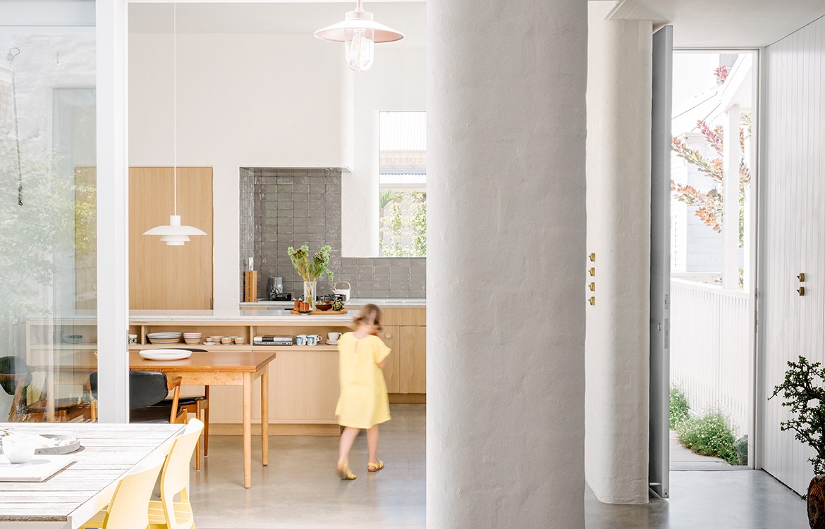
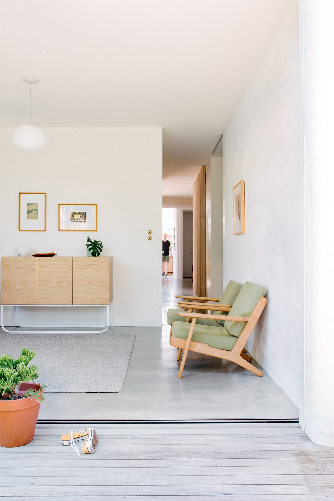
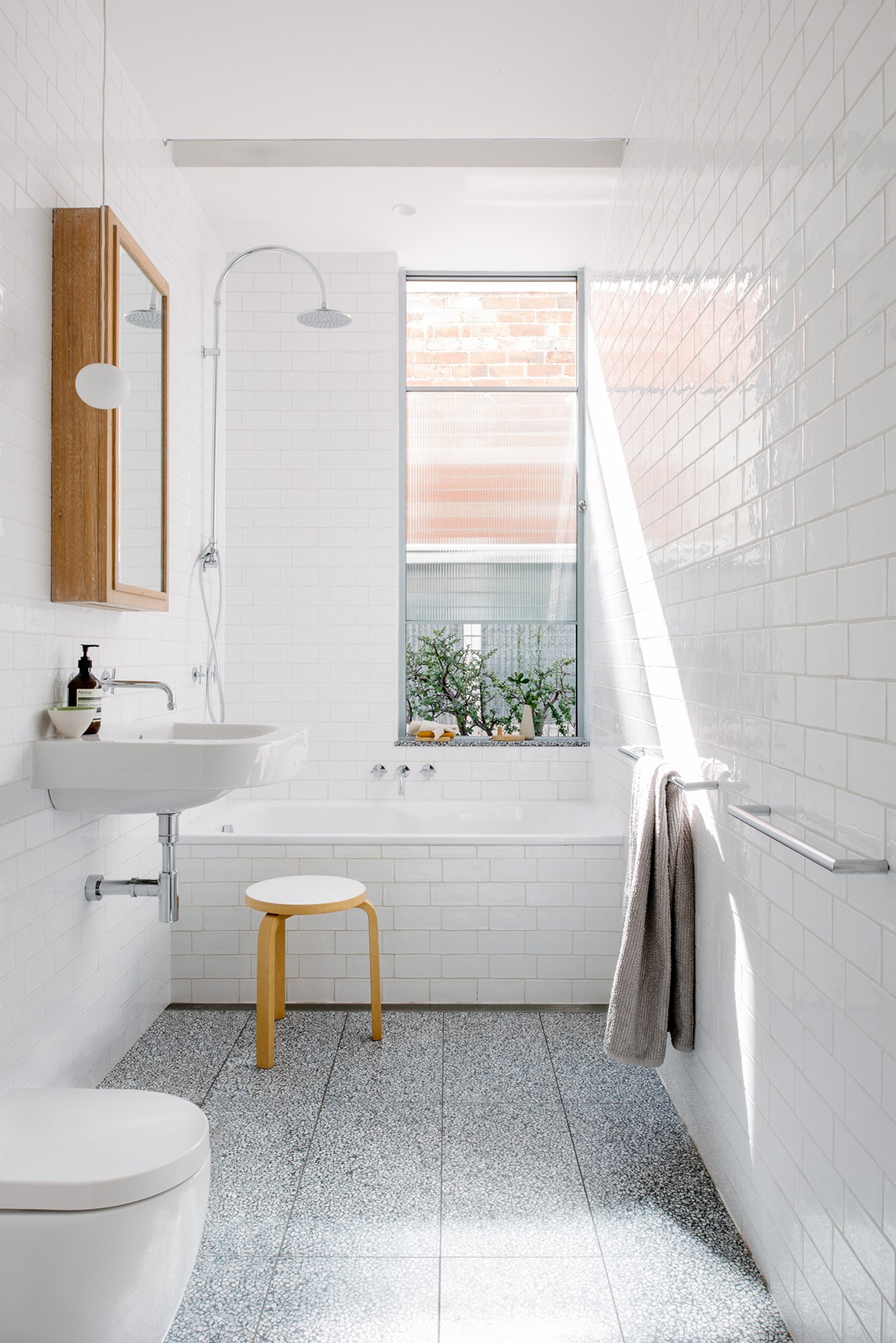
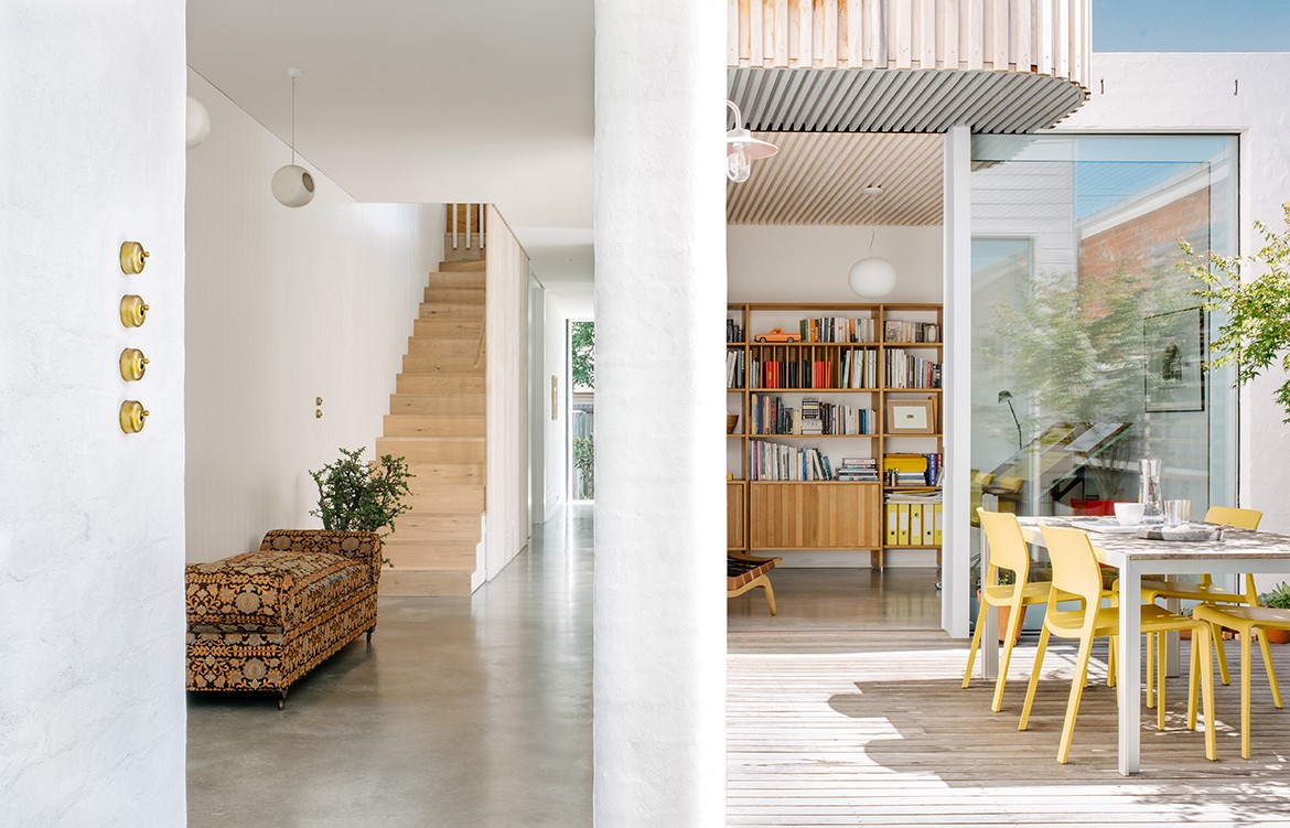
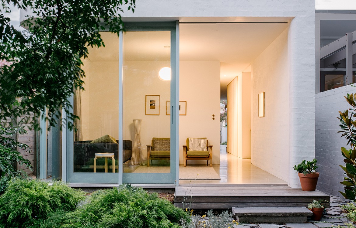
Topology Studio demolished the once renovated 1950s building and started from scratch; creating space for a kitchen at the front of the home that captured the beautiful morning light. Light was an important consideration for these homeowners, and they awarded it a voice in the design of the new home. “We were extremely careful in our consideration of the quality of light and texture,” says Amy. “The old house had beautiful soft light and we worked hard to ensure that this was maintained in the new design. Spaces change with the seasons and across the day as light crosses textured surfaces of the masonry, the burnished slab, and the internal timber walls,” she explains. “Internal and external corners are rounded and this adds to the complexity and dynamic of light. The spatial flow is quite complex with an internal courtyard that allows for joyful interactions between spaces, both horizontally and vertically.
The compact layout of the home was intentional and considered with the homeowners wanting to reduce embodied energy consumption and employ passive design principles. They wanted to ensure the comfort of the coastal home was retained – thinking outside the box on ways they could achieve this was imperative.
Topology Studio managed this balance by planning the efficiency of the space intelligently. Excellent flow between rooms within the house creates a deceivingly spacious environment that feels open and large, while still being compact and therefore ensuring energy usage remains low.
The couple also selected materials that were high quality, long-lasting and adept at coping with the home’s coastal positioning to further ensure the longevity and sustainability of the property.
The resulting home is intelligent. Its exceptional attention to space and light gives the home its bright and breezy character and enables a petite design to cater beautifully to its family. Its attention-to-detail particularly on the exterior allows it to slot in smoothly on a street lined with homes from many decades past.
Topology Studio
topologystudio.com.au
instagram.com/topology_studio
Photography Paul Hermes
Styling by Lynda Gardener, Belle Hemming
Dissection Information
Dayview sashless windows
Brio retractable fly screens
Vintage Louis Poulsen PH4/3 pendant from Angelucci
Louis Poulsen Doo-Wop pendants from Royal Design
External lighting Davey Lighting, Mast Light and Chelsea Outdoor from Dunlin
Jasper Morrison Glo Ball pendants from Euroluce
Iro pendants from ISM Objects
Led lighting from Vintage LED & Inlite
Durable Terrazzo internal and external tiling from Fibonacci and Signorino.
Port Fairy bluestone crazy pave from Bamstone
Asko & Schweigen appliances
Brodware tapware
Door hardware from Design Doorware
Insulated burnished concrete slab on ground floor with gas fuelled hydronic heating
Timber flooring American Oak Engineered boards from Royal Oak Floors
Wall tiles semi hand made from The City Tiler
Recycled brickwork masonry (internally and externally) painted with Porters Stone Paint
The front section of the house is reverse brick veneer, with painted T&G timber cladding
Joinery and internal timber hand finished in Woca finishes
Original metal door handles reinterpreted for the kitchen and front door handles using American Rock Maple by designer-maker John Hallett
The rear fence is made from boards salvaged from the original fence that was in itself made from reused hardwood stud framing
We think you might also be interested in the Seaberg House by Kerstin Thompson Architects
