Dubbed an ‘architectural jewellery box’ by Carter Williamson Architects, Concrete Blonde is an updated terrace house in Sydney’s inner west that features a delicate and considered array of materials – concrete, brick, timber and stainless steel – accentuated by lightplay captured through skylights and a courtyard well.
Irene and Peter, Carter Williamson’s clients, had lived in this 100-year-old house in Annandale for a few of years before engaging the studio in 2014 for some simple architectural updates that would better align the residence to their unique way of life.
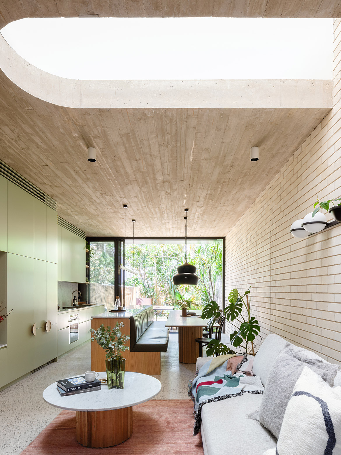
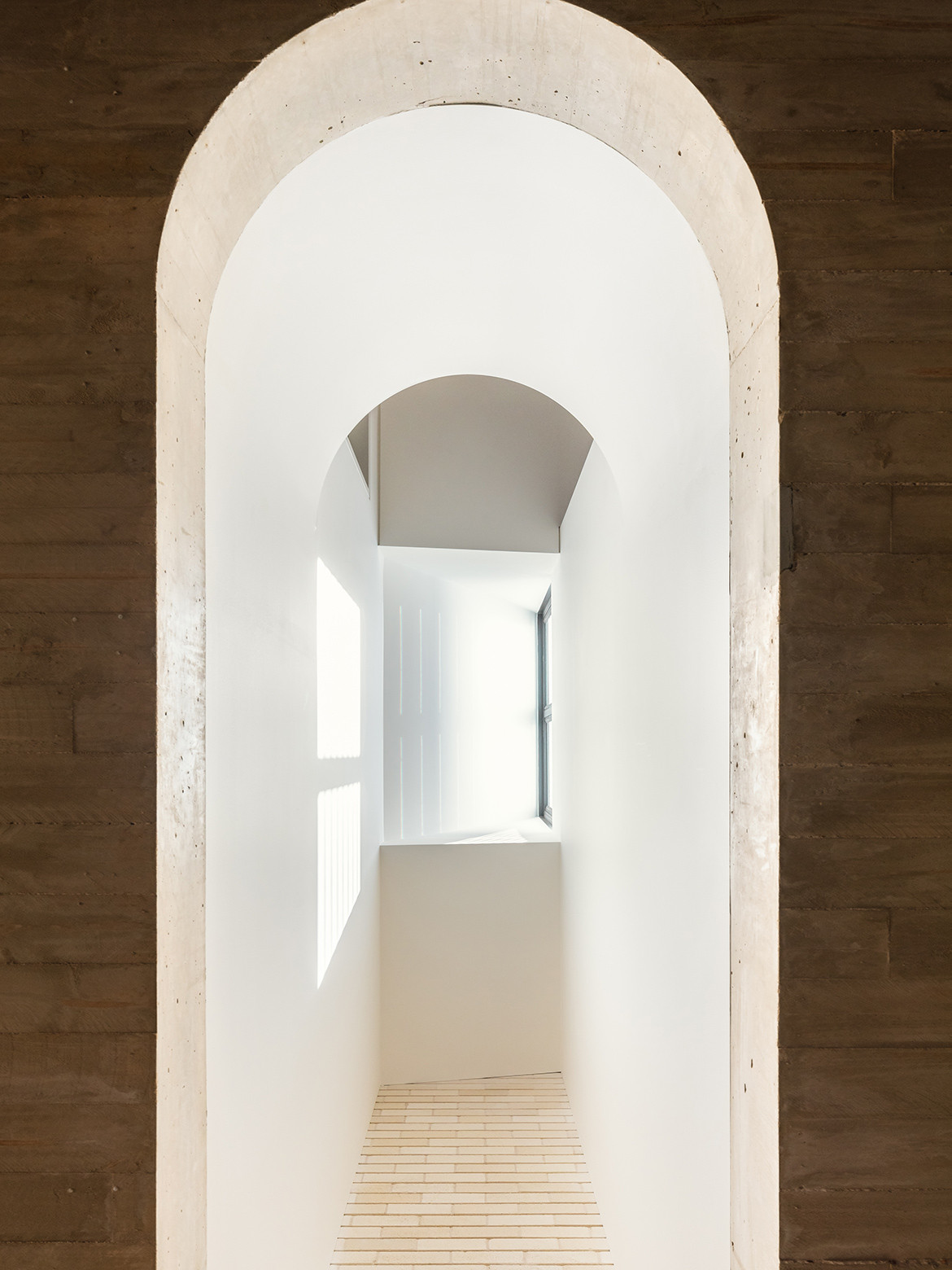
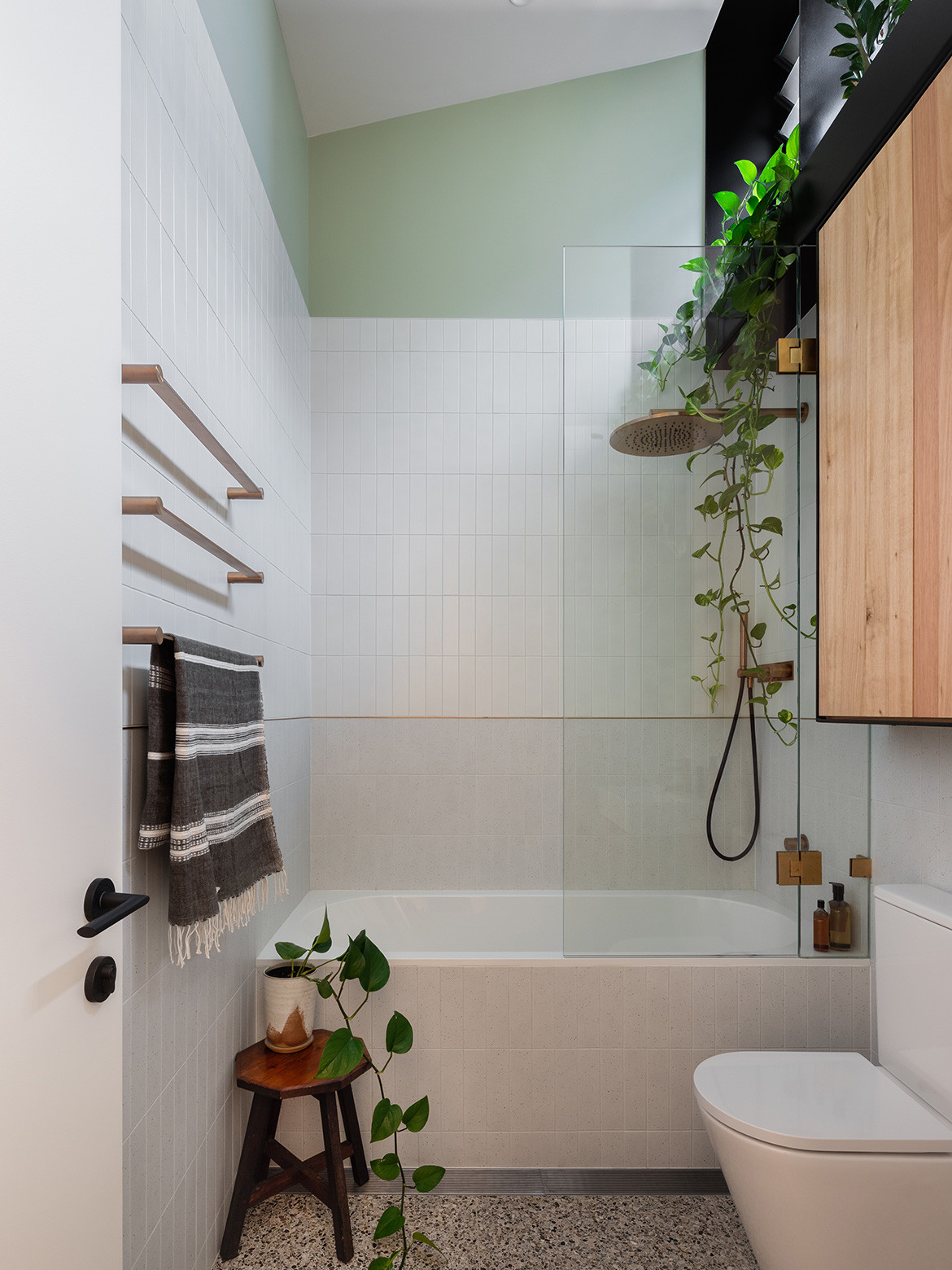
They had an interest in the material palette and requested polished concrete, exposed brickwork, natural wood and stainless steel. These are durable, long lasting, low maintenance and high-performance materials. Concrete, for example, naturally self regulates the temperature year-round, trapping cooling air in summer and acting as a thermal mass in winter.
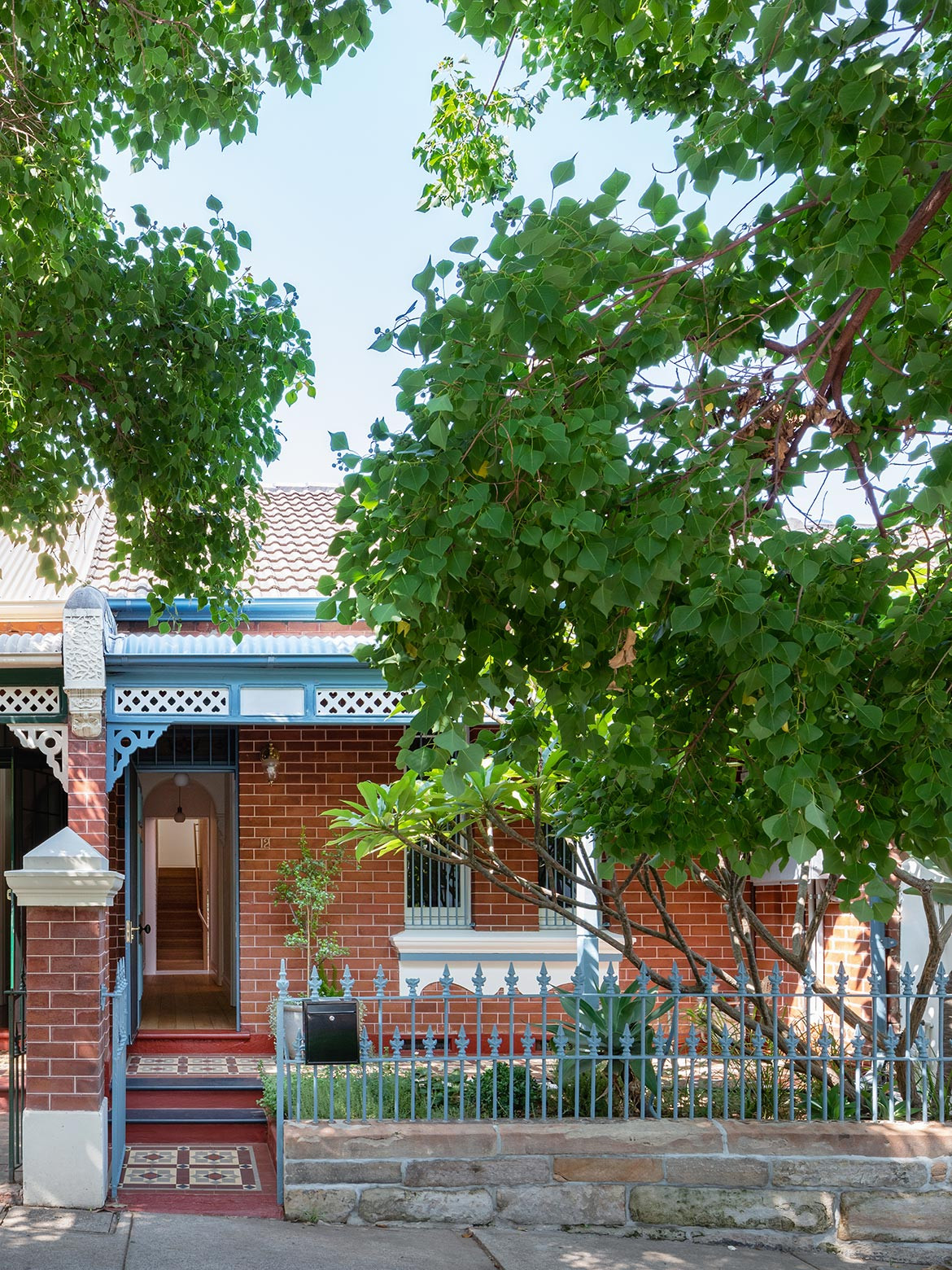
Underpinning the brief was an understanding of the cultural and architectural significance of the heritage façade that sat in a row of eight identical others – so this was restored and maintained. The five-metre-wide site may be considered generous compared to other terraces but by no means is it large, so the circulation of the building needed to be clever and efficient.
Functionally, there was a desire for open communal spaces that flexed to host extended family and friends, but could just as easily offer a peaceful sanctuary when they weren’t entertaining. The clients wanted private zones to which they could individually retreat, and they wanted to feel connected to the environment through natural light and sightlines to their prized garden.
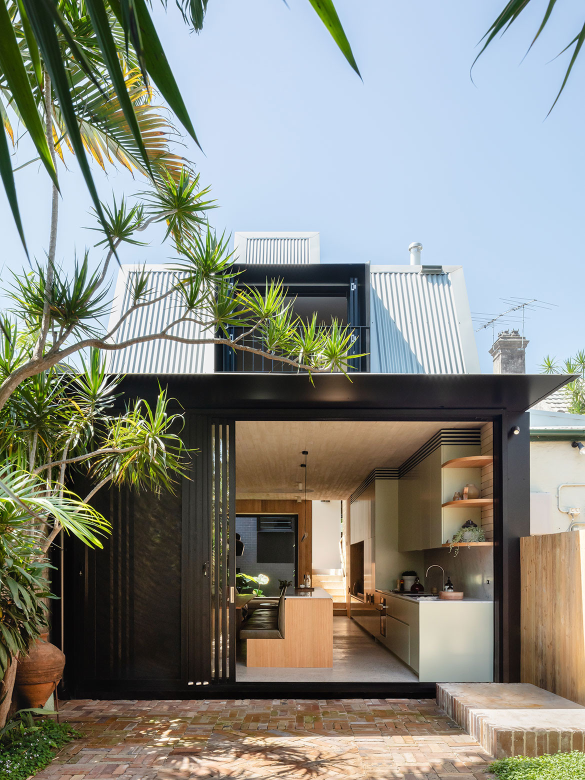
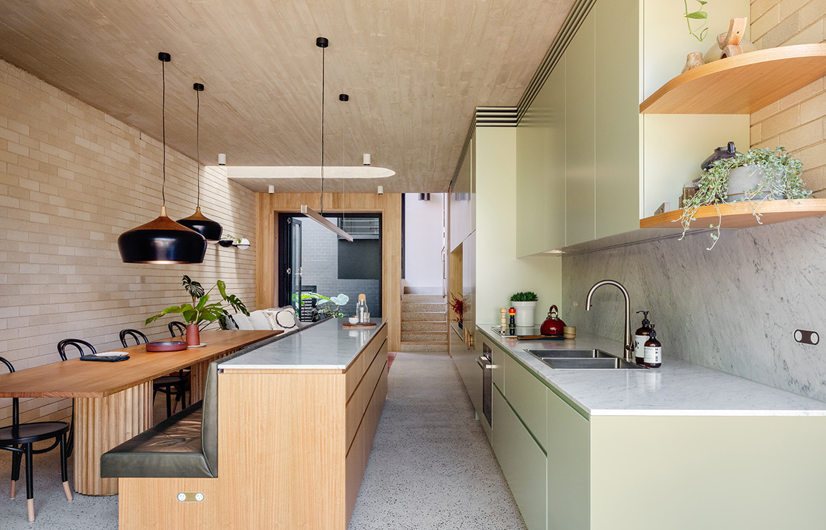
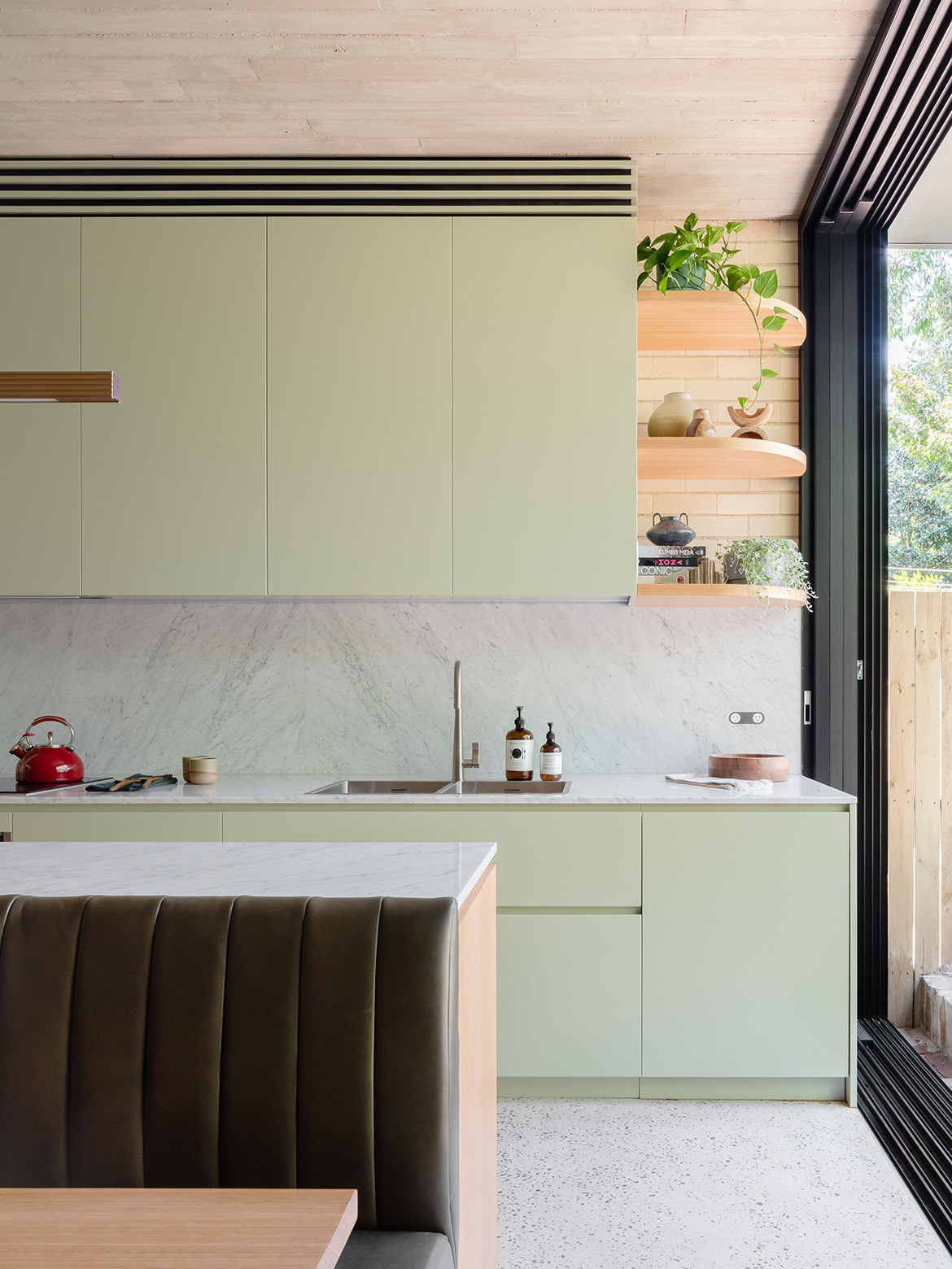
The kitchen/living/dining area is perhaps the most notable architectural moment of Concrete Blonde. In response to the brief, “black sliding glass doors dissolve away to connect the kitchen to the rear courtyard,” says architect and project lead Ben Peake. “These four spaces, [come] together as one, creating the heart of the home.”
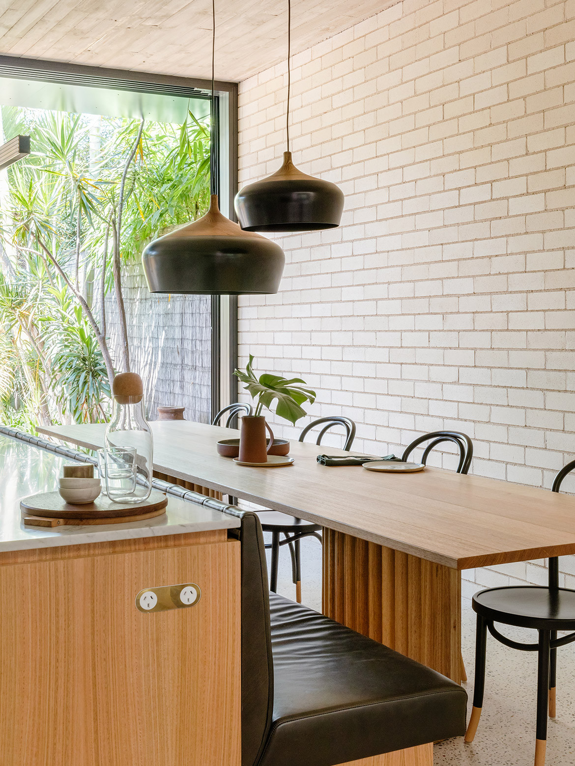
Inside, the kitchen island extends on the outer side to form bench seating – which also works in a tight site to conserve space. The dining table is a custom creation designed by Carter Williamson and Orange-based furniture designer Will Brennan. The dark green leather upholstery for the bench seating, and the cabinetry and joinery (made from Tasmanian Oak and finished in Dulux White Cabbage), are a subtle reference the native gumtrees outside and “a nod to the home’s former kitchen colour and memories of our clients extended family homes in Greece,” adds Ben.
“I am a believer the heartbeat of every home is the kitchen,” says Irene. “It is a place of deep conversations and connection with people.” Carter Williamson has created the trifecta: a highly functional space, a space that at every corner or moment connects resident to nature or each other, and a space in which the clients joy to be.
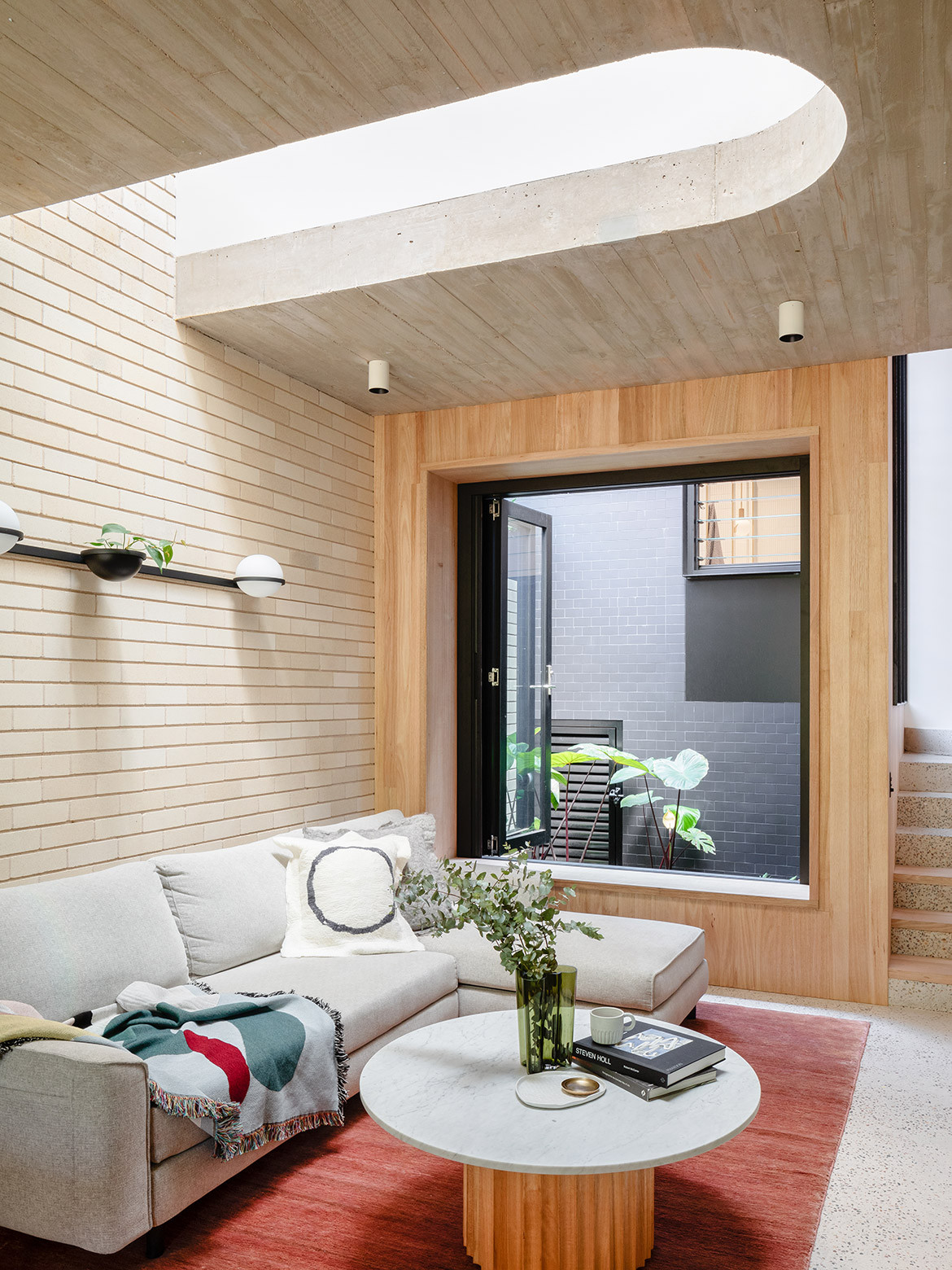
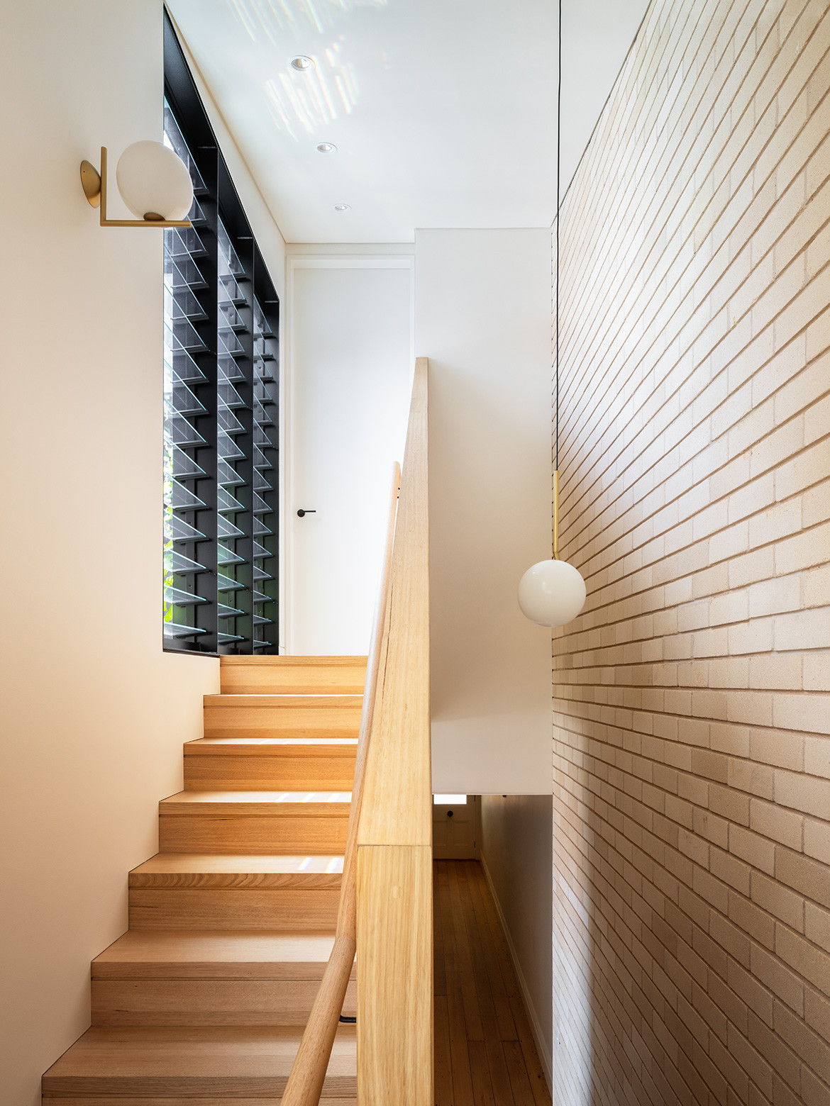
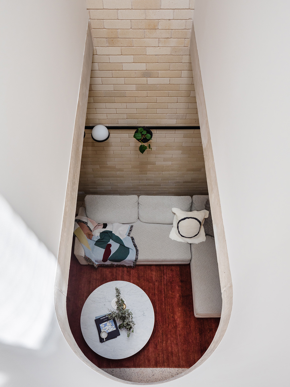
At the other end of the kitchen/living/dining area an internal courtyard demarcates the public and private, providing natural light sources at both ends and the centre of the large communal space. “A curved linear void sits above the living space…bridging northern light from a high window deep into the plan,” says Ben. “We often use skylights and voids to deal with the challenges of planning and less than ideal orientations.”
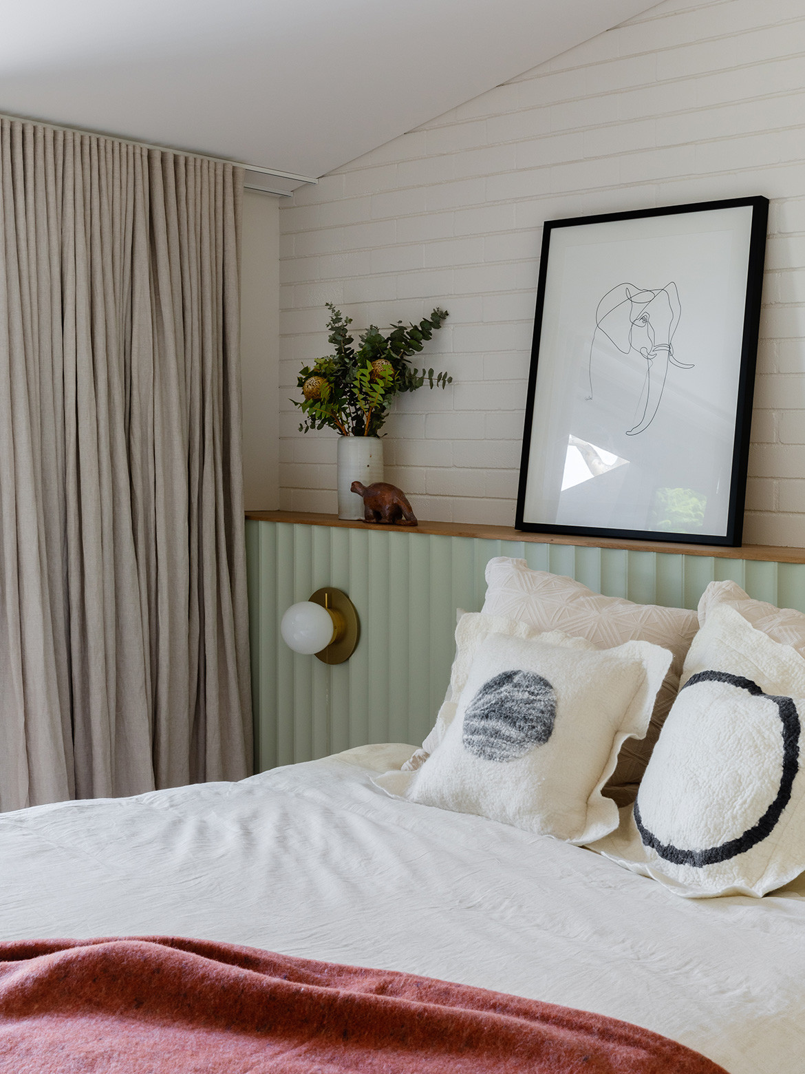
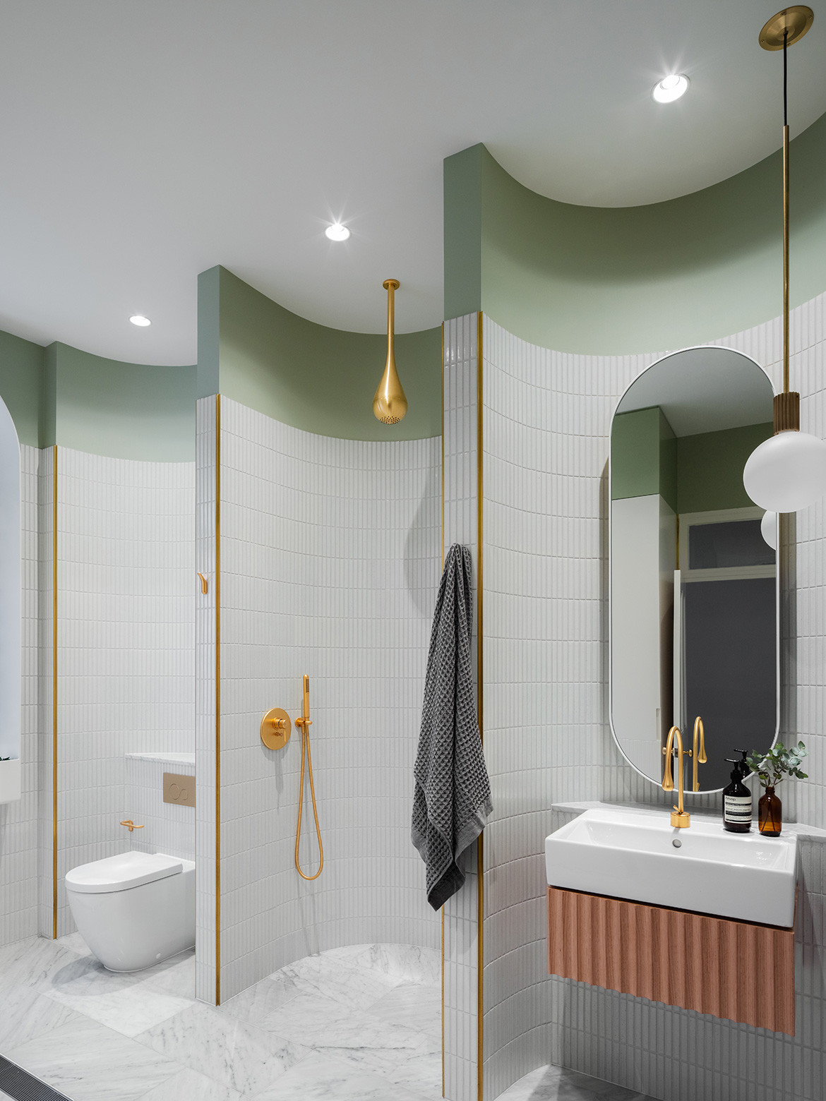
A split staircase connects the renovated back end to the front two rooms (a bedroom and new bathroom) or further up to the main bedroom and studio room. The main bathroom, which was previously the second bedroom, is divided into micro spaces through curved tiling. This gives an intimacy to the respective spaces within a relatively large bathroom and also offers visual interest. On the facing wall is a hidden laundry.
“Every step we take in the home creates little joyful moments,” says Irene, the project having been completed November 2019. Back in 2014 she and her husband had emailed a number of architects with a detailed brief of what they wanted. They ultimately chose to work with Carter Williamson because they felt this studio had the greatest understanding of their brief, which gave equal weight to the little moments as it did the larger ones.
Carter Williamson
carterwilliamson.com
Photography by Katherine Lu
We think you might also like Darlinghurst House by Brad Swartz Architects
