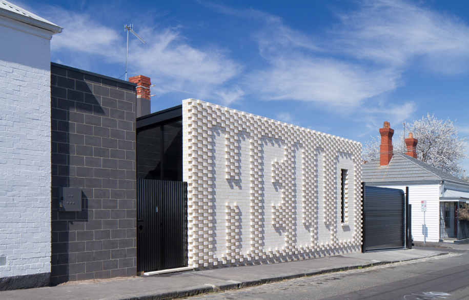
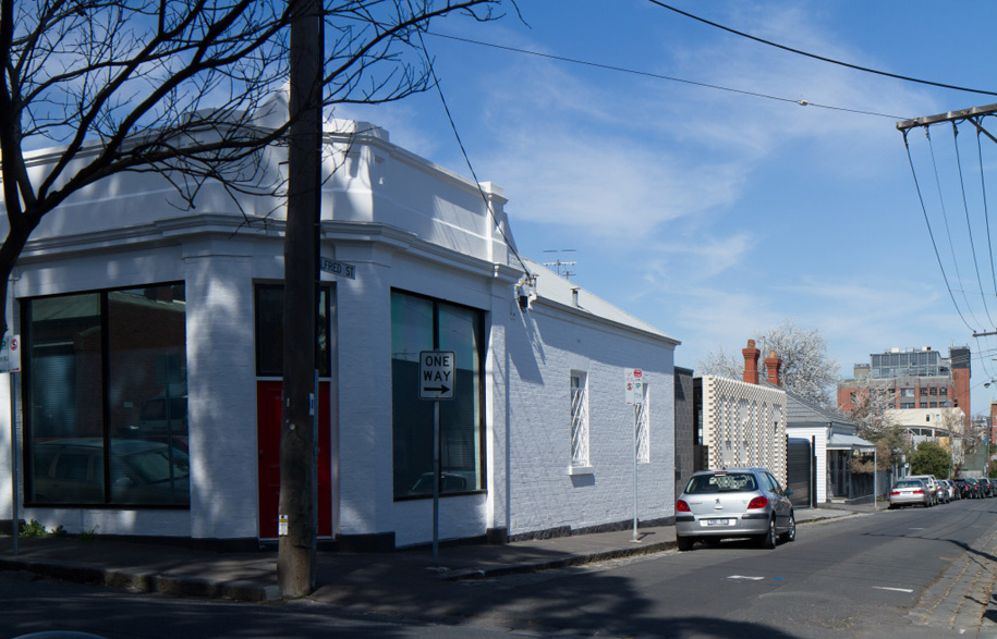
Designed by Melbourne-based firm, OOF! Architecture, the Hello House has one rather obvious stand-out feature, a large white-glazed-brick wall with protruding and inset bricks spelling out the word ‘Hello’.
“The Hello House could have been a typical inward-looking home with the usual modern rear extension to a Victorian house,” says OOF! Architecture’s Fooi-Ling Khoo. “The clients, however, were interested in the idea that their project should be more than just a private home.”
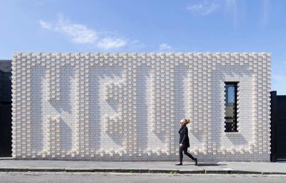
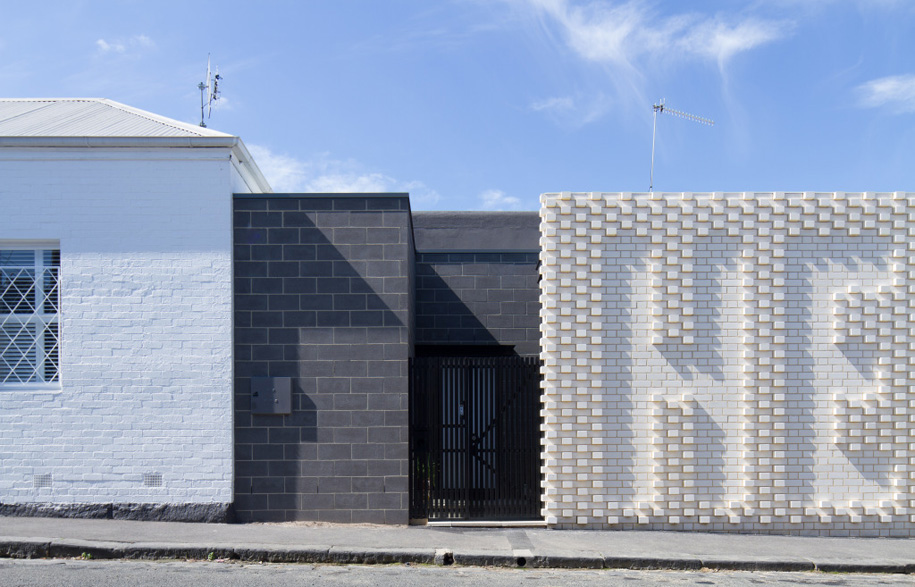
Sitting on a corner opposite the local cafe, the area is a hub of activity for the neighbourhood, a sort of mini-civic centre. “Rather than using the house as a tool to shut themselves off, we thought it could be a way to be part of the ‘village’ they loved.” Their conversations led to the most distinctive feature of the home, the ‘Hello’ wall.
Khoo began working with the clients – a creatively minded couple – around 7 years ago. The first round of plans had been drawn up for the site – an old Victorian shophouse – and they were not far from beginning work when the clients’ circumstances changed and the project was shelved.
“When we were able to revisit the design five-and-a-half years later, many elements were reconsidered and some, considered superfluous, were removed,” Khoo explains. “Ultimately it created a wonderful opportunity to approach the design with fresh eyes, and the building is all the better for it.
“The Hello wall may not have come about had it not been for this ‘resting’ time for the design.” The wall is a collaboration with Melbourne artist Rose Nolan, whose work in large-scale typography has featured in numerous galleries and even a Melbourne tram.
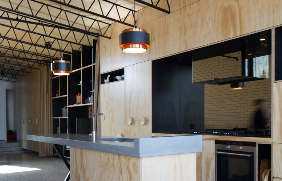
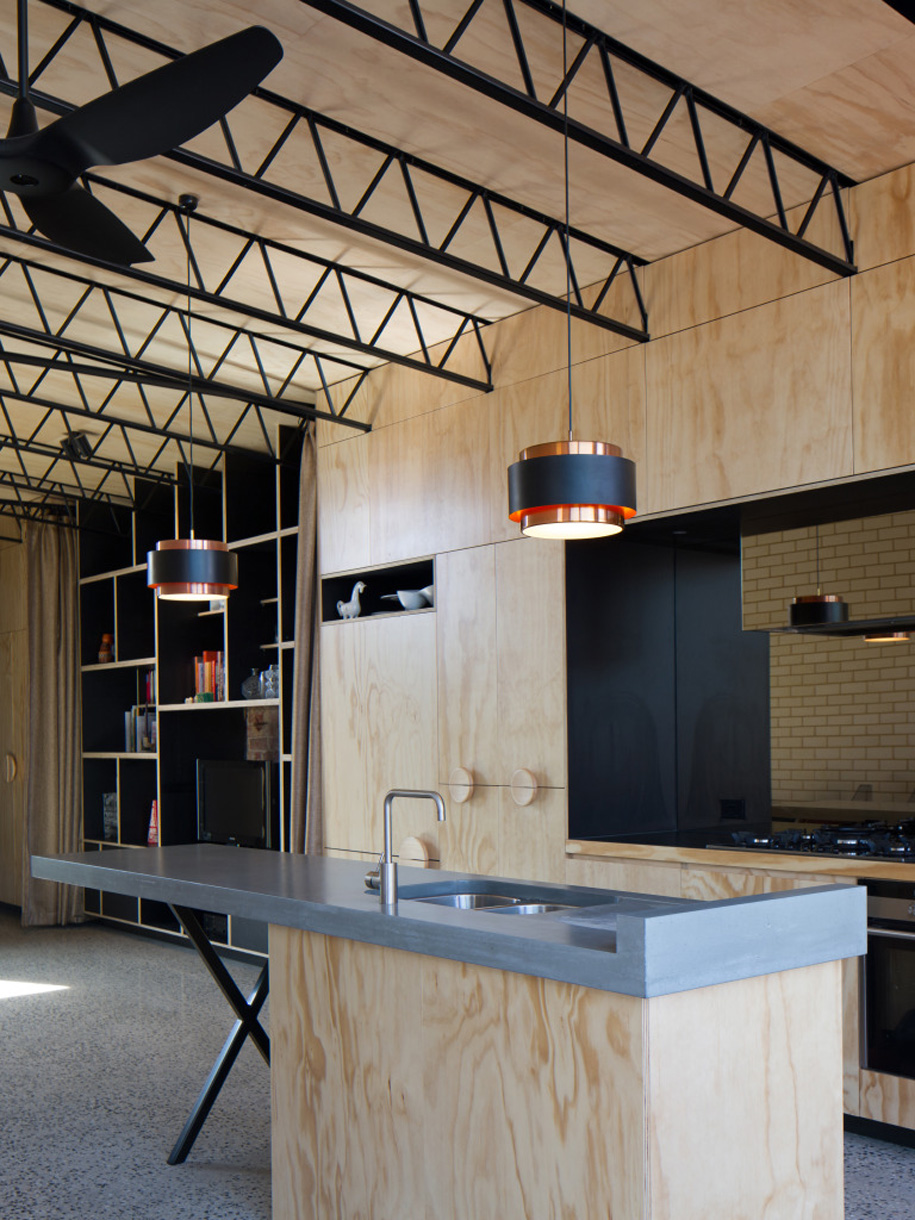
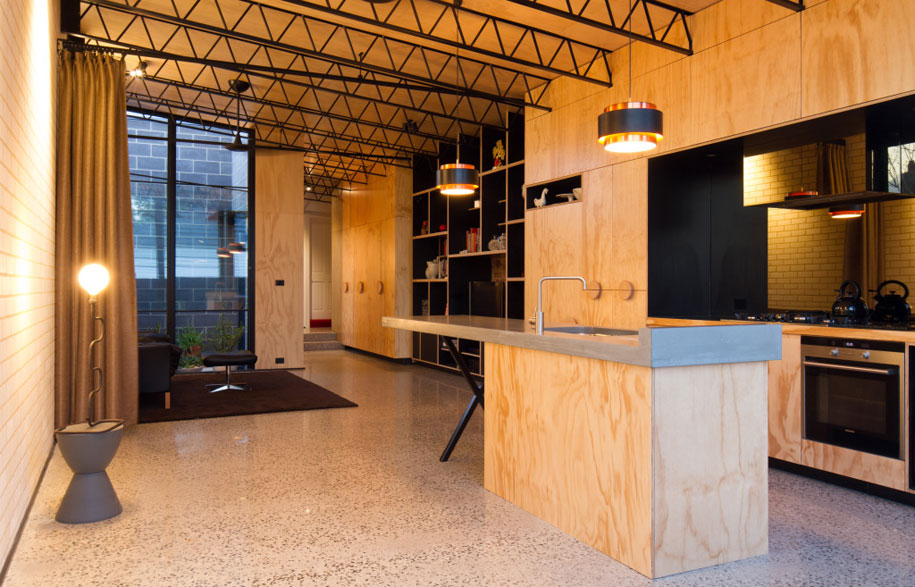
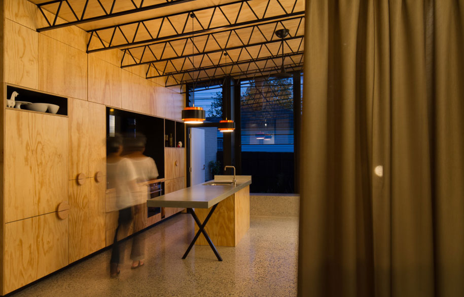
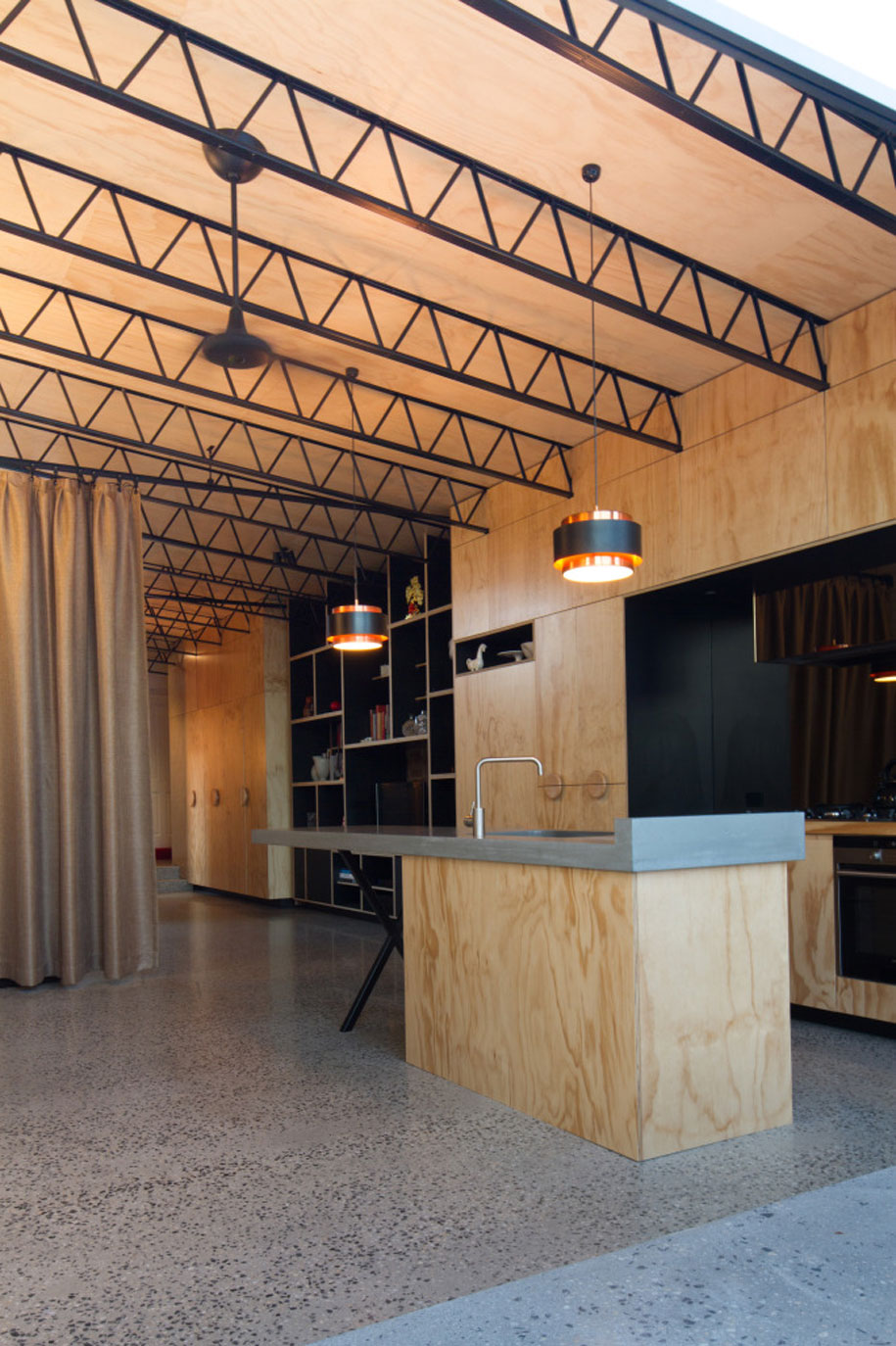
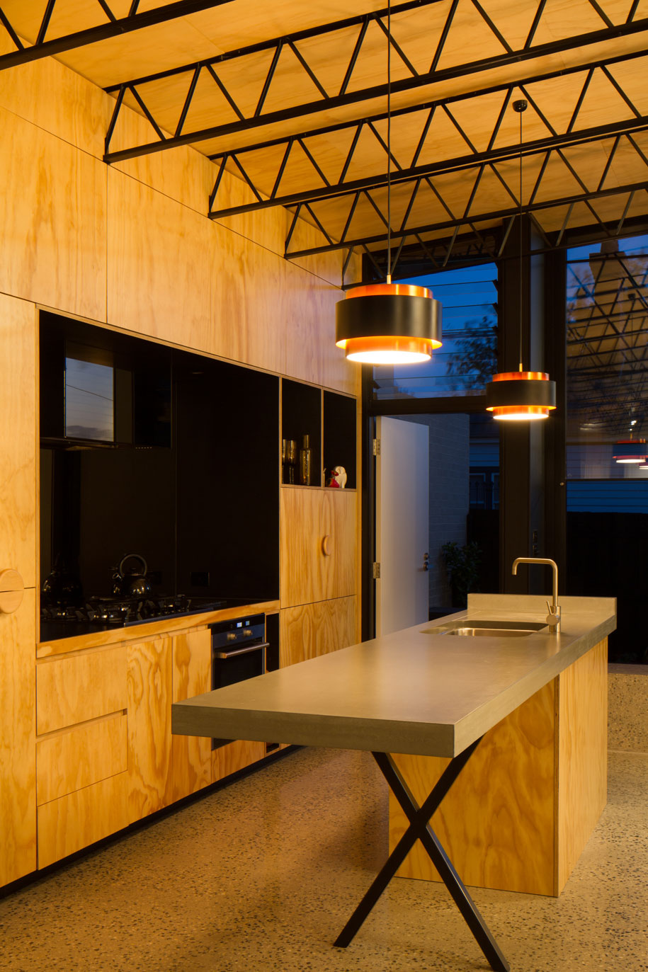
 The main aim of the design was to create a liveable, modern house with the living, kitchen and dining spaces at the rear of the property, maximising light and creating a sense of open spaciousness on a small site. This inspired the rear open-plan space, with full-height glazing at each end, high ceilings and a minimal materials and colour palette.
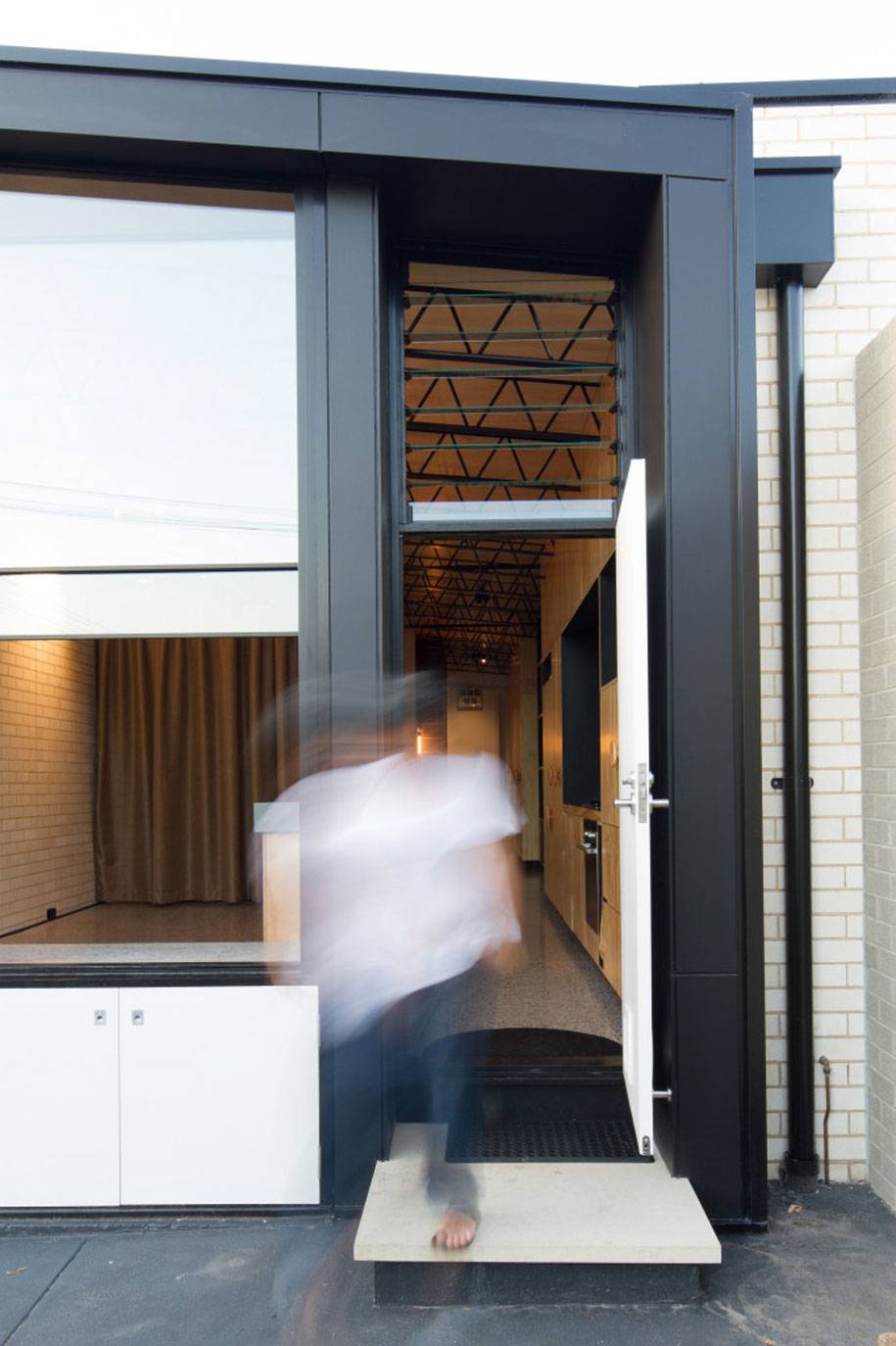
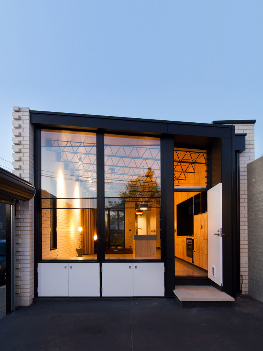
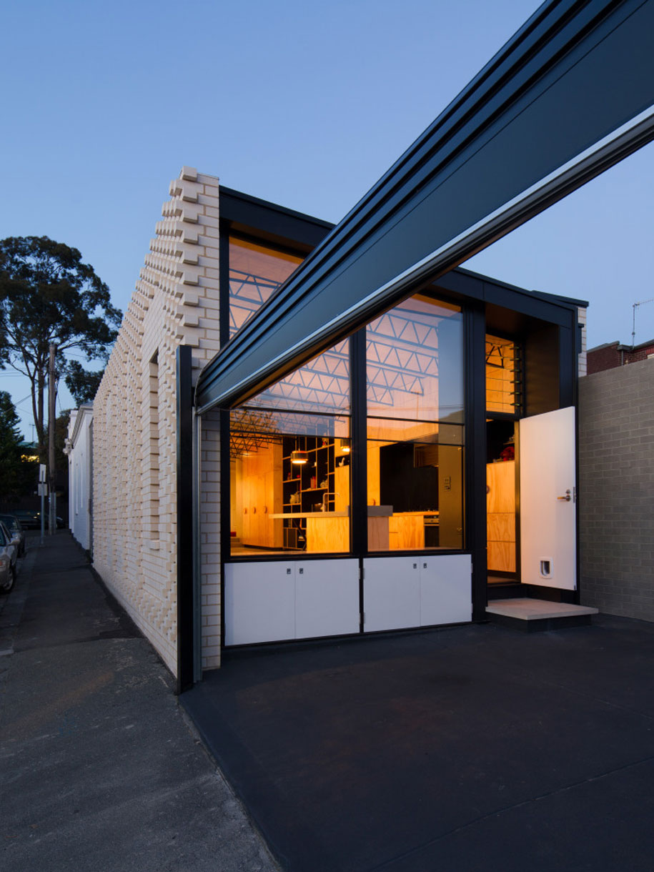
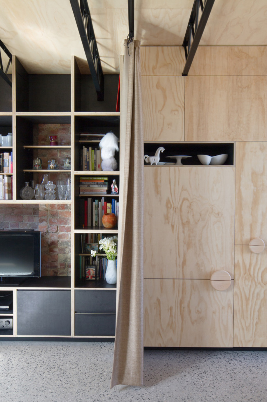
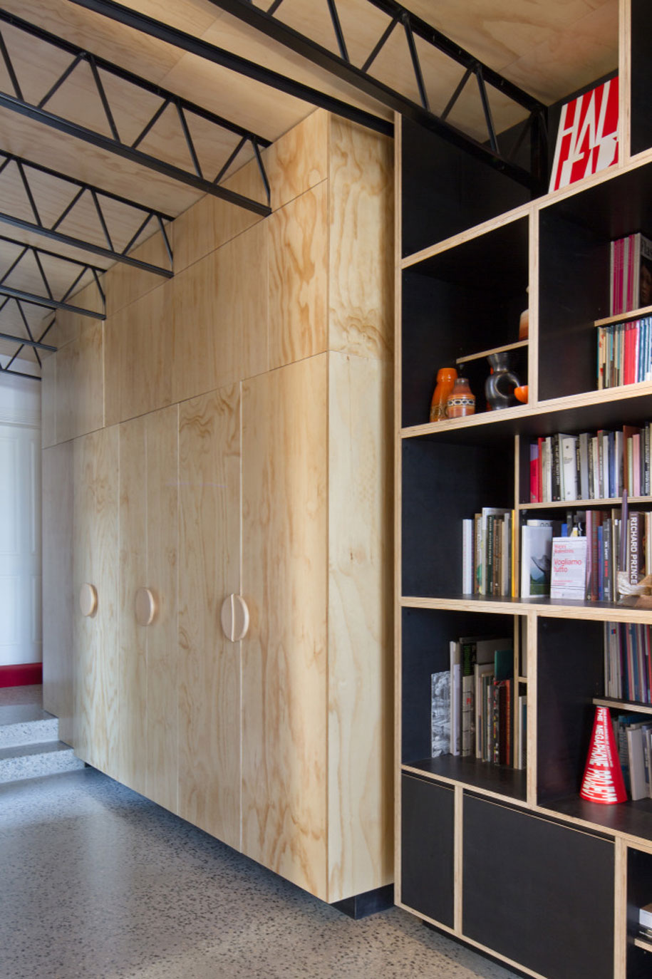
The welcoming nature of the façade is echoed in this space behind. The simple materials, such as plywood, polished concrete and brickwork, allow for a more demure side to the home’s outward personality.
“A lot of the materials we have used are modest, ordinary materials, like plywood, brickwork and industrial trusses, but there’s a bit of extra craft on top, which makes them extraordinary. So there was an investment in ideas and craft rather than ‘stuff’. ”
“The Hello House would not have been possible without the clients to embrace it”
The Hello House would not have been possible without the clients to embrace it, something Khoo identifies: “They are people who embrace ideas, partly because they work with creative people themselves. They like ideas rather than being interested in prestige, luxury or ‘bling’”.
Photography by Nic Granleese
OOF! Architecture
oof.net.au
