It’s an almost immortalised brief to architect: residents of a heritage-listed terrace in an inner-city suburb – most often Sydney or Melbourne – imploring their architect to find a way to fill the house with natural light. And in response, an architect’s ingenuity and skill is tested as they face long and narrow houses with challenging site orientations, parti-walls, heritage associated restrictions, and council regulations to boot.
The residents of Darlinghurst House in Sydney had lived in the former incarnation of the residence some years before engaging architect Brad Swartz. They found him through the widely acclaimed Darlinghurst Apartment (his own) that effectively launched his eponymous practice back in 2015.
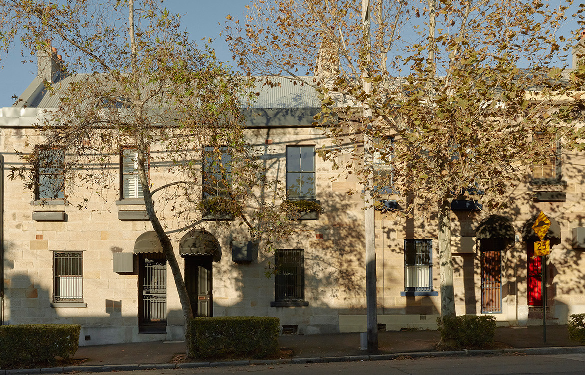
Unsurprisingly, to fill the house with as much natural light as possible was central to the brief, alongside updating and re-programming the 1880s-built terrace to facilitate a modern approach to living and respond to the couple’s unique way of life.
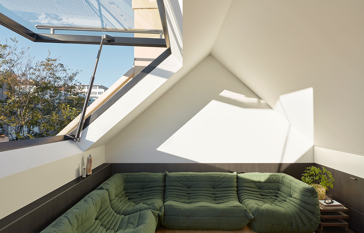
Being restricted to the confines of an existing shell was nothing new for Brad – his portfolio to date shows he is more than adept in this way of thinking. “Instead of being able to build out, it was about trying to create perceptions of more space,” he says. Subtleties in design, such as emphasising the 9.5-foot ceiling heights, shifting elements to allow uninterrupted sightlines and room widths, creating a continuous line of integrated joinery, and a light colour palette have helped Brad and his team achieve this atmospheric shift. These integral yet understated design cues play supporting roles to the two main acts: a large, operable skylight and a central staircase that allows natural light to filter down.
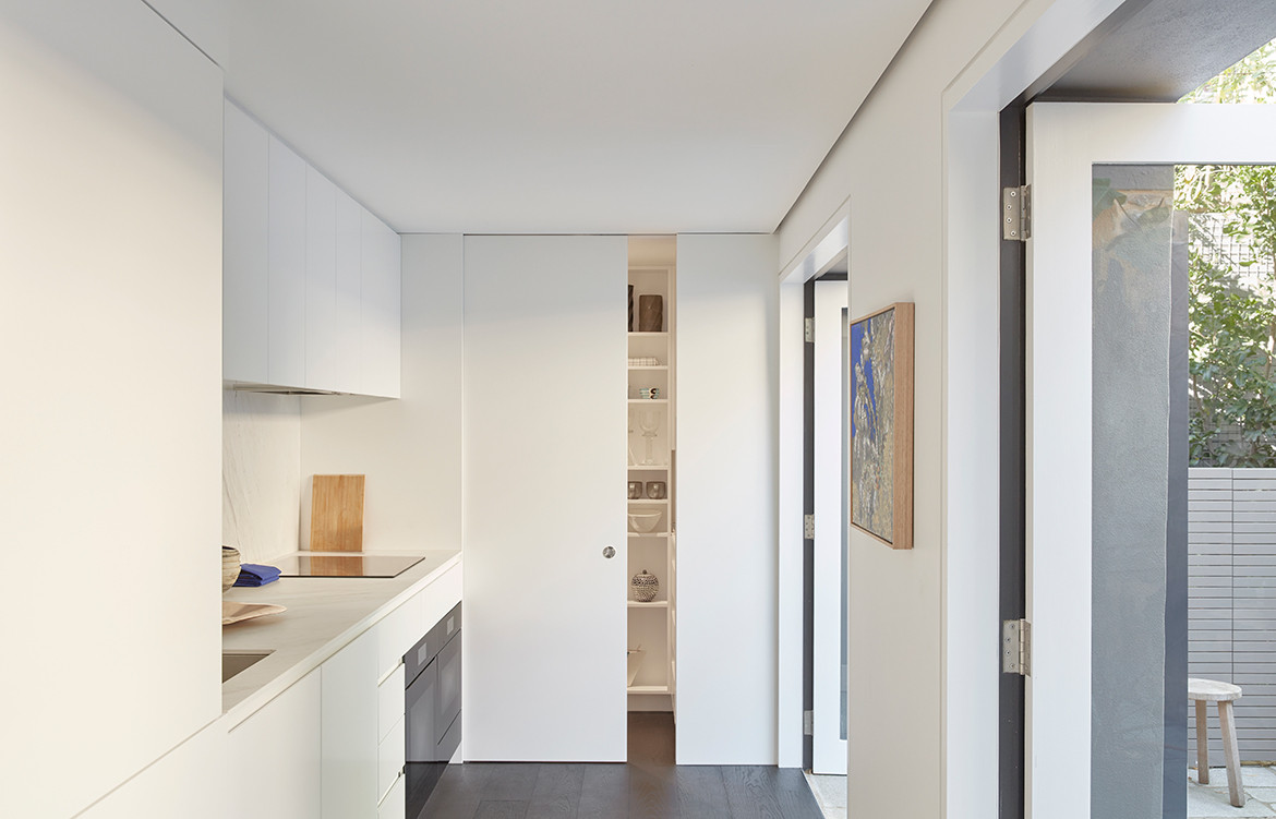
The kitchen located to the rear of the ground floor was plagued by a narrowing site and benchtops on either side. Mitigating the need to extend into the courtyard the architect removed the second benchtop lining the south wall.
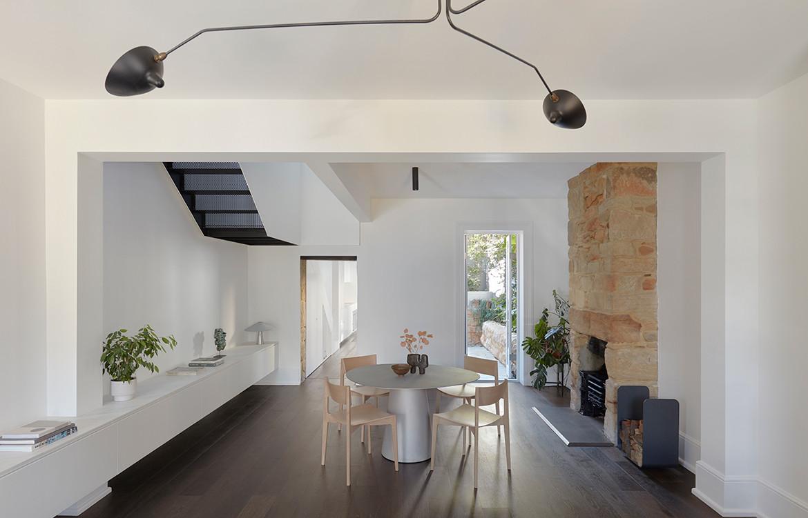
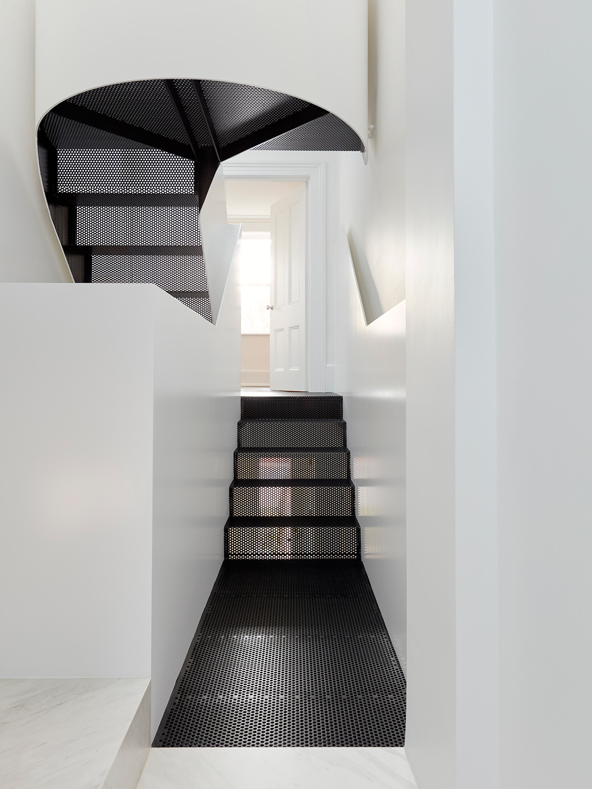
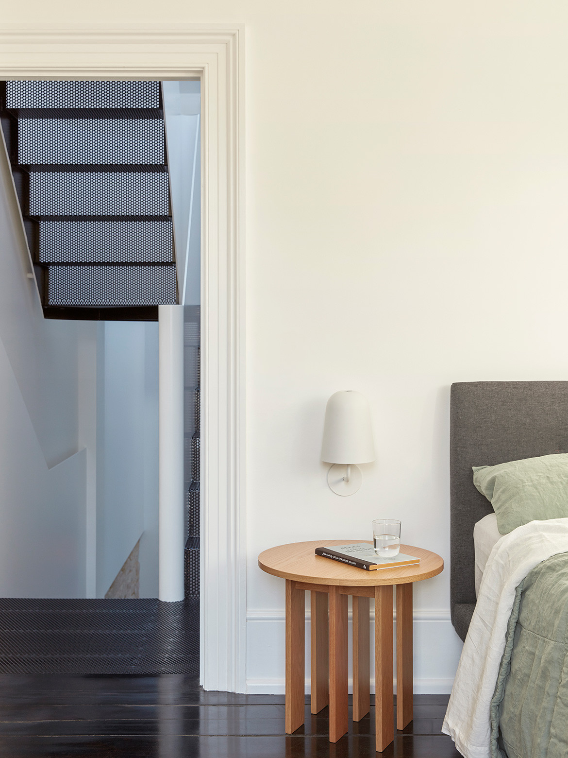
A steel balustrade wraps the stair like a ribbon caught mid-motion, floating down through the centre of the house. It’s a strong sculptural element reminiscent of the work of American artist Richard Serra that absolutely characterises the project. Painted in a white just a touch glossier than that of the walls, the intended effect was to bounce light streaming in from the skylight down through the levels. Moreover, the black steel mesh footing of the stair was a strategic move as much as a visual marker, increasing visual transparency and allowing light to pass through, connecting the rooms directly beneath to the skylight rather than blocking them off. The stair also offers a subtle journey as you climb and descend; on the first landing the height of the balustrade is almost exaggerated at 1300 millimetres, establishing a sense of peace and enclosure. As you reach the attic space, however, the railing height is reduced to the minimum requirement mirroring the openness of the second living space.
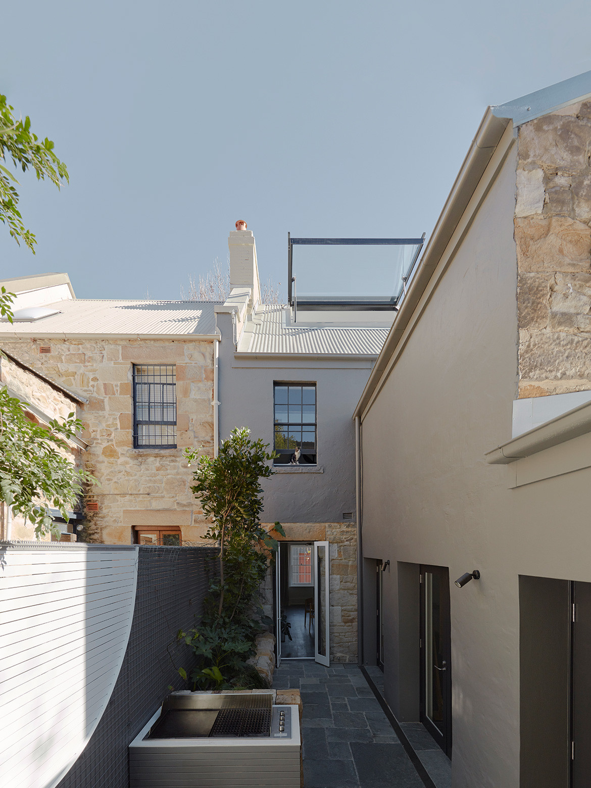
Initially the clients had hoped for a rooftop terrace. The east-west centre axis of the house means the existing courtyard on the ground floor is shaded for much of the year. Unfortunately – though apparently not surprisingly – this wasn’t approved by council as they are careful to protect the visual and acoustic privacy of neighbours. In a conciliatory move Brad designed in the large, fully operable skylight that, when open, could trick the senses into thinking one was outside. “The fixed part gets your light in, but being able to open the whole thing up [makes] the room feel like an outdoor space,” says Brad.
A steel balustrade wraps the stair like a ribbon caught mid-motion, floating down through the centre of the house.
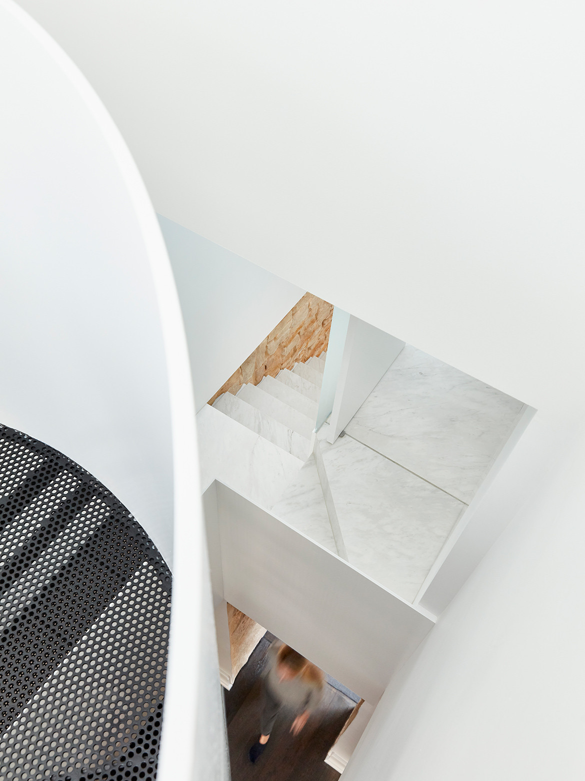
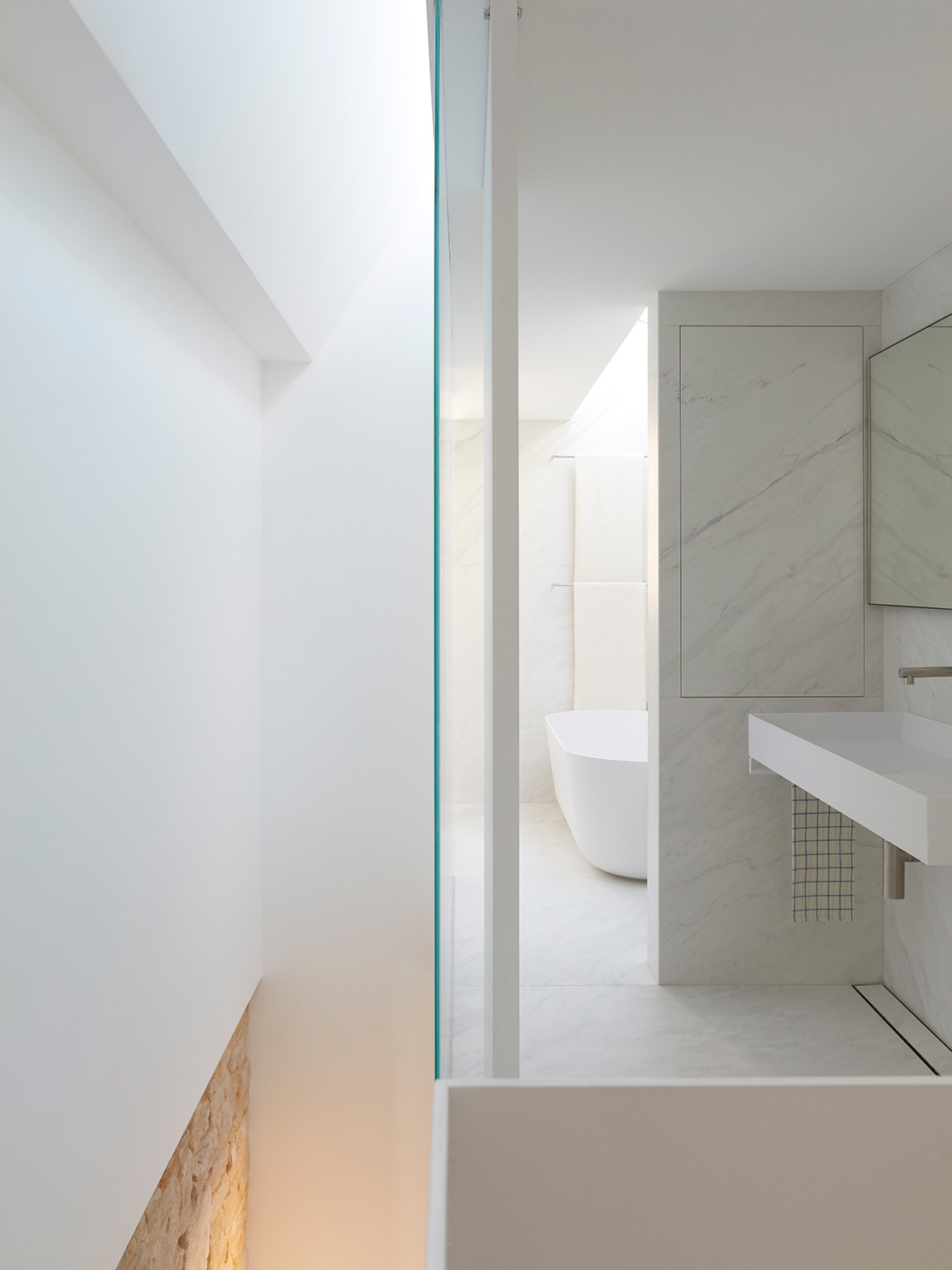
A second skylight was used in the bathroom (formerly a small study) and between the stair and bathroom a frosted glass panel allows the light from each to be shared without sacrificing privacy. “The light from the skylight over the stair brightens up the bathroom and, similarly, the skylight in the bathroom adds more light to filter down the stair,” explains Brad. At just one centimetre wide it also allowed the bathroom a little extra width, compared to a stud wall that would have been at least 110 millimetres wide. As the adage goes: a little often goes a long way.
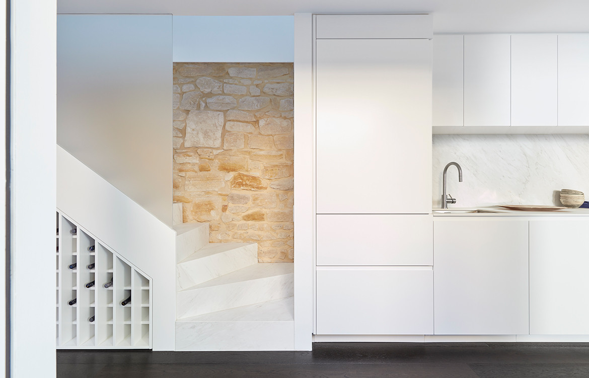
While the second living area is the only addition in terms of square metres, the layout of the residence is drastically different. Mostly so on the ground floor. To begin with, the staircase was originally situated close to the front door, which was a strange progression of entry as it led upstairs to the two private bedrooms rather than deeper into the house to the entertaining areas such as the living, dining and courtyard. It also cut the dining room almost in half. By flipping it 180 degrees, and moving it back and in line with the kitchen joinery, the dining room now feels open and spacious with clear sightlines and a generous ceiling height.
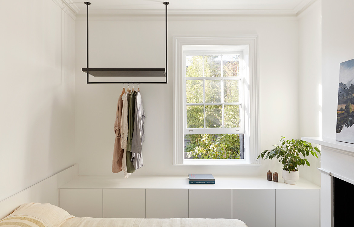
The kitchen located to the rear of the ground floor was plagued by a narrowing site and ill-conceived benchtops on either side. As soon as there was more than one person in the kitchen it would feel overcrowded. This was clearly not an effective use of space. Without extending into the courtyard, which would have resulted in losing valuable outdoor space and access to natural light, Brad responded by removing the second benchtop lining the south wall. This also allowed him to increase the width of the remaining bench from the standard 600 millimetres to 700. Again, a seemingly small alteration made a sizeable impact on the performance of the space, affording extra room for food prep, serving meals, and everyday appliances. Beyond the kitchen is a carefully organised pantry and laundry that had previously housed an exceptionally small bathroom.
As it was the history of the terrace that originally appealed to Brad’s clients it was necessary to update the programme without designing out the site’s past. The colour palette of the original features that have been retained and restored is mirrored in the newer materials to ensure a feeling of visual consistency throughout the residence. For example, the black mesh steel of the staircase seamlessly transitions from the original dark timber floorboards.
“Throughout the whole project there are constant touches. We tried to almost integrate the new interventions with the old interventions in a way that juxtapose each other [without competing],” says Brad. It is this sensitivity to site, understanding of client, and appreciation of a clever programme, that makes this project such an interesting one. Furthermore, its adaptability allows onlookers and visitors to imagine themselves in this space. It treads the line between reflecting its owners’ way of life and appealing to that of others.
Brad Swartz Architects
bradswartz.com.au
Photography by Tom Ross. Styling by Olivia Bossy
Dissection Information
Michelangelo MAXIMUM honed Marmi collection tiles from Artedomus
Sometimes, We Sit Chair by Olivia Bossy
Pierre Jeanneret chair from Composition by Office Elias
Cork Coffee Table from The Vault
Like Butter Table by Olivia Bossy
Armadillo & Co rug
Glass sculptures by Shelley Witters from The Vault
Black vase from Spence & Lyda
Joao Manardu wooden drop vessel from Studio ALM
Alum dining table by Studio Henry Wilson
Comedia del Arte sculpture from Studio ALM
Togo sofa system by Ligne Roset from Domo
Articulated Coffee Table from The Vault
Additional vases from Planet Furniture
Beds from Project 82
Soldier Table from Grazia & Co
Artwork by Liz Alexander
Architectural lighting by Erco Lighting
Plafonnier 3 Bras Pivotants designed by Serge Mouille from Flos
Toio floor lamp from Flos
Mabeo metal light from Studio ALM
Miele ovens and dishwasher
Wolf cooktop from Sub-Zero + Wolf
Rangehood from Qasair
Integrated fridge from Liebherr
Laundry appliances from Miele
Titan stainless steel tapware from Caroma
Falper Quattro Zero basin and bath from Rogerseller
