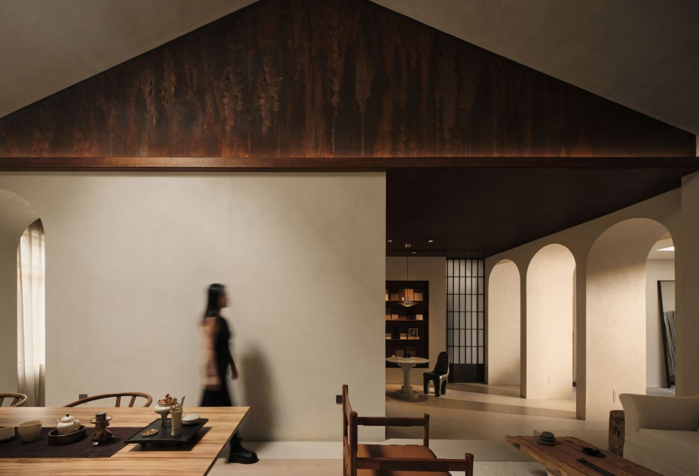
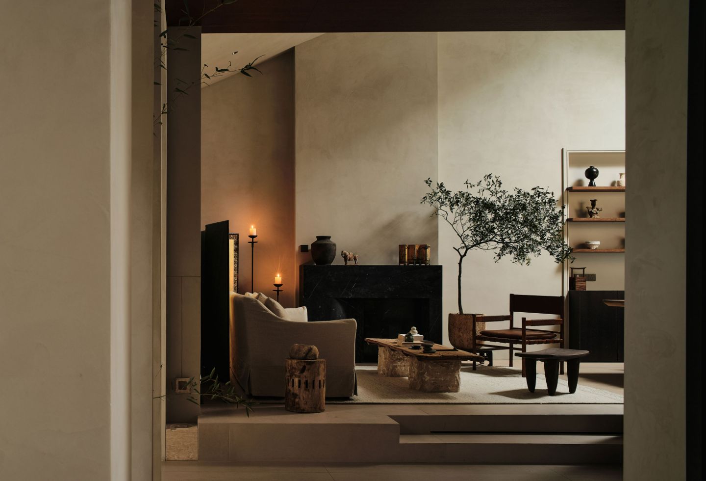
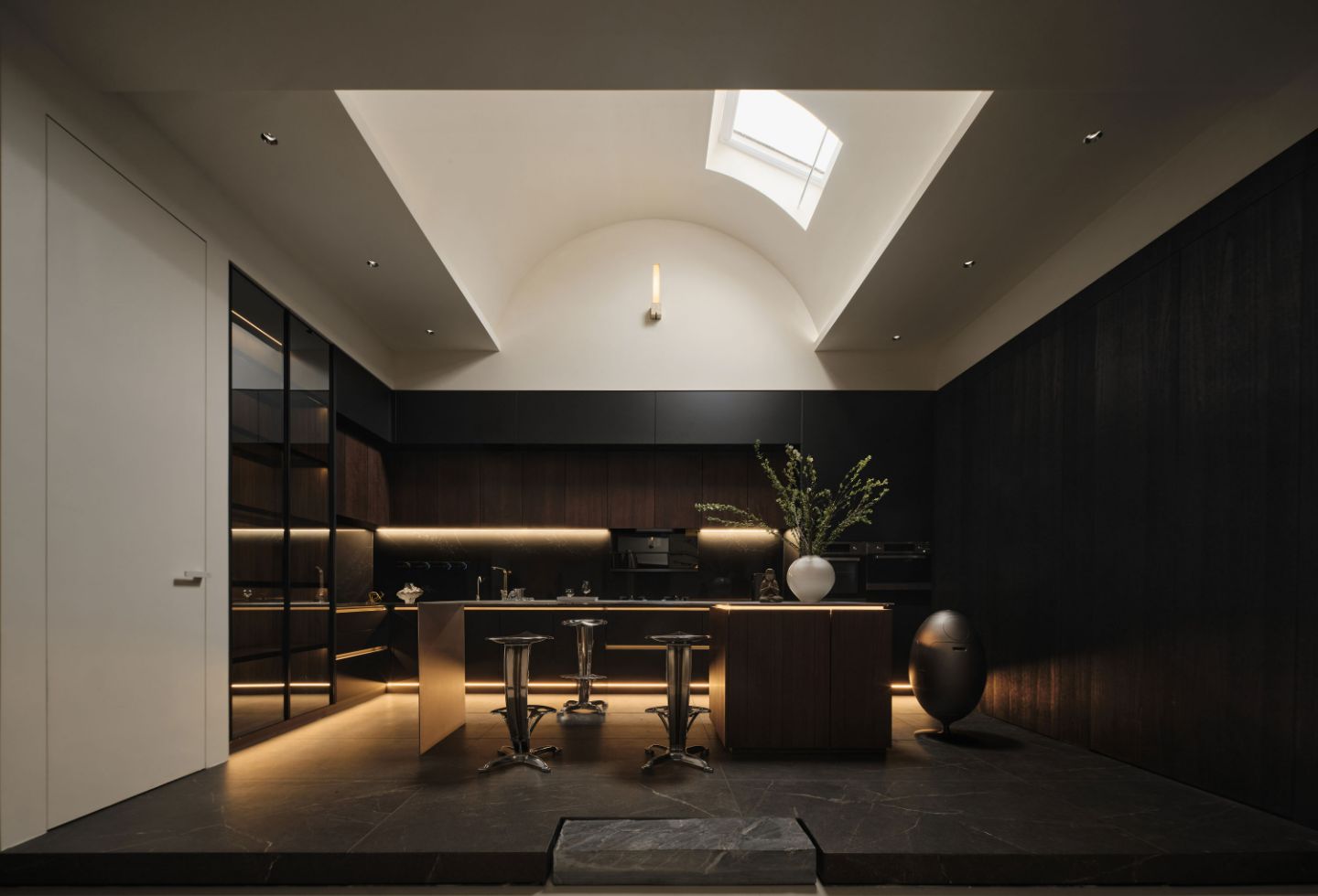
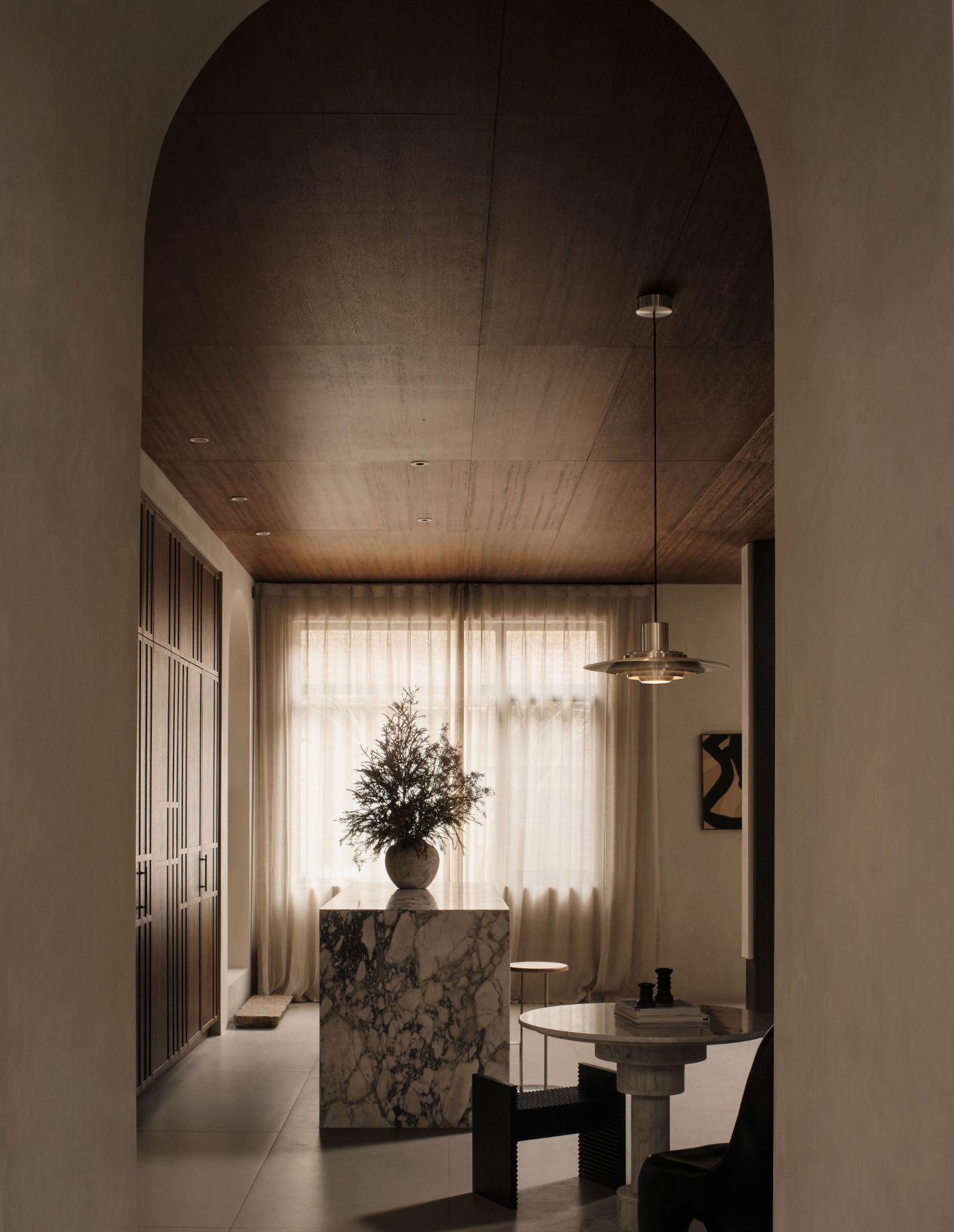
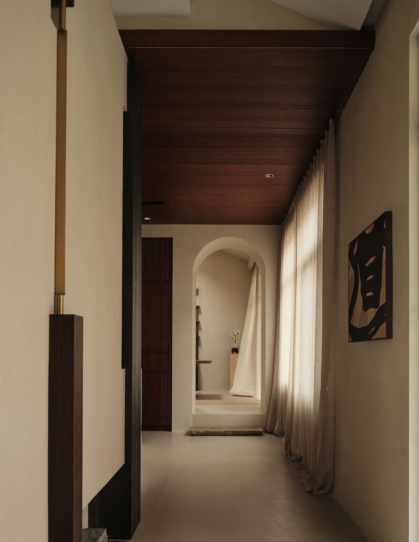
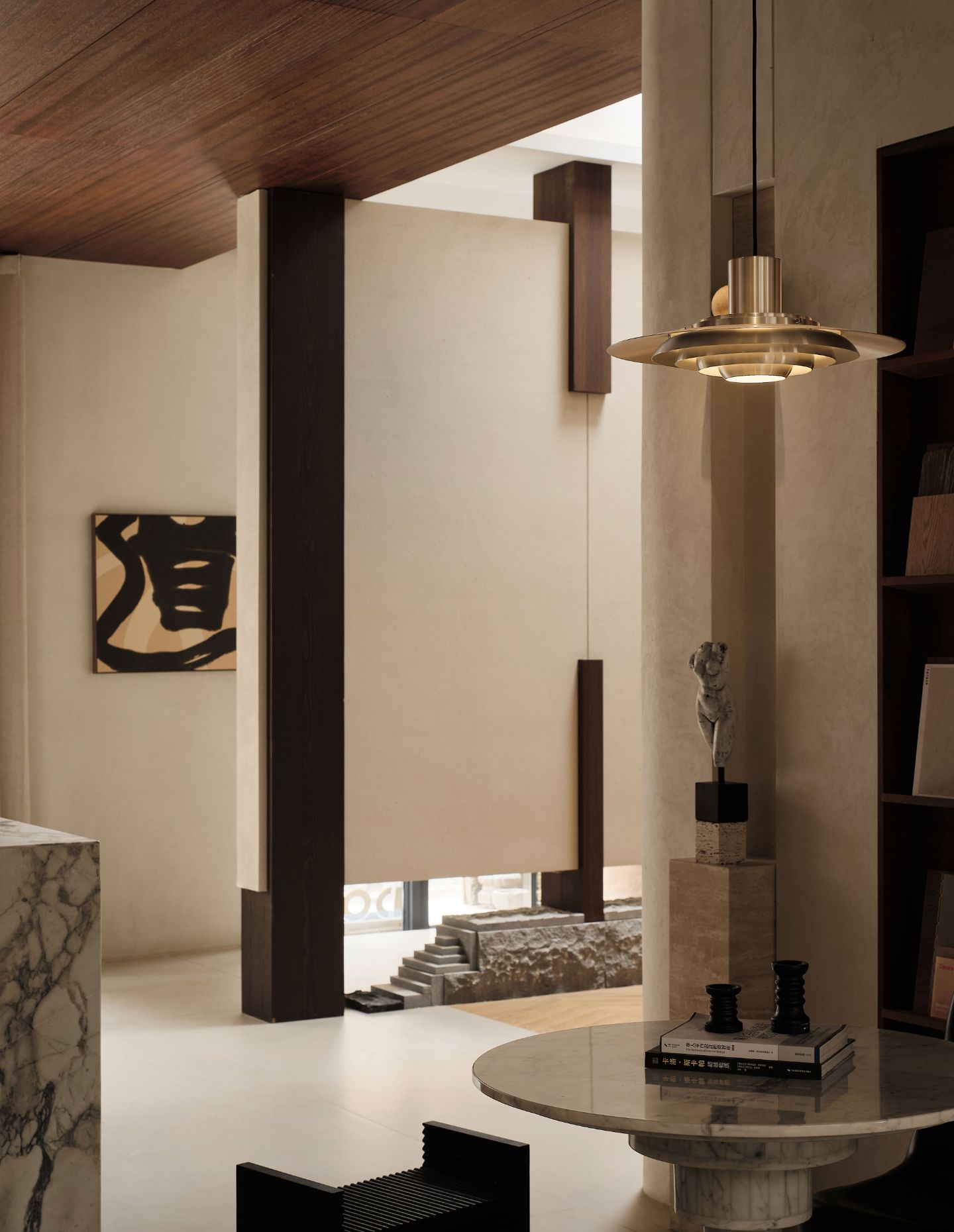
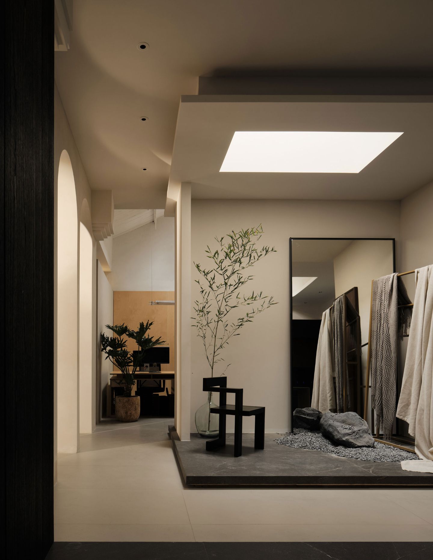
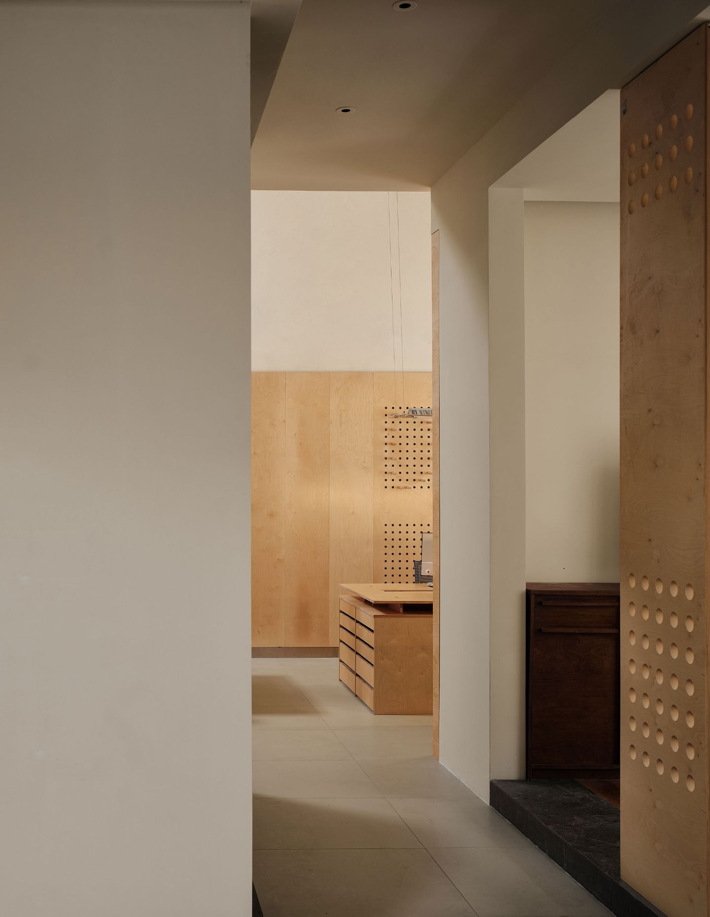
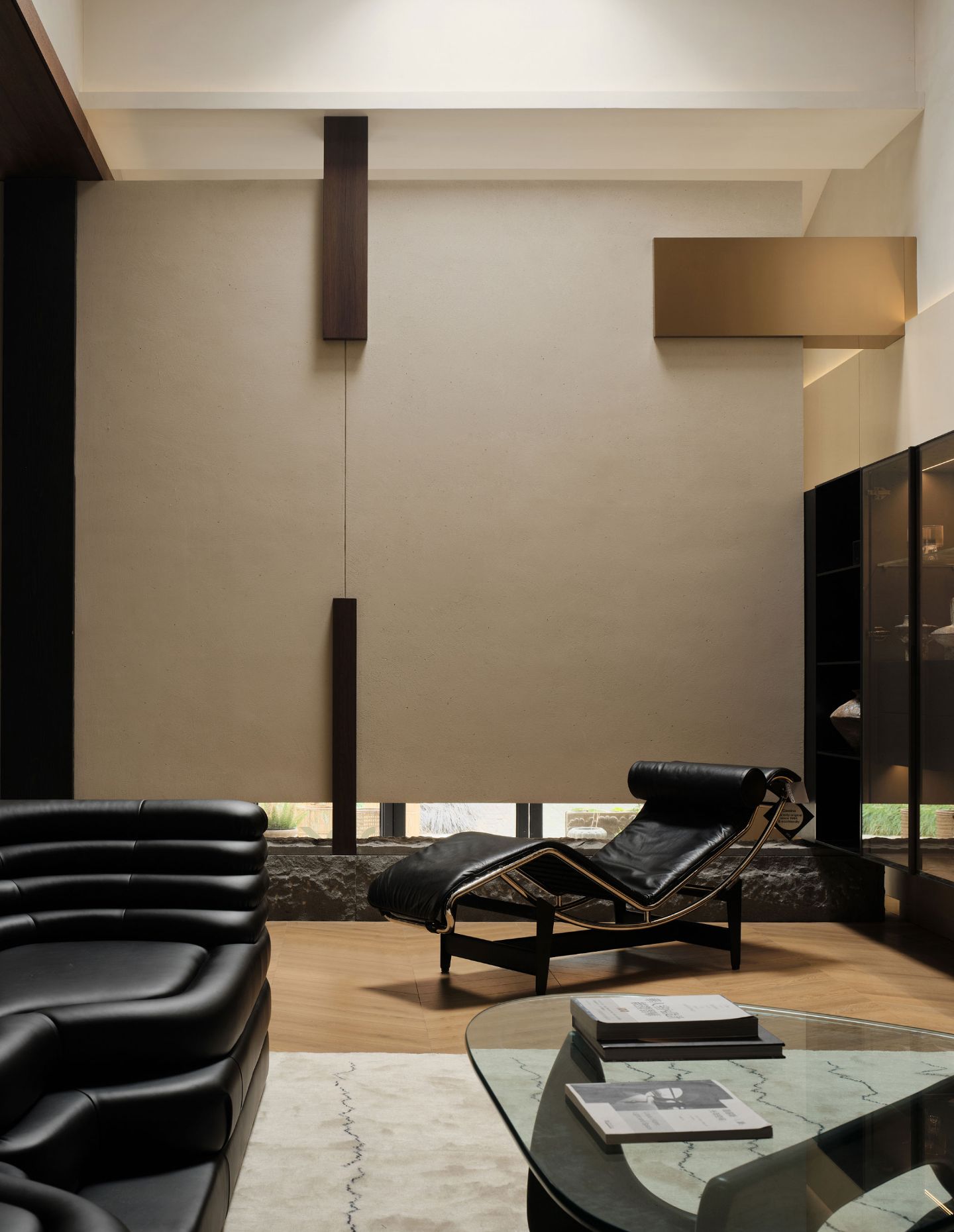
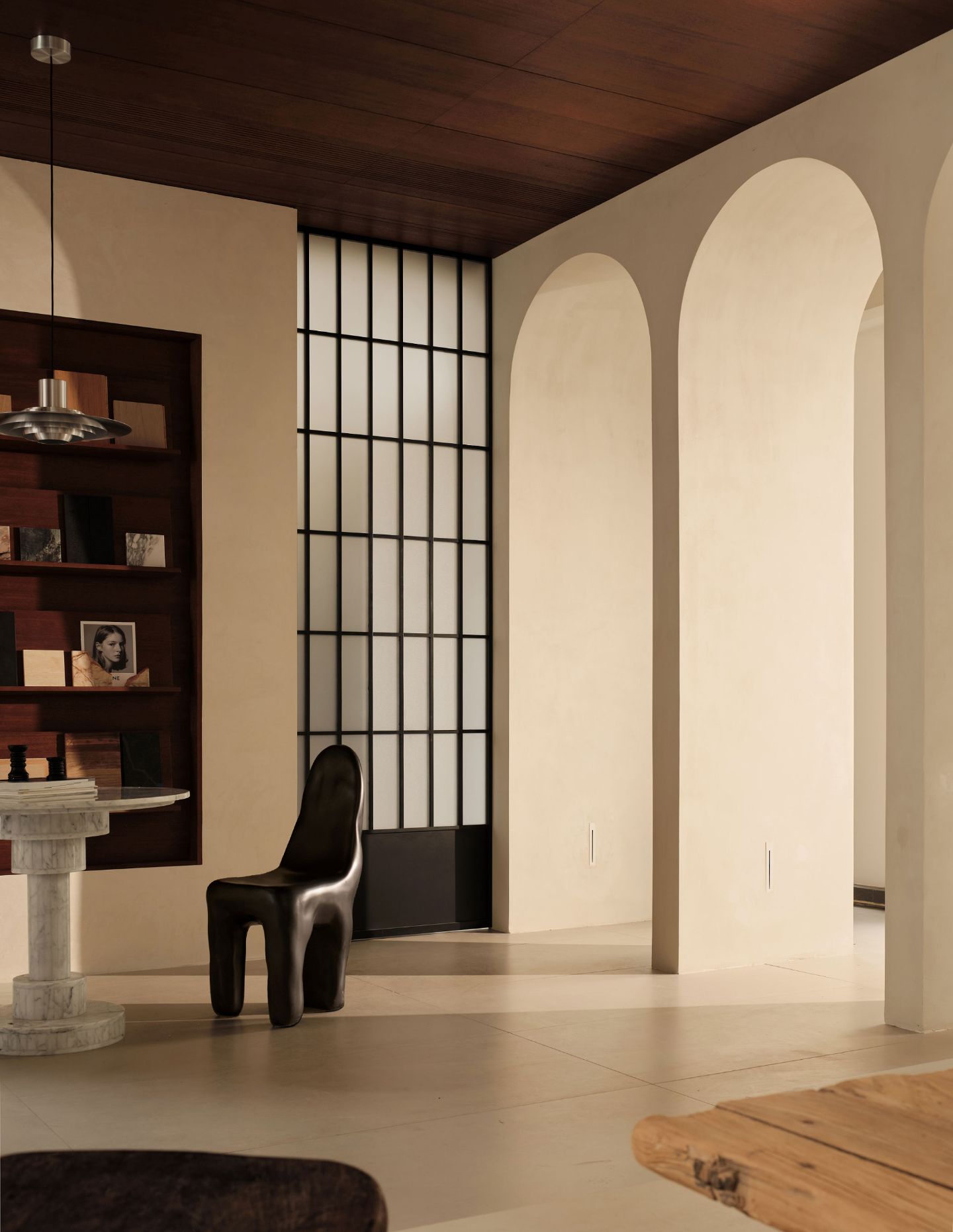
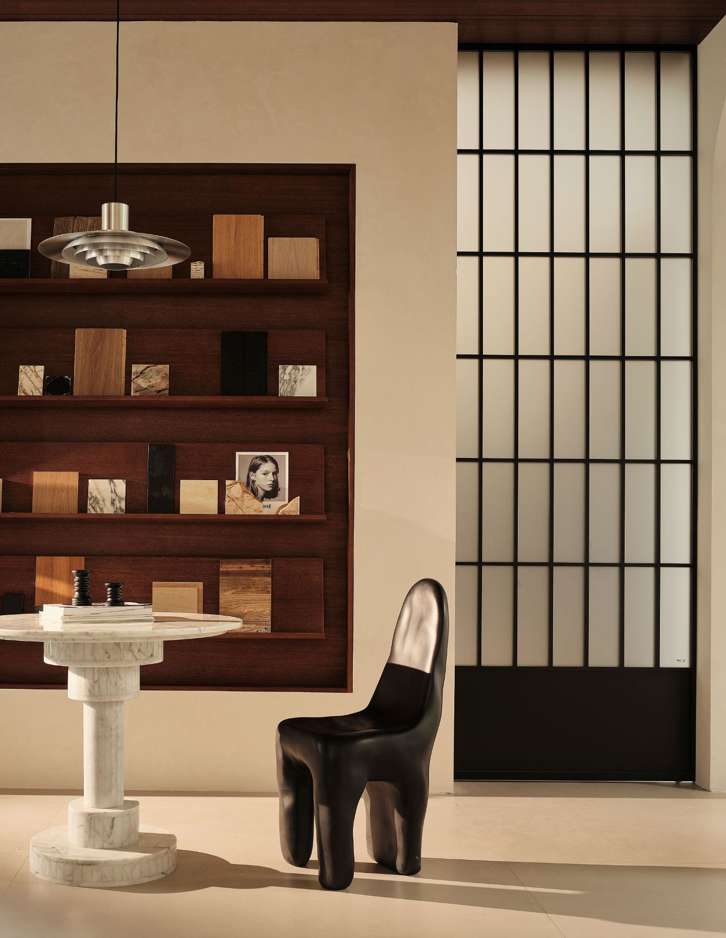
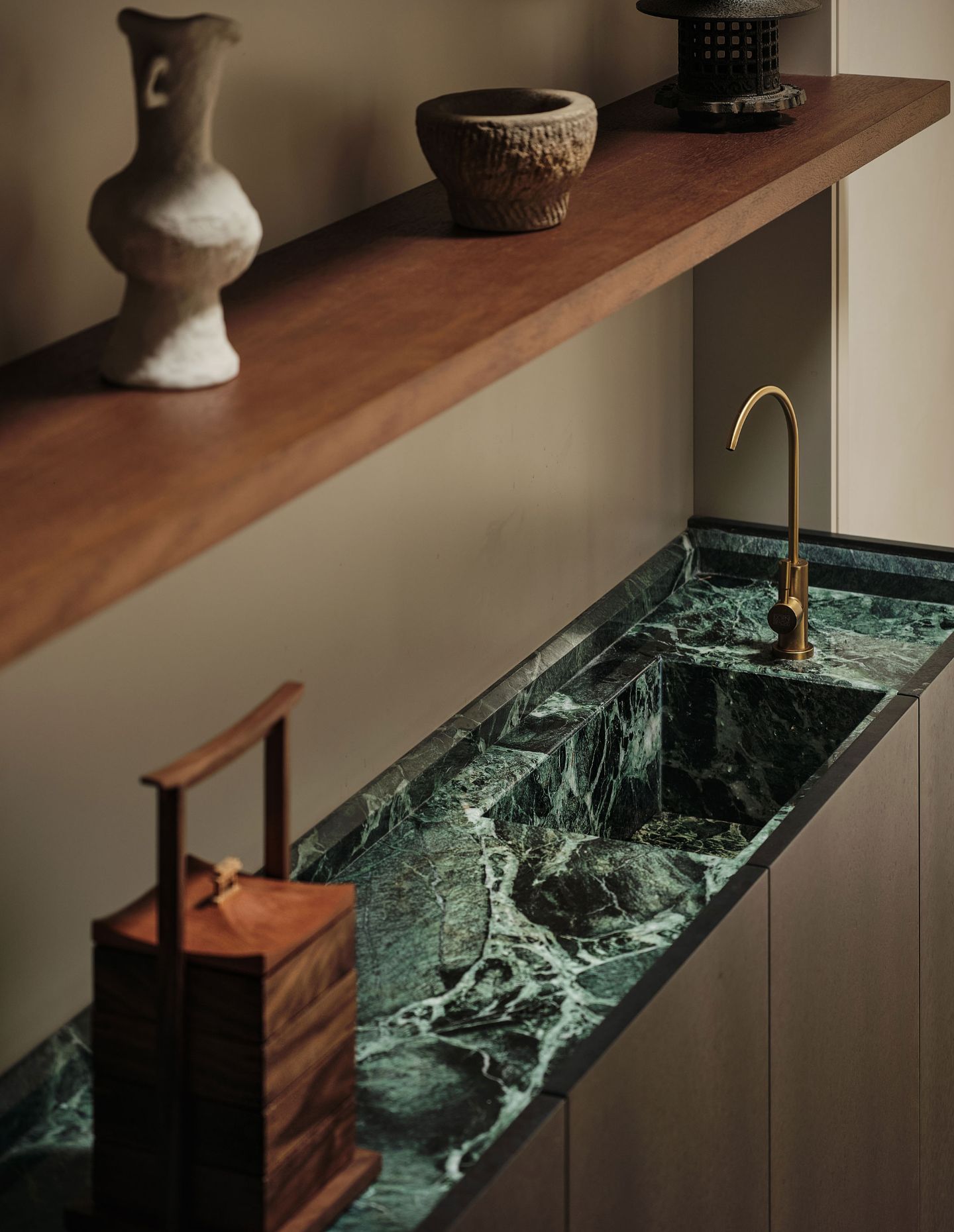
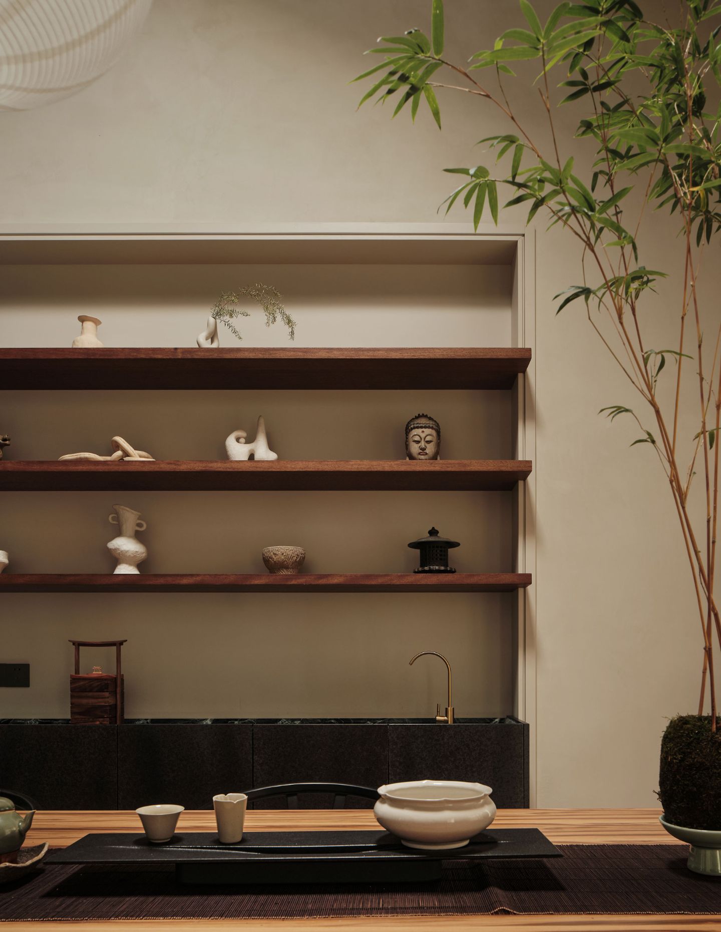
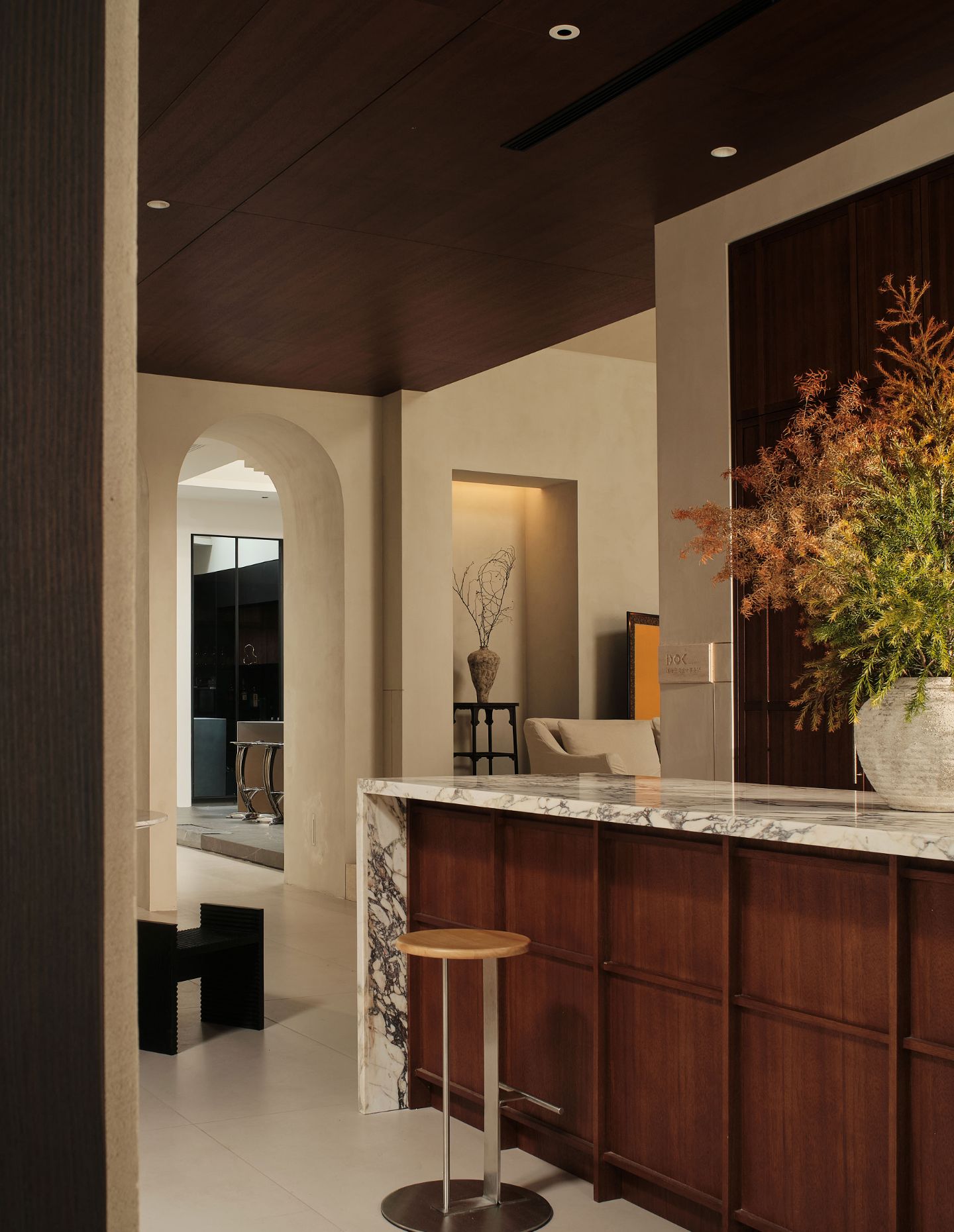
Designers often design with the tangibility of space to the forefront, always aiming to impress clients with the palpable experiences of their work, an experience where they can immerse themselves. Visualising a space can be difficult for the non-professional, and the showroom typology seems a favourite for attempting to convey what a designer can achieve. It perhaps offers an answer to the question of why these physical spaces often take their cues from both residential and commercial design styles. More specifically, DOK Design has created an interior which allows their clients to experience firsthand the richness of organic materials, natural light and refined detail in a series of rooms which also includes the designers’ very own studio workspace.
Positioned in Jing’an District, Shanghai, China, you will find the showroom and studio of the eclectic DOK Design. The firm has designed a space around an array of core pillars – namely time, emotion, light and shadow, to name a few. “Our surrounding environment organically establishes a kind of spiritual connection with metaphysical consciousness through various forms, such as spatial constructions, the rendering of specific atmospheres, and the reshaping of tactile surroundings,” says the team at DOK Design.
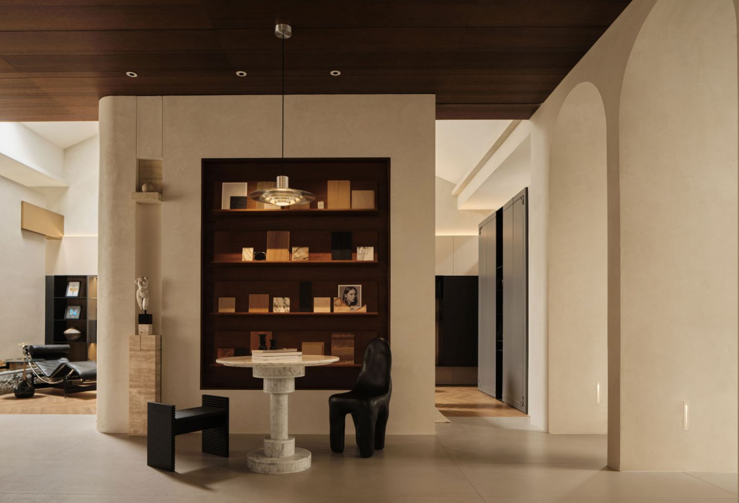
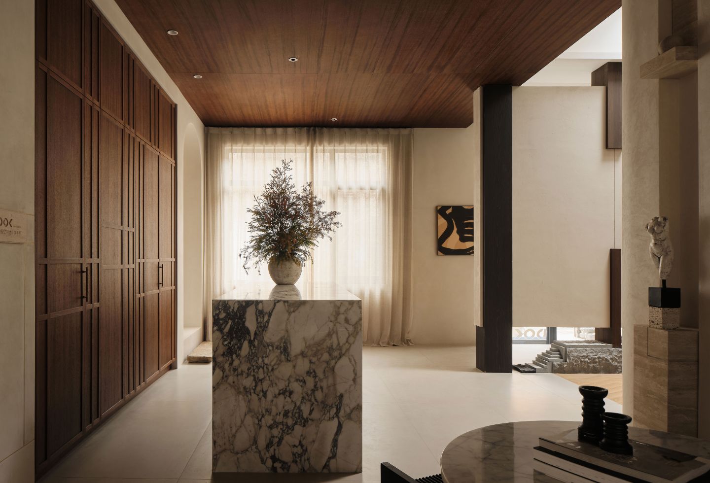
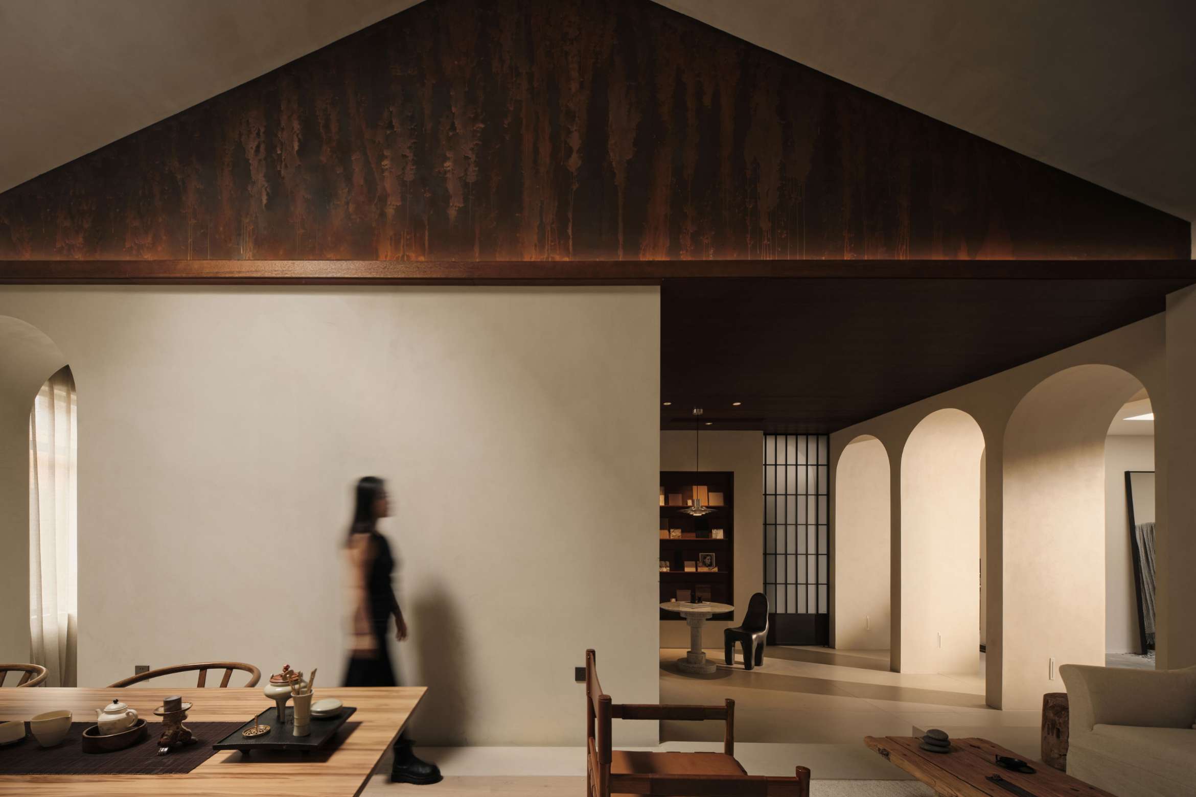
Located within an original textile factory, the existing framework set the scene for the reconfiguration while also serving as a constraint. The floorplan spans 320 square metres and includes a reception, negotiation room and multiple displays such as a living room, various dining rooms and a tea-time reception hall. “Entering at the east end of the space, the path of circulation mirrors and expands the layout of the interior – its meandering, winding trajectory eventually opening up to a more free, forward movement,” explain the designers.
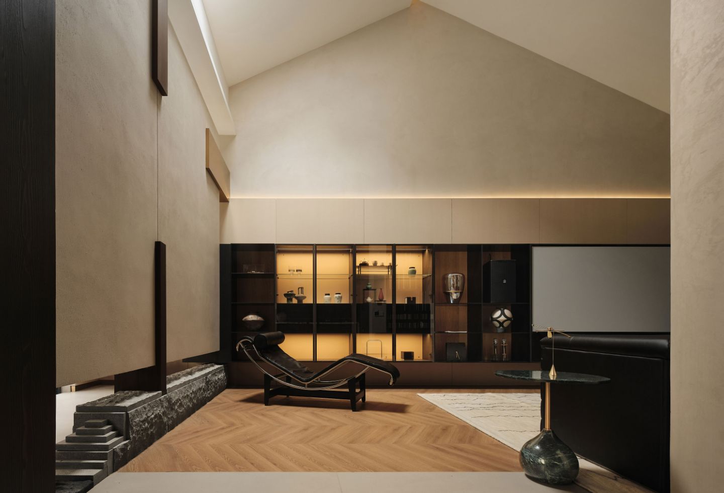
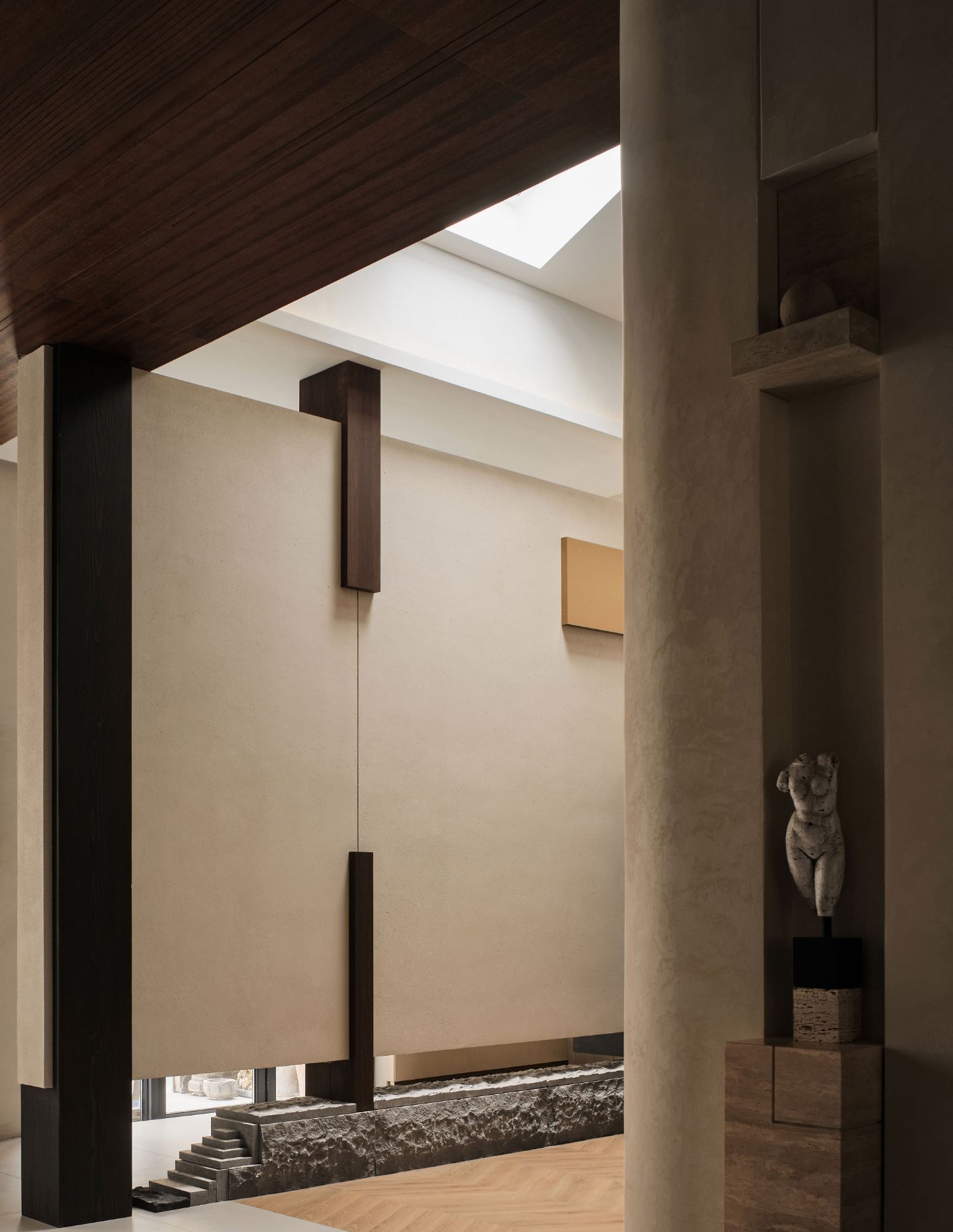
Upon entry, a solid wall is orientated at the entrance to obscure direct views of the interiors and allows the creative mind to wonder what exists within, inviting visitors to step inside. The layout is formed by the intersection of horizontal and vertical design features, with gaps at its upper and lower portions. “The sculptural carved granite at the bottom of the wall recalls the freedom and exacting craftsmanship of Chinese brushwork, while referencing the natural relationship between mountain peaks and rushing rivers,” says the team at DOK Design.
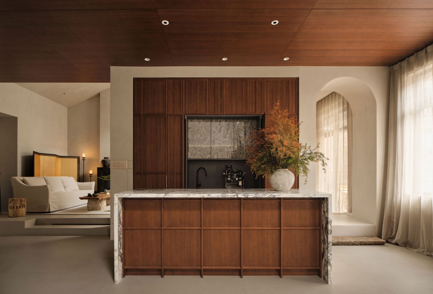
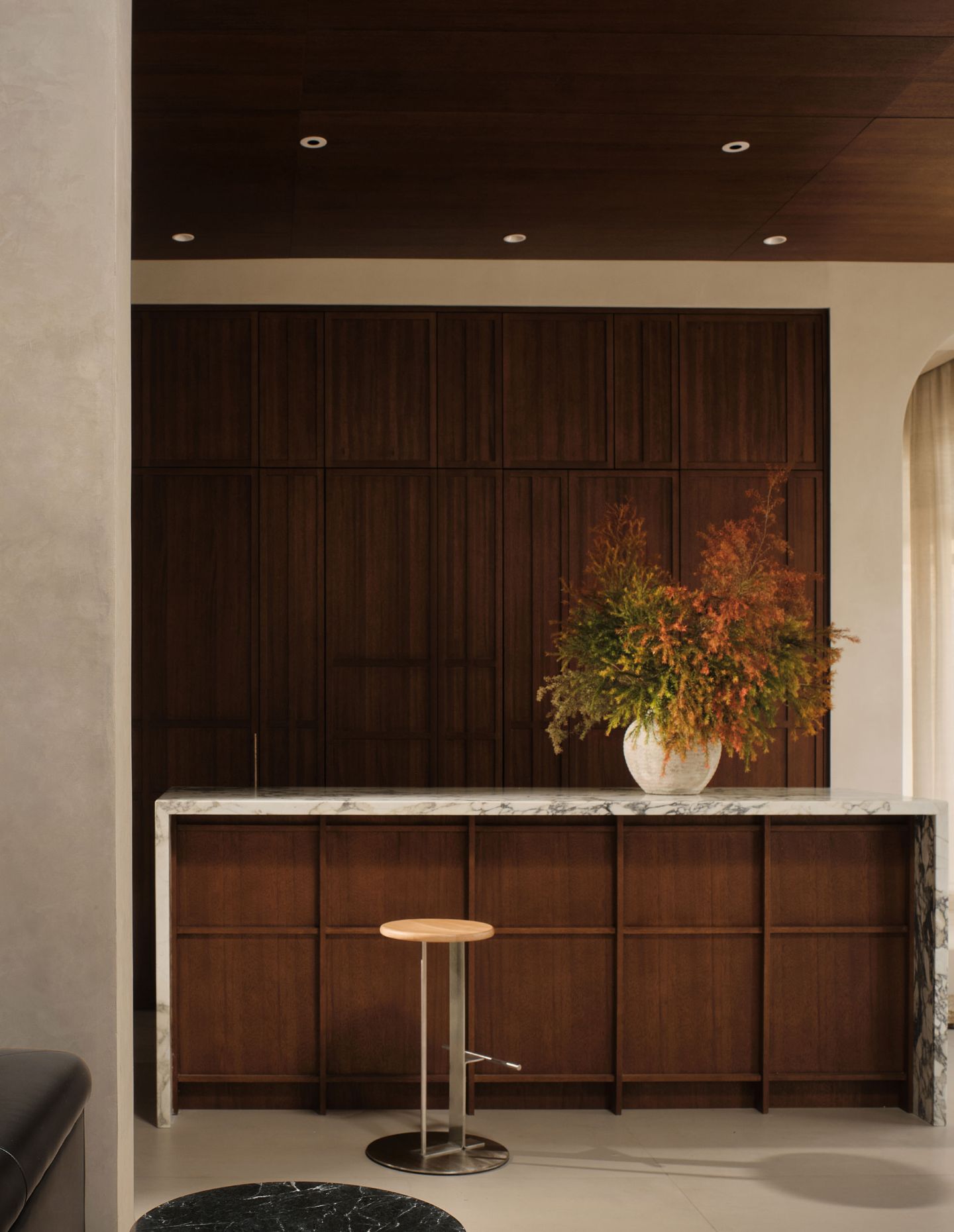
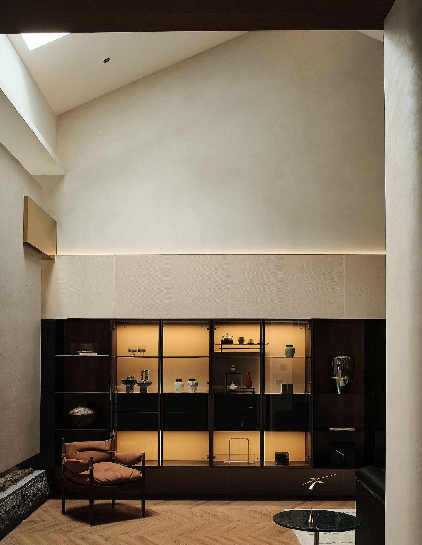
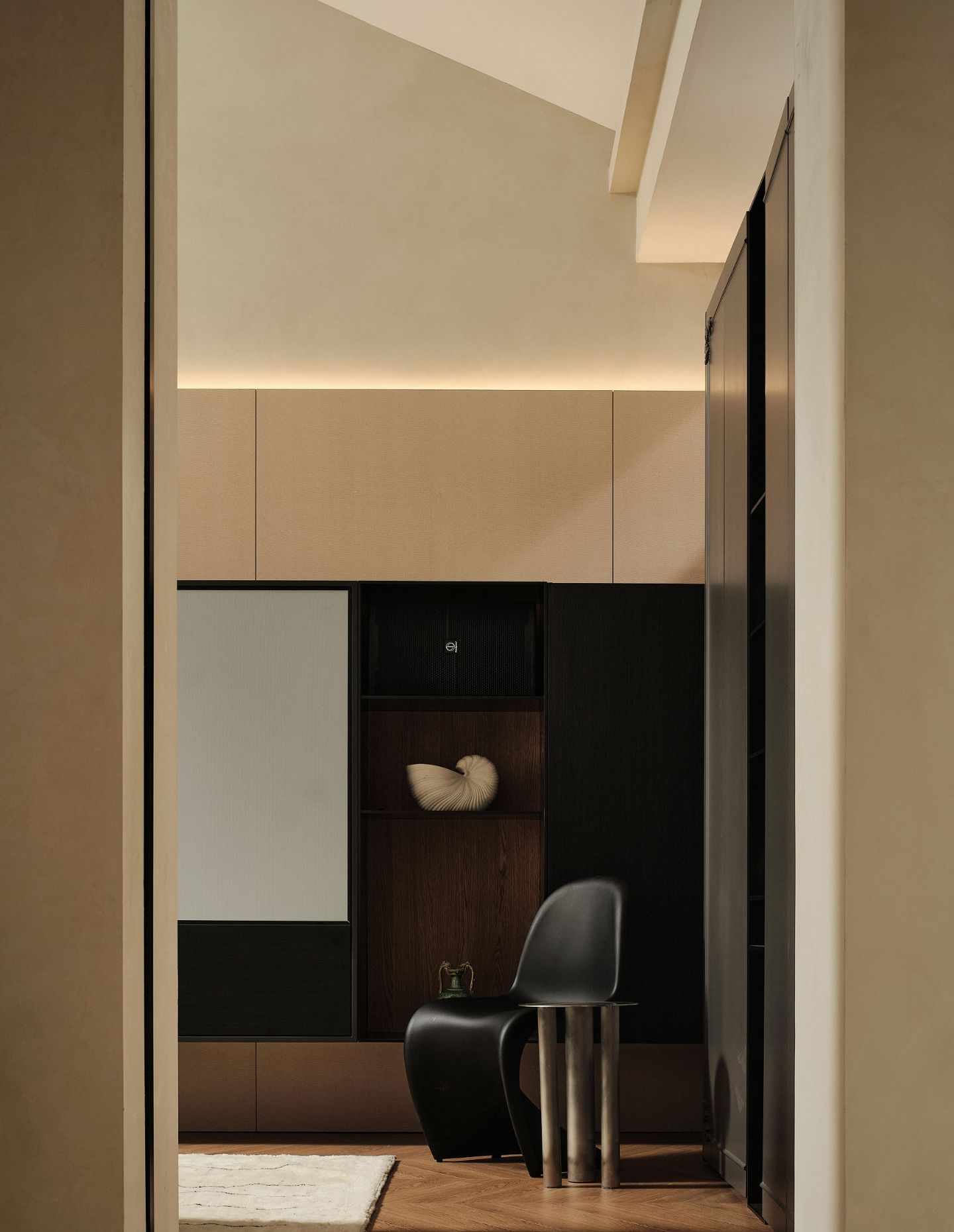
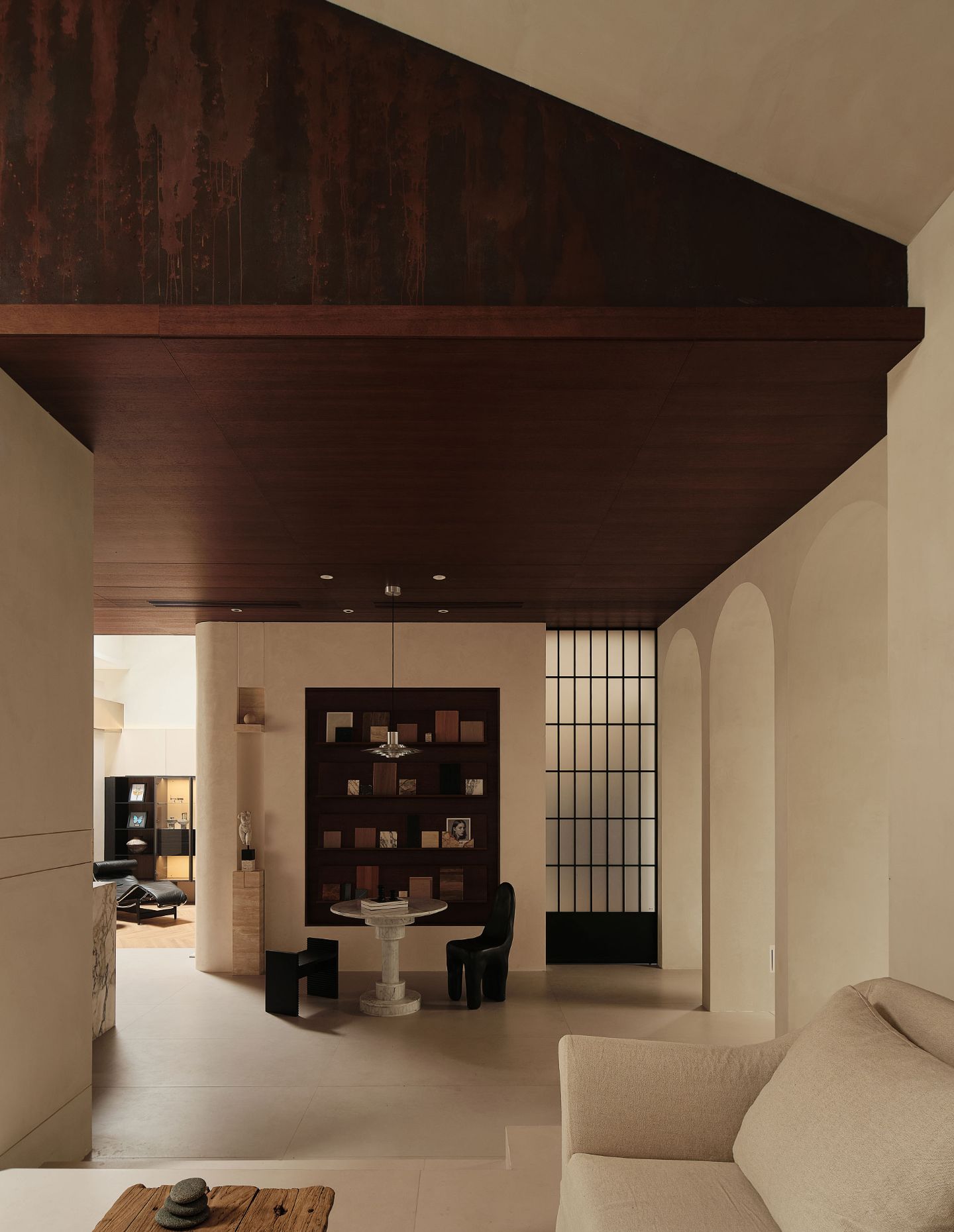
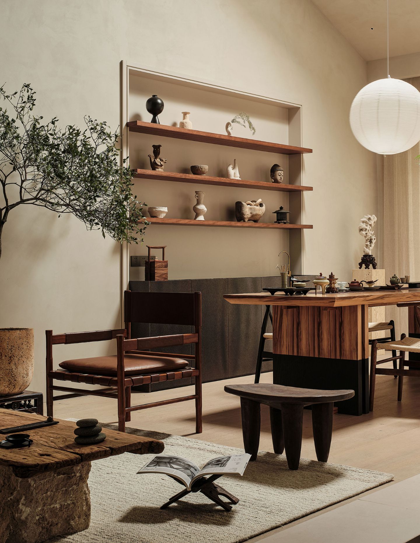
Within the home displays, furnishings and fixtures imitate the scale of the room. “Here, cabinets of a variety of forms and materials are displayed within, in addition to a flexible arrangement of furniture which presents potential spatial organisations to visitors.” Overhead, the ceiling is set on an incline and echoes the original shape of the roof, maximising headspace while retaining the original skylight and allowing natural light infiltration.
