Share housing might be deeply entrenched in memories of a living standard some of us would sooner forget. But the essence of living together in a space designed to encourage the sharing of time, spaces and facilities is altogether a positive and nourishing means of living.
That explains why some prefer to live en masse in retirement villages and how apartment blocks often evolve into microcosms of community. We like to be alone, but we also like to be together. And when populations abandon the village to flock towards an often inhuman-scale city, holding on to some element of that neighbourhood structure – even one so small as contained within the same property – that can only be good for us.
This is the understanding that informed the design of and renovation to an existing Edwardian terrace from Foomann Architects. An emphasis of the communal was inherent to the site from the very beginning. The architects are long-standing friends with the soon-to-be occupants, who rallied together artists and furniture-maker friends to collectively advise on the design of the site and work on custom pieces used within.
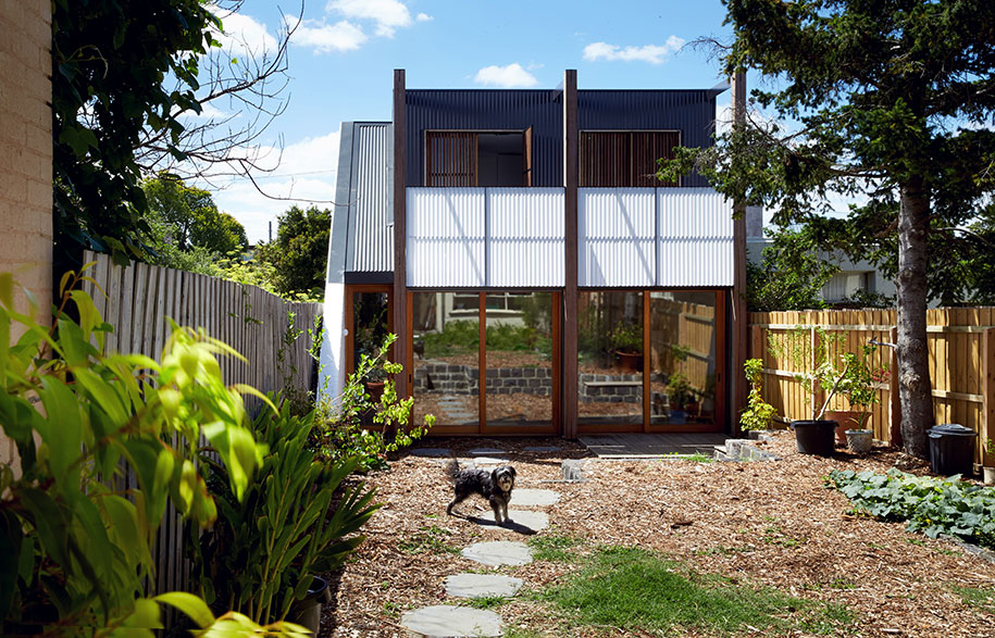
The team from Foomann helped to search for and find the perfect site. The site itself held a humble two-bedroom home in good condition, which would be saved and tenanted out to friends. Meanwhile, the farther carport space would be transformed into a second standalone structure, separated from the main house by an intersecting garden, and offer expanding flexibility to the original plot of land.
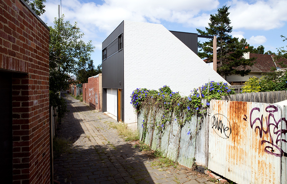
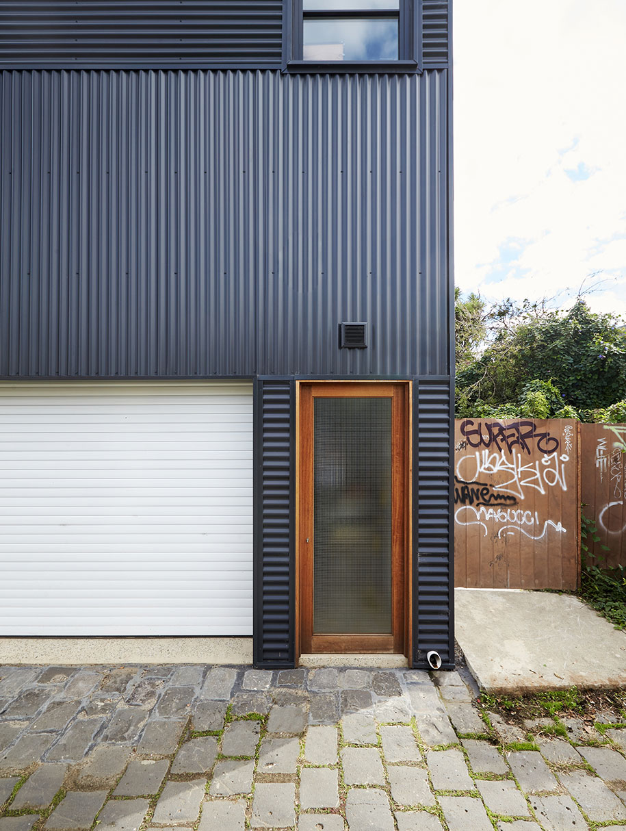
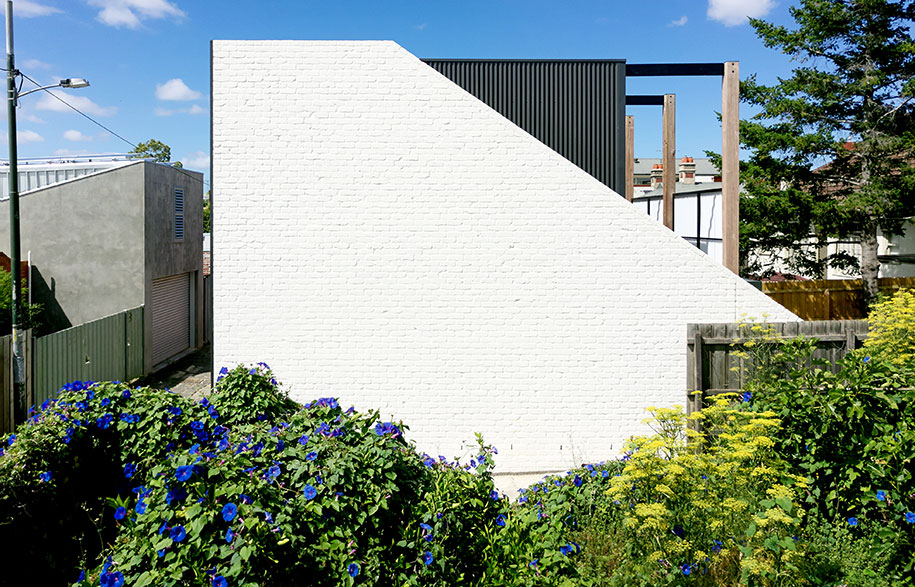
The secondary structure laces together different Australian architectural typographies to form a beautifully balanced relic of both old and new. The brief was to create an economic structure using affordable, good quality materials. Corrugated iron cladding across the front and back of the structure nod to the nation’s rugged past. The cross-directional placement of sheets exaggerate the optical dimensions of the building all the while creating a modern, tapestry-like façade. Balancing the symbolic weight of this material, the warehouse presence of the site – structural bones on display – helps to create an ultimately contemporary building.
From the back laneway perspective, the secondary structure is quite closed off – harsh even – with a distinctly industrial feel. However when approached from the main house across the garden, the new structure is eased, resembling closer to a welcoming cottage.
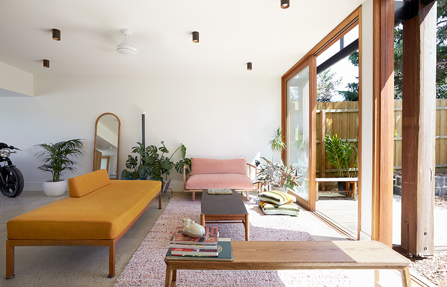
Floor to ceiling sliding glass doors illuminate light back over the garden and visually extend the interior space to the outside. The inclusion of different toned timbers help to merge the built space into the surrounding native plantings, imitating the nearby trees while nicely offsetting the strict lines of the iron roofing.
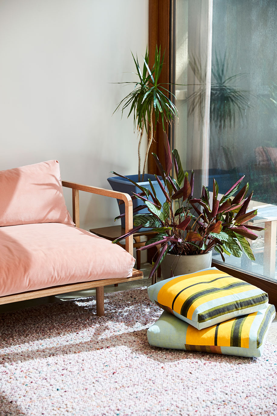
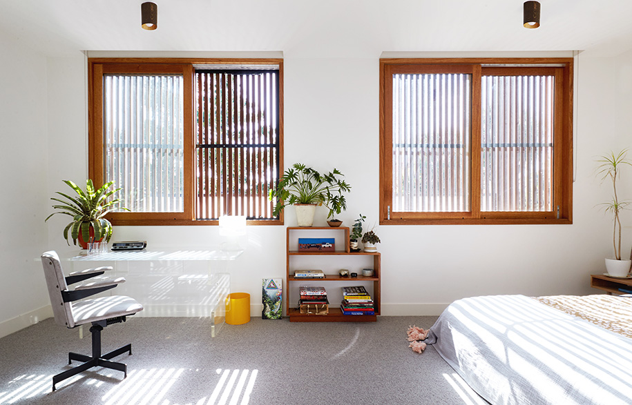
Likewise, the interior is a soothing mix of mid-century inspired contemporary pieces. Lush rose velvet and sunburst orange linen sofas in elegant timber frames delineate the space. Minimal art and wall decorations help to extend the height of the rooms and ensure a sense of openness. This does not mean though that the space is without interest, with flourishing deep green potted plants casting lively shapes against the white walls.
The intention is to fully capture the potential of the site, to enable for friends to visit and to stay – to live together. Outside of the bedroom spaces, the houses, garden and living spaces are designed to be used and shared between all occupants. A clever response to increasingly unaffordable cities, or an elegant means to live a life fulfilled not only by spaces but by the people within, the rejuvenation of this site marks the evolution of modern living – one which no doubt will be increasingly common in future years.
Foomann Architects
foomann.com.au
Visioneer Builders
visioneer.com.au
Words by Ella McDougall
Styling by Esme Parker
Photography by Willem-Dirk du Toit
