It is a cloudless, blindingly hot morning where the sun’s brilliance throws defined shadows on walls and the heat dissolves distant forms into mirages. I’m standing outside Fade to Green with architect Han Loke Kwang, founder and principal of Singapore-based HYLA Architects, observing one of his recently completed houses designed for a couple and their three teenage children. The weather is typically tropical and barely bearable but it presents the perfect opportunity for the house’s properties to shine.
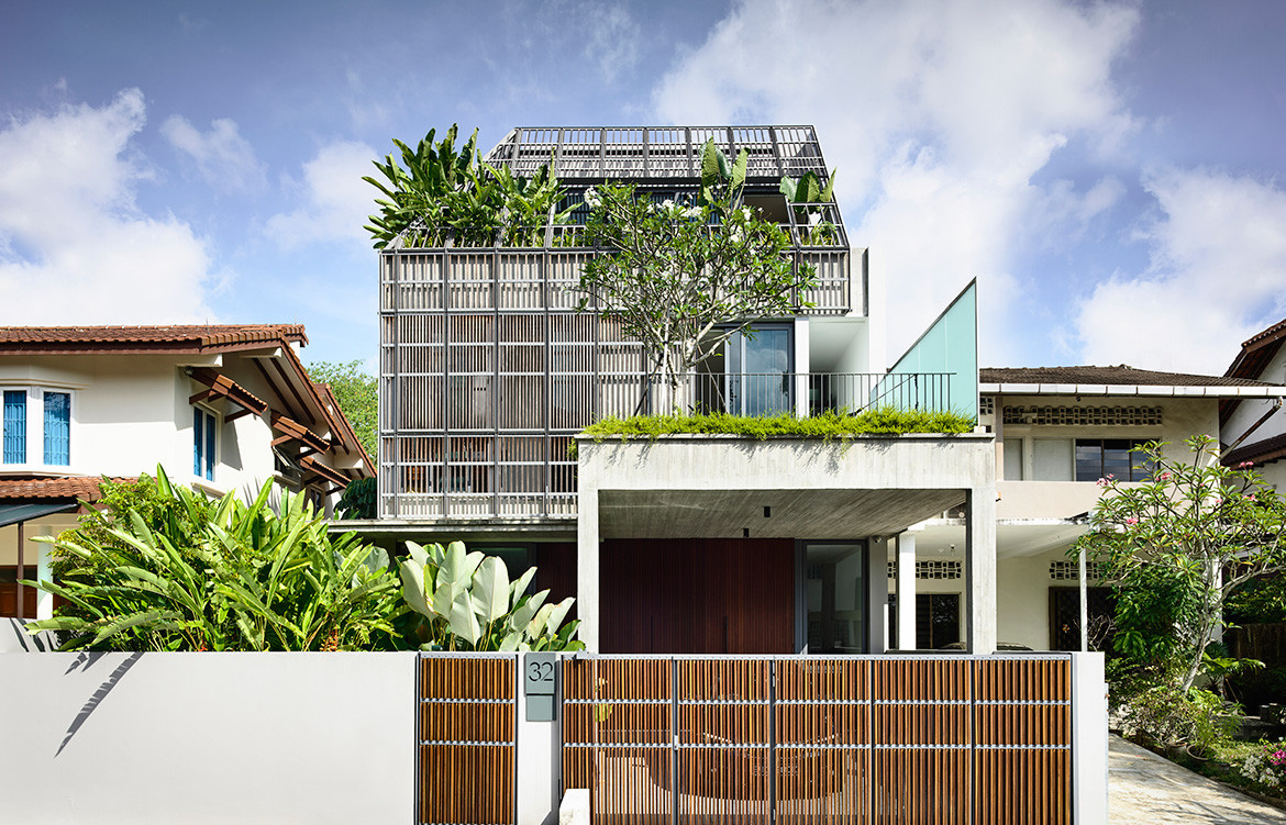
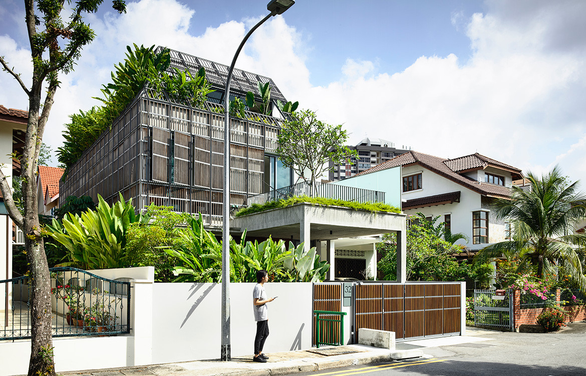
The simple, two-and-a-half-storey structure is clad in a trellised skin aged to a chalky grey and the sunlight casts graphic shadows against the off-form concrete shell against which timber strips are layered to bring out depth and detail. On the first storey, the verdant planting is mirrored at the house’s attic with greenery poking, pushing and feathering out of screens and balconies. It’s a pretty spectacle, though not in the conventional sense of pristine whitewashed walls, ornate grilles and terracotta roofs capping neighbouring houses.
“It contrasts with most of my other houses that are more streamlined and straightforward. In this house, both nature and architecture have a very informal feel; it’s not so manicured.”
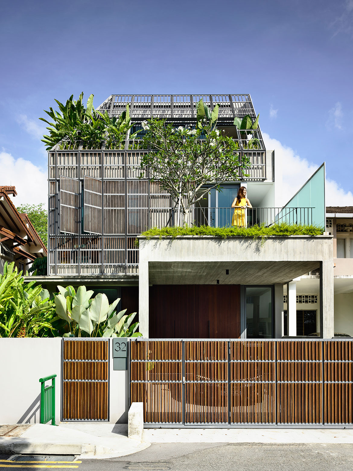
The aesthetic here is more raw and imperfect, matched by the insouciant proliferation of plants. It’s a departure from the œuvre of HYLA Architects. “It contrasts with most of my other houses that are more streamlined and straightforward. In this house, both nature and architecture have a very informal feel; it’s not so manicured,” says Loke Kwang.
He was inspired by vernacular houses homeowners built for themselves in south east Asia that use tin roofs and aged timber, with plants growing around them haphazardly. “For this project, our idea was to blur the distinction between architecture and nature, but we didn’t just do this with space. We did this with the building form in a way that nature appears to be almost taking over the building; nature interweaves with the skin,” he elaborates.
The assimilation of nature is a persistent theme in Loke Kwang’s designs. But while the concept usually presents as internal courtyards concealed behind reticent façades – fabricated as defence mechanisms from the sun and prying eyes, the screen here bestows upon the house a more open character. Playing diverse roles, it filters views and light while allowing the house to breathe.
Assimilation of nature is a persistent theme in the work of HYLA Architects.
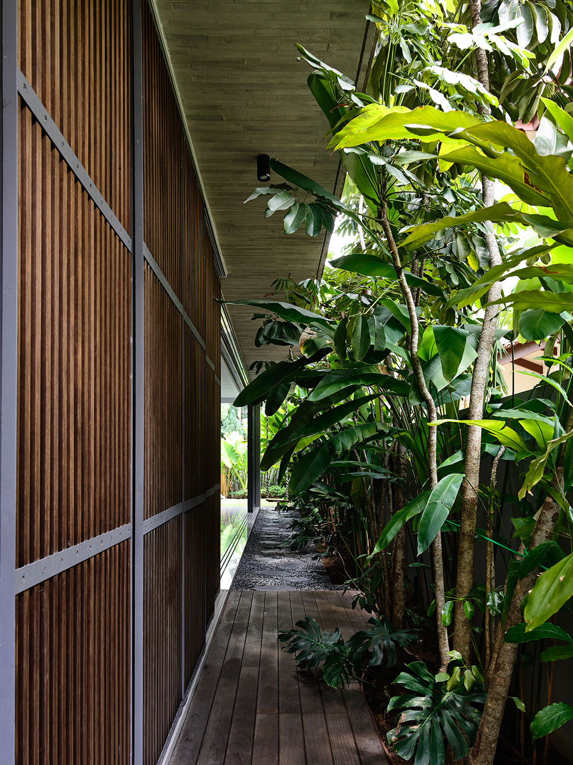
The screen design is also deliberately industrial, with bolts and steel members exposed. Timber from Norway using Kebony® technology not only fades to a charming grey over time but is also chemically treated to remove moisture so it doesn’t warp. Subservient to the culture of newness, not many Singaporeans favour the faded look of timeworn timber. But Loke Kwang is a fan. “To me, the faded grey is so beautiful, but people here don’t like things to tarnish. Hopefully, this project can change the perception. If you look at old buildings in Europe, they are very beautiful because they have aged well,” he reflects.
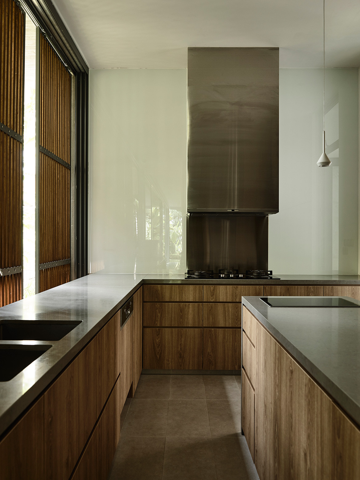
At the same time, the thoughtful detailing of the skin informs the interior experience. The timber battens are spaced wider apart over beams and denser over openings. “And at the very top, we let it open up so the plants can grow out of it. So there are many aspects to the screen,” adds Loke Kwang. Indoors, the uncomplicated material palette takes its cue from the architecture with tonalities of grey and brown. The integral fusing of nature and building also grounds the internal experience.
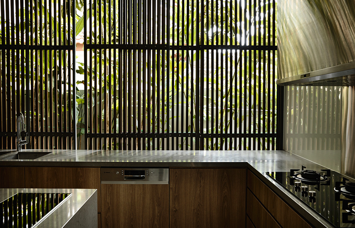
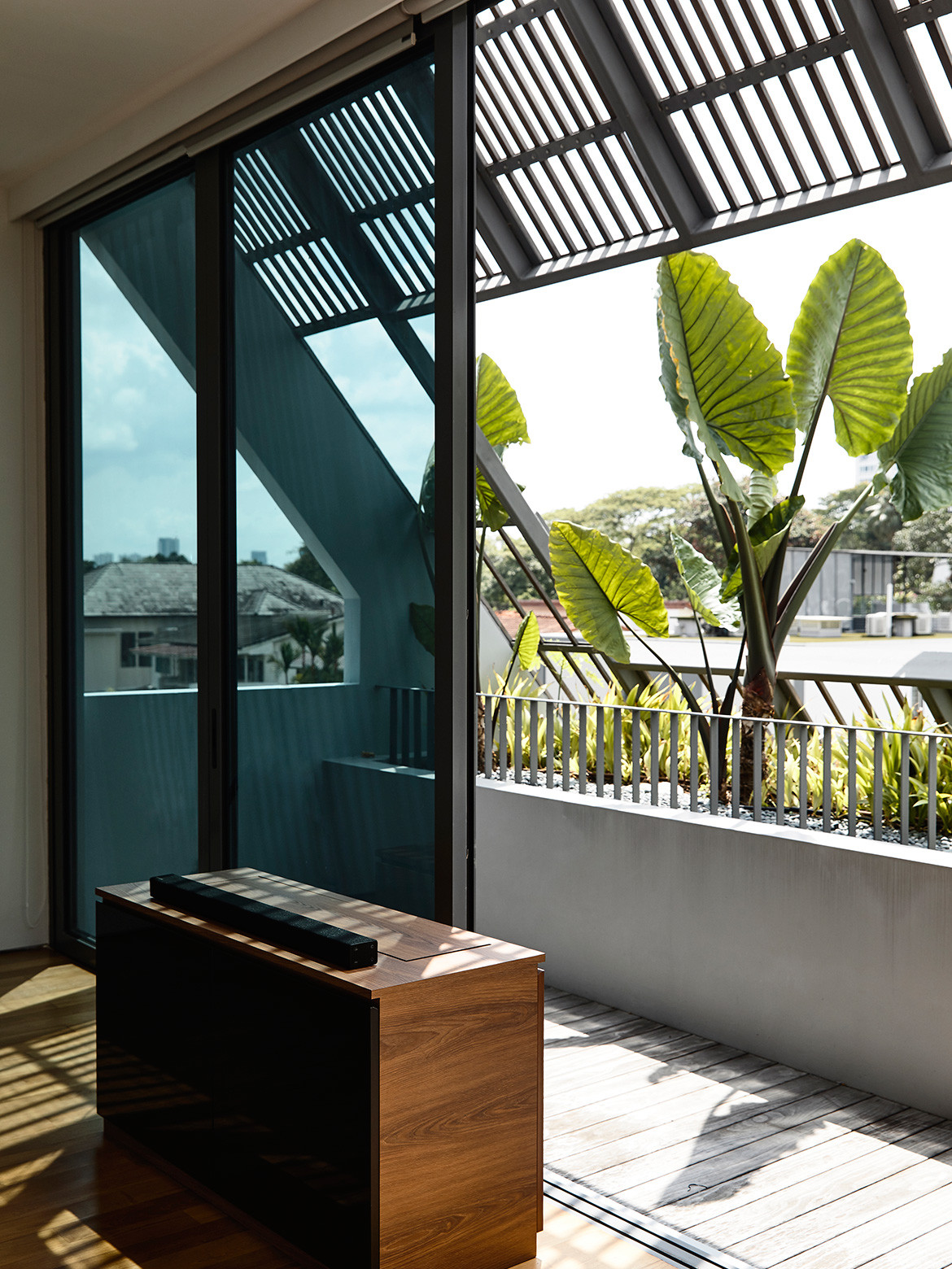
On the first storey, a perimeter garden abuts common spaces while on the second storey, a large window frames the vista of the car porch roof garden pillared with a sculptural Frangipani tree. The attic master bedroom suite enjoys a lush garden setting, created with a one-metre planter buffering the front balcony and edging the side elevation. Through habitual motions such as resting, bathing and the washing of hands, the encounter with nature does not stop. Tall plants act as a privacy shield, though blinds can be drawn should the occupants wish for more discretion.
Aptly, Loke Kwang thinks of the family as living surrounded by nature. This differs vastly from how the family used to live, hemmed up in an apartment. The wife particularly relishes this change. Her favourite corner is the living room where the indoor–outdoor dialogue is accentuated with full-height sliding glass doors that remain constantly open and a self-installed, old fashion rope-and-plank swing in the garden that beckons one to step into the green.
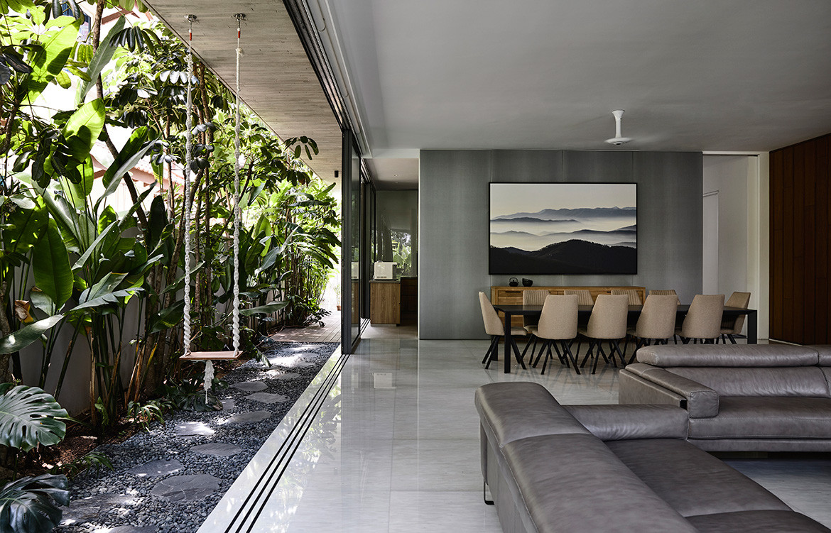
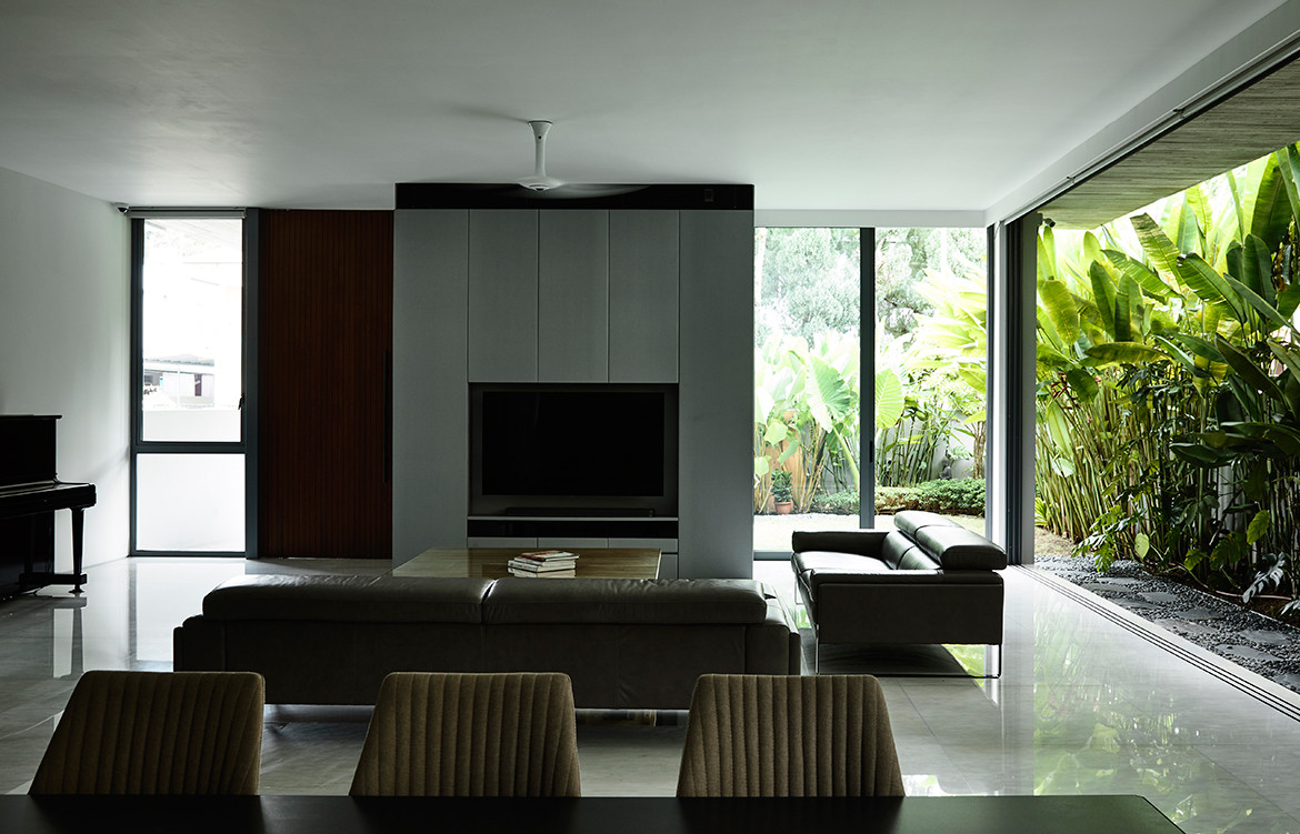
“I like a lot of greenery. In fact, I love forests,” she says. “We’ve had a lot of visiting squirrels, so much so that we are experimenting with plants that are more resilient. We also see many birds.” The screen also works like a charm so the occupants rarely deploy the blinds. “It’s just nice, not too bright, and very well ventilated. And we hardly switch on the air conditioners,” she adds. This is affirmed on the day of our visit, where it is cool and shady despite the hot and humid weather outside. It is all credit to Loke Kwang’s thoughtful implementation of passive and active methods to reduce heat load and cool the house.
Aside from the screen, the house has a southeast-northwest orientation to mitigate sun exposure. Where the western sun enters, more screening is applied, while in the east that is privy to the more forgiving morning sun, the façade is more porous. The house is also set back against the parti wall on the second storey for a skylight to bring natural illumination deep into the plan. A roof ventilator and heat-reducing window glass aids in cooling interiors, while solar panels and a rainwater harvesting system decreases maintenance cost for the owners even as they up the house’s eco-friendly qualities.
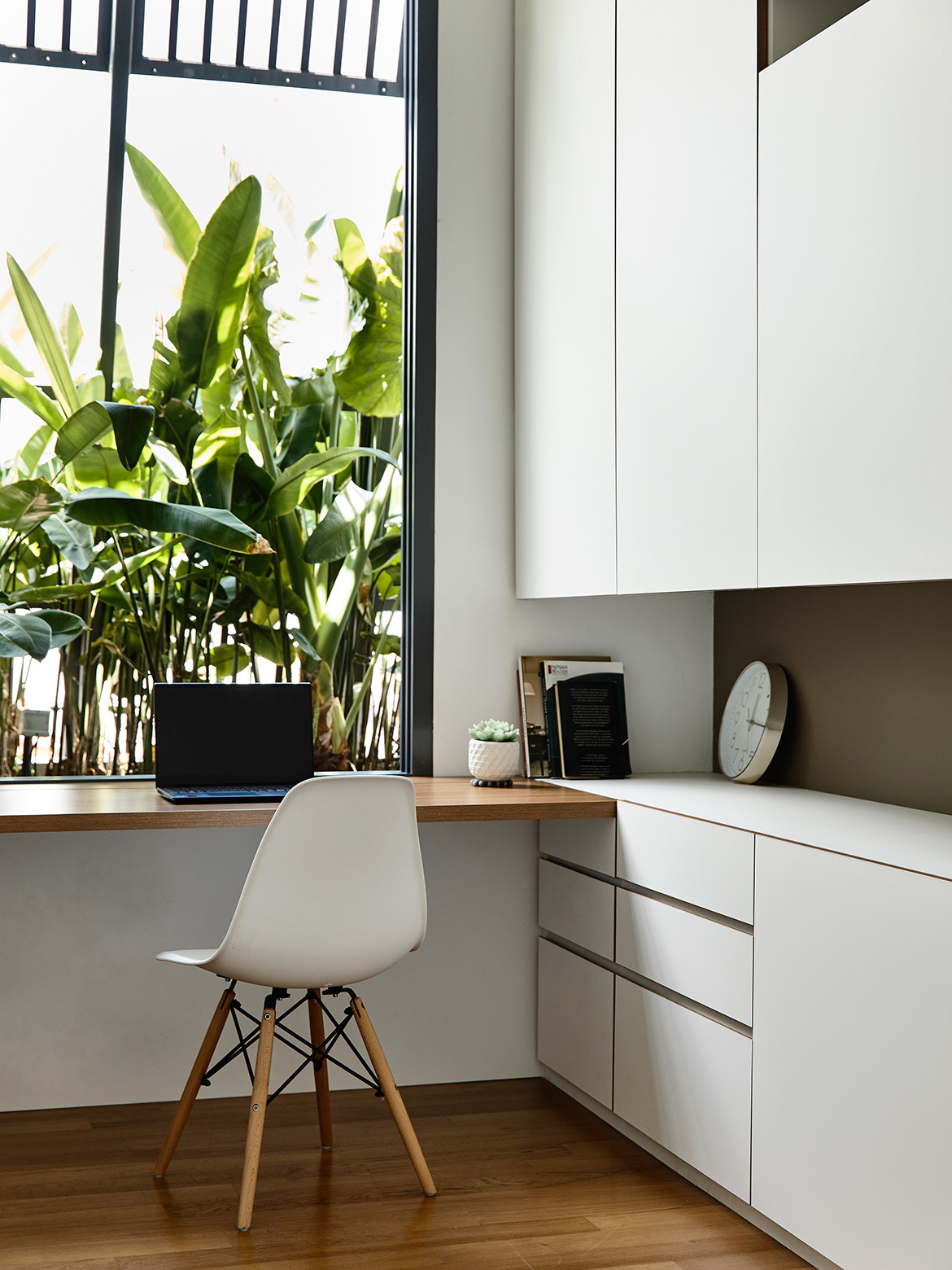
These are seemingly quotidian considerations but vital in creating a house that works and will last – an often overlooked aspect of sustainability. At the end of the day, it is not all fancy gestures for Han Loke Kwang, his clients trust that they will not only get a unique home, but also one that is easy and delightful to live in.
HYLA Architects
hyla.com.sg
Photography by Derek Swalwell
Dissection Information
Kebony treated timber screen
Arkos Swam M downlights from Relex Illumination
Kawajun C5 Designer lever door handles from Lock & Co.
Lunea undercounter basin by Villeroy & Boch
Cristina Rubinetterie shower and bath mixers from Wan Tai
We think you might also like NS House by K2LD Architects
