Connecting all the senses, Federal House by Edition Office transmutes the every day into an orchestration of carefully considered experiences.
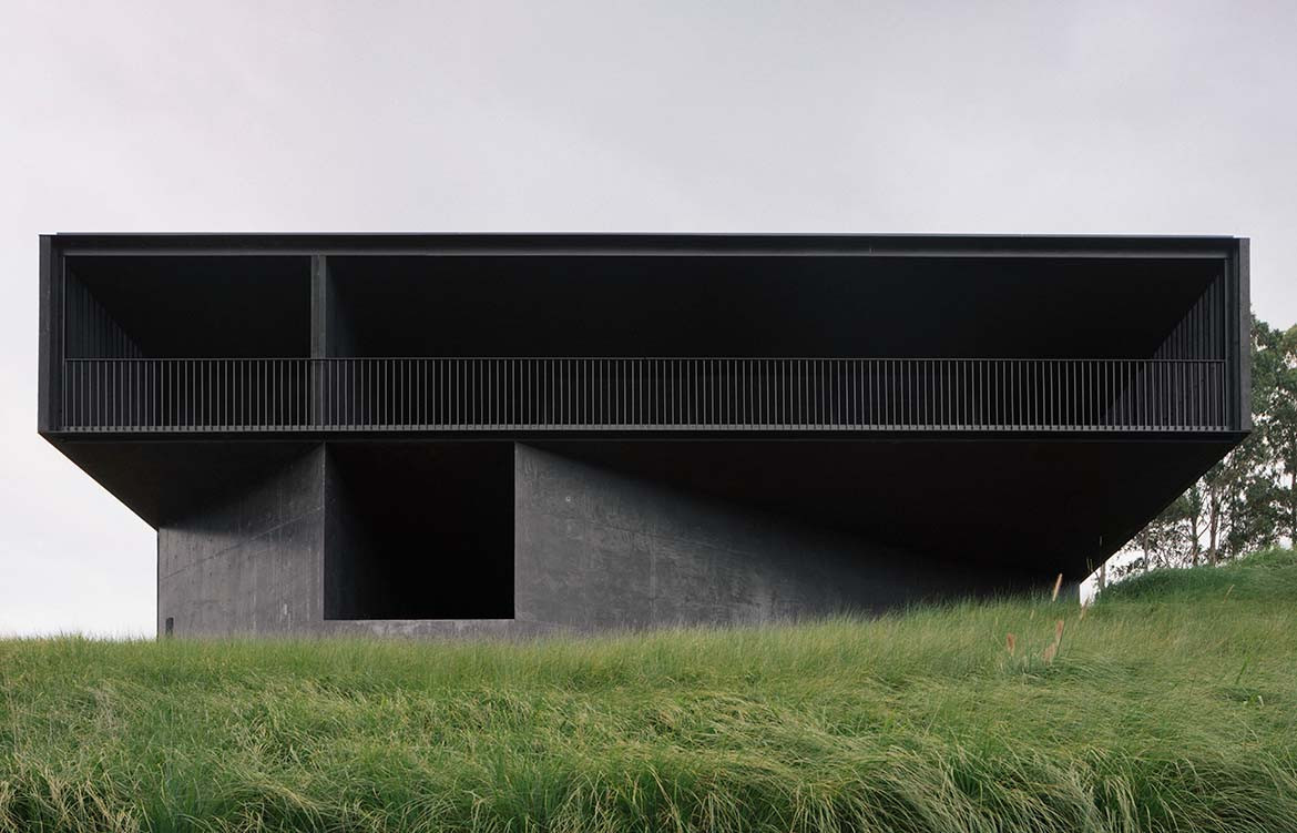
The house nestles, a poised beast in a lush sub-tropical forest, one flank cantilevered off a steep incline. Seen from above, its roofline reads as a ridged carapace. Façades closed, defensive. Yet on approach, as you move about it, the outer wall appears to breathe – robust timber battens, observed obliquely, permit views through an expansive verandah that wraps the structure on two sides. Occlusive but porous, Federal House is imbued with a dynamism that belies its very evident stillness.
“We were really focused on how the house would perform in its setting, the way it connects to landscape and to a sense of deep time,” says architect Kim Bridgland. “The primary objective was to ground the house – and the clients – to that place.”
The place is the hinterlands of Byron Bay in northern New South Wales. The clients, like the architects, are based in Melbourne. While ostensibly a secondary residence, the house is designed to evolve as life unfolds. Entered from the west, the dark concrete floor gives way to a central void – open to the sky and descending to a fresh-water pool that anchors and aerates the house. To the left, a wide indoor walkway leads around the north façade, effectively describing an internal cooking/dining/living zone.
A row of sleeping and bathing rooms (“an enclave of withdrawal, rest and solitude”) forms the east wing. A lounge area abuts the integrated garage to the south, punctuated by a secondary portal oriented uphill into dense camphor forest. “The idea was to minimise the living and sleeping spaces and maximise the outdoor connective zones adjacent to them,” says Aaron Roberts, who co-founded Edition Office with Bridgland in 2016.
“So, when the weather is right, you can expand the house out. And when the conditions are cooler, you can pack it down and heat certain spaces. This creates a more intimate atmosphere around those living areas, at the same time heightening awareness of context.”
While the plan is rational – essentially, three interior volumes arranged around a central courtyard – the experience of the house is ultimately emotional. That’s partly because, as you move from the long view, approach and pass through the ventilated façade “its object-ness dissolves”, as Bridgland puts it.
But moreover, because as you cross the threshold all senses are solicited, abetting an impact that was until then purely visual. The blackened timber battens are rough-hewn, enticing to touch, drawing the visitor in. Rich earth and fern smells emanate from the central atrium. Acoustics attenuate. Temperature drops as a breeze climbs the hillside, crosses the subterranean lap pool, funnels up the stairwell and disperses about the house. You can almost taste it.
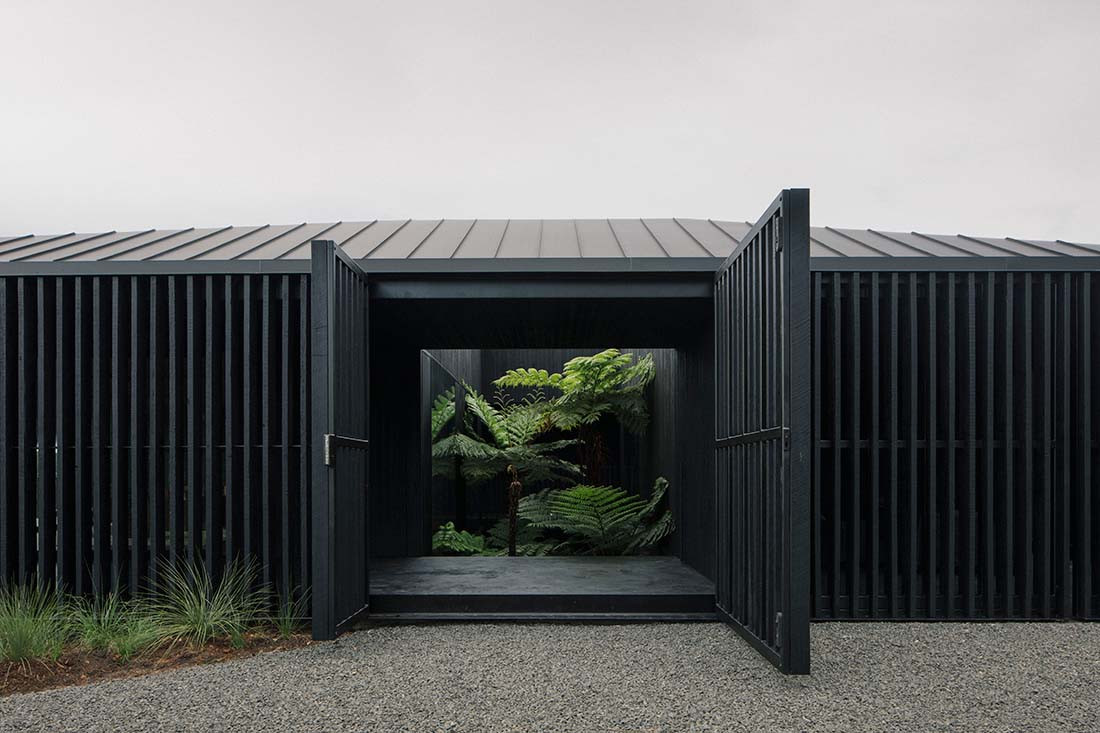
“We wanted to allow the landscape, the elements, in,” says Roberts, pointing out the way light bounces off the downstairs pool and dapples the entrance.
“The experience is similar to that of a waterhole in a secluded valley,” adds Bridgland. Yet, for all its deference to nature, Federal House (named for the nearby township, population just over 700 souls) is assuredly architectural. Composed as a concrete plinth atop which is poised a timber sculptural event, the structure is weighted to the base, disintegrating skyward. Grounding building, and its inhabitants, in place.
The lower volume is obliquely angled to telescope valley views; the concrete construction echoes Peter Zumthor’s Therme Vals in the Swiss Alps – which the client visited during the design process.
The upper floor, with its play of mass and void, solid and air, is an incarnation of Japanese novelist Jun’ichiro Tanizaki’s essay In Praise of Shadows, published in 1933. Celebrating an aesthetic that revelled in the dark drama of Noh theatre, the deep
eaves and nooks of traditional housing, even the meditative joy of a chilly outside toilet on a dusky evening, Tanizaki has become something of a touchstone for architects who seek to celebrate the nuance of semi-obscurity. For Bridgland and Roberts, the reference allows them to move beyond site specificity and tap into a certain timelessness.
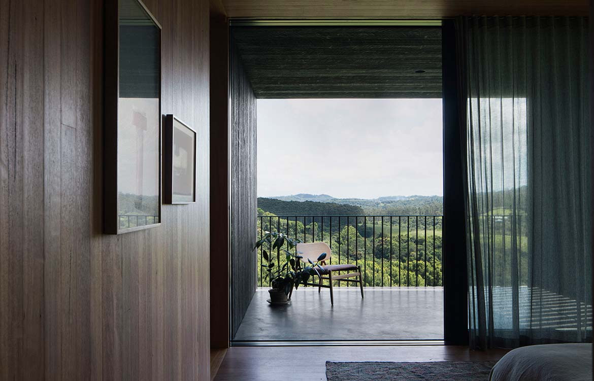
“We find beauty not in the thing itself but in the patterns of shadows, the light and the darkness, that one thing against another creates… Were it not for shadows, there would be no beauty.” Tanizaki wrote that. But it might well be an Edition Office mantra.
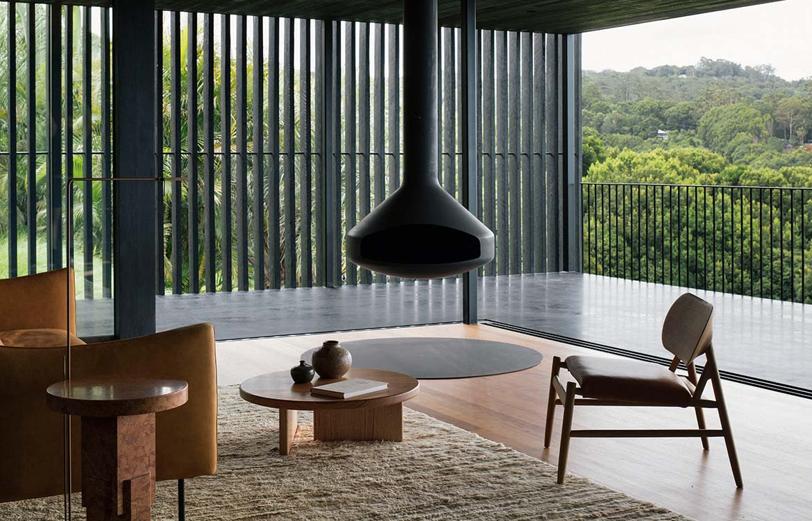
The interior nods eloquently to Scandi maestro Alvar Aalto in its use of warm timber floors and walls; furnishings are in honey-hued leather, unvarnished ply, offset by touches of black metal.
Like Aalto’s Helsinki Villa Mairea (1939) vertical timber battens create visual linkages to the surrounding landscape. Like Aalto, Bridgland and Roberts designed bespoke hardware for Federal House, notably door pulls that the hand encounters like a caress. “Aalto would have risen to give us a whack on the back of the head if we didn’t follow his path of phenomenology in designing a door pull that you consciously touch in a particular way,” Bridgland laughs.
He believes the house, like all Edition Office projects, has “a particular singularity”. That it is “a whole thing unto itself” but nonetheless exists intrinsically in relation to its setting. “Each person who comes across that place brings their own understandings of what it means to them, of what the friction or the overlap between that new building in that place might be. For us, that’s a really interesting dynamic.”
Singular the house may be, but its appeal is universal; at once of its place and otherworldly.
