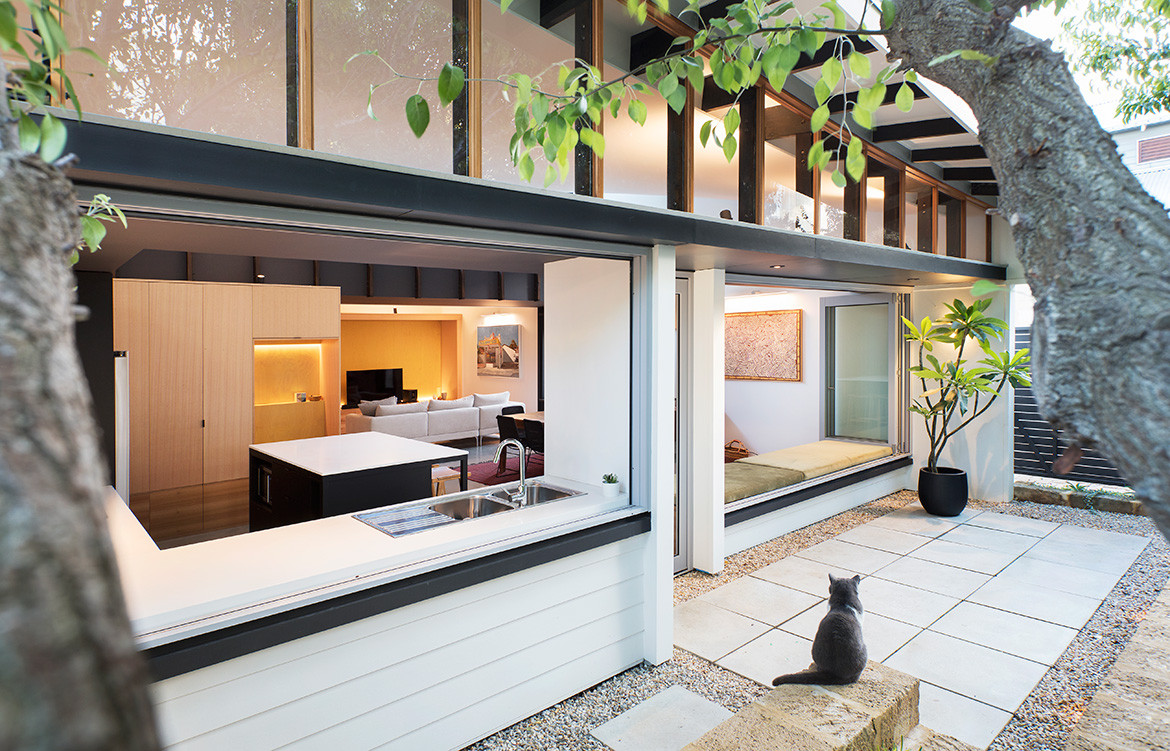
Hemmed in by neighbours on a battle axe block, this modest timber workers cottage had been altered over the years with lean-to additions that disconnected it from the garden. The owners – Soo, Marty and their young daughter Sophie – wanted better connections to the outdoors, and dedicated accommodation for interstate grandparents and visitors.
“We talked about remedying those deficiencies and looked at a few configurations, which we had priced,” says Philip Stejskal of Philip Stejskal Architects. “The double-storey option was discounted because of cost.”
They elected instead to retain the front two rooms as bedrooms, and remove the rear section, and then rebuild within a similar footprint to conserve the back garden.
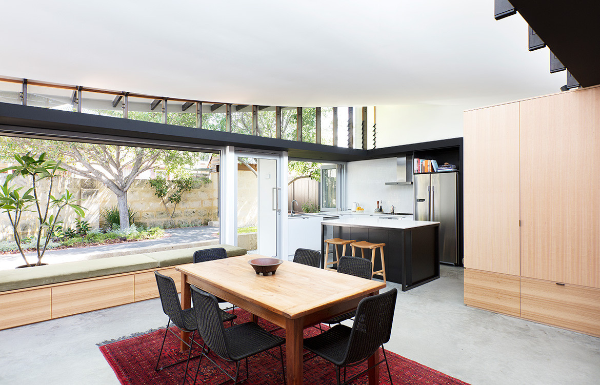
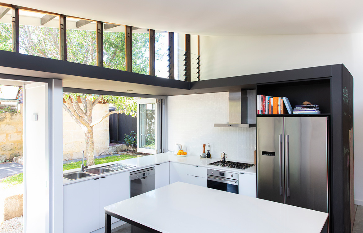
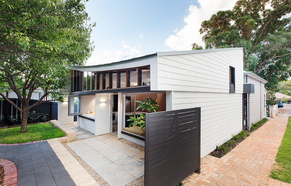
The new guest suite and family bathroom sit opposite the relocated living room, which adjoins an open-plan kitchen and dining area. These spaces open to the garden with a bench seat in the dining zone that can be used internally and outside, and servery windows in the kitchen. The result is a sense of spaciousness that belies the modest footprint, which extends just 800millimetres further than the previous lean-to structures.
By addressing the constraints of the battle axe site and limitations of the original house the rear part of the house is much more comfortable and enjoyable to inhabit.
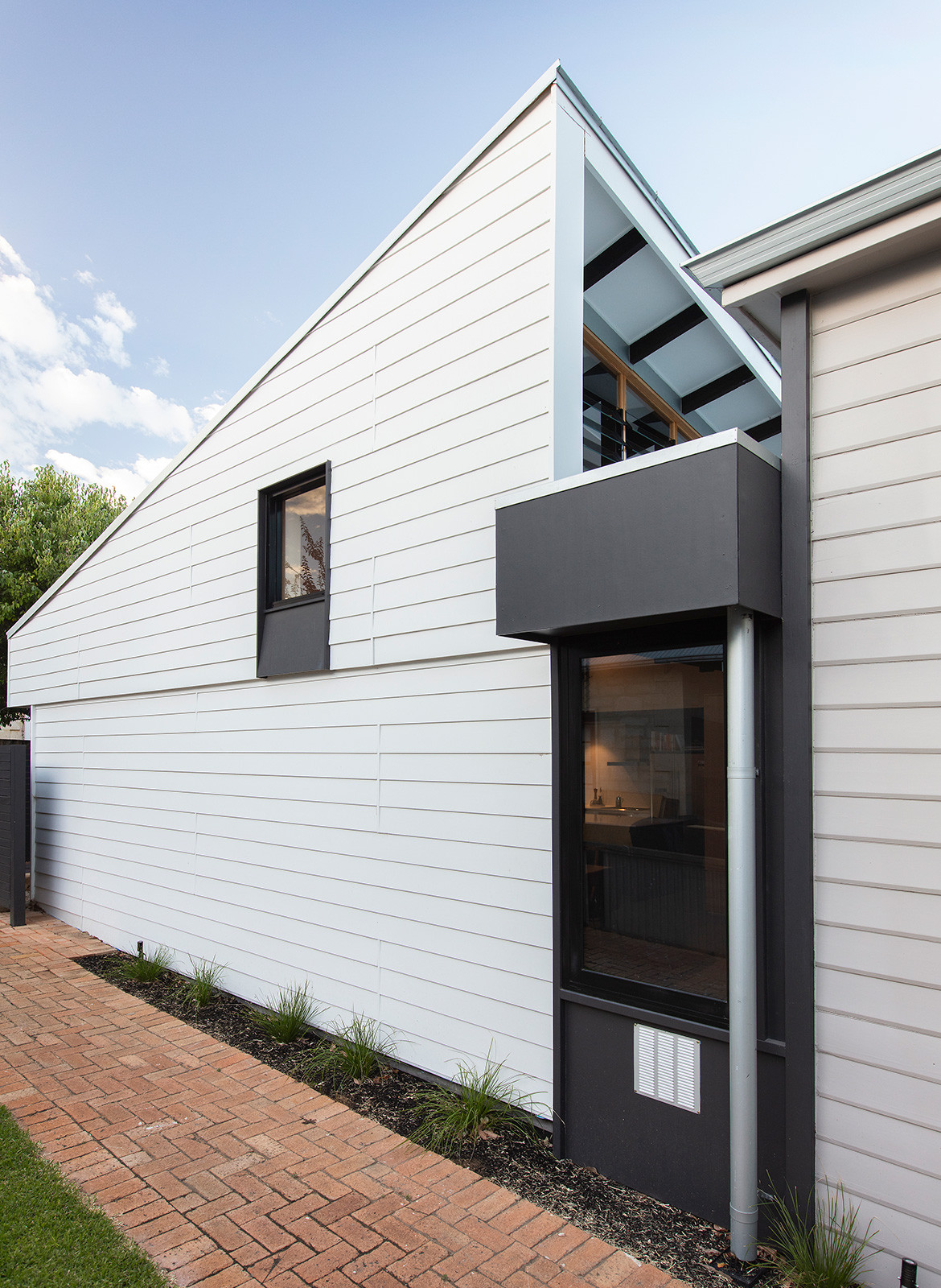
The rationalised floor-plan is topped by a poetic roof that tilts upwards in opposite directions, incorporating high-level louvres and clerestory glazing. The roof is draped like a handkerchief over a grid of 20 timber rafters, each slightly different in shape to achieve the tilted effect. It may look complex, but it was relatively simple to design and construct, according to Phil.
“We did a site analysis and found the breeze comes from the south-west,” he explains, “and we wanted to capture north light, which was towards the front of the house. We also wanted to exclude hot afternoon sun in the summer but introduce winter sun on to the concrete slab.
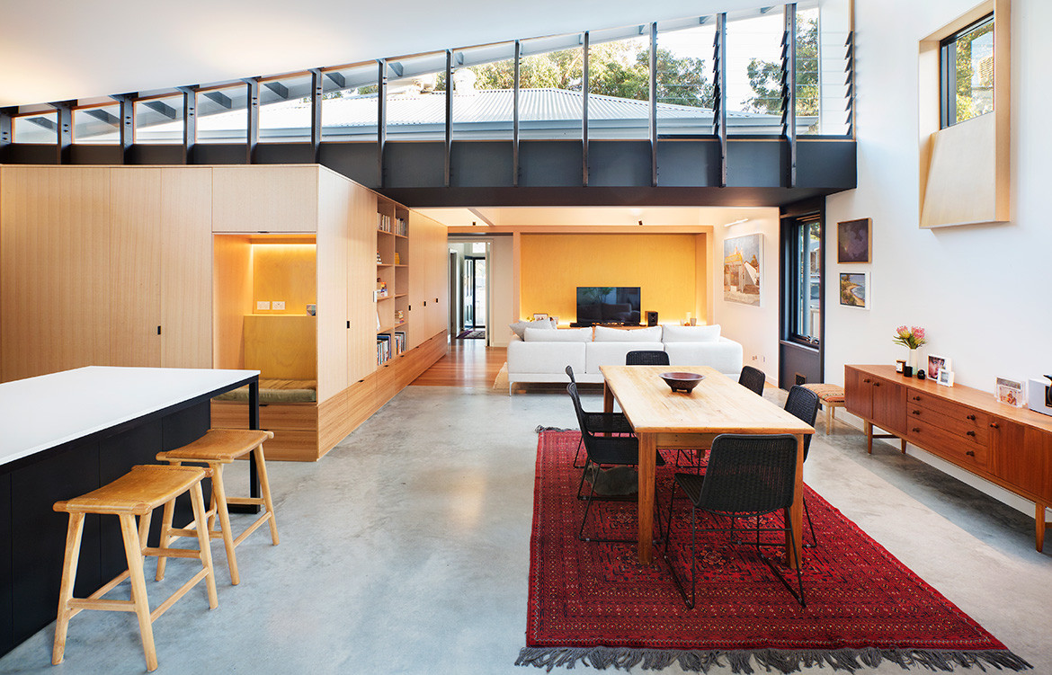
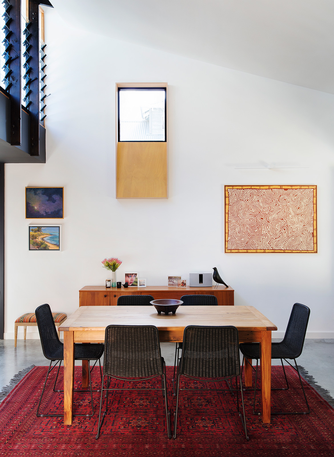
“As we started to try and accommodate each of these things – and because the land is quite low-lying and the neighbours are close – it became apparent that we’d have to address those issues at roof level, so we pulled and pushed and sculpted the roof plane to respond to each concern.”
“What I find most rewarding is that we were responding mathematically to a brief and site opportunities.”
Phil says that a similar result could have been achieved with double-skillion roof, but it would have been more intrusive in the space. “In this case, we managed to focus the available funds where they had the most benefit,” he says. “Once we talked the builder through it – while they were pricing the job – it was easily understood, and the carpenter enjoyed the construction because it was really quite straightforward.
“What I find most rewarding is that we were responding mathematically to a brief and site opportunities, but what emerged was a highly sculptural form that we didn’t initially envisage.”
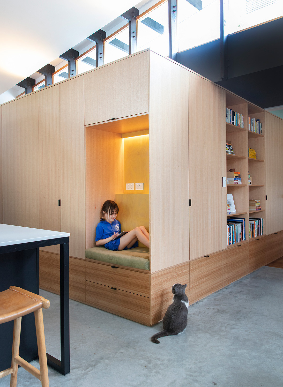
By addressing the constraints of the battle axe site and the limitations of the original house – and through careful consideration of seasonal variations – the rear part of the house is much more comfortable and enjoyable to inhabit now (with no need for air conditioning) all year round.
Philip Stejskal Architecture
architectureps.com
Photography by Bo Wong
Dissection Information
Bespoke joinery by Challenge Cabinets
Burnished concrete floors with Satin Solvent from Handley
Empire stools from Claremont
Nedlands sofa from King Living Furniture
Recycled Rimu timber dining table and chairs
Chairs from Citta Design
1960 English Sideboard from Hunters and Collectors
We think you might also like BENT Annexe by BENT Architecture.
