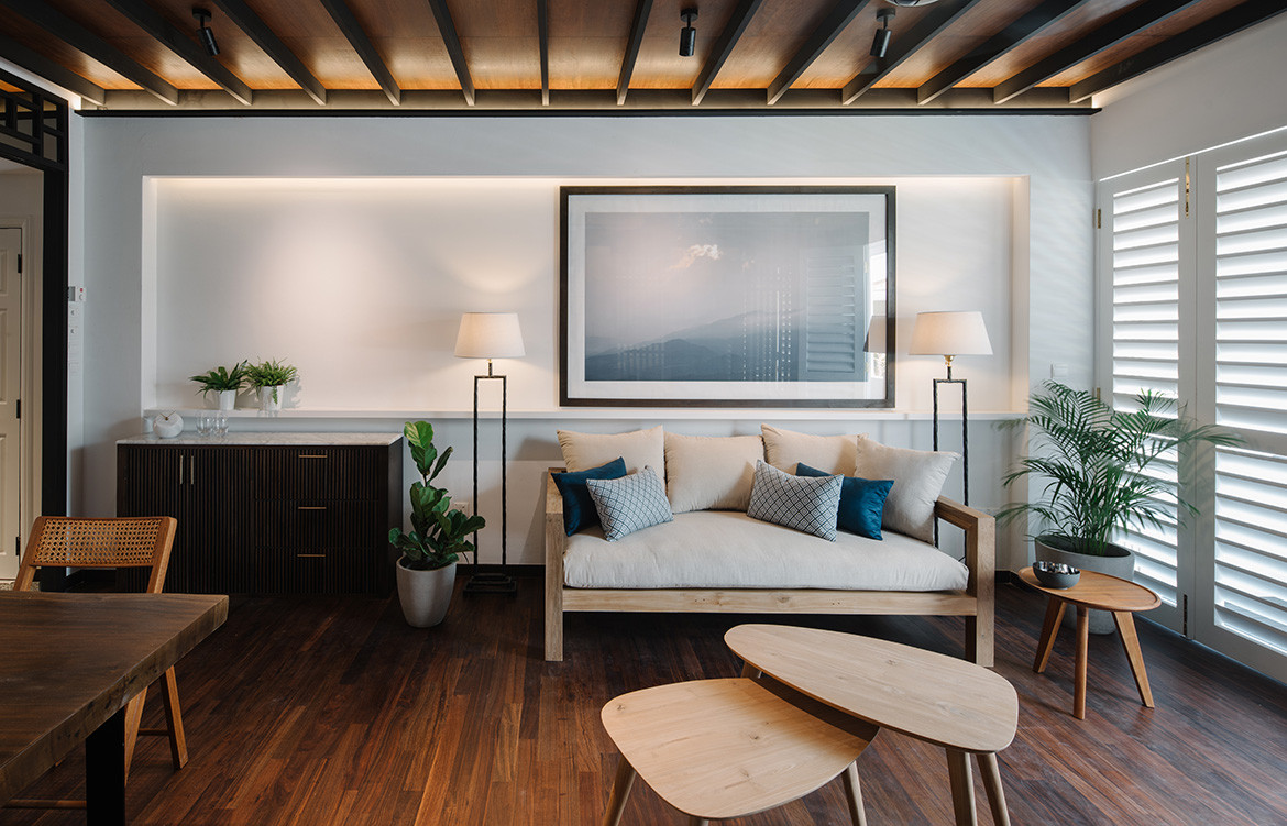
Ryota Yamazaki and his wife Cheryl Ang wanted their two-bedroom resale condominium apartment to have a feeling of easygoing tranquility, and turned to designer Goy Zhenru from Goy Architects to help them achieve this.
Inspiration came in the form of Singapore’s classic architecture – from the rows of conservation shophouses lining heritage streets to the black-and-white bungalows that dot the landscape of the more prestigious neighbourhoods. By taking cues from these buildings,Goy Architects has designed a home that fully embraces Singapore’s tropical vernacular.
“Elements like the ceiling joists and casings are integrated into the design and construction. We wanted to bring out the vernacular aspect of the space,” says Goy.
Goy Architects engaged Towner Construction, the same contractors that worked on and restored The Warehouse Hotel. “For this home I really wanted to provide the best services, and the guys from Towner Construction know what to do with conservation elements and details,” Goy explains.
In its previous condition, the apartment was gloomy and dank, and so one of Goy’s main design objectives was to create ventilated spaces and introduce natural light.
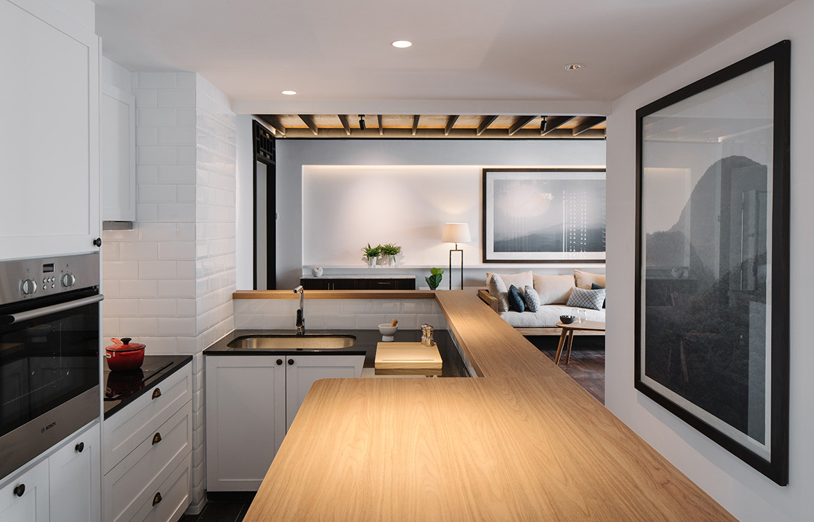
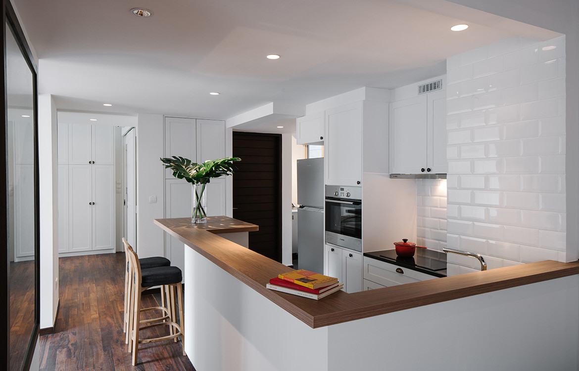
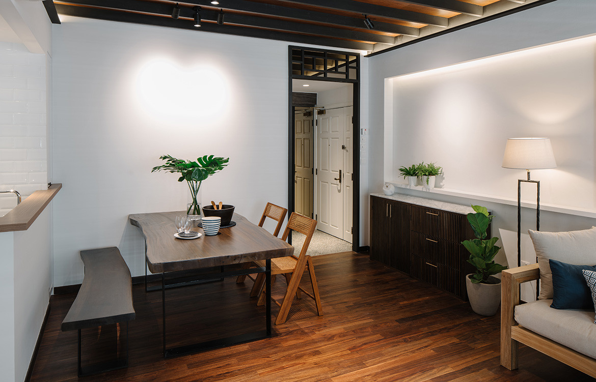
The walls to the kitchen were knocked down to open up the space visually and introduce a more inviting vibe. And in keeping with the vernacular design, timber was chosen as one of the predominent materials – not just for flooring and fittings, but also when it came to the furniture, which were either sourced from Indonesia or specially customised for the owners.
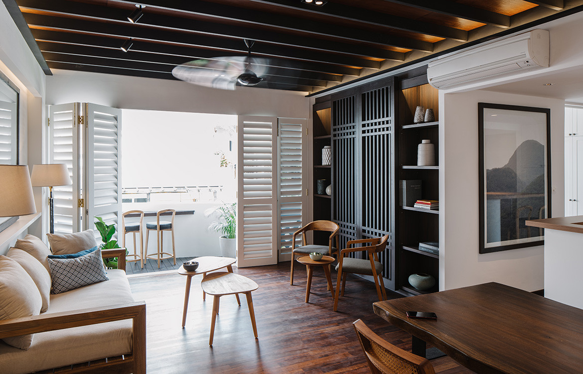
In the living room, French folding doors open to reveal the balcony. When fully opened, natural light floods the space and creates the scene of veranda living that the owners desire. Also, shuttering the doors on particularly sunny days still allows light into the home through the louvred fronts.
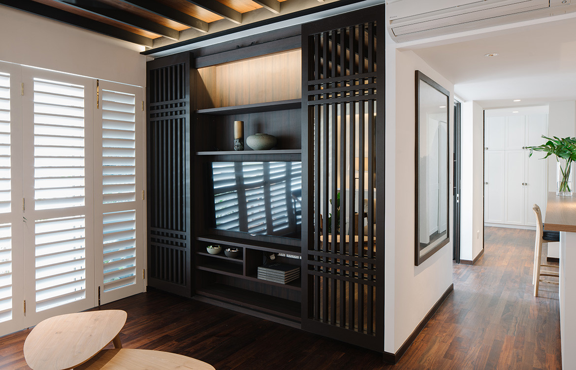
Another key feature in the living room is the timber screen, which conceals the television when not in use. The design is a throwback to the Southeast Asian theme, with its layered, linear pattern and dark timber construction.
With the apartment’s new open layout, Goy needed a way to visually demarcate the space. Instead of building glass walls or doors, she came up with a subtle way to segregate the zones: the ceiling in the living room is designed to look like rafters and joists. “It adds texture to the room without compromising space,” she explains. “This ceiling feature is a great way to visually demarcate the different zones in this home. You know where the living room ends and the kitchen begins, even if there are no vertical partitions marking the boundaries.”
Goy Architects
goyarchitects.com
We think you might also like this apartment by Mimimology
