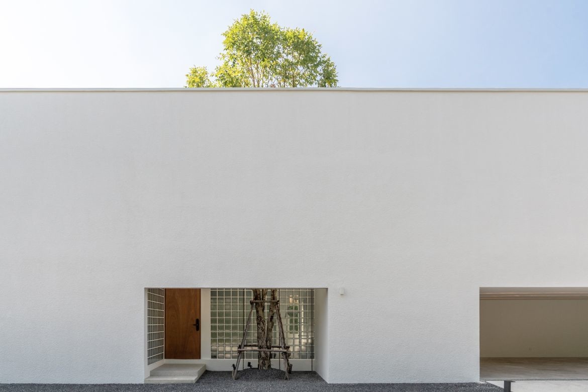
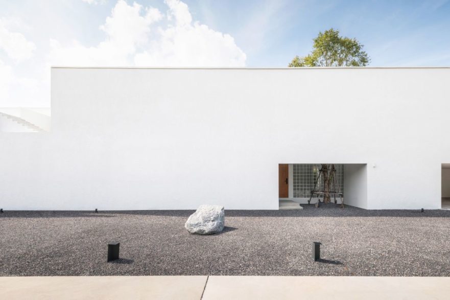
As the architects approached House Between the Wall, they faced a unique challenge: the site was a long, rectangular plot nestled beside a busy street. However, rather than letting this restriction hinder their creativity, they saw it as an opportunity to create something truly special.
The team decided to design a house that stood out with its bold and solid facade, in the form of a simple box. This choice not only prevented outside views from intruding on the property, but it also allowed for a scenic and relaxed interior space, complete with privacy and an abundance of natural light.
The walls were finished with an elastic texture paint to prevent cracking and conceal any irregular surfaces that may appear from changes in weather. The total space is split between 260 square metres of interior living and 140 square metres of exterior paths and greenery.
The long shape of the house was used to separate the interior into two wings, one for guests and one for the owner. The potential of the long length space also allowed for social distancing in the circulation of the house, with the flow of connected programming that could be opened or closed as needed.
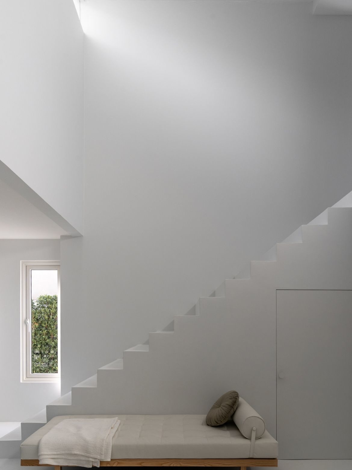
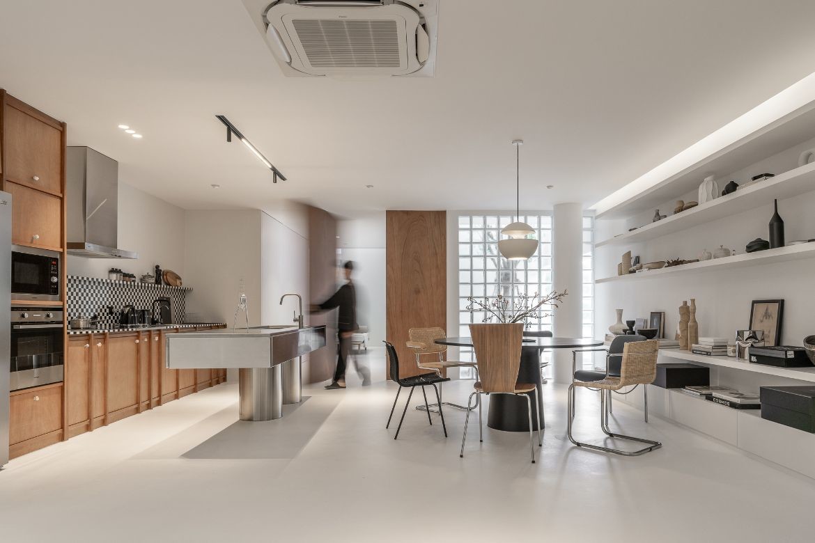
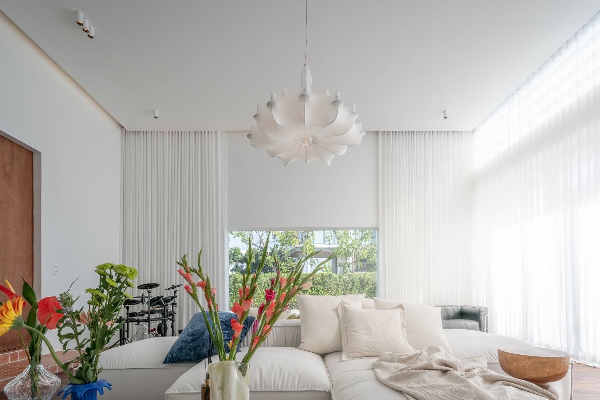
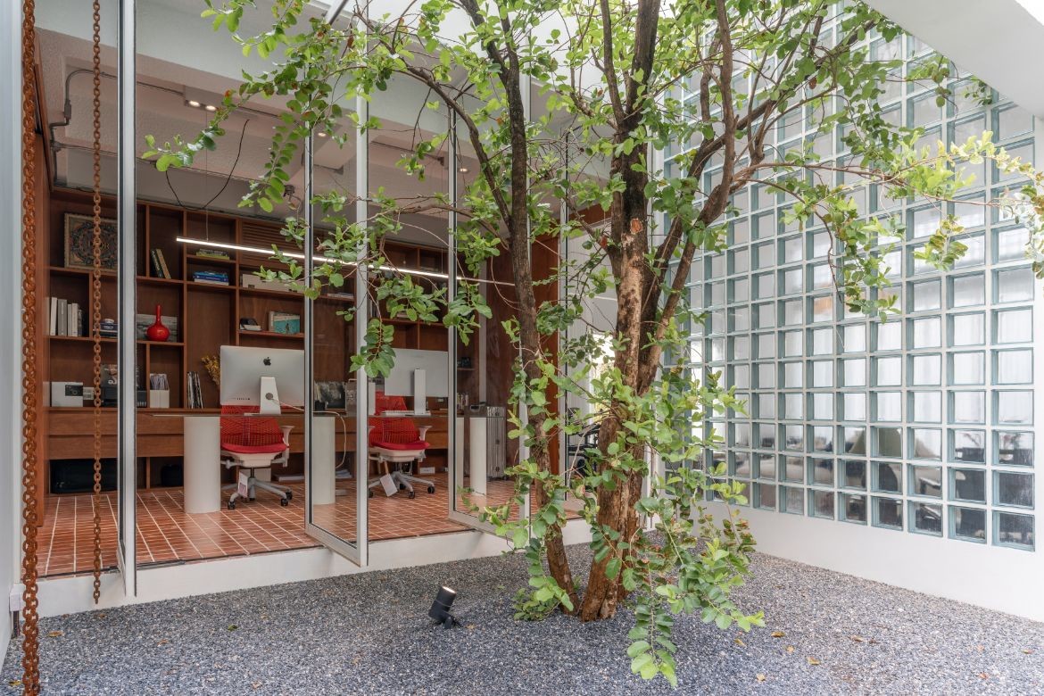
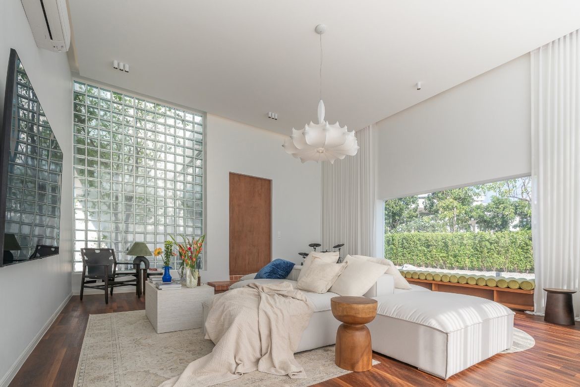
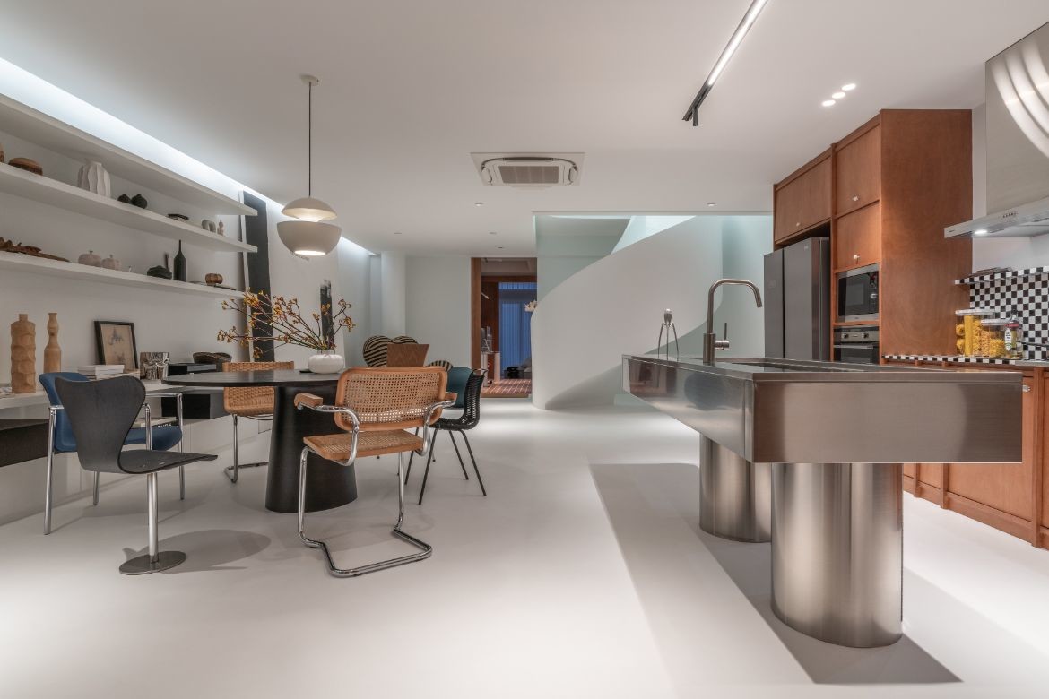
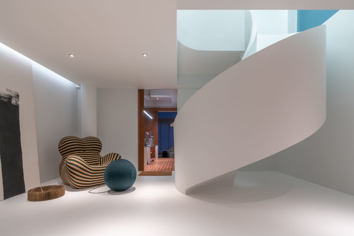
The house is also designed to have a minimalistic yet warm and inviting atmosphere, with natural light embraced on the large white canvas of the interior. After entering the residence, visitors are welcomed by all-white spaces that create a calming feeling, contrasting with the bustling energy of the outside world. The simplicity of the interior atmosphere is further emphasised by the use of natural light, which passes through glass brick blocks to provide indirect light and avoid heat radiation.
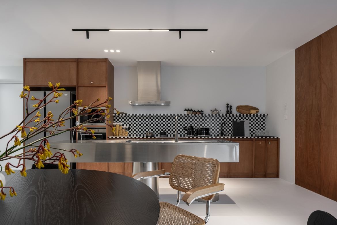
The plywood pivot doors divide the open space planning, and the main kitchen and dining area are designed to express a sense of craftsmanship, most notably is the checkered pattern on the kitchen backsplash, and in the selection of various objects. The opposite side of the house features a collection of books, art and objects.
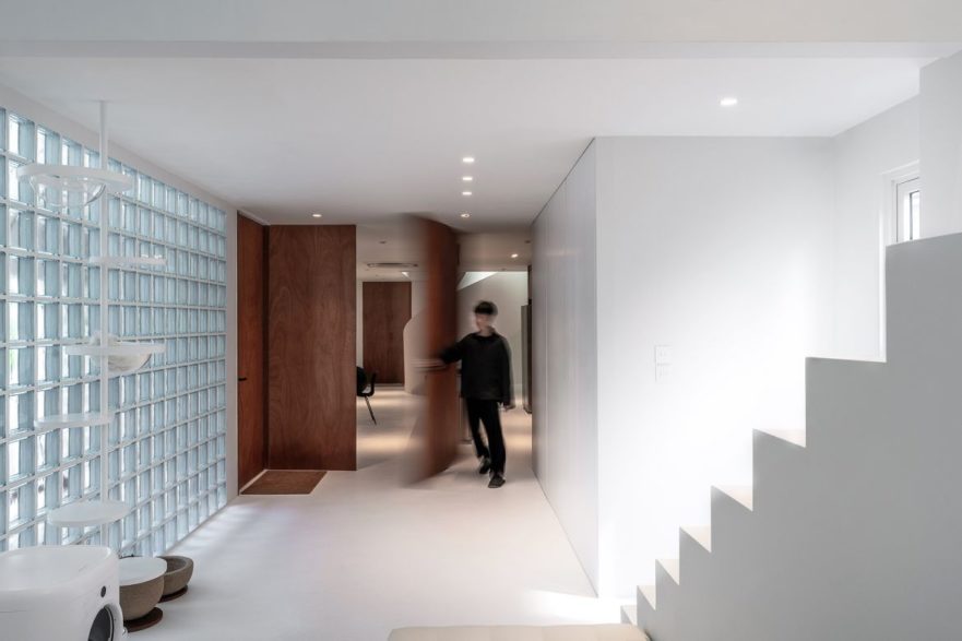
The goal for the interior aesthetics was inspired by mid-century design alongside the simplicity of a white gallery space, which all coalesces in creating a calming residence.
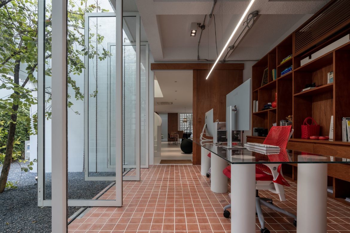
An open planning approach throughout contributes to the sense of an expansive interior, achieved via features such as continuous flooring without steps, natural lighting that helps to purify the air, and an abundance of greenery that surrounds the exterior and connects the house to its natural surroundings.
The House Between the Wall concept is a true reflection of the architects’ ingenuity and creativity in the face of seemingly restrictive site conditions.
This residence was Shortlisted in the 2022 INDE.Awards – The Living Space category, entries are now open for the 2023 INDE.Awards, find out more at indeawards.com.
Project details
Architecture & interiors – AA+A Architects
Photography – VARP Photography
