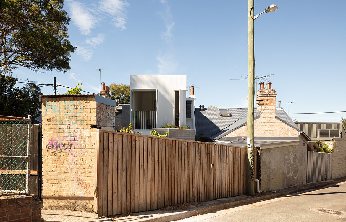
Located in the middle of Newtown in Sydney’s inner west, Newton House is, according to architect Dean Williams of Architect George, “situated on one of the smallest sites you will come across as an architect.” Occupying only 68-square-metres, it is not an exaggeration to say that this house fits into the “tiny houses” typology.
In addition to being tiny and awkward, it is also located in the middle of six terrace houses, adjacent to a busy train line and underneath a flight path and is also bound by thirteen angled boundary lines. Not to mention its siting in the centre of a varied and active urban context. “There is a lot going on, in a very dense and grungy inner-city environment,” says Dean. “The design for the project needed to rationalise these angles, the tiny site and its active urban context.”
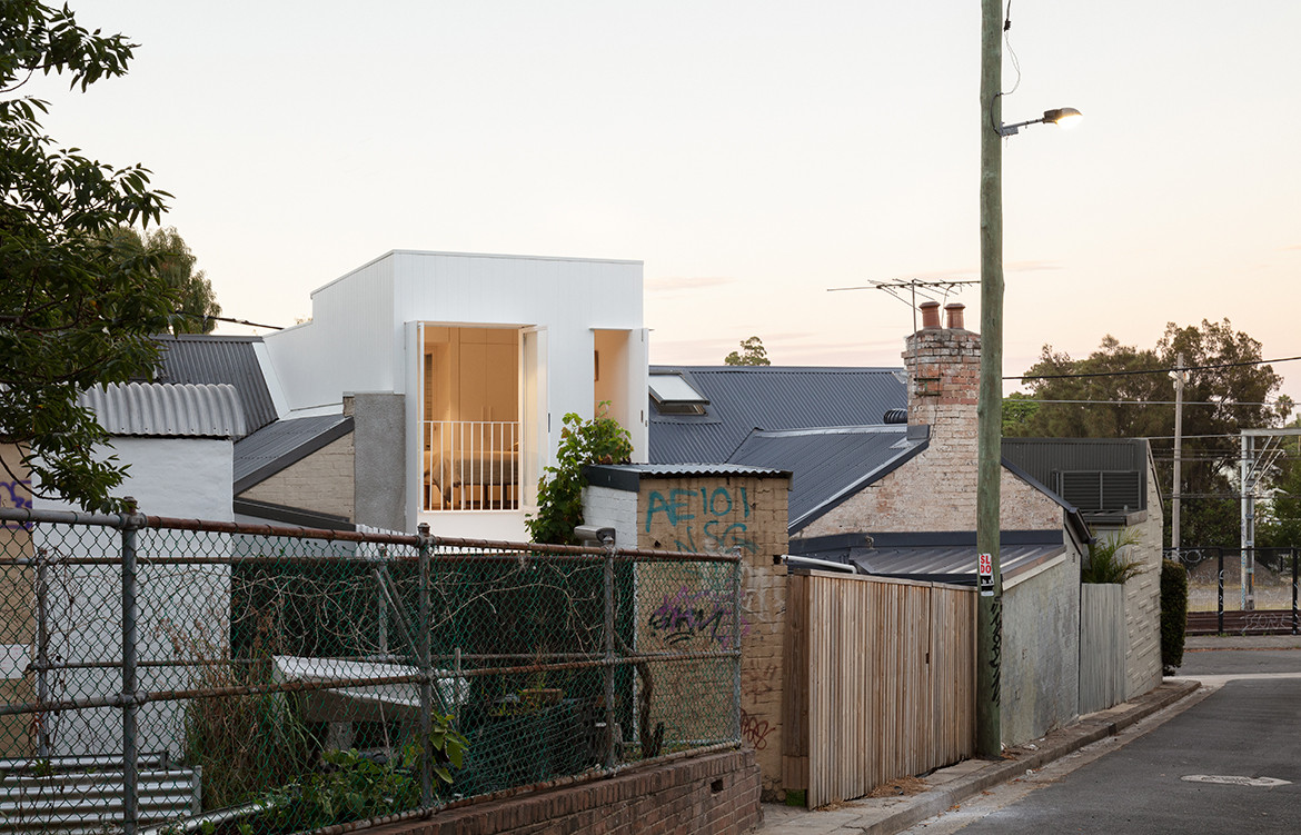
On a positive note, the plot benefits from good sunlight and proximity to urban amenities, which includes a much-loved community park, community veggie gardens and a heritage-listed church framed by trees. As an emerging practice committed to creating meaningful and responsive buildings for people and places, the team have capitalised on these urban resources by framing views and creating access where possible.
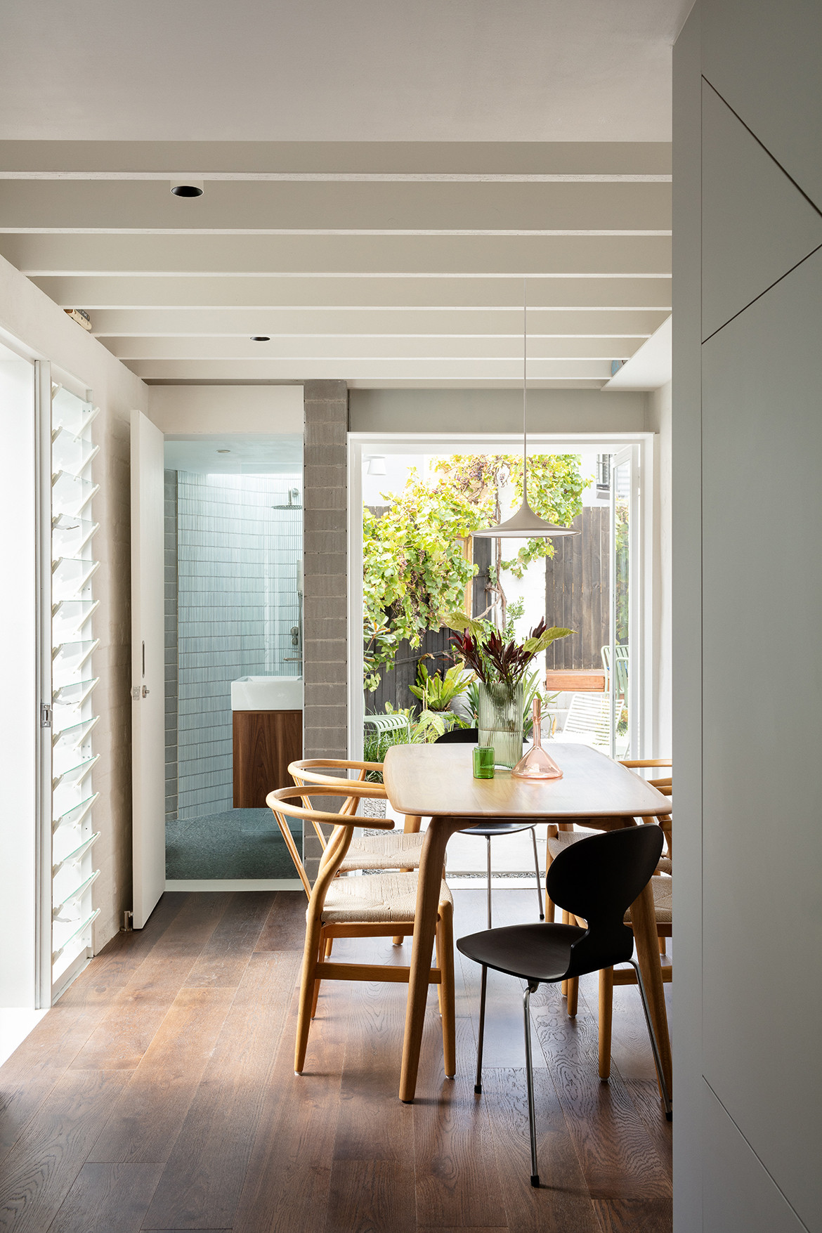
“The brief called for a two bed, two bath home with improved connections to the outdoors,” adds Dean. The team elected to retain the existing ground floor footprint and setback pattern of the rear lean-to which provides additional garden area and access to sunlight and greenery through a semi-internal lightwell.
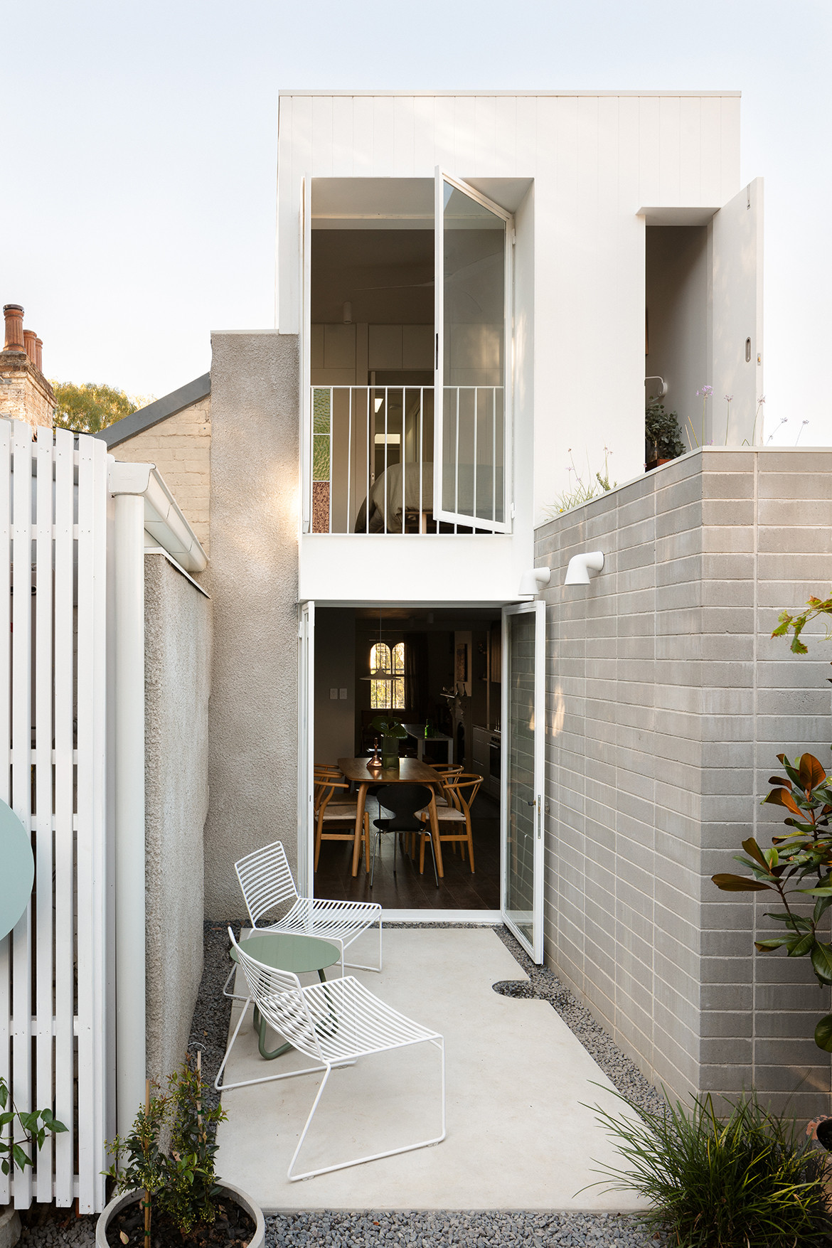
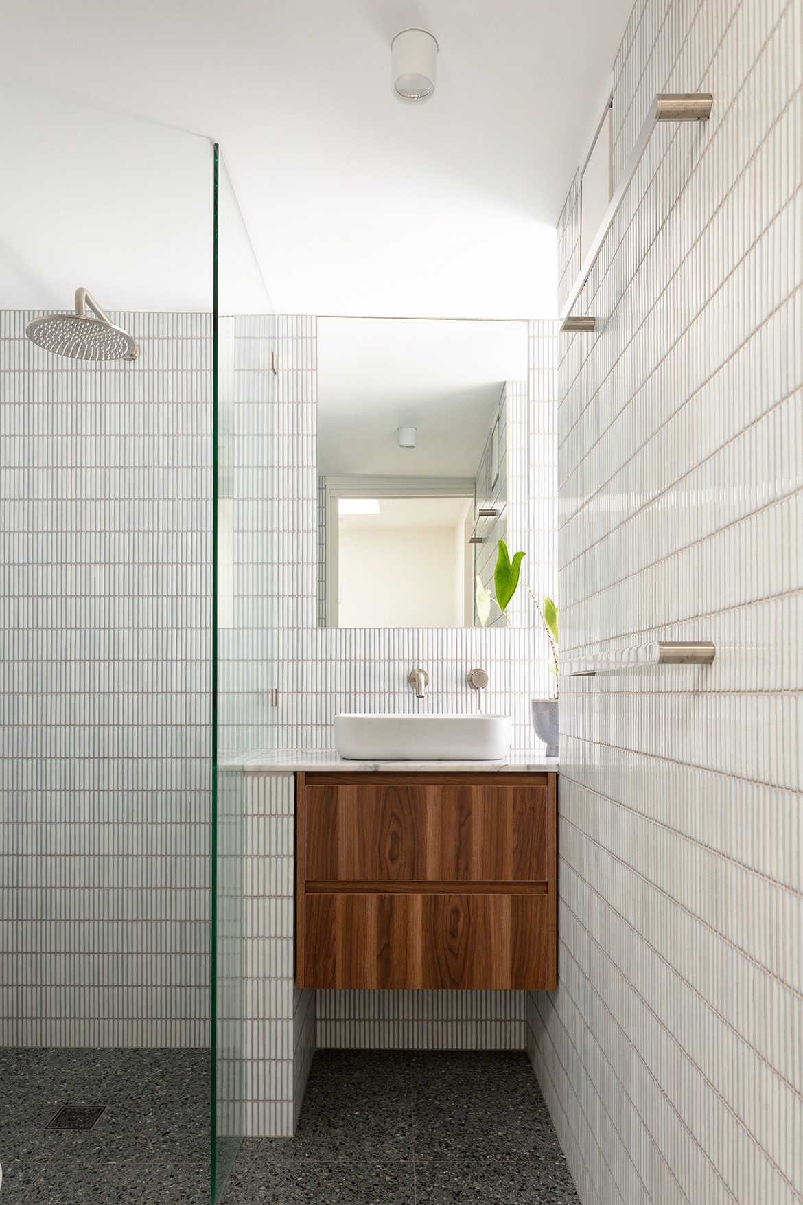
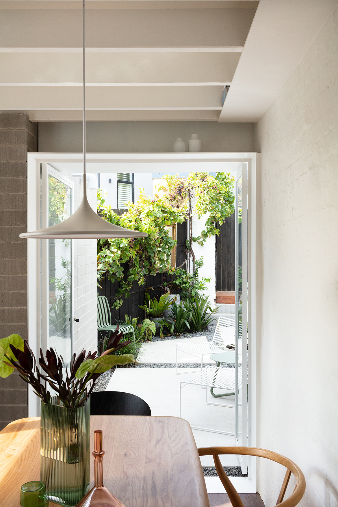
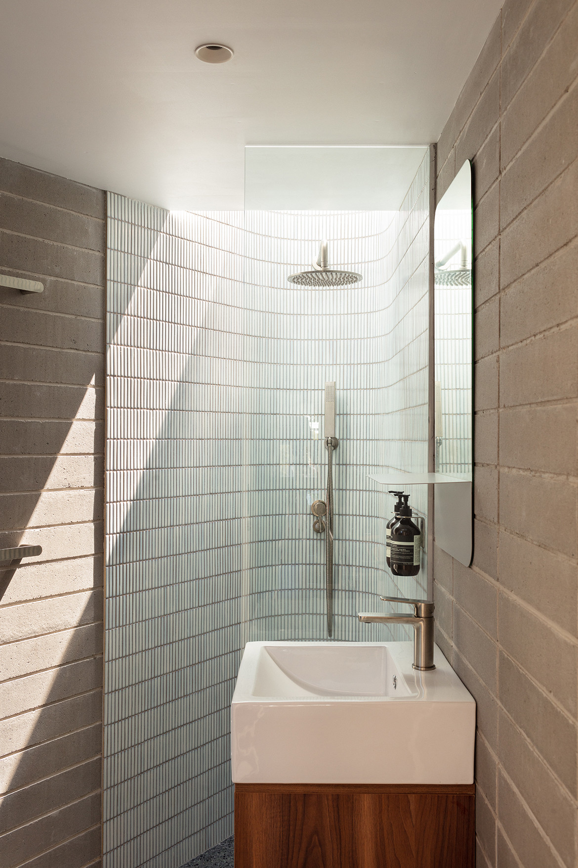
“This was more important to the clients than the additional physical space that you could grab here,” explains Dean. “In addition, a minor reworking of the existing ground floor plan and removal of unwanted walls resulted in a dramatic improvement to the site. The existing rear bathroom was demolished to allow the sun-drenched courtyard to become visually and physically connected to the living areas. A new (smaller) concrete block bathroom was squeezed within a triangular portion of the site.
In response to the brief for additional space, the team also added a new first-floor volume. The new, subtle first-floor addition follows the set-back pattern of the ground floor. All rooms have access to generous north-facing windows and a green roof is located above the rear bathroom provides a much loved green outlook from the bed.
The rear Juliette style balcony and the green roof accessed from the first floor bedroom allow the building to ‘open-up’ to the rear park and urban community or ‘close-down’ when privacy is required. “The outdoor areas are almost equal in size to the footprint of the house and the new planning has better rationalised the awkward angled courtyard,” he continues. “The courtyard is now generously connected to the living areas, providing a series of external areas for entertaining.”
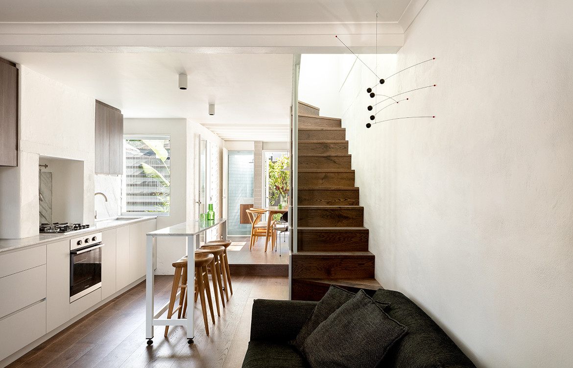
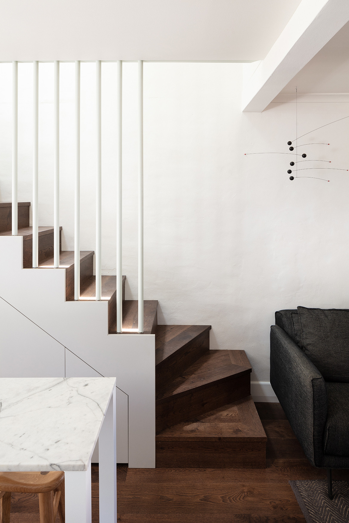
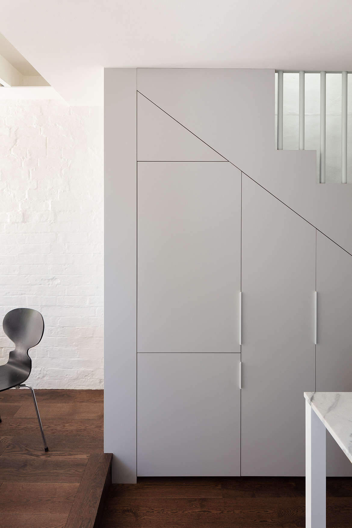
Internally, every inch of space has been accounted for. With the kitchen occupying the space under the stair, the only circulation area is the small one-and-a-half square metre landing on the first floor. “The physical size of the house wasn’t that important to the clients. They chose quality over quantity, which is the best way we can live more sustainably,” he adds. “A home that was sustainable and compact meant that spaces were unique and of high quality rather than larger in scale.”
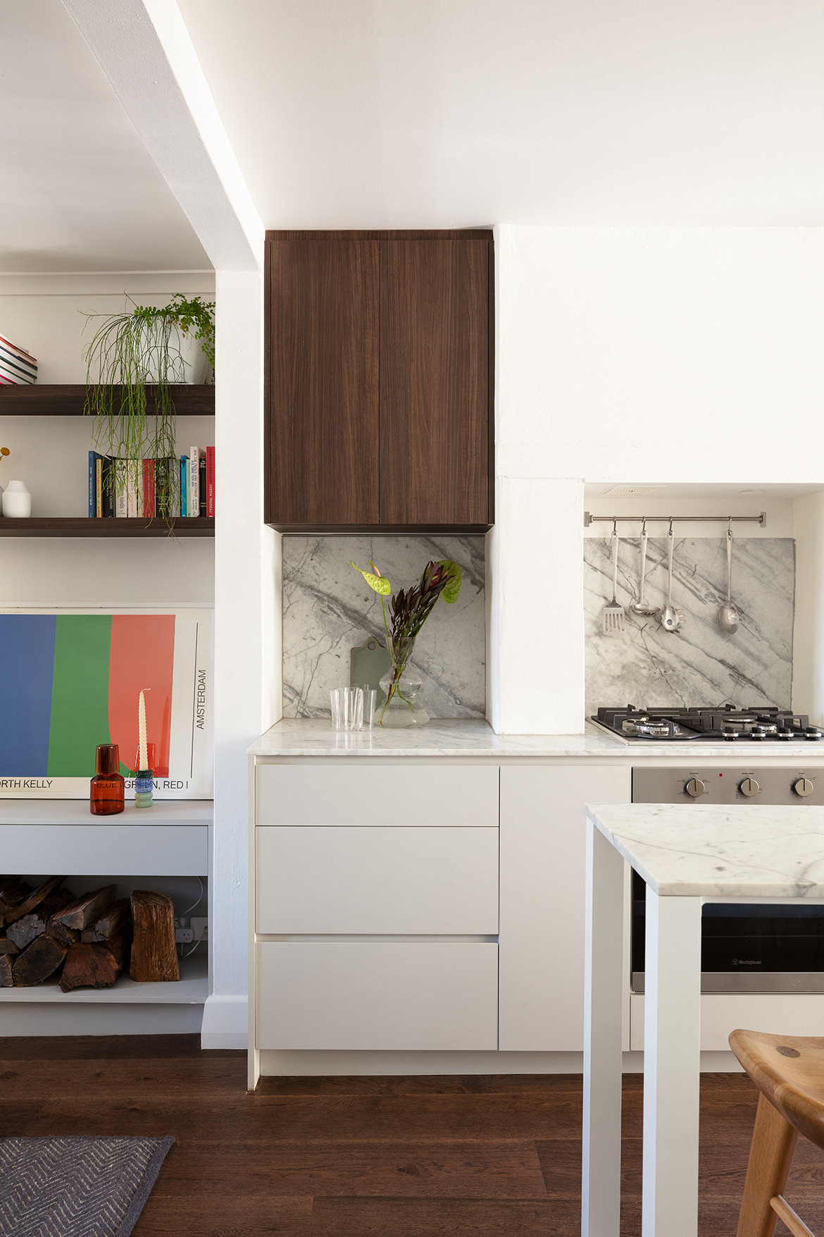
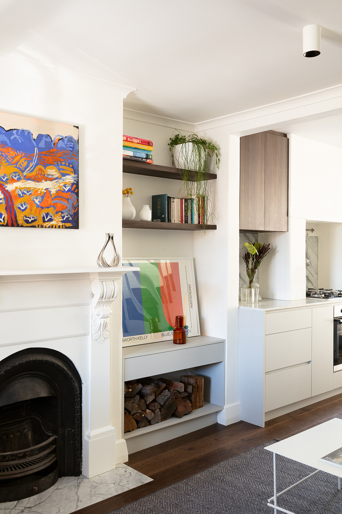
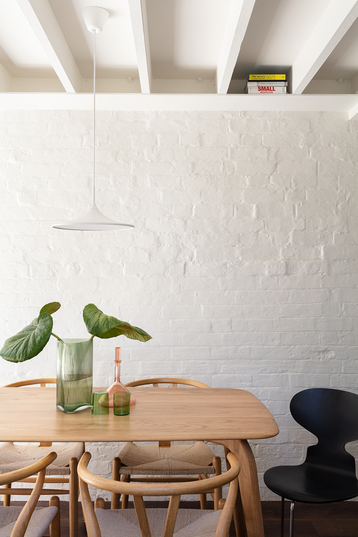
Aesthetically, the architects have leveraged the varied textures that existed in the original house. “The surrounding context is full of different materials and colours all with strong overlays of graffiti and urban life. We loved the existing rough rendered walls and brickwork that formed part of the existing home,” Dean says. “We made a deliberate decision to keep everything white to highlight all the different textural qualities and history of the house.”
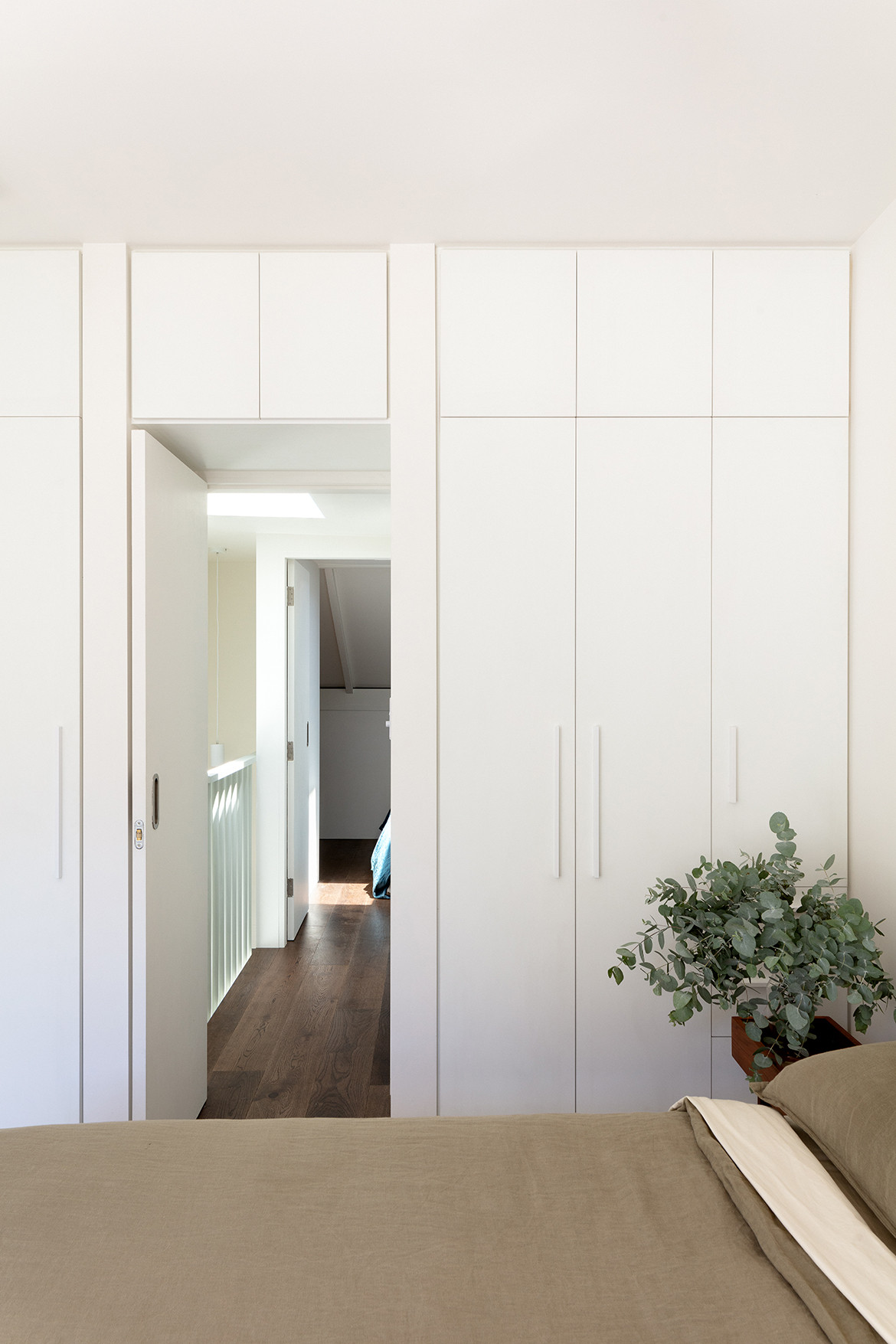
The use of robust materials like concrete block internally, add a sculptural element to the interiors while more luxurious finishes like ceramic mosaic tiles have been used with restraint. The joinery is discreet (neutral Laminex panels), allowing the inherent textures of the house and the beauty of the natural world to take precedence.
“The sharp straight lines of the steelwork provide a nice contrast against the wobbly and rough brick textures of the existing structure,” continues Dean. “The steel reveals are honest, with fine edges, alcoves and integrated shelves destined to be filled with the belongings of the clients over time.”
Having overcome multiple planning, scale and budget constraints, it is remarkable how Newton House still exudes elegance and refinement. “Our design response for the new addition was deliberately singular in colour and simple in form so as to not further overwhelm the varied surroundings,” concludes Dean. “Our clients also wanted the home to be unique, to be a strong reflection of their personality and how they like to live. They wanted to walk past the house or play with their dog in the rear community park and feel a strong connection to their place.”
Project Details
Architecture and interiors – Architect George
Photography – Clinton Weaver
We think you might like this story that looks at five of the best prefab homes
