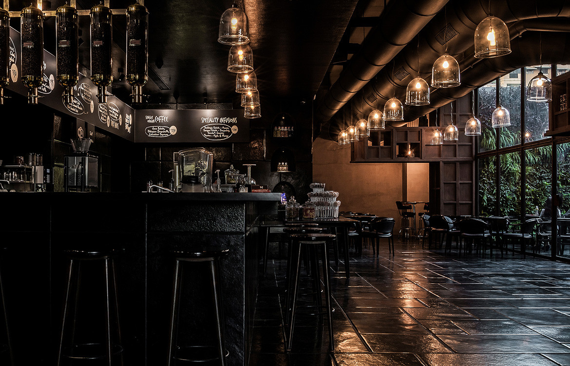
Cave-like in its presence, this café by IKSOI Design Studio in India belies a cool hangout for creatives, coffee lovers, and tourists alike. Despite a unique and distinct vibe to the space, the project, Java+, is, in fact, an addition to the existing Courtyard by Marriott in the city of Ahmedabad. Local architecture firm IKSOI were tasked with the job.
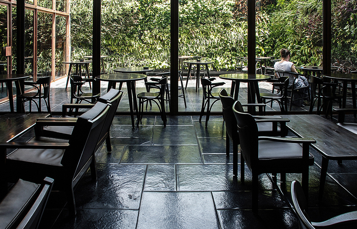
In a manner that truly champions working with our site and surrounds – rather than against them – the moody and mysterious eatery was once a general storage space for hotel management with no openings and a complete lack of natural light. IKSOI Design Studio opened up the space by removing two boundary walls from the northeastern side of the site and added in a courtyard. Coupled with the high volume ceilings this allowed the architects to use dark colours on the walls and floors without making the space feel claustrophobic: rather open and spacious all the while maintaining its cave-like atmosphere.
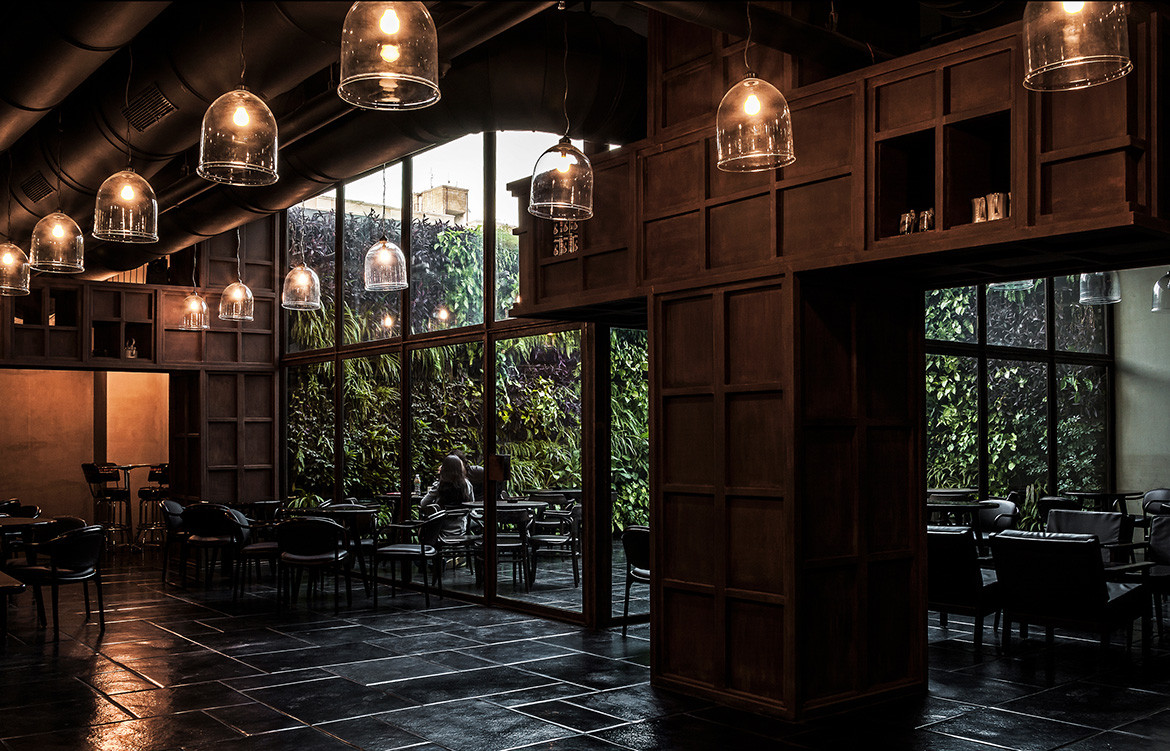
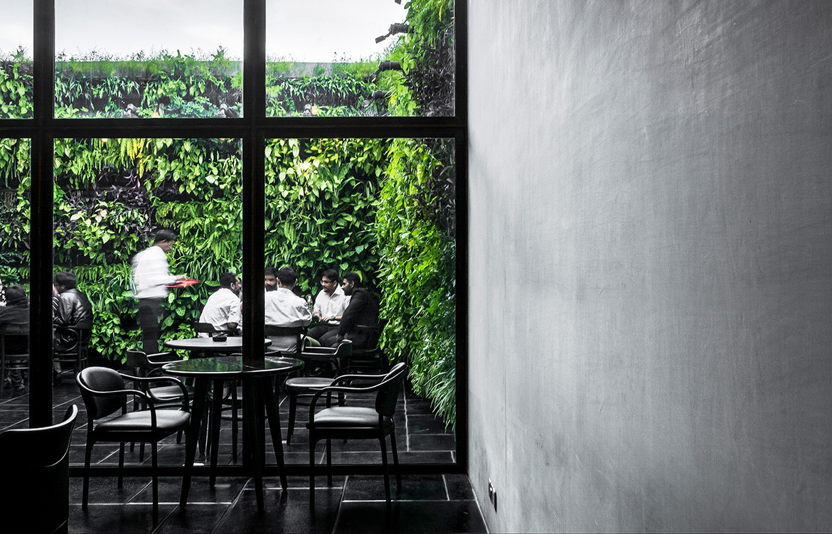
The added courtyard and filtering in of natural light likewise added an experiential quality to the café, conceptualised as three distinct spaces: finished in black, grey and green and characterized by the amount of daylight entering each space.
The moody and mysterious eatery was once a general storage space for hotel management with no openings and a complete lack of natural light.
The first space experienced upon arrival acts as a transition between the rest of the hotel and café. It is entirely finished in black limestone and features lower ceilings than the rest of the café, actively exaggerating the transition.
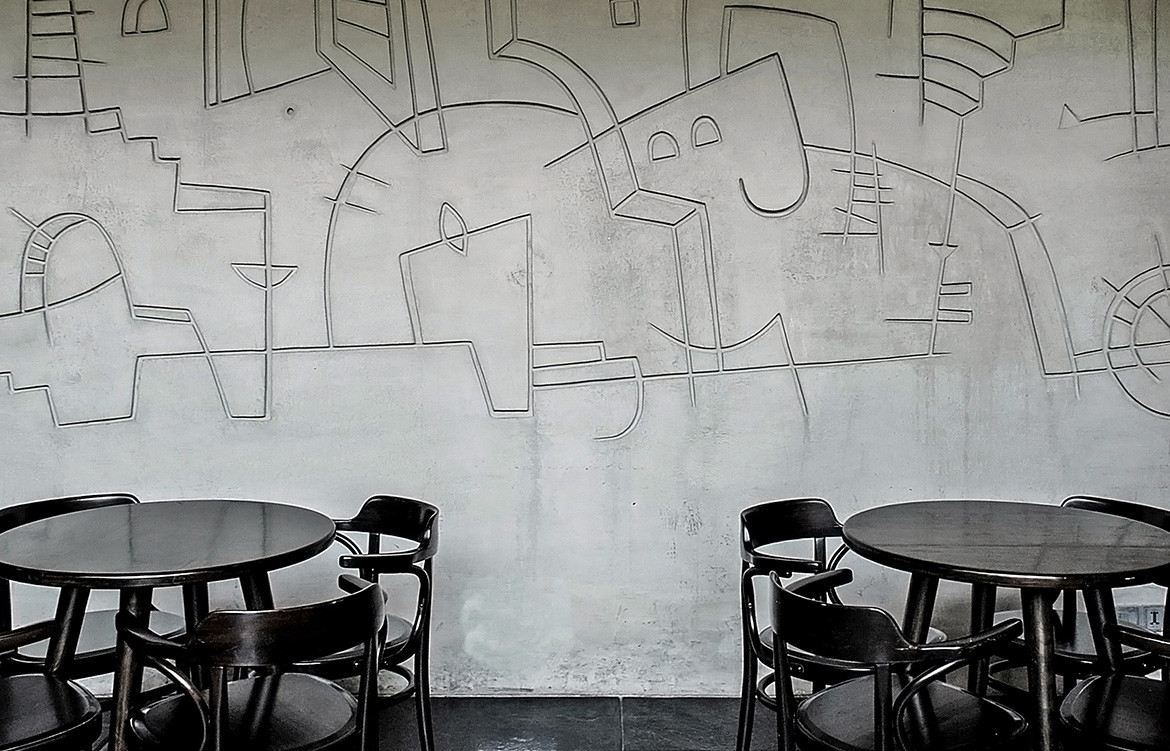
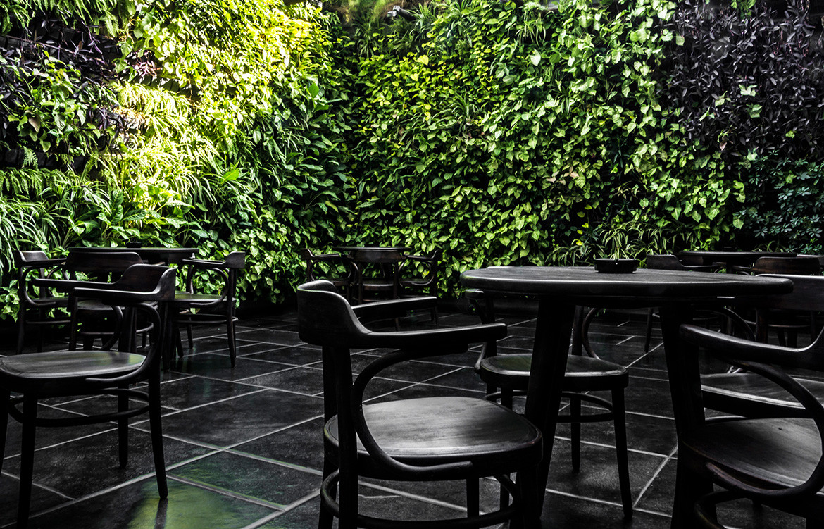
A grey, slightly lighter palette emerges as you make your way closer to the courtyard. The space is higher and walls are etched with simple line drawings. The Thonet chairs are original vintage pieces over three decades old – salvaged from an old ship. Daylight filters in.
The Thonet chairs are original vintage pieces over three decades old – salvaged from an old ship.
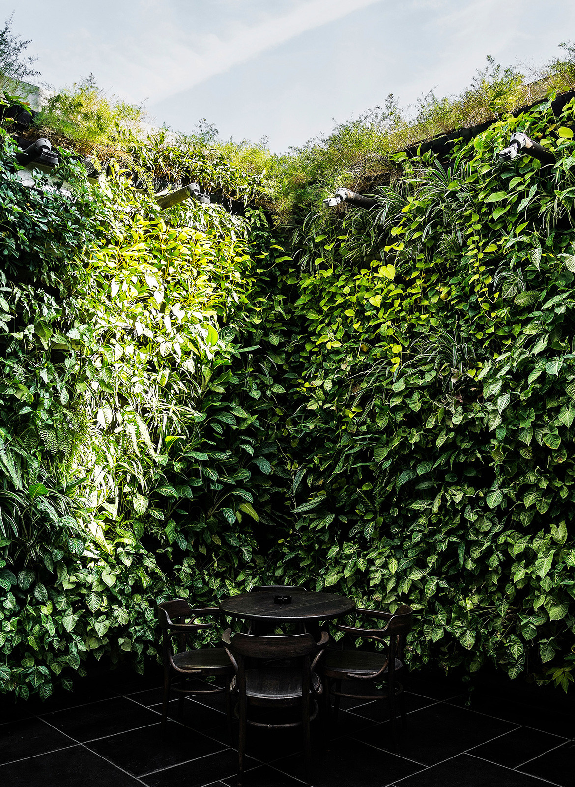
The final space, outside in the courtyard, is characterised by the vertical gardens lining the walls and open space reaching to the sky. Java+, through its design, attempts to explore the beauty of contrast within materials, textures and light.
Photography by Vishal Mehta
We think you might also like Traditional Indian Interior Design Is Modernised At ISH.
