Designed for a couple with three young children, it was always the dream of builder Marcus Hamilton and partner Sigrid Hamilton, to build their own family home – one that would be simple, enjoyable to live in and capture the northern sunlight on this prominent corner site (approximately 600 sqm). “The process started over 10 years ago, before our first daughter was born,” says Marcus, whose oldest daughter, Frankie, is now nine years old and one of three daughters (Milla, 7 and Goldie, 4). “We were living in a townhouse in Port Melbourne, but that was more of a ‘pad’ than a family home,” he adds.
While the family lived in the house for four years and knew what they were after, they hadn’t firmed up an architect. “We’ve always loved the work of Kennedy Nolan but thought they wouldn’t be interested in a relatively small project with the budget we had,” says Marcus, who having built the leading Melbourne photographer Derek Swalwell’s home, asked his advice. As Kennedy Nolan had renovated Swalwell’s home, he suggested that Marcus give them a call.
Fortunately, Kennedy Nolan was up to taking on this project, mindful that the house had to be fairly robust for a family with three young children and a dog. “We could see the potential of the site, but also could see some of the challenges,” says architect Rachel Nolan, Principal and co-Founder of the practice. “But we also saw that the 1930s bungalow [the original house] was inauspiciously located in the middle of this corner block and not making full use of the property,” she adds.
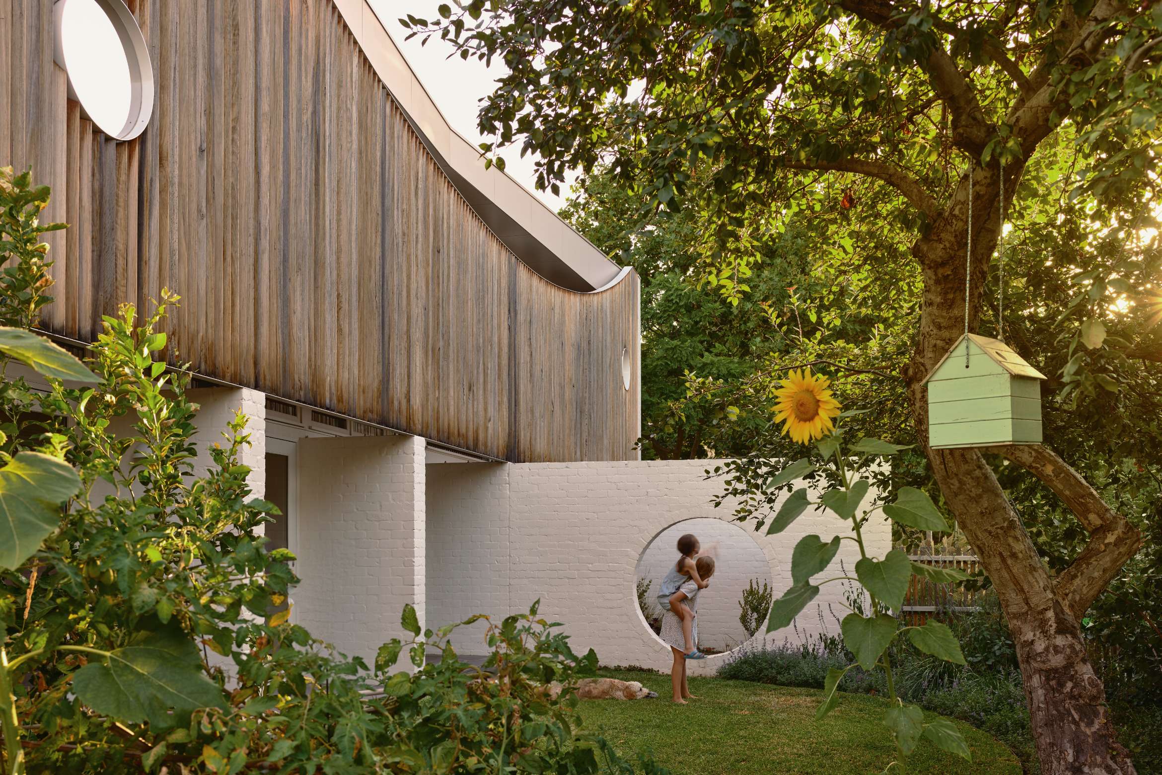
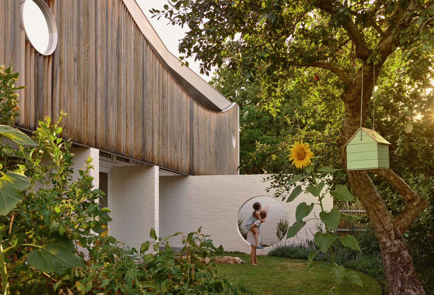
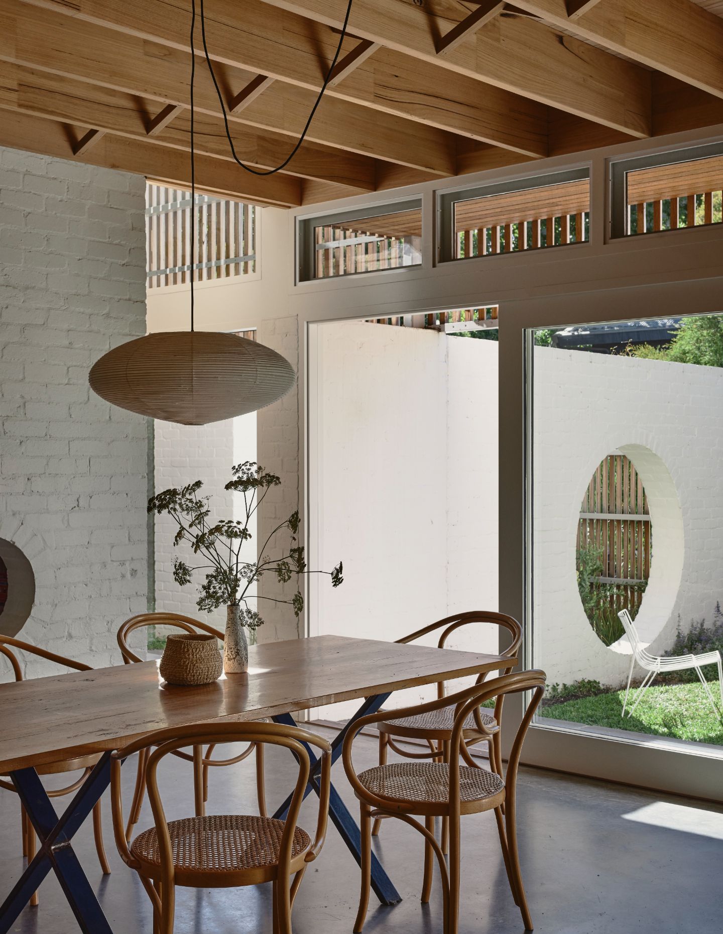
The new two-storey brick house has been positioned along the southern edge of the site, allowing the garden to be fully used and enjoyed year-round. While the established Jacaranda tree on the north west corner was retained, the reminder of the garden was reworked by the owners who have green fingers, with the architects establishing the framework to create these garden nooks/outdoor rooms. “We kept a small portion of the garden open to the street and installed a series of paths that led indirectly to the front door,” says Nolan. A ‘moon gate’, a signature of Kennedy Nolan that takes the form of a large circle in a brick fence, allows the children to explore the different gardens, including the manicured lawn on the western side of the home.
Related: The Studio Kitchen by Kennedy Nolan and Laminex
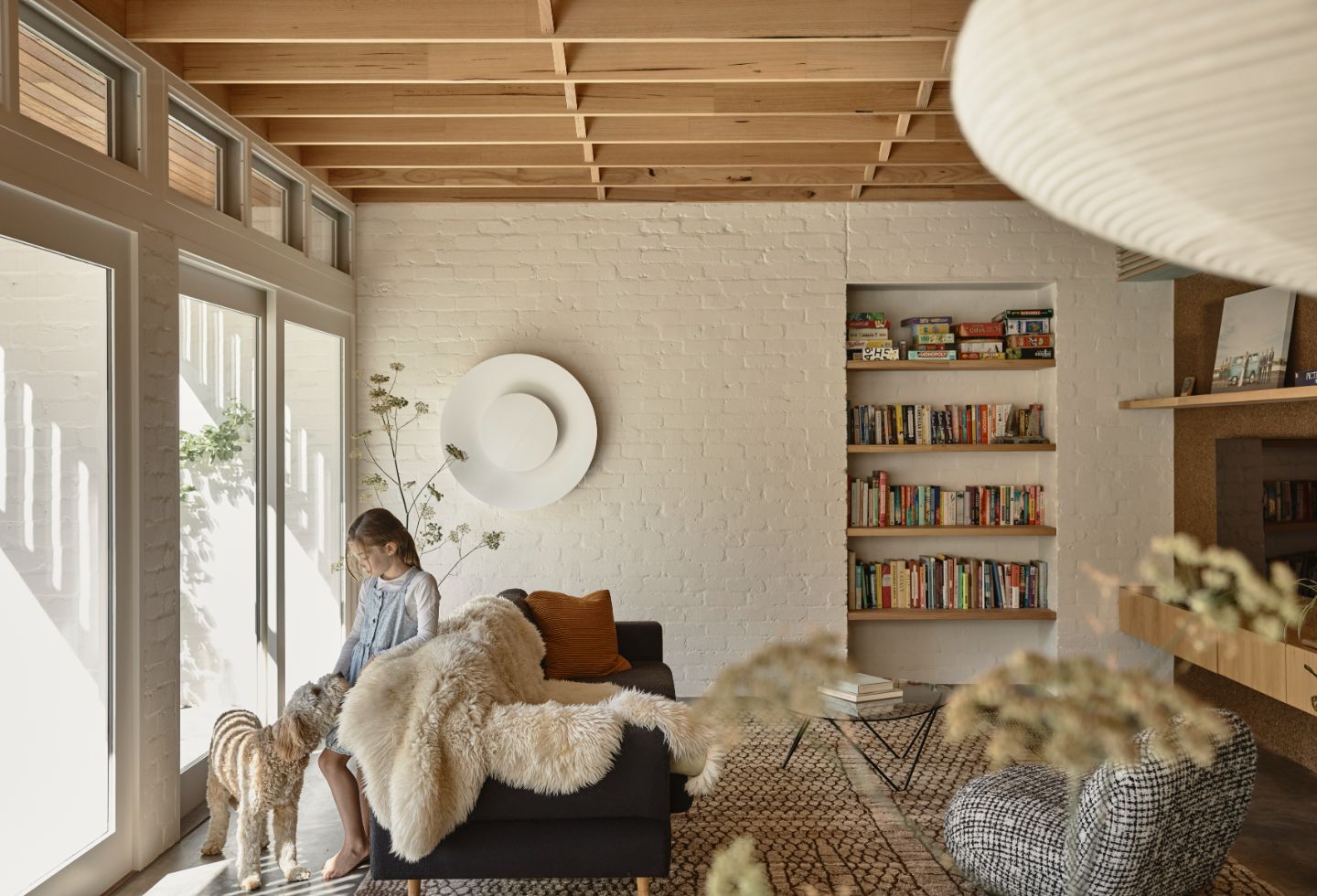
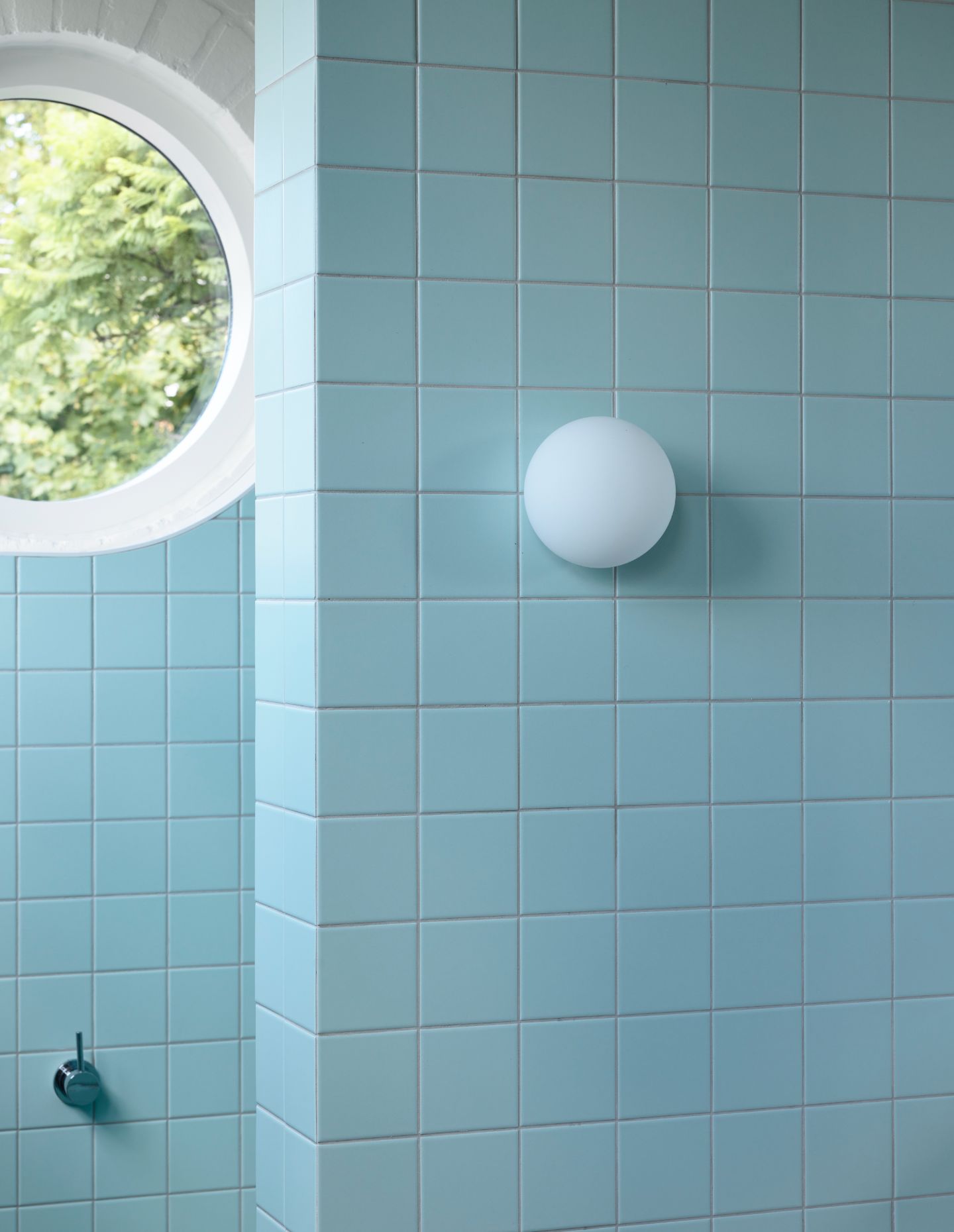
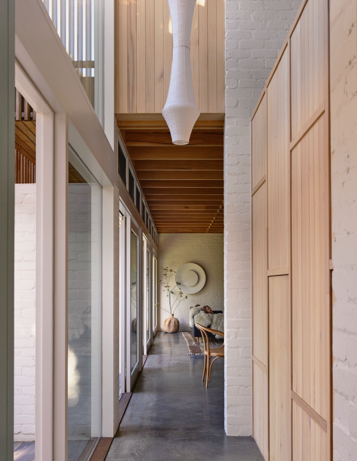
Given there was a need to keep things fairly simple, Kennedy Nolan located the living areas to the north with the service areas, such as the laundry and powder room, to the south. Apart from a separate living area, accessed by a sliding door, the remainder of the ground floor is fairly open plan, with the brick nib walls on the outside helping to create an enfilade effect along the northern edge.. Although simple in its floor plan, with the main and children’s bedrooms located on the first floor, there are still some nifty design moves to be found. A double-height void immediately past the front door features a two-metre-long Isama Noguchi paper lantern – allowing for both northern light and cross ventilation. Kennedy Nolan also made use of the undercroft below the stairs that functions as a cubby house for the children. Complete with its oculus-shaped window, the children can keep an eye on their parents rather than vice versa. And instead of the usual approach to a staircase, the architects created a generous landing mid-way through the rise that functions as a library for the children. Adjacent to broad steps, which act as a miniature theatrette, this unexpected intervention creates another space for the children to play. The more formal living area also conceals a built-in study nook for the parents. Although, as Marcus says, “most of the time the ‘formal living area’ is used by the children for playing with Lego.”
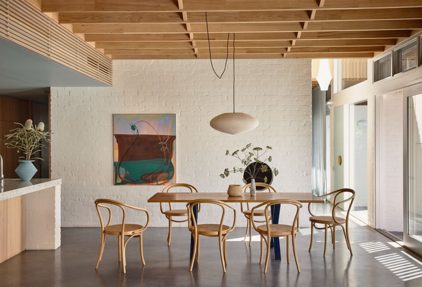
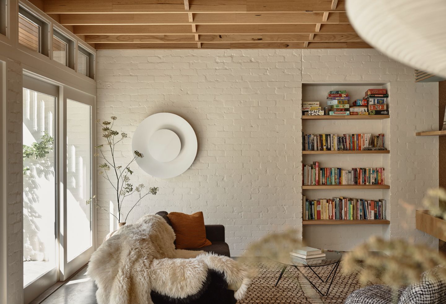
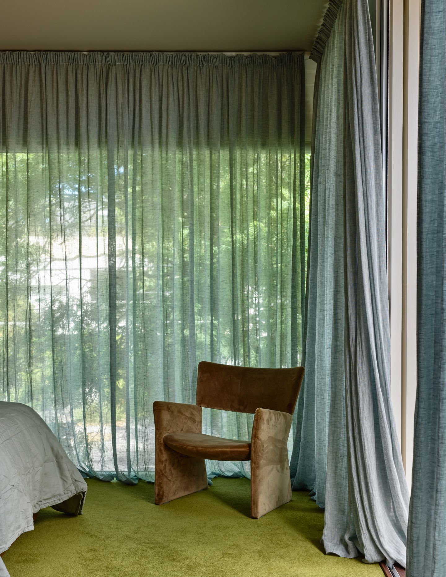
While the finishes have been kept fairly simple, including pale blue painted doors and polished concrete floors, there is still a fine level of detail, with customised joinery and exposed timber joists that extend across the ceiling on the ground floor. Terrazzo benches and splashback in the kitchen add to the mix. “My uncle worked as an architect in Sydney and I always loved visiting some of the homes he designed in the 1960s and ‘70s,” says Marcus, who was keen to create a similar vibe, but moving onto a more contemporary expression.
“You could say this house is fairly simple and understated, but it also has a certain amount of confidence,” says Marcus, who was open to Kennedy Nolan’s ideas. And unlike many family homes, where doors are often kept shut to keep ‘ready for visitors’, here there’s a sense of use, and the pleasure of exploring both the house and, as importantly, the garden itself.
Next up: The timeless appeal of Raheen House by C. Kairouz Architects
