1. Kitchen art – Sculpted Space by HYLA Architects
This dry kitchen counter’s curvaceous, evocative form embodies Sculpted Space house’s artistic sensibilities.
A house designed for art usually distinguishes architecture as shell and art as object. HYLA Architects’ Sculpted Space House attempts to merge the two for its art collector owner.
The façade is an expressive montage comprising a rectilinear timber cantilever and screened planes juxtaposed with concrete fins, and a rotund brass-wrapped staircase. This palette continues indoors as a tactile canvas for artworks that eschews the white box gallery aesthetic.
The dry kitchen island counter, connected to the living room, is itself a piece of sculpture. A concrete-lookalike Dekton sintered stone top, the tone of which matches the floor tiles, caps a sinuous steel base. “It brings out the casual, semi-outdoor effect that we aimed for with the home.
We used a reflective material for the base that can be applied in an organic profile to lighten the appearance of the 2.8-metre-long counter,” says Han Loke Kwang, the Singapore-based firm’s founder. It stands out against dark cabinetry containing metal-and-tinted glass kitchen appliances.
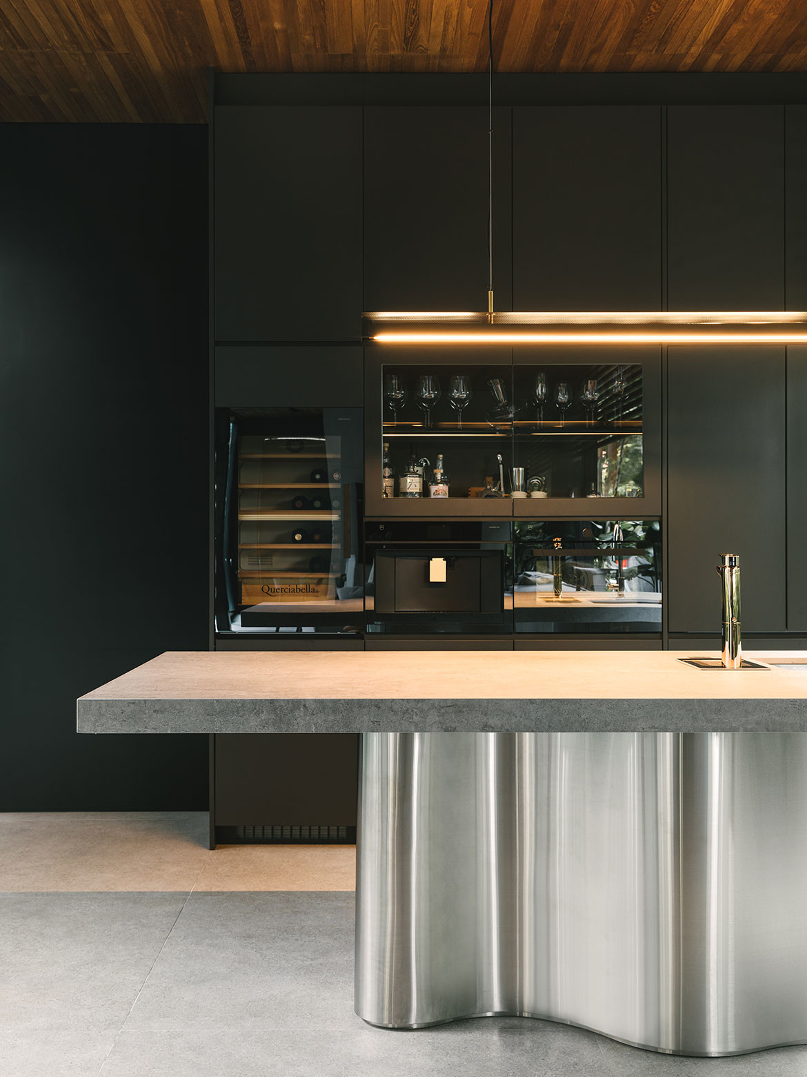
The island counter is a casual dining space for the family of three. They can sit facing the person behind the counter, the garden and pool that runs alongside each side of the house, or the television at the end of the living room. Like art, its harmony with the house’s overall design sensibilities elevates the utilitarian and routine activities of cooking and eating.
HYLA Architects
hyla.com.sg
Words – Luo Jingmei
Photography – Daniel Koh
2. An enveloped garden – Nucleus House by Palinda Kannangara Architects
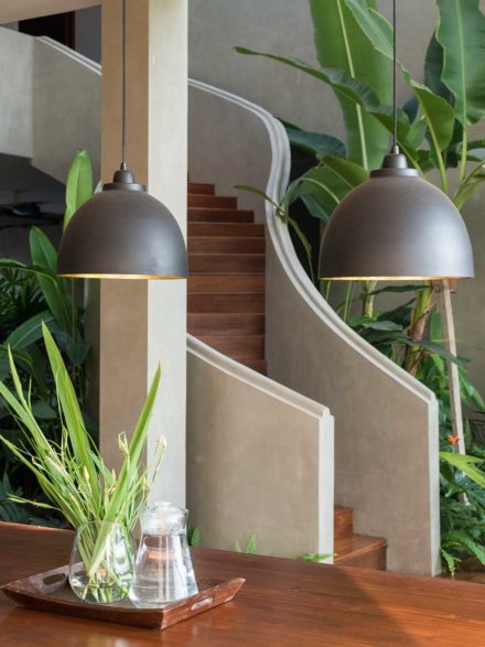
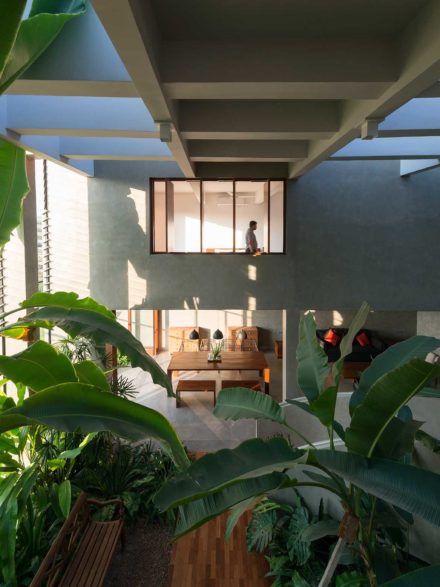
Needing to create security and privacy but not wanting to be disconnected from nature, Nucleus House by Palinda Kannangara Architects places a large central garden in between the dining and the kitchen areas.
Set within rolling fields of rice paddies, the clients of Palinda Kannangara Architects wanted a home that was private but still brought the outdoors in. The solution can be seen in the insertion of an interstitial greenhouse space overflowing with lush tropical planting, which separates the dining area and kitchen.
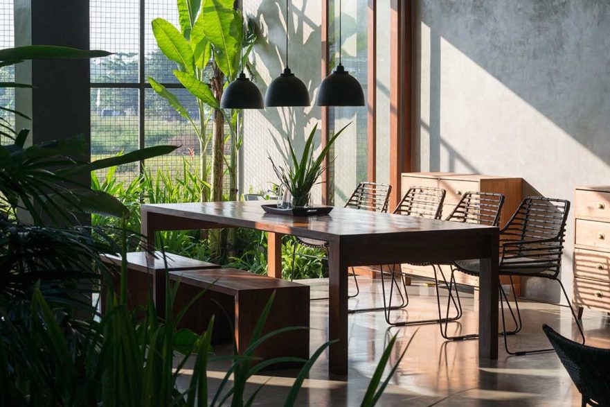
The kitchen is positioned on the other side of the courtyard area and has been deliberately hidden away. It’s a decision that puts focus on the dining area and its surrounding verdant gardens.
Extending the typical parameters of a dining area, the central courtyard invites a moment of pause and rest. Replete with a bench seat, the owners can take a cup of tea or coffee and sit within an open yet private garden space.
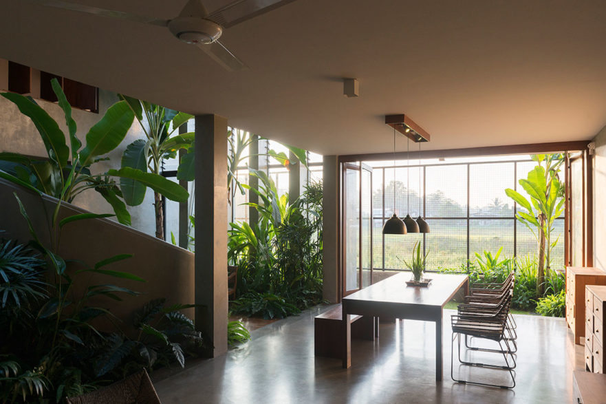
“We wanted it feel like you were outside. The courtyard offers a moment to stop and feel refreshed and is a bridge that connects the kitchen and the dining space, as well as the rest of the home through a spiral stair,” says Kannangara.
The emphasis of Nucleus House is not on cooking, instead this has been flipped on its head, placing the dining space and courtyard centre stage, where the enjoyment of eating, drinking and entertaining is the core function of the home.
Palinda Kannangara Architects
palindakannangara.com
Words – Aleesha Callahan
3. Ripple effect – Ripple House by FMD Architects
A canny manipulation of layout, level and materiality by FMD Architects brings a kitchen firmly into the fore of this terrace house in Melbourne.
Ripple House is named for a series of domestic spaces that unfurl in unison with a timber-battened ceiling that undulates above them. Concealed behind the façade of a single-fronted Melbourne terrace, the updated interior of this home responds to a brief that prioritised light and a perception of expanded space, with the kitchen designed as a central component.
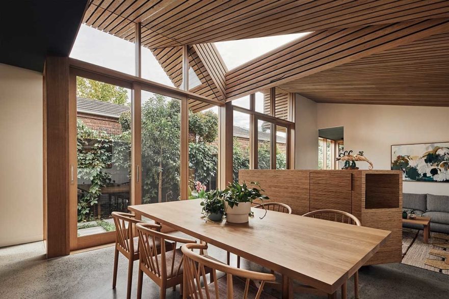
The clients, a couple nearing retirement, sought amendments to the original floor plan that would open up the home, find connection to the outdoors and draw light deep into the dark interior. Fiona Dunin of FMD Architects was presented with a classic terrace floor plan – bedrooms and bathrooms at the front, a cramped living room beyond and a lean kitchen tacked on to the rear.
Cognisant of the clients’ desire for light, space and a connection to the outdoors, Dunin inverted the floor plan by relocating the master bedroom to the rear (leveraging morning light) and positioning a new guest bedroom/home office at the front of the house, thereby centralising the living and dining zone and kitchen.
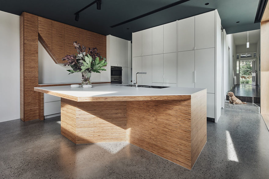
The kitchen is defined by a change up in level, angular joinery elements and a lowered dark green ceiling, the latter forming a lateral continuation of the faceted timber ceiling. “The shape and form of the timber ceiling is not without reason,” explains Dunin.
“The ceiling has been engineered to create a sense of definition but has been raked at specific angles to catch northern sun above the neighbouring brick wall.” A triangulated, angular slit in the ceiling brings morning light into the kitchen, thereby illuminating the bespoke joinery and kitchen table. The joinery pieces were designed to be uncomplicated, structural pieces that felt like sculptures in the newly expanded space.
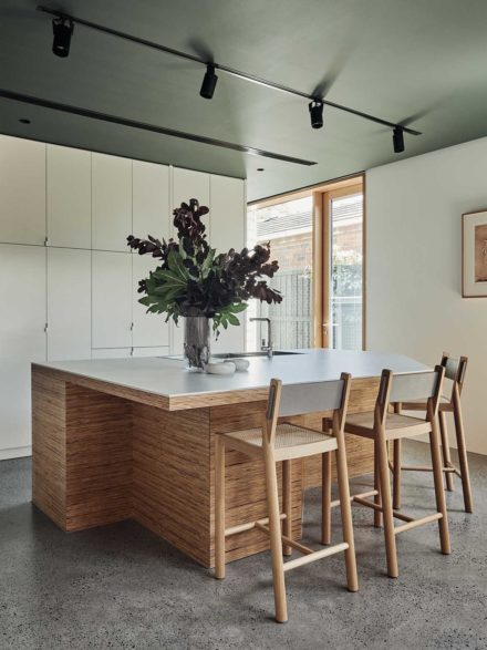
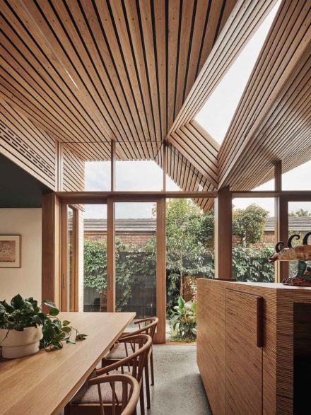
The angular nature of the ply island mimics the ceiling form and serves as a generous congregation or gathering spot. An angled plywood piece of carpentry conceals the extractor, while an understated vertical plane of white joinery is specifically designed to be “anonymous” in the space, concealing the fridge and pantry.
Significantly, the kitchen also enjoys a strong connection to the outdoors, a fundamental aspect of the new layout that was non-existent in the original home.
FMD Architects
fmdarchitects.com.au
Words – Elana Castle
Photography – Peter Bennetts
Want to explore more kitchens? Take a look at all of our kitchen design stories.
