It goes without saying that when it comes to contemporary residential architecture, kitchen design is integral to setting the tone for and the flow of a house’s shared spaces. In Habitus #44 for our 2019 Kitchen and Bathroom issue we explored the ways in which architects and designers nourish themselves and their clients through the work they do and the places and spaces they create – specifically in these spaces in which we often gather, and to which we like to retreat. For your kitchen design inspiration, here are three architect-designed kitchens that are truly heart-of-the-home-worthy.
Portsea Beach Shack by Pleysier Perkins
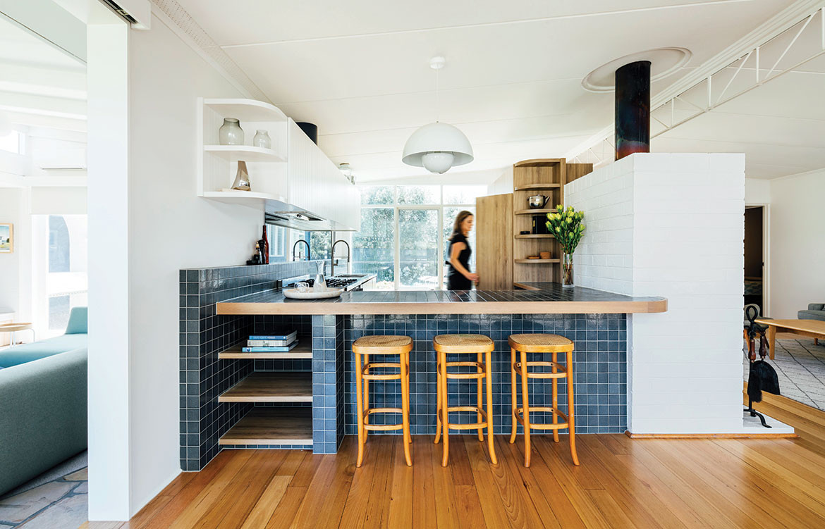
The kitchen in Portsea Beach Shack, by Pleysier Perkins, is open, relaxed and robust enough for family and friends to casually gather around.
Beach houses are all about enjoying laidback times with family and friends. Portsea Beach Shack on the Mornington Peninsula is the holiday home of a fun, creative, professional couple with a young daughter. They engaged Pleysier Perkins to update and extend their classic 1960s beach house to improve the function and internal flow of the kitchen and living area and to create a better connection to the outdoors.
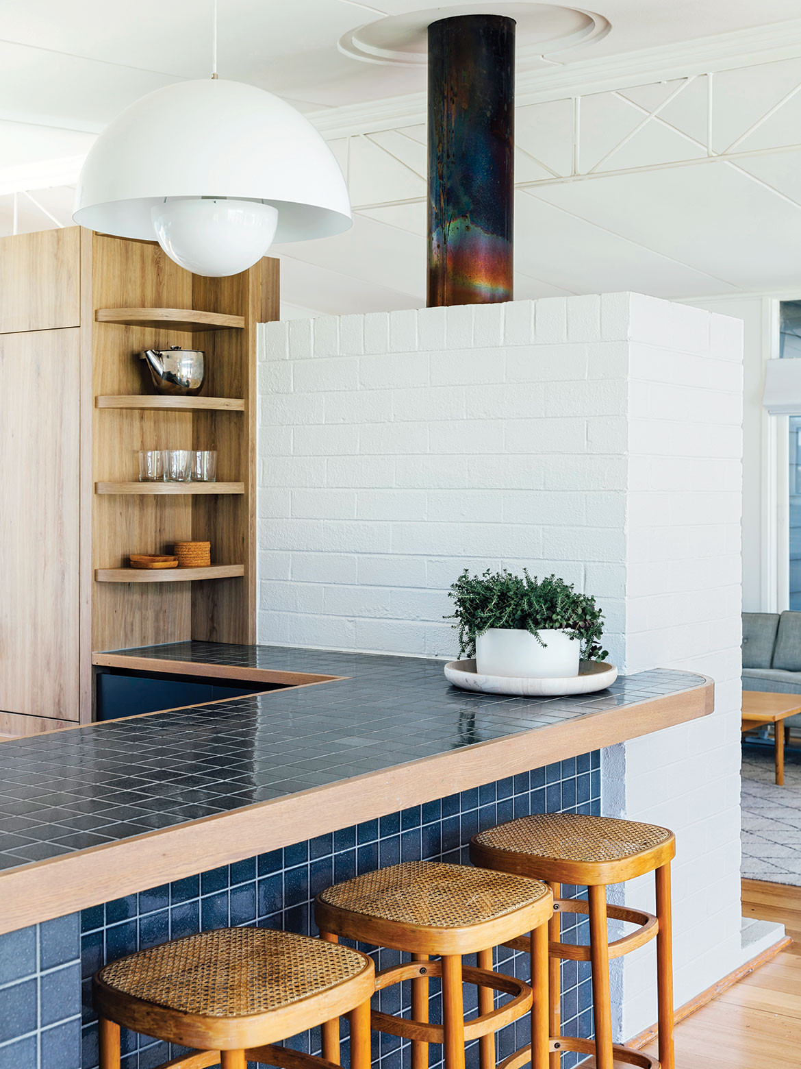
The kitchen is relaxed and robust; an open and comfortable space for family and friends to gather around. A play of coloured and textured materials – glazed tiles, timber joinery, stainless steel, white painted brick and V-groove boards – maintain the beach house vibe and evoke the spirit of mid-century architecture and design. “The client loved the handcrafted ideology of mid-century design and the subtle cracked effect of the glazed Japanese tiles are in keeping with the charm of the house,” says interior designer Elise Burton. The blue-tiled benchtop and timber joinery hug the existing brick chimney, and curved corners visually soften the straight lines of the architecture.
A stainless-steel bench provides a hardwearing surface for food preparation and dishes. The pantry and fridge are located where kids can easily come and go. And a freestanding cooker is large enough for casual summer soirées. “It’s all about sharing good times,” says Elise.
Pleysier Perkins
pleysierperkins.com.au
Words by Rebecca Gross | Photography by Michael Kai
YT House by rear studio
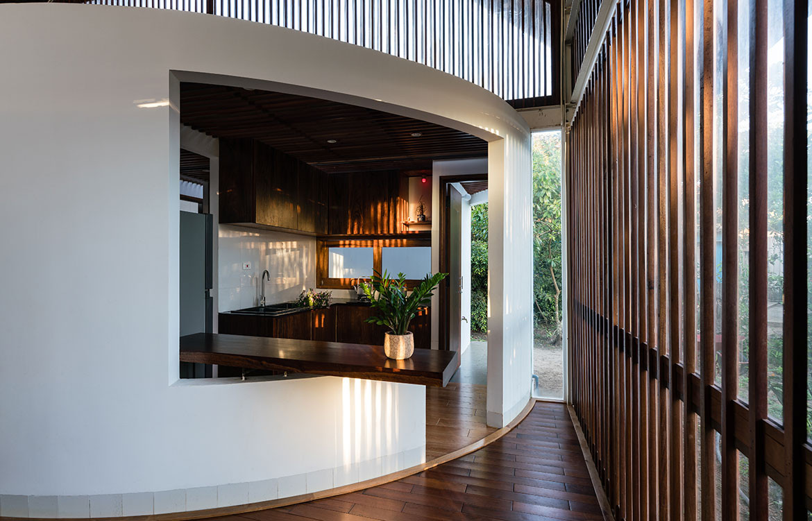
Situated in a small village northwest of Dak Lak province, Vietnam, spaces within YT House by rear studio are influenced by the surrounding vernacular.
Differing from kitchens in the western world, Asian kitchens often feature a classic charm with simple lines and a soft elegance that works to preserve cultural traditions that have been passed on from generations.
Based in Ho Chi Minh City, Vietnam, architecture practice rear studio harnesses design in a way that maintains privacy in the kitchen, but conveys the spirit of a modern user. Opening up to more than one common area within the house, the spatial configuration of the kitchen also caters for connectivity and conversation between family members.
Subtly juxtaposing with the rectangular form of the houses’ four walls and floor plan, rear studio designs the formal entryway within YT House as a circular structure, repeating. The circular block that houses the kitchen and the bathroom also works as a central core of the residence and frees up the common spaces to reveal a light, open-plan design. Framing the kitchen are curved solid walls, but carving out a rectangular doorway in the centre creates a sense of symmetry, similar to the timber batten screens that frame the exterior of the house.
In YT House, the kitchen really is the heart of the home – as it creates an important link with other functional spaces.
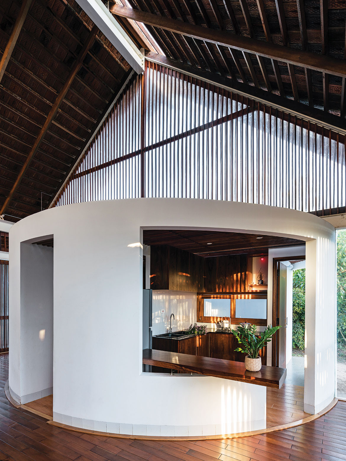
rear studio
rearstudio.com
Words by Thida Sachathep | Photography by Quang Dam
Leichardt Oaks by Benn+Penna
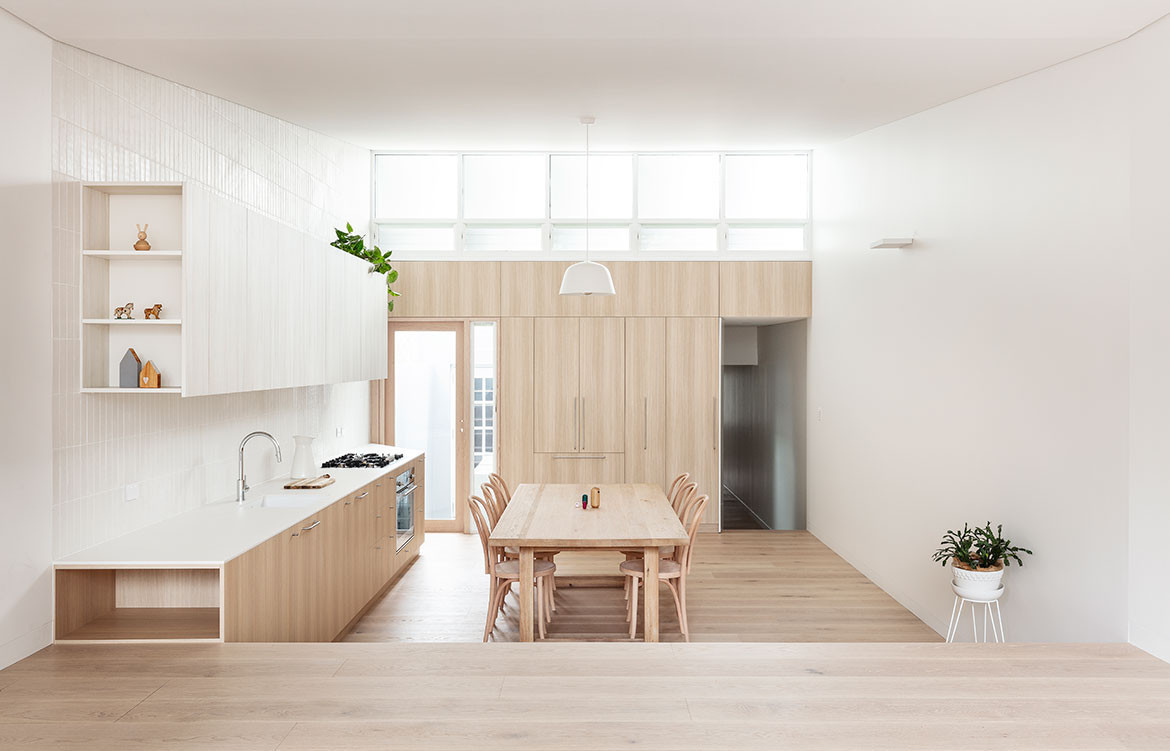
Benn+Penna designed the Leichhardt Oaks kitchen like a piece of furniture, creating a holistic backdrop in a calm and contemplative space.
As our kitchens become an increasingly integrated component of dining and lounge areas, they are being designed to quietly fade into the background to create a cohesive sense of space. The clients of Leichhardt Oaks wanted a calm and contemplative kitchen, dining and living room, and engaged Benn+Penna to design one long volume that flowed seamlessly out to the garden. “Because it is one room we were conscious of it not reading simply as a kitchen, but more as living room joinery, almost like a piece of furniture,” says Andrew Benn, director of Benn+Penna.
The kitchen has a pared-back design and minimal material palette. Joinery on the rear wall sits flush with the door and hallway openings to provide a smooth timber backdrop. Overhead cupboards have white timber door fronts to visually recede into the fully tiled wall, and under-bench cupboards lockstep with the stairs, which offer a subtle division of space. Shelving tucked into the ends of the cupboards provides display space for the living room.
As the soft tones of the materials catch the afternoon sun through the high-level windows and the morning sun filtering in from the garden, they reflect the light around the room and cast a soft atmosphere across the space.
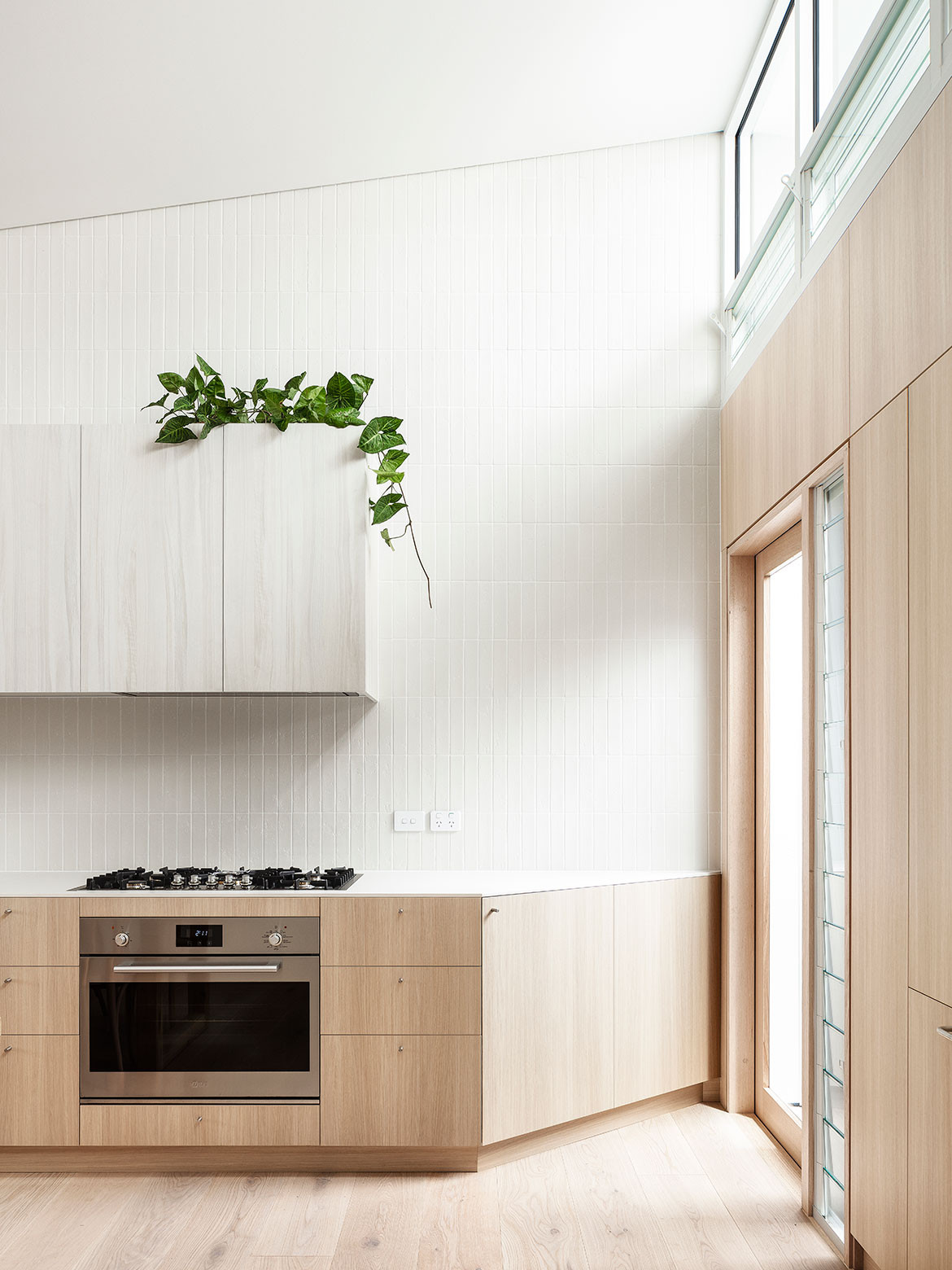
Benn+Penna
bennandpenna.com
Words by Rebecca Gross | Photography by Tom Ferguson
We think you might also like Stewart Street Residence by Stavrias Architecture and Cantilever Interiors
