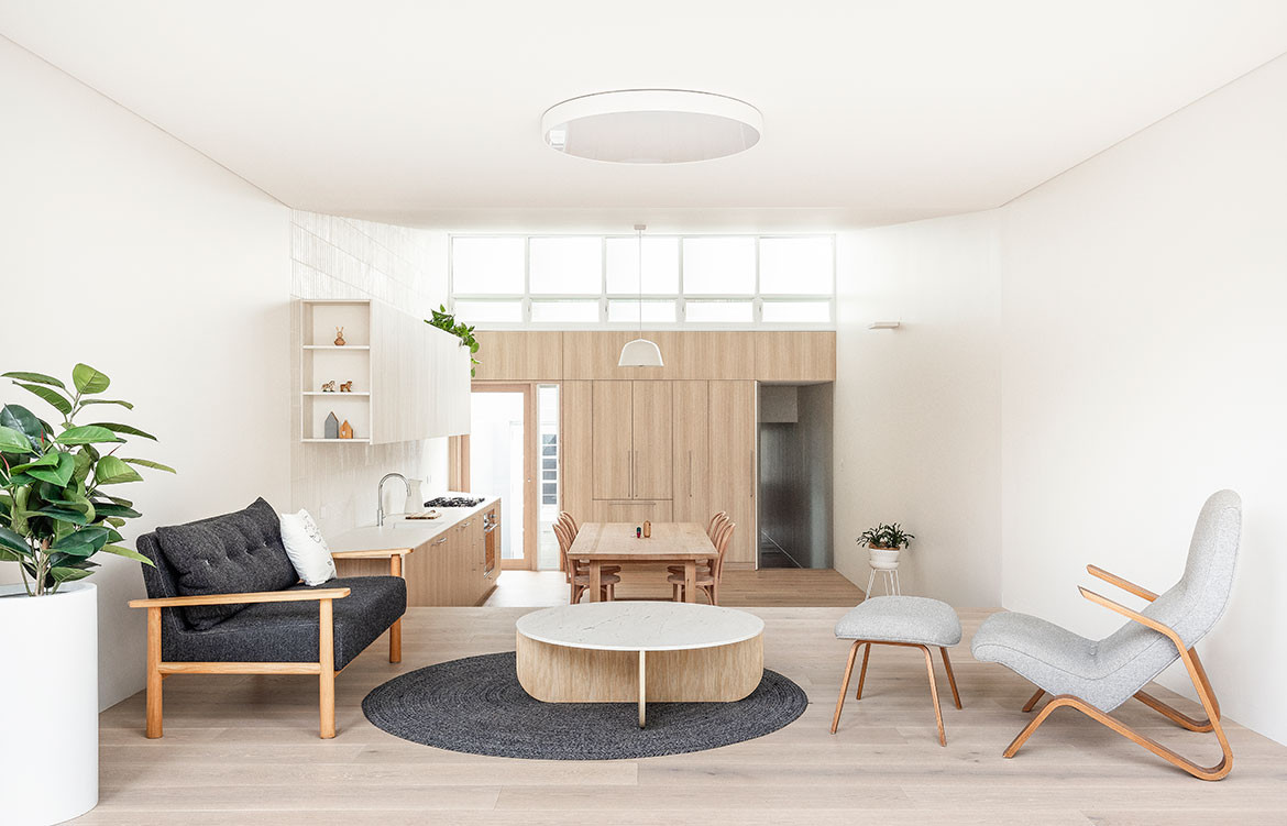
As our kitchens, dining and living areas become increasingly integrated, the joinery is being designed to fade quietly into the background for a cohesive sense of space. The owners of this late-Victorian cottage in Leichhardt, Sydney, wanted to update their kitchen, dining and living area with one long volume that flowed out to the garden. They had seen a previous house by Benn+Penna, Surry Hills Pocket, and engaged the studio to create a calm and contemplative space.
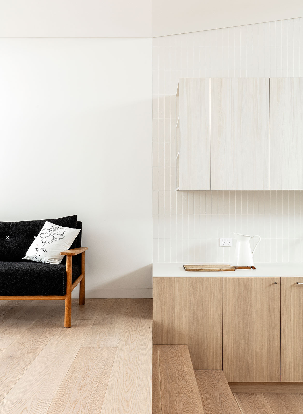
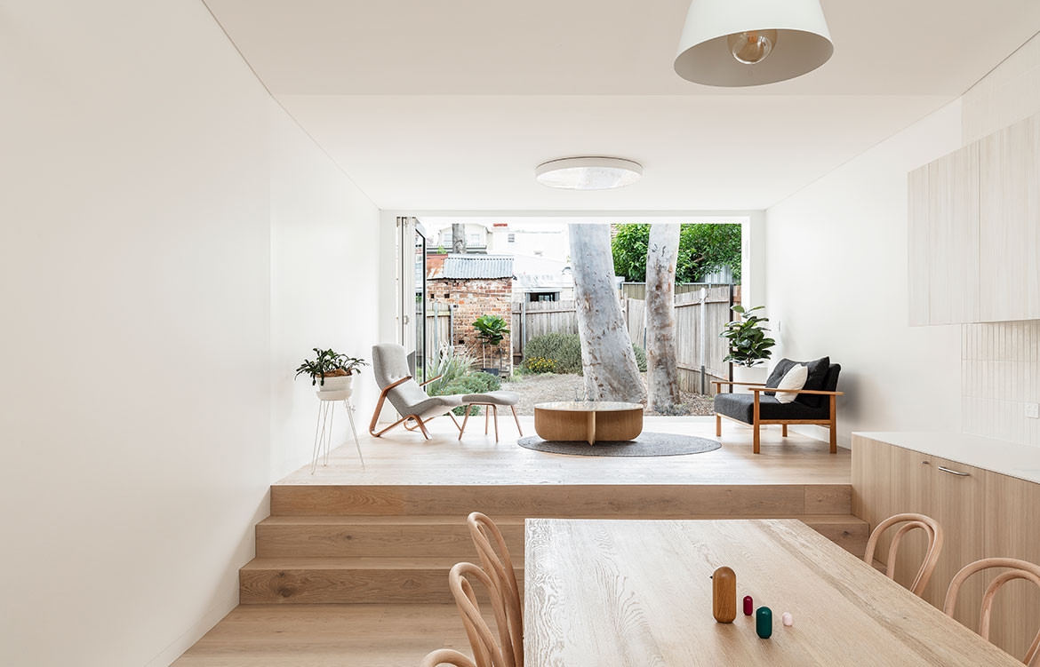
Benn+Penna removed the rear lean-tos to create the elongated volume. Clerestory windows and a 1.5-storey-high ceiling in the kitchen creates a light and more generous sense of space. Steps negotiate the slope of the site and provide a subtle division between the lounge and the kitchen and dining, while also serving a place for guests to sit and kids to play.
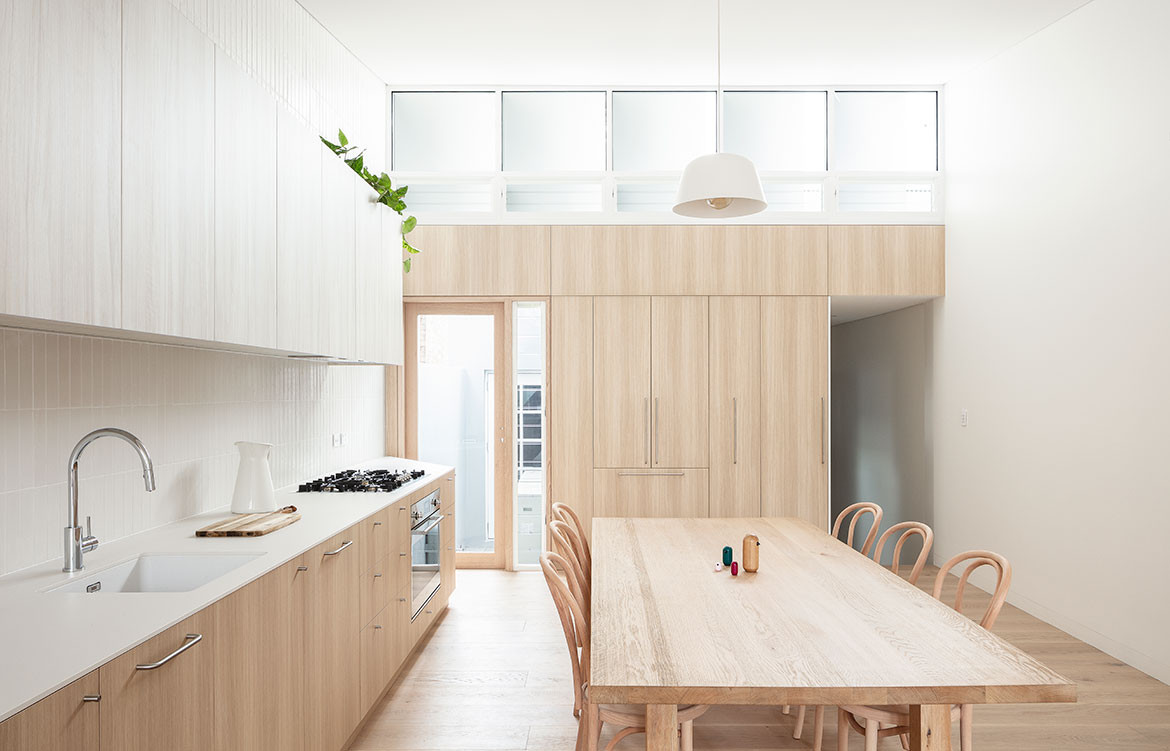
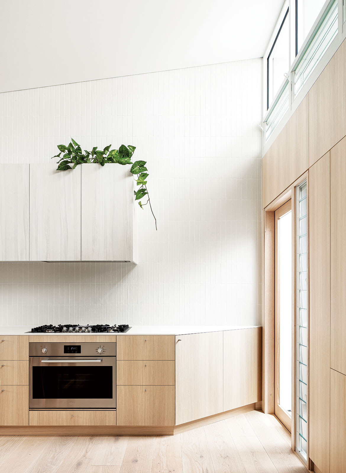
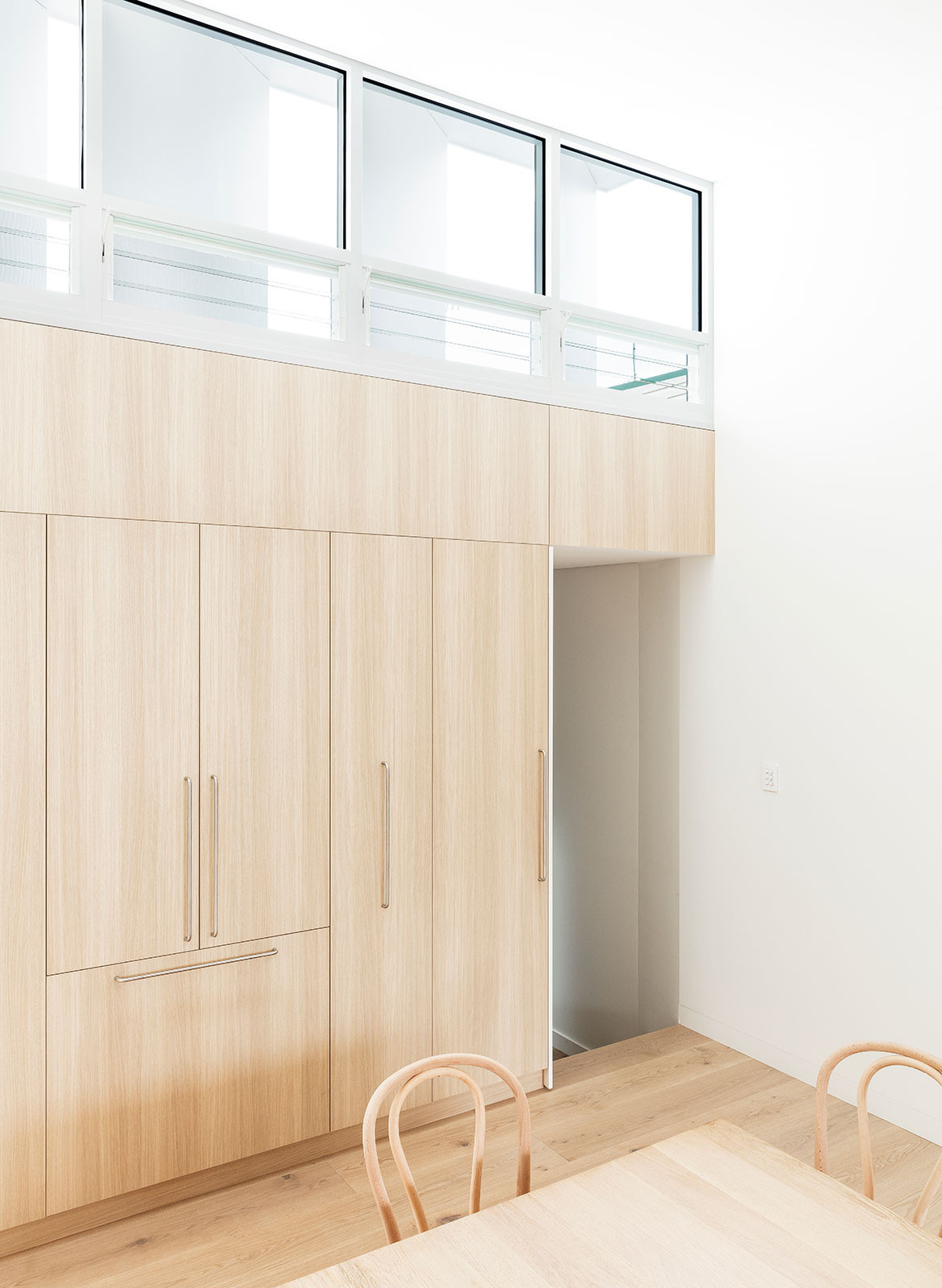
The kitchen has a pared-back design and minimal material palette with cabinetry integrated into the architecture of the room. “We were conscious of it not reading simply as a kitchen, but more as living-room joinery, almost like a piece of furniture,” says Andrew Benn, director of Benn+Penna. The joinery on the rear wall sits flush with the door and hallway openings to provide a smooth timber backdrop. Overhead cupboards have white timber door fronts to visually recede into the fully tiled wall and under-bench cupboards lockstep with the stairs. Shelving tucked into the end pieces of the cupboards provides display space for the living room.
The timber and white material palette has soft tones, minimal contrast and reflects light to create a contemplative space. As morning light pours in through the garden and afternoon sun filters through the high-level windows, the light bounces off the surfaces to cast a soft atmosphere across the space.
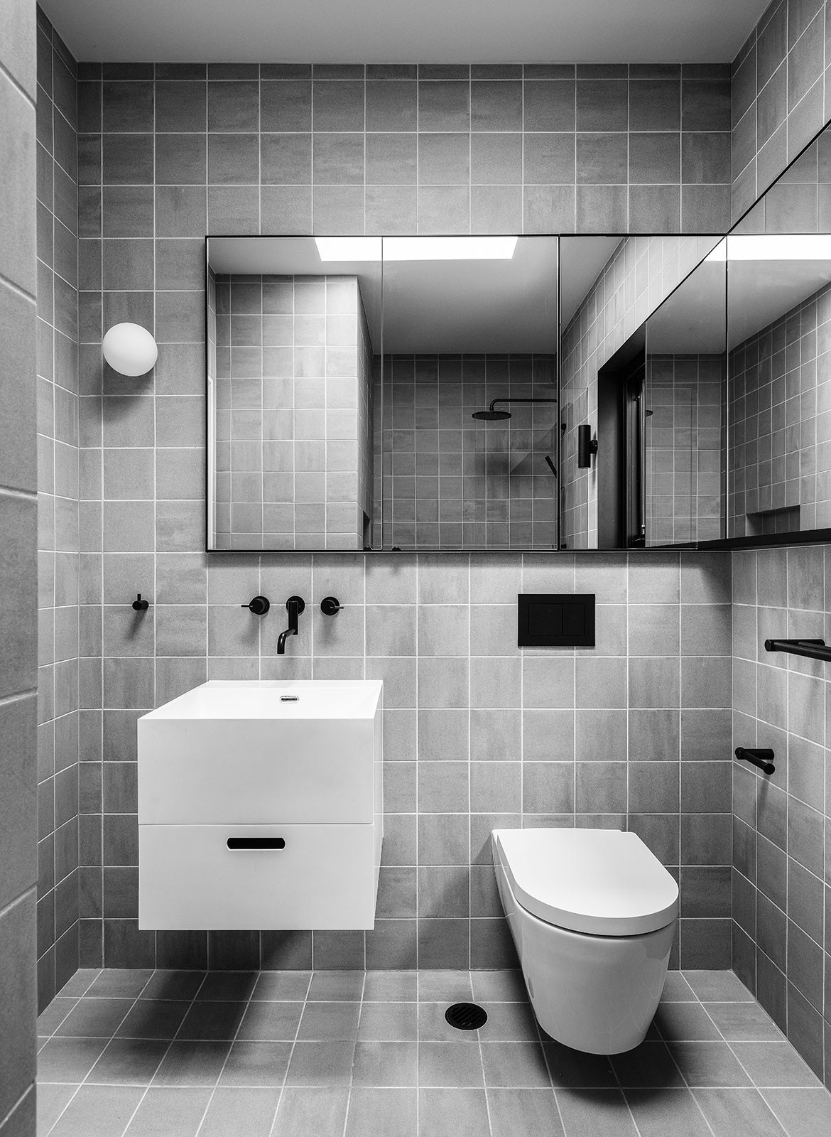
Benn+Penna also designed the new bathroom to be as calm and contemplative. The grey, white and black palette is low contrast within the space, but a counterpoint to the kitchen, dining and living space. “It’s a little surprise in the whole design,” says Andrew.
Benn+Penna
bennandpenna.com
Photography by Tom Ferguson
We think you might also like Design According To Heritage And Climate: Shaun Lockyer.
