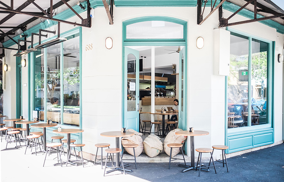
Connecting with community and living local is valued more and more in today’s urban lifestyle. Little Evie Café in Redfern, Sydney, has been designed with the concept of “creating a community” and within only weeks of opening it’s doing just that. “It’s an understated space with quiet confidence that it is fast becoming a local favourite again,” says Adam Burns, Design Director of multi-disciplinary practice Design Portfolio and tasked with the design of Little Evie Café.
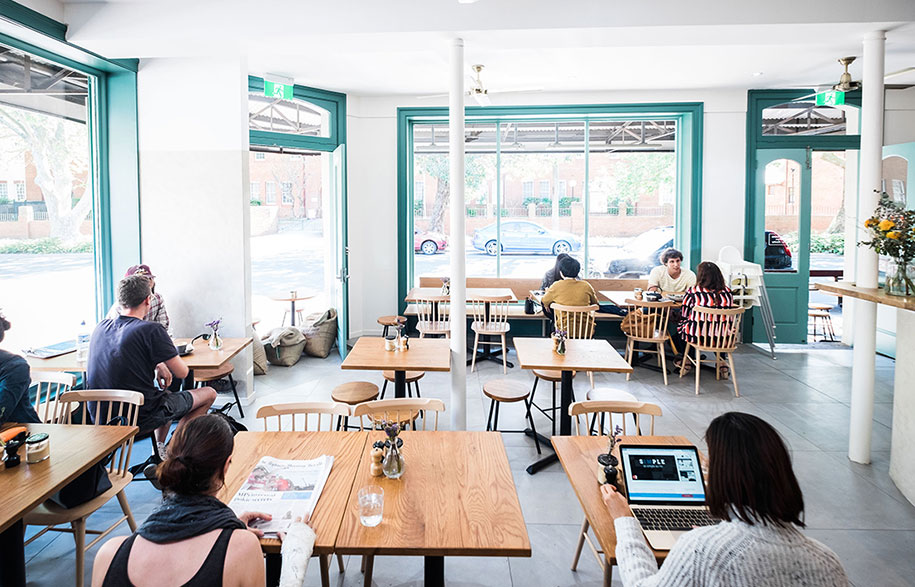
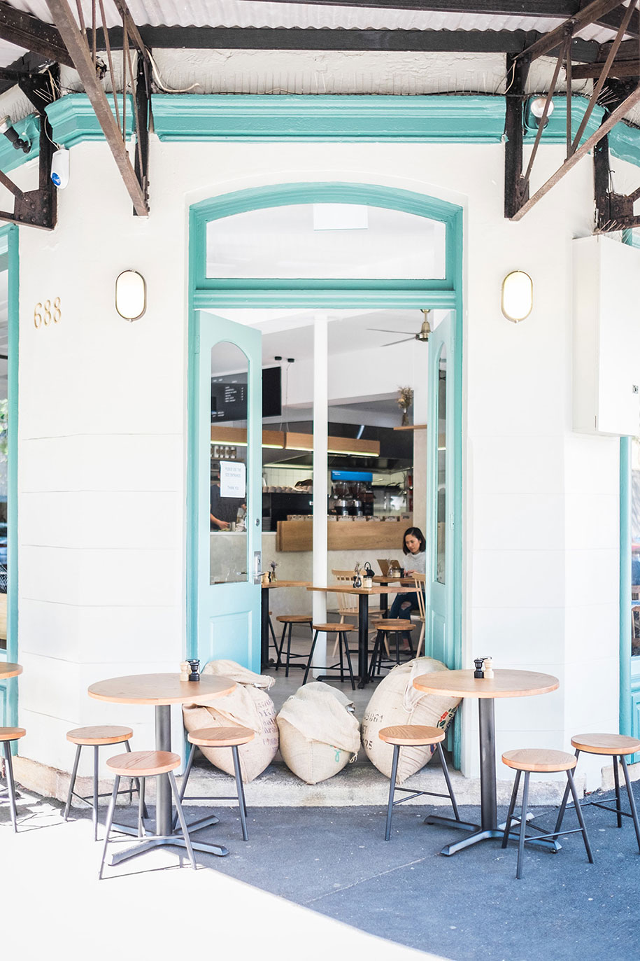
Little Evie occupies a corner position at the end (or the start) of a string of lively shops and cafés on leafy Bourke Street, “Its location in Redfern is well known, having been a popular café for a decade and one of the first cafés on Bourke Street,” says Adam. “Historically it’s an important spot for locals and we wanted to create an environment that anyone would feel comfortable visiting and get the locals talking again.”
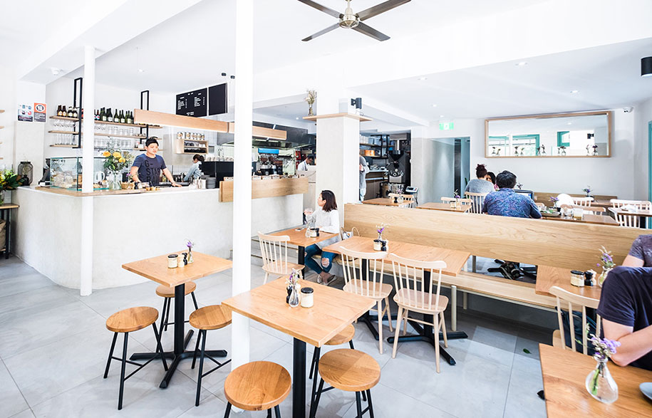
Little Evie’s owners Dimitri Tourlas and Sevin Zhang wanted a “warm, inviting, clean environment” and the result is pared back, open and sunny. In fact, it’s filled with sunlight having high ceilings and expansive windows on two sides of the café. “It’s an airy, fresh and clean space, especially being a corner building with such large windows,” says Dimitri. “The light brings good energy into the café,” says Dimitri.
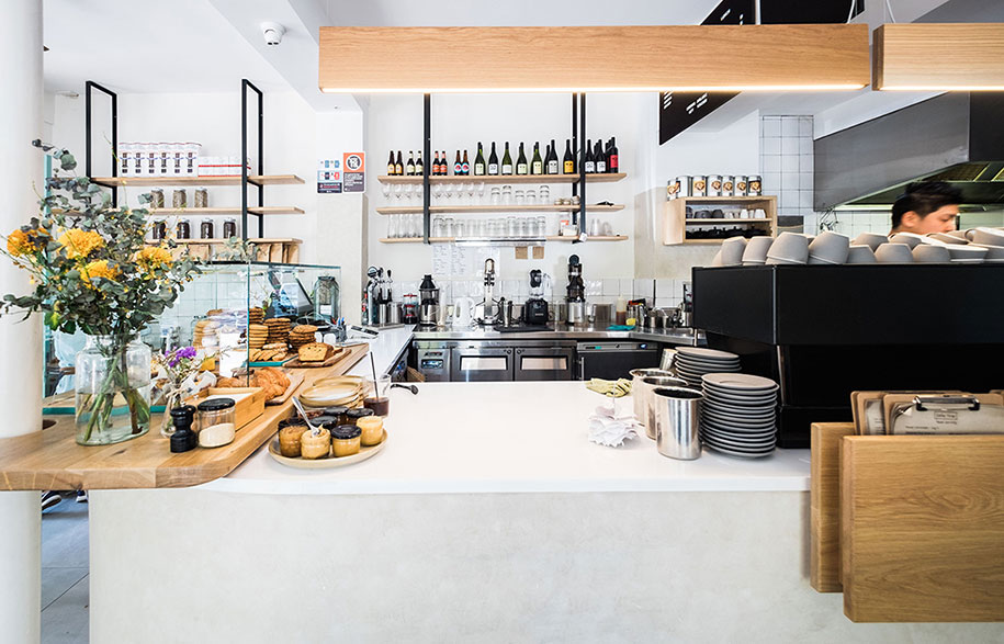
A natural material palette of American oak, cork and marble, and French-washed walls, offers a warm and neutral backdrop. The materials inform the subdued colour palette, with two-tone aqua-painted trim as a colourful accent around the windows and on the doors. From outside, aqua draws attention to life within the café; and from inside, it frames views of life taking place outdoors. “It’s clean and fresh whilst also being nostalgic in some ways,” says Adam.
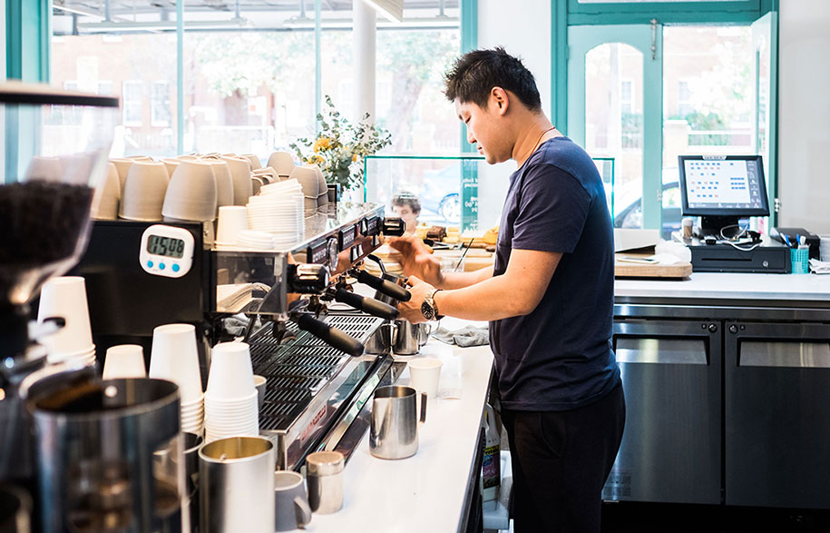
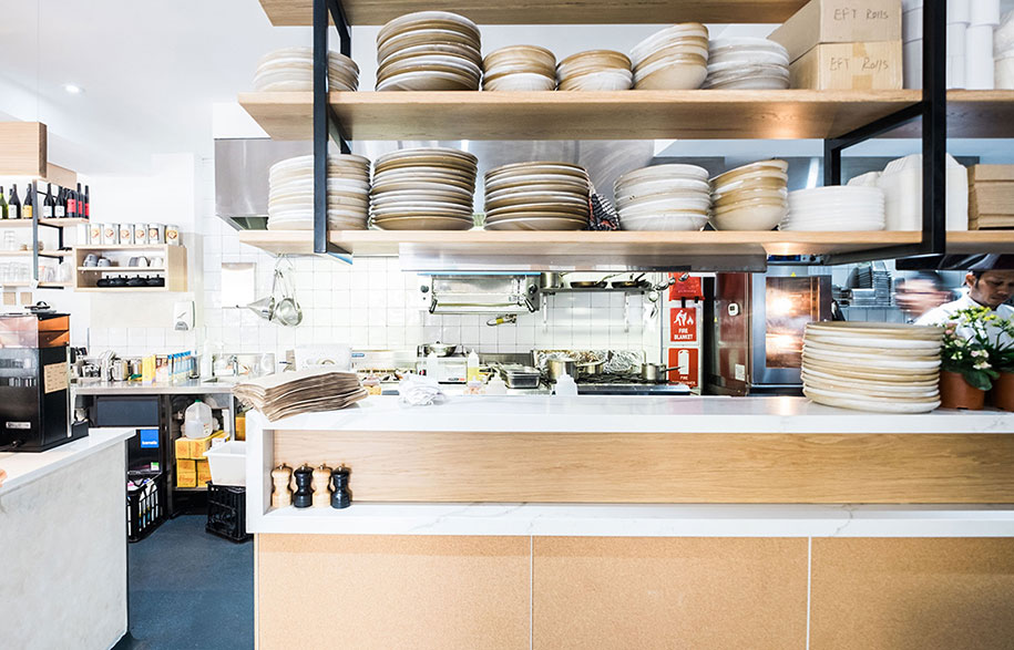
Tables and seating are spread across two levels to ensure full use of the space. A double-sided banquette straddles the change in levels, and the modern Windsor-style Chair Ironica by Ton have a retro simplicity that also adds a nostalgic touch. The counter curves around the coffee and kitchen area and has a marble and timber bench and two thin and elongated Carta pendant lights by Chris Hardy. The counter will also soon be hand painted by Sally Lee Anderson, an artist whose work Adam discovered in smallspaces, a store just three doors along Bourke Street from Little Evie.
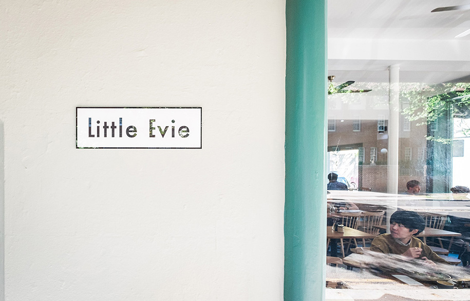
In Hebrew, Evie comes from the name Eve, which means life, living, lively. Little Evie Café embodies those three meanings, being a refreshing new café where a flourishing community of locals share conversation and food.
Design Portfolio
designportfolio.com.au
Words by Rebecca Gross.
Photography by Bob Barrett.
