On a relatively quiet street, a stone’s throw from Gordon’s Bay, established houses and old bungalows sit side-by-side – but one house immediately catches the eye with its rectilinear façade and explosion of green foliage – aptly named Barefoot House.
Stepping off the street, a garden path meanders through a throng of carefully placed trees, leading into a cavernous foyer space. While it might be unusual to see sprawling 5.6-metre windows on the street level entry, the overgrowth of planting obscures the interior and adds a playful sense of adventure.
In the entry portico, “Timber lines the ceiling, running from the outside to the inside, opening up to a large double-height void. It creates a moment of pause that acts as one large, connected courtyard,” explains Alex Prichard, associate and lead architect on the project at Madeleine Blanchfield Architects.
Looking back to the street, the greenery has enclosed the space to produce an immediate sense of immersion. “The landscaping was so important to create something that felt quite private from the inside. But the scale and light make it feel generous,” explains Prichard.
From here, the eye is drawn down the hallway where the promise of light beckons. Stairs lead up on the left and a central void courtyard of more greenery sits on the right, before the narrowness of the hall gives way to a large kitchen, dining and living space. “There’s a sense of reveal as the rooms open up,” comments Prichard.
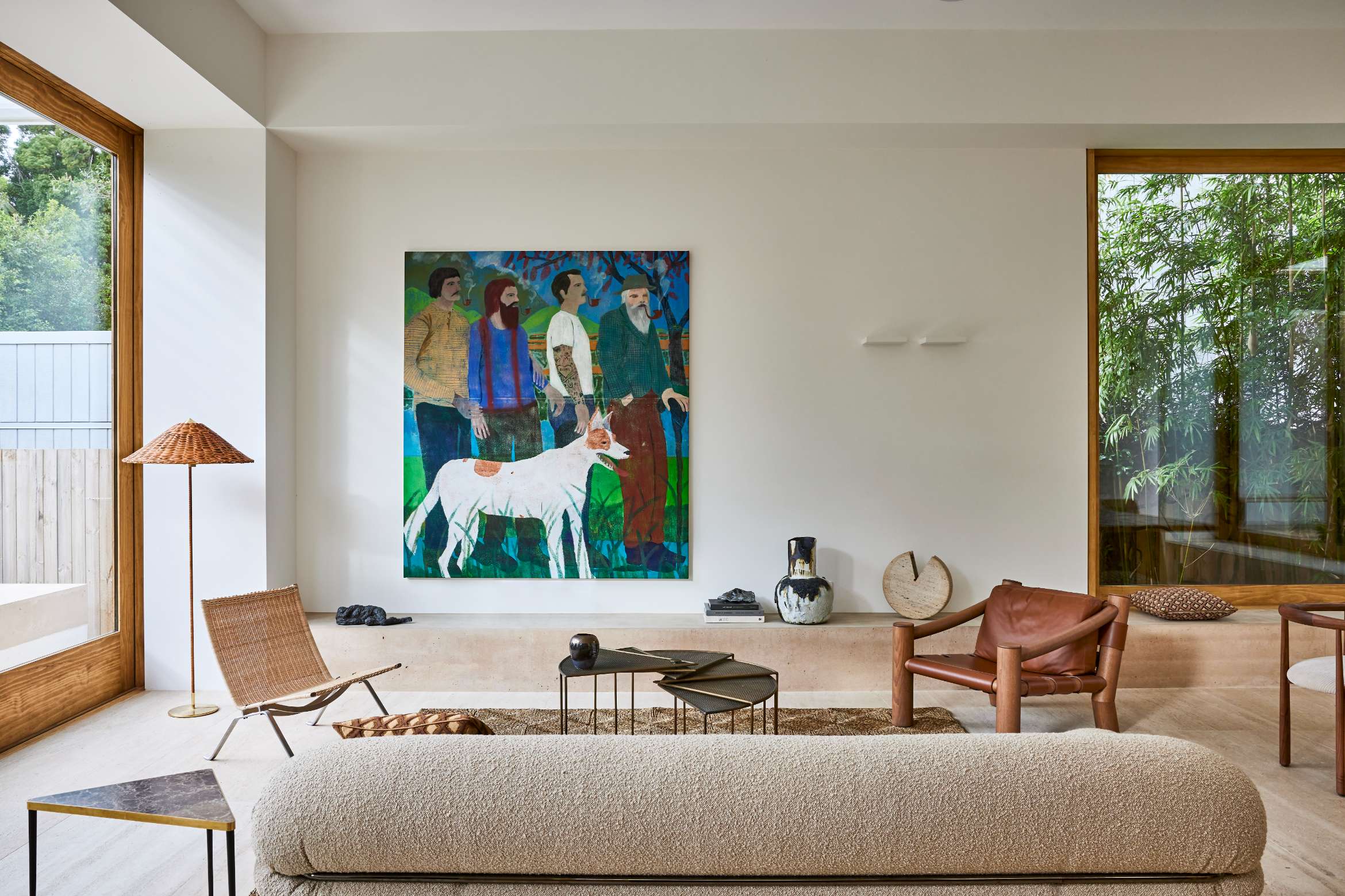
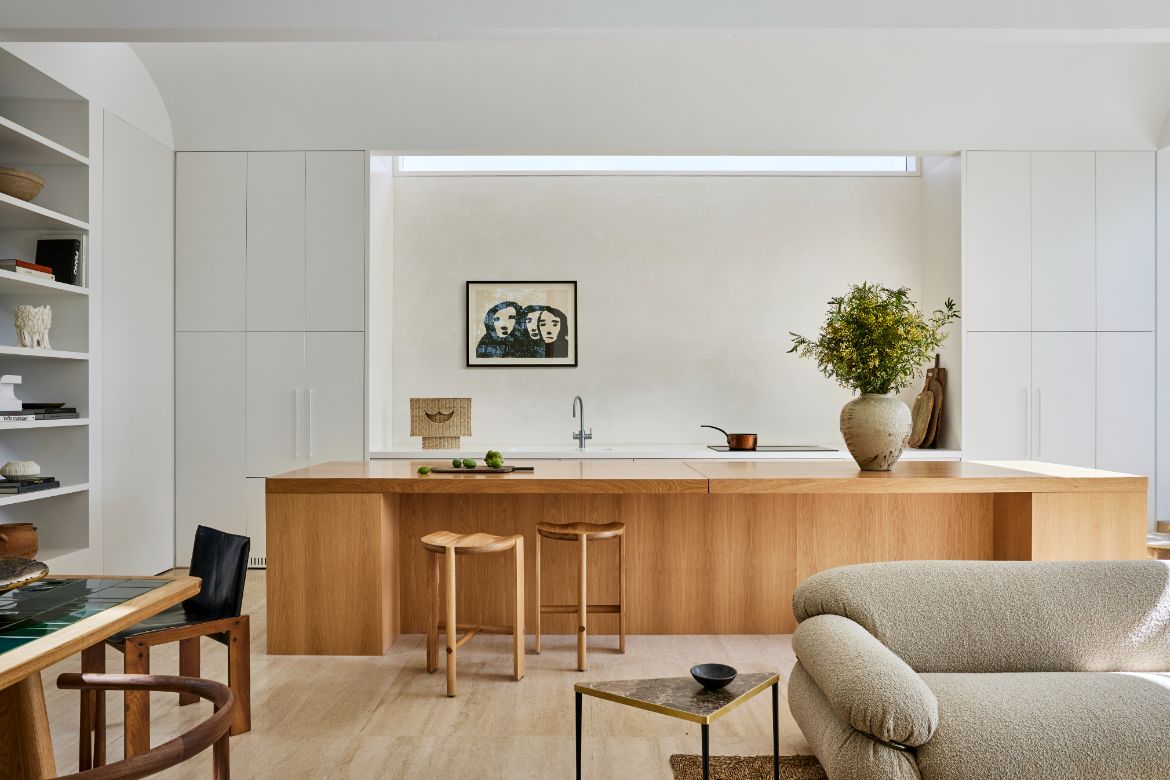
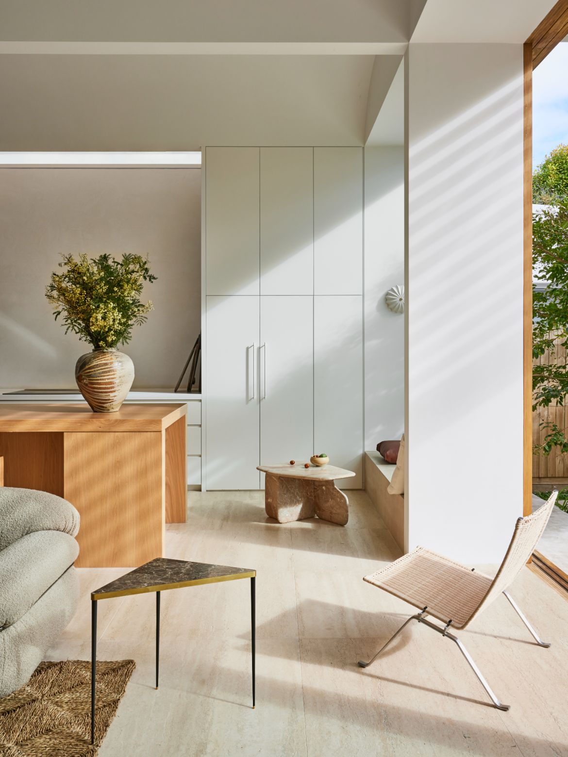
A scooping double-height white textured wall curves up to a clerestory window, which immediately makes its presence felt upon entering this open plan zone. The large expanse, left bare, allows for a minimalist backdrop while ensuring privacy and light in abundance.
Related: Getting to know Madeleine Blanchfield Architects
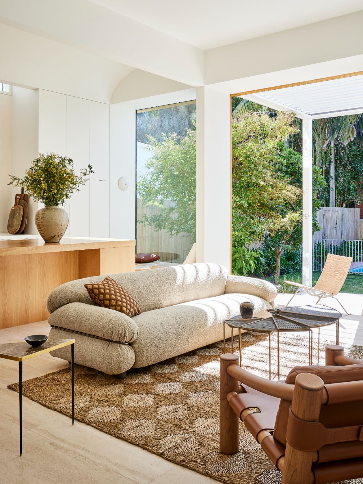
Despite empty expanses of walls, views to green are captured everywhere. “We wanted the owner’s to always be able to see nature – to make up for the loss of garden by bringing it into the frame of view,” shares Madeleine Blanchfield, principal and founder, Madeleine Blanchfield Architects.
Creating internal vistas was a deliberate decision, not only to establish an oasis for family life, but also because of the surrounding urban density. “The interior needed to look inward to hide from the neighbours,” adds Blanchfield.
The connection to the garden is especially pronounced with the insertion of a wild and flourishing interior courtyard. Positioned in the centre of the home, it mitigates the changing levels that step down from the entry to the living area at the back of the property. It’s also an alternate – more playful – walkway down into the heart of the home, connecting the kid’s rumpus to the living area.
The feeling of spaciousness is an exceptional achievement given how much has been packed into the relatively tight parcel of land. “We worked really hard to get four bedrooms and breakout spaces,” says Blanchfield on the rigorous approach to planning the 200-square-metre residence. Long sightlines, voids and double-height spaces make this a reality. As well as ensuring every space is utilised, such as an area to sit under the stairs facing the garden, and the breakfast nook beside the kitchen.
Aesthetically, Barefoot House draws on contemporary beach luxe, with a warmth that was inspired by the owner’s experience of the soft light of Puglia, Italy. The combination of stone and terracotta, alongside rust-tinted concrete, creates layers of depth and tone. Materials have been used in the most effective ways, for instance a datum line along the top of the capping details runs around the entire exterior.
The floor has been used as a fifth plane. “The materiality underfoot is textural with a mix of terracotta and travertine,” says Prichard, which also alludes to the home’s moniker ‘Barefoot House’. And it can be attested that the owner’s often stroll in from the beach, fresh from a surf with sand and salt in tow, adding to the authenticity and robustness of the architecture.

More than the framed tropical gardens and honesty that oozes from this home, there is a fastidious attention to detail that allows it flow so easily. “Something that’s not so obvious but feels really nice are the way level changes are dealt with. We designed these curving, concrete wraparound benches,” explains Prichard, on the low-line benches that run stepping down from the internal courtyard to the dining area, and again from the back deck to the backyard. “They allow a kind of casualness,” Prichard notes, and they also offer places to perch and mingle when hosting guests.
To soften the rectilinear forms of the façade, curves are subtly repeated in various elements and details, such as the super-thin stair balustrade, which Prichard explains is fabricated in steel to make it a structural element and allow it to sit as minimally in the space as possible. The ceiling above the timber kitchen island bench is also curved – bouncing and reflecting light throughout.
“We spend a lot of time doing stuff that no one notices but when you’re inside it feels right,” comments Blanchfield on the attention to detail that defines the studio’s approach.

For instance, Prichard shares the painstaking attention that went into making sure the large timber-framed back sliding doors were designed in such a way that when open each pane of glass aligns perfectly behind the breakfast nook; and that the height of the frame’s base matches the height of the concrete wraparound bench.
There is an undeniable essence to Barefoot House – easy going, gregarious and warm – which emanates from the architecture and interiors, and most importantly is encapsulated by the family who inhabit it.
Madeleine Blanchfield Architects
madeleineblanchfield.com
Photography
Pablo Veiga


