Located on the edge of a reserve in the middle of Toorak, this pocket of nature forms the nexus for Matteo by Trinity, The House of Curves.
Defined by its large curving presence, the home is both contemporary and timeless, with nods to the Art Deco architecture so prevalent in Toorak, without overtly sitting in any particular camp. Rather the design is fluid and open with the surrounding landscape, particularly the large eucalyptus trees framed and brought into the interior: “It was important that they have some presence the house, and we thought if we designed it to keep those beautiful trees we would maintain that connection to landscape,” says Design Director Constantine Procopiou.
Key to the design was a desire to see as much of the Yarra as possible before the city views that stretched out to the horizon: “The view of the skyline of the city is integral to how the house was designed, and how the spaces are formed from each other” says Procopiou, To this end, the home has been designed as an enveloping structure that cocoons and protects: “It wraps itself around you” says Procopiou of the curving form of the home.
Large cantilevers that follow these curving lines further the notion of being wrapped with the ground floor, casting shade on the expansive north-facing windows connecting the living areas and providing covered alfresco areas. Beautifully engaged with nature and protected from the weather, they are in many ways more of a family hub than the spectacular reaches of the rooftop entertaining space that captures a glimpse of the city beyond.
The home is infused with natural light, which greets you from beyond the foyer as you enter. Passing through, your eyes are drawn up to a sculptural oval void with a delicate feature light that ascends this double height space over a marble oval inlay, reflecting the void above. To one side is a discrete glass elevator, while an elegantly simple spiral staircase is almost tucked out of sight.
Approaching from the path there is a glimpse of the curved stairs. Still, it is not revealed as a sculptural form in the usual sense: “It’s not until you fully ascend the house that you start appreciating the form of how it comes together, and then standing from the top looking down, you get that beautiful three level helical staircase as a kind of unfolding environment from the top. It’s a really nice way to experience the architecture of the house,” says Procopiou.
The incursion of light into the house has been played with beautifully with large areas of glazing drawing the morning light into the home, while shadows have been introduced elsewhere. This is arguably at its finest in the main ensuite, where three vertical slit windows have been placed in the concave expanse of the curving façade: “It was as much about bringing in light as how it played in the space. You get that moment at about two o’clock where pinstripes come through those beautiful windows. We wanted to have that connection between the indoors and the outdoors and have the house feel light,” says Procopiou. Accentuating this play on light, Articolo lighting produces crafted moments, casting patterns across the curves that sweep through the house.
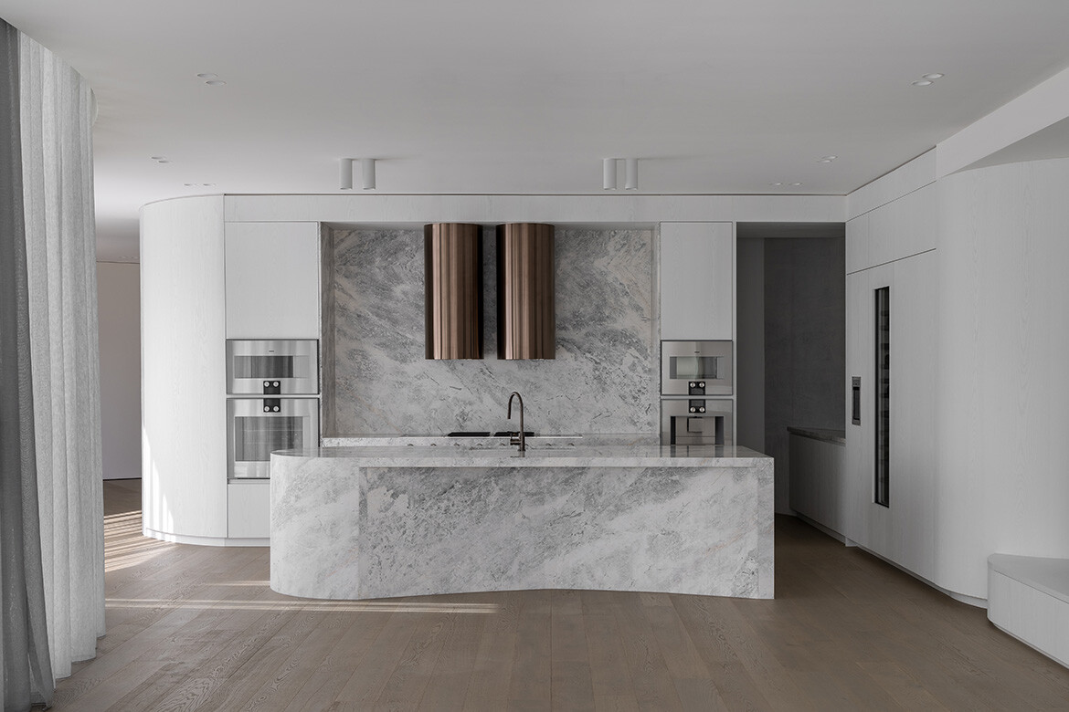
The simple but luxurious palette of marble, limestone, Dolomite (used for all the stonework), timber and chunky loop carpets (Galet, Bremworth) set the stage for some unique and extraordinary furnishings.
“We knew very early on that furniture was going to be one of the challenges of a house like this, you can’t just put a square couch around a curve,” says Procopiou. With children anticipated to be at the house often it was imperative that the furniture be durable with resin coming up early in their search as an alternative material that could work with the home.
Stumbling across CasaBlanco in Sydney, Procopiou was impressed by the furniture, but also the shared sense of legacy: “They’re a little family business, so aligned with that ethos of who we are,” says Procopiou. The dining table, chairs, and side tables were all sourced from CasaBlanco, but so too were the velvet dining chairs and lounge bases, while a fabulous three-legged table on the rooftop deck is from Coco Republic.
The basement floor is an impressive counterpart to the lightness of the home. Here, the tone is dark and beautifully lit with a wall of suspended chilled wine, a rotating car plate, and a cinema. And if that sounds a wee bit James Bond, the intention is not there. Instead, this is a practical space for parking the car and grabbing a bottle of wine before heading up for dinner. The cinema is perhaps an architectural folly with impressive art-style lighting and a back wall of carved stone providing a bar. But, again, it’s all in the intention and this is a room for watching movies with friends. The comfortable chairs, the precise sound system, and the deep Indigo blue (Trinity Blue) cinema experience are just as it should be as Procopiou explains: “We wanted the feel of that beautiful blue indigo to pervade the whole room. We didn’t want a black theatre, we wanted it to have life to it, so it felt inviting,” which it most definitely is.
Project details
Architecture and interiors – Trinity Architects
Photography – Timothy Kaye

