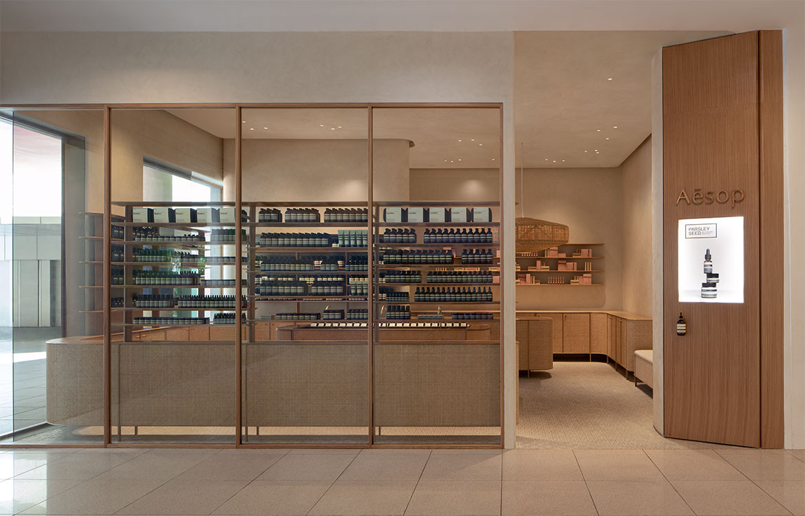
After a Google image search of ‘Singapore’ you will see an onslaught of shots of the glittering skyline populated by familiar architectural marvels both old and recent. These images of Singapore were not what designer Kian Yam of Hong Kong-based studio MLKK looked for as inspiration. A former in-house architect of Aesop,Kian was commissioned by the brand to design its sixth store in Singapore, located at the VivoCity Mall. Her online preliminary research before visiting the actual site proved to be uninspiring. Then, there was the location itself.
“The location posed quite a challenge,” says Aesop’s General Manager (Asia) Frederic Seiller, speaking at the store’s opening. “Aesop is all about creating a sense of domesticity. Most of our stores around the world are located inside stand-alone buildings facing the street. With this location, we have to create that in this retail unit inside a mall that can feel very cold and very commercial.”
Kian finally found what she was looking for in a photograph from the design brief put together by Aesop’s Retail and Design and Development Manager (Asia) Leon Goh. It was a picture of an HDB building façade, a perfect slice of Singaporean life. “It’s an image that’s very familiar to Singaporeans and it showcased tonnes of [aspects of] domestic life in one single elevation,” says Kian. This image became the starting point of the store’s narrative – that there is a hidden warmth and a vibrant domestic life behind Singapore’s more glamorous facade.
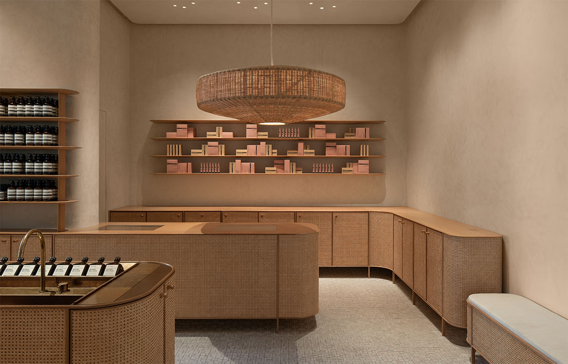
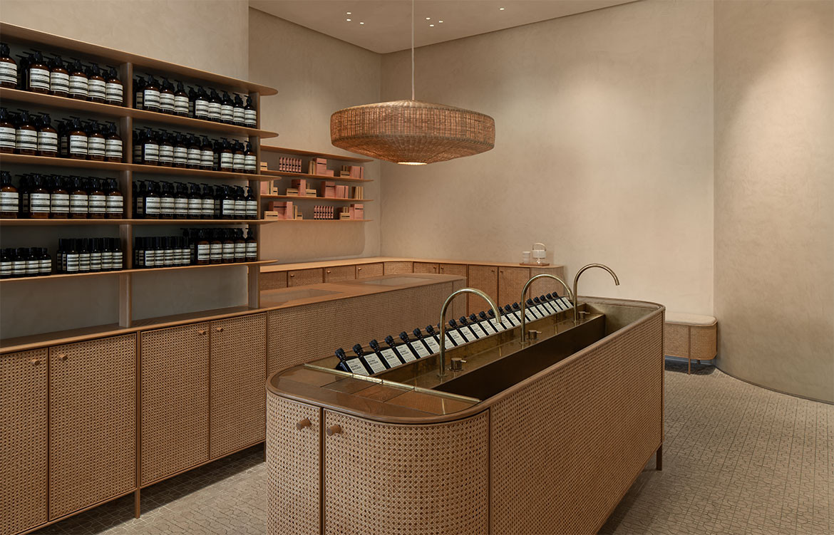
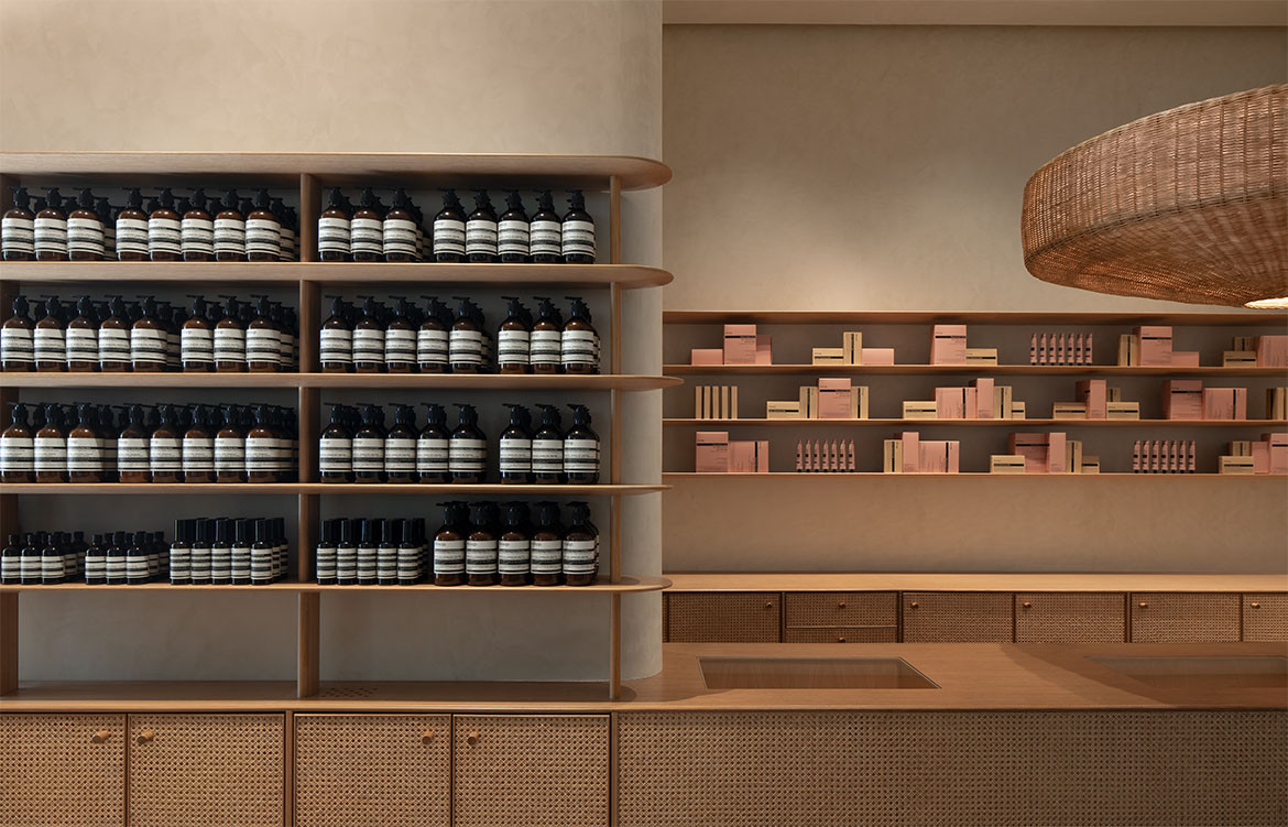
Kian expresses the narrative through material selections and craftsmanship involved in the making of Aesop VivoCity’s interior. The three main materials are rattan, cement tiles and lime-wash paint with accents in brass, copper and pale timber. The result is a space that feels both contemporary and familiar.
The hero of the interior is the woven rattan wallpaper that layers the front side of the cabinets. This woven rattan wallpaper was sourced from a local establishment, the Chun Mee Lee Rattan furniture shop located on the ground floor of an HDB block on Bukit Merah Lane. “It’s a very affordable material that you can buy in rolls and fabricate into whatever you want,” comments Kian.
For the store’s centrepiece, the sink, rattan is paired with a timber countertop and brass and copper basin and taps, while above the cashier, a large rattan chandelier floats majestically against a plain, lime-washed wall. The unglazed geometric cement tiles are a nod to the domesticity of neighbourhood restaurants and mid-century apartment interiors.
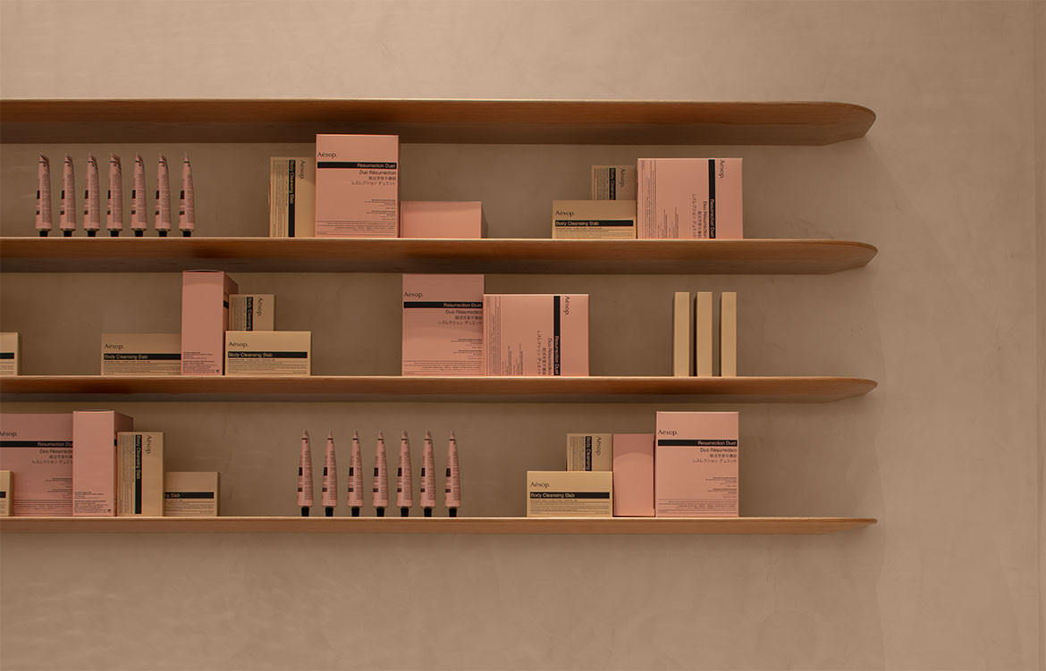
The colour scheme is beige with a pink undertone courtesy of Aesop’s product packaging. There are no sharp edges inside the store, and each design element – from the custom-made cabinet handles to the curving shelves – seems to invite touch. Pair these elements with Aesop’s signature, almost addictive, scented oils and Aesop has, once again, successfully recreated its signature multi-sensorial retail experience without actually completely replicating its past designs.
MLKK
mlkk.studio
Photography by Marc Tan
We think you might also like Bassike, Paddington by Akin Atelier
