This article originally appeared in Habitus Issue #59 – find out more and subscribe here!
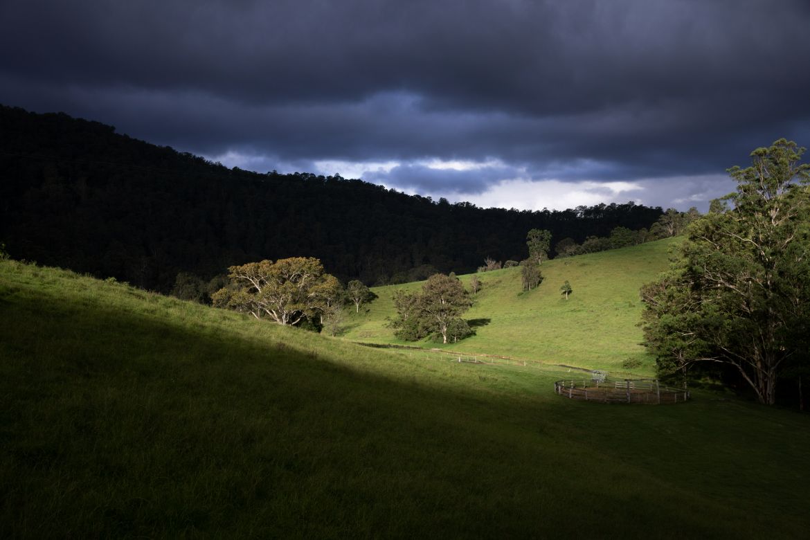
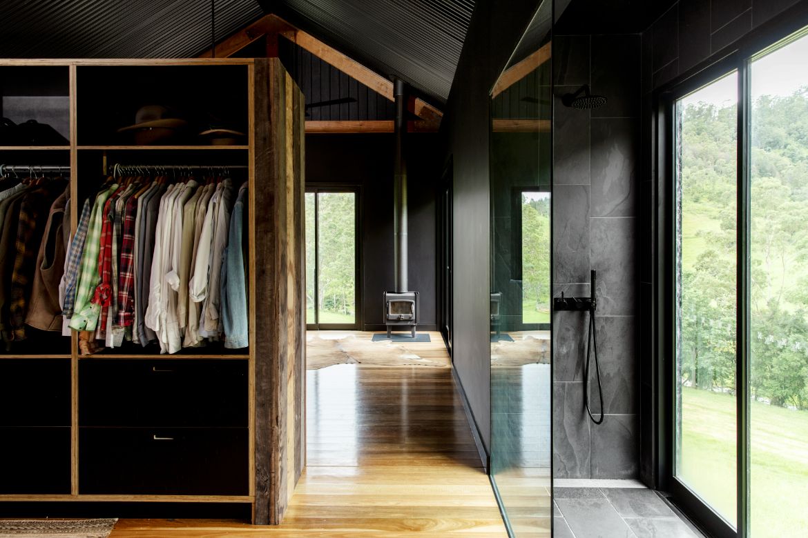
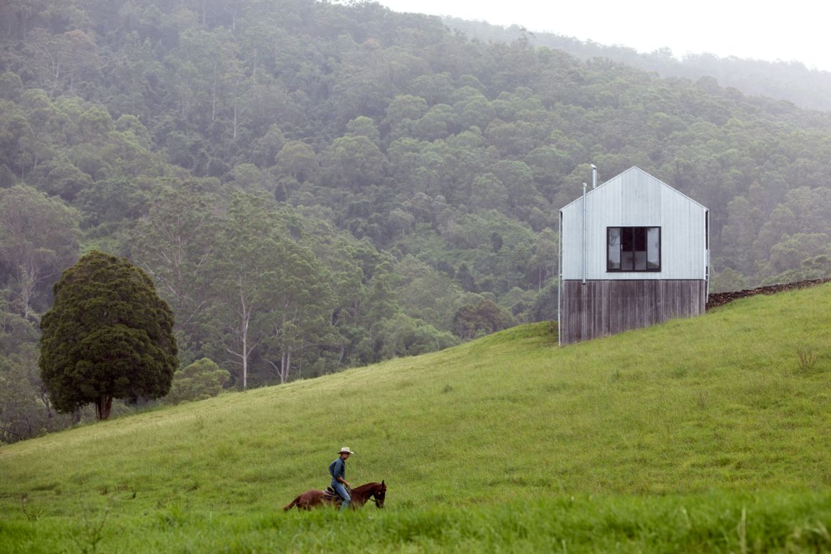
For landscape architect Hugh Main, the decision to place his house at a point where both the valley and mountain would be incorporated into the view was a very deliberate one: “My parents always said build where the cattle camp,” he says, adding that, “as a landscaper, it’s about appreciating this beautiful landscape, to be able to look at everything. The ideal thing to me was to find a place where no one can see you and you can’t see anybody else.” This last point was important, given the showers are placed within the glass perimeter of the bedrooms, which likewise have no barrier between the interior and view.
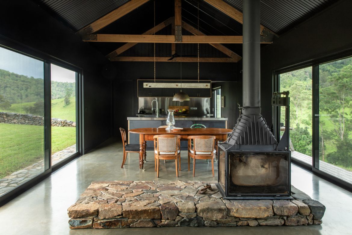
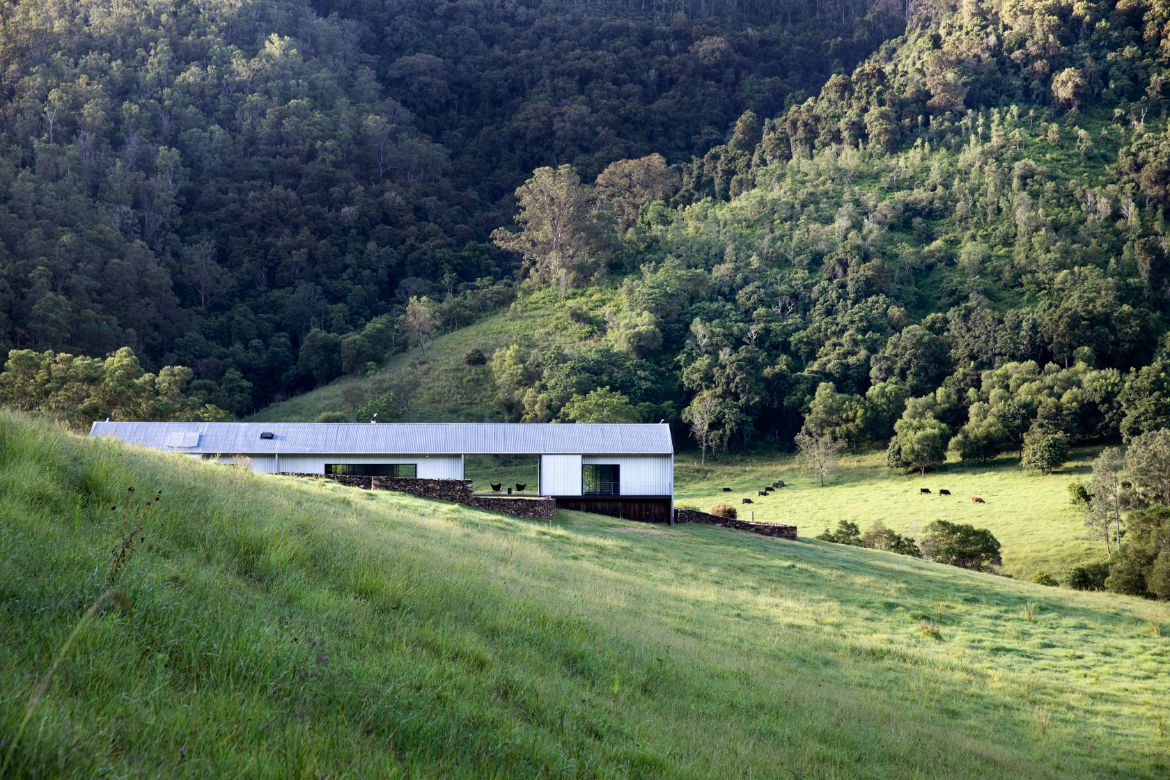
With architecture by Sam Crawford Architects, and built by Lukas Dellsperger, the house is designed around the tenets of the Arcadians, where the home is a protected space from which to observe nature. The layout is free-flowing and constantly connected to the outdoors.
“As a child I was always outside, and the idea of being inside is a frustration to me, so the house takes advantage of this opportunity to be part of nature,” says Main.
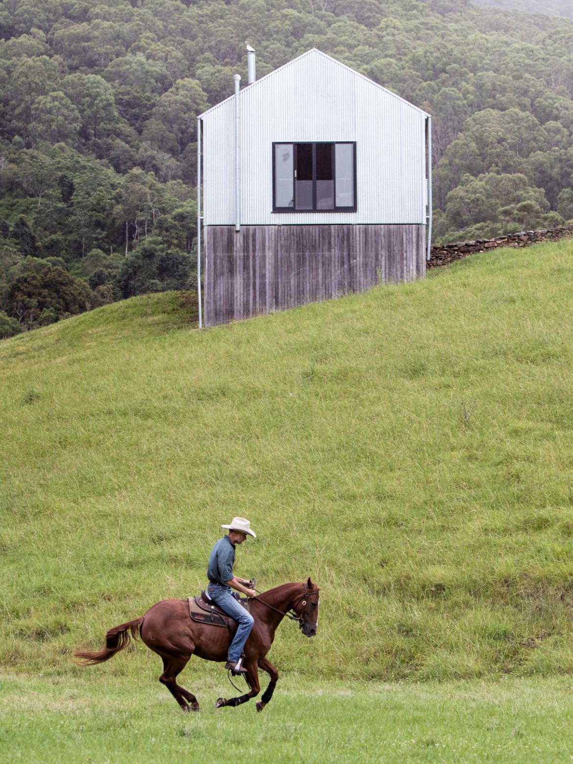
As such, the simple shed-like pair of joined pavilions is clad in corrugated steel to further embed the building in the rural: “I find houses in the landscape to jar on the whole. Whereas being a country boy, a woolshed or stable in the landscape just sits more quietly.”
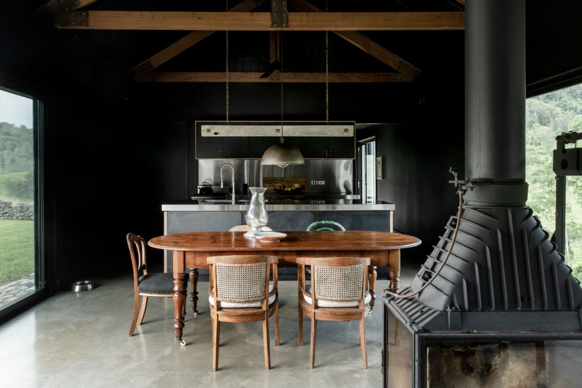
Timber, concrete and glazing make up the remainder of the palette as a materially honest and beautifully executed interior that is spacious and light filled. Opening to both sides of the glazed middle portion of the larger of the two volumes, the home interacts directly with nature both from within and when viewed as a whole. In the open space between the pavilions are a pair of leather butterfly chairs, which Main’s great aunt introduced him to as a youth.
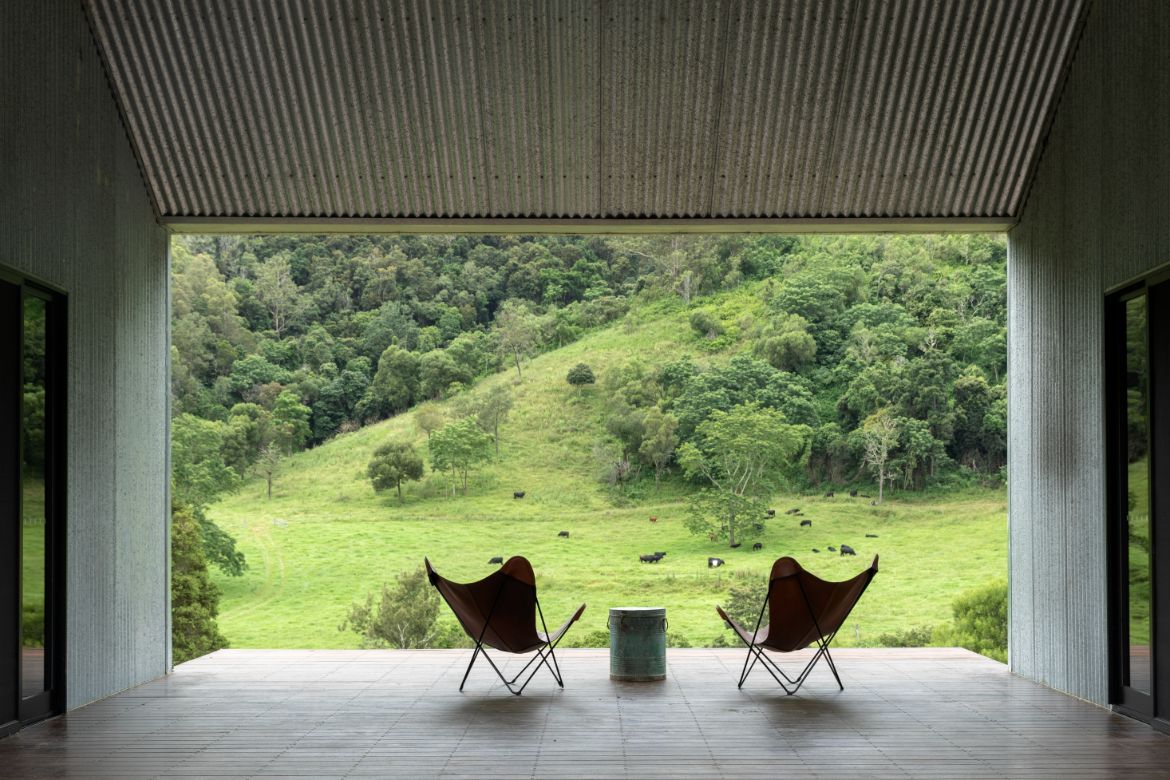
Framing the whole and embedding the home comfortably into the landscape are the long stretches of curving stone wall.
Gathered from the property, there is an intimacy of place and form evident on the careful placement. “I’m claiming the horizon line into the design, if you look at that view across the house, you’ve got the roll of the lawn taken up by the roll of the stonewall, which takes up the roll of the pasture-covered hill, and then the roll of the horizon with forest.”
The stone walls moreover conceal a gate that stops the horses and cows from entering the house via the deck, but otherwise it is only the small stonework at the house parameter that limits their access. As such, the animals, and particularly the horses, Shadow and Zephyr, are able to engage with Main throughout most of the house.
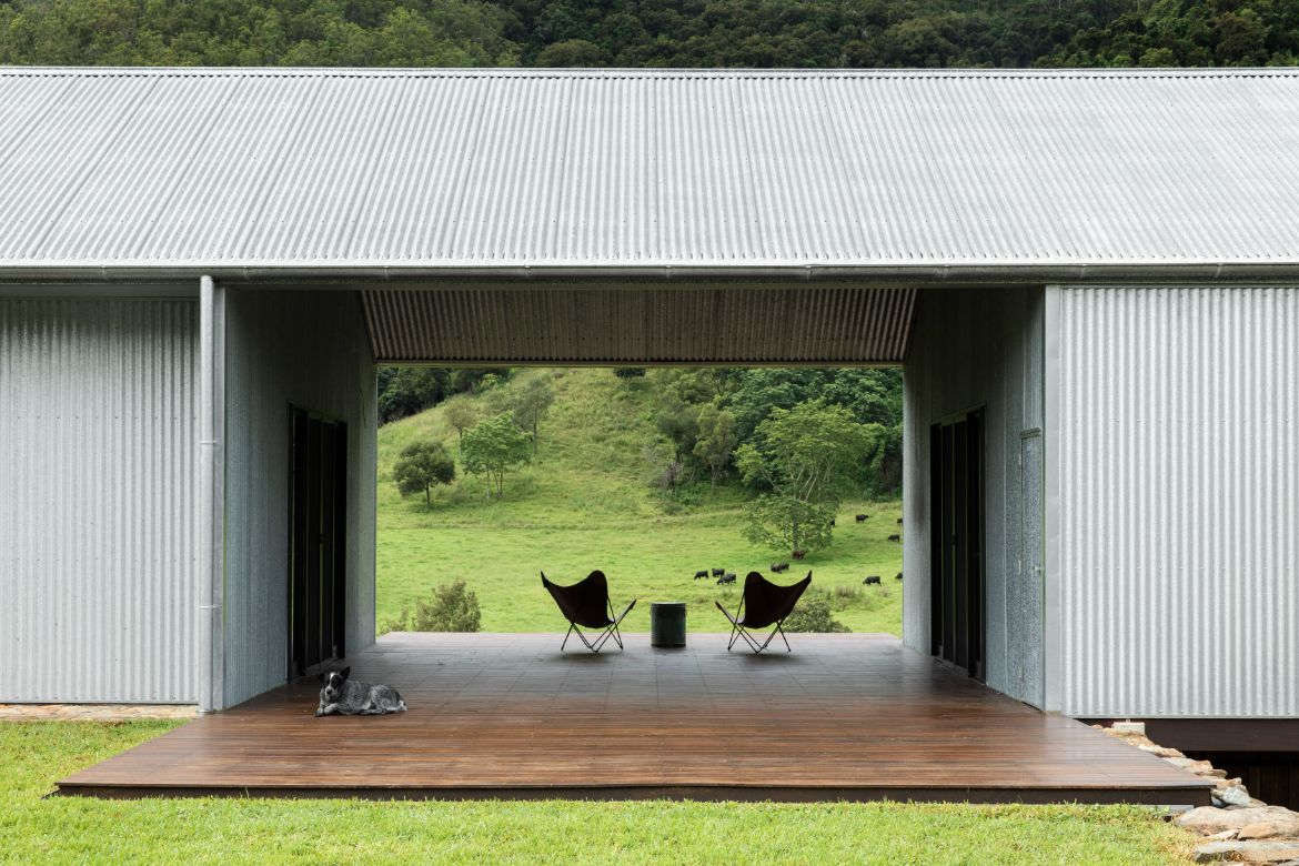
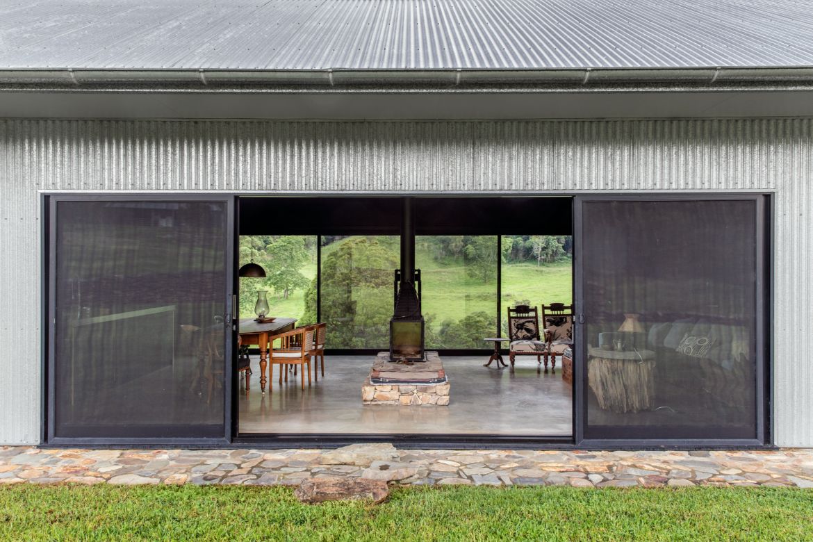
The landscape in this instance is crafted to be continuous with the house and lifestyle. The collecting of rocks, for example, serves to make the pastures smoother and safer for the cattle and horses, but also provides the means for making the walls. Likewise, grasses are kept down with cattle rotation, both for the practical feeding needs, but also to create a vista of variation with visible contours meeting sparse and dense copses before the thicket of trees as the mountain ascends.
The curation of the interior is similarly considered, with every piece connected to family or the property in some way. The collection of silver and pewter cups, bell and hipflask on the chest of drawers, for instance, each belonged to a family member.
“I’m constantly curating. I’ve had that chest of drawers since I was born, so I’ve been putting things on it for 53 years now and it constantly rotates, you just keep moving, and shaping and acquiring and editing as a constant process,” says Main, adding, “the bedhead in the main suite is from the floorboards of the old dairy that blew away.”
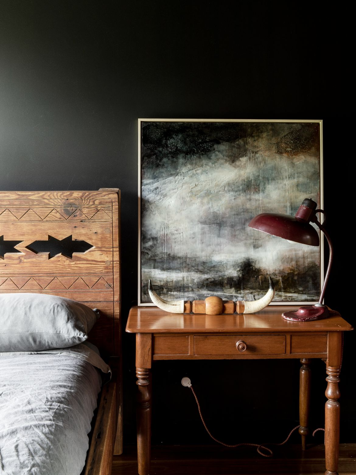
The guest bedroom headboard is a Santa Fe-inspired design, which Main designed in his early 20s.
“It’s my Scottish gene – I never let anything go to waste! There is so much more beauty to something with your DNA in there, to me it’s much more personal. I go into a shop and freak out because it’s all made in a factory and soulless, but anything you pick up that someone else has touched or made or given to you, it’s just got so much more meaning.”
The unique lighting is particularly impressive with family considered in the curation: “The red table lamp was from my great aunt, the table it is on was my grandmother’s and the horns are from a steer we had called Forbes. And the artwork, in encaustic wax by Liz Priestley, called These Uncertain Times, I bought during Covid.”

The collection of furniture in the dining room is likewise inherited, with a story for every piece including the coffee table: “The stump was from my great aunt and uncle’s place from a tree my father knocked down when he was a schoolboy, and the tabletop is from a birdbath that was in the garden.”
The small horse head lamp on the cofee table is again from Main’s great aunt’s home in Cootamundra, NSW (Wiradjuri Country). A Flos light over the main bed is one of the few contemporary additions that include Jieldé and Zenko lights of the industrial ilk.
When first exploring a client’s needs, Main asks them what they really love, for his own home he has asked the same question, with horses being his prime passion.
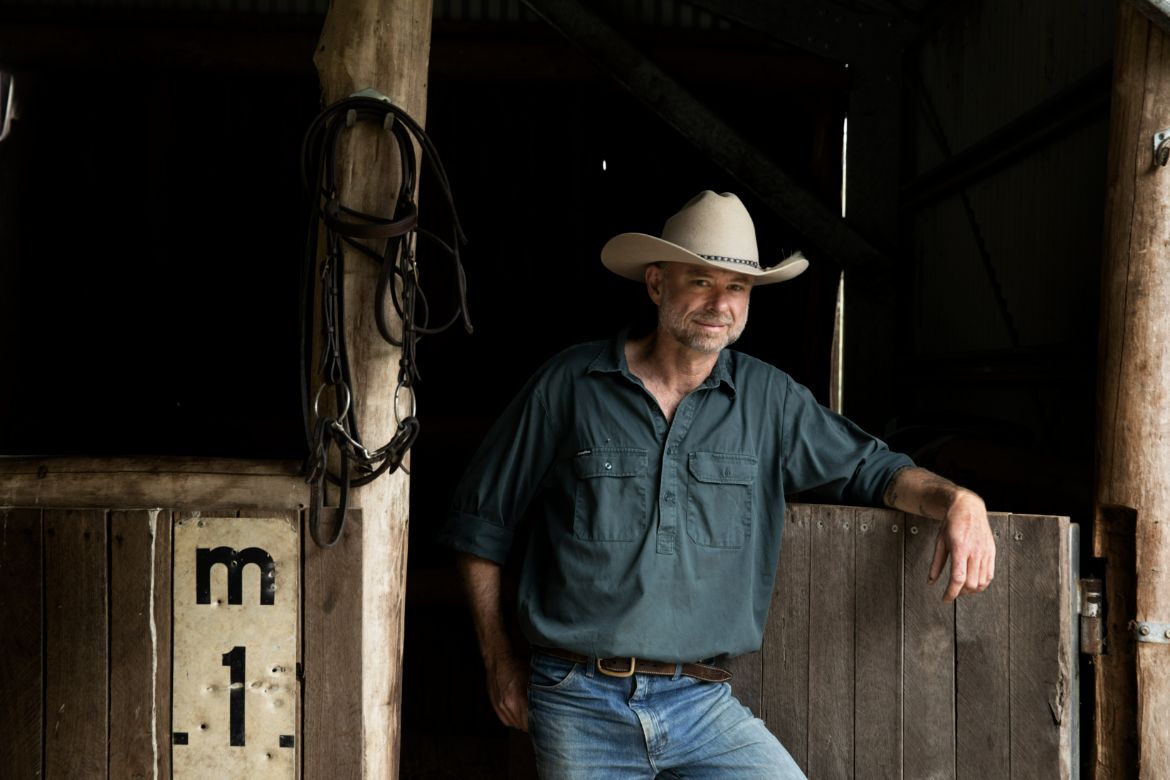
“I’ve been riding since I was born, so that was something instilled in me by my family – but not just the horses and gear, [also] the way you look after it. I like things ordered, I can’t handle chaos, and they are such beautiful objects, beautifully made, you can see the hand,” says Main of the meticulously displayed and cared for saddles and tack.
While there is a personal story attached to each piece, there is nothing of the sentimental. To some extent this is due to the masculine nature of the home, which is without embellishment.
It is moreso driven by Main’s appreciation for authenticity and robust design: “Whether it’s furniture, or whether it’s an object or a saddle or bridle, it’s got its own character and story to it and the better you look after it the more gorgeous it becomes.” And gorgeous it is, with nature fully enveloping and informing the whole, while the artisan hand is authentically realised in every detail.
Spirit Level
spiritlevel.com.au
Sam Crawford Architects
samcrawfordarchitects.com.au
Photography
Jason Busch
