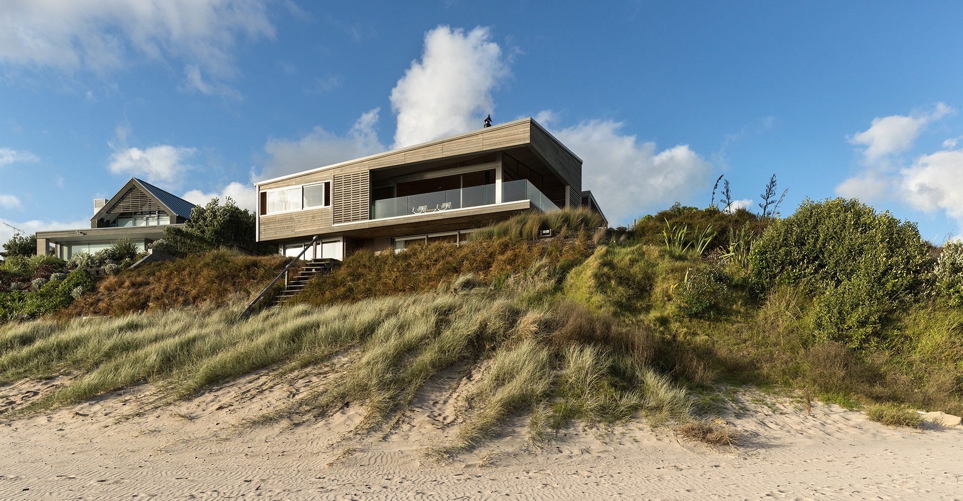
As a dialogue between form and context, a building sits somewhere on the scale between assimilation and juxtaposition. The geometries of the Hahei House beach retreat create contrast while borrowing from the organic forms of the coastline. It strongly assimilates in colour and material – the grey-stained cedar, sandstone, and light grey roofing iron all have the same bleached out surface of the sand and rock. Large panels of glass are recessed behind a deep, shadowed verandah and, overall, it is matt and silvered like a piece of driftwood washed up on the beach.
Hahei House is a subtle home in other ways too. Architect Paul Clarke has addressed the broad beachfront but utilised a large sand dune to disguise its two-storey volume. The L-shaped house appears to be a single storey as it wraps around the hill creating courtyards sheltered from onshore winds.
“By referencing the style and scale of the bach culture,” says Paul, “we have worked with traditional forms and details, but been respectful in how we have reinvented them. The low-lying roof, recessed verandahs and outdoor roof structures provide a human scale appropriate for the beach and casual holiday life.”
He has used natural metaphors from sand forms and reflected these in the roof geometries. Folded rectangles tip and tilt on the elevations, reflected in soffits and ceilings – subtle structures that have the form and lightness of a folded paper plane.

There is a wonderful sense of space and scale with rooms, wings and zones dispersed throughout the 340-square-metre interior. “The house was built for a family of five – with young adult children – and to accommodate family and friends,” says Paul. “So the house has to have different zones to give the owners retreat spaces even when the house is full. There’s a lot going on with hidden surprises that relate to the family’s routine – things
they enjoy.”
For the Hahei House, the transfer between public and private space is ingeniously conceived across the two levels and between open beachfront and the more blinkered site interior. The architect has split the two wings of the L into separate forms, linked by a circulation zone. This patterns the house into four areas: bedrooms downstairs, two that face the beach plus a large den with bunks and seating; a further two bedrooms upstairs and night lounge; and the main living space in the prime position. The arrangement and humble scale of each space makes it adaptable to small or large numbers without feeling empty or full.

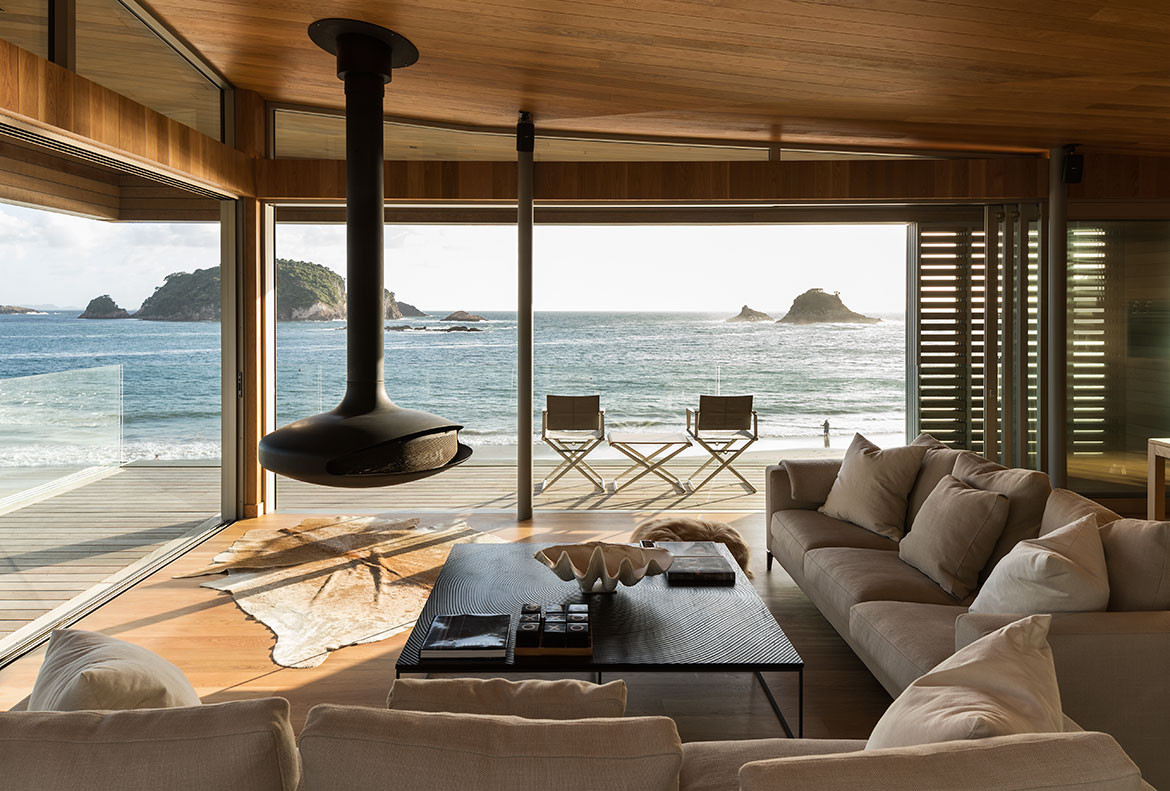
The main family space runs the full length of the front elevation on level one and features the hero view of the ocean. It is an exposed position – like the prow of the ship – and so the architect has detailed a deep verandah along two sides, protected by wind shutters with close connection to a protected courtyard behind. A ‘night’ lounge also looks onto the courtyard, a quiet retreat space away from the kitchen and dining. And behind this courtyard is a second courtyard with a hot tub and a wonderful garden. Two guest bedrooms look onto this space, tucked discreetly away from the living rooms areas.
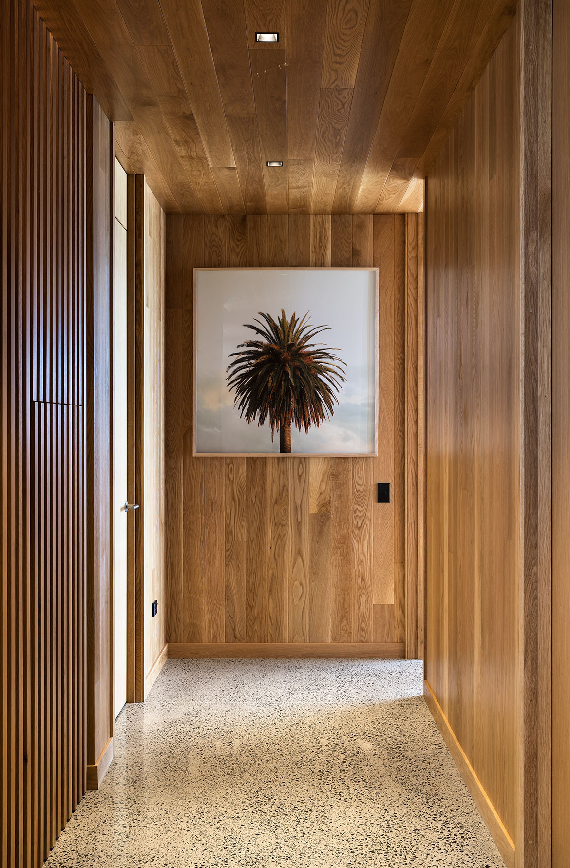
One of the most alluring aspects of the house is the timbered interior. Like the interior of a boat or cabin, the American Oak-lined floors, walls, and ceilings are warm and enveloping. It gets fairly cold in New Zealand, and the Oak provides real clarity about being inside. In contrast to ‘bringing the outdoors in’, these spaces do the opposite. From being cocooned by the golden oak to then move outside to the bleached greys is a sensory contrast that elevates the sense of protection on the edge of a vast ocean front.
Studio2
s2a.co.nz
We think you might also like other projects from Habitus House Of The Year

