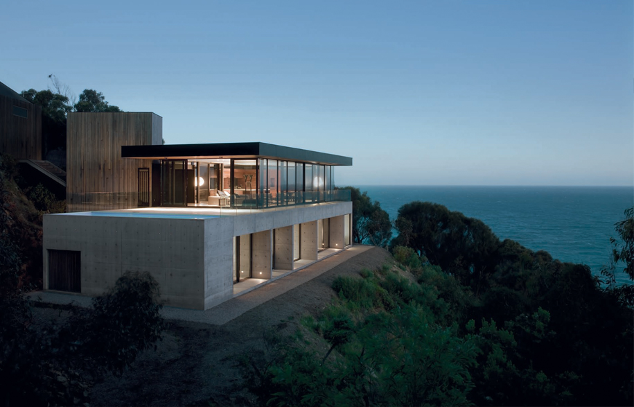
Above: exterior is Spotted Gum cladding and off-form concrete, with double glaze window units from Viridian. Roof is Colorbond Midnight.
Photographers Tom Berry and Mary Cooke had the foresight to purchase this majestic site 21 years ago. With only a few other homes sharing this prime cliff top location, it is outof- the-way for most travelling along Victoria’s Great Ocean Road. “We were looking for land to build a house on, but didn’t think we’d find something so close to the water, or with such a dramatic outlook,” says Tom.
Surrounded by national park and literally on the edge of a cliff, the couple made their own investigations. Rather than wait for a sale sign to appear, Mary went to the titles search office to find out who owned the half-hectare property. After the Ash Wednesday fires (1983), “the owner wasn’t interested in re-building his house,” says Mary, “so we made an offer.”
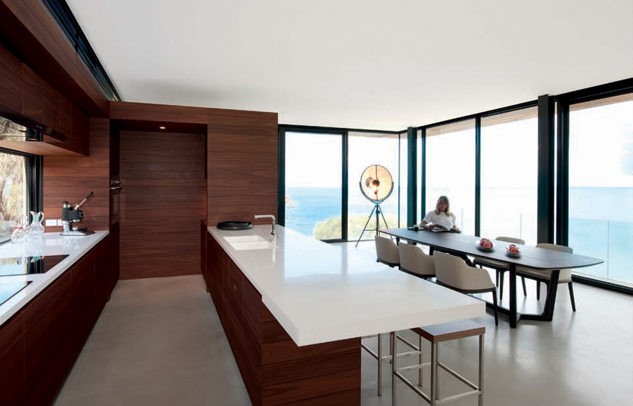
Dining room features Concorde dining table, Grace dining chairs and Fortuny lamp, all from Poliform.
In the early 1990s, Tom and Mary began excavating the site, which has a fall of 60º. They built a small self-contained weekender so they could take some time “to think about what we actually wanted, rather than rush in and have regrets later,” says Tom. Only about eight square metres, it is relatively bohemian compared to the recently completed house.
Four years ago, Tom and Mary approached architect, Nik Karalis from Woods Bagot. They had seen his beach house at St. Andrews, an extruded, elongated, glazed pavilion. “We loved its simplicity and the way it connected to all the elements. We wanted a house that was fairly monumental, something anchored, rather than ‘touching the earth lightly’,” adds Tom. They were conscious of the high winds the area receives, and “there are times,” says Mary, “when the rain comes in horizontally against the windows”.
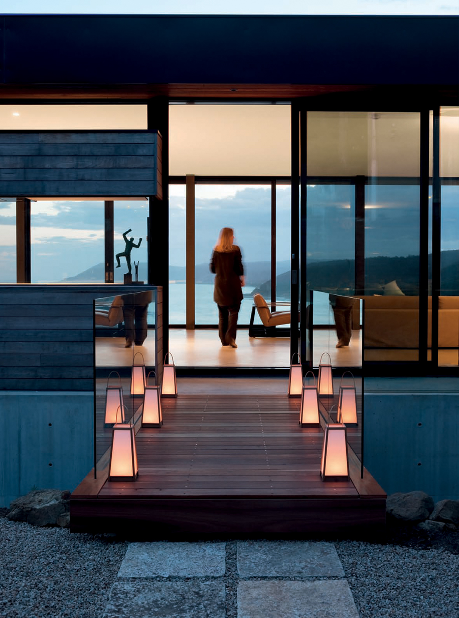
Mary enjoys the views.
The name Tadao Ando cropped up at the outset. Tom and Mary are devotees of the renowned Japanese architect and were keen to include concrete in the design of their new house. “Ironically, even before we mentioned Ando, Nik emailed us a photo of one of our favourite Ando buildings in Tokyo. We knew the relationship with Nik was going to work,” says Mary. As well, it was important to both Mary and Tom that “Nik understood that we wanted to be part of the design process, and not just handed a finished scheme.”
Inspired by Ando, Karalis designed three different schemes for the couple. “We had the rooftop access house, the cantilevered house and the double pavilion house, which is the closest to the final outcome,” says Karalis, With the rare cliff opportunities over the precipice of the Great Ocean Road, maximising the views was of paramount importance.
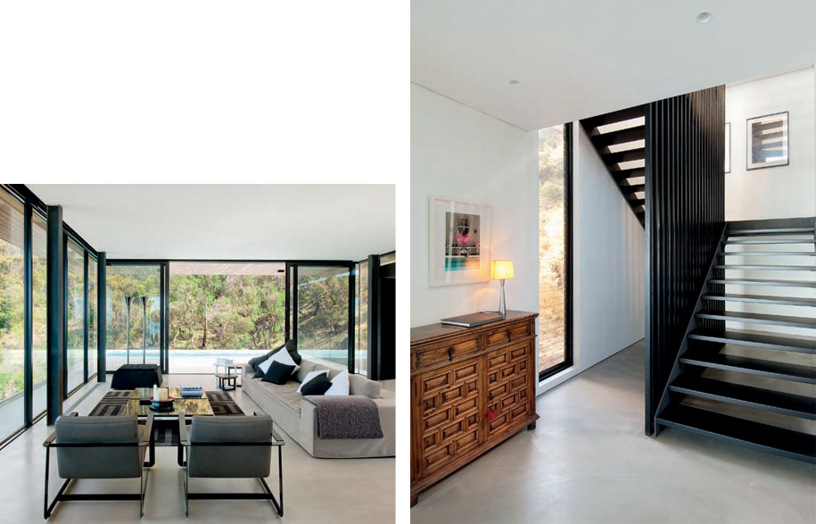
Left: Airport sofa and Gaston leather armchairs, from Poliform. 1960s chrome lights from BIBA London, owner’s collection.
Right: Open treads of the stairwell provide a sense of transparency.
The second design, the ‘cantilevered house’ captured the couple’s profession perfectly (two photographers with telescopic vision), but the design narrowed the view of Bass Strait. A simple 90º turn, however, provided the ideal solution. “Locating the house across three stepped terraces was the only way to position the main pavilion towards the edge,” he says. “It provides both orientation towards the night lights of the Lorne headland and the panoramic view.”
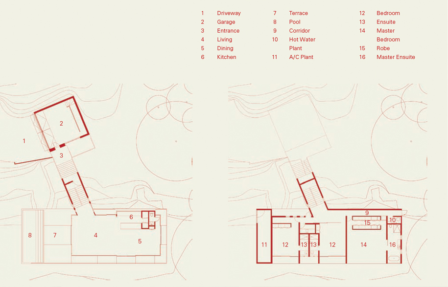
The house itself comprises three interconnecting forms. The lowest level is constructed in off-formed concrete, with concrete walls extending to the interior. Directly above is a glazed pavilion, with large sliding glass doors leading to a terrace and swimming pool. The third element, the Blackbutt-clad form containing the stairs and circulation, links the other two.
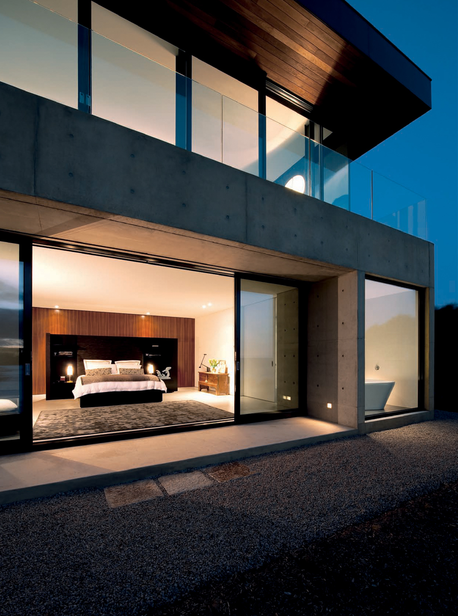
The main bedroom is literally on the edge of a cliff, with the sound of crashing waves below.
Along with the strong Ando-like forms, Karalis also acknowledges inspiration from more local landmarks. The Pole House (designed by Frank Dixon in the 1970s), also on the Great Ocean Road, has a 23-metrelong, bridge-like access. Like this bridge, the connecting external walkway between the garage and living areas in Tom and Mary’s home creates a sense of journey.
The journey’s climax is the dramatic 15-metre span vista along the open plan kitchen, living and dining areas. Visually driven, Tom and Mary enjoy watching “the colour of the ocean continually change from jade, to blue to grey”. It’s a stark contrast to their photographic studio in the city, which has an internal focus.
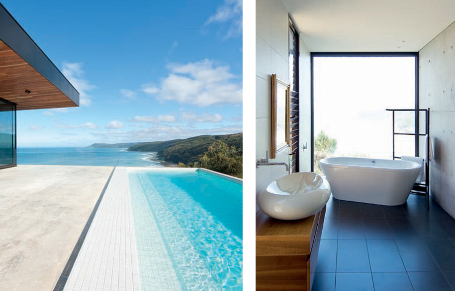
Left: The lap pool forms a continuous band of water to the sea.
Right: sanitary and tapware from Mary Noall.
Internally, the kitchen is treated as a piece of furniture, clad in Blackbutt. And to make this area appear integral to the living areas, they steered away from some of the traditional hallmarks of a kitchen, such as a fridge. Fisher & Paykel ‘Cool Drawers’ concealed behind the kitchen’s timber joinery mean some of the fridge drawers can be turned off if they’re not being used. “Sometimes it’s just Mary and I down here. Other times, we arrive with guests,” says Tom.
To ensure that the maximum number of guests could be accommodated, the couple preferred fewer and larger pieces of furniture rather than a smattering of chairs and sofas. “We wanted the furniture, like the architecture, to be fairly timeless,” says Mary, who selected a number of pieces from Poliform. And like the furniture, less is more for the artwork, with a few select photos taken by Mary from her exhibition titled ‘Tortured Nature’ adorning the walls. A maquette by sculptor Peter D. Cole on a buffet will soon appear in a considerably larger scale in one of the two courtyard spaces.
One of the most coveted rooms is the main bedroom and ensuite, safely ensconced within the solid concrete form on the ground level. Featuring glazed walls and large sliding doors to a gravelled terrace, it is closer to the crashing waves than almost every other property along the Great Ocean Road. “Sometimes, the waves can be pounding. But you always feel quite protected here,” says Mary.
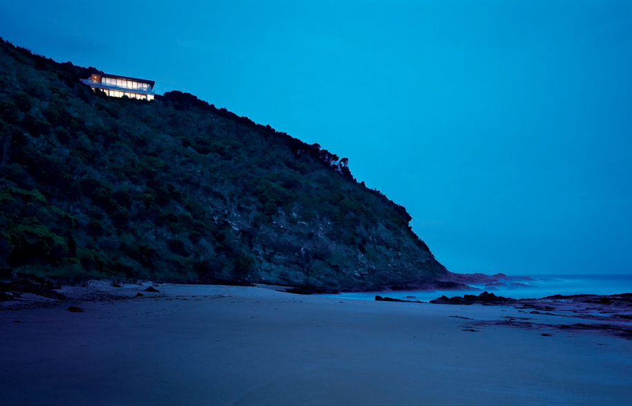
Perched on a cliff, the house is one of only a dozen in the area.
Photography: Tom Berry and Mary Cooke
