Distillation is an art. To distil a web of conflicting challenges to an essential but integrated design is to work towards the highest form of poetry. Masters would appear to have produced an outcome almost effortlessly when in truth, much thought and experience have preceded a deceptively simple solution. Within the Faber Hill estate in Singapore resides the latest house completed by design team Tomas Jaramillo, Diego Molina and Maria Arango of ONG&ONG. It is their fourth house in this neighbourhood and one of their most elegantly resolved works.
“Our first challenge,” says Diego during a tour of the house with Shanti its owner, “was to turn what was originally a semi-detached house into a detached one. The land size allows for this conversion and this was one of the first requests from the owners.” The clients’ parents have lived at this Singapore property from its inception in the 1970s, having purchased it directly from the developer, but they themselves have lived in Jakarta for over 20 years.
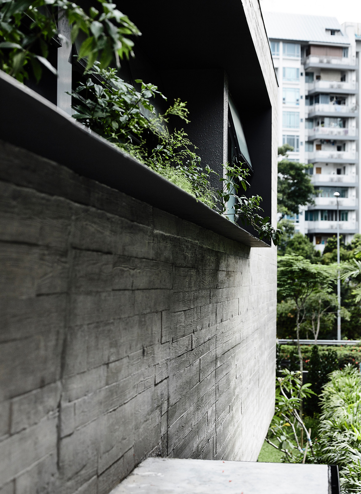
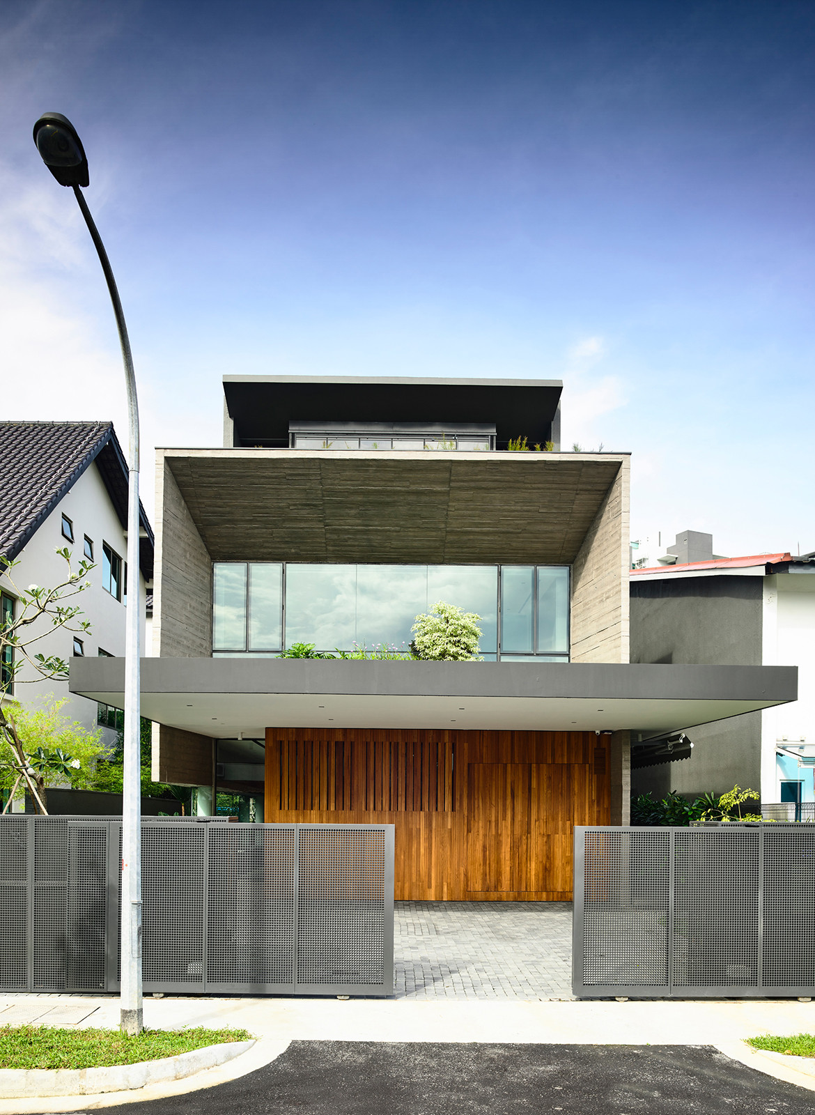
When they relocated back to Singapore, they decided to redevelop the house to its full potential. After exploring several semi-detached options in the initial design, the decision was made to proceed, even if it meant surrendering a 2-metre strip of built floors and the prospect of overlooking the neighbour’s party wall. But the advantages of air, light and independence proved irresistible. The solution adopted was to reclaim floor areas to the maximum line allowed on both sides of the boundary, thus giving the house a perfectly rectangular floor plate with a strong symmetry along a central axis. Indeed, symmetry became an operating influence on the overall design. The neighbour’s wall is painted with the same grey that themes the interiors of the residence.
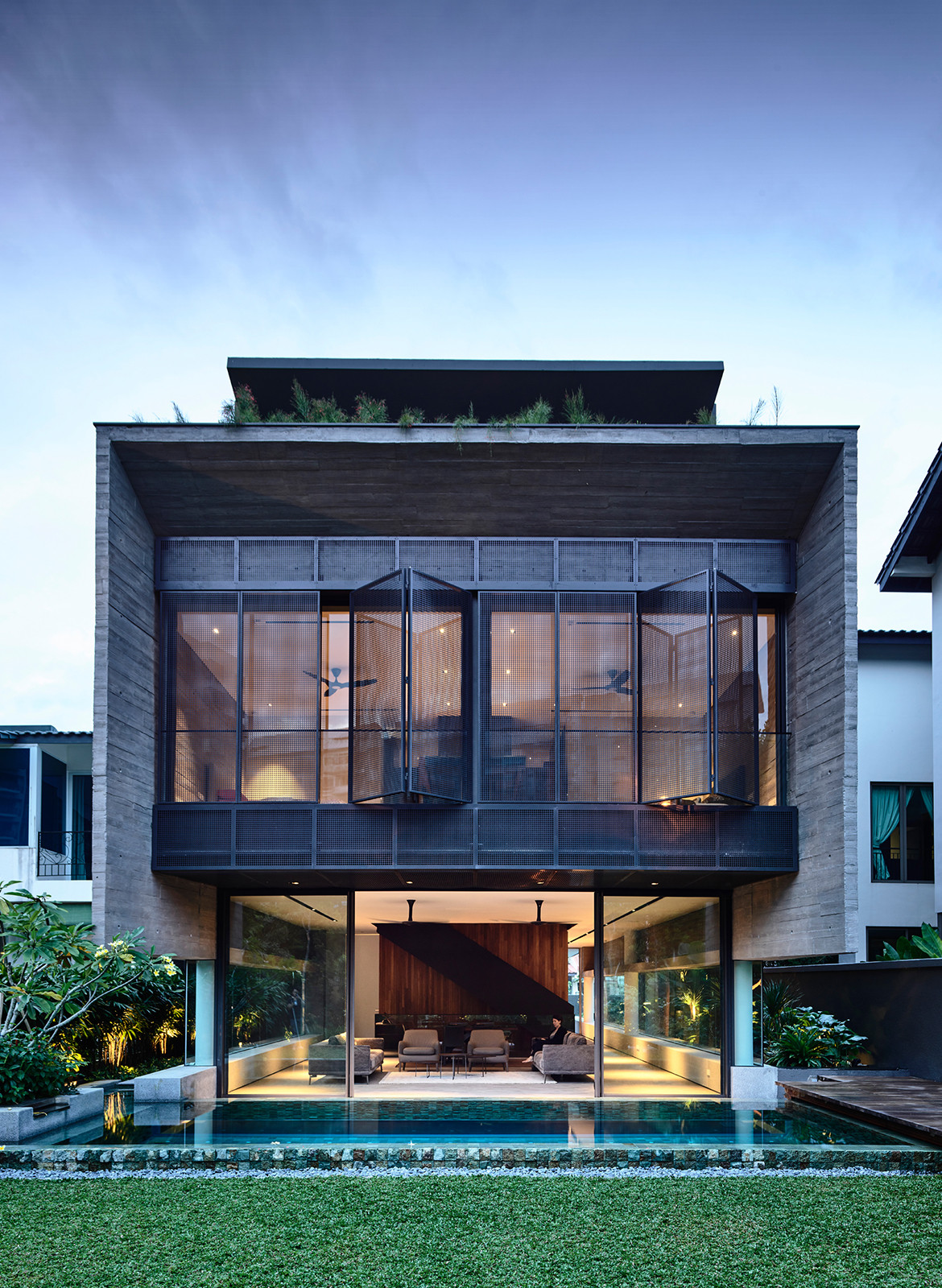
“Our second constraint was having to deal with the noise from the Ayer Rajah Expressway (AYE),” adds Tomas Jaramillo, ONG&ONG’s senior designer in charge of the project, in reference to one of the country’s major arterial highway. As the back of the house faces this expressway, placing the living room directly in front of this noise source was certainly a considered one. Not only due to the noise factor but also because it is at odds with conventional practice to place living areas in front of an internal road entrance.
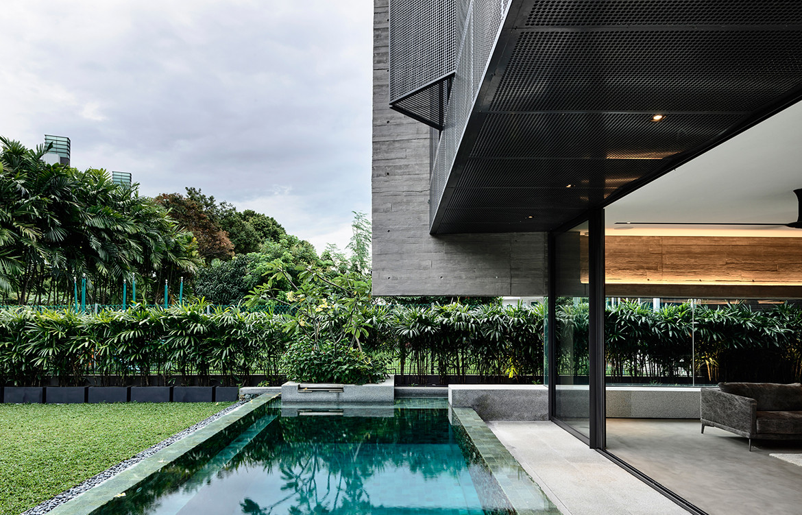
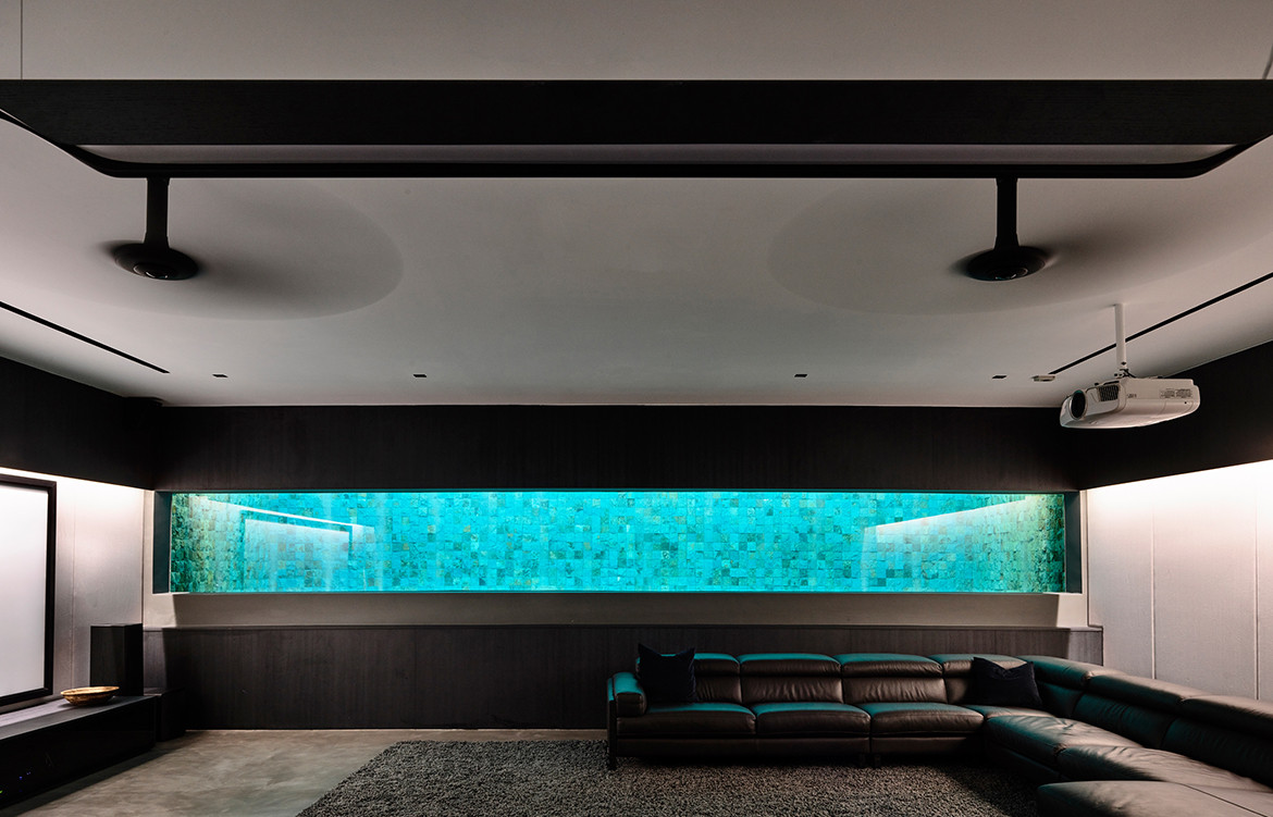
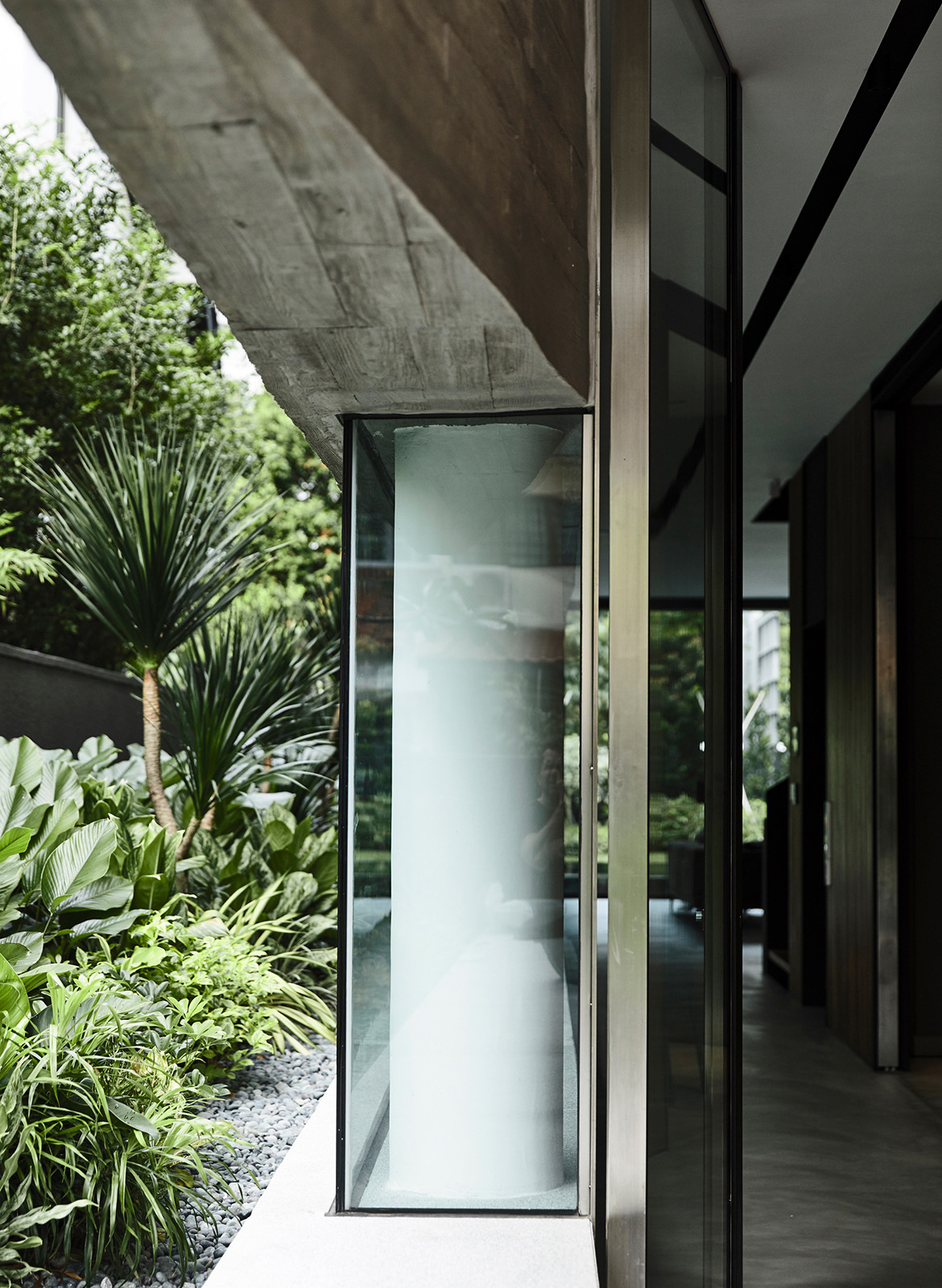
The reason for subverting this convention is compelling too. Setbacks from the highway meant there is more garden area at the back, whilst mature trees planted beside it provided a ready-made verdant backdrop. The fact that the rear 12-metre building setback line did not apply to basement structures also meant that a pool could be built along the back garden and its bottom could be appreciated from the basement via the use of the acrylic panel.
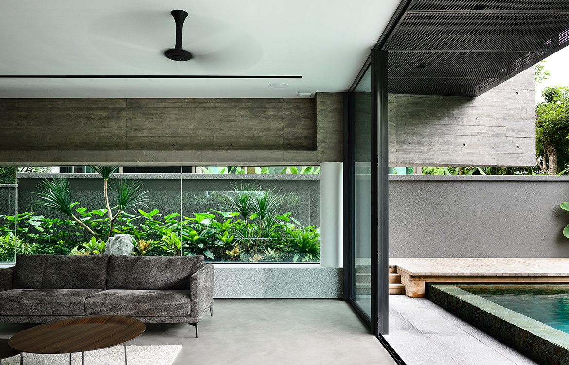
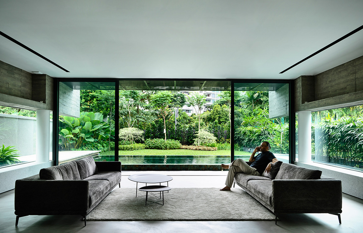
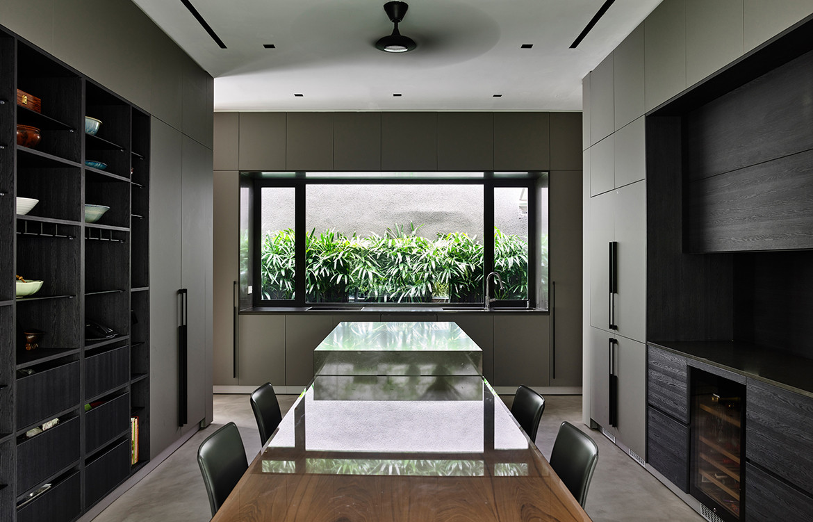
“Naturally, the back garden then became the focal point of the house,” says Tomas “but we had to be careful with the noise.” On the ground floor, the only effective solution was fixed double-glazing and a limitation to the opening panels. But this limitation simplified the design. The garden became a panoramic framed view, the concise exemplification of the Chinese design practice of jiejing or “borrowed scenery” – water in the foreground, lawn and shrubbery in mid-ground, trees in the background. In a choreography of framed views, much as in a lyrical Japanese movie by Ozu, a visitor enters the house via a passage that skirts through the kitchen and lift lobby, led on by a low-running band of bay window before the culminating scene at the living space, where the hard edges of cut materials dissolve into the green beyond. The serenity of this space is now so prized that the clients’ forbade their parents to clutter the concrete ledges with collectibles and various forms of art, even though this was what they have been designed for.
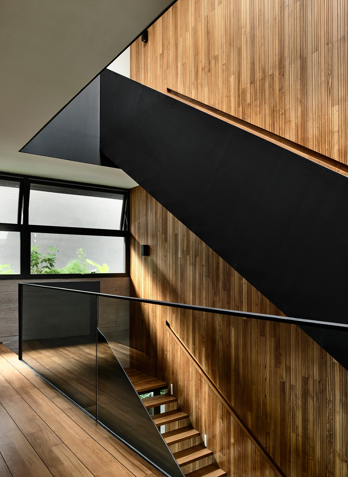
Should the living room doors be kept open, the other place of quiet respite would be the subterranean floor directly below. Here, one is effectively transposed to a realm of pool-filtered light complete with the soothing sound of rising bubbles propelled from a row of jets along the acrylic plane. This space can be further contained by a track of acoustic curtains next to the stairwell. Otherwise, the stairwell, which rises over four floors, becomes a socialising shaft; a vertical ‘hearth’ that connects all floors visually and centrally. Crowned with a skylight and bedded with a dry rock garden, one can imagine everyday conversations floating up and down its teak panels; voices from faces rather than from the intercom.
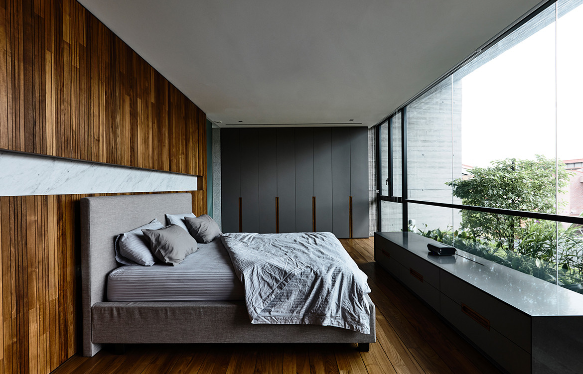
Another example of a gentle subversion of the convention is the master bedroom designed without a walk-in wardrobe. Instead, all the side walls of the bedroom are lined with contiguous, streamlined cabinetry that is then flush with – and visually extended to – the external projecting walls. These cantilevered wedges are joined across the top to form a tapered eave that is in turn, a part of the ledge-cum-parapet for the water feature on the roof terrace above. The aesthetic composition is thereby part and parcel of the practical elements and one is hard-pressed to decipher which design consideration had preceded the others.
Perhaps this survey could end where it started, back to the threshold of the house. Here, the vertical teak strips that line the walls have continued from the outside into the stairwell at the heart of the house. Beside the front door, it conceals the shoe cabinets. Opposite the shoe cabinets are granite plinths that look right as an anchoring base to the row of free-standing columns. But they are here also appropriately used as benches for sitting on as one puts on the shoes. Next to these plinths, the planted soil level is raised to almost the same level. The plants are then seen even when one is seated in the living room sofa. Colours are understated so that the leafy greens and the woody panelling become the natural highlights, with the Indonesian furniture from the owners’ collection serving as accents. Together, they form a gracious, harmonious entity and the very essence of distilled design.
ONG&ONG
ong-ong.com
Photography Derek Swalwell
We also think you might like House With A Loggia by RT+Q Architects
