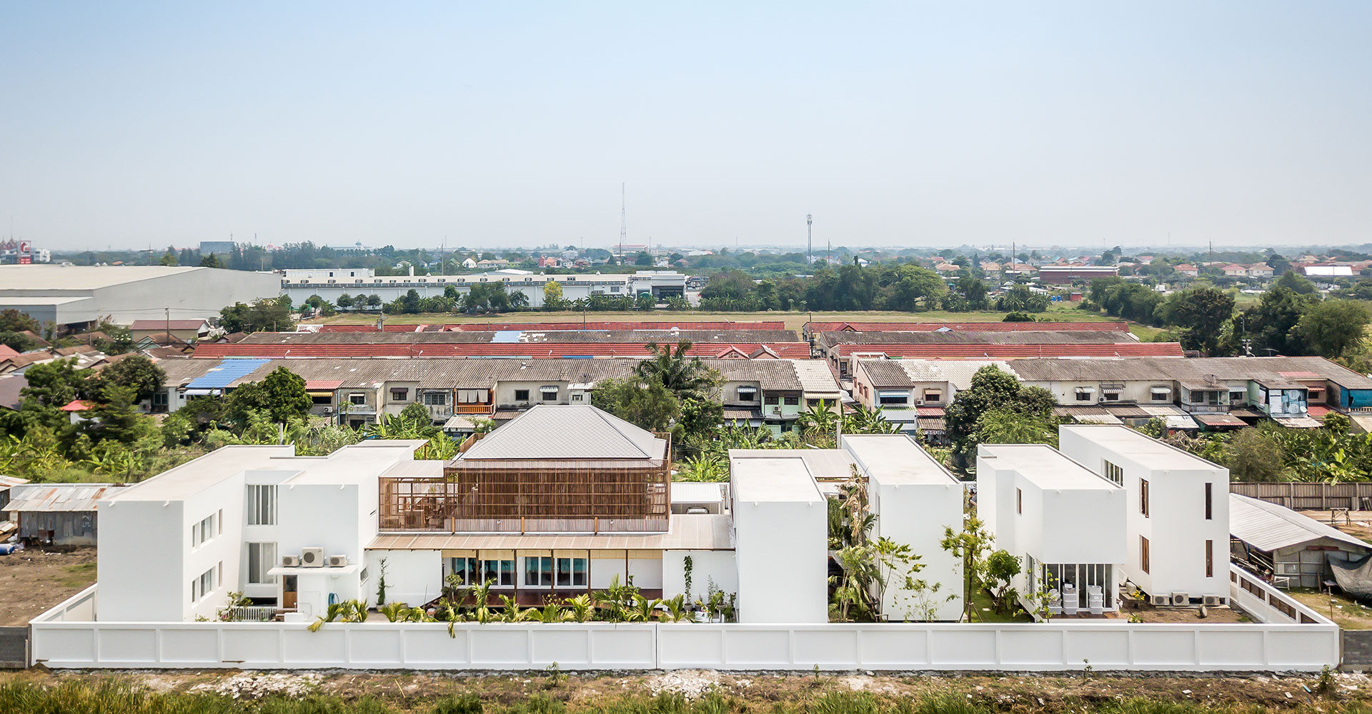
Located in the tranquil landscape of Minburi, on the outskirts of Bangkok, the context offers a sense of retreat that drove the intentions behind the design of this residence. It was conceived as a group of interrelated dwellings, a compound, rather than a house in the traditional sense. Patama Roonrakwit, the owner and architect of the residence, intended that the place be many things. Hence, it is not just a family residence, but the compound also includes an architectural office, a tourist agency and a music school, plus accommodation units for visiting foreign friends. These functions all answer to the diverse requirements of the Roonrakwit family which consists of three generations, including seven members from 8 to 84 years of age. In addition, there is a one hundred year-old wooden house belonging to the family for four generations that had to be relocated to the site.
The first question Patama, needed to answer was how to accommodate all these requirements while retaining the sense of privacy and tranquility that the context already offered.

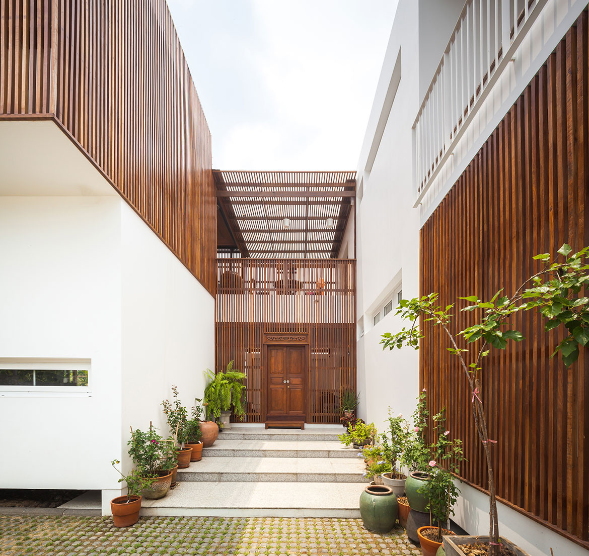
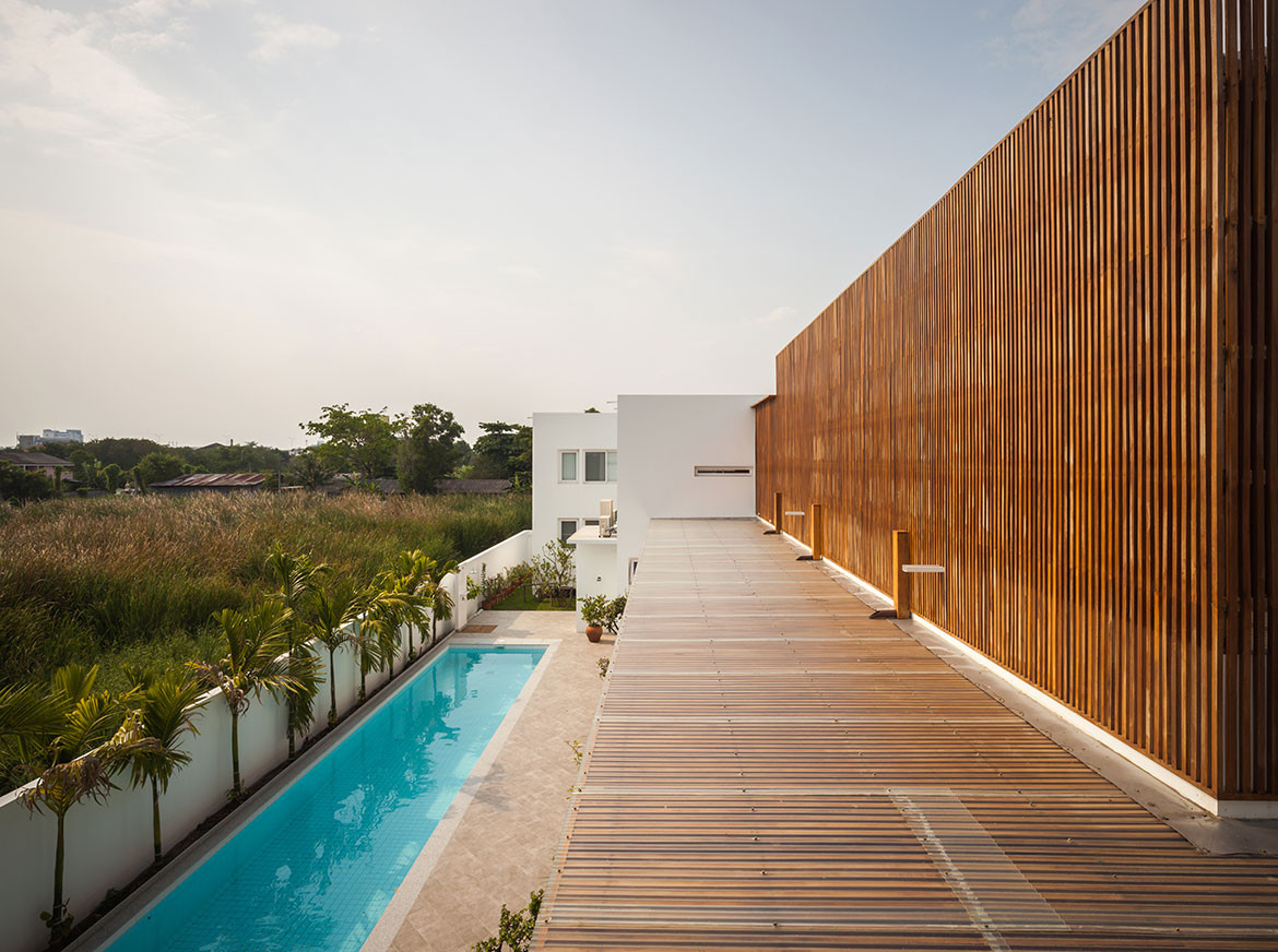
Patama’s solution was simple. In order to sustain the sense of individuality while acknowledging familial community – as well as embracing the tropical climate – the place would be organised as a compound of separate units joined together by roofed terraces. Once separated, all of the ‘boxes’ are free to let light and air in. The way these units are positioned within the site also aims at an interplay between privacy and community, letting the inhabitants of each unit be protected within their own spaces while allowing them to see and be seen as desired. The views from within, while generous, are never homogeneous. Instead, they are always framed to give the inhabitants different ways of relating to the landscape, which can be brought near, remain far, or left in-between. For this reason, everyday domestic activities are never overshadowed by the presence of the surrounding landscape, which becomes a background for contemplation rather than an overbearing foreground that screams for attention.
Built for a family of seven, plus frequently visiting foreign friends, the residence is organised into seven separate yet interconnected units. Four dwellings and two working units are connected by a central ‘communal’ unit that also contains the old wooden house on its upper level. From public working spaces to private living spaces, every area accommodates diverse functions that are translated into different ‘rooms’. Yet many of the rooms are not defined by the traditional element of a wall, but instead the perimeter of the rooms is left blurred, allowing the many usages to merge and emerge. This also occurs between the interior and exterior spaces of the house. Apertures are stratified in such a way that the inhabitants’ relationship to the surrounding landscape can be adjusted or chosen at will, which creates a free play of light and darkness, the fresh air, the breeze as well as the views. The compound is designed with a unique sense of lightness, along with the sensitive stratification of its enveloping enclosures that make the place a welcoming public space while remaining a private universe awaiting its inhabitants, who return each day, to retire and quietly recharge before the next day begins.

With two young children in the family, the residence has to accommodate not only the current needs, but also to foresee and take into the account future requirements that will arise as the children grow older. It has to be flexible enough to provide a framework for future transformation. Such simple balance is not easy to achieve. Had the design been too specific, the house would have remained firmly fixed, resisting any functional adjustments. On the other hand, had the design been too loose, each space may have lacked identity, without the particularity that creates a sense of place. It is only through careful anticipation that the design achieves the balance of being both framed and free.
The uniqueness of its appearance also comes from the re-use of architectural elements and materials from an old house, dismantled and reassembled in a new way, with a new language. It is at once familiar and refreshingly new. Materials and elements, local and ‘old’, are configured and assembled with a language pertinent to current usage, giving an ambience of something contemporary. It is a house conceived from a close connection between inner demands and outer context, creating a unified whole that belongs to both the owner and the place where it is situated.
CASE Architects
casestudio.info
We think you might also like other projects from Habitus House Of The Year

