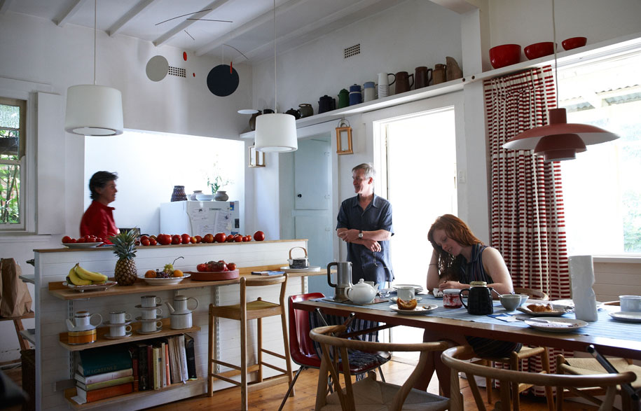
Simon Lloyd and Libby Dempster live with their daughter, Georgia, and Pepper, their Maltese Terrier. Lloyd, an artist and industrial designer, also has a studio in the back garden of their home in Ormond, Melbourne. Rustic, and surrounded by vines, their Californian bungalow is a work in progress. “It’s quite an austere house,” says Dempster, who lectures in Performance Studies at Victoria University. “We bought it twelve years ago more for the location, close to the Montessori School.”
Dempster met Lloyd in Darlington, Devon. Lloyd moves comfortably through all the visual arts, including painting – he exhibited recently at the Anita Traversa Gallery in Richmond, Melbourne. In the early 1980s, he was studying three-dimensional design and Dempster was involved in the Dance Umbrella Festival in London, where the duo collaborated. “Simon didn’t really design the stage set,” says Dempster. “It was more a series of objects, in timber, rope and a yacht sail.”
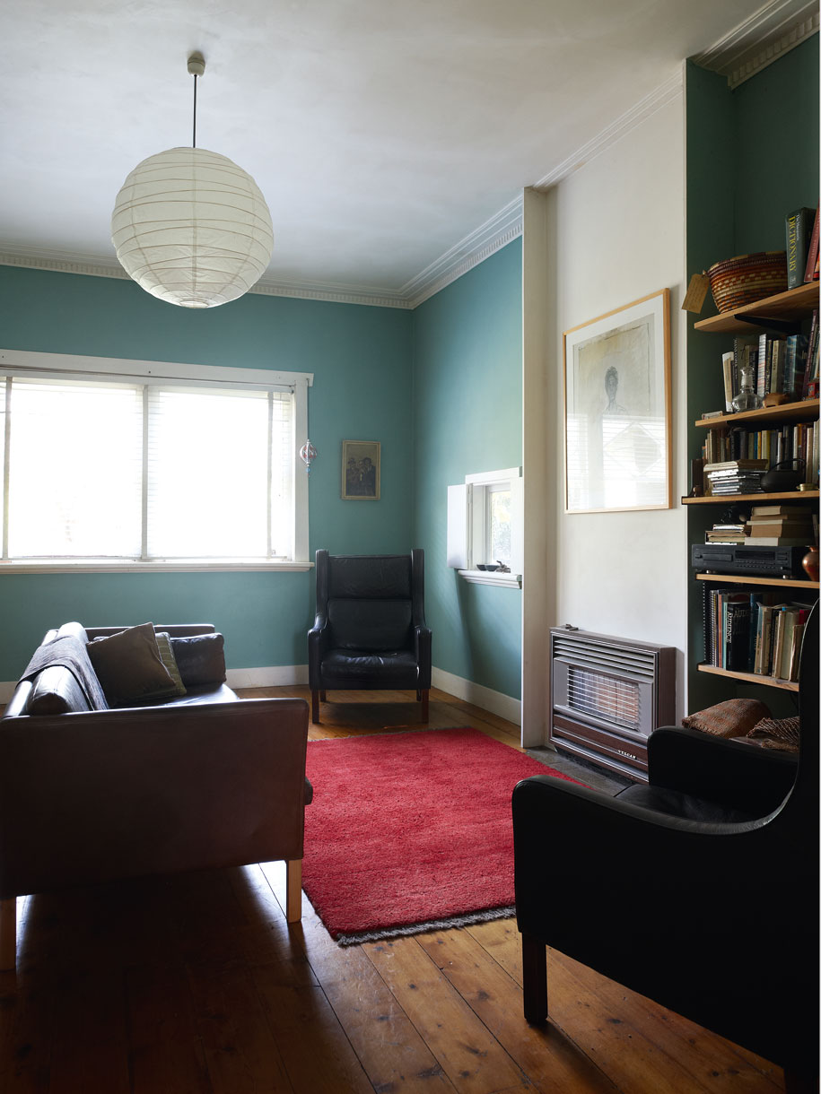
The main living room is filled with bookshelves and features high-back Danish leather armchairs.
Fast-forward three decades and their house is filled with objects. Some reflect Lloyd’s interests in simple household objects. Ceramic plates gather on shelves, together with cups, utensils and even old watches. Some of these items are regarded with pleasure, others are questioned by Dempster as to their worth from a design perspective. “Look at these knifes and forks [by Enzo Mari, a leading Italian designer]. They look beautiful, but I’m not mad on how they feel in your hand,” she says. Nevertheless, she does appreciate Lloyd’s fine sensibility, both his purchases, as well as his finds. Two leather arm chairs in the lounge by Danish designer, Borge Morgansen and bought from Dean Angelucci, are cherished, as is a designer chair found on the nature strip. Other finds, such as a 20th Century chest from the Depression years is Dempster’s find, from out the back of a secondhand store.
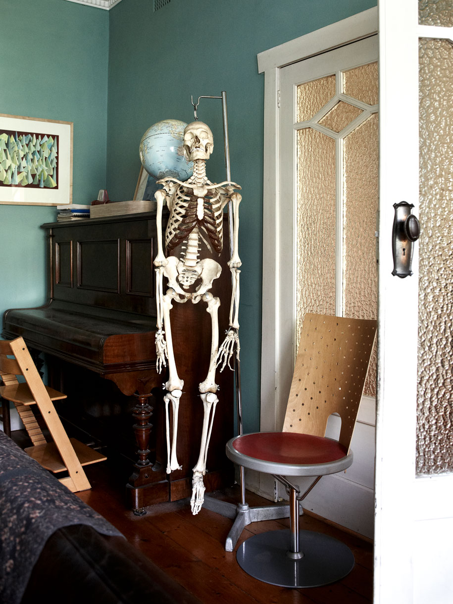
The ‘family skeleton’ adds a quirky feature to the formal lounge.
Lloyd and Dempster have slowly re-worked the house over the last twelve years. One of the walls separating the kitchen and dining area has been removed while a new alcove with a concealed skylight provides filtered northern light into the kitchen. Lloyd did most of the work, himself, but he was guided by Dempster’s ideas. Christopher Alexander’s book, Pattern Landscape, showed them the importance of the path of light as it moves through and around a house. “We’re always conscious of the outdoors, wherever we happened to be,” says Dempster. The home grown fruit ripening on kitchen benches is also testimony to the family’s strong connection to nature. “Libby and I are drawn to similar things, those that have a sense of honesty, with little pretence,” says Lloyd.
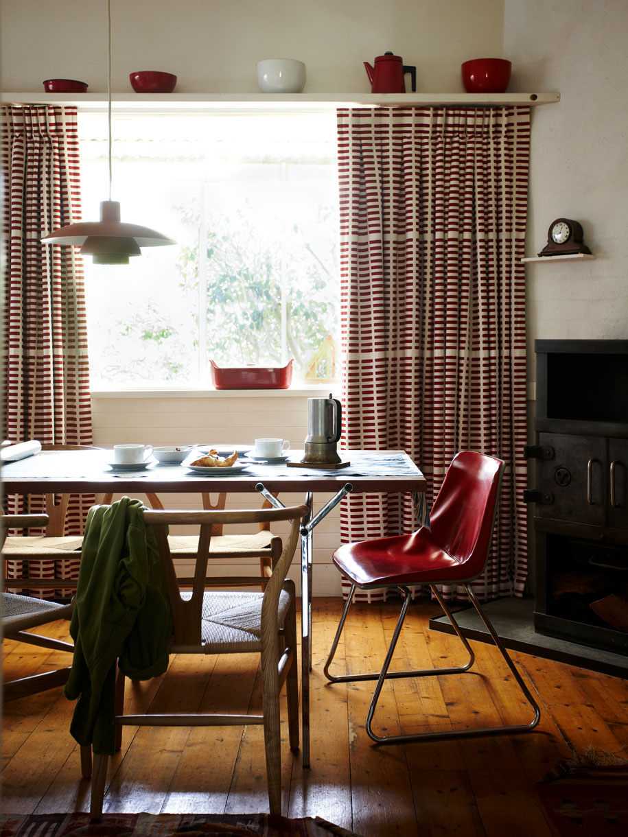
The main living room is filled with bookshelves and features high-back Danish leather armchairs.
Lloyd’s studio, a shed in the back garden, overgrown with vines, is also a perfect backdrop for his ceramics, paintings and objects. And although the exterior is weathered timber, worn by age, the interior is pristine, with white-painted tongue and groove timber walls, illuminated by generous skylights. One can almost see Lloyd’s precise way of thinking on show, with simple everyday objects, such as rocks, displayed like gallery exhibits.
While Lloyd and Dempster haven’t collaborated on a performance in recent times, both bring their own talents to the space. Dempster, for example, sees space with people moving through it, while Lloyd is often drawn to the materiality of a space. “Libby tends to go back to an idea, maybe re-work a concept,” says Lloyd. “A space needs to be functional, not just aesthetic,” says Dempster.
Irrespective of how a design decision is reached, it is clear that this house is home to three highly creative people, all conscious of the simpler and often the most important things in life.
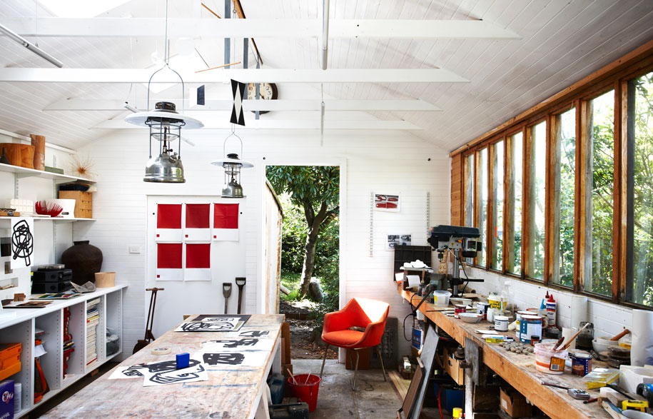
Simon’s studio includes the original back door of the garage. This creates additional light, as well as strengthening the connection to the garden. The studio is extremely ordered with work in various stages of production.
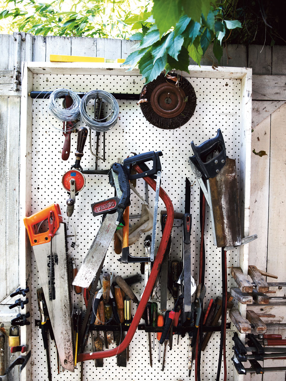
Tools of the trade are arranged on a peg board.
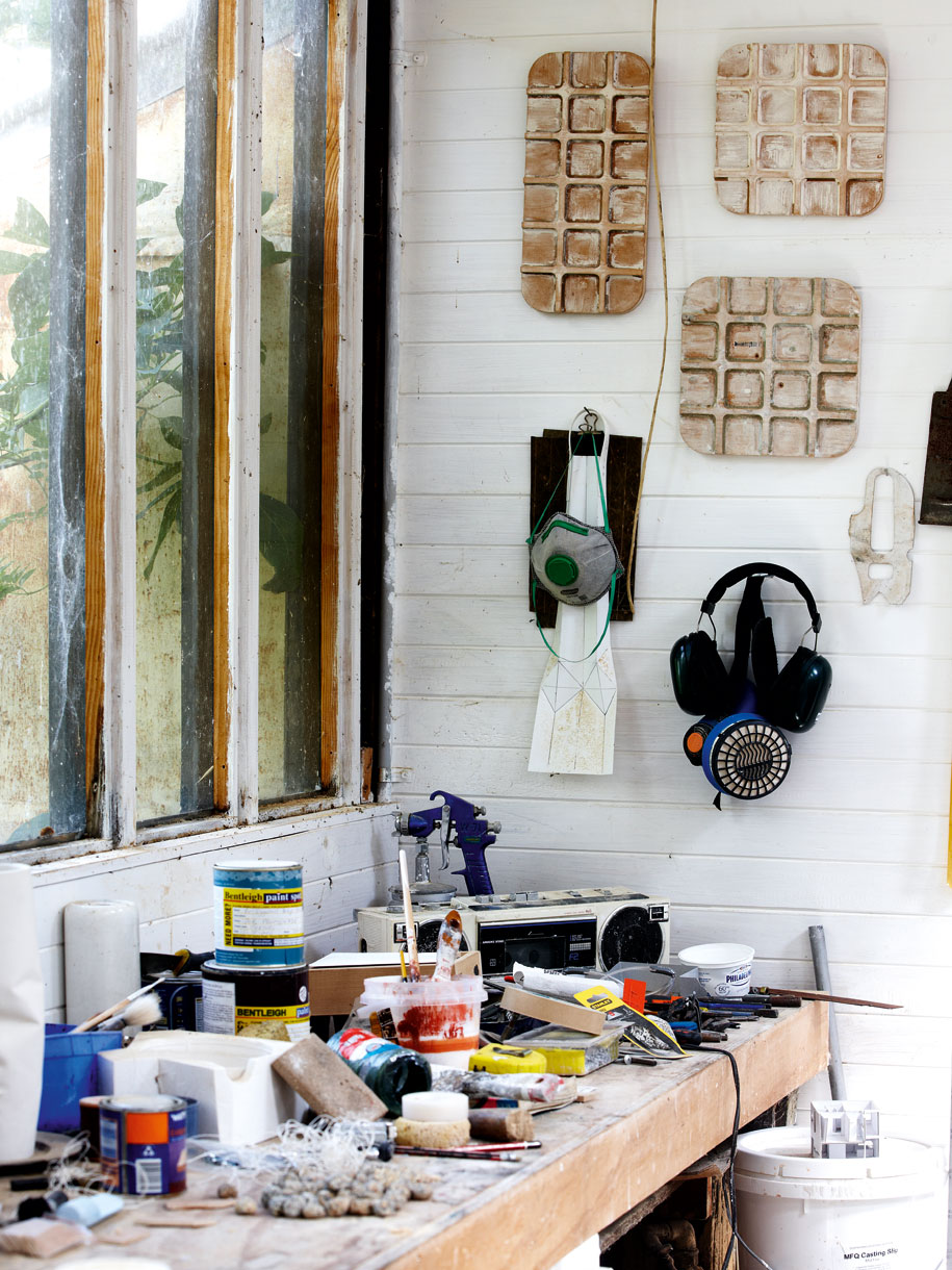
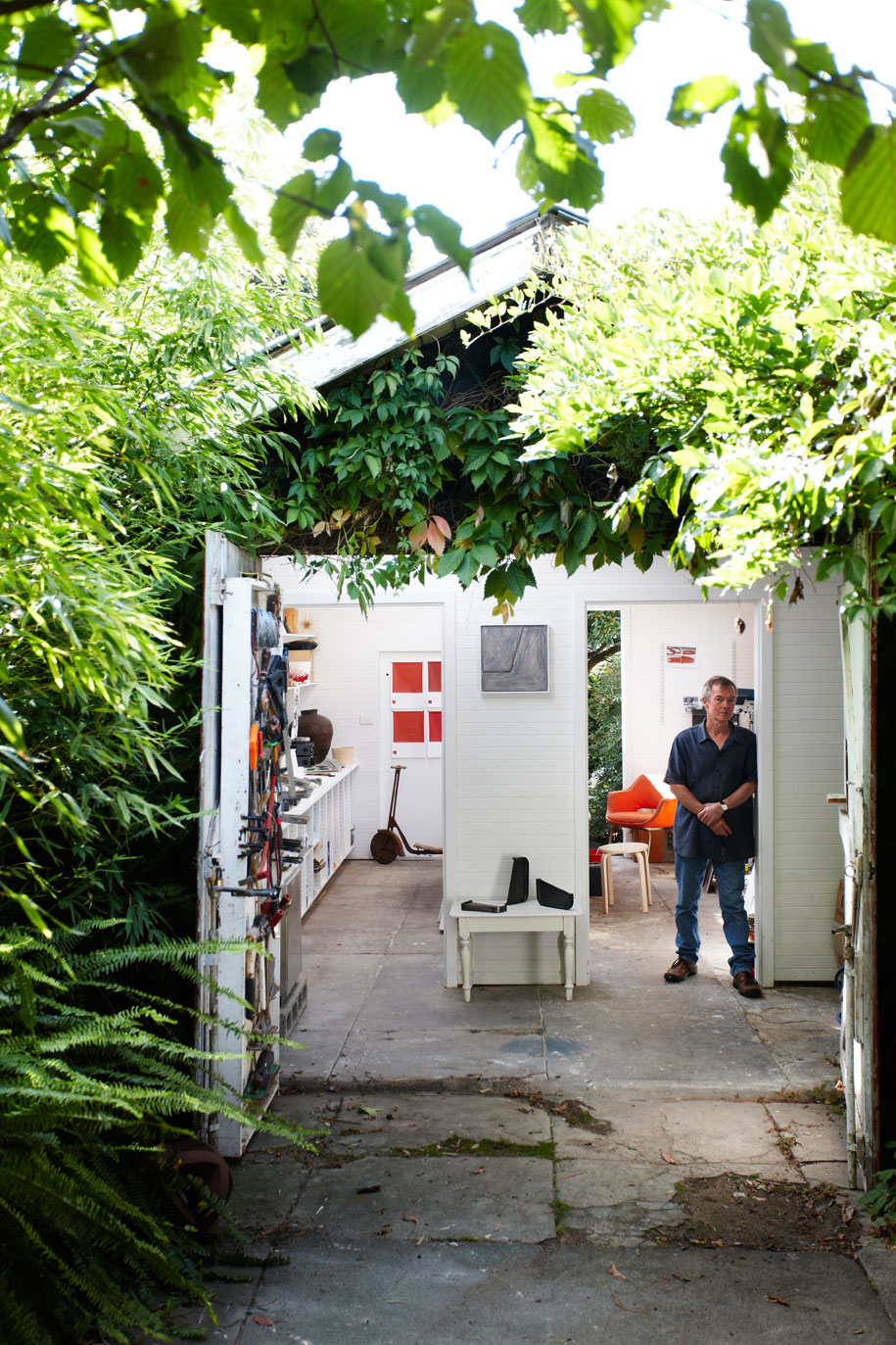
Simon Lloyd in his studio, a converted garage in his back garden. Covered with ivy, the studio is pristine with white walls and concrete floors.
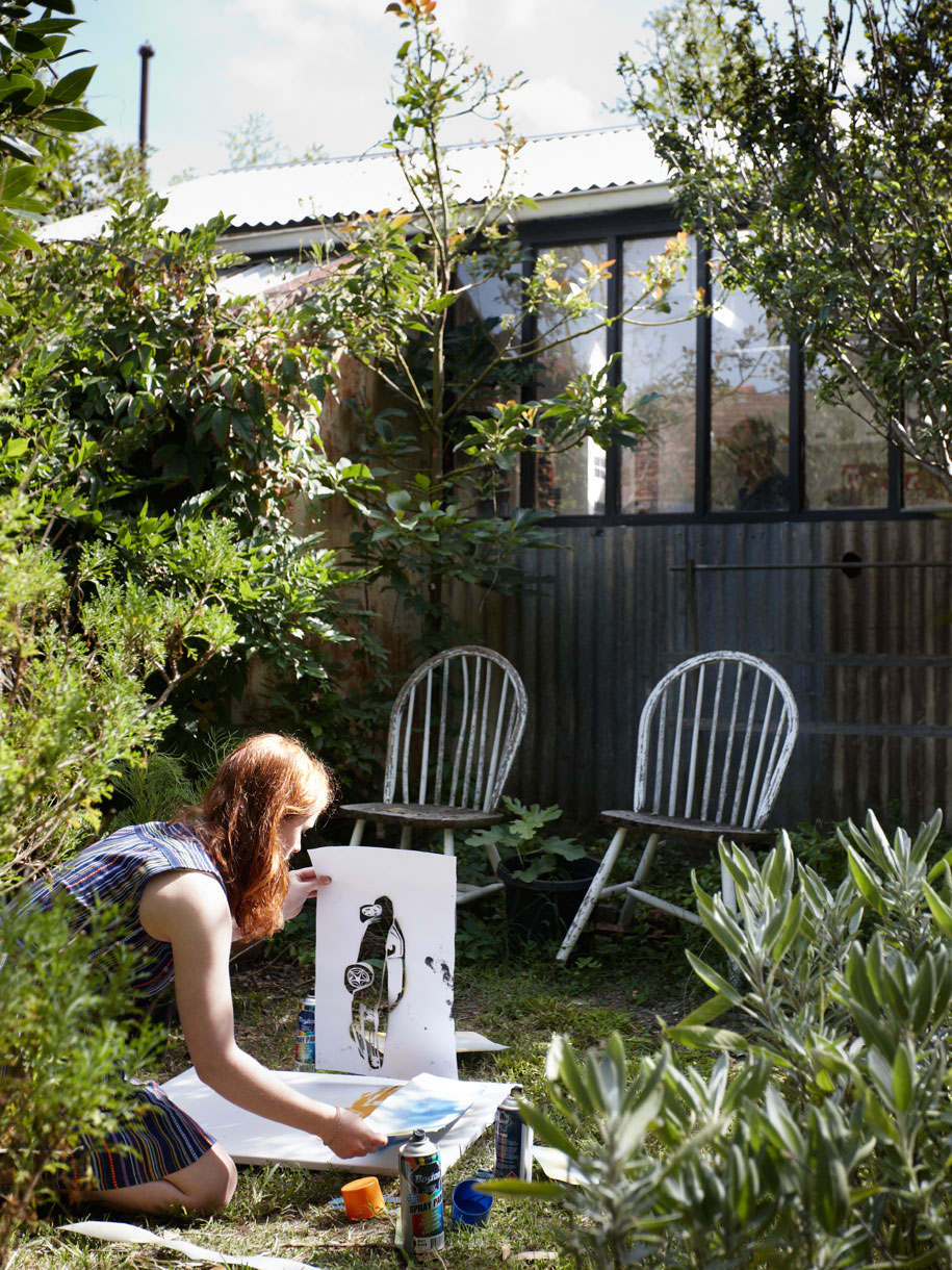
Georgia uses the back garden is used as another room, with furniture often taken from inside, as well as sheets of paper.
