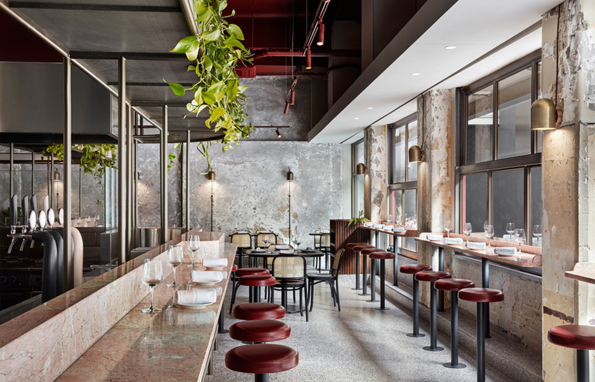
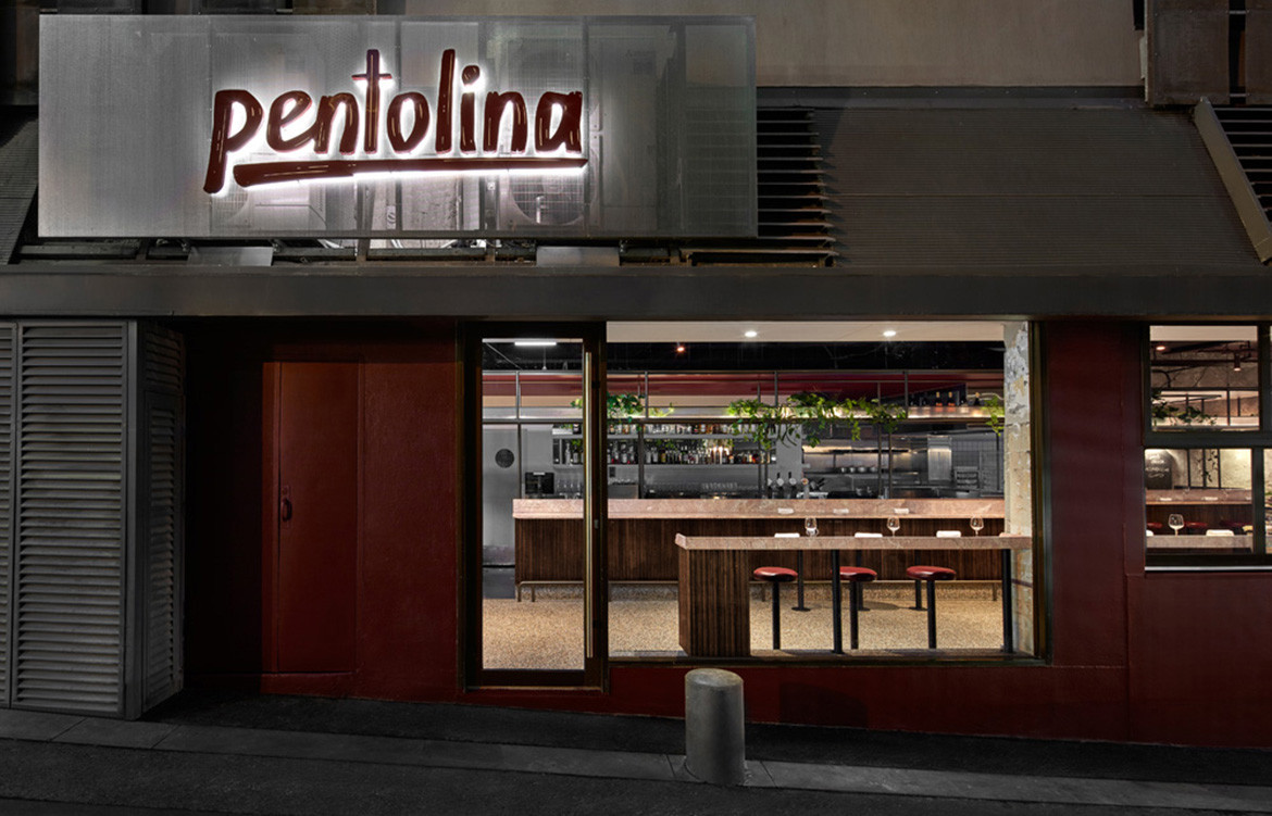
There aren’t a lot of things Italy’s ancient city of Rome shares with Australia’s contemporary cultural hotspot Melbourne, however, a passion for design, food and culture certainly tops a small list. Local design studio Biasol have used these shared passions as the basis for the design of a new restaurant – appropriately located on Little Collins Street.
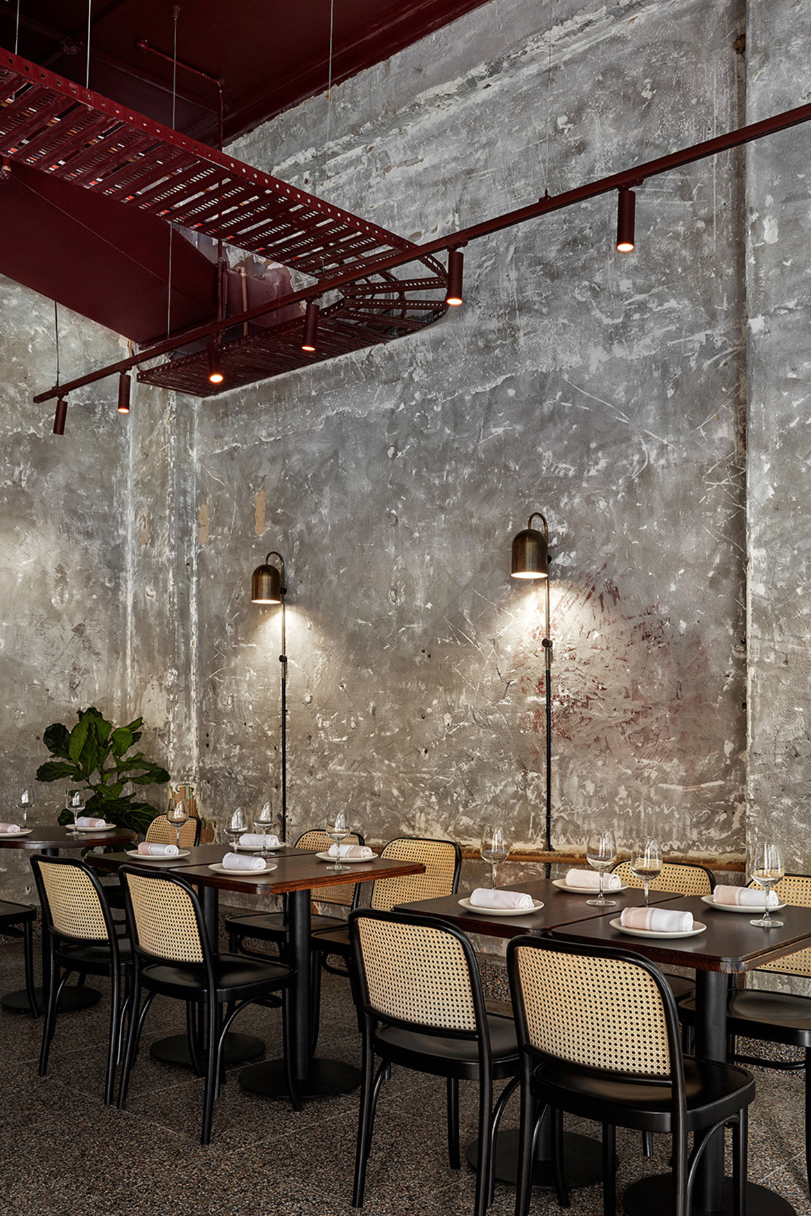
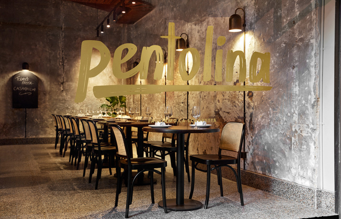
The century-old building in which the new casual dining restaurant, Pentolina, is situated alludes perfectly to the history of Rome and traditional pasta making. A respectful renovation of this building sees hand-rendered concrete walls that mirror the stone façades of historic Roman laneways.
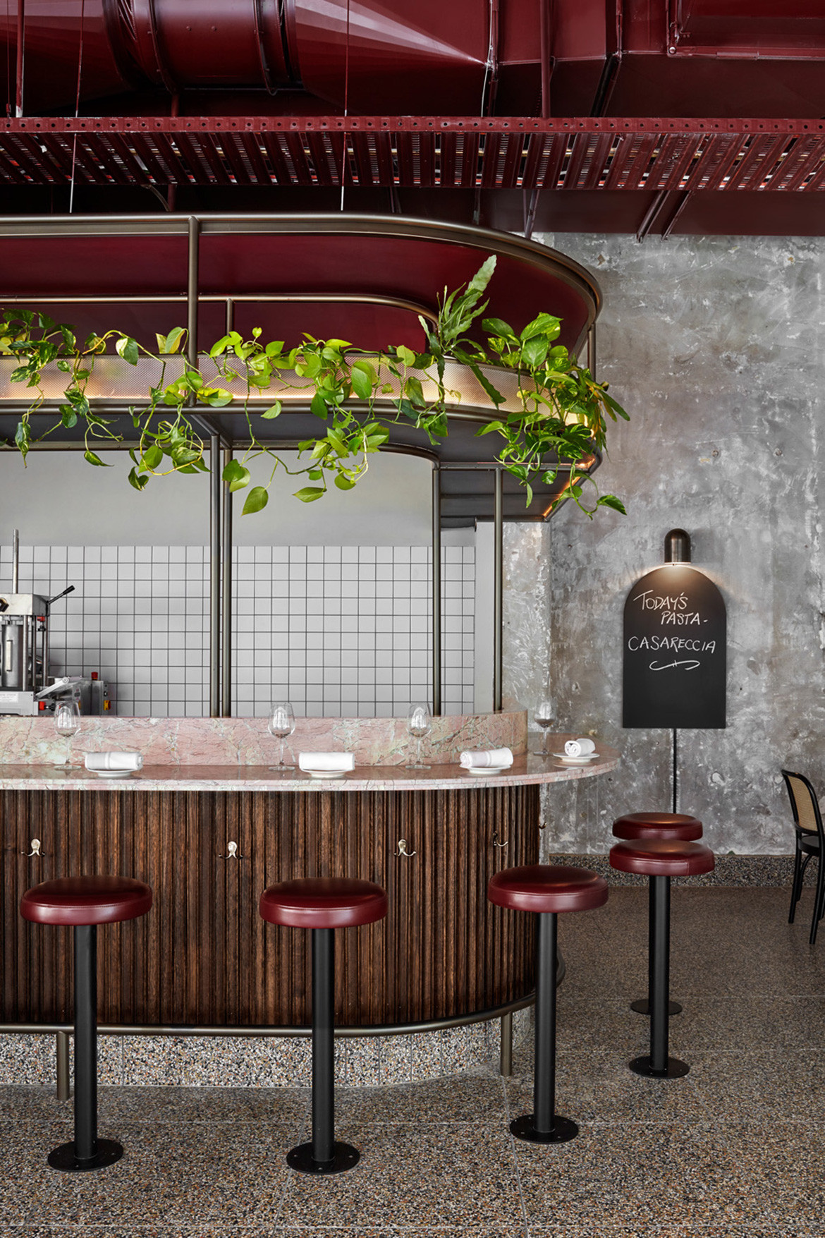
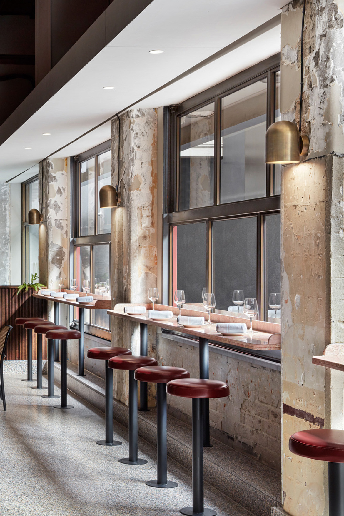
Inside, the interior architecture and layout have been configured in such a way that evokes old-school Italian pasta bars in the inner city – identified by Biasol in the research and development stages. As an example, a double-curved counter with bar stools spans the length of the restaurant providing the central feature of the space.
“The counter unifies the key functions of the restaurant – bar, cookline, pasta making and dining – and in true Italian fashion brings guests together to engage with each other and the staff,” says the founder of the multi-award winning design studio, Jean-Pierre Biasol. Overhead, the curves of this bar are mirrored in the bespoke and inbuilt shelving in one of many efforts to ensure consistency in the project realisation.
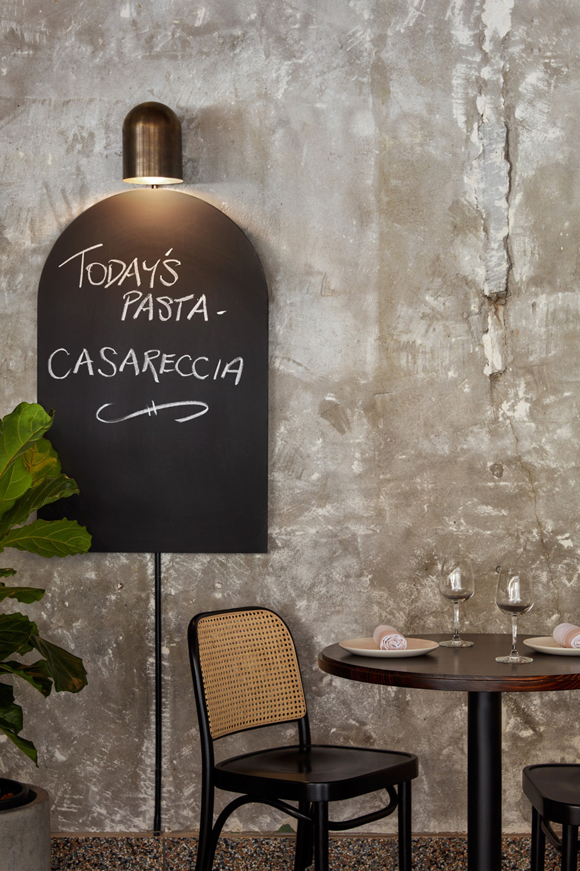
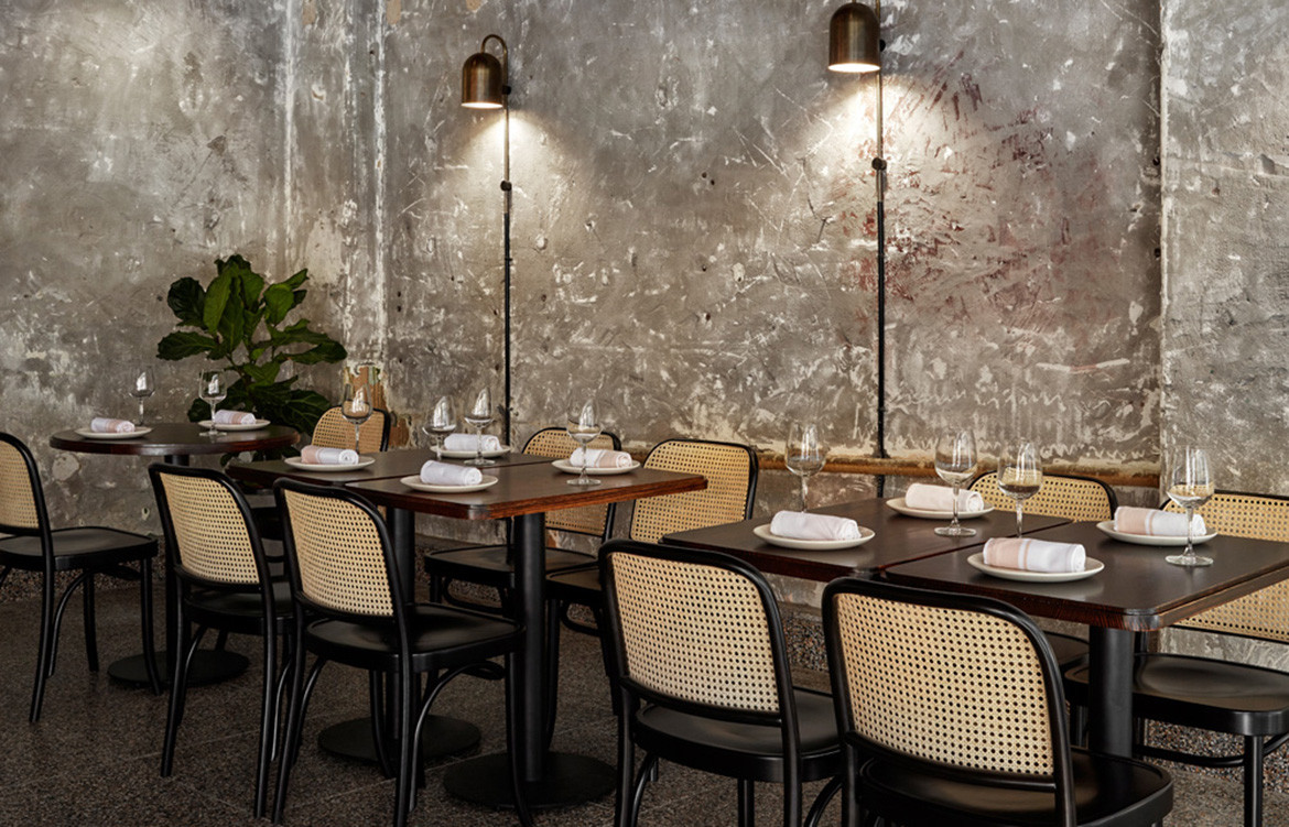
Materiality and colour have just as important a role in ensuring the project meets the brief. Deep burgundy – a shade thought to incite food cravings – colours the bar stools and ceiling; a rose-hued marble bar is reminiscent of the pink granite of ancient Rome; Terrazzo floors draw speak to a long-standing sixteenth-century Italy formal design vernacular; and scalloped Tasmanian oak lines the bar front providing a warmth to quite a formal space respective to the casual-cool flux of Melbourne restaurants.
“The brand identity infuses Pentolina with a sense of place. The freehand typography is inspired by handmade pasta and the Italian expression ‘facciamo la scarpetta’ – the ritual of mopping up delicious pasta sauce with fresh bread,” concludes Jean-Pierre.
Biasol
biasol.com.au
Photography by Jack Lovel
We think you might also like Pinkie by Biasol
