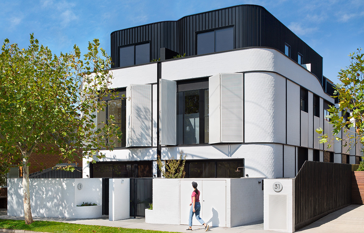
Developments across Melbourne are a dime a dozen, but there are some that bring something different. Pine Ave, designed by Cera Stribley Architects with interiors by The Stella Collective, with developers ANGLE and BuxtonGroup has some unique design details to set it apart.
Designed with young families in mind, Pine Ave is a fresh and modern interpretation of the classic art deco architecture common in the area. To bring the project to life, developers ANGLE pulled together a key team of collaborators – seeing strength in balancing the right mix of experts. The project is made up of eight townhouses, each three storeys high.
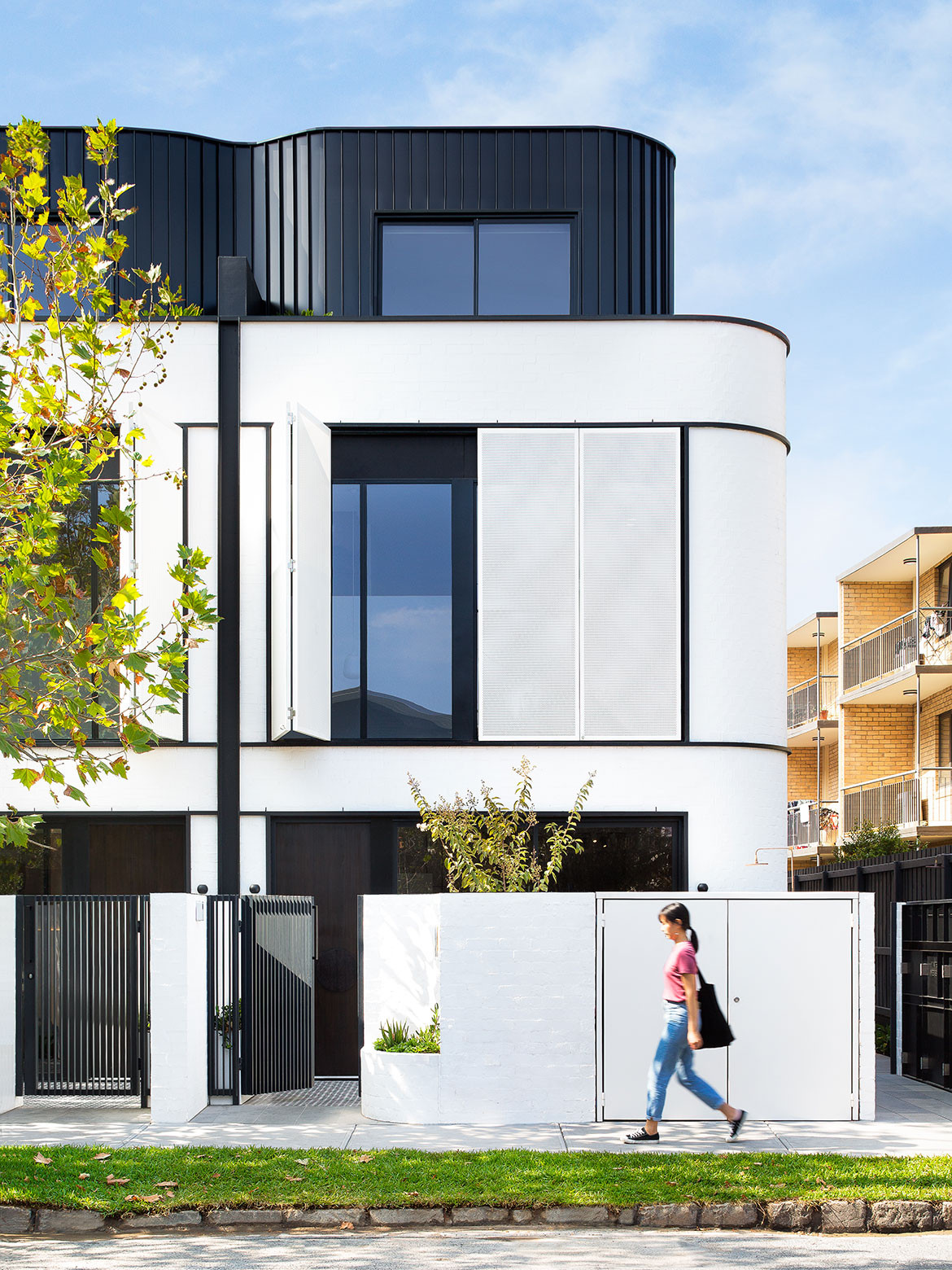
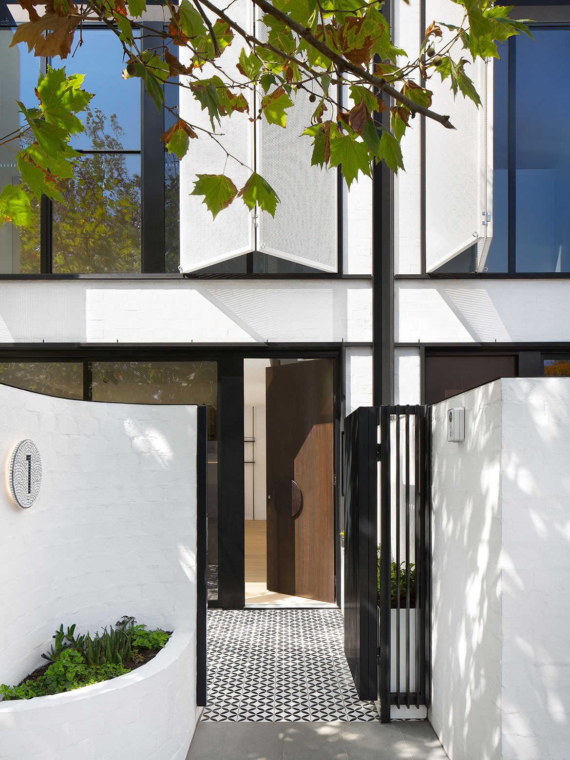
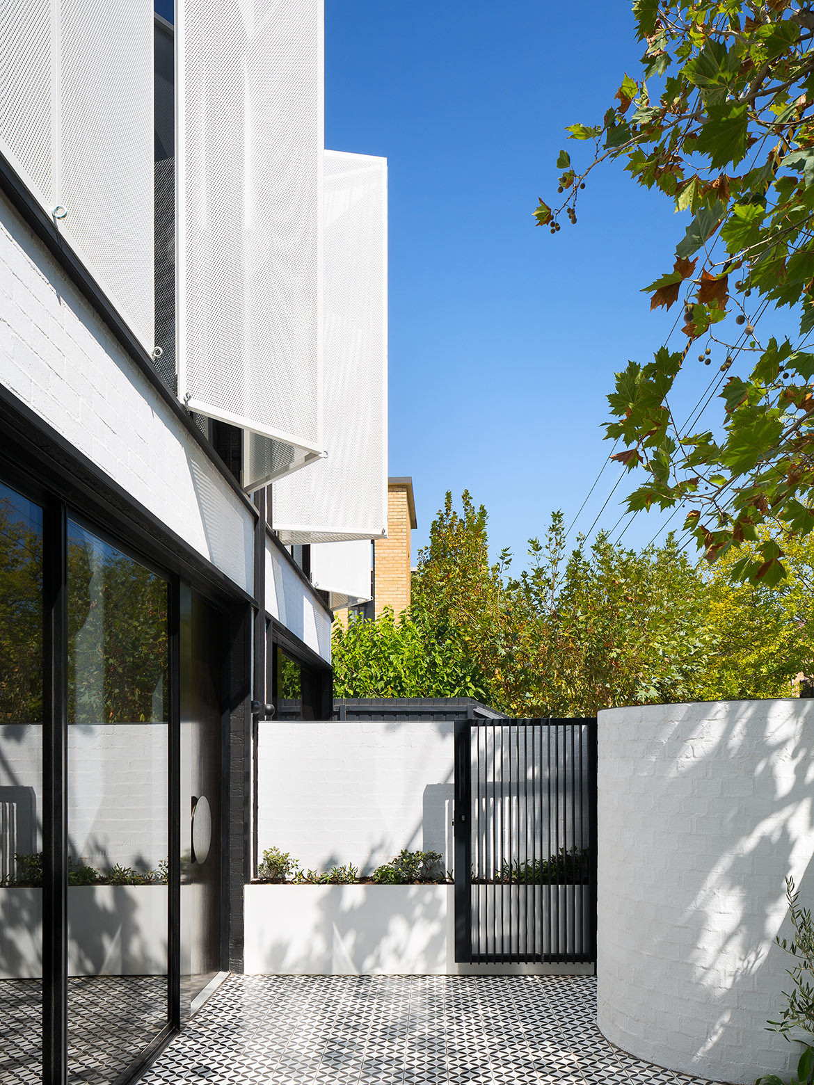
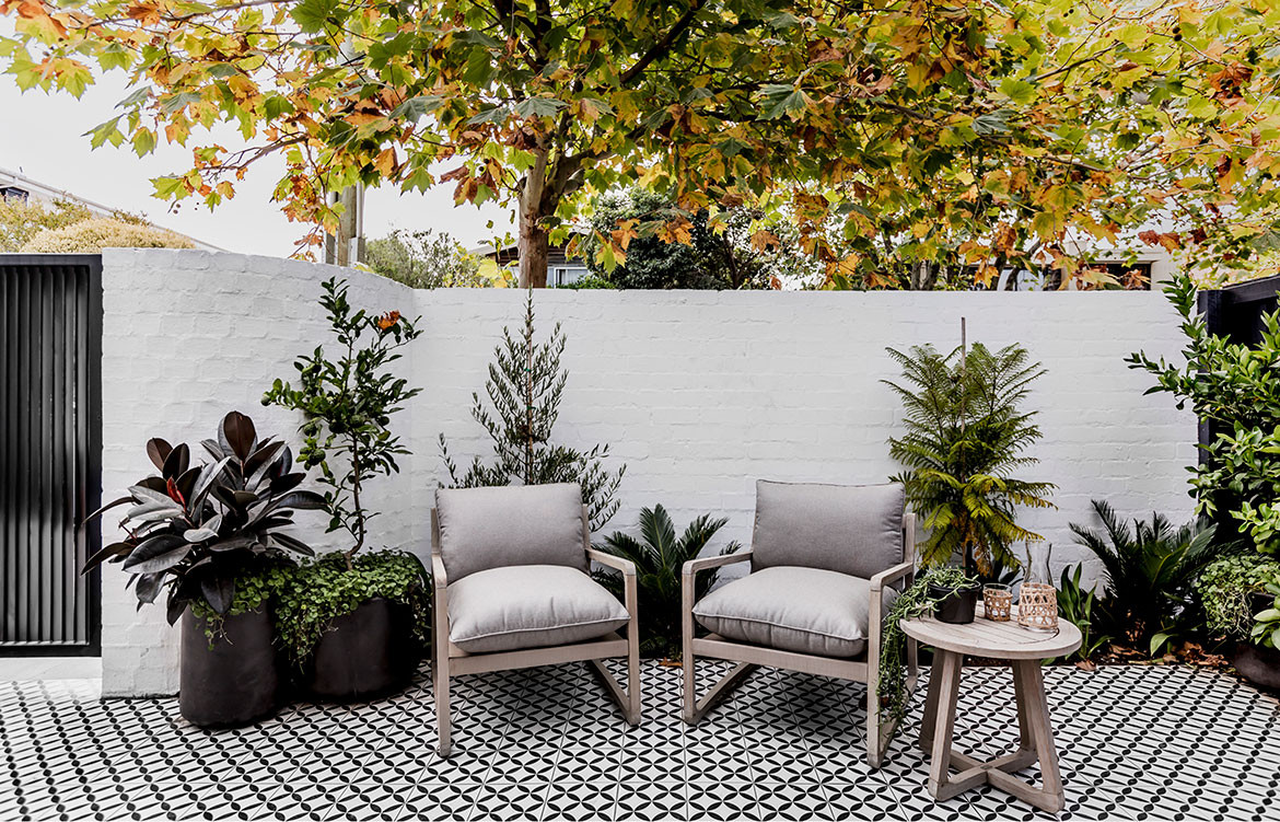
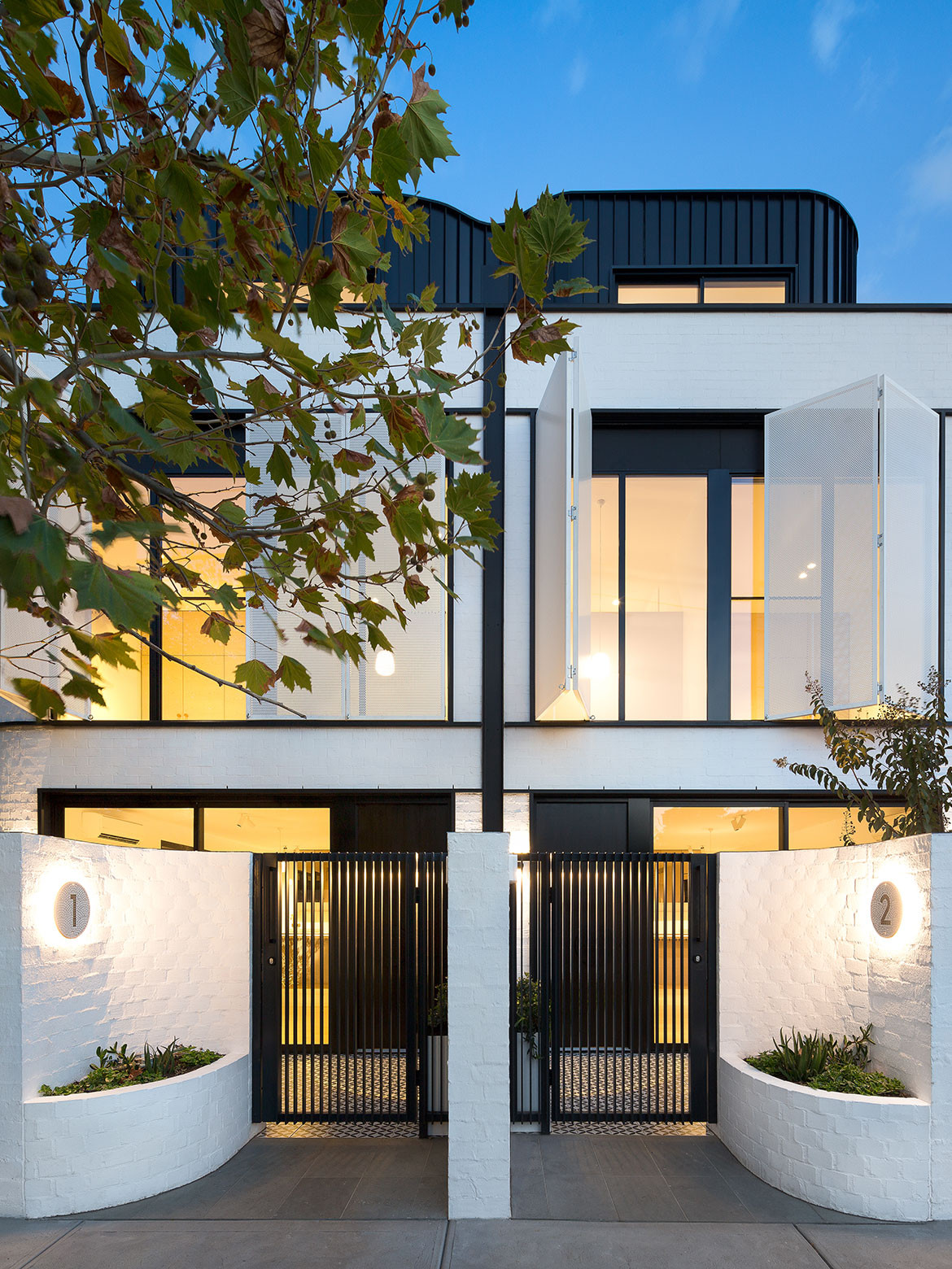
The distinctive façade of Pine Ave draws reference to art deco through its curved brickwork and balanced details. Upon closer inspection the façade belies its modern interpretation through the materiality. Offsetting the white brickwork is a charcoal cladding, while the windows include a white perforated screen. “We had to really push for council approval on the material selection,” says Kegan Harry, Director of ANGLE and sister company Earl.St.
Wanting to capitalise on the ocean breezes and maximise liveability of each townhome, the layout and planning of the block has meant each one has dual aspects. This is key for cross-ventilation and ample light.
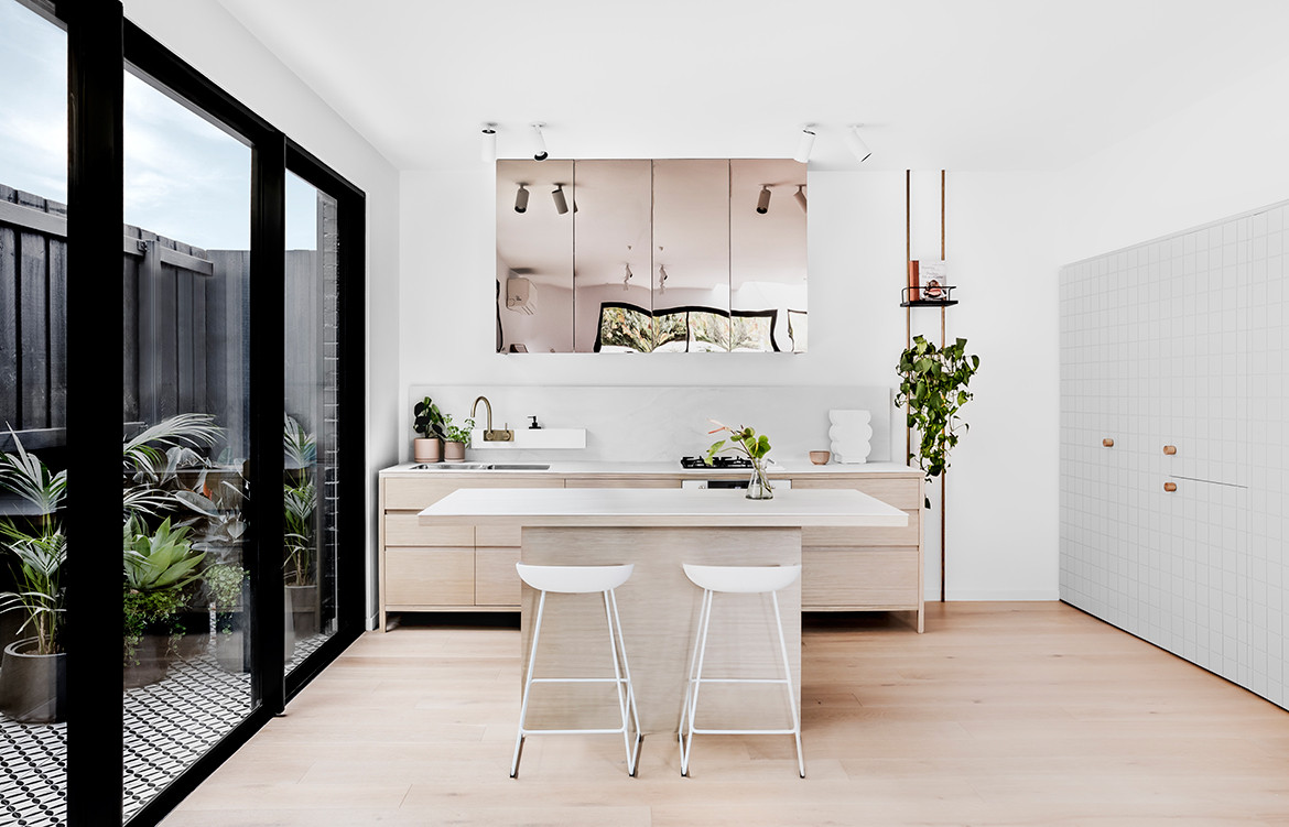
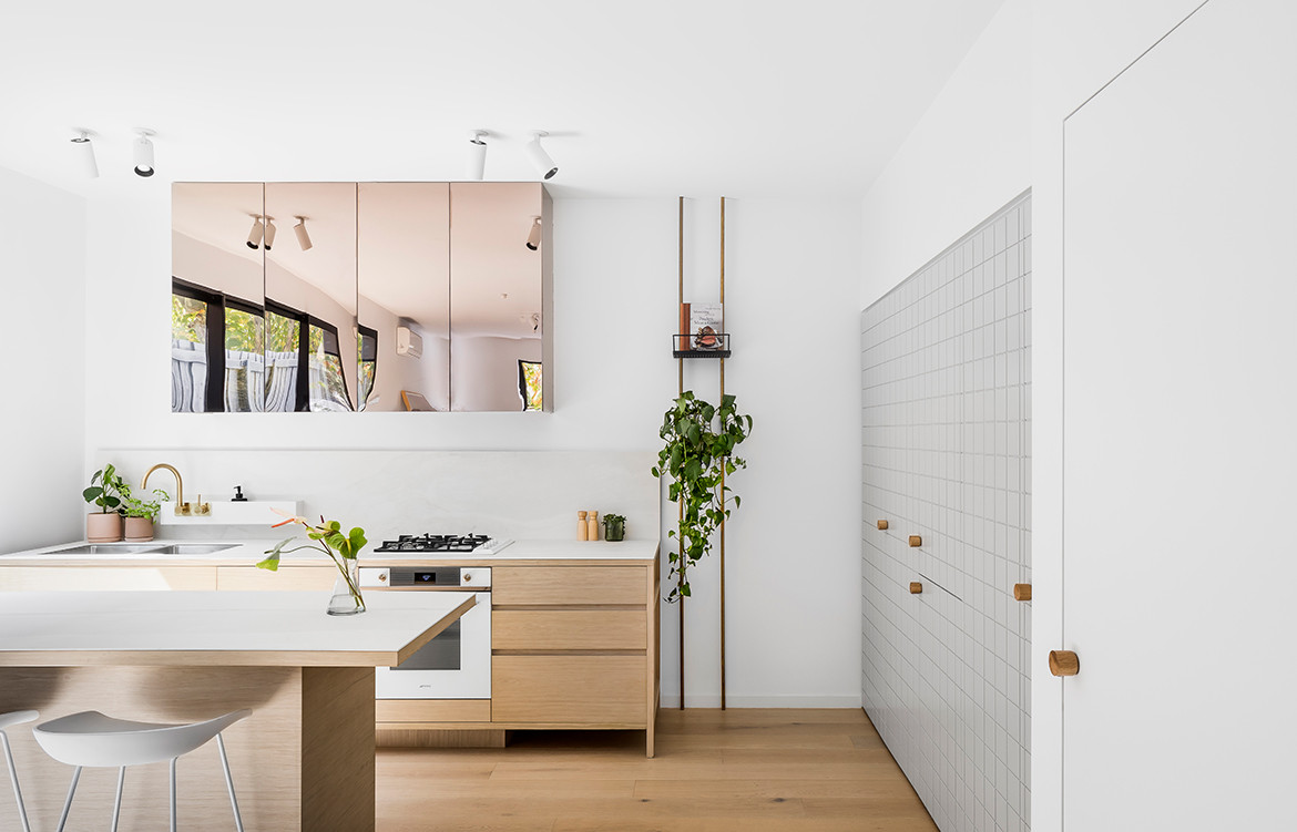
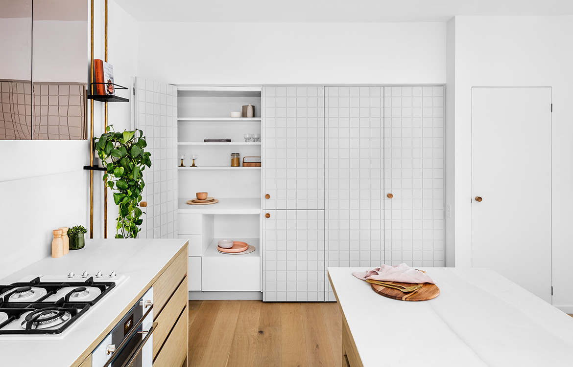
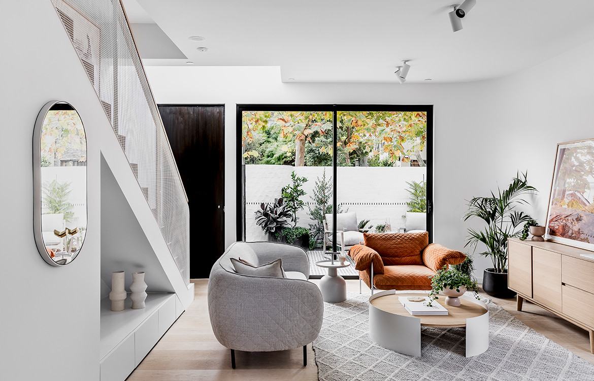
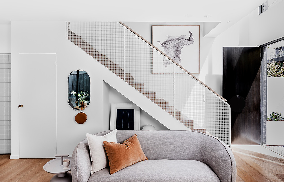
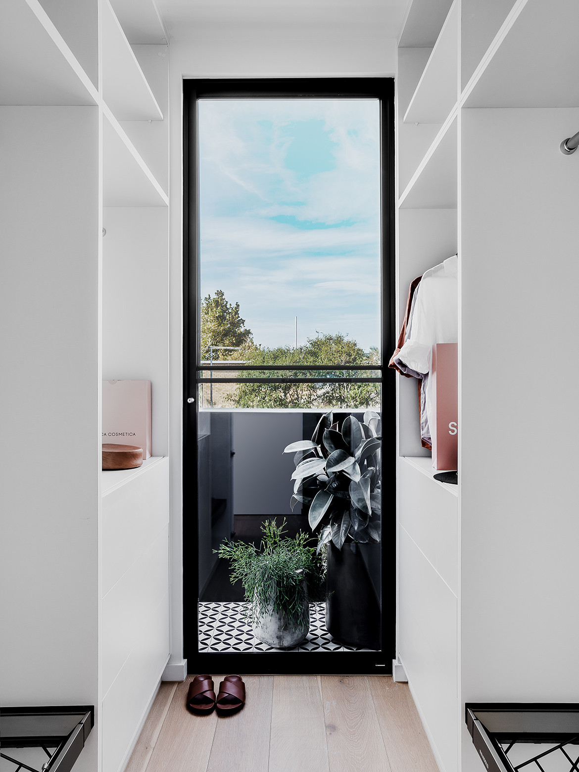
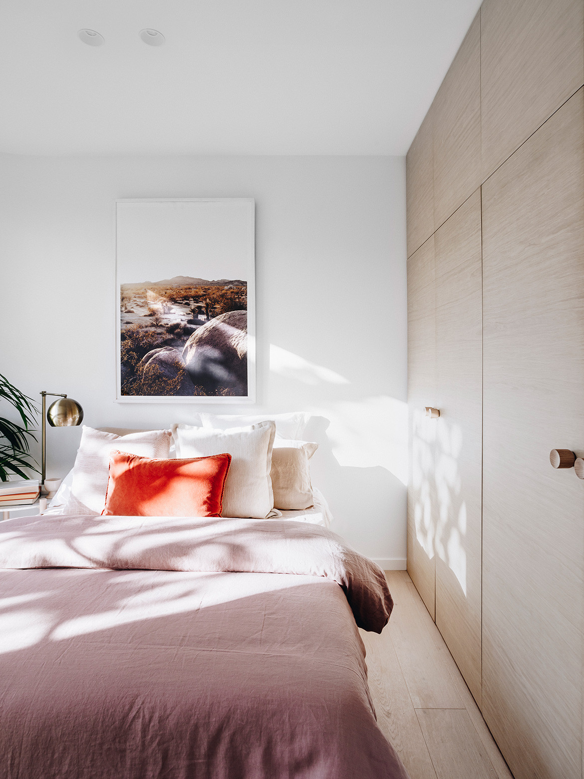
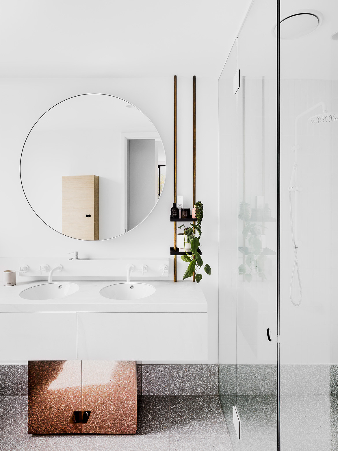
Once inside, thoughtful details come to the fore, with The Stella Collective having been appointed as interior designer. The material palette is fresh and fun, perfect for young families. Blonde timbers have been paired with brass details and finishes, while design elements like reflective cabinetry work to amplify the space. Perforated metal, as seen on the exterior, makes its way to the interior, allowing for a sense of lightness while repeating the same modern language from inside to out. Storage has been well considered, with hidden cupboards and draws as well as a series of brass shelves running from the kitchen to the bathroom.
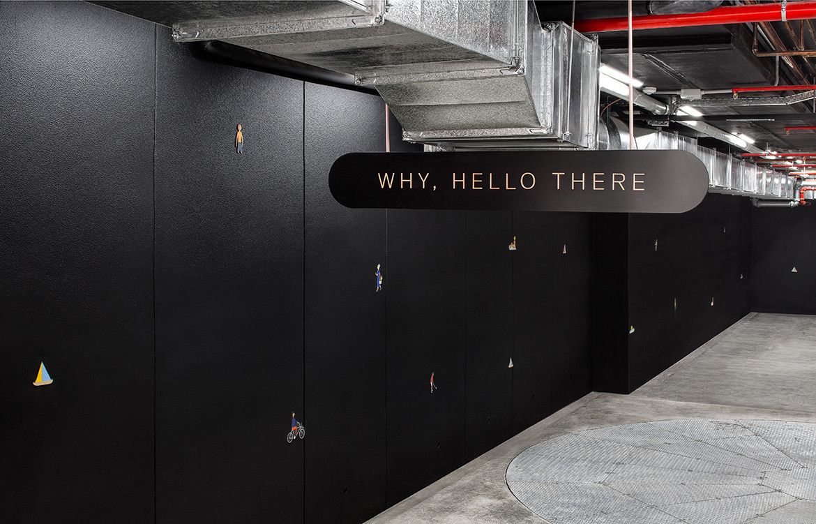
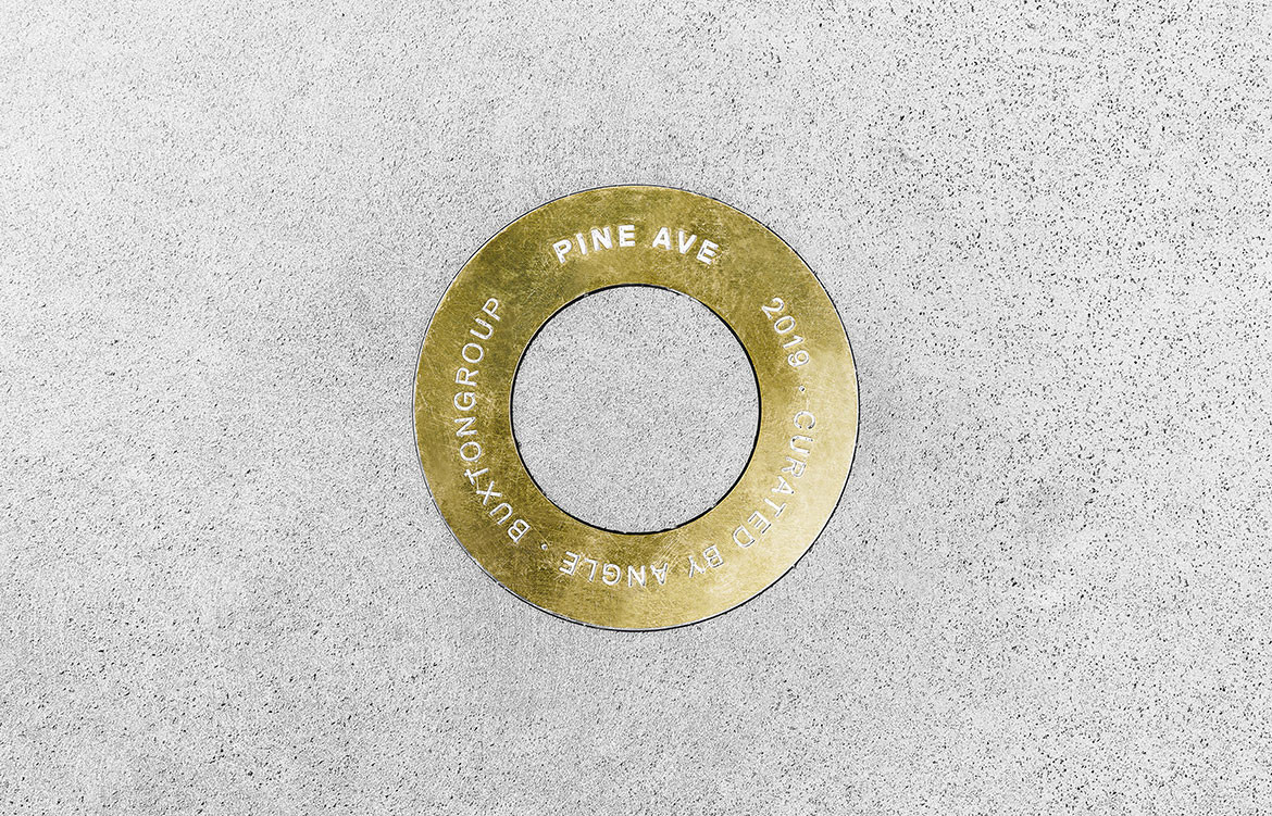
Other elements that come together to make this project stand out are the custom wayfinding and services elements. Communal services like a workshop and bike storage is marked with identifiable signage, designed especially for the project by ANGLE. “It’s the kind of details that really kick things up a notch,” says Harry, “It might be small but we really want to make sure it makes our projects feel like a home.”
Though a modern interpretation of the art deco period, Pine Ave has been built with quality and care – features that will ensure it has an enduring appeal while ageing gracefully in Elwood.
Cera Stribley Architects
cs-a.com.au
The Stella Collective
thestellacollective.co
ANGLE
angle.com.au
BuxtonGroup
buxtongroup.com.au
Exterior photography by Emily Bartlett, interior photography by Maegan Brown.
We think you might also like Shadow House by Nic Owen Architects
