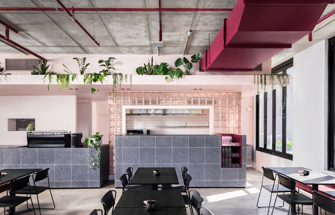
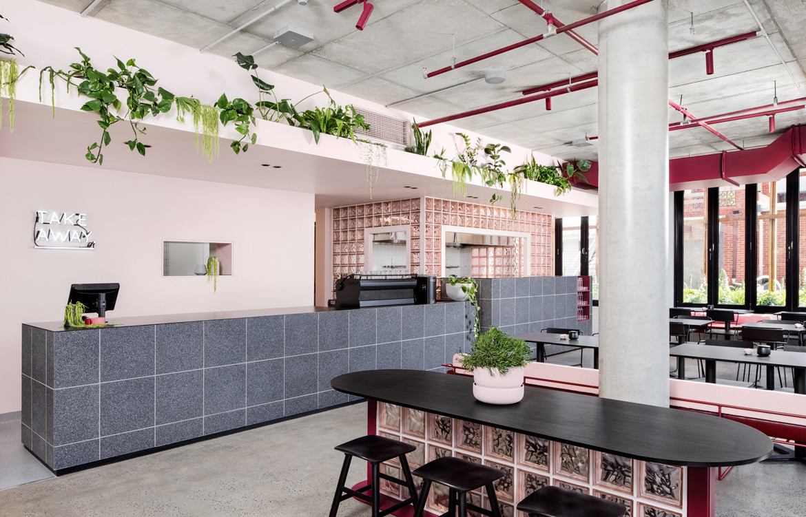
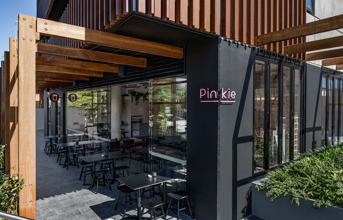
Laying eyes upon Biasol’s latest project, the pink-adoring character of Maggie from 1957 comedy Funny Face would shudder with pride. It’s easy to imagine that the brief for Pinkie, a new café in Melbourne’s northeast, was ‘Think pink – and you’re the Michelangelo!’.
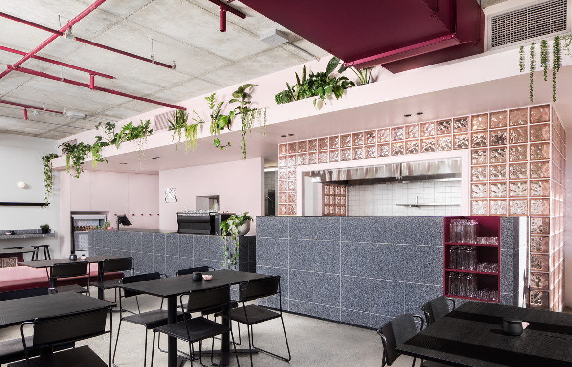
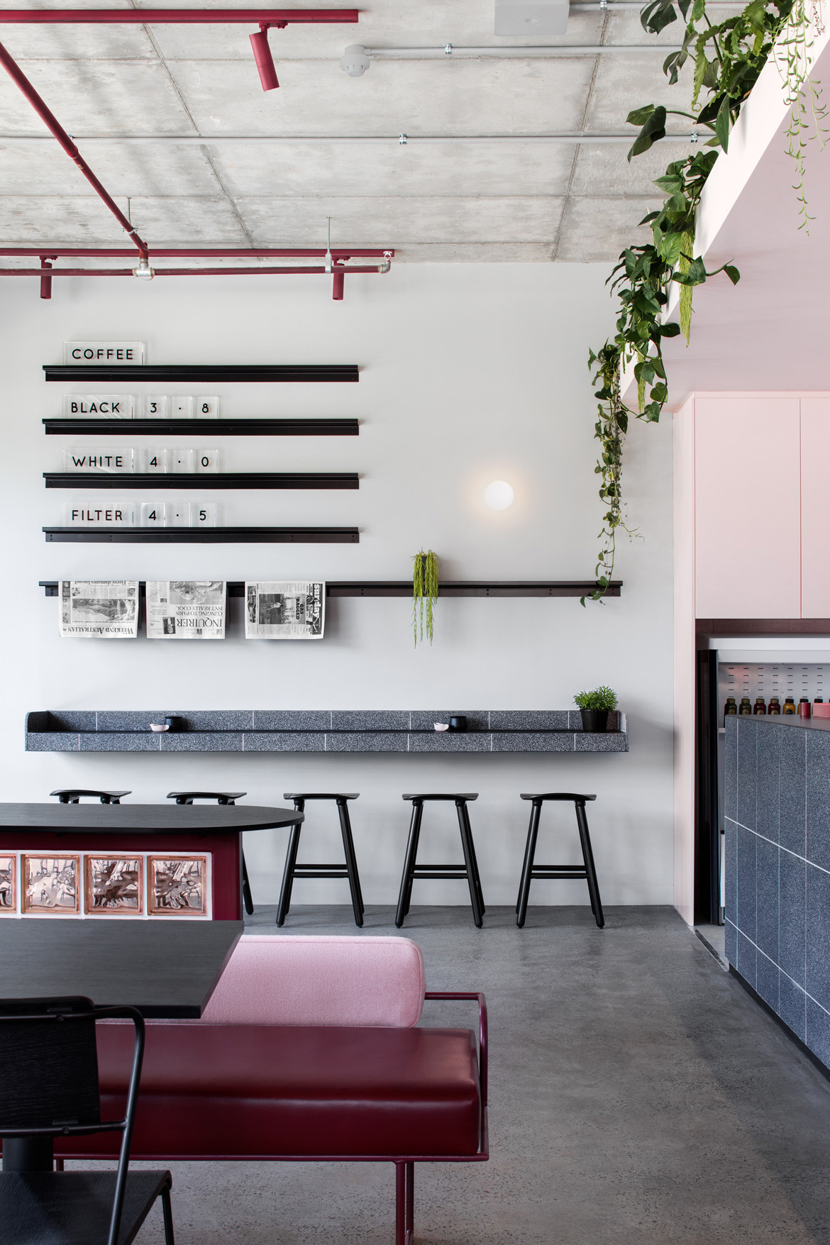
Maybe it sounds easy, taking a café and bathing it in a hue. But there’s a lot more that went into the execution of Pinkie than a paintbrush and a tin of rose-coloured Dulux. For the project, Biasol drew on their multidisciplinary roots in architecture, interior design, branding and product design to develop a concept filled with surprise textures, subtle shifts, deft spatial layouts and a delicate balance of tonality. Despite the project’s single-minded resolve regarding its palette, there’s nothing overwhelming about its application.
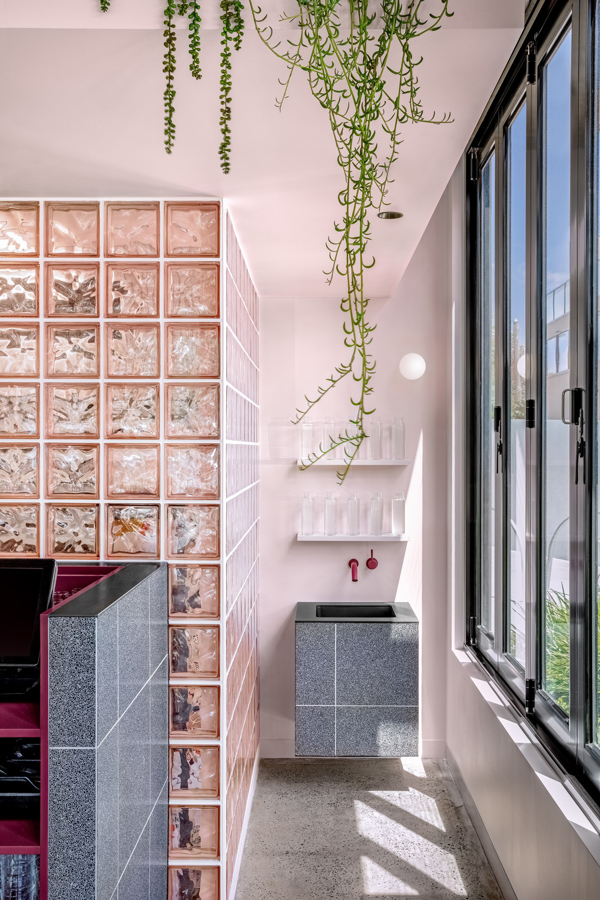
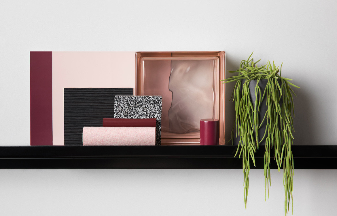
Architect and Biasol founder, Jean-Pierre Biasol, was approached by the owners of St. Rose and No. 19 – two already successful Melbourne cafés – with a brief to create a “bolder” design for their next concept. The colour palette, already outlined, was what ignited the idea for a cohering name. “It was also the perfect opportunity to incorporate our rose-pink glass bricks,” says Biasol’s Heidi Wong, who was in charge of Pinkie’s signage and branding.
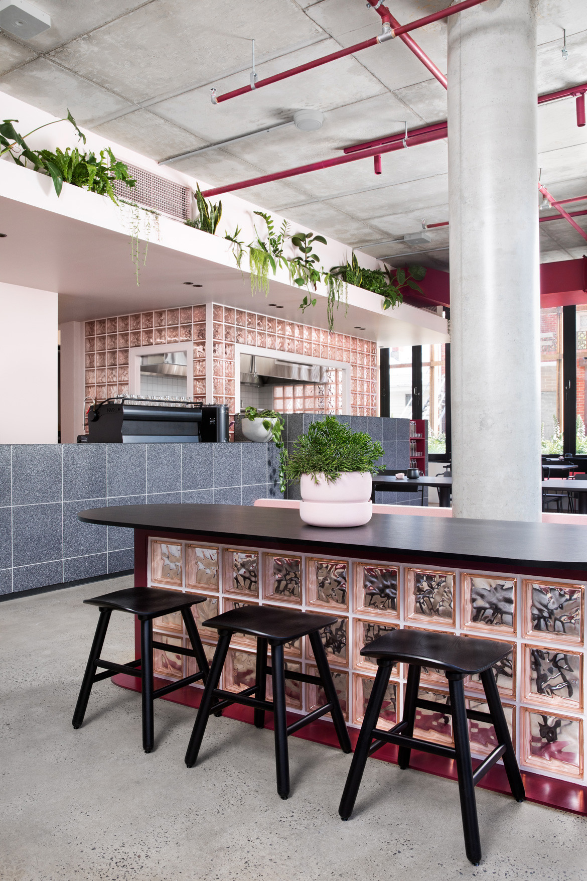
Since it was founded in 2012, Jean-Pierre’s studio has become known for taking the old and making it new, and Pinkie is no exception to this. This is particularly evident in the extensive use of glass brick – a lynchpin of late 20th Century homes – and the bold, geometric touches that Heidi says were gleaned from the iconic Memphis design movement.
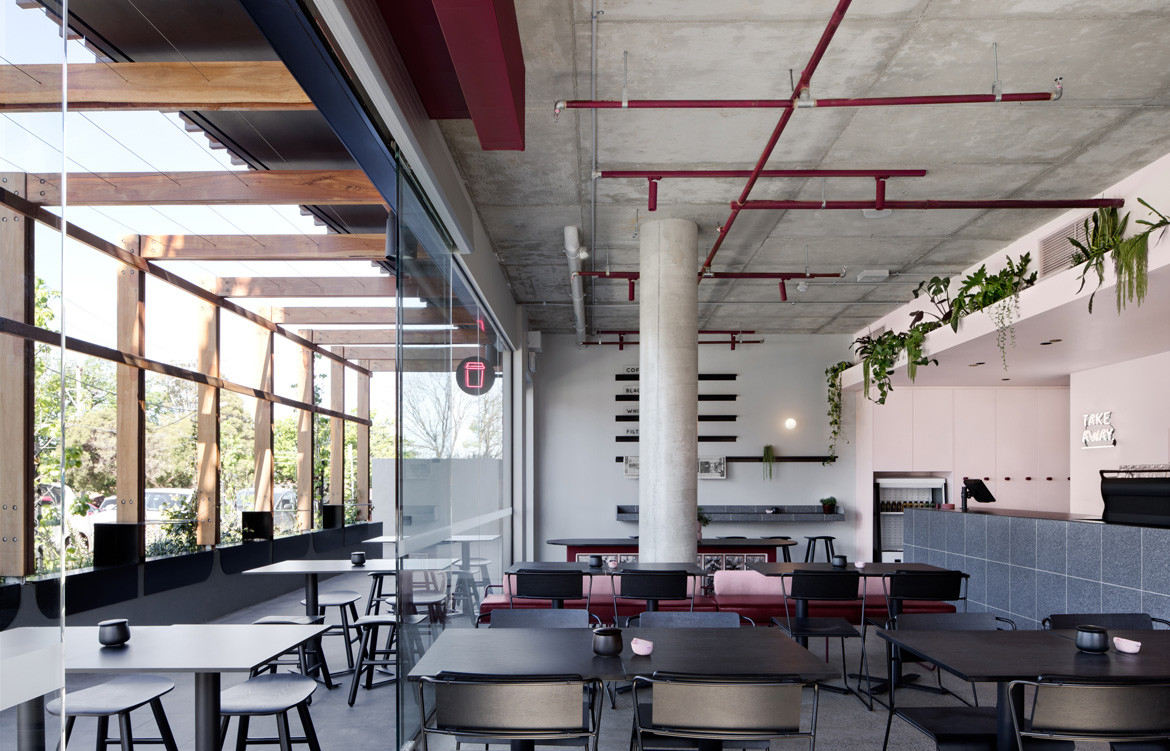
“Our design process is often inspired by the past, as we reignite and modernise styles for contemporary appeal,” she explains, throwing out design references that span eras and styles. The contrast of pink ducting against exposed concrete on the ceiling is typical of postmodernism, she says, while the bare, minimal forms are evocative of Bauhaus; the bright bursts call to mind Ettore Sottsass and Memphis, and the glass brick kitchen framework pays homage to the French architect Joachim.
This mixing of movements speaks to Biasol’s deep appreciation for its design predecessors, while their seamless blending in Pinkie confirms the studio’s own individuality and capacity for innovation.
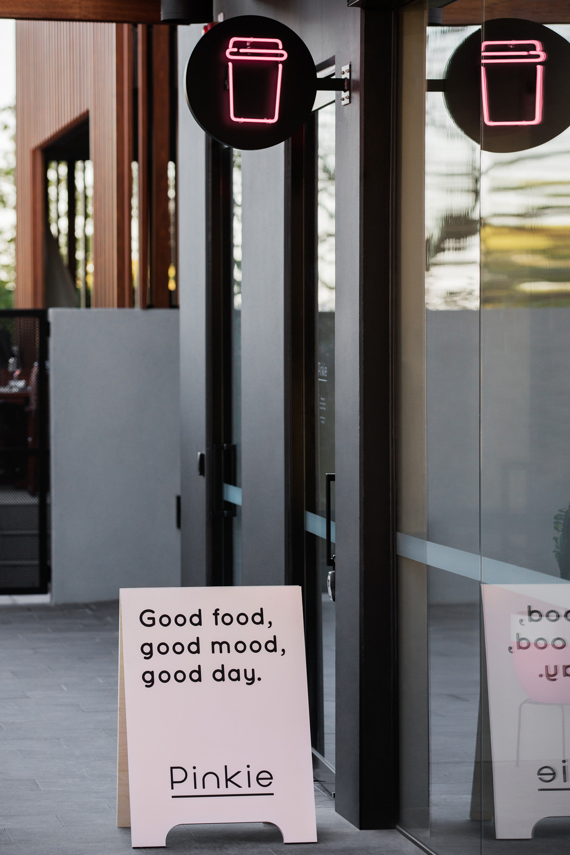
Of course, no matter how clever a project’s design, a deal always needs to be struck with functionality. Pinkie’s layout is evidence of Biasol’s capacity for delivering efficiency tempered with beauty. The careful spacing out of features was done to maximise functionality and operations, and clear differentiation between takeaway and dining areas is achieved through a simple neon marker. Even the rose-coloured bricks are more than something nice to look at, cleverly wrapped around the kitchen to bring natural light and transparency.
Biasol
biasol.com.au
Photography by James Morgan
We think you might also like Boosa Cafe by Kestie Lane
