Sometimes, when design takes centre stage, it does so without shouting or fanfare. Such is the case with Pippins, a residence by Mazzei and Webster Architecture & Interiors that sits quietly amid the windswept peaks of Red Hill. Set upon an irregular site, the home takes its cues from the land it rests on, extrapolating the undulating topographies of its surroundings on the Mornington Peninsula and translating them into an architectural narrative.
The clients primarily reside in Toorak; however, they have had a holiday house in Red Hill for approximately 20 years. Their previous home was spread across multiple levels and situated on a vast site, resulting in excessive upkeep which became impractical as they embraced a new chapter of life. About a decade ago, they purchased the property where Pippins now stands along with an ancillary house. “The intention was to build a single-storey home for multigenerational use, depending on their family situation down the track,” says Dan Webster, Director of Webster Architecture & Interiors. The brief was simple: design “an easy, robust [home] while still capitalising on the aspects they loved about the site.”
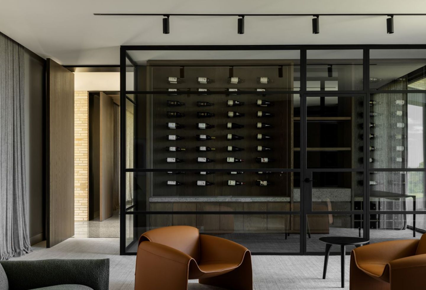
Perched discreetly below the crest, Pippins takes an X-shaped form — a geometric layout that, while formally bold, is designed to respect the land on which it stands. “You have swinging environmental factors down [in Red Hill]; it is either still or the winds are really strong and cold as they come off the water. So, the [clients] were aware they either needed to expose themselves or protect themselves, so we leant on a lot of their knowledge of [the area],” explains Webster. Its sleek tapering rooflines, evocative of California’s desert architecture, cantilever over the structure, casting dramatic shadows while maintaining a lightness that defies the solid concrete construction. It’s a visual symphony where the building becomes an extension of the landscape, emphasising natural contours without over-asserting its presence. “The X-shaped layout does mean the overall footprint of the building is much greater than if you were to cluster all the rooms together… [which meant] the impact on the landscape was more significant,” adds Webster. “However, what we tried to do was get the house at a level that minimised the number of earthworks and heavy landscape close to the home, which would bleed out to the natural [plantation].”
Related: A refined interpretation of Brutalism in residential design by Powell and Glenn
The ‘flying roof’ echoes Mid-Century Modernism and cantilevers outwards, extending over three-and-a-half metres in certain corners. This, combined with the thermal mass of the concrete, creates a heat bank crucial in the cold climate of the bucolic location. Beyond its functional merits, this roof structure with its sleek bullnose edge captures the minimalism that defines the entire aesthetic.
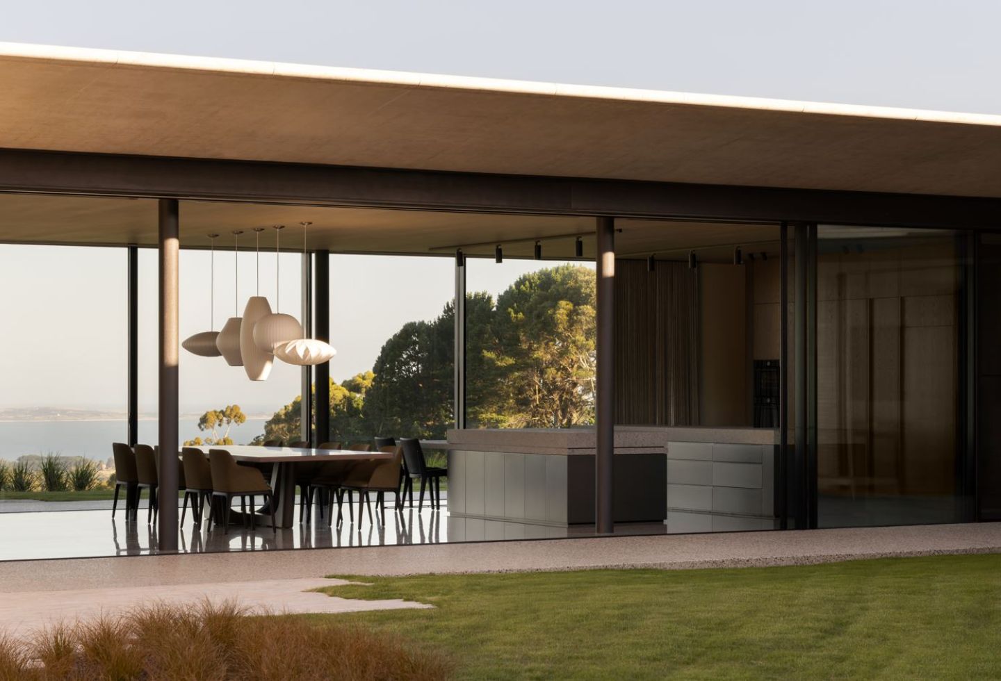
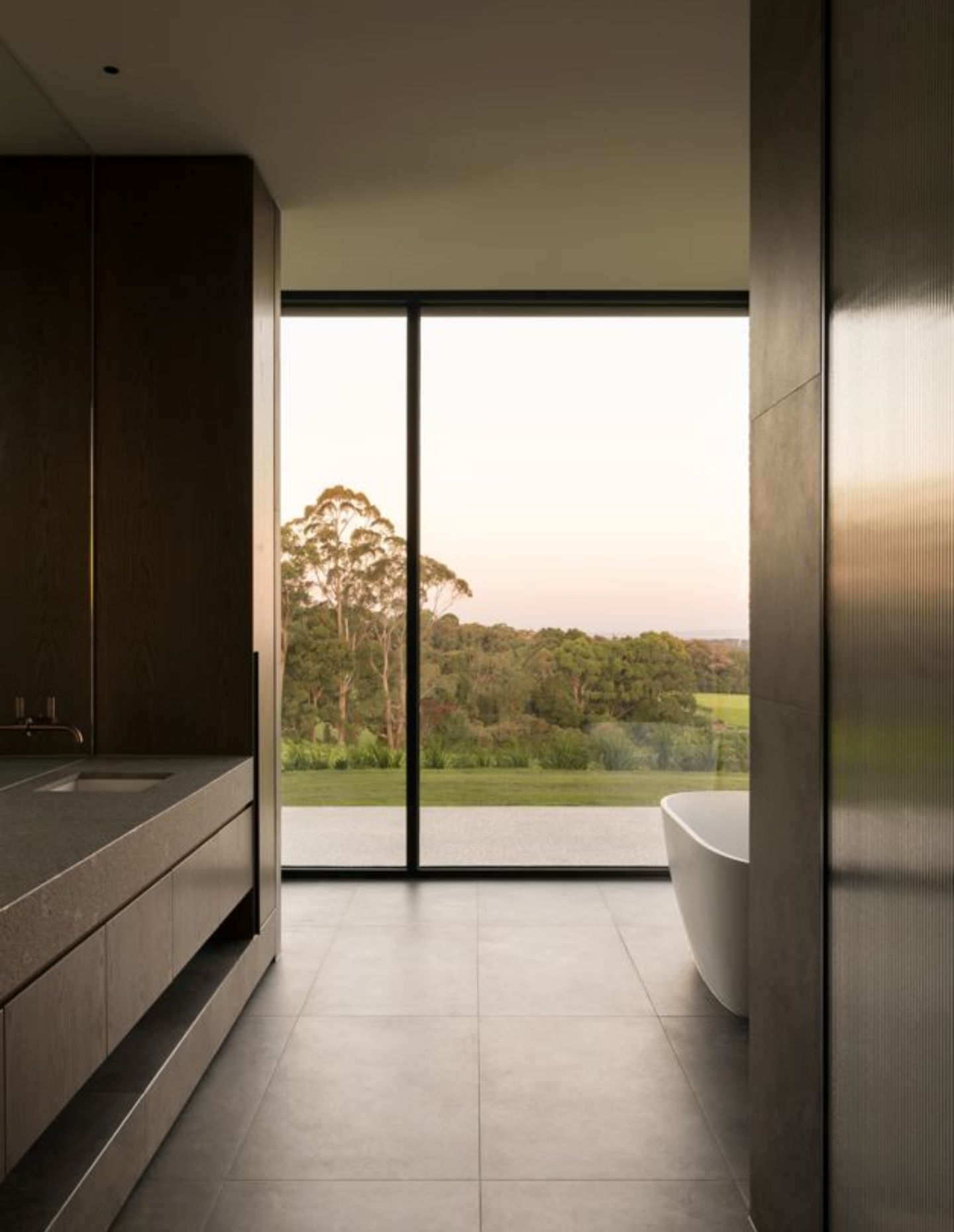
The home cascades across its site, with living areas flowing into terraces and landscaped pockets that bring the outside in. “The orientation paired with the view, which competed with the wind… the idea was that we create a series of pavilions that were transparent. Even if you were on the alternative side from where the view is, you could still see through [… and this] allowed the clients to maintain the view of the bay but protect them from the winds,” Webster continues. “That was the idea behind the large pockets on either side of the house that informed the X-shaped [layout].” The floorplan opens the residence to these panoramic vistas from each room while forming intimate sheltered outdoor spaces, defying the Peninsula’s fierce winds. Each facet of the home is experienced fully, allowing a continuous dialogue between inside and out.
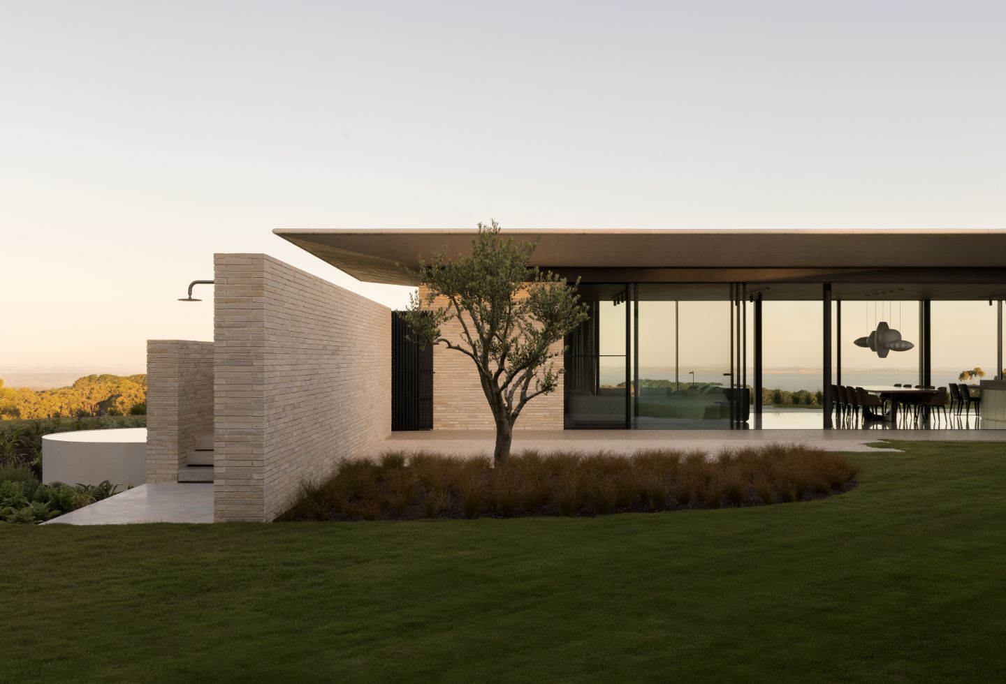
The house was positioned on the same level as the previous structure, ensuring minimal environmental disruption. All earthworks also used on-site soil, further reducing the ecological footprint. This integration extends to the surrounding landscape, where the work of Nathan Burkett Landscape Architecture ensures a flow from the house to the garden.
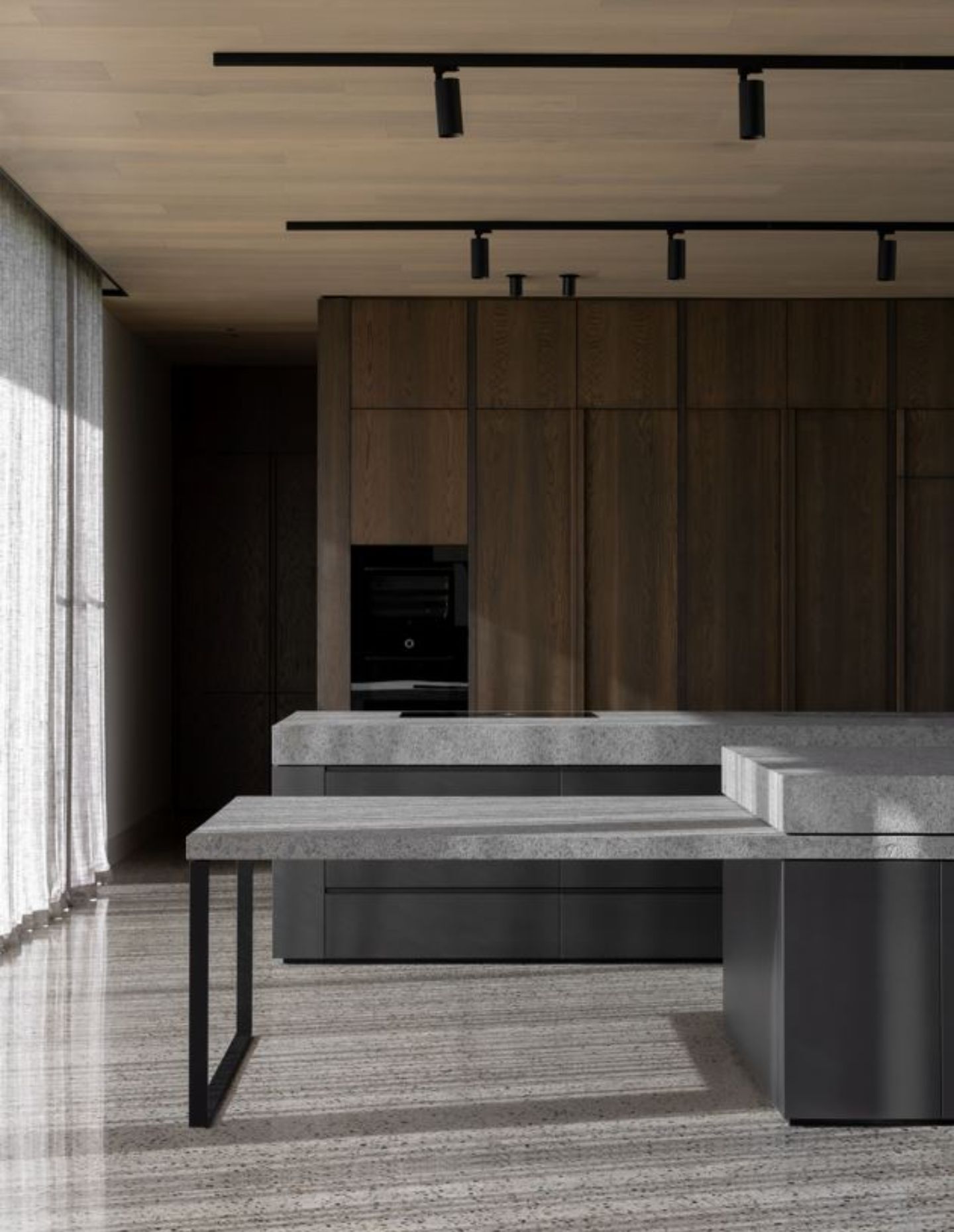
With uninterrupted views of Western Port Bay and Red Hill’s rolling greens, the architecture is intentionally porous, framing the horizon as if each view were a masterstroke on a canvas. The expansive circulation areas are reimagined as a gallery for the clients’ impressive 40-piece art collection, primarily ranging from Indigenous to contemporary Australian works. “The clients [longed] to showcase as many pieces as possible but wanted transparency to the outside […] so there was a competition between the glazing and location for artwork,” says Webster. “We tried to make any circulation zone, particularly the secondary spaces, incorporate as much art as possible.” The secondary bedroom wing, with minimal openings, is essentially a gallery with the walls of the cloister lined with curated art. The main vestibule acts as a gallery, delineated in the middle of the home and connecting each wing. Enveloped primarily in glass, it houses the more sculptural pieces in the clients’ art oeuvre, changing the medium of what’s on show as X marks the spot.
Next up: The design of Six-Ways House by Kennedy Nolan is intentionally restrained
