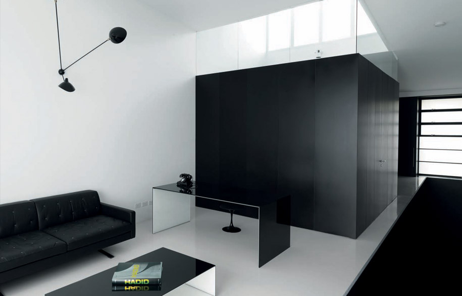
Hero: Top level sitting room featuring a Tunnel coffee table and Bridge desk by Piero Lissoni, Marc Krusin and Carlo Tamborini for Glas Italia, from Space Furniture; vintage telephone from Sydney Antique Centre; black wall lights Serge Mouille.
It used to be a grocery warehouse servicing the corner stores of Sydney’s city fringe suburb of Surry Hills. It was double-fronted, with one, a loading dock at the end of what is now a pretty cul-de-sac of restored terrace houses and a mysterious sandstone retaining wall at the end; and the other, facing north onto a through-street.
The internal width of the house is 4.65 metres. As Ian Moore points out, once the guest bathroom, laundry, storage, the stair to the upper level and the minimum width required for the garage were taken into account, there remained just 10mm for the wall between the garage and the stair. “What could I use which was 10mm thick which could hold the house up?” Moore asks rhetorically. The answer was a 10mm thick steel plate structure which forms the entry portals, the stairway wall, the kitchen surround and the floor-to-ceiling bookcase in the main living area – thus defining the functional and aesthetic character of the house.
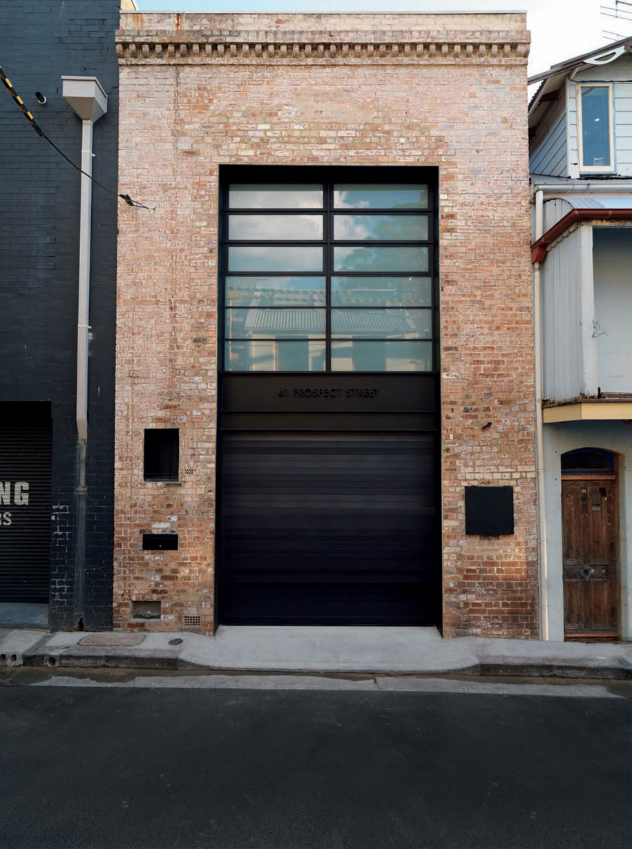
The garage entry with the address laser-cut into the steel portal.
In fact, the upstairs is wider than the downstairs, but has been brought in to match the downstairs width, mainly in order to accommodate the steel columns in the walls which support the steel beams needed to open up the roof.
But for Ian Moore, who originally trained as an engineer, the difficulties thrown up by re-inventing an inner suburban warehouse are simply creative challenges, especially given his portfolio of supremely elegant houses and apartment buildings.
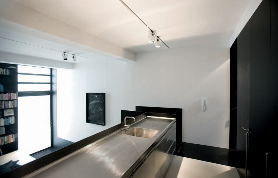
The kitchen looks down on to the visitor entry and main living area. Kreon track lighting from dedece.
The catalyst, in this case, was his client who, after hunting around for some time, asked him to come and take a look at the warehouse. “I said ‘It’s perfect’. She said she’d go to the auction and asked me what she should go to. I said, ‘Keep going until you get it.’ Which she did, thankfully.”
Thereafter, the client remained at arm’s length, giving Moore the simplest of briefs: “All I want is a black and white Ian Moore house with a very well-lit bathroom and a big bath.”
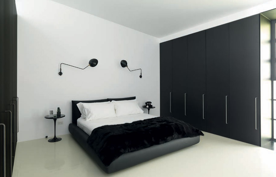
Marcel Wanders Dream bed by Poliform; Eero Saarinen Tulip bedside tables by Knoll from dedece.
From this simple brief has emerged what could be described as a poem in black and white. This tonal counterpoint works in tandem with a splendid manipulation of space and light to make the house absolutely right for what it needs to do – not too big and not too small, private but never claustrophobic, compact but flowing and providing the opportunity for two people to have their own personal space when required.
The front door is the old cul-de-sac loading dock, but now with a massive, pivoting translucent glass door. This opens directly into the main living space and a black steel stairway which leads up to the next level (with the kitchen and the other loading dock, now the garage with laundry, storage and guest bathroom) and then continuing on to the upper level with a sitting room, bathroom and the only bedroom.
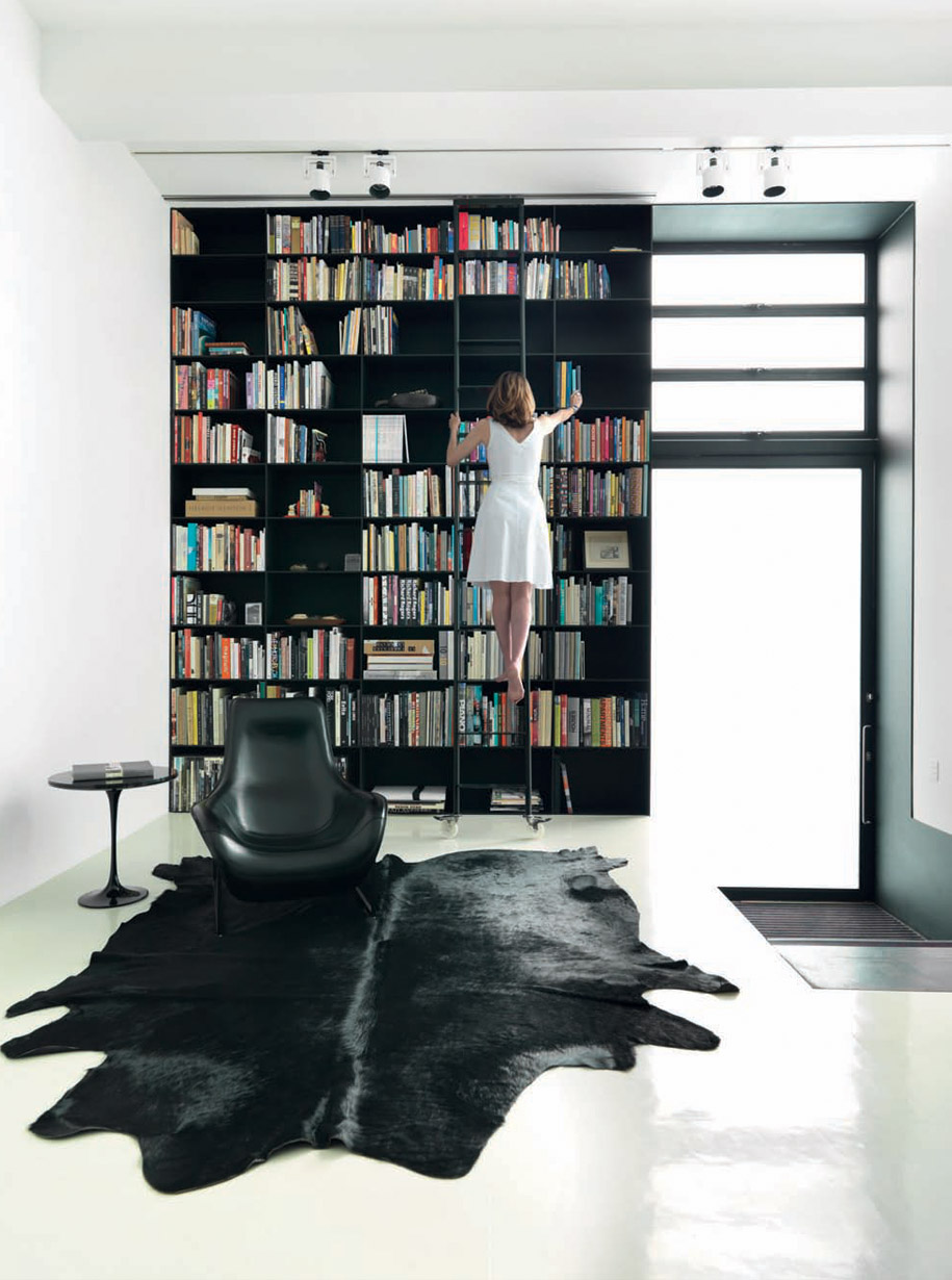
Visitor entry featuring the floor-to-ceiling steel bookshelving, Antonio Citterio Mart armchair by B&B Italia, from Space Furniture; vintage Eero Saarinen Tulip side table by Knoll from Shapiro Gallery, restored by Your Home Design.
The ground floor living room is framed on the street side by an impressive black steel plate floor-to-ceiling bookcase, and on the other side by a steel plate-framed banquette above which is the galley kitchen.
A steel portal frame – yes, 10mm thick – runs up the two levels and encloses the stairway to the upper level which helps create a great sense of adventure as one climbs the stairs into the light that suffuses through the upstairs translucent glass windows.
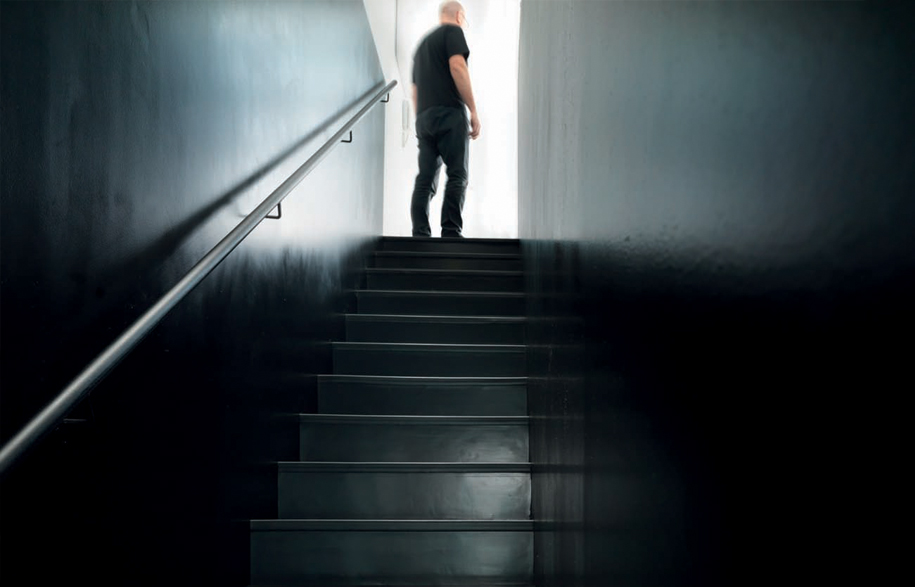
Stairs to the top level are a steel plate frame.
The warehouse had been bought by an artist in the 1970s, who then converted it to a studio and residence. The bedroom and living room were upstairs. “We have added the bathroom,” says Moore. “We just got a big can opener, got the roof and cranked it up, so it is flooded with light.”
The bathroom Moore describes as a “major success”. It sits between the upstairs living room and the bedroom, a floating black cube (the joinery is black anodised aluminium), but with clear glass highlight windows on the three interior sides and the roof jacked up on the southern side to accommodate a bank of electrically operated glass louvres which draw light in literally day and night. “You can get up in the middle of the night,” says Moore, “go there and you don’t need lights at all.” Black on the outside, inside the bathroom glows and reflects Moore’s on-going adventure with Corian which here includes the bath, the walls, the floor and the custom-designed basins.
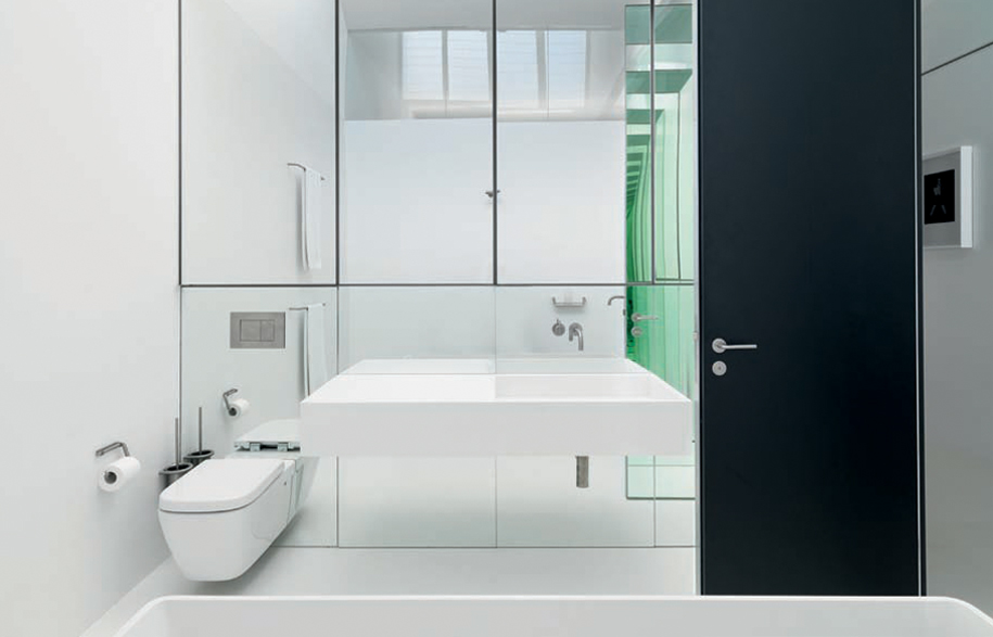 Handbasin is custom designed by Ian Moore in Corian; Cube WC by Caroma.
The bathroom, says Moore, creates a sense of separation between the bedroom and the sitting room, but also a sense of containment for the bedroom. It also contributes to the black-and-white graphic poetry of the house because, as Moore points out, you can stand at the top of the stairs and see the black box of the bathroom and the black box of the stairway, while downstairs when you enter you see the black box of the kitchen.
The garage has a white epoxy floor. But this was not possible on the upstairs timber floor where an epoxy finish would crack. Instead, Moore has used a rubber finish which not only softens the experience of moving around in the house, but offers a beautifully subtle variation – a warm off-white to complement the otherwise pure white of the house. Similarly, a series of black-and-white photos along the upstairs wall provides an intriguing contrast to the pure blacks of the new insertions.
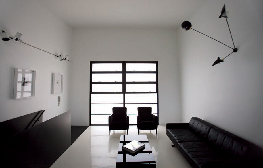 Upstairs sitting area with windows referencing the building’s industrial past combine with vintage Art Deco armchairs from Shapiro Gallery, upholstered by Recovery Upholstery; Kennedee sofa by Jean-Marie Massaud for Poltrona Frau, available from Corporate Culture.
Deciding not to use curtains was an important factor in using the high performance translucent glass for the windows – drawing in modulated sunlight during the day and filtered light from the streetlights at night. When open, the bedroom window frames the outside Paperbark tree, but screens out the neighbouring houses. Otherwise, the black steel framed windows quietly reference the light industrial buildings typical of the precinct.
Space, light, elegance and restraint – these are qualities I associate with Ian Moore’s previous work, and they are defining characteristics of this intimate house. As with his other, larger scale projects, light is used here to create the space. What distinguishes this new house is the way in which he has used black as a unifying graphic element. Like a De Stijl painting, the composition of the house is essentially musical with the tangible, assertive black line counterpointed against the intangible, fugitive white space to create the rhythm of space itself.
Ian Moore
ianmoorearchitects.com
Photography: Iain D. MacKenzie
iaindmackenzie.com
