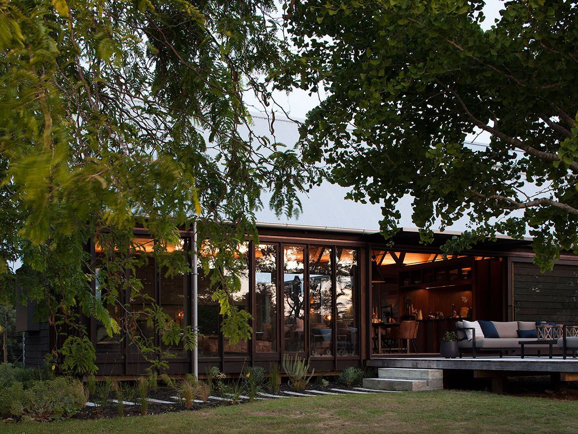
These clients were interested in a vernacular timber house for their family. A farmhouse that would look as though it had been there forever and have minimal impact on the landscape. Peaty solids make the block extremely flat, with long, expansive views around the rural and holiday district of Omaha. Featuring an orchard, cricket pitch (used by the local community), and large estuary to the north-west, it enjoys unlimited space and aspect.
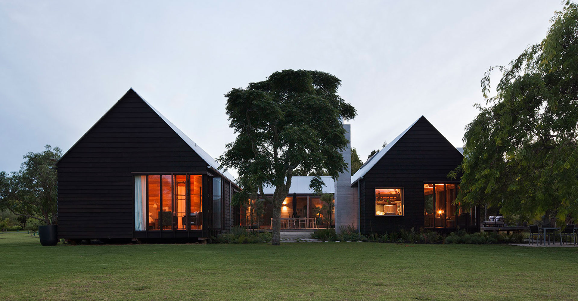
“We quickly dismissed any radical forms,” says architect, Aaron Paterson. “The planning is contemporary, but the elevations and sections are traditional. We broke the mass down by dividing the house into three gabled dwellings – a garage/guest house, main living wing, and a bedroom wing.” The main axis runs north to south and a boardwalk passes right through the two main pavilions, connecting the living spaces east to west. Courtyards, pathways, gardens, and steps join the three buildings together, creating outlook and outdoor spaces for every use and every time of day.
There is a lovely axis down through the centre of the cluster, beginning at the orchard and washing line. Like all good farmhouses should, practical spaces must fit the day’s routines. Here, it starts at the washing line, makes its way through the garage, past the wood stack and vegie garden and up into the house. Inside, there is a generous, covered back porch and laundry then on to a passage past the scullery and kitchen before entering the living room. “We really laboured the planning to get the right sequence of domestic functions through the house,” says Aaron. “The back door is more important than the front door, so the connections had to work seamlessly.”

The budget in this house afforded the time and materials to create bespoke, handmade items. So, the architects have explored vernacular construction inside as well as out with creativity found in transforming traditional elements into their contemporary counterpart. The attention to detail is astounding.
“Working within a set architectural language, we took the opportunity to explore what Rem Koolhaas has called the ‘elements of architecture’. We’ve focussed on the aesthetic and structural possibilities of timber and steel with a view to re-defining the individual elements, such as ‘door’, ‘window’, or ‘roof’.” Past the iconic barn silhouette and rustic weatherboards, you’ll find fine boxed steel windows, minimalistic detailing to the point of the total absence of bargeboards or visible flashings. The results remind me of the care found in product design, only at a much larger scale.

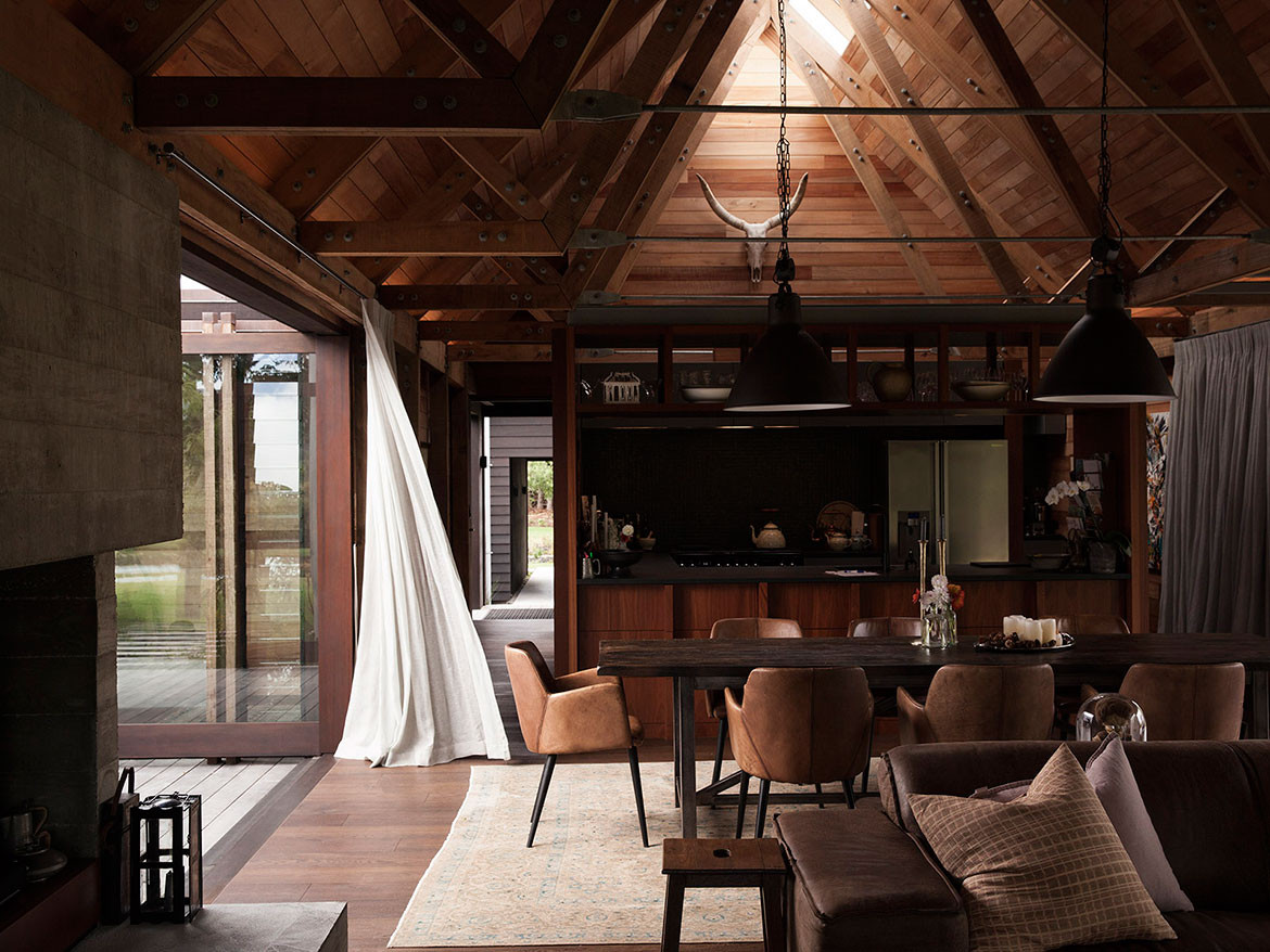
The iconic 45º barn roof creates a cathedral-like interior lined with solid New Zealand Beach and Pine plywood to form seamless walls and ceilings. Tonka posts, transom beams, and truss frames are joined with exposed bolts for their agricultural reference. And the dark stained Oak floor completes a rich, warm interior reminiscent of a colonial New Zealand church or a wharenui on a Marae.* It has a similar patina and the soft light quality found in these older handmade timber buildings.
Rather than the large expanses of glass we have become accustomed to, the architects have scaled door and window openings to frame particular views and control the amount and intensity of light that enters the house. This strong interiority is very purposeful and creates a sense of drama as the timber surfaces and details are accentuated and modelled by these smaller scale openings.
“This is less like a pavilion and more like a solid object with elements carved out,” says Aaron. “It contrasts with other interiors I have completed that embrace the modernist aesthetic of lightness and openness. By contrast, this house has been a search for beauty in shadowy space and dappled light. Light falls really softly in this house, and the experience is very restful and contemplative.”
*A wharenui is a Maori meeting house, often the focal point on a Marae, or meeting ground.
Paterson Architecture Collective
p-a-c.nz
Steven Lloyd Architecture
stevenlloydarchitecture.co.nz
We think you might also like other projects from Habitus House Of The Year

