Jeremy Loy and Peggy Lim had spent the last five years in the Netherlands, where Loy was posted for work. There, they resided with their two children in a Dutch city dwelling with a narrow frontage and a long plan.
“Typical Dutch houses have big windows at the front but no skylights. When we were there, [we embraced] this obsession with light because it was gloomy for most of the year,” says Loy.
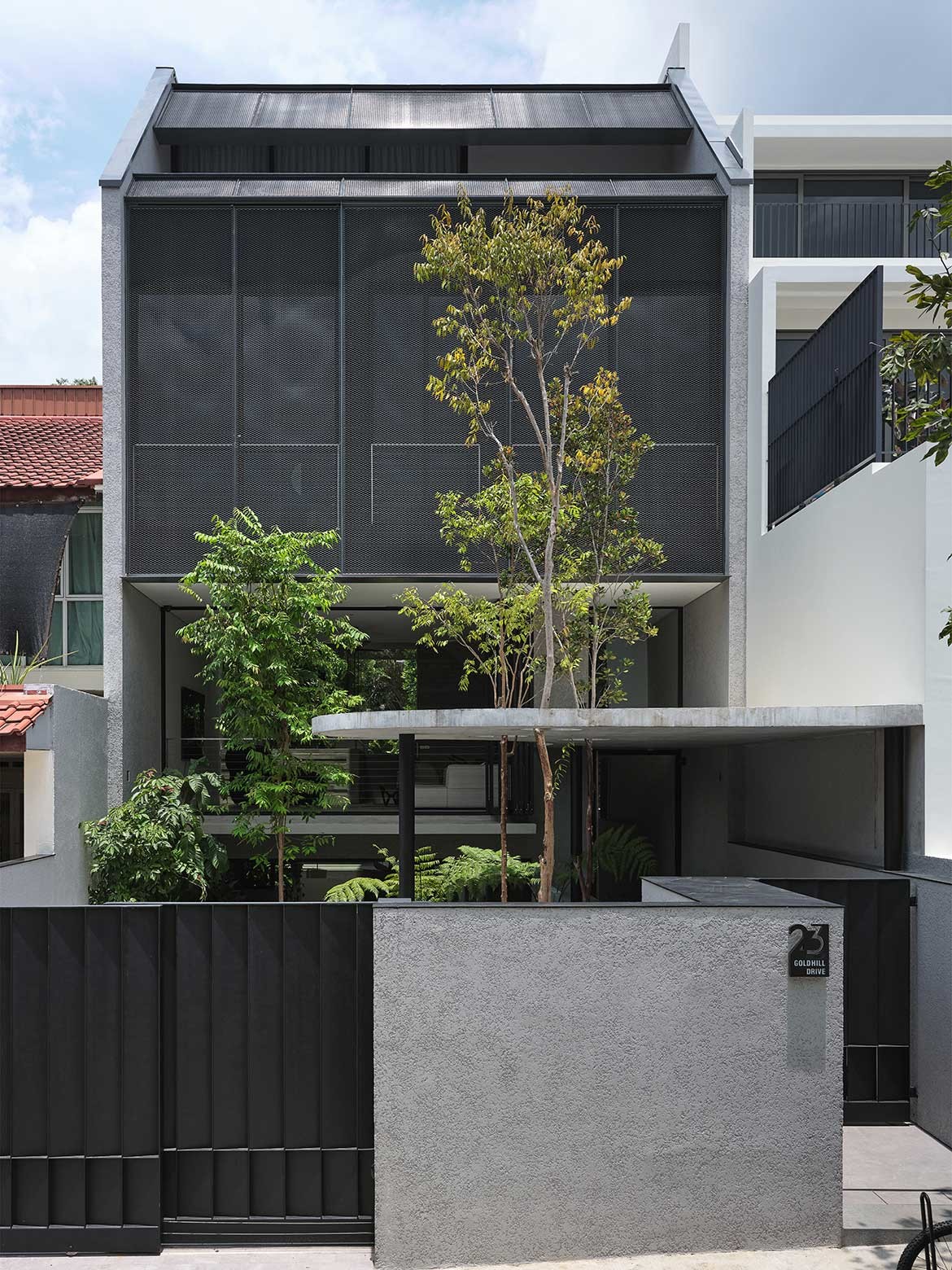
This scenario is similar to terrace houses in Singapore that are wedged on both sides by neighbouring walls. When they returned to Singapore, the couple purchased one and engaged Formwerkz Architects to design it. The clients chose the plot for its proximity to the children’s schools and its dual frontage.
“The front faces the street, but the back connects to a lusher expanse facing a black-and-white housing estate. The land slopes gently toward the back with a slight elevation of a metre,” describes Alan Tay, one of the firm’s founders and the project’s lead architect. A community garden out back where Lim sometimes buys produce from adds to the neighbourly camaraderie.
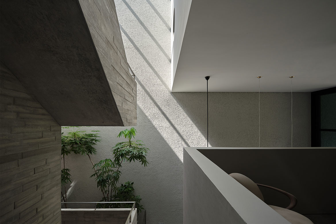
Tay designed a sectionally driven house. Its strong, three-dimensional, layered spaces and long sightlines are better experienced in person than in the compressed format of photographs. Split-levels, internal terraces, skylights, a free-plan and a grand double-volume dining room, make the house feel capacious.
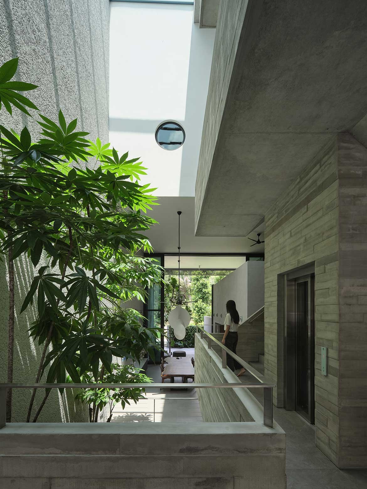
The internal programs are arranged around a central atrium next to the vertical circulation core.
“The atrium is naturally lit with a skylight and ventilated by an induced stack effect, which works better in this instance because the house’s east-west orientation limits the potential to take advantage of the prevailing wind direction for cross-ventilation through the block,” says Tay.
A towering sterculia foetida tree with spreading foliage busks in the sun and shades the spaces beneath.
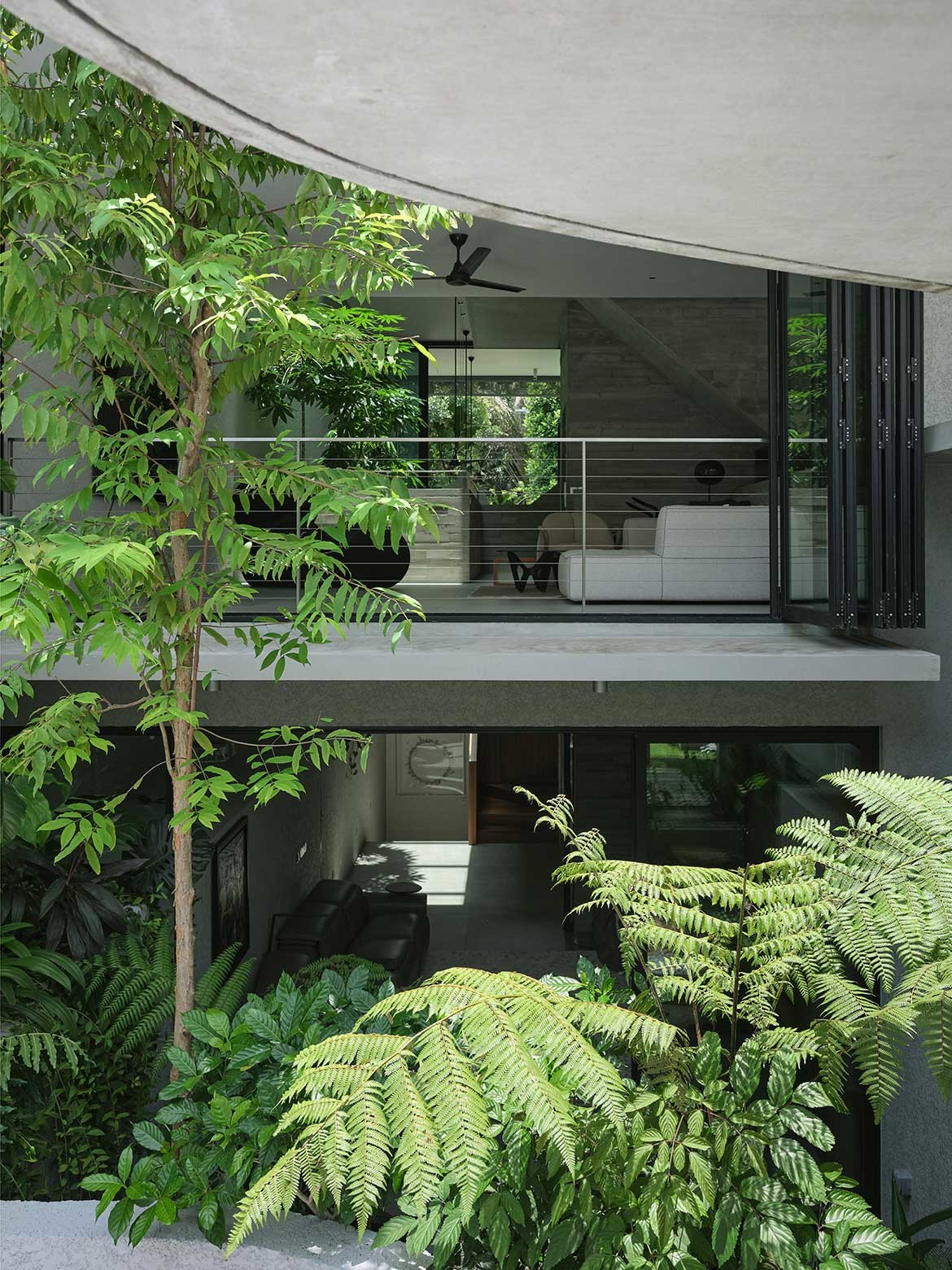
There is a wonderful sense of being outdoors even when one is standing in the house’s centre. In the rear, a ficus lyrata tree that grows well in shade springs from a hole in the flooring.
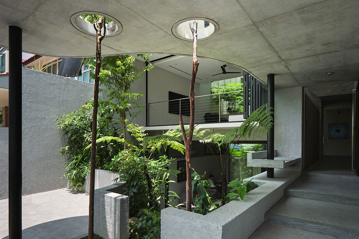
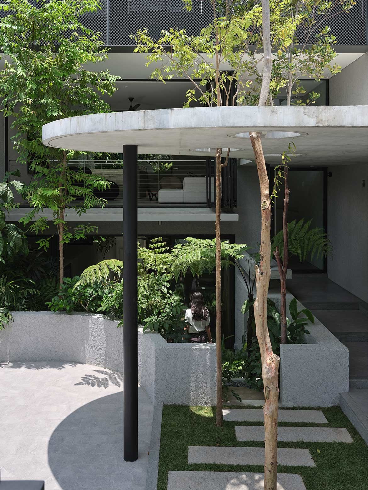
Out front, a skinny trunked tristaniopsis and cratoxylum cochinchinense tree perforate through gaps in the garden canopy. “We embrace this blurring of outdoor-in lines,” says Loy. This includes the living things that come with plants. “It’s always our inclination to design with nature,” says Tay, adding, “In a sense, nature and landscape, or sometimes the ecology [goes beyond being part of the] design vocabulary to becoming part of the design issues we wish to engage.”
There are two ways to enter the house at the front: straight through a corridor where steps lead up half a level to an elevated living room; or down a cascading pathway enfiladed by plants into the basement entertainment room. Defying convention, these underground rooms are showered with light.
Loy had requested for a light-filled basement after seeing an Instagram image. “It feels airy; you don’t feel hemmed in. I watch football here. It’s nice because from the street level, I can’t be seen even if I leave the doors open,” he says.
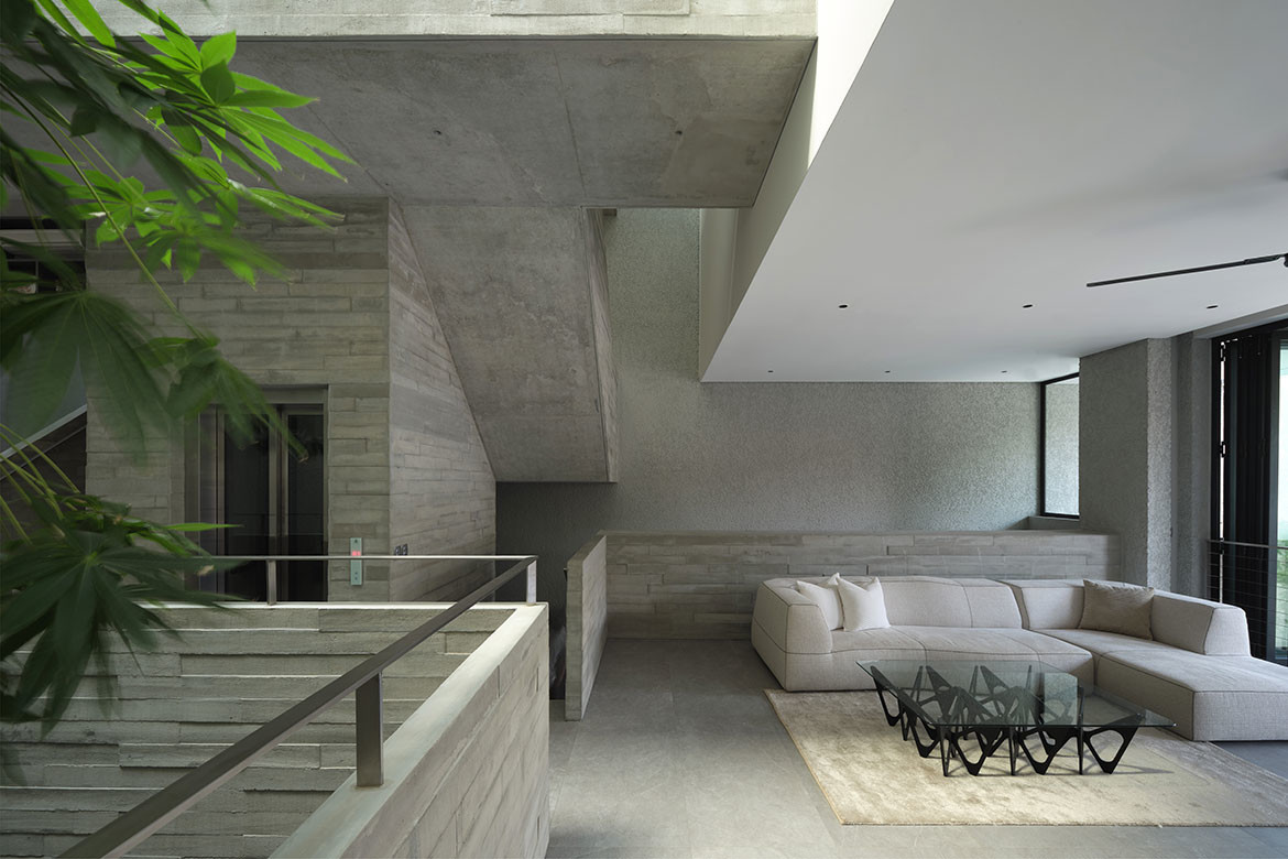
The living room and study overlook the dining room on the split level between the basement and the first storey.
It is the most important space in the home, embellished by a dramatic assemblage of Overlap pendant lamps from Flos, floating like abstract clouds in the void.
“We told the design team that most of the time when we entertain, we would end up in the dining area all the way through, so we put the living room away to become a more private area,” Lim shares. The staircase landings stack above like balconies.
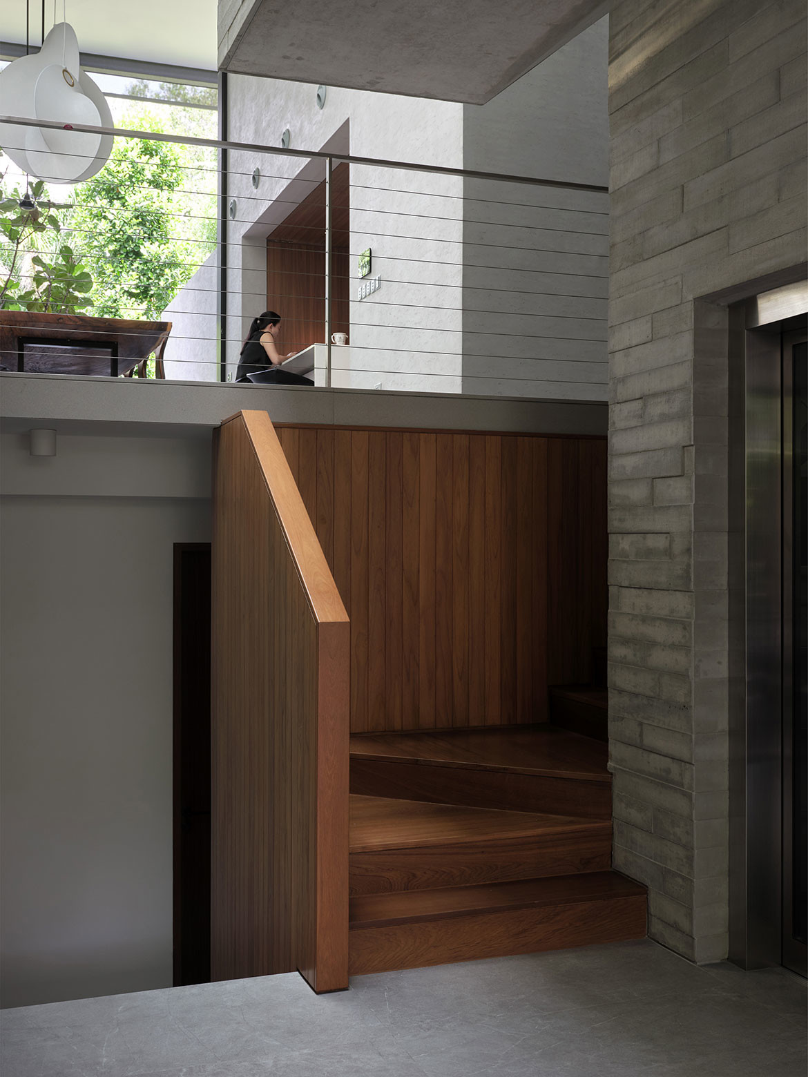
They have become an informal control tower where the parents and children communicate with hollers through the porous home.
“Our design attempts to further Adolf Loos’ Raumplan [that organises rooms around a series of stepped areas]. Our adaptation was making the staggered floor plates accessible by lift,” highlights Tay, on incorporating a lift with doors on both ends to accommodate the split levels.
The bedrooms – four, including the main bedroom – are tucked away on the upper levels. They are modest so that more floor area is given to common areas and towering volumes to prioritise connection and engagement.
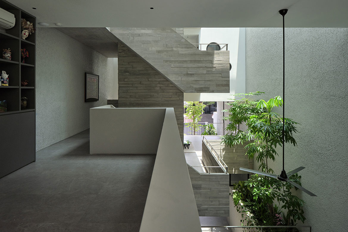
Porthole windows in the children’s bedrooms allow communication across the atrium to the main bedroom, whose porthole window is hidden like a surprise behind the wardrobe’s carpentry doors.
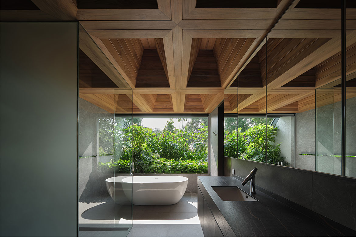
Another door in the joinery leads to the ensuite, where landscaping outside the window doubles as a privacy veil. A timber coffered ceiling creates a complementary backdrop.
“There is a bit of idiosyncrasy and indulgence here in a predominantly restrained palette. And it’s always nice to have wood in the bathroom but impossible in the humid tropics, so we put it in the ceiling to ensure it is always well-ventilated,” says Tay.
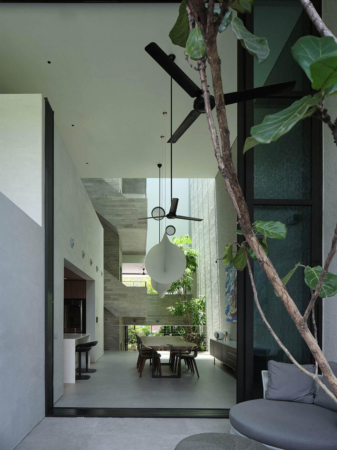
The children’s bedrooms fronting the street enjoy privacy through expanded metal mesh screens. This accompanies the overarching use of board-form concrete and roughcast plaster finish to give the house a raw feel where indoor and outdoor materials are homogeneous.
On the light they lacked in Holland, there is no dearth of it here – or natural breezes and nature for that matter.
The house embodies the tropical abode ideal while not bowing to any vernacular pastiche. Affirms Lim: “When I visit my neighbour’s house, there are always lights on. For us, it’s natural light until evening.”
Project details
Architecture – Formwerkz Architects
Photography – Fabian Ong
We think you might like this article about a country gem in Ballarat, Victoria.
