The Tate House easily fits into the category of a mid-century icon. Located in Taroona, a 15-minute drive from Hobart, it overlooks an estuary of the Derwent River – a place that is a much denser urban environment now than when architect Esmond Dorney originally drew up the plans.
While the surroundings may have changed, the Tate House has lovingly remained in the same family since it was built. Erik, who now owns the house with his wife Sally, first saw it when he was only four-and-a-half years old.
“Esmond was a good friend of my Uncle Charles, who originally commissioned the house. In 1963, a few years after the place was completed, my grandparents moved into the lower level, creating a self-contained apartment,” shares Erik.
While Erik and Sally have a great connection to this home, the time had come to make some updates. Sally had developed multiple sclerosis, and so they wanted to make the home more comfortable.
The couple worked closely with an occupational therapist to assist in developing the functional brief: a lift to connect the two levels (previously access was only from outside), a new broad internal staircase, and a greater amount of space around things such as beds and baths to eventually accommodate a wheelchair if required.
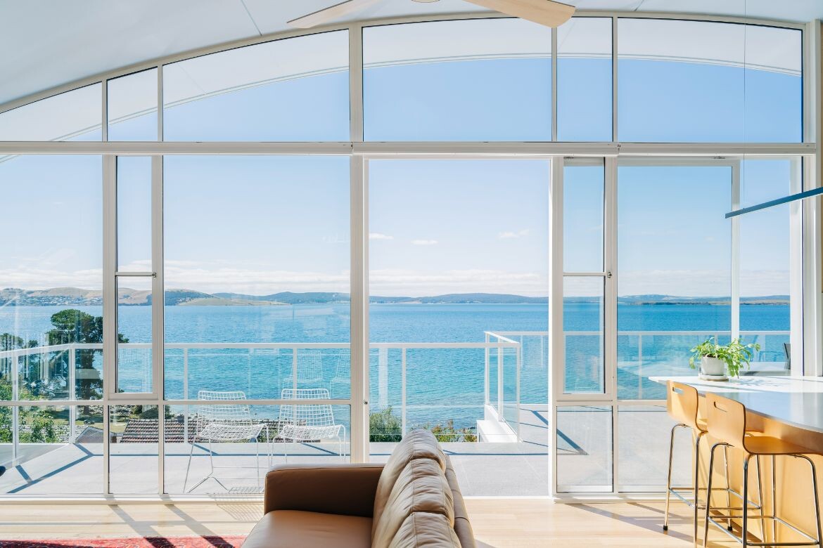
In addition, they opened up the spaces and made the house more thermally efficient. This included double-glazed windows, and increasing cross-ventilation from a new wrap-around deck as well as a large sliding door from the kitchen and dining area.
Preston Lane Architects was appointed to the project and from the first site visit took note of things that needed to change to meet the brief. “There was no physical connection to the outdoor spaces and the internal views were compromised. The distinctive roof structure remained, as well as many of the original internalised plywood walls used to divide the spaces. These walls certainly reduced the amount of light as well as camouflaging this beautiful, curved ceiling,” shares Daniel Lane, co-director of Preston Lane Architects.
“I certainly don’t do dark spaces. We couldn’t live in a grey box with low light levels, feeling constrained,” says Erik, who enjoys the pale blue curved ceiling that forms a connection to the sky.
New glazed sections above the plywood walls allow the curved roof form to be legible while allowing sunlight to permeate. “Esmond had an ability to create these lightweight, almost tent-like roofs to give you that sense of protection from more inclement weather,” adds Erik.
For Esmond’s son Paddy, the “Tate House is as close as it gets to Dad’s way of thinking – but even with its simplicity, there’s a sense of complexity”. Paddy knew Erik as a child, when he and his family spent time at the Dorney’s beach house. “Erik has an understanding of Dad’s approach, which is about creating shelter, bringing a family together as well as being integral to the environment.”
While Preston Lane Architects maintained the essence of Dorney’s vision, with its lightweight steel-piped roof structure and a distinctive ladder/trellis over the side front door (a hallmark of many of Esmond’s designs), the house has been adeptly reworked. The new insertions include oak plywood joinery in the kitchen and the same plywood walls throughout.
Previously the water views could only be enjoyed from the kitchen and dining areas; now these are seen when descending the front path, with its 20 per cent fall. “We were also mindful of not distracting from the water views,” says Lane, who extended the lower level to the edge of the new first-floor deck.
The Tate House now features fluid, open plan living areas at the top level, including a separate guest bedroom with an ensuite. What was formerly Erik’s grandparents’ domain on the lower level extension is the main bedroom, ensuite, sitting area and a kitchenette. “We haven’t increased the original footprint upstairs. It’s still a relatively modest-sized house by today’s standards,” says Lane.
For Erik and Sally, who live in this iconic home, the family connections certainly make this place feel much more precious. But the practical updates make it a comfortable, modern space to live in. “It’s a 10-degree Celsius day today. The south-westerly winds are blowing and when I put my head outside, it’s certainly nippy. But half an hour later, when I draw the blinds and the sun rises, the temperature inside rises to 18 degrees. It’s cosy and you feel protected,” says Erik. For Sally, her condition has certainly thrown some challenges but, as she remarks, “the house doesn’t make me feel disabled”.
Lane, who was taught by Paddy Dorney at university, always knew – along with his fellow students – of Esmond Dorney’s significance. “Some of his finishes and details may seem quite simple by today’s standards. But his ideas and approach to architecture were well ahead of his time, and he is still a hero in architectural circles and beyond.”
Project details
Architecture and interiors – Preston Lane
Original architecture – Esmond Dorney
Photography – Adam Gibson
Builder – Thylacine Constructions
Location – Taroona, Tasmania, Australia
Traditional custodians – Mouheneener people
DISSECTIONS
FINISHES
Tasmanian oak timber flooring in loba finish.
LIGHTING
Dioscuri wall light by Artemide from Casa Monde. Kinetic adjustable light by Unios from Casa Monde.
FIXED & FITTED
Cooktop by Neff, Fridge by Fisher & Paykel, Rangehood by Miele from Harvey Norman. Masport Rosewood fireplace from Hunts Heating. Daikin inverter. Blinds in honeycomb from Boniwell.
This article originally appeared in issue #58 of Habitus, the Creative Spaces issue

