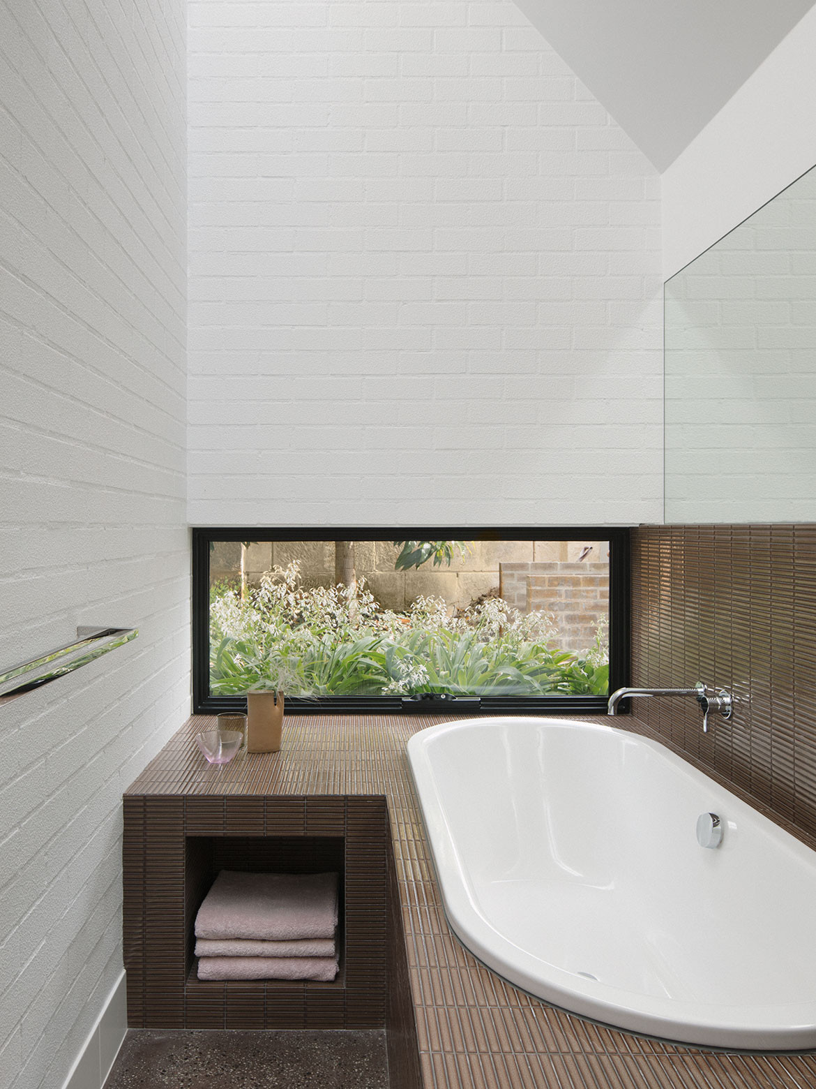
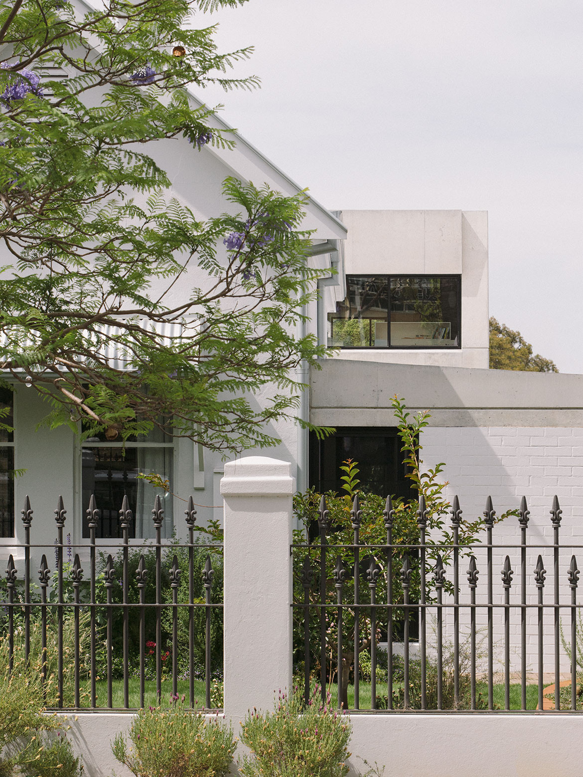
The Reed House in Subiaco, Perth, is home to Frances and Mark Reed and their four daughters aged between six and 16. Designed by architect Beth George – Frances’ sister – the project comprises a restoration to the façade of an original Edwardian house, a renovation of the interiors, and a redesign of the “zany” addition to the rear, pegged to have been built in the 80s or 90s.
Core to the client’s brief was to fluidly integrate the heritage façade with a modern renovation and extension to the body of the house. This was purely preferential, as the previous owners had in fact removed the house from the heritage registrar. Frances and Mark agreed unequivocally on all parts of the brief, such as the wish for communal spaces that encourage family time in addition to private areas that offer time alone. But there were also elements that spoke stronger to each as individuals.
Frances was eager to see modest spaces with elegant yet unfussy detailing. With a particular penchant for mid-century furniture and lighting, she sourced many of the standalone pieces of furniture herself. The dining table, however, is a custom creation from local furniture maker Guy Eddington.
Core to the client’s brief was to fluidly integrate the heritage façade with a modern renovation and extension to the body of the house.
For Mark, it was paramount that there be a relationship between the indoors and outdoors. The previous addition had lacked this type of connection and he wanted to be able to come home after work and play with his daughters in the pool. To this effect an outdoor kitchen was designed to be an extension of the indoor kitchen rather than separate or secondary.
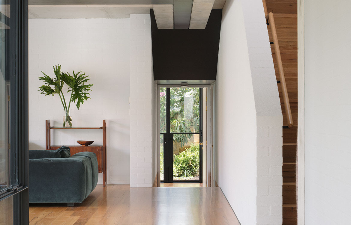
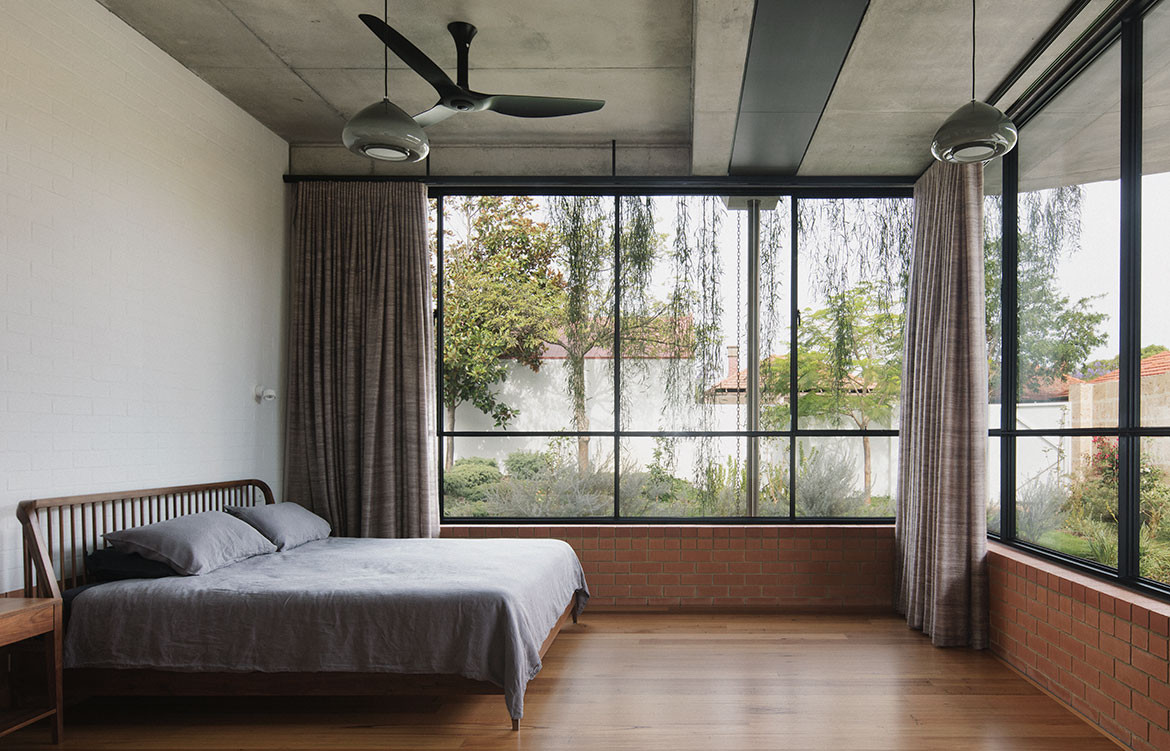
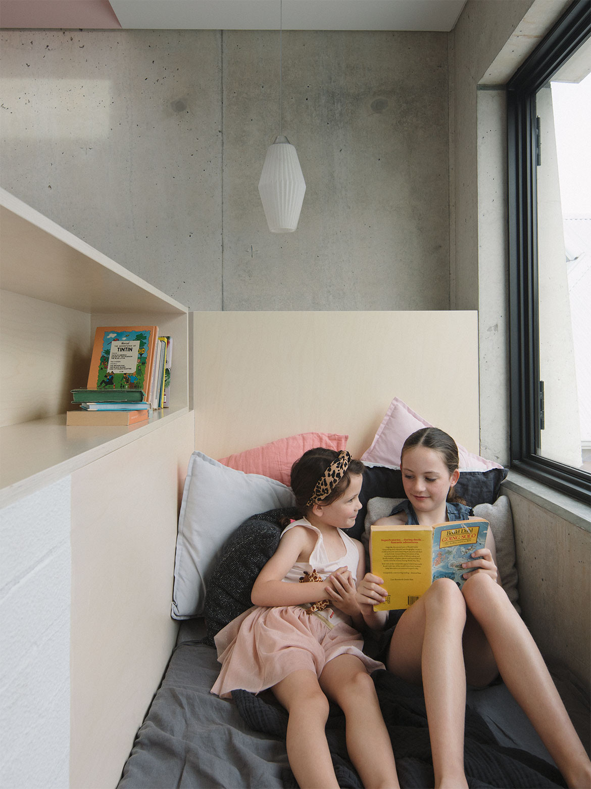
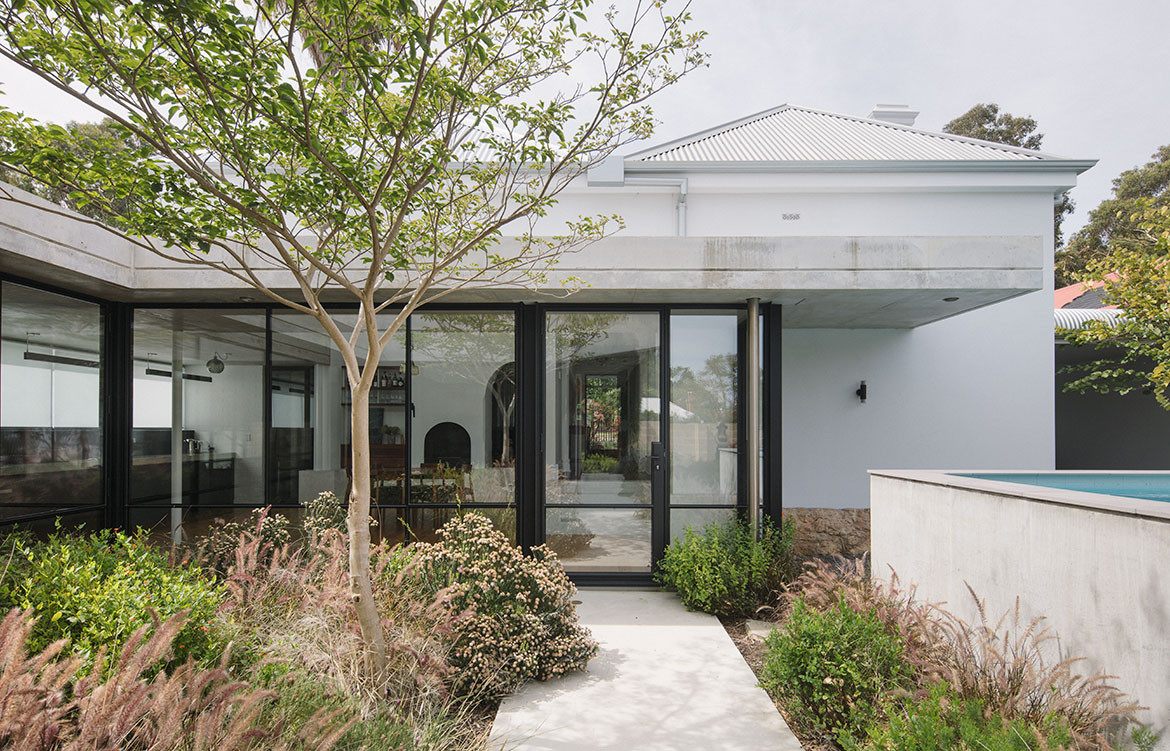
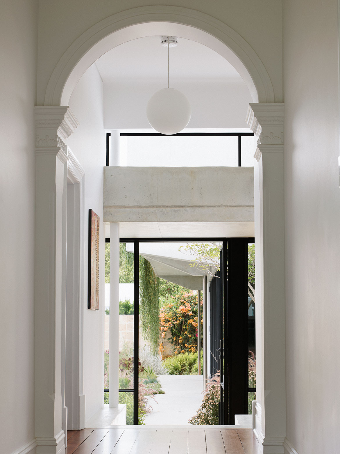
To passers-by, the restored exterior of the original house remains street-facing, with a new carport and porch upholding the same language. Inside one finds the original parlour and a guest bedroom and study (with a compact bathroom between the latter two). Move down the hallway to find the garden, or through the deep archway for the kitchen, long and linear flanking the sunken dining room. Continue through the ground floor to two separable living areas or the main bedroom and bathroom adjacent. Otherwise, venture upstairs to find the four daughters’ bedrooms past a reading nook at the top of the stairs.
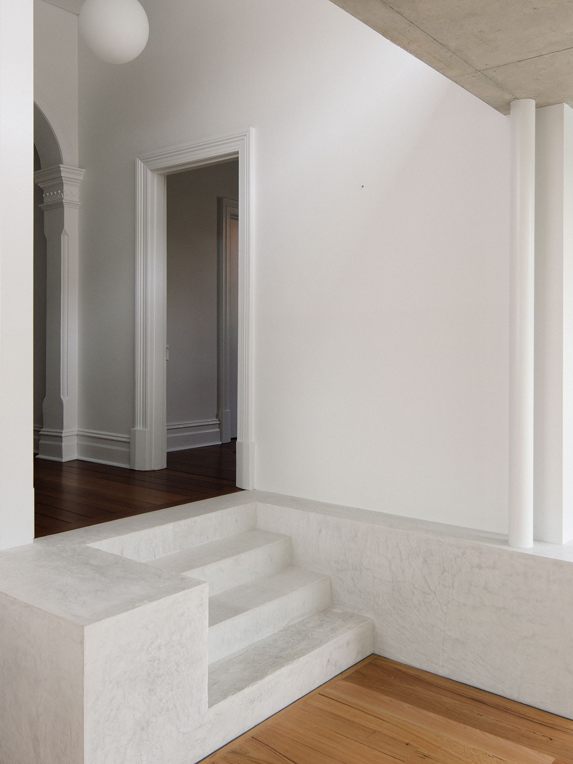
“By excavating the dining space by 600 millimetres, I could create a tall volume that one steps down into from the existing house”
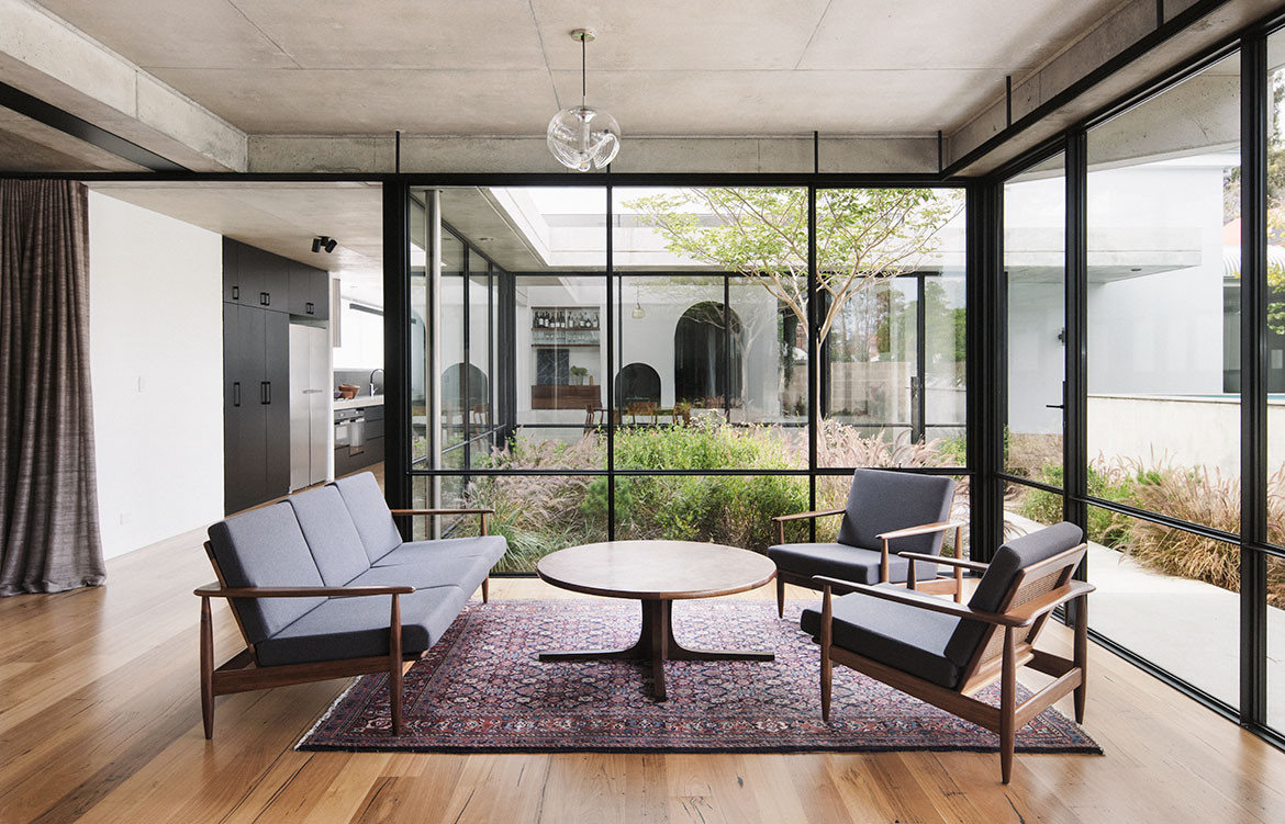
Frances and Mark, even Beth as the architect, each had strong inclinations to bridge architecture with nature. “From this shared desire for a house deeply embedded in the landscape grew the idea of having every room paired with a garden,” recalls Beth.
From the various elements of the brief from Frances and Mark, Beth was able to separate three key themes to the architecture; Spines, Dig and Gardens.
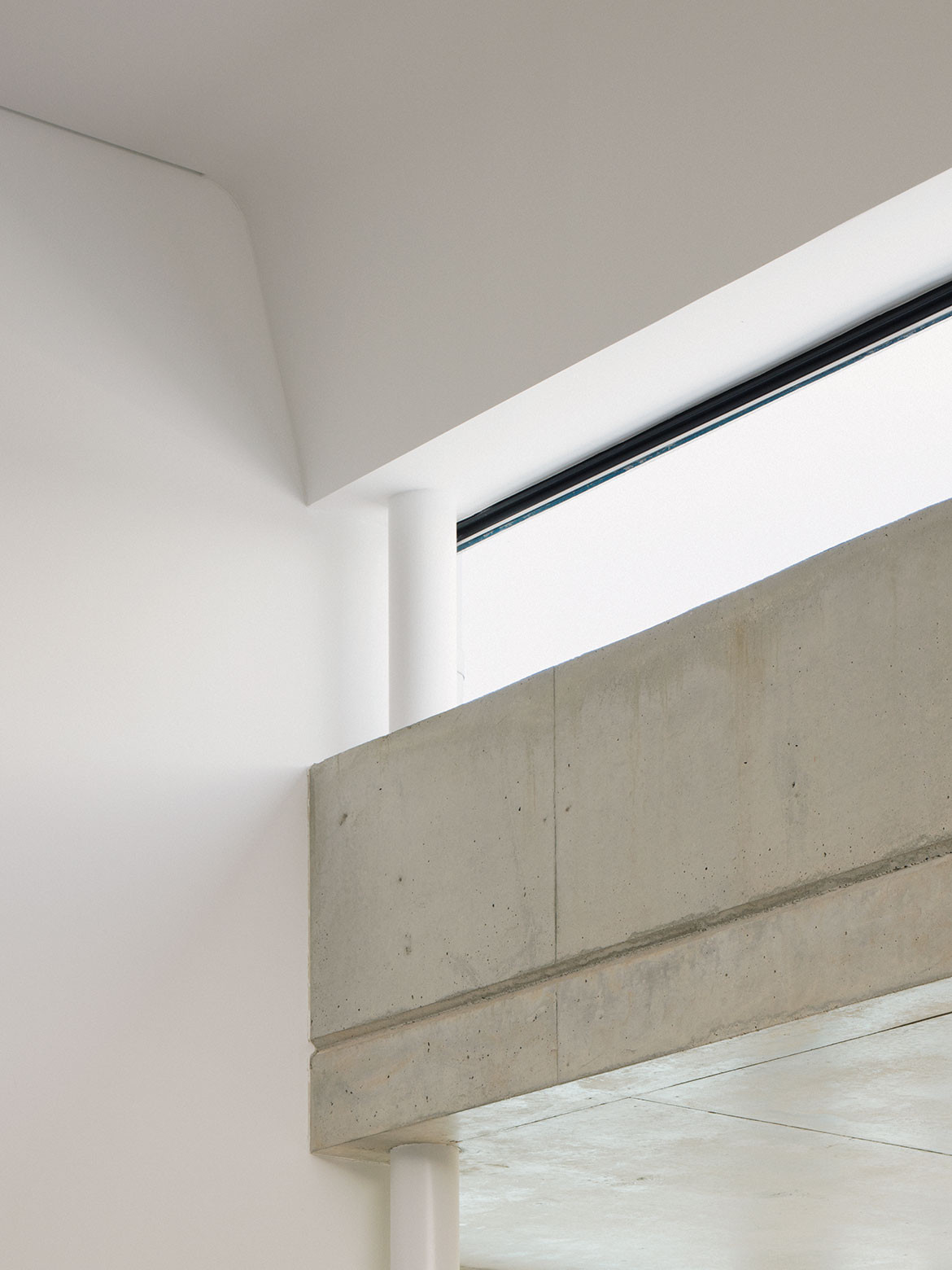
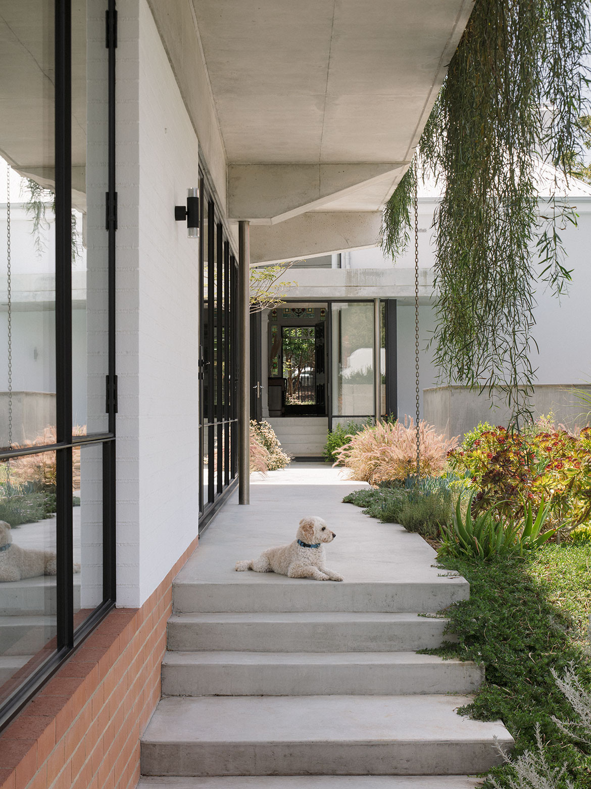
The idea was that one long spine would seamlessly connect the original building to the modern extension with subtle design cues that reinforce this transition without creating a disconnect. “A language was sought that would match the level of detail of the original dwelling without emulating its features, and this has been achieved through gentle curves, the tempering of light, tactile surfaces like textured brick,” says Beth.
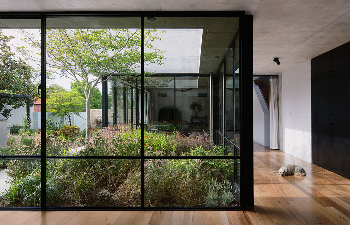
One long spine seamlessly connects the original building to the modern extension with subtle design cues that reinforce this transition without creating a disconnect.
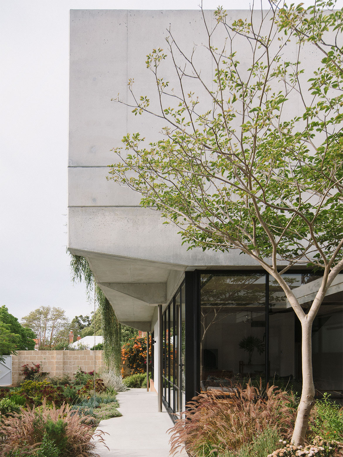
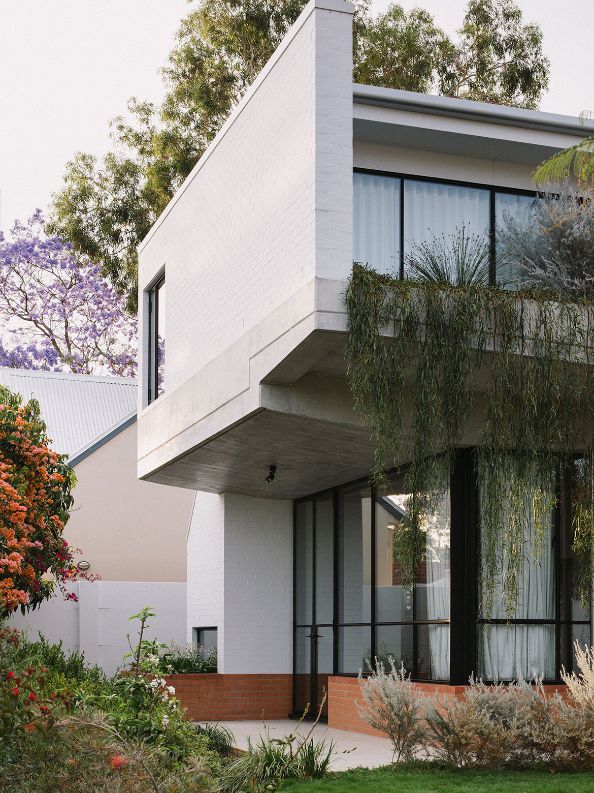
Instead of rooms either side of the extended hallway (one of the earlier designs), the extension masses to the west and opens out to maximise the volume of the block. By the time one reaches the new architecture they are in somewhat of a garden corridor, one wall is almost completely covered by hanging plants. The second spine, which runs in parallel to the first on a north-south axis, takes the form of a wind tunnel – a direct request from Mark! – and progresses from the gym at the front to the kitchen, living and main bedroom.
Frances trained and worked for many years as an archaeologist. The dining space, physically and conceptually the central area of the project, combines her profession and her family. “By excavating the dining space by 600 millimetres, I could create a tall volume that one steps down into from the existing house. This allowed me to treat the suspended slab, the soffits and planter, as one continuous concrete element that now slips in underneath the eaves of the original house,” says Beth.
The extension masses to the west and opens out to maximise the volume of the block.
Finally, we return to the notion of pairing each room to a garden or landscaped area. A courtyard enclosed in glass breaches the long, rectangular-plan of the extension, and is suitably paired with the living and dining room. Located between the old and new, it doubles to provide spatial separation yet visual continuity. The main bedroom on the ground floor pairs with the lawn and a cascading bougainvillea on the rear wall. The daughters’ rooms on the second story connect to tree canopies below and planters outside their respective windows. Landscape architect Christina Nicholson was given a brief for plants of different height, colours and textures.
Informing architect Beth George’s design thinking for Reed House and framing the resulting architecture are two primary conversations. The first is honouring the history of the site and the second is between architecture and landscape and facilitating new memories for the clients and their daughters. “This home enriches the way we live as a big family – we have spaces for togetherness, and also for seclusion. We now live outdoors far more than we used to… The kids have cultivated unexpected play-spaces everywhere,” affirms Frances.
Beth George
beth-george.com
Photography by Benjamin Hosking
We think you might also like The Habitus Edit to Internal Courtyards
